- Ê
- Â
fEliza Joseph has 6 post(s)
Zoo name: Woodland Park Zoo
Address: 5500 Phinney Ave. N. Seattle WA 98103
Hours of Operation: 9:30 AM to 4:00 PM daily
Lecture name: Save The Frogs!
Speaker: Kelly R. McAllister
Date & Time: August 11th, 2017 at 1:00 PM
Blurb of subject of lecture: The Oregon Spotted Frog is an endangered species because of habitat alteration including invasive grass that eliminates their home and breeding range. This lecture will explain the conservation efforts being made and how you can help!
Before reading these articles and watching the videos I had almost no perception of how photos used to be made or the impressive art of making a photomontage. Our generation has grown up with technology everywhere. Even babies these days can be seen using iPods or iPads. I myself have no experience with black rooms or creating images from negatives which is why I found the articles and videos so fascinating! It is incredible to watch Jerry Uelsmann go step by step through the process of making a photomontage. One mistake and the whole project had to be done over again. I did not even know that graphic design existed in the 18th and 19th centuries. It makes me appreciate the technology of today and the ease of photoshop to a greater extent. Today we can create montages in a matter of minutes all by just moving a finger. While I can appreciate the art of the old fashioned black room way of photography, I prefer the computer.


Definitions
Gumfiate (verb) – To swell, to puff up.
Running (adj) – The act of moving one’s legs to travel quickly.
Hiccup (noun) – An involuntary spasm of the respiratory organ that creates a characteristic “hiccup” sound.
Radiant (adj) – Shining brightly.
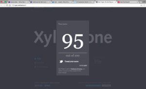
I took this quiz multiple times to achieve this score. I had a lot of trouble with the words that needed a more kerning than others such as “Toronto” and Quijote.” I found it easier to kern the words that only required a little adjusting and harder to find the right spot for the letters that needed to be moved greatly.
My Perspective
I found the movie Helvetica incredibly interesting. Before watching the movie, I had paid very little attention to what typefaces are used in the world around me, but the movie opened my eyes to the use of the font, Helvetica, around the world. For example, as a person walks down Broadway they are surrounded by a multitude of jumping and excited neon signs exemplifying hundreds of of colors. These words and motion displays all channel into the atmosphere that is customary of Times Square. It’s busy and hectic, but the signs are a substantial part of the New York experience. I learned from the movie that the signs, however, are not all as unique as they look, for many of them have at least one thing in common- the font. Helvetica is the most common form of font used for advertisements, signs, logos, and hundreds and hundreds of universal items in the U.S. and all over the world. As I watched the movie, I begun to recognize Helvetica’s style and it was extremely interesting to me that I was able to connect it to so much of the type all around me every day. Although controversial to some, Helvetica is essential to the graphic community and makes up a significant amount of visuals produced by professionals. The font is crisp, and helps the reader capture the message that is put forth to them. Bolded or italicized, Helvetica is sure to get the message across. I love how this font can be used universally but still make each design look original.
Quotes
Lars Müller: “And I think I’m right calling Helvetica the perfume of the city. It is just something we don’t notice usually but we would miss very much if it wouldn’t be there.”
I like this quote because it embodies the biggest take away I had from the movie. It expresses how the general public doesn’t notice the abundance of Helvetica used in a city like New York, but how essential it is to the atmosphere. The comparison to it being like perfume is an excellent way to put it because it subtly floats through the air while capturing people’s attention.
-

- OLYMPUS DIGITAL CAMERA

Michael Bierut: “It’s The Real Thing. Period. Coke. Period. Any Questions? Of Course Not.”
In this quote, Bierut is comparing a dated advertisement for Coke to a more recent one in a magazine. While the first advertisement has a lot to look at on the page with many different colors and fonts used, the more recent advertisement is clear, precise, and undeniably for the product. The second advertisement uses Helvetica and only needs a few words to get the point across. I like how Bierut uses this example to show how Helvetica revolutionized the advertisement industry.


Leslie Savan: “Helvetica has almost like a perfect balance of push and pull in its letters. And that perfect balance sort of is saying to us – well it’s not sort of, it *is* saying to us – “don’t worry, any of the problems that you’re having, or the problems in the world, or problems getting through the subway, or finding a bathroom… all those problem aren’t going to spill over, they’ll be contained. And in fact, maybe they don’t exist.””
This quote made me question if just a font on a piece of paper could really be so powerful as to reassure its audience that all of their real world problems no longer exist. Although I doubt the legitimacy of this claim, I love the message behind it. However exaggerated, this artist believes so strongly in the effect that Helvetica has on its audience. I like how inspired this designer feels by the font, and it made me look at it in a new way.

Why Graphic Design?
Throughout my four years of high school, I lived in the “Graphic Communications Lab.” This was a class that I took randomly as a ninth grader, and soon fell in love with. It became more than a class to me, it became my home. Through this class and the ones to follow, I gained great knowledge in how to use InDesign, Illustrator, and I dabbled in Photoshop. I also became comfortable using the technology of a color printer, a large format printer, a screen printer, a printing press, a laminator, a folding and scoring machine, a cutting machine, and many others. I was incredibly lucky to have gone to a high school that gave me the opportunity to find my passion. The shop was able to continuously buy up to date equipment by having the students participate in live jobs for parents, employers, and the city itself. Working with clients and being responsible for creating work that I could later see being utilized throughout the town taught me important skills such as time management, professionalism, work ethic, and confidence, as well as increasing my experience on the graphic design programs. Throughout my high school career, I fell in love with creating logos. By reading “What is Graphic Design?” I learned that I am most interested in Brand and Identity Design and Book Jacket Design.
Brand and Identity Design
Throughout high school, I had the opportunity to create logos for local companies. Whether they were being put on business cards or printed on clothing, knowing that my creation was the focal point for many printed advertisements of said companies was inspiring in itself. I love how logos can have an incredibly simplistic design and still be unique and eye catching. They are functional and designed to embody something about the company they are for. This symbolic expression of design allows for a lot of creativity. The piece of artwork literally becomes the brand’s identity which means that along with stating something about the company, effective logos use emotion to express the company’s goal. It is this challenge of creating something never done before that is both simplistic and memorable that I love about creating logos.


Book Jacket Design
I personally have never listened to the phrase, “don’t judge a book by its cover.” I used to be an avid reader and I largely picked the books I wanted to read purely based on whether or not they were attractive and compelling to look at. I always felt that the visual design on the front gave more insight on what the book would be about, then the summary on the back. Standing in a book store with all the time in the world, I take a step back and scan the side edges of all the book covers. If one pops out to me, I will remove it from the shelf and examine the front of it. I love how much power the design of a book jacket has on potential readers. Although many people deny it, I feel as though all books can be judged by the design on the front for it is usually the sole image in the entire book and thus it starts reader’s imaginations. I think this process of creating a book jacket is fascinating because there are limitless possibilities to what impact it could have on the reader.


Leave a Reply Cancel reply
You must be logged in to post a comment.
-
-
Classroom
-
Recent Comments
- Matthew Rakowski on Framing/Grids Reading
- Laura Romaniello on Framing/Grids Reading
- Madeline Gaskill on Framing/Grids Reading
- Anna Heindl on Framing/Grids Reading
- Maria Pallozzi on Framing/Grids Reading
- Emily Perry on Framing/Grids Reading
- Rachel White on Framing/Grids Reading
Categories
-
About
KSC Graphic Design

Leave a Reply
You must be logged in to post a comment.