- Ê
- Â
fRachel White has 6 post(s)
Zoo: New England Aquarium
Address: 1 Central Wharf, Boston, MA
Hours of Operation: Sunday – Thursday: 9:00am – 6:00pm, Friday – Saturday: 9:00am – 7:00pm
Lecture Name: The Stars Below Us
Speaker: Soledad O’Brien
Date & Time: June 10th, 2017, 3:45pm
Blurb: Everyone has looked up at the sky and admired the stars, but have you ever stopped to gaze at the ones in our oceans? Experience and learn all about these little creatures with us at the touch tank!
Photography Before Photoshop
All of these articles were extremely interesting to me, because they explained how artists were able to create these surreal pictures by just using darkroom techniques. Watching the videos of Jerry Uelsmann creating some of his works really showed how complex the process of creating these images used to be, and its truly inspiring to watch someone like him go through the process. Nowadays, creating montages like these is as simple as the click of a few buttons so being able to see it done by someone who’d worked with these types of photography before photoshop was around is amazing.
Overall Response
Both the articles and videos show a whole new side of graphic design that many people didn’t believe was possible before computer programs like photoshop were created. It’s amazing to see designers and artists creating these pieces with so much emotion and story behind them simply by using photographs and dark rooms. The process is truly inspiring to watch and it sheds a light on how long graphic design has actually been around.

Surprised, adj.
An unexpected event or action; to experience excitement or shock.
Intrude, verb.
To push or force into something or a situation; to put oneself in an uninvited situation.
Senticous, adj.
Prickly or thorny; sharp.
Jittery, adj.
Nervous, unable to relax; anxious
This quiz really gave me a good idea of how kerning works and how to do it accurately. The longer the words got, the more difficult it became to kern everything in a way that looked similar throughout the entire word. The hardest word for me was “gargantuan” because of how close together the letters fell. After taking this quiz and doing this activity, I really see the importance of kerning and the affect it can have on a word.
My Opinion on the Film
Prior to watching this film I’d known of Helvetica and had used it in projects before in high school, but I never considered it to be as big as it truly is. Watching this movie really made me realize just how much the typeface is used and I stated to see it in different things throughout my day. It definitely made me think more about the typefaces all around me and the different styles that exist, and how few are actually used in the real world. Every time they showed different company logos and signs in Helvetica it really stuck with me, because I never realized they were the same font. Although the film felt slightly repetitive to me, it still made an impact on the way I think of typefaces and will effect how I place type now.
Quotes
“Type is saying things to us all the time. Typefaces express a mood, an atmosphere. They give words a certain color.” – Rick Poynor
This quote really resonated with me because I agree that the way something is written or the style that’s used to write it can really give off different personalities to the words. If a serious text is written in a basic and common font, it’ll give off the vibe of being a serious and important piece of text, whereas if it were written in a cursive or silly type of font, I may not look at it in the same way. I agree with Rick Poynor that font is so important to how the message is presented.
“And I think I’m right calling Helvetica the perfume of the city. It’s just something we don’t usually notice but we would miss very much if it wouldn’t be there.” – Lars Muller
When thinking about Helvetica and seeing it so prominently in the movie, it really is something that doesn’t go noticed. I know for myself I never looked at the font that different stores used and realized they were all the same, but I think that Lars Muller is right in saying that if it were gone, it would be noticed. It’s something that seems so insignificant but actually makes an impact on our lives.


“For me, Helvetica is just this beautiful, timeless thing. And certain things shouldn’t be messed with, you know?” -Michael C. Place
Although Helvetica is everywhere, it’s not something that’s obnoxious to see all the time or something that really stands out as overused in my opinion. I agree with what Michael C. Place that it just shouldn’t be changed, it works as a font for all these different things.


Graphic Design
I’d never really had an interest in graphic design until I took a class in high school, and found that it was a form of art that I really enjoyed and felt successful in. I hope to be able to continue using the skills I learn from graphic design and all that goes into it in my everyday life while in college and after graduation.
Once I’d read further into the forms of graphic design that exist, I found that I really enjoy publication design and brand and identity design, because they show two completely separate worlds of design while still tying together the importance of showcasing one specific thing. I also feel that these two areas are very important to lifestyles in which we live today.
Publication Design
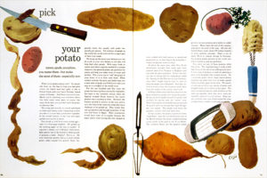
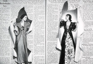
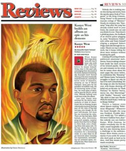
I feel that publication design is interesting because I it’s a way to express how an article or piece of writing has affected you. I believe it allows for personal ideas to be placed into a work while still allowing for the writing to be effective and powerful. I’ve also noticed that I’m more likely to read something if there’s an interesting design or object which goes along with the article. For instance, if an article in the newspaper is discussing the dangers of prescription drugs, a publication designer might add to the piece with images that show the negative effects of prescription drug use or a tipped over bottle with pills spilling out, and these imagines will help bring the reader even further into the writing. I like how it can enhance the impact of something and make it even more memorable overall.
Habits of a Publication Designer
Brand and Identity Design
Brand and identity design is really interesting to me because it’s a way of making something it’s own thing. During the graphics course I took in the past, I was instructed to think of a business, and then create a logo around it. This was really enjoyable for me because I took the idea of a business and what I wanted from it, and gave it it’s own identity. I’d chosen a coffee shop as my base idea, and ended up creating a logo that wasn’t the same as every other coffee shop logo out there. In order to make a unique logo, I had to consider all other logos out there and think about what hasn’t been done yet, which kept me working on the piece and improving it as much as I could. I feel that this type of design is important and memorable, because it can be seen everywhere. Starbucks Coffee is a successful brand, and it’s known for it’s logo that was created by a brand and identity designer who had to look at other coffee shops and find a way to make a unique and unforgettable image.
![]()
Leave a Reply Cancel reply
You must be logged in to post a comment.
-
-
Classroom
-
Recent Comments
- Matthew Rakowski on Framing/Grids Reading
- Laura Romaniello on Framing/Grids Reading
- Madeline Gaskill on Framing/Grids Reading
- Anna Heindl on Framing/Grids Reading
- Maria Pallozzi on Framing/Grids Reading
- Emily Perry on Framing/Grids Reading
- Rachel White on Framing/Grids Reading
Categories
-
About
KSC Graphic Design

Leave a Reply
You must be logged in to post a comment.