- Ê
- Â
fEmily Perry has 6 post(s)
ZOO: San Diego Zoo
ADDRESS: 2920 Zoo Drive in Balboa Park, San Diego, CA
HOURS: 9:00 am to 7:00 pm
DATE AND TIME: Saturday, April 22, 2017 2:00pm
SCHOLAR: Daniel Rubenstein
Why do Zebra’s have stripes?
Ever wonder why Zebras have stripes? Princeton University ecologist Daniel Rubinstein will be answering this question in an interactive presentation at the San Diego Zoo! Rubinstein has been studying zebras for over ten years. His presentation will also elaborate on the advantages and disadvantages of a zebra’s pattern in the wild. Don’t miss out on this informative and entertaining presentation!
Faking It: Manipulated Photography before Photoshop
I found the articles interesting because I never realized how much photo manipulation photographers could do without photoshop. I found that all of the photos in the article conveyed significant themes and were very entertaining to look at. It was astonishing to find out how much work altering a photo took during the 18th and 19th century. Although learning Photoshop may be difficult, using Photoshop allows us to alter photos much quicker than when it was done in a dark room.
Jerry Uelsmann
Watching and learning about Jerry Uelsmann was very inspiring and astonishing. The process of creating a photomontage in the dark room appears to be much more work than using Photoshop. The fact Uelsmann creates such beautiful montages without using Photoshop makes his images more powerful and interesting to look at. I like that Uelsmann wants people to have an emotional response to his work rattan have people wonder how he created it. When you show someone a photomontage today, most people would know it was done with Photoshop. The fact that Uelsmann does not use Photoshop makes his photos much more interesting and powerful. When looking at Uelsmann’s work I found myself having a powerful response to all of his montages. I hope one day I can generate a powerful emotional response through my work like Jerry Uelsmann.
Overall Response
I hope that soon I will be able to make powerful and interesting photomontages like the montages created in the 18th and 19th century. Although Photoshop is fairy easy to use, I would enjoy making montages in a dark room because it is more hands on. I am very inspired to make great photomontages using photoshop after reading the articles and watching the videos.
-

- Dream Theatre by Jerry Uelsmann
-

- Room with Eye by Maurice Tabard
-

- Dirigible Docked on Empire State Building by Unknown Artist
-

- My favorite photomontage by Jerry Uelsmann
Overjoyed, adj over·joyed
Extremely happy; feeling great joy
Slurp, verb
To drink or eat noisily often causing a disturbance
Music, verb
To express through the sound of music. Usually through vocal, instrumental, or mechanical sounds that have a rhythm, melody, or harmony
Improcerous, verb
low or short, not tall
Overall, I think the kern quiz was a fairly accurate representation of what kerning is really like using illustrator. However, I don’t think there is necessarily one solution when it comes to kerning like there was in the quiz. There are certainly ways to kern that look better than the default. The most challenging words for me to kern in the quiz were AWAIT, YVESS, and WAVE.
Helvetica
Before watching the film Helvetica, I never realized how often the typeface was actually used. The film showed logos and brand names that I never realized used Helvetica. I was especially surprised that I had never noticed that the MTA subway system in New York City used Helvetica. Having visited the city last month, I became very familiar with the subway system and found that it was surprisingly easy to use for someone like myself who did not know the city well. Massimo Vignelli’s decision to use such a simple, clean and familiar typeface like Helvetica may have contributed to how easy it made navigating the New York City subway system. This inspired me to incorporate more simple and timeless elements in my design in order to create an emotional and familiar connection to the viewer.
“I’m obviously a type o maniac, which is an incurable if not a mortal disease. I can’t explain it. I just love, I just like looking at type. I just get a total kick out of it: they are my friends. Other people look at bottles of wine or whatever, or, you know, girls’ bottoms. I get kicks out of looking at type. It’s a little worrying, I admit, but it’s a very nerdish thing to do.” – Erik Spiekermann
Erik Spiekermann
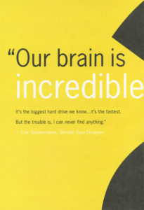
Quote and Poster by Erik Spiekermann
Poster Design by Erik Spiekermann
When I heard this quotation, I instantly related to it. Although it may be a nerdish thing to do I have always loved looking at different typefaces and their layout. Similar to Spiekermann, I have always been the person in the group to pick up a book cover or a product’s packaging to point out how interesting and clever the type or design was.
“Helvetica has almost like a perfect balance of push and pull in its letters. And that perfect balance sort of is saying to us – well it’s not sort of, it *is* saying to us don’t worry, any of the problems that you’re having, or the problems in the world, or problems getting through the subway, or finding a bathroom… all those problems aren’t going to spill over, they’ll be contained. And in fact, maybe they don’t exist.” – Leslie Savan
I remember hearing this quotation and agreeing with it very strongly after seeing all of the ways Helvetica is used in our daily lives. It is true that Helvetica often solves our problems through giving directions, helping us recognize brands, and guiding us through our tax forms. It is the ultimate typeface of problem-solving and Helvetica’s simple and clean design reassures us that everything will be okay.
Leslie Savan
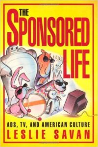
“The Sponsored Life” by Leslie Savan
“The Swiss pay more attention to the background so that the counters and the space between characters just hold the letters. I mean you can’t imagine anything moving; it is so firm. It, not a letter that bent to shape; it’s a letter that lives in a powerful matrix of surrounding space. It’s… oh, it’s brilliant when it’s done well.” – Mike Parker
I found this quote to be rather intriguing because I think people often overlook negative and surrounding space of a typeface. When passing by a sign that uses Helvetica, all anyone does is read and move on with their day. If someone were to really look at the space surrounding the typeface they would find that the space surrounding the text is just as important. Although this may be something only designers look at it, I think it is a good habit for everyone to get into.
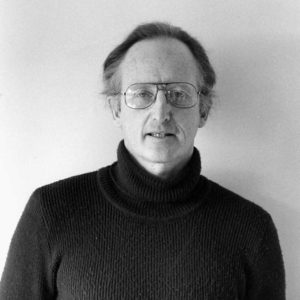
Mike Parker
Mike Parker “Godfather of Helvetica”

The Target logo is one of many logos that uses Mike Parker’s Helvetica.
Graphic Design is…
For as long as I can remember I have wanted to pursue a career involving design. Therefore, declaring my major in graphic design was no question. Since I was a child, I have always paid close attention to detail, my eyes would light up at magazine covers and frequently recognized different company logos. I have always been fascinated with the large role graphic design plays in our everyday life. Through street signs, product packaging, logos, and even just text we can observe the powers of graphic design. It gives me the greatest sense of joy to one day be apart of spreading and creating the power of graphic design as my career. I look forward to expanding my knowledge in order to create more creative and powerful pieces of design.
Although I have always known I wanted a career in graphic design, I haven’t always been sure as to which area of graphic design I would enjoy most. After reading “What is Graphic Design” I was able to narrow down which areas I would enjoy most. The areas I am the most interested in and would like to focus on in my career are Publication Design and Brand and Identity Design.
PUBLICATION DESIGN
As someone who enjoys looking through magazines and newsletters in order to observe design techniques, I have often imagined myself being a publication designer. Although I think it may be challenging to represent different elements such as fashion or business in publications, I enjoy the challenge of looking further beyond the most obvious solution. Publication design allows a wide variety of solutions and strategies, forcing the designer to work out of their comfort zone. As a publication designer you never really are designing the same thing. Every publication or issue is quite different, therefore, allowing more creativity from the designer. If I were able to get a job as a graphic designer at this very moment, I would love for it to involve publication design.
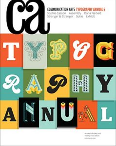
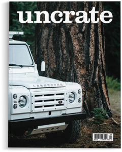
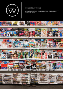
Comma Arts Magazine | Uncrate Magazine | Works that Work Issues
BRAND AND IDENTITY DESIGN
Another form of graphic design I find intriguing and would love to be apart of is brand and identity design. I love the idea of being apart of a brand or business’s process of creating a recognizable and emotional response from customers. With each brand’s identity being different from another, a new idea and solution for a design is always possible and ready to be created. I would enjoy designing for a brand or business because not only would my design be a part of their identity, but because I will have gotten to experience creating that identity with the client. However, I imagine brand and identity design to be quite challenging considering a new and very unique design is needed for every client.
examples of brand identity design:
Design Envy | Comma Arts | Logo Design Love
Leave a Reply Cancel reply
You must be logged in to post a comment.
-
-
Classroom
-
Recent Comments
- Matthew Rakowski on Framing/Grids Reading
- Laura Romaniello on Framing/Grids Reading
- Madeline Gaskill on Framing/Grids Reading
- Anna Heindl on Framing/Grids Reading
- Maria Pallozzi on Framing/Grids Reading
- Emily Perry on Framing/Grids Reading
- Rachel White on Framing/Grids Reading
Categories
-
About
KSC Graphic Design

Leave a Reply
You must be logged in to post a comment.