- Ê
- Â
å Wednesday, January 25th, 2017
Helvetica
I thought the movie was very informing, before I was not very aware of the history of typefaces or how it had been influenced/created. This movie moved throughout history by interviewing graphic designer and art directors from the time and their experience and lastly how this functioning art evolved.
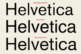
Wim Crouwel had this to say about Helvetica “The meaning is in the content of the text and not in the typeface, and that is why we loved Helvetica very much.” This is a modern, clean, clear, legible typestyle. Making it the perfect neutral typeface to use within the commercial business. This typeface was created on a grid by Max Miedinger with Eduard Hoffmann in 1957 in Switzerland.
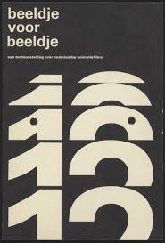
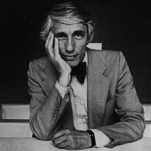
image by Wim Crouwel Wim Crouwel
By this typeface becoming so popular and becoming the norm for the typeface in the word it had influenced graphic artist and art directors to start looking at words in a different way to provide and alternative looking typefaces. This begins a movement of artist like David Carson experimenting with design. David Carson was quoted in this movie. “Don’t confuse legality with communication just because something is legible doesn’t mean it communicates and, more important doesn’t mean it communicates the right thing” which I think perfectly describes his work. His work has a message more important then the message trying to convey within the words, he adds the emotion to the words by altering these things placement, spaces, portion, and weight.

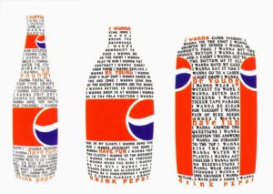
David Carson image by: David Carson
This movie also goes in-depth about Erik Spiekermann who created typefaces that used words to communicate a message in a less “grunge”/abstract style. In fact it looked more personal as he describes in this quote “A real typeface needs rhythm, needs contrast, it comes from handwriting, and that’s why I can read you’re handwriting, you can read mine” His work look like hand writing with little creative thing to give it definition of style.

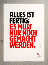
Erik Spiekermann images by: Erik Spiekermann
Graphic Design is…
For as long as I can remember I have wanted to pursue a career involving design. Therefore, declaring my major in graphic design was no question. Since I was a child, I have always paid close attention to detail, my eyes would light up at magazine covers and frequently recognized different company logos. I have always been fascinated with the large role graphic design plays in our everyday life. Through street signs, product packaging, logos, and even just text we can observe the powers of graphic design. It gives me the greatest sense of joy to one day be apart of spreading and creating the power of graphic design as my career. I look forward to expanding my knowledge in order to create more creative and powerful pieces of design.
Although I have always known I wanted a career in graphic design, I haven’t always been sure as to which area of graphic design I would enjoy most. After reading “What is Graphic Design” I was able to narrow down which areas I would enjoy most. The areas I am the most interested in and would like to focus on in my career are Publication Design and Brand and Identity Design.
PUBLICATION DESIGN
As someone who enjoys looking through magazines and newsletters in order to observe design techniques, I have often imagined myself being a publication designer. Although I think it may be challenging to represent different elements such as fashion or business in publications, I enjoy the challenge of looking further beyond the most obvious solution. Publication design allows a wide variety of solutions and strategies, forcing the designer to work out of their comfort zone. As a publication designer you never really are designing the same thing. Every publication or issue is quite different, therefore, allowing more creativity from the designer. If I were able to get a job as a graphic designer at this very moment, I would love for it to involve publication design.
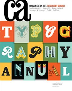

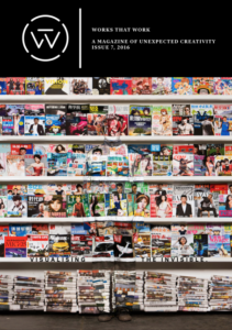
Comma Arts Magazine | Uncrate Magazine | Works that Work Issues
BRAND AND IDENTITY DESIGN
Another form of graphic design I find intriguing and would love to be apart of is brand and identity design. I love the idea of being apart of a brand or business’s process of creating a recognizable and emotional response from customers. With each brand’s identity being different from another, a new idea and solution for a design is always possible and ready to be created. I would enjoy designing for a brand or business because not only would my design be a part of their identity, but because I will have gotten to experience creating that identity with the client. However, I imagine brand and identity design to be quite challenging considering a new and very unique design is needed for every client.
examples of brand identity design:


Design Envy | Comma Arts | Logo Design Love
Leave a Reply Cancel reply
You must be logged in to post a comment.
Graphic Design
I’d never really had an interest in graphic design until I took a class in high school, and found that it was a form of art that I really enjoyed and felt successful in. I hope to be able to continue using the skills I learn from graphic design and all that goes into it in my everyday life while in college and after graduation.
Once I’d read further into the forms of graphic design that exist, I found that I really enjoy publication design and brand and identity design, because they show two completely separate worlds of design while still tying together the importance of showcasing one specific thing. I also feel that these two areas are very important to lifestyles in which we live today.
Publication Design
I feel that publication design is interesting because I it’s a way to express how an article or piece of writing has affected you. I believe it allows for personal ideas to be placed into a work while still allowing for the writing to be effective and powerful. I’ve also noticed that I’m more likely to read something if there’s an interesting design or object which goes along with the article. For instance, if an article in the newspaper is discussing the dangers of prescription drugs, a publication designer might add to the piece with images that show the negative effects of prescription drug use or a tipped over bottle with pills spilling out, and these imagines will help bring the reader even further into the writing. I like how it can enhance the impact of something and make it even more memorable overall.
Habits of a Publication Designer
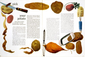
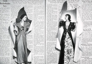

Brand and Identity Design
Brand and identity design is really interesting to me because it’s a way of making something it’s own thing. During the graphics course I took in the past, I was instructed to think of a business, and then create a logo around it. This was really enjoyable for me because I took the idea of a business and what I wanted from it, and gave it it’s own identity. I’d chosen a coffee shop as my base idea, and ended up creating a logo that wasn’t the same as every other coffee shop logo out there. In order to make a unique logo, I had to consider all other logos out there and think about what hasn’t been done yet, which kept me working on the piece and improving it as much as I could. I feel that this type of design is important and memorable, because it can be seen everywhere. Starbucks Coffee is a successful brand, and it’s known for it’s logo that was created by a brand and identity designer who had to look at other coffee shops and find a way to make a unique and unforgettable image.


Leave a Reply Cancel reply
You must be logged in to post a comment.
-
Classroom
Recent Comments
- Matthew Rakowski on Framing/Grids Reading
- Laura Romaniello on Framing/Grids Reading
- Madeline Gaskill on Framing/Grids Reading
- Anna Heindl on Framing/Grids Reading
- Maria Pallozzi on Framing/Grids Reading
- Emily Perry on Framing/Grids Reading
- Rachel White on Framing/Grids Reading
Categories
-
About
KSC Graphic Design

Leave a Reply
You must be logged in to post a comment.