- Ê
- Â
å Thursday, January 26th, 2017
What is Graphic Design…
My interest in graphic design started in high school. I worked with adobe illustrator and loved drawing on there. I am a studio art major, and I can’t see myself leaving it, but I am looking forward to learning graphic design. Although I find graphic design intimidating, I wanted to try and see if being a designer could be a path I’d want to follow. Even if I decide that graphic design isn’t for me, It would be something I’d like to learn so I can do it in my spare time as a break from the studio. I also feel that graphic design is a good tool to have for any career in the future. Let’s say I become successful with studio art after graduation, I’m going to need graphic design skills to make a cohesive webpage, pamphlets, business cards…etc. It’s a good thing to know, and is relevant in everyday life.
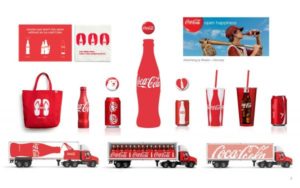
BRAND AND IDENTITY DESIGN
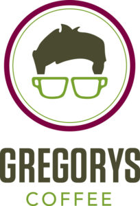
Target, Lacoste, Walmart, Hollister…etc. What do these and many more share, memorable brand logos. Target’s target, Lacoste’s alligator, Walmart’ss flower/firework looking logo, Hollister’s seagull. Little logos that mean big things to everyone, and are easily recognizable. Simple designs are something that I would be interested in trying. What stands out even more to me is brands representing the companies, and the complimenting logo. When I think of “Gregory’s Coffee” I think of walking by Bryant Park and seeing the emblem of the top half of a man’s face. I would love to be the designer who creates that logo that you just can’t forget. Like I said before, I like being told what to do. For this case it would be I would like to know what they want, whether itd be an object and I can make multiple renditions of it. Or maybe they want a specific emotion or feeling to be portrayed through something I feel is fitting. It’s interesting how much a logo and brand could make much more money just based on curb appeal through design.
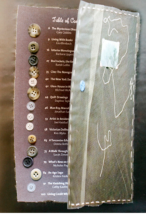
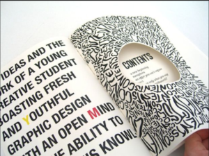
PUBLICATION DESIGN
Publication design interests me because it’s everywhere. Newspapers, magazines, periodicals…etc they are in every household or business. Everyone has seen one or all of these things, and read articles of news, travel, fashion, business…etc. It’s something we have all seen, and I could spend hours looking, then re-looking through magazines noticing different details in the designs, layouts, type, pictures, drawings…etc. An interest I have in publication design would be to see what I can do differently, to see how well I can promote the context through visual aids or different formatting. Or to see if there’s opportunity for making a spread purely for the art and graphic designing rather than including text. I think my personality would be good for this line of work because I’m great at being told what people want from me, rather than free expression. I’d like to be the person an author or journalist comes to for my layout and design to compliment their text. I wouldn’t oppose changing my style for their perspective and goals in their layout. It would be amazing to be any part of publication, seeing as it’s everywhere and anyone and everyone has an opportunity to see the work that is done.
Why Graphic Design?
I first sparked an interest in graphic design when I took a graphics design class in high school, where I learned how to use computers to create logos, designs, magazine flyers, and business cards. In the following graphics class, I had learned about the more physical side of graphic design, like how to create advertisements and signs for businesses, how to create vinyl stickers, how to use a typesetter, how to create shirts in many different ways such as screen printing and heat transfer paper. I don’t really know yet if I want to become a designer, or just do it in my free time as a hobby.
What Draws You to the Brand and Logo side of Graphic Design?
Possibly my favorite part of graphics is being able to design logos for companies, and creating a corresponding overall image of the company itself. I’d love to be able to create a logo that reflects the company in an appealing, yet fitting way. For example, a famous designer by the name of Milton Glaser created the “I Love NY” logo. This wasn’t for a company, but for the state and city of New York itself. The logo is simple, easy to read, and attractive, it was designed to help attract tourists back to the city at a time that the city wasn’t looked at in a good light. And the logo was successful, 40 years later and the logo itself generates $30 million in merchandise a year, and helped bring back tourists to New York City. Being able to accomplish something like this is insane, although possible and actually occurs all the time with all sorts of different companies and the effect their logo can create on others.
![]()
Links: Logo and Identity Design | Milton Glaser | What Make’s a Great Logo
What Draws You to the Advertising side of Graphic Design?
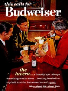
I personally feel that advertising design goes hand in hand with brand and identity design and are quite similar. While brand and identity tends to focus more on the logo itself and how it reflects the company or organization as a whole. Advertising design focuses on the ads themselves. Take the company Budweiser, their logo itself hasn’t changed much at all over the past century, but their advertisements themselves are constantly changing to remain appealing and modern, while still sticking with the same overall theme. Their ads are manly or appealing to men and thats because they’re targeting the audience that has proven to be the most profitable for them, but they still change it enough to stay in style. This is what I find thrilling, being able to create an advertisement that sends messages through visuals that evokes certain feelings and emotions in people.
Links: TV Advertising | Advertising Design | Advertising Industry
Leave a Reply Cancel reply
You must be logged in to post a comment.
I didn’t know much about graphic design and I never thought I would like it. I only took graphic design at my high school so I could get enough art credits. After taking graphic design 1 and 2 in school I really enjoyed it. My first graphic design class I didn’t know what to except or what we would even do. In the beginning I felt that it was very confusing and that maybe I should switch out. I had no clue what to do on the computer or what object did what. I ended up staying in the class and after a couple weeks I got the hang of it. I decide to take the second graphic design class my senior year and I already knew what I was doing and liked it a lot. I never thought I would ever do graphic design in college or maybe as a major but now I might be thinking about it.
I had no clue what types of graphic design I would like. After reading the passage I learned a lot more about the different types of graphic design that I didn’t know existed. The two graphic designs that caught my eye and I seemed to like the most were Type Design and Publication Design.
Type Design
I found type design to be very interesting. I learned about the different fonts that you can use and how each font means something different just by the way it looks. Its amazing how someone takes time to come up with a new font that can then be changed into either bold or italic. Having one word and changing one thing about it I think it makes it mean something else. The way the different fonts look I think it gives off a different meaning. Making something for a brand or any type of label I feel would be a good fit for me because you have to be patient and organized which I think I am.
To learn more about typography click here Typography What is Typography


Publication Design
I found publication design to be very interesting. I thought about how fun it would be to make a magazine cove, newspaper or something for a business. I like reading magazines and looking at the front covers because thats the first thing mostly everyone sees. You can see how the creator uses the different colors, layouts, pictures and how they set it up. I didn’t know much about publication design but now I know how important it actually is because everyone sees it. In high school I had to make a magazine cover in one of my graphic design class and I really enjoyed doing that project. Its interesting seeing all the pictures on the front cover and seeing how they made the magazine cover by putting labels, pictures and fonts together. I feel this would be a good fit for me because I could see myself doing this and taking different pictures and putting them together to make the perfect front cover.
To learn more about publication design click here Publication Design What does a publication designer do
Leave a Reply Cancel reply
You must be logged in to post a comment.
Why Graphic Design?
Throughout my four years of high school, I lived in the “Graphic Communications Lab.” This was a class that I took randomly as a ninth grader, and soon fell in love with. It became more than a class to me, it became my home. Through this class and the ones to follow, I gained great knowledge in how to use InDesign, Illustrator, and I dabbled in Photoshop. I also became comfortable using the technology of a color printer, a large format printer, a screen printer, a printing press, a laminator, a folding and scoring machine, a cutting machine, and many others. I was incredibly lucky to have gone to a high school that gave me the opportunity to find my passion. The shop was able to continuously buy up to date equipment by having the students participate in live jobs for parents, employers, and the city itself. Working with clients and being responsible for creating work that I could later see being utilized throughout the town taught me important skills such as time management, professionalism, work ethic, and confidence, as well as increasing my experience on the graphic design programs. Throughout my high school career, I fell in love with creating logos. By reading “What is Graphic Design?” I learned that I am most interested in Brand and Identity Design and Book Jacket Design.
Brand and Identity Design
Throughout high school, I had the opportunity to create logos for local companies. Whether they were being put on business cards or printed on clothing, knowing that my creation was the focal point for many printed advertisements of said companies was inspiring in itself. I love how logos can have an incredibly simplistic design and still be unique and eye catching. They are functional and designed to embody something about the company they are for. This symbolic expression of design allows for a lot of creativity. The piece of artwork literally becomes the brand’s identity which means that along with stating something about the company, effective logos use emotion to express the company’s goal. It is this challenge of creating something never done before that is both simplistic and memorable that I love about creating logos.


Book Jacket Design
I personally have never listened to the phrase, “don’t judge a book by its cover.” I used to be an avid reader and I largely picked the books I wanted to read purely based on whether or not they were attractive and compelling to look at. I always felt that the visual design on the front gave more insight on what the book would be about, then the summary on the back. Standing in a book store with all the time in the world, I take a step back and scan the side edges of all the book covers. If one pops out to me, I will remove it from the shelf and examine the front of it. I love how much power the design of a book jacket has on potential readers. Although many people deny it, I feel as though all books can be judged by the design on the front for it is usually the sole image in the entire book and thus it starts reader’s imaginations. I think this process of creating a book jacket is fascinating because there are limitless possibilities to what impact it could have on the reader.


Leave a Reply Cancel reply
You must be logged in to post a comment.
Graphic Design and Me
I have never really had any experience in graphic design prior to college, I had always taken film classes in high school because that is what my main interest was. I’ve always been pretty good at art so I never took any art classes in high school either, now that I am in college as an art major I really enjoy the amount of art courses I am taking. I am looking to do the dual option BFA in art and design so I can do half graphic design and half studio art. In doing graphic design, I have a pretty good idea of what my favorite types of design are. With my love for film making, I would say that motion design is definitely one of my favorite types of graphic design. I am also very interested in advertising design.
Motion Design
I originally came to Keene with the idea that I was going to be a film major because I have always wanted to work in a studio whether it be for film making or television production, I just really enjoyed the whole editing together sequences of shots and adding transitions and video elements. I loved watching a piece of motion come together and the whole process that goes into it. Designing and putting together title scenes, animations, trailers, music videos, adding music, etc. brings me joy and I could sit there and put together a video all day without complaining. I have a good amount of experience with putting together motion designs and short films/videos through the classes I have taken in high school and the robotics club I was a part of (I was the head of the marketing team). I understand that it is very important to convey a message correctly and get the right audience to acknowledge it and grab their attention. This is done through color schemes, the way things flow together, the image conveyed in the motion, the sound that is added, the typography, and many more aspects that trigger our psyche and create a specific emotion that designers want to create for the audience. In this article, the typography of stranger things, it talks about how a few aspects of a motion can create such a powerful feel in such a short span of time. The reason why I love motion design and film making so much is because I really enjoy the challenge to create something that is visually pleasing and brings out a reaction from the audience.

Advertising Design
Advertising design is interesting to me because it goes hand in hand with motion design. I am able to advertise for the videos I make and with the same visual concepts. It’s all about the visual appearance and it’s effect on the psyche to draw a viewers attention. I have experience in advertising design through the robotics club I was a part of in high school. I would put together images and information onto pamphlets, brochures, posters, banners, etc. to market for our team and get people interested in the program. It is important for advertisements to have the ability to stick with you, whether it’s a catchy tune or catch phrase. Something that allows the audience to remember the company pr product that the advertisement was providing information for. I love to get creative and think outside the box to get someone intrigued by whatever is designed. In order to create a well designed advertisement, one must have the ability to understand and use psychology, marketing, and creativity for the best results.

Leave a Reply Cancel reply
You must be logged in to post a comment.
Watching the film Helvetica left me feeling more involved in the world. We all see the font helvetica day to day whether it’d be in advertising, maps, or simply on a paper for an assignment. I loved seeing flashes of just how often helvetica is used. Maybe I don’t appreciate so much that we use that font so often, but it was interesting to see how much of it we all don’t acknowledge it surrounding us. It was very funny for me to see that helvetica is what is used for subway directions. I spend my breaks and summers mainly in Manhattan, Queens, and Brooklyn with my friends. It’s something I’ve never noticed. But what I’ve noticed over time was whenever I read a those subway signs I feel okay. Hearing some of the designers talk about emotion through purely font was something that made sense to me. Nothing is better than taking the path from hoboken and seeing “Journal Square to 33rd St.” in that simple sleek familiar font. The gap between the letters in fonts is something that I have always payed attention to, whether intentional or not. Massimo Vingnelli said, “It’s the space between black that makes it”. Mike Parker echoed that talking about the “interrelationship of negative space” and how “the space between hold the letters”. All of these stood out to me and brought me back to the times I would go through fonts and look at the spacing between and see what I liked and what bothered me.
Helvetica font is comforting to me in the fact that its uniform and consistent. But Erik Spiekermann said, “Rythm, contrast it comes from handwriting…helvetica has none of that”. I loved this because I am intrigued by everyone’s, individual, handwriting or font choices. Or how Paula Scher said that “font could be your own medium”, that was something I hadn’t thought about. I always thought that font was the afterthought to the context. I was cool to hear designers perspectives of fonts. But when I thought about using font as a medium, instead of particularly the content, It seemed like something that I feel you never really know when it is finished. But seeing Stefan Stagmeister’s work, this made more sense. Stagmeister said “when I get bored of working on a typeface, I leave them alone”. That to me made me think of working with fontfaces as like working with pastel, paint, pencil or charcoal. That you can leave things when you feel done, even if others don’t consider it done. Going back to Scher’s point, that the font is the medium. This makes me feel more comfortable with graphic design and working with fontfaces. David Carson said “don’t confuse legibility with understanding”. That secured me in the feeling that working with types doesn’t need to be so “helvetica” all the time. It doesn’t need to be the default that you use, you can choose your own font to use, or multiple fonts. Watching Helvetica broke down the wall for me to look at Graphic Design and not be so scared, but relate to it and feel more comfortable with experimenting.


Helvetica
Before watching the film Helvetica, I never realized how often the typeface was actually used. The film showed logos and brand names that I never realized used Helvetica. I was especially surprised that I had never noticed that the MTA subway system in New York City used Helvetica. Having visited the city last month, I became very familiar with the subway system and found that it was surprisingly easy to use for someone like myself who did not know the city well. Massimo Vignelli’s decision to use such a simple, clean and familiar typeface like Helvetica may have contributed to how easy it made navigating the New York City subway system. This inspired me to incorporate more simple and timeless elements in my design in order to create an emotional and familiar connection to the viewer.
“I’m obviously a type o maniac, which is an incurable if not a mortal disease. I can’t explain it. I just love, I just like looking at type. I just get a total kick out of it: they are my friends. Other people look at bottles of wine or whatever, or, you know, girls’ bottoms. I get kicks out of looking at type. It’s a little worrying, I admit, but it’s a very nerdish thing to do.” – Erik Spiekermann
Erik Spiekermann
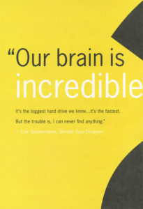
Quote and Poster by Erik Spiekermann
Poster Design by Erik Spiekermann
When I heard this quotation, I instantly related to it. Although it may be a nerdish thing to do I have always loved looking at different typefaces and their layout. Similar to Spiekermann, I have always been the person in the group to pick up a book cover or a product’s packaging to point out how interesting and clever the type or design was.
“Helvetica has almost like a perfect balance of push and pull in its letters. And that perfect balance sort of is saying to us – well it’s not sort of, it *is* saying to us don’t worry, any of the problems that you’re having, or the problems in the world, or problems getting through the subway, or finding a bathroom… all those problems aren’t going to spill over, they’ll be contained. And in fact, maybe they don’t exist.” – Leslie Savan
I remember hearing this quotation and agreeing with it very strongly after seeing all of the ways Helvetica is used in our daily lives. It is true that Helvetica often solves our problems through giving directions, helping us recognize brands, and guiding us through our tax forms. It is the ultimate typeface of problem-solving and Helvetica’s simple and clean design reassures us that everything will be okay.

Leslie Savan
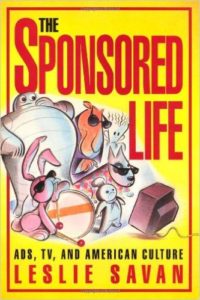
“The Sponsored Life” by Leslie Savan
“The Swiss pay more attention to the background so that the counters and the space between characters just hold the letters. I mean you can’t imagine anything moving; it is so firm. It, not a letter that bent to shape; it’s a letter that lives in a powerful matrix of surrounding space. It’s… oh, it’s brilliant when it’s done well.” – Mike Parker
I found this quote to be rather intriguing because I think people often overlook negative and surrounding space of a typeface. When passing by a sign that uses Helvetica, all anyone does is read and move on with their day. If someone were to really look at the space surrounding the typeface they would find that the space surrounding the text is just as important. Although this may be something only designers look at it, I think it is a good habit for everyone to get into.
Mike Parker
Mike Parker “Godfather of Helvetica”

The Target logo is one of many logos that uses Mike Parker’s Helvetica.
-
Classroom
-
Recent Comments
- Matthew Rakowski on Framing/Grids Reading
- Laura Romaniello on Framing/Grids Reading
- Madeline Gaskill on Framing/Grids Reading
- Anna Heindl on Framing/Grids Reading
- Maria Pallozzi on Framing/Grids Reading
- Emily Perry on Framing/Grids Reading
- Rachel White on Framing/Grids Reading
Categories
-
About
KSC Graphic Design

Leave a Reply
You must be logged in to post a comment.