- Ê
- Â
å Saturday, January 28th, 2017
My Perspective
I found the movie Helvetica incredibly interesting. Before watching the movie, I had paid very little attention to what typefaces are used in the world around me, but the movie opened my eyes to the use of the font, Helvetica, around the world. For example, as a person walks down Broadway they are surrounded by a multitude of jumping and excited neon signs exemplifying hundreds of of colors. These words and motion displays all channel into the atmosphere that is customary of Times Square. It’s busy and hectic, but the signs are a substantial part of the New York experience. I learned from the movie that the signs, however, are not all as unique as they look, for many of them have at least one thing in common- the font. Helvetica is the most common form of font used for advertisements, signs, logos, and hundreds and hundreds of universal items in the U.S. and all over the world. As I watched the movie, I begun to recognize Helvetica’s style and it was extremely interesting to me that I was able to connect it to so much of the type all around me every day. Although controversial to some, Helvetica is essential to the graphic community and makes up a significant amount of visuals produced by professionals. The font is crisp, and helps the reader capture the message that is put forth to them. Bolded or italicized, Helvetica is sure to get the message across. I love how this font can be used universally but still make each design look original.
Quotes
Lars Müller: “And I think I’m right calling Helvetica the perfume of the city. It is just something we don’t notice usually but we would miss very much if it wouldn’t be there.”
I like this quote because it embodies the biggest take away I had from the movie. It expresses how the general public doesn’t notice the abundance of Helvetica used in a city like New York, but how essential it is to the atmosphere. The comparison to it being like perfume is an excellent way to put it because it subtly floats through the air while capturing people’s attention.
-

- OLYMPUS DIGITAL CAMERA

Michael Bierut: “It’s The Real Thing. Period. Coke. Period. Any Questions? Of Course Not.”
In this quote, Bierut is comparing a dated advertisement for Coke to a more recent one in a magazine. While the first advertisement has a lot to look at on the page with many different colors and fonts used, the more recent advertisement is clear, precise, and undeniably for the product. The second advertisement uses Helvetica and only needs a few words to get the point across. I like how Bierut uses this example to show how Helvetica revolutionized the advertisement industry.


Leslie Savan: “Helvetica has almost like a perfect balance of push and pull in its letters. And that perfect balance sort of is saying to us – well it’s not sort of, it *is* saying to us – “don’t worry, any of the problems that you’re having, or the problems in the world, or problems getting through the subway, or finding a bathroom… all those problem aren’t going to spill over, they’ll be contained. And in fact, maybe they don’t exist.””
This quote made me question if just a font on a piece of paper could really be so powerful as to reassure its audience that all of their real world problems no longer exist. Although I doubt the legitimacy of this claim, I love the message behind it. However exaggerated, this artist believes so strongly in the effect that Helvetica has on its audience. I like how inspired this designer feels by the font, and it made me look at it in a new way.

In watching the film Helvetica, my eyes were opened to the world around me and made me aware of how reliant we are on typeface. I had never really noticed how important typeface is to our society and how it affects our daily lives until now. Anywhere you look, Helvetica is used 99% of the time. On street signs, business signs, maps, directories, buildings, logos, food products, and anything that requires the use of text information for the American society. Ever since watching this film, everywhere I go I am scanning the streets looking for Helvetica and taking note of how often it is used. Just sitting in my room writing this I am looking around and noticing how often Hevletica shows up.
Like Lars Muller said, Helvetica is “the perfume of the city, we don’t notice it but would miss it if it wasn’t there.” I find this statement to be very true because if we take away everything that is written in Helvetica and replaced it with something like Times New Roman, the atmosphere would be completely changed. I agree with Leslie Savan’s statement (below) about Helvetica treating all problems from our daily lives as if they don’t exist. “Helvetica has almost like a perfect balance of push and pull in its letters. And that perfect balance sort of is saying to us – well it’s not sort of, it is saying to us don’t worry, any of the problems that you’re having, or the problems in the world, or problems getting through the subway, or finding a bathroom… all those problems aren’t going to spill over, they’ll be contained. And in fact, maybe they don’t exist.” Helvetica is like the cure-all for typeface, it is the go-to. It very versatile and has the ability to make everything simple. It doesn’t project any certain mood or feel to the audience, it is up to the content to do that. Wim Crouwel makes a good point when he says “the meaning is in the content of the text and not in the typeface, and that is why we loved Helvetica very much.”
Lars Muller


-
- OLYMPUS DIGITAL CAMERA
Leslie Savan

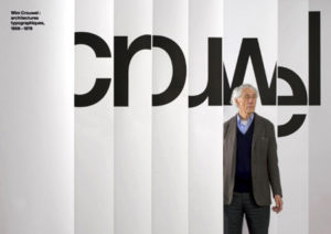
Wim Couwel
-
Classroom
-
Recent Comments
- Matthew Rakowski on Framing/Grids Reading
- Laura Romaniello on Framing/Grids Reading
- Madeline Gaskill on Framing/Grids Reading
- Anna Heindl on Framing/Grids Reading
- Maria Pallozzi on Framing/Grids Reading
- Emily Perry on Framing/Grids Reading
- Rachel White on Framing/Grids Reading
Categories
-
About
KSC Graphic Design

Leave a Reply
You must be logged in to post a comment.