- Â
å January 2017


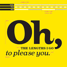
í Helvetica Post
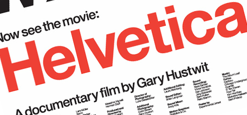
Watch the film Helvetica again.
iTunes Rental — HD $2.99
Write a post about it.
1
Write a cogent personal response to the film where you describing your perspective on it. What was your reaction? What parts were the most interesting? Don’t regurgitate and summarize (I already know what the film is about :), choose moments and respond with your own thoughts.
2
List 3 quotes from the film by 3 different speakers. Be sure to include who said it. The quote should be 10-15 words (more or less).
Remember, you can find quotes online but some of the best ones are not there. Get your own from the film. Write a sentence or two about each quote as to why you like it. Saying “I like it” is not enough. Be thoughtful. What does the quote do to enlarge your thinking, incite curiosity or entertain. Do you disagree?
3
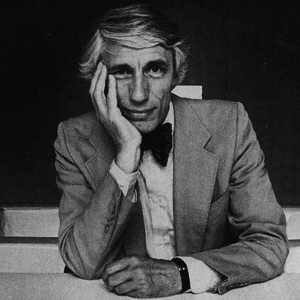
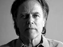
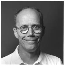
Create a gallery of images of each of the speakers. Try to go beyond the first Google links. Check out their websites. Put them together in a gallery.
4
Place this post in the Category: Helvetica Post
Explore
Read/explore the links below as well as other reflections on the typeface and the film that you find.
https://www.youtube.com/watch?v=hD08IoXF6sM
Listen to this podcast about Gary Hustwit:
http://designobserver.com/feature/gary-hustwit/9617
Font Fight! Video
A bit of nerd type humor here. To get the full effect you should look up the typefaces…
If you think this is funny you should consider the graphic design major.
https://youtube.com/watch?v=m6djQHeqMwQ
Arial vs. Helvetica: A comparison
Michael Beirut writes about the film Helvetica in this article.
Due 9pm Sunday, January 29
(so I can read them)
One clearly designed post with headers and hierarchy that includes the below three components
- Response
- Salient Quotes
- Speaker Image Gallery
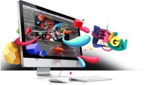
í What is Graphic Design?
Read!
Download a Guide to Graphic Design Chapter 1

Talk about why you are interested in graphic design. Do you want to be a designer or just use these skills for another passion? Write about two areas of graphic design discussed in the readings that interest you. What is it about that area that excites you?
Explore These Online Sources
Use this website as a launching point. Sure you can use other sites but this one has been curated by a designer. A fine set of curated links beats Google any day.
Write a blog post about two different types of graphic design that are interesting to you.
Talk about what interest you in those two areas of design. What is it about your personality and abilities that would be a good fit for corporate identity work, motion graphics, web design or other areas.
No book reports please! I don’t want you to regurgitate the reading all over me (eew). Your perspective and opinions. A true ‘response’ from your brain to mine. Be specific about specific works. What details do you find fascinating and more importantly why.
I really don’t care if you ‘like’ something unless you can tell me why.
This post must contain:
One
2-3 links for each type of graphic design. You should link to personal web sites, image collections, or even videos. Make sure the links function and go to other sites.
Two
3 photos for each of the two types of design you are interested in. They should be from different designers.
Three
Write 2-3 concise paragraphs. Correct spelling and grammar please.
Four
A well-designed blog post with paragraphs, headers and selective bolding.
Due at beginning of class on Thursday, January 26
-
Classroom
-

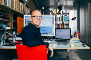
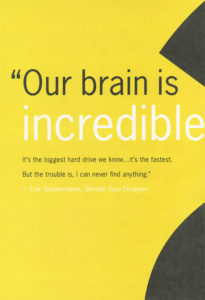
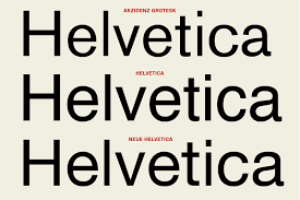
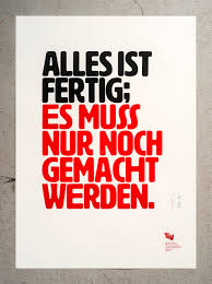
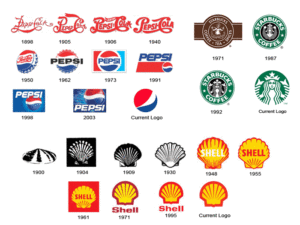
I thought the movie was very informing, before I was not very aware of the history of typefaces or how it had been influenced/created. This movie moved throughout history by interviewing graphic designer and art directors from the time and talk their experience and lastly how this functioning art evolved. Wim Crouwel had this to say about Helvetica “The meaning is in the content of the text and not in the typeface, and that is why we loved Helvetica very much.” This is a modern, clean, clear, legible typestyle. Making it the perfect neutral typeface to use within the commercial business. This typeface was created on a grid by Max Miedinger with Eduard Hoffmann in 1957 in Switzerland. By this typeface becoming so popular and becoming the norm for the typeface in the word it had influenced graphic artist and art directors to start looking at words in a different way to provide and alternative looking typefaces. This begins a movement of artist like David Carson experimenting with design. David Carson was quoted in this movie. “Don’t confuse legality with communication just because something is legible doesn’t mean it communicates and, more important doesn’t mean it communicates the right thing” which I think perfectly describes his work. His work has a message more important then the message trying to convey within the words, he adds the emotion to the words by altering the placement, spaces, portion, and weight of the words. This movie also goes in-depth about Erik Spiekermann who created typefaces that used words to communicate a message in a less “grunge”/abstract style. In fact it looked more personal as he describes in this quote “A real typeface needs rhythm, needs contrast, it comes from handwriting, and that’s why I can read you’re handwriting, you can read mine” His work look like hand writing with little creative thing to give it definition of style.
-Christopher Mitchell