


1
Search the web for a living creature from the natural world whose body is completely within the frame of the photograph. This includes non-human creatures such as mammals, fish, birds, plants, anything…perhaps with the exception of bacteria which are a bit small.
2
The image must be at least 1000 pixels in height, width or both.
3
This image must be completely discernible from the background (or have a white background). Do not choose celebrities or other syndicated consumer imagery. The image should be raw.
4
Open the image in Photoshop and adjust the contrast of the image until you have a strong mix of lights, darks and mid-tones. Don’t blast out the detail. Preserve as much detail as possible. Save the image as “[animal name]_original” in your project folder.


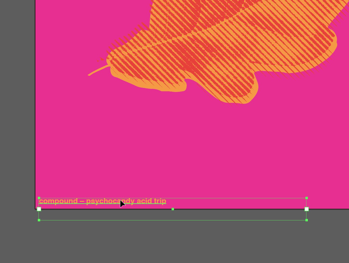
Color in Design
Although I have always known subconsciously that color choice was important when it came to design, I did not realize how much of a science choosing and mixing colors is. Using different color groups in design allows the viewer to have an emotional reaction which ultimately controls how they view the piece. For example, the textbook reading describes neutral earth tones as quiet with strong control contrast and monochromatic blues as expressing a “no-nonsense attitude.” These readings caused me to become more interested in the psychology of color and why color makes us feel and react a certain way. I believe learning more about the psychology of color will allow my designs to become stronger.
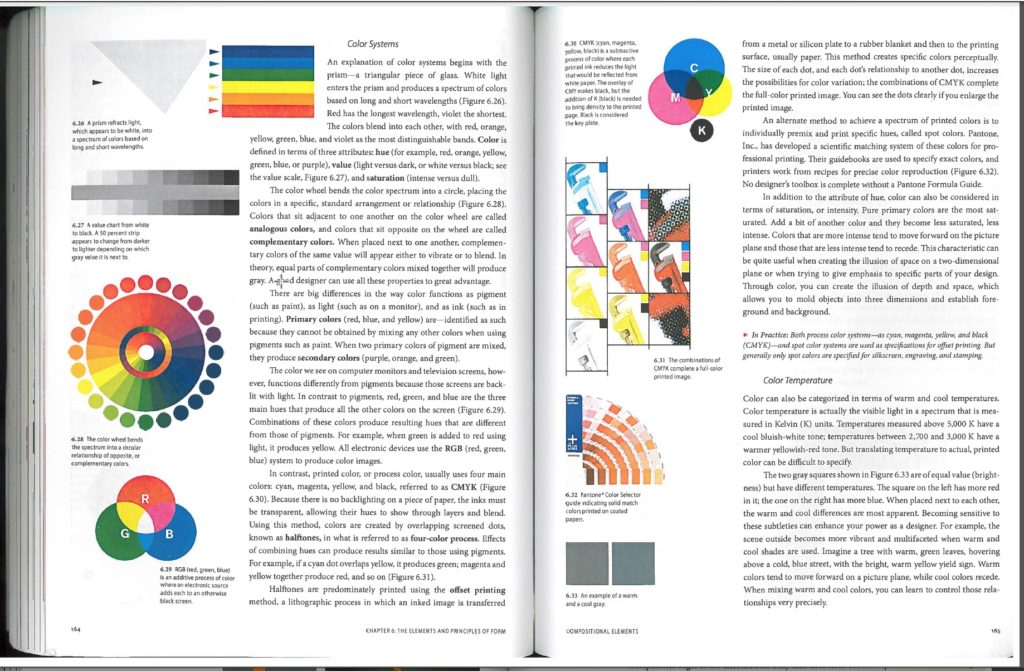
Although I have read and learned about Primary, Complimentary, and Secondary colors in other classes and on my own, I was unaware about analogous colors and tertiary colors. I was also surprised to learn that colors we see on screen are created by the additive color method while colors in print are created by the subtractive color method. Although I have seen the detail of RGB on a zoomed in computer screen, I had never realized zooming in to a print using CYMK would look similar in terms of the pattern of dots.
In the first article, I found the claim that color is unstable very interesting. I was initially unsure about how color could be unstable, but the article explained that there are many elements that can influence and change how someone perceives a color. For example, every person has slight differences in how they see color, color can change depending on the lighting, it can change depending on what colors are around it, and the connotations of color can even shift from culture to culture. This was not something I had considered before, and it has given me a new outlook on how to use color appropriately.
Wassily Kandinsky made another intriguing point about color that changed the way I thought about it. Kandinsky said that colors vibrate and move, creating unity and discord. For instance, a lemon-yellow color can make an observer turn away while a blue color can draw people in and give the eye some relief. I experienced this concept myself when the yellow shades were brought up on the projector and I had to look away because it was startlingly bright and hurt my eyes.
These are just a few of the key points that I took away from these readings. I now feel more prepared to tackle the challenge of using color in visual design and I feel that I have a greater understanding of how to use it effectively.
I was interested by the idea that graphic design was seen only as something black and white at one point. The evolution of color within graphic design is very cool, as well as the style and formatting differences from generation to generation throughout time. Also the idea of colors and what they represent, and the varying meanings throughout civilizations across the world. When in Graphic Design: The New Basics talks about basic color theory, I understand this all thoroughly. I am a studio art major, and since I was a little kid taking drawing lessons, I always had a good grasp on complementary colors and analogous colors, and using the color wheel in classes at Keene help to grow my understanding of colors as well as teach me new understandings. After taking drawing classes at Keene I’ve learned about saturation, value, shade, highlight, intensity…etc. And these are all key concepts to creating a cohesive, comprehendible graphic design works. I liked to read and think about the “psychological effects of color” in Chapter 6: The Elements and Principles of form. What I really enjoyed was reading the emotions behind the colors, and reading the quote from Matisse (one of my all time favorite art masters) saying “when I paint green, it doesn’t mean grass; when I paint blue, it doesn’t mean sky.”. That is the beauty of color. Is you can even use colors that aren’t nearly related to the physical object, but gets the point across, or gets the figure across, or gesture or concept. Either way the use of color is never ending, and I find that to be utterly exciting. The way I want to think about color for graphic design, is clean clear and sharp focus, with a subtlety of softness, gestural, under your own interpretation. With my drawings and paintings for art I have to go about graphic design in a much different way. I think graphic design should be clean overall, but with art I find there is no right answer. Learning about subtractive and additive color, have one meaning overall. But the way we use these colors on screen vs. on paper are qualitatively different, and I’m excited to use color in a new way.
I had always known that color plays an important role in anything created for a visual purpose, but I had not known that color was once seen as a fundamentally black and white enterprise. Back then color printing was a luxury. Nowadays, we don’t think twice about printing something in color. It is the norm to us. I find it interesting that design used to be understood as an abstract armature that underlies appearances and color was seen as subjective and unstable. The human body is an amazing machine, the way our eyes interpret how light bounces off of things which then is interpreted by our brains to output a color. Our eyes perceive color based off of pigments, brightness, and the objects around it. This makes me think more about people with color blindness, how they interpret colors based off of the reflective light that is caught in their eye.
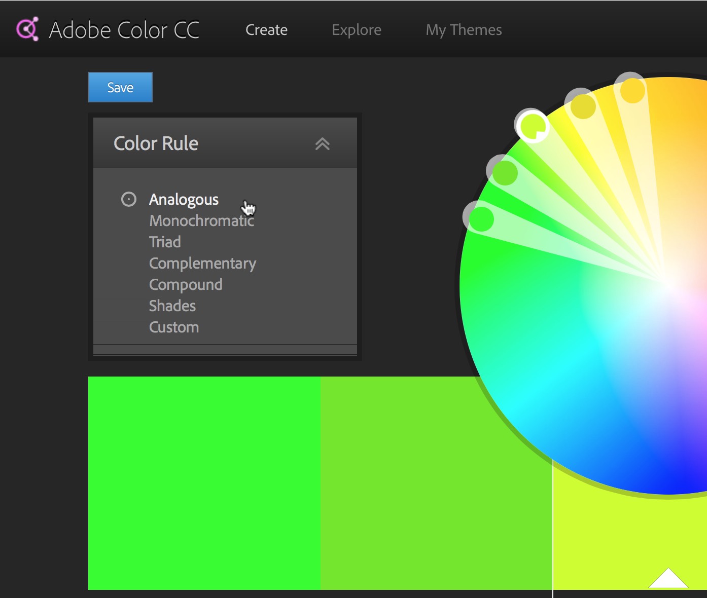
For the most part, I had known that color carries a specific meaning in our culture and it amazes me how much of an impact color has on the human eye and our emotions. In taking foundations of design here at Keene, I learned more about the color wheel and the different types of color systems. I had no idea there was a such thing as double complimentary and analogous colors. I just thought there was complimentary colors and that was it. I learned what colors go good with others to be visually pleasing to the eye. I also learned that instead of primary and secondary colors, there are also tertiary colors which are made up of one primary and one secondary color mixed together.
The evolution of graphic design and the use of color astonishes me. It is so fascinating how a few different colors put together or near each other on a page can give you so many different feelings. Psychology and design definitely go hand-in-hand in terms of appearance and color. I find it so cool how color has so many different aspects that go into it such as temperature, saturation, value, and intensity. I love the idea of color in design because the possibilities are endless!
Prior to reading these articles, I knew that color choice was something of relatively high importance. However, I did not realize how important color really is and I definitely did not realize just how important it is and how much decision making should go into choosing colors. I did not know that there were such things as color systems. The only time that I had learned about colors in a prior class was in basic art classes but even then we did not do anything past the average color wheel. The only information I knew about the color wheel was the primary colors and I you mix primary colors; you get secondary colors. I never knew that different color wheels (RGB and CMYK). CMYK is a darker color scheme whereas RGB is lighter because more light is added from the original color.
Prior to reading these articles I did not know much about color temperature. The warmer a color is the brighter the color is likely to be and if a color is cooler, the color is more likely to be darker. Because I am a film major, I work a lot with color correction. In the articles, they talk about value, saturation and hue. These articles, while they were not very long or difficult to understand, they were very helpful and they helped refresh my memory on lots of different aspects of color.
I have always marveled at how color works and interacts to effect our perception of things. I have noticed over time that even artists who don’t have as a developed technical skill but have a great grasp on color can still have just as popular art. Graphic designers have to choose carefully when considering colors for their designs so that they can accurately and appropriately represent the company. If the colors don’t match up well or aren’t pleasing to the eye, it can turn people away. For example, red is a common color used in palettes for restaurants because it often represents hunger subconsciously.
One thing that did surprise me in this reading, however, was the explanation of subtractive and additive colors. I knew that it existed to an extent, but had never really knew what it meant. Pigment based colors are subtractive because they absorb more light than they reflect. When mixed, they reflect less and less light, creating black. Additive colors on the other hand, are light based colors. The more they are mixed the more light is reflected, and thus creates white instead of black like subtractive colors. I found this to be an interesting and informative bit on how color works and is perceived physically.
Color
Color has always been a mystery to me. I know how it works and I know that some colors look good with other colors, but the science and the understanding of it always makes me stop and think. People are seeing color, but is it actually there? How do the colors look so vivid or so lifeless? Color gives off different impressions to each and every viewer. Depending on the brightness and contrast of the piece, the onlooker will either get happier vibes or more dull and depressing vibes. The readings made me think more on the meanings and science behind all colors of the universe. I am in Painting 1 and have taken Foundation Experience. In the class, we have talked about the mixing and matching of colors in our artwork, and these articles made more sense to me than just talking about them.
I know about all the categories of color whether it be bright and vivid to dull and boring. These readings help me more on mixing, matching, and the use of the colors to bring out emotions. I will have more of an understanding while using the colors in my design classes. Primary colors are prettier than that of tertiary colors. My understanding of color, how it is printed, the creation of feelings through color, and how one looks at it on a computer compared to paper is much more clearer now.
I found this reading a very good reminder of my foundation of designs class, I took a year ago however I found this reading gave me a better understanding of how color is used within graphic design uses these methods to make signs and visual language appealing. Rather then how they are implied with studio for an example painting. Often color is token for granted with this article it shows us the science of color of how they can be used to blend and change its value and strength. Also how Certain colors side by side each other can either enhance each other. I found the readings to remind me some of the important things about color and even expended on particular color sciences I haven’t read about before. For instance the color models were like CYMK and RGB.
These readings were very enriching because they exposed me to new and different ways of how color is used. I was already aware of some of the uses of color like how color can convey different moods, reality and information. Colors are a very powerful aspect of our everyday lives that not many people actually process, but subconsciously every decision made with colors is for a reason. For example fast food restaurants make sure that their signage and menus have colors that invites us to eat and buy more, only from the usage of color. I also found it interesting in these articles that our perception of color truly depends on its pigmentation of the physical surfaces that we are looking at. The brightness and ambient lighting changes how we comprehend that sort of color. For example, my film crew and I just created a poster for our film which does not consist of many colors. We printed it in black and white and also some in color, the color print looked like it had a purplish tint to it but once we brought it out from a tungsten light and into florescent lighting the whole color changed and it looked less purple. Regardless, the color wheel provides so much contrast that designers use to their advantage to make certain things stand out or make them disappear like camouflage. Lastly, I found these articles to be very interesting and information filled with knowledge I have yet to learn more about.
I enjoyed reading these articles because there was more than just colors. Colors can set the mood of something yellow can be happy and dark red can be for something bad. Colors have shades to them like lights and darks. Its interesting looking at the color wheel seeing opposites, primary and secondary colors. You can mix colors together to make a new color or shade and show different values. This made me think about how much we use colors in our everyday lives. Something I didn’t know about was near complements. These near complements are colors I think look good together like how they looked on the coffee cup with the purple and rosy pink in the first reading. The way I use color is usually just reds and blues the simple colors. I am going to try and use different shades and try to use near complements and see what I can make . This will make me change about the way I feel about colors because there is more to colors and they can help set the tone of something and the meaning. What would the world look like if we different have color I think it would be dull and boring.