- Ê
- Â
5 Helvetica Post
Helvetica Review
I felt that the movie Helvetica was quite interesting. I liked how they interviewed a broad spectrum of famous/talented graphic designers to get each of their opinions on the typeface. And they received some very different feelings about it. Some felt that the typeface was easy to read, timeless, and beautiful. While others found it to be overused, boring, and just overall . I believe it to be more of a mix of the two extremes. It’s very easy to read, and is timeless because it’s so uniform and simple. It’s definitely overused and because its so simple, using the typeface doesn’t inflict any kind of emotions of feelings in readers.
Quote from Massimo Vignelli:
“You can say, ‘I love you,’ in Helvetica. And you can say it with Helvetica Extra Light if you want to be really fancy. Or you can say it with the Extra Bold if it’s really intensive and passionate, you know, and it might work.”
I find this quote to be a little much, yes by changing the style of the font you do change the impact of the words themselves, but it’s not really going to be effective unless the person reading it is a graphic designer


Quote from Lars Müller:
“And I think I’m right calling Helvetica the perfume of the city. It is just something we don’t notice usually but we would miss very much if it wouldn’t be there.”
I find this to be the most accurate quote throughout the entire movie. And it’s why I think helvetica is not the best font, because it doesn’t pop, it’s just instantly processed in our brains.


Quote from David Carson:
“Don’t confuse legibility with communication. Just because something is legible doesn’t mean it communicates and, more importantly, doesn’t mean it communicates the right thing”
This is another great quote, and it explains Helvetica completely. Yes, it’s easy to read but it’s so uniform that it can be used to say a million different things that are unrelated. And because of that the words lack expression
HELVETICA
Helvetica is one of the most used typefaces in the world. To me, there was no better font to make a documentary about. Prior to watching the film, I had never thought about how often Helvetica is used in my daily life. Some of the most popular brands such as Toyota, Jeep, and American Airlines have mad an everlasting imprint in our minds of their logos by using arguably the most simplistic font available on any given computer. The film “Helvetica” was a very interesting film in my eyes. This typeface is everywhere around me and I had no idea. I thought that the film was very intriguing because it dove down to show the deeper meaning behind the font itself and its many uses. I believe that there were some parts of the film that could have been made more interesting by not dragging on as long but overall, the film “Helvetica” was one of the most interesting, eye-opening documentaries I have ever seen.
Quote #1: “If you want to say something, say nothing” -Massimo Vignelli
During the film, this was one of the quotes that caught my attention. This quote, the first time you read it, seems very foolish and does not make much sense. To understand this quote you need to analyze it further than what is on the surface. Once you go deeper down into the quote, what Vignelli is saying is that sometimes being simplistic tells the story better than if you try to make things too complicated. For example if the company “Target” had used a font other than that of Helvetica, many people may not have been drawn to their company as they would because they used Helvetica. I believe that this quote applies to many things in the way that sometimes less is more.


Quote #2: “Type is saying things to us all the time. Typefaces express a mood, an atmosphere. They give words a certain coloring.” -Rick Poynor
This quote was also able to catch my eye because it is very true. Everyday, we are mesmerized by the different typefaces that we see everyday without even knowing it. For example, if you are in the mall and you see an ad for a new pair of Nike sneakers and later that day you are thinking about the swirly font that they used when advertising, that is typefaces effect on you. Typefaces have the ability to create an impression on us and change our mood towards a company and this is what this quote is saying.


Quote #3: “The meaning is in the content of the text and not in the typeface, and that is why we loved Helvetica very much.” -Wim Crouwel
The context of this quote is very meaningful. What Wim is saying is that we stress too much about the typeface that is used and worry not enough about what is being said. If the message within any given graphic or title is meaningful enough it will be memorable; and the typeface does not matter. I think this quote is important because it is all about the message, not the typeface.


Understanding Helvetica
I wasn’t sure what to expect from a movie that revolved a singular font. Looking back now I think I found parts of it more interesting than I thought it would be, but it still had flaws. I appreciated learning the history of the font, and in turn learning more about the history of font making and graphic design in general. It was also interesting to get a look into graphic design culture, some of the big names from it, and all the varying professional opinions on such an influential font. It definitely surprised me how often this particular font was used and how I’d never noticed it. However, this is also where it felt like the film began to fail. After a while, opinions and facts seemed to repeat, and the movie felt stretched out to be a little longer than it should’ve been. Overall, though, it was fascinating to get a look at a deeper understanding of Helvetica and the influences it as a typeface can make in peoples lives.
Helvetica Quotes
“Don’t confuse legibility with communication. Just because something is legible doesn’t mean it communicates and, more importantly, doesn’t mean it communicates the right thing.”
—David Carson
This is something I feel is deeply important to graphic design as a whole. It’s essentially the whole philosophy of graphic design; it’s taking words or images and manipulating them for a deeper meaning towards the viewer. If it only had to be legible it wouldn’t be graphic design.
-

- David Carson
“Maybe the feeling you have when you see particular typographic choices used on a piece of packaging is just “I like the look of that, that feels good, that’s my kind of product.” But that’s the type casting its secret spell.”
—Rick Poyner
I like this quote because it represents one of the biggest thoughts I felt the movie was trying to get across to the viewers. That typeface is something we see every day but don’t truly consider it’s effect on us. Our entire opinion about something can be molded by something as simple as the font and we don’t even think about it.
-

- Rick Poyner

“You can say “I love you” in Helvetica. And you can say it with Helvetica Extra Light if you want it be really fancy. Or you can say it with the Extra Bold if it’s really intensive and passionate. And it might work.”
—Massimo Vignelli
This is another quote I think really emphasizes the affect the design of a typeface has on people. Even something as simple as the font being bolder changes how you read, feel, and perceive it in your head. It’s an emotional response that graphic designers have to understand for their work.
-

- Massimo Vignelli


Helvetica Thoughts and Opinions
“Helvetica,” is a movie on the typeface, Helvetica, and how it is seen everywhere you go. Multiple times throughout the movie a variety of artists continued to say that the font was everywhere and always being used for many different reasons. In my opinion, because of its repetitive agreement from all the artists saying how it was used so often, it got very old and boring. I appreciated the many people they interviewed to get their word across and see what they have to say about it, but in the end they said exactly the same thing as the one before did. I enjoyed the montages they brought into the film because it showed many examples and instances that Helvetica could be used for the public eye and for various other reasons such as advertising, packaging, promoting, etc. When Michael Place said “…ordinary things that people would just gloss over, I find very beautiful,” I can’t help but agree because it is always the small things in life that make someone feel comfortable and simple. This may be why they use it so often is for the simple reason for it being comfortable and safe. The film was certainly informative and opened my eyes a little more to see if there are any signs using the typeface, Helvetica.
“It’s air, you know. It’s just there. There’s no choice. You have to breathe, so you have to use Helvetica.”-Erik Spiekermann
This quote is great because of the metaphor he uses to describe the font. It is simple and easy to understand to any living, breathing human being.


The life of a designer is a life of fight: fight against the ugliness. Just like a doctor fights against disease. For us, visual disease is what have around, and what we try to do is to cure it, somehow, with design. –Massimo Vignelli
I like the way he describes organization and having less chaos just by using this font. Helvetica is neat and legible to read, so it is like trying to cure disorder with the typeface that demands order.


“You’re always a child of your time, and you cannot step out of that.” –Wim Crouwel
This quote made me think about the bigger picture and I thought it was very thought-provoking. It is very true how people are a product of their times and these artists happen to show it through their time with Helvetica and how people will grow up with it all around them for a very long time.
Watching Helvetica for the first time I didn’t know what to expect. After watching the movie I found it to be very interesting and informational. I didn’t know much about Helvetica and I had no clue about the different typefaces and how they are all around us. We see typeface all around the world either on brand names, logos, airplanes etc. The most interesting part I think was seeing how someone can take a word and change one aspect about it and it would look totally different. Also after seeing the movie I am now noticing how Helvetica is everywhere and before I never really noticed it so I’m appreciating it more.
Quote 1
“It’s air, you know. It’s just there. There’s no choice. You have to breathe, so you have to use Helvetica.” Erik Spiekermann
The first quote is from Erik Spiekermann and he is a German typographer and designer. Reading this quote caught my eye right away because Helvetica is everywhere so its saying how we breath it in. I agree with this quote because its just there and we have no choice about it. Its talking about how much we use Helvetica and we can’t get rid of it anytime soon.


Quote 2
“And I think I’m right calling Helvetica the perfume of the city. It is just something we don’t notice usually but we would miss very much if it wouldn’t be there.” Lars Muller
The second quote is from Lars Muller. Reading this quote I really liked it because I agree with it. Helvetica is everywhere around us like when you stray perfume it goes everywhere. We also don’t really notice Helvetica around us like the quote say. It has such an impacted on our lives and without it what would we do.


Quote 3
“You can say, “I love you,” in Helvetica. And you can say it with Helvetica Extra Light if you want to be really fancy. Or you can say it with the Extra Bold if it’s really intensive and passionate, you know, and it might work.” Massimo Vignelli.
The last quote is from Massimo Vignelli who was an Italian designer who worked in a number of areas ranging from package, housewares and furniture design. This quote is really what typeface is about. You can take a simple word and change one aspect about it and it will look totally different. You can make the word look fancy, bold or light and this is what the quote is explaining.


What’s Helvetica?
Before even beginning this film I did not expect it to be at all what it ended up to be, which was captivating. When first hearing about this film and how it was about one typeface and the history behind it I began to wonder what I was about to watch and if I would enjoy it or not. Only a couple minutes into the film I realized that it was much more than just one simple typeface that we see daily. Being a Film Production major, we don’t focus to much on what kind of text we’ll add in the title of our film or the credits, it’s pretty much what looks good and is legible. It was extremely interesting to learn that Helvetica is the most popular typeface and many people (including myself) don’t even realize it because it is so widely used in our lives. One of the more interesting parts of the film was how Helvetica actually evolved over the years and how font was found to be easy to see, clear and good for mostly everything we need to read. It was also very intriguing how people can focus so much on a simple font that can make such an impact, but also have the viewers not realize how powerful that text really is.
Quotes from Cast
“You can say, “I love you,” in Helvetica. And you can say it with Helvetica Extra Light if you want to be really fancy. Or you can say it with the Extra Bold if it’s really intensive and passionate, you know, and it might work.” Massimo Vignelli
Massimo was one of the first people we were introduced to in the film and his statement really stuck with me during and after the film. The feeling you can leave with someone with just words is absolutely incredible and how we portray and interpret it in our minds is even more incredible. The fact that humans can decipher what kind of tone and emotion you are expressing through a text without the person physically there, is quite fascinating. Being in a generation where text is so heavily depended on for communication and expressing emotion it was eye opening to hear someone address the fact that depending on the wording and emphases used in a sentence can mean a different thing each time.
-

- Massimo Vignelli

“It’s air, you know. It’s just there. There’s no choice. You have to breathe, so you have to use Helvetica.” Erik Spiekermann
As I had mentioned earlier how I had learned that Helvetica is actually everywhere in everyday life, Erik emphasizes that it truly is just there. I thought he was particularly interesting because of his blunt and bold statement about Helvetica. He made the great, yet simple comparison to breathing in air and how we just have to do it to survive so we must use this type to survive as well. Although we may not realize it’s right in front of us like air, it is still always there and most likely always will be in some shape or form.
-

- Erik Spiekermann
“And I think I’m right calling Helvetica the perfume of the city. It is just something we don’t notice usually but we would miss very much if it wouldn’t be there.” Lars Muller
This particular quote I believe ties in with the other two quotes very nicely because as I have stated we don’t realize how much we use Helvetica but once we do notice it would be a lost element in our lives if it was not there. Thinking about this typeface more into depth has been quite interesting in the way where what would we have if it wasn’t Helvetica? Because this culture is so used to seeing it, but also not realizing what they’re seeing, how would it impact people if all of a sudden we stopped used this typeface. Lars is correct by saying that we would miss it very much if it wasn’t there anymore. This particular typeface is so deeply embedded into our lives that we have become so accustom to it that it is just normal to see it all the time.
-

- Lars Muller
My Perspective
I found the movie Helvetica incredibly interesting. Before watching the movie, I had paid very little attention to what typefaces are used in the world around me, but the movie opened my eyes to the use of the font, Helvetica, around the world. For example, as a person walks down Broadway they are surrounded by a multitude of jumping and excited neon signs exemplifying hundreds of of colors. These words and motion displays all channel into the atmosphere that is customary of Times Square. It’s busy and hectic, but the signs are a substantial part of the New York experience. I learned from the movie that the signs, however, are not all as unique as they look, for many of them have at least one thing in common- the font. Helvetica is the most common form of font used for advertisements, signs, logos, and hundreds and hundreds of universal items in the U.S. and all over the world. As I watched the movie, I begun to recognize Helvetica’s style and it was extremely interesting to me that I was able to connect it to so much of the type all around me every day. Although controversial to some, Helvetica is essential to the graphic community and makes up a significant amount of visuals produced by professionals. The font is crisp, and helps the reader capture the message that is put forth to them. Bolded or italicized, Helvetica is sure to get the message across. I love how this font can be used universally but still make each design look original.
Quotes
Lars Müller: “And I think I’m right calling Helvetica the perfume of the city. It is just something we don’t notice usually but we would miss very much if it wouldn’t be there.”
I like this quote because it embodies the biggest take away I had from the movie. It expresses how the general public doesn’t notice the abundance of Helvetica used in a city like New York, but how essential it is to the atmosphere. The comparison to it being like perfume is an excellent way to put it because it subtly floats through the air while capturing people’s attention.
-

- OLYMPUS DIGITAL CAMERA
Michael Bierut: “It’s The Real Thing. Period. Coke. Period. Any Questions? Of Course Not.”
In this quote, Bierut is comparing a dated advertisement for Coke to a more recent one in a magazine. While the first advertisement has a lot to look at on the page with many different colors and fonts used, the more recent advertisement is clear, precise, and undeniably for the product. The second advertisement uses Helvetica and only needs a few words to get the point across. I like how Bierut uses this example to show how Helvetica revolutionized the advertisement industry.


Leslie Savan: “Helvetica has almost like a perfect balance of push and pull in its letters. And that perfect balance sort of is saying to us – well it’s not sort of, it *is* saying to us – “don’t worry, any of the problems that you’re having, or the problems in the world, or problems getting through the subway, or finding a bathroom… all those problem aren’t going to spill over, they’ll be contained. And in fact, maybe they don’t exist.””
This quote made me question if just a font on a piece of paper could really be so powerful as to reassure its audience that all of their real world problems no longer exist. Although I doubt the legitimacy of this claim, I love the message behind it. However exaggerated, this artist believes so strongly in the effect that Helvetica has on its audience. I like how inspired this designer feels by the font, and it made me look at it in a new way.

In watching the film Helvetica, my eyes were opened to the world around me and made me aware of how reliant we are on typeface. I had never really noticed how important typeface is to our society and how it affects our daily lives until now. Anywhere you look, Helvetica is used 99% of the time. On street signs, business signs, maps, directories, buildings, logos, food products, and anything that requires the use of text information for the American society. Ever since watching this film, everywhere I go I am scanning the streets looking for Helvetica and taking note of how often it is used. Just sitting in my room writing this I am looking around and noticing how often Hevletica shows up.
Like Lars Muller said, Helvetica is “the perfume of the city, we don’t notice it but would miss it if it wasn’t there.” I find this statement to be very true because if we take away everything that is written in Helvetica and replaced it with something like Times New Roman, the atmosphere would be completely changed. I agree with Leslie Savan’s statement (below) about Helvetica treating all problems from our daily lives as if they don’t exist. “Helvetica has almost like a perfect balance of push and pull in its letters. And that perfect balance sort of is saying to us – well it’s not sort of, it is saying to us don’t worry, any of the problems that you’re having, or the problems in the world, or problems getting through the subway, or finding a bathroom… all those problems aren’t going to spill over, they’ll be contained. And in fact, maybe they don’t exist.” Helvetica is like the cure-all for typeface, it is the go-to. It very versatile and has the ability to make everything simple. It doesn’t project any certain mood or feel to the audience, it is up to the content to do that. Wim Crouwel makes a good point when he says “the meaning is in the content of the text and not in the typeface, and that is why we loved Helvetica very much.”
Lars Muller

-
- OLYMPUS DIGITAL CAMERA
Leslie Savan

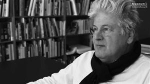
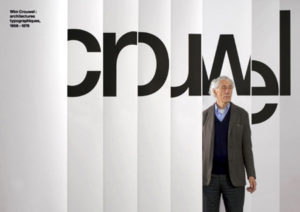
Wim Couwel
My Opinion on the Film
Prior to watching this film I’d known of Helvetica and had used it in projects before in high school, but I never considered it to be as big as it truly is. Watching this movie really made me realize just how much the typeface is used and I stated to see it in different things throughout my day. It definitely made me think more about the typefaces all around me and the different styles that exist, and how few are actually used in the real world. Every time they showed different company logos and signs in Helvetica it really stuck with me, because I never realized they were the same font. Although the film felt slightly repetitive to me, it still made an impact on the way I think of typefaces and will effect how I place type now.
Quotes
“Type is saying things to us all the time. Typefaces express a mood, an atmosphere. They give words a certain color.” – Rick Poynor
This quote really resonated with me because I agree that the way something is written or the style that’s used to write it can really give off different personalities to the words. If a serious text is written in a basic and common font, it’ll give off the vibe of being a serious and important piece of text, whereas if it were written in a cursive or silly type of font, I may not look at it in the same way. I agree with Rick Poynor that font is so important to how the message is presented.

“And I think I’m right calling Helvetica the perfume of the city. It’s just something we don’t usually notice but we would miss very much if it wouldn’t be there.” – Lars Muller
When thinking about Helvetica and seeing it so prominently in the movie, it really is something that doesn’t go noticed. I know for myself I never looked at the font that different stores used and realized they were all the same, but I think that Lars Muller is right in saying that if it were gone, it would be noticed. It’s something that seems so insignificant but actually makes an impact on our lives.


“For me, Helvetica is just this beautiful, timeless thing. And certain things shouldn’t be messed with, you know?” -Michael C. Place
Although Helvetica is everywhere, it’s not something that’s obnoxious to see all the time or something that really stands out as overused in my opinion. I agree with what Michael C. Place that it just shouldn’t be changed, it works as a font for all these different things.


Watching the film Helvetica left me feeling more involved in the world. We all see the font helvetica day to day whether it’d be in advertising, maps, or simply on a paper for an assignment. I loved seeing flashes of just how often helvetica is used. Maybe I don’t appreciate so much that we use that font so often, but it was interesting to see how much of it we all don’t acknowledge it surrounding us. It was very funny for me to see that helvetica is what is used for subway directions. I spend my breaks and summers mainly in Manhattan, Queens, and Brooklyn with my friends. It’s something I’ve never noticed. But what I’ve noticed over time was whenever I read a those subway signs I feel okay. Hearing some of the designers talk about emotion through purely font was something that made sense to me. Nothing is better than taking the path from hoboken and seeing “Journal Square to 33rd St.” in that simple sleek familiar font. The gap between the letters in fonts is something that I have always payed attention to, whether intentional or not. Massimo Vingnelli said, “It’s the space between black that makes it”. Mike Parker echoed that talking about the “interrelationship of negative space” and how “the space between hold the letters”. All of these stood out to me and brought me back to the times I would go through fonts and look at the spacing between and see what I liked and what bothered me.
Helvetica font is comforting to me in the fact that its uniform and consistent. But Erik Spiekermann said, “Rythm, contrast it comes from handwriting…helvetica has none of that”. I loved this because I am intrigued by everyone’s, individual, handwriting or font choices. Or how Paula Scher said that “font could be your own medium”, that was something I hadn’t thought about. I always thought that font was the afterthought to the context. I was cool to hear designers perspectives of fonts. But when I thought about using font as a medium, instead of particularly the content, It seemed like something that I feel you never really know when it is finished. But seeing Stefan Stagmeister’s work, this made more sense. Stagmeister said “when I get bored of working on a typeface, I leave them alone”. That to me made me think of working with fontfaces as like working with pastel, paint, pencil or charcoal. That you can leave things when you feel done, even if others don’t consider it done. Going back to Scher’s point, that the font is the medium. This makes me feel more comfortable with graphic design and working with fontfaces. David Carson said “don’t confuse legibility with understanding”. That secured me in the feeling that working with types doesn’t need to be so “helvetica” all the time. It doesn’t need to be the default that you use, you can choose your own font to use, or multiple fonts. Watching Helvetica broke down the wall for me to look at Graphic Design and not be so scared, but relate to it and feel more comfortable with experimenting.


-
Classroom
-
Recent Comments
- Matthew Rakowski on Framing/Grids Reading
- Laura Romaniello on Framing/Grids Reading
- Madeline Gaskill on Framing/Grids Reading
- Anna Heindl on Framing/Grids Reading
- Maria Pallozzi on Framing/Grids Reading
- Emily Perry on Framing/Grids Reading
- Rachel White on Framing/Grids Reading
Categories
-
About
KSC Graphic Design

Leave a Reply
You must be logged in to post a comment.