- Â
B Reference
B Printing at Redball
Redball is the KSC print service on the second floor of the Student Center. They do 8.5″ x 11″ and 11×17″ color and black and white laser prints inexpensively. They also do large format poster prints.
Redball Website
To get something printed, you email the files to redball@keene.edu. Email PDF files only. All files must be under 40MB to get through the mail system. You need to show up early and he prints it while you wait. Don’t wait until just before class.
Dana
Dana is the name of the man that runs it. Be nice to Dana. Get to know him. He controls your prints and he is friendly and we love him so love him back.
Cost
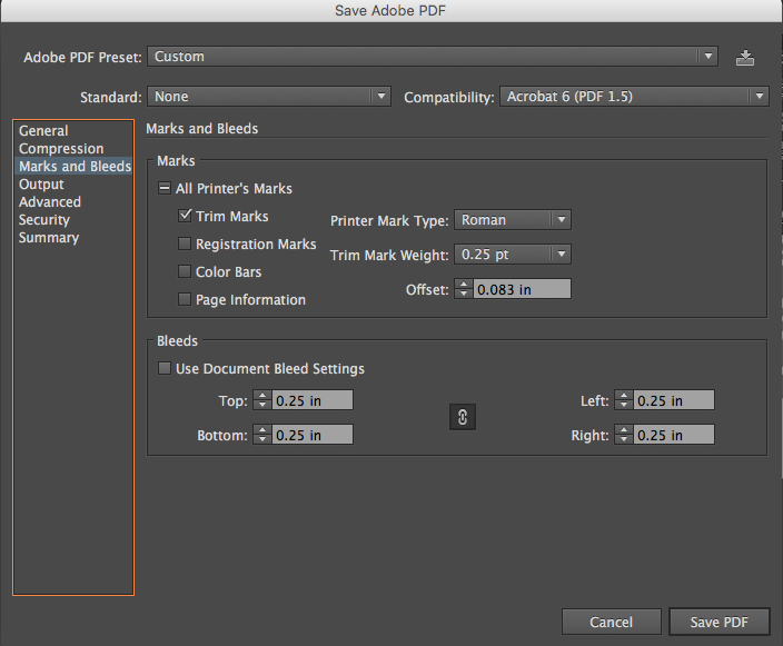
PDF Settings for Crops and Bleeds
Example Email
Here is an example of a very clear email to send to Dana. Err on the side of clarity and you will not be disappointed.
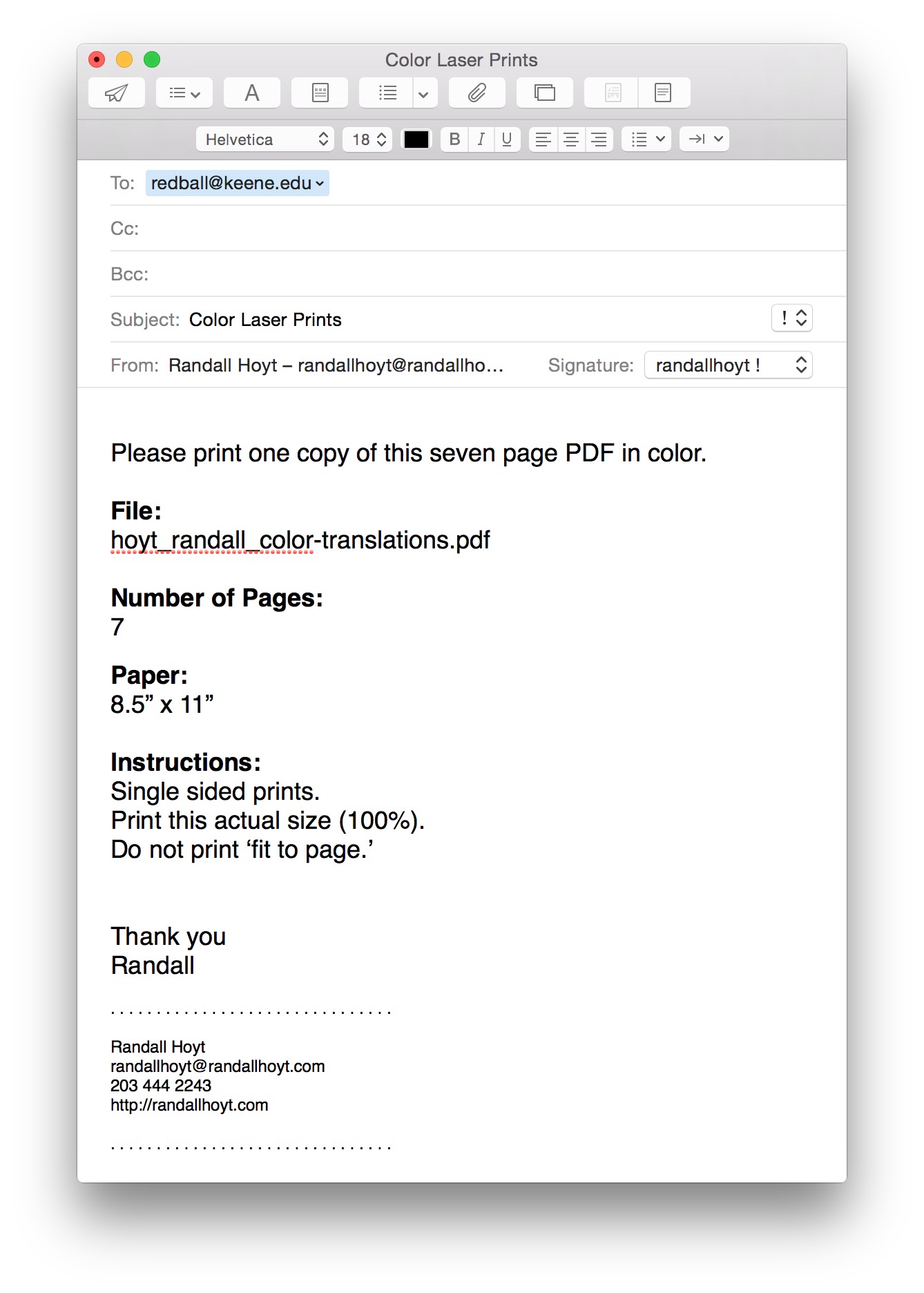
Make sure you also ask him to add trim marks to your order!
B Figure/Ground Examples
Stable Figure/Ground


Reversible Figure/Ground (can be see two ways)


Ambiguous Figure/Ground: No clear relationship. Goes back and forth.


B Type Anatomy
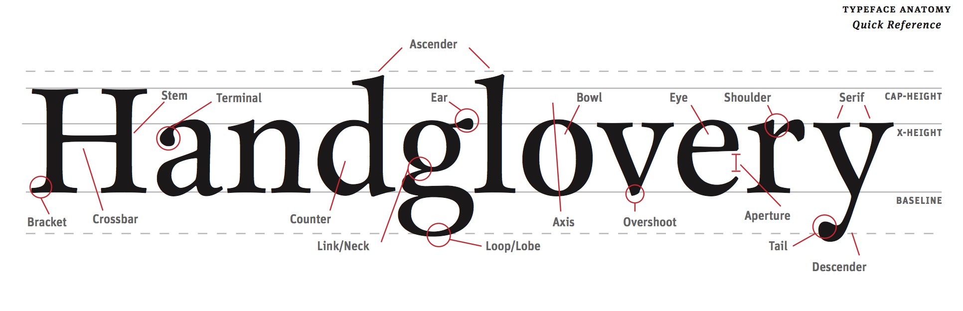
Read
Read this guide about identifying the parts of letter forms.
Explore these Type Anatomy Links
B Illustrator 101
Please use these videos to familiar yourselves with Illustrator
B Printing with Crop Marks
Here are some basic instructions for printing your files with crop marks in the lab.
Select “Print” from the file menu.


Choose the graphic design printer in the lab.

Set the paper size to US Letter (8.5″ x 11″)

Make sure the scaling is set to “DO NOT SCALE”

Select “Marks and Bleeds” in the top left.

Check “Trim Marks”

Uncheck “Use Document Bleed Settings” and make sure the top, bottom, left and right boxes are set to .25 inches.

Click the “Print” button in the bottom right corner.

The print should look like this on the paper. The thin lines are called crop marks.

B The Manila Envelope

1. Get a 9″ x 12″ manilla envelope. (You will likely need 3 or 4.)
2. Write the following neatly in top right corner of the front of the envelope.
3. Write your first name last name on one line.
4. Write the name of your class on the second line.
5. Write “SPRING 2017” on the third line.
7. Insert work neatly inside.
B Get Some Tools!
Thumb Drive or External Hard Drive
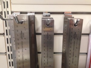
Steel ruler (15″ or18″)
X-acto knife

X-acto replacement blades (box of 40+ blades)

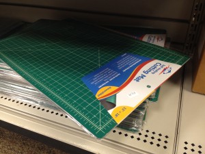
Cutting matte (12″ x 18″ min.) recommended*
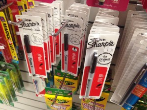
Black sharpie markers (one thin, .01-.03 & one thick + various sizes)
Due Monday, September 11 before class starts.
This is your FIRST QUIZ!
B Elements of Graphic Design Ch 1

Read this chapter and write a 200 word comment. The author talks about space. Explore how the concept of space in design has informed your eye. Observe space in your physical environment. Describe an example of ’empty’ space versus an example of ‘active’ space. Be specific.
Due Tuesday, January 31 by start of class
B Post Style Guidelines

Check and correct all posts against these guidelines prior to posting them.
General
- Use proper categories for all posts (not ‘zero’).
- Do not use numbered assignment categories for posts such as ’02 Helvetica’ as they are for instructor use only.
- You do not need your name in the page title.
- Use proper capitalization, spelling and grammar.
- List the authors for all example work (if possible).
Formatting
- No spaces between paragraph header and paragraph.
- Remove all extra lines.
- Create clear divisions for different sections if necessary.
- Remove colons “:” after headers on their own line.
- Do not center the page titles or headers.
- Do not indent the first line of type.
- Do not underline anything.
- Do not use multiple colors for text or header elements.
Links
- Do not have ‘naked’ URL links.
- Test all links.
- Use descriptive link names.
- Annotate (short descriptions) links.
- Links should open a new page.
Images
- Put images next to designer names.
- Use medium sized images for design examples (600px or less)
- Use the gallery function for 5 or more images.
- Manually resize images to be consistent if necessary.
-
Classroom
-

Because design elements are viewed in relation to the space they are in, it is important for designers to pay attention to the space surrounding a design (empty space). If the negative space surrounding a text or image is ignored, the design’s message becomes weak and boring. Empty and active space are important because they help create a positive reaction from the viewer. Because space is often overlooked by most people, using it strategically within a design can grab the viewer’s attention even more. Empty space is the area that lies behind a design or image, while active space is the space the design takes up.
Depending on what the designer wants to express in the design, more empty or active space is used. For example, mail-order catalog designers are trying to get the viewer to purchase as much as possible. By filling the empty space with products, the active space is being used far more than the empty space. This overwhelms the viewer with products to purchase, making them more likely to see something they want to buy. However, an advertisement for the newest iPhone is often simple and clean, therefore using the empty space surrounding the product to highlight the iPhone. If in these examples the designer were to ignore the empty and active space, selling the products would not be as likely. This is why it is so important for designers to know how to use both empty and active spaces effectively.
The concept of space in design is extremely overlooked by many people, mainly because they don’t realize the impact it can actually have and they don’t notice the way the space is being used. By utilizing the empty and active space, designer can enhance the message they’re trying to send by either bombarding the piece with a specific design or multiple designs, or allowing a singular design to lay in an empty space where the eye can easily be drawn to. The idea of empty and active space can be seen in the real world as well as in design, such as in high end stores versus low end stores. The higher end business will utilize the empty space in order to give off a higher quality and more expensive appearance, while the lower end business would utilize the active space in order to show the large quantity of products and lower sales prices. In design this can be seen in magazines where large spaces are left empty in order to provide an intellectual and artistic appearance. The use of the empty and active space allows for different messages to be presented and are important in design because they allow us to see things in a different light and express different messages.
Understanding how to effectively use empty and active space as a graphic designer is essential. Empty space, negative space, and white space are all terms used to describe the space around and between an image. This space can be any color, and it can be utilized in many ways to either jump out of the page and become a focal point, or to become a background to highlight the more prominent image on the page. Active space is the image, text, or design that is placed onto the the page. Too little white space and the page will look chaotic and cluttered, but if too much white space is used the page will look boring and incomplete. One very helpful and interesting point that the chapter made was to compare a doctor’s focus on keeping a patient well instead of just curing their sickness, to a designer’s focus on negative space instead of just creating active space. This metaphor gave me a new way to look at designs.
As I observe the space around me, I notice an example of active space vs empty space. There are two calendars hanging up on the wall across from me. One is very simplistic with a single owl in the middle of the page that pops out because of the white space behind it. The other calendar has a picture of city life with buildings, cars, bright lights and fireworks exploding in the background. There is purposefully very little empty space on this calendar to show the motion and intensity of city life. Both calendars use negative space differently to portray different messages.
I have always found an interest in the relation between positive and negative space. In design it would be categorized as figure and ground. The layout on a paper can go from catastrophic to clean depending on just how you use the “background”. I quote background because on page 119, “Thus, when it is used intriguingly, white space becomes foreground”, which I found to be so true and that using white space is limitless. I enjoyed reading about the types of figure and ground relationships. Stable figure and ground, reversible figure and ground, ambiguous figure and ground. I love to go through magazines, pamphlets…etc. and pay close attention to the use of the layout with consideration of the spatial context. I notice things like the space between a header and the content, the use of imagery whether it’d be thumbnails, a cover photo, background..etc. Having empty space where it is mainly background and can look finished or as if it is “leftover space”. While active space may be a good description of parents filling out the ad’s in the back of my high school textbooks. There’s basically no room to look, no break between any imagery or words. Making it cluttered and unattractive to the eye. Like looking at a bridge and appreciating the break between the background and the bridge as the form, but when you look under the bridge and see it covered in graffiti over the years to the point where nothing is legible. Although this may be a good image for an artist, as a graphic designer that is not what you want to be producing. Something I’ve come to notice more as I got older and as the class progresses is font faces. Noticing the relationship between the font shape and the shape left. I liked learning the word “counterform” which means the space within letters.
The concept of space is very important concept in design and for designers. In our everyday environment we see empty and active space all the time, as it is an essential aspect day to day. As Gregg Berryman writes, “everyone looks at things but very few people see”.
Empty and active space are both used to portray, advertise and sell different things and can work both positively and negatively depending on what the designer is trying to portray to us and how. Personally, I think white/empty/blank space is good. I think that when there isn’t enough of it things get too cluttered and what is trying to be shown gets lost in the mix of too many other things. When you are trying to advertise for something for instance, or when I am looking at an advertisement for lets say a restaurant, you don’t want to have all different things written on it and a ton of pictures. Instead you just want to have the name, in big, clear, readable type. And small details about it someone would need to know also in clear type. Leave enough empty space so whats important is easy to read and see. I know when i’m reading something like that, if I see too much going on I sometimes lose interest or don’t know what exactly is trying to be advertised.
Active space is something that can be a good thing as well, to not make something so boring and make you not want to read it. Having too much empty space can do that to something. A good time to have active space could be in posters, calendars, & newsletters which are just a few I can think of off the top of my head. When they present one image for instance, you want it to pop and fill the page since that is the only thing being presented. In a newsletter, it is usually rare that their is a lot of empty space because there is usually a lot of information. To make it not as boring pictures can be added to intrigue the reader. The concept of space is something so important and something that goes so unnoticed it was really interesting learning more about the concept of space.
Empty space is just as important to a visually pleasing design as active space is. This is something that I have over looked, but this reading really made me think about it. Gregg Berryman said, ” Everyone ‘looks’ at things but very few people ‘see’ effectively.” People do not put nearly enough thought into the space of a design that they do not use, but when this is ignored the odds of that design being ignored are much higher. Every piece of design is meant to be seen, but when all of the thoughts are focused on how to use space rather that what space not to use, designs can become cluttered and ugly very quickly. An example of empty space would be the space between letters, the sides of the page, and overall just the background the design. If the empty space is used properly, it will direct the viewers attention to exactly what the designer intended for them to see
Active space is space that the design takes up. Over use of active space can more often be seen in a catalog or magazine, where the designer just wants to show you as much as possible on one page and hope that you see something that catches your eye. To me a great design is a mixture between the two, and that mixture differs depending on what the design is intended to do.
When it comes to art and design, space is a huge component. Empty space, negative space, white space and space alone are all utilized to better define the area around an image or object. An artist can use space to really emphasize the focal point of an image. Active and empty space, if used correctly, can really have a positive impact on the viewer. Many business use active and empty space to better emphasize a product within their advertisements. For an example, often products are shown in nothing but a white background, helping the product stand out more for the viewer. It makes the product look more bold and important. This is the case with many car advertisements. Sometimes, a car will be shown in a plain or very simple background (empty space) so it will stand out. However, in many magazines for toy advertisements, the creator overwhelms the viewer with so many options and toys, hoping that at least one product will be bought. Also, in certain images with nature, the background plays a huge role. Whether there are trees in the background, or just a calm lake, can really bring out the simplicity of a photo. In my dorm room that I am currently sitting in, I notice two pictures. One is a picture of a football zoomed in on a football field, and of course my eyes are attracted straight to the football and nothing else. Another picture in my room is of the skyline in New York City, and it has such a busy background, drawing my eyes to all of the lights and building shapes in the sky. This just goes to show that an artist can do many things with space just to portray different messages or certain focuses.
Emptiness is something that we realize or we don’t this kind of space is thought to be best used by filling in different spots. In lots of artwork emptiness is used as a counterpart to the filled in space already. But being a designer we need to look at empty space as something beautiful and helpful to our creative minds. Creatively using empty space to make a specific design or to portray a positive shape is also some ways we can used empty space in art work. I believe that using this type of space can be quite inserting in the way where creating a piece of work turns into figuring out how the actual objects and the blank space contrast with each other. Along with placing these objects in spaces that are empty it becomes a figure/ground relationship between the objects and the space it is sitting in. By not only placing these objects in some space we also see the contracts but also the beauty of both coming together to make something new. By having this blank space we also activate it by putting objects in it to activate this plain space and make the scene look more interesting and interactive.
Space is a concept exceedingly important to understand as a designer, yet often underrated by the common onlooker. Using space correctly can make or break a design. Lots of “white space” can make a clean cut statement about a product or idea, while a busier space can be used to describe a specific concept, like the feeling of anxiety. Your ability to use space to suit your design is crucial to how you design, because it’s a part of how you communicate with the viewer. Everything you do with the design should be purposely placed for the benefit of the communication with the viewer. Carelessly open or busy space could leave the viewer confused, leave them with a bad impression, or worse, not attract their attention at all. I think one of the places I think the most about space in design is with websites. If the website is overloaded I will almost immediately click out of it. The first glance of the order of the website will instantly decide my willingness to read it. It can’t be so busy that it’s confusing, but it has to have enough stimulating design that I’m still interested in it. You may not be conscious of the effect of space, but it is constantly changing how we perceive things.
Space is always something ignored in art, wording, or our lives. Art shows negative space, unused, or forgotten space that could elaborate more on the main subject. Wording is the way someone or something speaks either through visual or vocal expression. Our lives and having personal space or space between loved ones socially. Everything has space, but we go right ahead and ignore it. With fonts, words, and spacing everything has to mesh together somehow in perfect harmony. The space and the subject go hand and hand and help out the other. For example you have a word or multiple words to describe something, but have no picture to go along with it. You would have to add an image to make the subject take up more of that empty space and really emphasize the words and image. Active space is where there is chaos on a plain piece of paper or on a blank powerpoint slide. Empty space is exactly what you would expect and that would be either nothing or the area around the chaos on that page. Too much chaos leads to not understanding things and being thrown around to different topics. For example, if you were to have a company and wanted to get your name out there, you would not have a collage and not have your company name stand out. Some of the most important things you can do is to make it clear, simple, easy to read, and self explanatory. The customer or client should never have to guess what your company name or purpose is. Empty space should be surrounding the active and capitalize on the ad. La Z Boy, for example, has negative space all around the letters, but the “Z” reverses the negative and creates a positive giving it an interesting design. Designers have to watch out for to much or too little space. It is needed even when you don’t think of it or realize it, you need it either in designing or life.
When it comes to elements of design space is often under utilized or ignored. However, after reading this chapter it was clear that space plays a very important role is the overall look of design, art, and even the everyday world. The part that grabbed my attention was the discussion on page 31 about white space and how to effectively use it by creating asymmetrical designs rather than symmetrical ones. This is because when an image is symmetrical the eye tends to focus on what is occupying the space rather than the space itself. If the space is too active it causes the viewer to become confused or to focus on too many elements which results in the page becoming overcrowded. Contrary to that, if the page is too empty the viewer could feel as if it is unfinished or that there is a lack of design elements to it. When relating to typeface, it is important to have a nice balance of active and empty space so the viewer is intrigued, but also clearly understands the message the type is trying to convey. I relate to the concept of space a lot through decorating a plain wall. When moving into my dorm it was tricky to find the right balance between too much clutter on the wall to too little. The element of space played a big factor because too much positive space would make the room feel not homey, while too much negative space would make the room feel small and busy. Space is important to understand because even if the viewer does not realize it, the amount of or lack of space can give off certain moods and feelings that the artist may not have intended.
We never really pay attention to space in design and how frequently it’s used to produce some very powerful effects. It has to be deliberately used, meaning that it isn’t just there, we have to make it. It plays a key role in framing, without it we wouldn’t know where to put designs in reference to. Everything would just be running off the page, or at least the designs would look uneven, and out of place. Space also requires a good figure/ground relationship, there are there different types, Stable, Reversible, and Ambiguous figure/ground. which all in turn allows the space to. An example of empty space would be a room with a box in the middle with no other objects surrounding it. The space surrounding the box is empty because it’s not being utilised. An example of active space would be a room filled with furniture. The space between the objects no only serves a purpose for being able to walk between the furniture, but also creates a powerful image that sets the objects apart from each other.
Space is described in this as emptiness. To have a functioning design you must have emptiness. Due to present the background and to ad positive and negative space. This is seen in many other jobs such as photography, painting, architecture, and sculptures. This is a hard thing to do if you aren’t good at “seeing” the space. “seeing means a trained super awareness of visual codes like shape, color, texture, patterns, and contrast”. This also go in-depth upon the separate functions of design. Which is unread design elements that are viewed in relation to the surroundings. How the two-dimensional emptiness in the background plays on the positive shapes in the foreground.
the use of space in a design brings attention to the actual design itself as well as creates a background for the design. Emptiness and space are the same thing, space can sometimes create a peaceful or causal aesthetic. This is because the blank space used isn’t necessarily eye grabbing therefore it doesn’t overwhelm the viewer. As well as bringing more attention to the actual design aspects. Space can give some designs a form of balance by bringing out the best aesthetical aspects of the design but also not overwhelm the viewer
Often times when thinking about space, many people think about outer space. However, in graphic design space is a very subtle thing that can make or break a project. Space has helped inform my eye in many different ways since reading this article. Prior to this article I always believed that the extra space, or empty space, within any given design was unimportant; but, this extra space is what helps bring the piece together to become pleasing to the human eye. On the surface, empty space and active space can appear to be the same thing. However, when you dive deeper that the surface there is a big difference. Many people often think that in order for a piece or design to catch someone’s eye, there needs to be little to no white space when in fact the opposite is true. Sometimes it is necessary to use the space within a design to help portray the message. For example, one time where it would be useful to have empty space is if you were advertising for a child hunger foundation and had the silhouette of a small child looking up into the sky begging. Empty space can also be used as active space to intrigue someone. For example, if you had an ad for a new running sneaker and you had a picture of someone running and there was space in front of them, as in the space they would be running. Below the space you could have Nike’s signature “Just Do It” which would be a good example of using empty space as active space. Space is an important concept in design because it has the ability to make a work of art into a piece of garbage and vice versa.
Space is defined when something is placed in it. In this chapter they talked about how the most overlooked element in visual design is emptiness and emptiness is space. Not having enough attention makes it seem ugly and unread. Emptiness is the unavoidable opposite of fullness, busyness and activity. They said how designers use the emptiness space by horizontally an image into it. Emptiness in two-dimensational design is called white space. For active space in the chapter they said to create a gray field, the white and black areas are equally essential. If you eliminate a single black line, the white space will become “activated”. The use of empty and active space allows the designers to see things different and mean something else. Empty space is the area that is usually behind a design and active space is how much space the design will take up. Designers should look at empty space as something helpful so that we can create something great. After reading this chapter I didn’t know much about empty and active space or what it even was. I also didn’t know how it may be affected by a designer and what the difference between them are but now I do.