- Ê
- Â
fheather has 35 post(s)
B The Design and the Play
Read and respond with a comment on this page.

Respond
What does the reading tell your about the process of graphic design that you may not have been aware of? Do you agree or disagree with the authors perspective on teaching from your own perspective as a student?
The Design and the Play Instinct by Paul Rand
Share your reactions about this reading in 200-300 words.
Compare the reading to your personal perspective and experiences. What does it make you think? How do you respond to the ideas it expresses? Articulate your thoughts clearly without regurgitating the reading.
Due Tuesday, February 7th before class starts.
13 responses to “The Design and the Play”
Leave a Reply Cancel reply
You must be logged in to post a comment.
B Figure/Ground Examples
Stable Figure/Ground


Reversible Figure/Ground (can be see two ways)


Ambiguous Figure/Ground: No clear relationship. Goes back and forth.


Leave a Reply Cancel reply
You must be logged in to post a comment.
í 03 Figure/Ground

Use Only Two Letters
Using only two letters create a series of dynamic typographic compositions. There are many forms these compositions can take. Experiment with large and small letters, combining similar forms, contrasting very different letter forms. Ultimately your goal is to create beautiful and dynamic form by playing with letterforms.
Download and install these typefaces.
What is flow?
As a designer one of your jobs is to control the attention of the viewer. By the design choices you make, you guide the viewer around the page. Your compositions will naturally have a flow to them. The viewer will start looking at something on the page and their eyes will move around the composition before coming to rest on a focal point. As a designer you have some influence over this process. Create compositions that activate the gaze and delight the eye.
Objectives
Your objective with this assignment is to:
- Understand how shapes interact to produce foreground and background relationships.
- Create stable, reversible and ambiguous figure/ground compositions.
- Learn how to manipulate letterforms using Illustrator
Rules of the Game
- You may only use two letters per composition.
- You make only use Garamond, Baskerville, Didot, Century, Helvetica.
- You may only scale and rotate.
- Do NOT stretch any letters.
- Both letters must be black on a white background.
- All work must be printed on a laser printer
- All work must be trimmed to size (6″x6″)
- You may use UPPERCASE or lowercase or a mixture of the two.
- You may use only the regular (not bold) and italic fonts of your typeface.
Make 9 Compositions
Make 9 6″x 6″ preliminary compositions in Illustrator using any two letters from the six class typefaces: Futura Bold, Garamond, Baskerville, Didot, Clarendon, Helvetica. Try to use different letters for all the compositions. The purpose of the assignment is the explore the alphabet.
3 composition with a small and a large letter
- Garamond
- Baskerville
- Helvetica
3 compositions with small to medium sized letters
- Century
- Didot
- Baskerville
3 compositions with large letters
- Your choice of typeface
- Your choice of typeface
- Your choice of typeface
Keywords:
large / small / contrast / asymmetry / space / drama / focus / flow
Format: 6″ x 6″ trimmed
Color: Black and White
Output: Laser (no inkjet)
Guidelines for Final Work
- When you print DO NOT use the “Fit to Screen” function located in the print dialog. Print 100%.
- Print from Acrobat if possible.
Due Thursday, February 2
- Print 5 compositions printed on 8.5 x 11″ paper with crop marks. WE WILL TRIM IN CLASS!
- PDF with 9 compositions on DropBox in your your folder:
03_Figure_Ground/lastname.pdf
Due Tuesday, February 7
- Print 9 compositions printed, trimmed in a manilla envelope
- PDF with 9 compositions on DropBox in your your folder:
03_Figure_Ground/lastname.pdf
Leave a Reply Cancel reply
You must be logged in to post a comment.
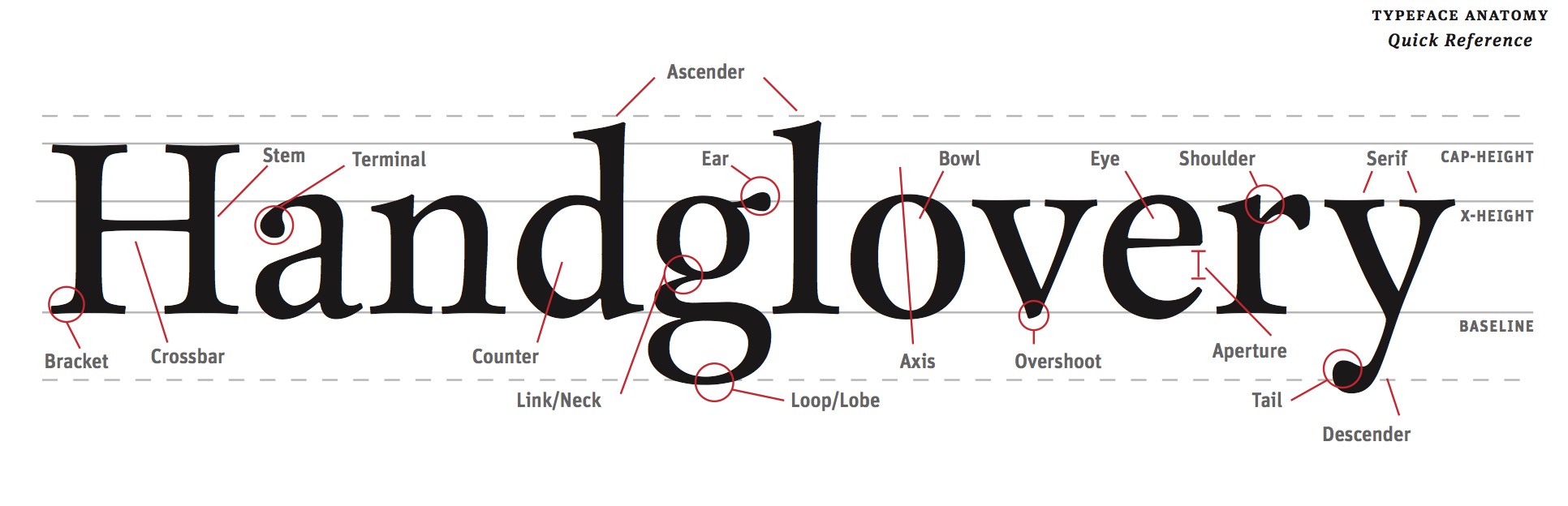
B Type Anatomy
Read
Read this guide about identifying the parts of letter forms.
Explore these Type Anatomy Links
Leave a Reply Cancel reply
You must be logged in to post a comment.
B Printing with Crop Marks
Here are some basic instructions for printing your files with crop marks in the lab.
Select “Print” from the file menu.


Choose the graphic design printer in the lab.

Set the paper size to US Letter (8.5″ x 11″)

Make sure the scaling is set to “DO NOT SCALE”

Select “Marks and Bleeds” in the top left.

Check “Trim Marks”

Uncheck “Use Document Bleed Settings” and make sure the top, bottom, left and right boxes are set to .25 inches.

Click the “Print” button in the bottom right corner.

The print should look like this on the paper. The thin lines are called crop marks.

Leave a Reply Cancel reply
You must be logged in to post a comment.
B The Manila Envelope

1. Get a 9″ x 12″ manilla envelope. (You will likely need 3 or 4.)
2. Write the following neatly in top right corner of the front of the envelope.
3. Write your first name last name on one line.
4. Write the name of your class on the second line.
5. Write “SPRING 2017” on the third line.
7. Insert work neatly inside.
Leave a Reply Cancel reply
You must be logged in to post a comment.
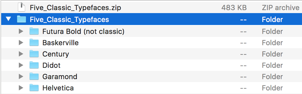
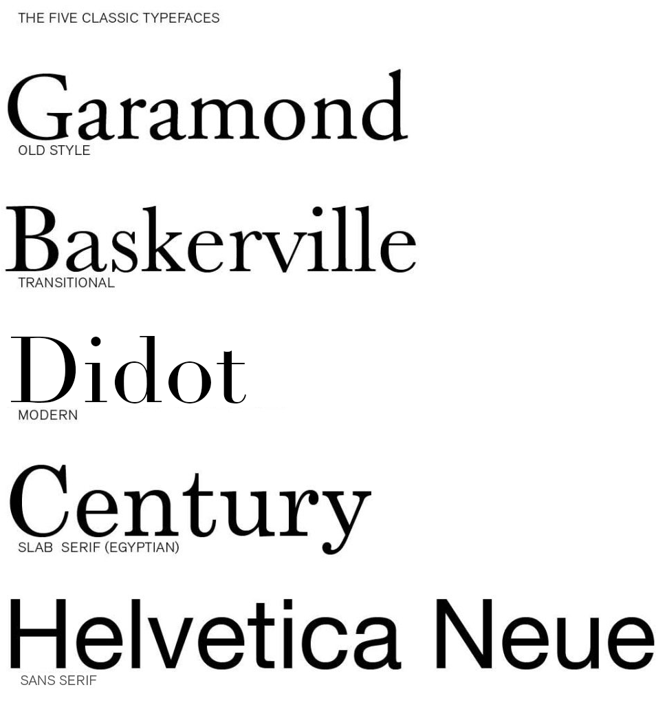
í The Five Classic Typefaces
Download and install these typefaces.
Explore these Links
Designing with Type 5: Identifying Typefaces
The Five Classic Typefaces | Steve Bowden: Endicott SP13
A Simple Overview of the 5 Classic Typefaces
Read them and respond as a comment to this post.
Compare two of the typefaces and explain why they are different and what informs your opinion. It is not good enough to say “I just like it”. Be specific about the type attributes. How are they the same? How are they different? How does the history of the typeface inform your opinion. For example: John Baskerville developed his typeface with thinner serifs to take advantage of the better papers and printing presses.
Due Tuesday, January 31 before class starts
17 responses to “The Five Classic Typefaces”
-
Ciara Gallagher says:
Didot and century have their own styles that differ greatly even though at first glance I could only see a slight difference. Century while being more traditional was created after the modern style Didot. Century was created by Linn Benton for the printer of the Century Magazine. While Firmin Didot created the letters and was used heavily by his brother. Didot font being created in 1784 didn’t get much attention until years later. The style grew in popularity due to the want for faces with strong contrast between thick and thin, unbracketed serifs. The unbracketed serifs are similar to century’s font, while century’s font was aiming to make the font round and sturdy and heavier than most serif’s. The century font has an x-height that was bigger while didot has a smaller x-height. To me the biggest differences is the serif styles as well as while Didot font looks wide the century font looks tighter because of thickness.
-
Laura Romaniello says:
The two typefaces that I found most interesting in background and style were Baskerville and Garamond. Although Garamond (1561) was created much earlier than Baskerville (1757), I found the two typefaces look fairly similar. Claude Garamond was a French publisher from Paris and is known for creating the apostrophe and accent written in French. Although Garamond died in in the mid 1500’s, his typeface didn’t gain popularity until the 1600’s. It is considered one of the most ink-friendly fonts and is known for being a very legible serif typeface. It is a typical Old Style typeface with little contrast between the thicks and thins with heavily bracketed serifs. On the other hand, Baskerville is a safe medium between Old Style and Modern. As a very traditional typeface, the serifs were more sculpted with a thicker contrast between thick and thinstrokes for a more dramatic feel. John Baskerville created a paper production technique that resulted in smoother and whiter paper. Baskerville characters are wide for their x-height, are closely fitted, and have great proportions. Both Garamond and Baskerville are considered the most readable typefaces.
-
Emily Perry says:
The two typefaces that I can see myself using often are Garamond and Didot. Both typefaces are very different considering Didot is a modern typeface while Garamond is old style. However, it was interesting to discover that both typefaces were created in France. Claude Garamond was originally thought to have created Garamond but it has been recently discovered that it may have been Jean Jannon in 1615. Unlike Garamond, there was no question as to who created Didot. The Didot family designed and used Didot during the 18th century. Like most modern typefaces, Didot has a strong contrast between its thick and thin lines while also having unbracketed serifs. Unlike Didot, Garamond has very little contrast between thick and thin lines and does have bracketed serifs. Garamond’s capital letters are shorter than the lowercase ascenders, making the typeface easier to read. Although these fonts are very different in their designs, I think their simplicity and history makes them strong typefaces.
-
Kaylie Petrillo says:
Baskerville and Century were the two typefaces which I liked the best out of the five we learned about. Baskerville was created in 1757, it is a transitional typeface which means it forms a bridge between both old style and the new modern faces. This type shows great contrast between thicks and thins and is very wide and closely fitted as well. Baskerville seems to have excellent proportions and is a clear and readable type I would use everyday. Century is a font which I already use a lot but never knew the details about. It was created in 1894 by Linn Boyd Benton. This type was the first major american typeface. It was expanded on the original type Egyptian which has thick slab serifs and thick main strokes. Century is known to be refined Egyptian font. The font is very clear and legible which is why it is used by many.
Although these two fonts were both created in different centuries they both are legible, clear, and readable and are still popular in todays world. Century has a bigger x-height than Baskerville, and Century is a bit more thick than Baskerville. Both fonts have such elegance to them that makes them so popular to this day. -
Rachel White says:
The two typefaces that I enjoy the most are Didot and Garamond. By just glancing at the design, it’s difficult to tell that these two typefaces are from two different time periods, and that Garamond is considered Old Style while Didot is Modern. I wouldn’t have thought that Didot was a Modern font since it still has an elegant design style like Garamond does. It’s interesting to see that the history of the two fonts is somewhat similar as well since both were designed in France, and appear to have a few similar attributes. Looking at the two typefaces, it’s easy to see that Didot appears much darker because it’s transition between thick and thin lines is very obvious, while Garamonds transition is slight, causing the font to appear lighter. Both typefaces are easily legible and as stated before appear to be formal typefaces, but Garamond appears more formal and elegant while Didot has some characteristics that make it appear more common and as a typeface that wouldn’t be used for significantly formal reasons.It’s interesting to read about the history of these typefaces and see what they were originally used for, and it definitely makes me think of the way I choose fonts for certain things.
-
Julia Montecalvo says:
The two types of typefaces I seemed to like the most are Garamond and Didot. Garamond is more old style and Didot is more modern. I think these two typefaces are different because Garamond letters are bold and thick. Didot has letter that are thin and not as bold. I like how Didot looks neater and cleaner looking if you need a simple name. Garamond seems to be more noticeable and from a distance it catches the eye more than Didot would. If you look at both fonts you can see how the letters end in a thicker line and Didot ends with thinner lines. Both fonts were designed in France and have history behind them. Claude Garamond was a French publisher and type designer whose designs many modern Garamond typefaces. Firmin Didot created the letters which was then used by his brother. It was interesting researching about these two different typefaces but also looking at some similarities that they share.
-
Eliza Joseph says:
Helvetica and Garamond are distinctly different typefaces in many ways. Garamond is an old fashioned typeface designed by Jean Jannon in 1615. With very little difference between the thick and thin lines, heavily bracketed serifs, and oblique stress, Garamond is a unique font with open and round letters for legibility. Helvetica on the other hand is a sans serif created in Switzerland designed by Max Miedinger. This universally used typeface is tall, has condensed letters, and equal sized strokes. Both Helvetica and Garamond are easy to read, yet they have distinct characteristics.
-
Christopher Mitchell says:
I have decided to compare the type faces Century and old style. These to have multiple thing in common yet differ in ways for instants look, portion and creation. For example Century was made in the USA during 1894 by Linn Boyd Benton. He made it believing it would be easier to read, with a greater legality through the characteristics. Benton had a friend as the publisher of Century Magazine who was looking for something thinner and stood out. He creatively took common looking typefaces and condensed the proportions and made the letters round and sturdy. Old style was made by Claude Garamond in 1617 long before century was created 277 years later. Garamond was a french publisher from Paris, a leading type designer who had inspired contemporary typefaces like Sabon, Granjon, and Garamond. “These early roman types are characterized by curved strokes whose axis inclines to the left, and little contrast between thick and thins.” Comparing them both Century has less contrast compared to Old Style. Yet Century is more portioned. I believe that century is a better for labeling and advertising due to the spacing. While on the other hand Old Style looks better as a font because of the contrast. Old Style has more weight distribution thought letters it as been leveled out be the proportion of each letter making it easy on the years to soothing flow visually.
-
Kyle Johnson says:
The two types of typefaces that caught my attention the most were Baskerville and Century. Baskerville is classified as a “transitional typeface” because it was created in between the Old Style and the Modern Faces. This font shows a large contrast between the thicks and the thins, and the stress of the type is almost vertical. Created in 1757 by John Baskerville, this font still remains popular and successful to this day. Century, on the other hand, was created much later, in 1894. This was the first American typeface and was created by Linn Benton for a magazine at the time. Unlike Baskerville, century has little contrast between the thicks and the thins. Baskerville is very wide for its x-height, have nice proportions, and are fit well. However, Century’s x-height is not too big for itself, and has a very simple markup. Both of these fonts are similar because of their simplicity and legibility. Both of these typefaces have come a long way and are still very successful to this day. These are two very common fonts, and it was interesting to learn more about the background and history of each one.
-
Jacob Whedbee says:
The two typefaces that were most appealing to me were Century and Helvetica. Century was created for the simple purpose of being more legible, and to me there is really no better reason than that. The letters do not vary nearly as much in thickness, and I think that is what really appeals to me about this font. It is very simple, and very clean. It originated in the United States in 1894, and that is not something you hear of very often. Helvetica was the other font I chose. Particularly after watching the film I found this typeface very interesting. It originated in Switzerland in 1957 by Swiss designer Max Miedinger. Many different variants of this typeface have been released over the years, these variants include changes in weights, widths, and sizes. Helvetica is everywhere, it seems to be one of the most widely used fonts. That to me is what is interesting about it, it fits a lot of situations. Even though there could be a typeface that does a better job in a certain scenario, the fact that Helvetica can be used in so many places is very interesting to me.
-
Matthew Rakowski says:
The two typefaces that immediately caught my eye when reviewing these five were Didot and Helvetica. Helvetica is a sans serif font, referring to its lack of serifs meaning extra loops and curves at the end of any given letter. When this font became popular in the 20th century, it intrigued many people worldwide. Didot on the other hand is a serif font which gained popularity during the 18th century. To me, these two fonts, even while being different styles, are both so simplistic yet can be very serious. You can argue that Didot is just a Helvetica font with serifs. The two fonts interested me because of their distinct differences yet slight similarity. Both of these fonts have a modern style to them which is why they are easy to read. These fonts are used daily because of their versatility, simplicity and ease of use. It was these factors that also made me like these fonts and will most likely be fonts I use often throughout the year.
-
Madeline Gaskill says:
Comparing the two typefaces Garamond and Baskerville was interesting because they are both are very different and both have interesting histories behind them. Garamond caught my eye because it is a classic old style of typeface and it is very legible because of its little contrast between the thins and thick of each letter creating an open/round form. This particular type face also went through quite a bit of revamping over the years. Claude Garmond, the creator of this typeface was one of the leading type designers of his type and while creating it he based its design off of Angelo Vergecio’s handwriting. This was very eye catching to me because that lead me to believe that people in this time really put some time and effort into their handwriting unlike today where everyone’s looks every different and possibly sloppy. Baskerville on the other hand is a traditional yet modern serif typeface that Jon Baskerville created. He created some improvements to this typeface like between the O and Q such as making the serifs sharper and more tapered by adjusting the layers around rounded letters. This font was created to be very legible and each for people to use and read. I enjoy this font compared to Garamond because it is thinner and seems slightly easier to read. I do enjoy both of these fonts and hope to learn more about them and other fonts along the way and the history behind them.
-
Maria Pallozzi says:
The typefaces Garamond and Baskerville are two of my favorite fonts. They are my favorites because of their classiness and their little flare they have to give them a fancy, old- fashioned theme. They have a lot of similarities between the two, but they have just enough to make them different.
Garamond, accredited to Claude Garamond when in recent studies possibly show Jean Jannon was the creator, is an old- style font that was designed in 1615. The easiness of reading this font comes from its openness and space between the letters. The thick and thin of the lines are spread evenly throughout the letter and shows nice subtle contrast of thickness when you notice the architecture of the letter.
Baskerville is yet another great font created by John Baskerville in 1757. This font was a transitional font because of its breakthrough out of the old style font and into the modern font style. The font has a very elegant look to it and has a good variety of letters that have a different thickness. Baskerville created the typeface because he wanted to take advantage of the printing press and the better papers.
They are the same in a lot of ways because they are both elegant and have fancy lettering. They have very similar bases on the letters and you can see the inspiration for Baskerville looks as though it could have originated from Garamond. -
Anna Heindl says:
My two favorite fonts used out the five are garamond and didot. Garamond has little contrast in its line weight, and uses a nice, curvy style that makes it comfortable on the eyes. Didot, on the other hand, is almost the complete opposite. It has high contrasting thick and thin lines and unbracketed serifs. Garamond I mostly imagine using a font for an article, while didot I pretty much exclusively imagine as a title font. Knowing the background and purpose of the font is important when considering your opinion on it. Garamond is an old style font, where the main concern with its creation was readability. Didot, on the other hand, is a modern font, where typeface designers were more concerned with the fashionable appearance of the font. I appreciate garamond for its simplicity and readability, while at the same time I appreciate didot for its more stylish and dramatic appearance.
-
Savanna Rovazzini says:
The two typefaces I am most familiar with are Garamond and Helvetica. When writing a paper I almost always am inclined to use Garamond. This is because I find the font to be proper and simple which is effective for formal writing. Simple fonts are effective for formal writing since the words do the talking instead of the font. With little personality or flare in the type, the reader can focus more on the content and meaning of the words. Helvetica however I find has a little more personality to it. The lines in the letters are more straight and blunt which can give a more bold vibe to the reader. I like this font when it is displayed as commercial items or in street signs. This is because the boldness of the font draws the reader in and makes them interested in what the content of the words are. So when dealing with street signs or other informative writing, Helvetica is a good font to use since it grabs the attention of the reader and comes across in a strong and impactful way. Garamond does not give off the same bold feeling due to it’s curlier, less aggressive letters. This results in the font being neutral and good to use for longer writing pieces such as essays or novels.
-
Nicholas Cocivi says:
My favorite two typefaces are, Baskerville and Didot. Baskerville is a more sophisticated typeface, it’s been around for hundreds of years, yet is timeless and because the characters are so wide apart, it makes for a very easy to read typeface. On the other hand, Didot looks more modern thanks to its combination of thick and thin lines, and has unbracketed serifs. This font was designed by a man by the name of Firmin Didot and his brother used the font in printing pressed. It’s a more fashionable font, that is classified under one of the most recent family of fonts called “Modern Typeface”. They both are very wide fonts and because of that, they are easier to read than most other fonts.
-
Luke Sweeney says:
The two typefaces that caught my eye the most were Didot and Helvetica. I like the look of Helvetica because of how simplistic it is and how easy it is to take in. Helvetica has very neat straight edge style that makes it very easy to read. It is very accepting to the eye compared to other typefaces. This would probably explain why it is so popular in advertisement and other forms of media today. Helveticas is a typeface of Swiss origin created in 1957 but did not become popular until the twentieth century. It became popular because of its clean readable design and style. Didot was named after the famous French printing family Didot it became popular because of its thick and thin design. What I like about this typeface is the contrast that is created by the use of thick and thin design that really makes it eye catching.
Leave a Reply Cancel reply
You must be logged in to post a comment.
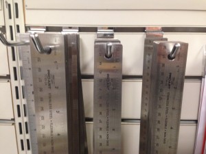
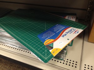
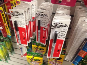
B Get Some Tools!
Thumb Drive or External Hard Drive
Steel ruler (15″ or18″)
X-acto knife

X-acto replacement blades (box of 40+ blades)

Cutting matte (12″ x 18″ min.) recommended*
Black sharpie markers (one thin, .01-.03 & one thick + various sizes)
Due Monday, September 11 before class starts.
This is your FIRST QUIZ!
Leave a Reply Cancel reply
You must be logged in to post a comment.
B Elements of Graphic Design Ch 1

Read this chapter and write a 200 word comment. The author talks about space. Explore how the concept of space in design has informed your eye. Observe space in your physical environment. Describe an example of ’empty’ space versus an example of ‘active’ space. Be specific.
Due Tuesday, January 31 by start of class
16 responses to “Elements of Graphic Design Ch 1”
-
Because design elements are viewed in relation to the space they are in, it is important for designers to pay attention to the space surrounding a design (empty space). If the negative space surrounding a text or image is ignored, the design’s message becomes weak and boring. Empty and active space are important because they help create a positive reaction from the viewer. Because space is often overlooked by most people, using it strategically within a design can grab the viewer’s attention even more. Empty space is the area that lies behind a design or image, while active space is the space the design takes up.
Depending on what the designer wants to express in the design, more empty or active space is used. For example, mail-order catalog designers are trying to get the viewer to purchase as much as possible. By filling the empty space with products, the active space is being used far more than the empty space. This overwhelms the viewer with products to purchase, making them more likely to see something they want to buy. However, an advertisement for the newest iPhone is often simple and clean, therefore using the empty space surrounding the product to highlight the iPhone. If in these examples the designer were to ignore the empty and active space, selling the products would not be as likely. This is why it is so important for designers to know how to use both empty and active spaces effectively. -
The concept of space in design is extremely overlooked by many people, mainly because they don’t realize the impact it can actually have and they don’t notice the way the space is being used. By utilizing the empty and active space, designer can enhance the message they’re trying to send by either bombarding the piece with a specific design or multiple designs, or allowing a singular design to lay in an empty space where the eye can easily be drawn to. The idea of empty and active space can be seen in the real world as well as in design, such as in high end stores versus low end stores. The higher end business will utilize the empty space in order to give off a higher quality and more expensive appearance, while the lower end business would utilize the active space in order to show the large quantity of products and lower sales prices. In design this can be seen in magazines where large spaces are left empty in order to provide an intellectual and artistic appearance. The use of the empty and active space allows for different messages to be presented and are important in design because they allow us to see things in a different light and express different messages.
-
Understanding how to effectively use empty and active space as a graphic designer is essential. Empty space, negative space, and white space are all terms used to describe the space around and between an image. This space can be any color, and it can be utilized in many ways to either jump out of the page and become a focal point, or to become a background to highlight the more prominent image on the page. Active space is the image, text, or design that is placed onto the the page. Too little white space and the page will look chaotic and cluttered, but if too much white space is used the page will look boring and incomplete. One very helpful and interesting point that the chapter made was to compare a doctor’s focus on keeping a patient well instead of just curing their sickness, to a designer’s focus on negative space instead of just creating active space. This metaphor gave me a new way to look at designs.
As I observe the space around me, I notice an example of active space vs empty space. There are two calendars hanging up on the wall across from me. One is very simplistic with a single owl in the middle of the page that pops out because of the white space behind it. The other calendar has a picture of city life with buildings, cars, bright lights and fireworks exploding in the background. There is purposefully very little empty space on this calendar to show the motion and intensity of city life. Both calendars use negative space differently to portray different messages. -
I have always found an interest in the relation between positive and negative space. In design it would be categorized as figure and ground. The layout on a paper can go from catastrophic to clean depending on just how you use the “background”. I quote background because on page 119, “Thus, when it is used intriguingly, white space becomes foreground”, which I found to be so true and that using white space is limitless. I enjoyed reading about the types of figure and ground relationships. Stable figure and ground, reversible figure and ground, ambiguous figure and ground. I love to go through magazines, pamphlets…etc. and pay close attention to the use of the layout with consideration of the spatial context. I notice things like the space between a header and the content, the use of imagery whether it’d be thumbnails, a cover photo, background..etc. Having empty space where it is mainly background and can look finished or as if it is “leftover space”. While active space may be a good description of parents filling out the ad’s in the back of my high school textbooks. There’s basically no room to look, no break between any imagery or words. Making it cluttered and unattractive to the eye. Like looking at a bridge and appreciating the break between the background and the bridge as the form, but when you look under the bridge and see it covered in graffiti over the years to the point where nothing is legible. Although this may be a good image for an artist, as a graphic designer that is not what you want to be producing. Something I’ve come to notice more as I got older and as the class progresses is font faces. Noticing the relationship between the font shape and the shape left. I liked learning the word “counterform” which means the space within letters.
-
The concept of space is very important concept in design and for designers. In our everyday environment we see empty and active space all the time, as it is an essential aspect day to day. As Gregg Berryman writes, “everyone looks at things but very few people see”.
Empty and active space are both used to portray, advertise and sell different things and can work both positively and negatively depending on what the designer is trying to portray to us and how. Personally, I think white/empty/blank space is good. I think that when there isn’t enough of it things get too cluttered and what is trying to be shown gets lost in the mix of too many other things. When you are trying to advertise for something for instance, or when I am looking at an advertisement for lets say a restaurant, you don’t want to have all different things written on it and a ton of pictures. Instead you just want to have the name, in big, clear, readable type. And small details about it someone would need to know also in clear type. Leave enough empty space so whats important is easy to read and see. I know when i’m reading something like that, if I see too much going on I sometimes lose interest or don’t know what exactly is trying to be advertised.
Active space is something that can be a good thing as well, to not make something so boring and make you not want to read it. Having too much empty space can do that to something. A good time to have active space could be in posters, calendars, & newsletters which are just a few I can think of off the top of my head. When they present one image for instance, you want it to pop and fill the page since that is the only thing being presented. In a newsletter, it is usually rare that their is a lot of empty space because there is usually a lot of information. To make it not as boring pictures can be added to intrigue the reader. The concept of space is something so important and something that goes so unnoticed it was really interesting learning more about the concept of space. -
Empty space is just as important to a visually pleasing design as active space is. This is something that I have over looked, but this reading really made me think about it. Gregg Berryman said, ” Everyone ‘looks’ at things but very few people ‘see’ effectively.” People do not put nearly enough thought into the space of a design that they do not use, but when this is ignored the odds of that design being ignored are much higher. Every piece of design is meant to be seen, but when all of the thoughts are focused on how to use space rather that what space not to use, designs can become cluttered and ugly very quickly. An example of empty space would be the space between letters, the sides of the page, and overall just the background the design. If the empty space is used properly, it will direct the viewers attention to exactly what the designer intended for them to see
Active space is space that the design takes up. Over use of active space can more often be seen in a catalog or magazine, where the designer just wants to show you as much as possible on one page and hope that you see something that catches your eye. To me a great design is a mixture between the two, and that mixture differs depending on what the design is intended to do. -
When it comes to art and design, space is a huge component. Empty space, negative space, white space and space alone are all utilized to better define the area around an image or object. An artist can use space to really emphasize the focal point of an image. Active and empty space, if used correctly, can really have a positive impact on the viewer. Many business use active and empty space to better emphasize a product within their advertisements. For an example, often products are shown in nothing but a white background, helping the product stand out more for the viewer. It makes the product look more bold and important. This is the case with many car advertisements. Sometimes, a car will be shown in a plain or very simple background (empty space) so it will stand out. However, in many magazines for toy advertisements, the creator overwhelms the viewer with so many options and toys, hoping that at least one product will be bought. Also, in certain images with nature, the background plays a huge role. Whether there are trees in the background, or just a calm lake, can really bring out the simplicity of a photo. In my dorm room that I am currently sitting in, I notice two pictures. One is a picture of a football zoomed in on a football field, and of course my eyes are attracted straight to the football and nothing else. Another picture in my room is of the skyline in New York City, and it has such a busy background, drawing my eyes to all of the lights and building shapes in the sky. This just goes to show that an artist can do many things with space just to portray different messages or certain focuses.
-
Emptiness is something that we realize or we don’t this kind of space is thought to be best used by filling in different spots. In lots of artwork emptiness is used as a counterpart to the filled in space already. But being a designer we need to look at empty space as something beautiful and helpful to our creative minds. Creatively using empty space to make a specific design or to portray a positive shape is also some ways we can used empty space in art work. I believe that using this type of space can be quite inserting in the way where creating a piece of work turns into figuring out how the actual objects and the blank space contrast with each other. Along with placing these objects in spaces that are empty it becomes a figure/ground relationship between the objects and the space it is sitting in. By not only placing these objects in some space we also see the contracts but also the beauty of both coming together to make something new. By having this blank space we also activate it by putting objects in it to activate this plain space and make the scene look more interesting and interactive.
-
Space is a concept exceedingly important to understand as a designer, yet often underrated by the common onlooker. Using space correctly can make or break a design. Lots of “white space” can make a clean cut statement about a product or idea, while a busier space can be used to describe a specific concept, like the feeling of anxiety. Your ability to use space to suit your design is crucial to how you design, because it’s a part of how you communicate with the viewer. Everything you do with the design should be purposely placed for the benefit of the communication with the viewer. Carelessly open or busy space could leave the viewer confused, leave them with a bad impression, or worse, not attract their attention at all. I think one of the places I think the most about space in design is with websites. If the website is overloaded I will almost immediately click out of it. The first glance of the order of the website will instantly decide my willingness to read it. It can’t be so busy that it’s confusing, but it has to have enough stimulating design that I’m still interested in it. You may not be conscious of the effect of space, but it is constantly changing how we perceive things.
-
Space is always something ignored in art, wording, or our lives. Art shows negative space, unused, or forgotten space that could elaborate more on the main subject. Wording is the way someone or something speaks either through visual or vocal expression. Our lives and having personal space or space between loved ones socially. Everything has space, but we go right ahead and ignore it. With fonts, words, and spacing everything has to mesh together somehow in perfect harmony. The space and the subject go hand and hand and help out the other. For example you have a word or multiple words to describe something, but have no picture to go along with it. You would have to add an image to make the subject take up more of that empty space and really emphasize the words and image. Active space is where there is chaos on a plain piece of paper or on a blank powerpoint slide. Empty space is exactly what you would expect and that would be either nothing or the area around the chaos on that page. Too much chaos leads to not understanding things and being thrown around to different topics. For example, if you were to have a company and wanted to get your name out there, you would not have a collage and not have your company name stand out. Some of the most important things you can do is to make it clear, simple, easy to read, and self explanatory. The customer or client should never have to guess what your company name or purpose is. Empty space should be surrounding the active and capitalize on the ad. La Z Boy, for example, has negative space all around the letters, but the “Z” reverses the negative and creates a positive giving it an interesting design. Designers have to watch out for to much or too little space. It is needed even when you don’t think of it or realize it, you need it either in designing or life.
-
When it comes to elements of design space is often under utilized or ignored. However, after reading this chapter it was clear that space plays a very important role is the overall look of design, art, and even the everyday world. The part that grabbed my attention was the discussion on page 31 about white space and how to effectively use it by creating asymmetrical designs rather than symmetrical ones. This is because when an image is symmetrical the eye tends to focus on what is occupying the space rather than the space itself. If the space is too active it causes the viewer to become confused or to focus on too many elements which results in the page becoming overcrowded. Contrary to that, if the page is too empty the viewer could feel as if it is unfinished or that there is a lack of design elements to it. When relating to typeface, it is important to have a nice balance of active and empty space so the viewer is intrigued, but also clearly understands the message the type is trying to convey. I relate to the concept of space a lot through decorating a plain wall. When moving into my dorm it was tricky to find the right balance between too much clutter on the wall to too little. The element of space played a big factor because too much positive space would make the room feel not homey, while too much negative space would make the room feel small and busy. Space is important to understand because even if the viewer does not realize it, the amount of or lack of space can give off certain moods and feelings that the artist may not have intended.
-
We never really pay attention to space in design and how frequently it’s used to produce some very powerful effects. It has to be deliberately used, meaning that it isn’t just there, we have to make it. It plays a key role in framing, without it we wouldn’t know where to put designs in reference to. Everything would just be running off the page, or at least the designs would look uneven, and out of place. Space also requires a good figure/ground relationship, there are there different types, Stable, Reversible, and Ambiguous figure/ground. which all in turn allows the space to. An example of empty space would be a room with a box in the middle with no other objects surrounding it. The space surrounding the box is empty because it’s not being utilised. An example of active space would be a room filled with furniture. The space between the objects no only serves a purpose for being able to walk between the furniture, but also creates a powerful image that sets the objects apart from each other.
-
Space is described in this as emptiness. To have a functioning design you must have emptiness. Due to present the background and to ad positive and negative space. This is seen in many other jobs such as photography, painting, architecture, and sculptures. This is a hard thing to do if you aren’t good at “seeing” the space. “seeing means a trained super awareness of visual codes like shape, color, texture, patterns, and contrast”. This also go in-depth upon the separate functions of design. Which is unread design elements that are viewed in relation to the surroundings. How the two-dimensional emptiness in the background plays on the positive shapes in the foreground.
-
the use of space in a design brings attention to the actual design itself as well as creates a background for the design. Emptiness and space are the same thing, space can sometimes create a peaceful or causal aesthetic. This is because the blank space used isn’t necessarily eye grabbing therefore it doesn’t overwhelm the viewer. As well as bringing more attention to the actual design aspects. Space can give some designs a form of balance by bringing out the best aesthetical aspects of the design but also not overwhelm the viewer
-
Often times when thinking about space, many people think about outer space. However, in graphic design space is a very subtle thing that can make or break a project. Space has helped inform my eye in many different ways since reading this article. Prior to this article I always believed that the extra space, or empty space, within any given design was unimportant; but, this extra space is what helps bring the piece together to become pleasing to the human eye. On the surface, empty space and active space can appear to be the same thing. However, when you dive deeper that the surface there is a big difference. Many people often think that in order for a piece or design to catch someone’s eye, there needs to be little to no white space when in fact the opposite is true. Sometimes it is necessary to use the space within a design to help portray the message. For example, one time where it would be useful to have empty space is if you were advertising for a child hunger foundation and had the silhouette of a small child looking up into the sky begging. Empty space can also be used as active space to intrigue someone. For example, if you had an ad for a new running sneaker and you had a picture of someone running and there was space in front of them, as in the space they would be running. Below the space you could have Nike’s signature “Just Do It” which would be a good example of using empty space as active space. Space is an important concept in design because it has the ability to make a work of art into a piece of garbage and vice versa.
-
Space is defined when something is placed in it. In this chapter they talked about how the most overlooked element in visual design is emptiness and emptiness is space. Not having enough attention makes it seem ugly and unread. Emptiness is the unavoidable opposite of fullness, busyness and activity. They said how designers use the emptiness space by horizontally an image into it. Emptiness in two-dimensational design is called white space. For active space in the chapter they said to create a gray field, the white and black areas are equally essential. If you eliminate a single black line, the white space will become “activated”. The use of empty and active space allows the designers to see things different and mean something else. Empty space is the area that is usually behind a design and active space is how much space the design will take up. Designers should look at empty space as something helpful so that we can create something great. After reading this chapter I didn’t know much about empty and active space or what it even was. I also didn’t know how it may be affected by a designer and what the difference between them are but now I do.
Leave a Reply Cancel reply
You must be logged in to post a comment.
B Post Style Guidelines

Check and correct all posts against these guidelines prior to posting them.
General
- Use proper categories for all posts (not ‘zero’).
- Do not use numbered assignment categories for posts such as ’02 Helvetica’ as they are for instructor use only.
- You do not need your name in the page title.
- Use proper capitalization, spelling and grammar.
- List the authors for all example work (if possible).
Formatting
- No spaces between paragraph header and paragraph.
- Remove all extra lines.
- Create clear divisions for different sections if necessary.
- Remove colons “:” after headers on their own line.
- Do not center the page titles or headers.
- Do not indent the first line of type.
- Do not underline anything.
- Do not use multiple colors for text or header elements.
Links
- Do not have ‘naked’ URL links.
- Test all links.
- Use descriptive link names.
- Annotate (short descriptions) links.
- Links should open a new page.
Images
- Put images next to designer names.
- Use medium sized images for design examples (600px or less)
- Use the gallery function for 5 or more images.
- Manually resize images to be consistent if necessary.
Leave a Reply Cancel reply
You must be logged in to post a comment.
-
-
Classroom
-
Recent Comments
- Matthew Rakowski on Framing/Grids Reading
- Laura Romaniello on Framing/Grids Reading
- Madeline Gaskill on Framing/Grids Reading
- Anna Heindl on Framing/Grids Reading
- Maria Pallozzi on Framing/Grids Reading
- Emily Perry on Framing/Grids Reading
- Rachel White on Framing/Grids Reading
Categories
-
About
KSC Graphic Design

It is very interesting to me to read about how different strategies and problems can have different affects on the way we learn and process information. I agree that a students success will depend on their natural skills and talents, moreover I agree that there needs to be some sort of teaching that allows for understanding all around rather than multiple ideas to create a solution that only a handful of minds can fully comprehend. I had never noticed before how important the way in which a problem is posed affects the way we go about finding a solution. Getting creative with subject matter definitely has a large influence on how our mind perceives the information, ultimately it calls for an easier understanding therefore an easier solution. It is vital to keep in mind the importance of order, without order things get messy and meaningless. I agree with the article that the possibilities of relationships like harmony, proportion, number, symmetry, rhythm, color, and contrast will let the student be capable of creating anything imaginable but also learn to do so within specific limitations. I find it interesting how simple design means so much to the viewer without realization, for instance the crossword puzzle. It also intrigues me how simple geometric shapes help formulate such creative designs and meanings because it forces you to see and create something that wouldn’t ordinarily be geometric. In reading this article, I have a broader understanding of what it means to create, design, teach, and learn new things, and how the process of doing so can be manipulated for a well-rounded solution.
During some of the graphic design courses I took in high school, I often wished for the assignments to be based more on creativity rather than rules and guidelines. I remember starting off one of the design courses with drawing and wondering how it would ever help me with my graphic design career. Drawing was challenging for me which lead me to strongly dislike it. However, when I began my first semester in college, I found a similar teaching tactic that I did not agree with. During my first semester I took Drawing 1 which left me wondering how it would benefit me in the future. But as weeks went by I found myself getting better at the different mediums I was using and the projects became less challenging. Because of this experience, I agree with what Paul Rand says about a problem with defined limits often produces a better solution. Since my drawing assignments were challenging and had rules, I was forced to think outside the box, therefore producing a better solution. If I was not being challenged in drawing, then I would have quickly lost motivation to succeed leading to a poor result. Due to more recent experiences doing challenging assignments, I have discovered that doing something more challenging will result in more knowledge gained. For instance, If our class did not have the guidelines we did when creating the figure grounds with text thenI would not have learned or been challenged as much as I was. Because we had to do different sized text, different fonts, and different letters, I gained motivation to do a better job and learned more about what made the composition more effective. Although doing design work that only involves creativity and self-expression is always enjoyable, It is the work that limits our creativity that helps us grow as a designers.
This reading got me thinking about the one thing that scares me the most, proportions. As a studio art major I’m constantly finding myself battling with the proportions of a body or the balance in a scene I’m creating. I always find trouble in knowing if what I’m doing is correct, but when I continue working on a project i always seem to figure it out either in the beginning or along the way. It makes me think about the geographic proportions in abstract projects i have made, as well as realistic or expressionistic types of work. While they vary in medium and content on the paper, the theme of balance and portion were always important. I related to the part of the reading talking about rules. “Without the basic rules or disciplines, however, there is no motivation, test of skill, or ultimate reward-in short, no game. I always hated having free range of drawing whatever I wanted, however I wanted. The more guidelines the more comfortable i feel. Because in my art classes it has been a set of rules, youre making this scene, these dimensions, this medium, this style, this is the emotion that should be portrayed…etc. and then I can choose my way to depict what is needed. I also loved the last paragraph on page 157 talking further about this, “..A mind so disciplined should be both more abstract and more concrete. It has been trained in comprehension of abstract thought and in the analysis of facts”. I agree with the authors perspective on teaching from your own perspective as a student. You got to the place youre at because of the descisions youve made based upon your options. Sharing the choices youve made and why you chose them as a student will be more relatable and theres not as much pressure because talking about a past self and decisions not current. I didnt realize the connection of graphic design to all the different styles of art or proportions. Graphic design is more connected in the world around me than I give credit to.
The information given about how specific strategies and issues can impact on the way we process certain things was very interesting to me. I believe that rules and structure do help out with the way we create art, however their needs to be less of that, and more room for our imagination and creativity. I believe that teachers and professors sometimes need to let loose and just let students open their minds, rather than always following a specific rubric. Everyones brains work differently, and some need more time to “get the gears going” in order to succeed. I certainly agree with the authors perspective of sometimes teaching yourself as a student. Over my years of working with art, I have gained much knowledge and became a better student just from practice, time, trial and error, etc. Often times self-inspiration is a big key to designing or creating art, and that is what I think people need to realize more.
The struggles that are discussed in this reading are fairly relevant to myself as well as others, even though I’m not personally someone who is studying design or working with it constantly. It’s always interesting to see the way that designers of the past have problem solved and even added to the abilities of other designers through their creative solutions, and it’s something that I can relate to on almost a daily basis. A large part of this reading is about finding new ways to look at something and developing a new viewpoint, and I’ve had to do that with designs in the past when I took a class in high school, as well as with the recent project we’ve done in this class. It’s all about creating a new perspective and changing around the way that something is looked at, like with the typography project, it was all about flipping the letters upside down, turning them backwards, and playing around with the different ways they could lay on the page. This reading shows that even the most talented and skilled designers still struggle and have to mess around with their work a bit before they can create a successful final piece.
In the beginning, the reading asks the question of if art can be taught or if a visual eye for art is inherently build into certain people. This has always been a concern for me because even though I have always enjoyed art, I have never thought of myself to be especially naturally talented at it. However, with instruction and practice, I believe it is possible for me to become better. The article next explores the different ways one can teach art. It comments on the necessity for rules, limits, and structure to guide the creative process and to encourage students to push boundaries. It states that with unlimited amounts of freedom, the project becomes meaningless and the student, indifferent. I myself definitely agree with this principle. I learn best by following directions and trying to stretch the limits of the directions given. It becomes almost like a competition for me to see what I can create with limited resources. I find this principle also applies to writing research papers. It is much easier for me to look outside my comfort zone to find a topic no body else is considering when guidelines are given, and it is less inspiring and more tedious to find a topic when I am given full freedom. I agree with the article when it states, “Without basic rules or disciplines, however, there is no motivation, test of skill, or ultimate reward.” Limits and rules are what makes it fun and challenging.
This reading was quite interesting at the beginning as I found myself wondering exactly what it was going to be about. As I kept going I began to make some connections between my personal life and what was being discussed. I agreed with the author when he talked about how in many schools they are not making a huge attempt to educate students on logical progression. I remember being in high school and having teachers completely disregard a student when he/she possibly needed extra attention in a subject. By this I mean if someone was having trouble test taking and did not know how to study properly, the teacher didn’t exactly want to put in the extra effort to figure out what would work with that student. I agree with how we should start exploring the use of unorthodox materials for learning and how they might not be ‘by the books’ but can help those kids who are out of the ordinary. It was also very interesting thinking about how teaching should alternate between theoretical and practical problems. I feel that in my schooling years I never was fully taught any practical skills, but I was taught those by my father. Practical skills can be taught anywhere I suppose, but if there was an alternation between the two I feel that it would benefit many. As I kept reading about different ways of Graphic Design layouts and different methods of skills, it really caught my eye of how differently you can do many things. I thought the de Stijl movement was quite interesting because of how much of a challenge it could be by being a functional use of materials but also having the restraint of colors. I enjoy these types of challenges where you really need to think outside the box to come up with a work of art and struggle through the process to create something great.
Everybody knows that one person who is extremely more artistic than the rest of us. In this reading, the author starts by asking the question of whether or not the brain is born with these skills/talents or if you can learn them throughout your life. There is often a debate whether or not skills like these can be taught over the years or if it is something you are not born with, you can not possess. This read was very interesting to me because I am someone who is not artistic by any means. This reading gave me a sort of hope because it talked about just how many different ways that there are to master the different types of being artistic and being able to add artistic value to a piece. Within this reading Paul Rand talks about how to develop a new viewpoint on the text in order to further develop artistic skills. He also talks about how the Chinese created a way of typography that used imaginary boxes to get the most utilization out of all 9 of these imaginary squares that are being used. Overall this reading by Paul Rand helps develop a mindset for less artistic people that they can be very artistic by changing their viewpoints on text and developing new strategies.
The reading gave a good representation of people always thinking differently on matters with the different usages and perceptions. People who think artists are gifted don’t think about the hard work they really put in, they think about how it came so easily to them and wonder how they get their talent so young or how they ever got to be so good. Artistic people had to develop their skills to get where they are. It does take constant practice, but it also takes the passion which also may be the equivalent to the word “gifted.” If you are confident in your ability to create art it comes easily and if not you will expect what you imagined. The people who worry stay within the lines and the ones who are passionate want to travel outside of them. This is why teachers and guardians should encourage the “outside of the lines” kind of learning because of the need to keep changing, rebelling, and keep in touch with ones sense of of wonder. Push the limits often, but know that there will always be an edge to a piece of paper. Less orders and more freedom because that is how you grow up is by personal experiences, but reign yourself back from going off the deep end. I wish I had the opportunity to let go every once in a while by my teachers. Time and time again I really wanted to show them what I can do, but my interests are never an assignment. I wish the government didn’t set so many guidlines and restrict art.
In this article, the author tackles the idea of heightened creativity through limitation, rather than perfect freedom. As I read, I felt as though something I’d long had a sense for had finally been explained to me in the words I could never quite express. That often, I felt better able to create when I had some kind of “rules” or “guidelines” to work with. It turns it into a puzzle, or like this article explained it, a game, for your brain to play and solve. I once had an art class where the teacher told us to do whatever we wanted as long as we got some things finished by the end of the semester, because she was teaching a lower level art class during the same period. I had no idea where to even start, and I felt totally uninspired to start. Even when I’m just drawing for myself, I often spend time looking at art I like to inspire some idea that will give me “guidelines” for what I want to create. It’s a lot easier for your brain to operate creatively when it’s able to focus its energy on one thing rather than dwell on a million possibilities.
In the beginning of this article, the author discusses the question of if people are born with more of an artistic side or if it’s simply something that is learned. I personally feel that most talented artists are born with it while a few learn how to become good at it. I also feel that although sometimes tedious and frustration, grids and guides are very helpful and can really make a huge difference in the artwork because it allows the artist to have a point of reference. Whenever I use Adobe Illustrator, Photoshop, Indesign, or Lightroom, I’m always using the guides to decide where to place certain images or letters or designs in relation to the space on the screen. I don’t find a lot of different types of grids useful because I find most of them to restrict my work a little too much,but theres certain grids that I use all the time, like the ninefold square and The Modulor System.
This article goes in depth on many of the elements that it takes to be good at design and talks about ways the schools often over look these the basic design problems which are harmony, order, number, measure, rhythm, symmetry, contrast, color, texture, and lastly space. Yet it tells use a great way to advance your skills at design is to problem solve like drawing pictures in cross word puzzles. Also using geometric, proportion, and usage of space can be practiced and well composition while involving yourselves creativeness to make it your own. Measuring can help position and make the design propionate.
Grid systems can add discipline which is also used in modern painting techniques and architecture. Playing around with the grids values which can deceive illusion on the eye and how people see the design. The interest in this is the creativeness including patterns and colors brought to the design while still trying to bring influences and strategy involving in the look of the design. I have wrote some good tips on how to keep on how to practice and to problem solve original ideas within a design aspect thanks to this article. I how to incorporate a bit of abstraction to my work and mixed media.
This article was interesting to me because it discussed the challenges and strategies many artists face in the subject of art. I took a few graphic design classes in high school and found that I tended to like the project where I had the most freedom and less rules. Rules when it comes to at always bothered me, however, I see the purpose and importance they have and how they help you think outside the box to overcome the challenges. the article also touched on the natural ability some people have to create art compared to those who have to learn it. I agree with the author and think anyone can learn to be successful at art and design, but the person with the natural ability might always have that upper hand. I was never naturally great at drawing or painting but I after some practice I definitely improved which shows the importance of working through the challenges that come along with art.