- Ê
- Â
fKaylie Petrillo has 4 post(s)
Rhythm:
- Senses relating to a regular repeated pattern of sound or movement.
- The measured flow of words or phrases in verse, forming various patterns of sound as determined by the relation of long and short or stressed and unstressed syllables in a metrical foot or line; an instance of this.
Impulsive:
- Having the property of impelling or producing impulsion; characterized by impulsion or impetus.
Rain:
- Senses relating to water vapour.
- Condensed moisture of the atmosphere falling to the ground visibly in separate drops; the fall of such drops; rainwater.
Jungible:
- That may be joined.
After taking this quiz several times I finally got a grade I was happy with. I found this quiz to be a bit tedious when trying to get the letter spacing to be perfect. Even after several times of trying it I still felt as if the way I was spacing them out looked good but didn’t match up correctly to get me a high score. I found the Frutiger type face and the FF Meta Black to be most difficult to match up perfectly and got the lowest scores on those two.
Why Graphic Design?
I have never really thought to learn about Graphic Design or what it is all about until recently. When I graduate and get my degree from Keene I am hoping to start up my own business. With this goal in mind, I want to learn not only the management aspects of owning a business but all aspects of it. With that being said, Graphic Design could be a big part in my business involving the design aspects of it. Including the signs, menus, advertisements and more. If I learn about Graphic Design now, it can intrigue me and enlighten me on all it has to offer.
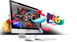
After reading “What is Graphic Design” I got to learn about all different types of designs and some intrigued me more than others. The two designs that excited me were Motion Design & Brand Design. Below I explain what intrigued me most regarding these two different designs. As well as some links to great websites involving Motion and Brand design, and images of each type of design.
Motion Design
Regarding Motion Design, I got interested in the areas in which this design comes to play. Some of these that interested me include in film making, animation, and visual effects. It intrigues me when sound and motion come together with pictures and words to make them kind of, come alive, and pop. This is a type of design that I find to be exciting because it makes it so real. My personality is very loud, outgoing and bold. This type of design seems to go well with my personality because it is so bold in itself and turns something original into something out there and different, different is a good thing.
Links: Motion Design Inspiration ~ The Latest Motion Design ~ Build Remarkable Animation 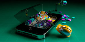

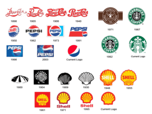
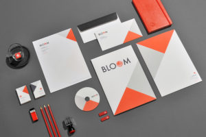
Brand Design
Brand Design excited me mostly because of what I want to do after college, which as I said was owning my own business. A huge part of owning your own business and having that business become successful is the branding of it. The biggest thing I find important about this type of design is the design of the logo for my business. As said in the chapter, the goal is to create a comfort zone for the general publicly presenting a familiar face to the name. Branding is something so cool and original, not one brand is the same to another and that just amazes me. When I own my own business I personally think the Brand Design aspects it will be one of the most exciting things to work on with a great designer.
Links: What Makes a Great Logo ~ Iconic Logo Designers ~ Logo Inspiration
![]()
Leave a Reply Cancel reply
You must be logged in to post a comment.
When we first started to watch Helvetica, I wasn’t sure what to expect. From a movie only involving one font I didn’t think there could be too much to learn.
I was wrong.
I never seemed to realize how big of a deal one typeface was, and how common Helvetica was around the world. Watching the movie, I found it fascinating how much we see Helvetica everywhere we go to the point where we are so used to it we don’t even think twice about it. I also thought it was cool that one typeface could be used almost everywhere and yet people still find a way to have their sign, billboard, or whatever else is in Helvetica, pop for customers or people to see it and be intrigued. Helvetica is one type, but that one type is used in so many ways to attract so many people. After watching this movie, i’m going to start looking around me to see all the ways Helvetica is being portrayed around me.
Below are some quotes from the film Helvetica…
“It’s not the notes its the spaces between that make the music” -Massimo Vignalli
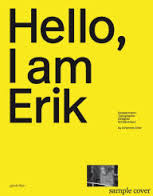
“It’s air, you know it’s just there there’s no choice you have to breathe, so you have to use Helvetica.” -Erik Spikermann

“The perfume of the city, we don’t notice it but would miss it if it wasn’t there” -Lars Muller
The reason these quotes spoke to me were because in each of them it just shows how powerful Helvetica really is to us, even us who don’t realize it. All three of these people, in different parts of the movie explain Helvetica as something so normal, and basic, but something that can’t be taken away. If Helvetica was changed to a different type face, the world would notice, and things could be effected. It just goes to show, how important typeface really is.
More work from the above designers…
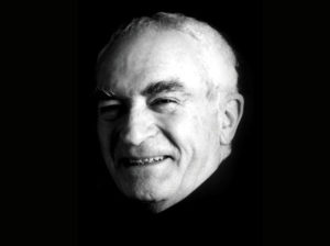
Massimo Vignalli
Erik Spikermann
Lars Muller
-
-
Classroom
-
Recent Comments
- Matthew Rakowski on Framing/Grids Reading
- Laura Romaniello on Framing/Grids Reading
- Madeline Gaskill on Framing/Grids Reading
- Anna Heindl on Framing/Grids Reading
- Maria Pallozzi on Framing/Grids Reading
- Emily Perry on Framing/Grids Reading
- Rachel White on Framing/Grids Reading
Categories
-
About
KSC Graphic Design

Leave a Reply
You must be logged in to post a comment.