- Ê
- Â
fMatthew Rakowski has 6 post(s)
Zoo Name: San Diego Zoo
Zoo Address: 2920 Zoo Dr, San Diego, CA 92101
Zoo Hours: M–Sat: 9AM – 6PM Sun: 9AM – 7PM
Event Date and Time: April 20, 2017 from 1PM – 3PM
Speaker: Dr. Anand B. Karnad
Inside the World of Venom With Dr. Anand B. Karnad
Join Dr. Anand B. Karnad as we prepare to dive into the world of venomous and non-venomous scorpions. You will even get the chance to touch and hold a non-venomous scorpion!
Prior to these videos and articles, I was one of the many people today who had no idea what kind of stuff goes on behind the scenes in a dark room. Sure, I have gotten a disposable camera and had someone at the local pharmacy develop them for me but I never knew what they were actually doing. After viewing the video about Jerry Uelsmann, it made me have a much higher appreciation for all of the work that we do on the computer. Now a days if you want something to be photoshopped you can download one of the thousands of simplistic photoshop apps the world has to offer. In this video he takes us through the process of what it takes to “edit” or produce a photo in a dark room. This process is lengthy and can be time consuming, but if we wanted to do this same process today, we could simply use a computer program. In the articles that we were given, they went over how people made photos look edited without actually using a computer. I think that these other articles were very eye-opening because prior to seeing these I just thought that people did not edit photos in the old days. Seeing that it was possible back then with what they have made me realize that anything I set my mind can be achieved, especially given the resources we have today.
Disoriented-
To turn from the east; to cause to ‘lose one’s bearings’; to put out, disconcert, embarrass.
This French word has to do with direction, or a lack there of. While I did not know that it was French, I knew that it had to do with not knowing where you were or the direction you were facing.
Caffeine-
A vegetable alkaloid crystallizing in white silky needles, found in the leaves and seeds of the coffee and tea plants, the leaves of guarana, maté, etc.
Because I am not an avid coffee drinker, I knew near nothing about the word caffeine other than it is what most people rely on to get their day going.
Bubbling-
The action of the verb bubble v.; the process of forming bubbles, rising in bubbles, etc.
Almost everyone can image what it looks like when you pour a soda into an ice-filled cup. It is a satisfying, eye-pleasing sight that should be fun to show through illustrator.
Gumfiate-
To cause to swell; to puff up
This word comes from a Scottish decent, and means to swell or puff up. To display this word I will have to involve some sort of swelling or puffing.
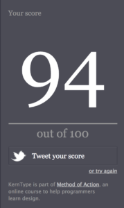
After taking the Kern Quiz many, many times, the final grade that I decided to use was a 94. Although it took me a while to obtain a score like this, I though the quiz was very eye-opening on how my skills of kerning were. I really liked that this quiz gave you the opportunity to manually do it. For me the words that I struggled with the most was xylophone and yvess. I’m not exactly sure what about these two words made me struggle so much but I continued to struggle with these two words. Overall, I enjoyed this quiz and think this helped a lot.
HELVETICA
Helvetica is one of the most used typefaces in the world. To me, there was no better font to make a documentary about. Prior to watching the film, I had never thought about how often Helvetica is used in my daily life. Some of the most popular brands such as Toyota, Jeep, and American Airlines have mad an everlasting imprint in our minds of their logos by using arguably the most simplistic font available on any given computer. The film “Helvetica” was a very interesting film in my eyes. This typeface is everywhere around me and I had no idea. I thought that the film was very intriguing because it dove down to show the deeper meaning behind the font itself and its many uses. I believe that there were some parts of the film that could have been made more interesting by not dragging on as long but overall, the film “Helvetica” was one of the most interesting, eye-opening documentaries I have ever seen.
Quote #1: “If you want to say something, say nothing” -Massimo Vignelli
During the film, this was one of the quotes that caught my attention. This quote, the first time you read it, seems very foolish and does not make much sense. To understand this quote you need to analyze it further than what is on the surface. Once you go deeper down into the quote, what Vignelli is saying is that sometimes being simplistic tells the story better than if you try to make things too complicated. For example if the company “Target” had used a font other than that of Helvetica, many people may not have been drawn to their company as they would because they used Helvetica. I believe that this quote applies to many things in the way that sometimes less is more.


Quote #2: “Type is saying things to us all the time. Typefaces express a mood, an atmosphere. They give words a certain coloring.” -Rick Poynor
This quote was also able to catch my eye because it is very true. Everyday, we are mesmerized by the different typefaces that we see everyday without even knowing it. For example, if you are in the mall and you see an ad for a new pair of Nike sneakers and later that day you are thinking about the swirly font that they used when advertising, that is typefaces effect on you. Typefaces have the ability to create an impression on us and change our mood towards a company and this is what this quote is saying.


Quote #3: “The meaning is in the content of the text and not in the typeface, and that is why we loved Helvetica very much.” -Wim Crouwel
The context of this quote is very meaningful. What Wim is saying is that we stress too much about the typeface that is used and worry not enough about what is being said. If the message within any given graphic or title is meaningful enough it will be memorable; and the typeface does not matter. I think this quote is important because it is all about the message, not the typeface.


What is graphic design?
Going into high school, I never thought that I would find my myself taking any graphic design courses. At my high school, they are some of the more popular classes we had to offer. Regardless of popularity, these classes never caught my attention until I was short a credit in my schedule. I decided to take Graphic Design 1 and I truthfully did not know what to expect. As someone who is a film major, I would definitely consider myself a visual learner. At first I thought that my graphics class was going to be challenging; however, it turned out to be one of the most fun and easy classes I took my senior year. Near the end of the last semester, I had to decide what classes I wanted to take. My friend had asked me a few times before to help with their Graphic Design homework and so I used my knowledge that I had obtained in high school to help them out. At this time I realized that I still had an interest in graphic design. I hope to use everything I learn in this class to help out with my film career. Advertising and branding are a very important part of film making and by taking this class, I can advance my knowledge and help my artistic ability and my film career. The two types of design in which I am most interested are in are Brand and Identity Design and Signage Design. These two types of design catch my eye for different reasons and both are very important in the graphic design field.
Brand and Identity Design:
Every single brand has its own specific identity that they use in order to define how people see their brand. Every company works very hard to create a logo that will forever last in the mind of its customers. When people hear the word apple, their minds have diverted to thinking of the bright white logo that is found in the multiple apple products that they have within their house. Brand and identity design interests me because as someone who hopes to make a big name for myself, eventually I will need to create some sort of logo and/or branding label for myself.
While making a logo for anything, you need to make sure that it is pleasing to the eye and memorable. This type of graphic design also interests me because I believe that it is crazy how a single designer can leave such a long lasting impression on a person. For example, if someone says the letters I, B, and M, I don’t think of a random set of letters, I think one of the most popular computer hardware companies around. Branding and identity design within a company can make or break any given company which is why I hope that I can use this class in order to learn how brand and identity design will advance any company which i will be a proud part of.
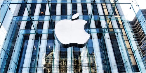


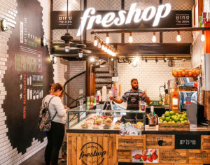
The photos above show examples of brand identity design.
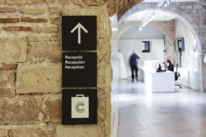
Signage Design:
Signage design interests me in multiple different ways. Signage design is one of the most simplistic yet so complex ways to get information to a reader or viewer. Combined with my interest in brand and identity design, I believe that these two types of design can come together and ultimately help not only major companies but small businesses as well. This is because small businesses often times have little to know way of getting their business off the ground because of financial issues or lack of resources. When designing a sign, whether it is for a big-name company or a local, small business, how you present it matters greatly.
Signage design is a type of design that is most always overlooked by the general public because of how subtle it is. When walking down the street you notice a sign for a new pair of Adidas sneakers. Soon after seeing that sign you see a sign that is for a new pair of Nike sneakers. You decide that you want to go back and look at the Adidas shoes. While Nike may be atop the sportswear industry, Adidas could have used bette signage design in order to get your attention better than that of Nike. Every day people pass by hundreds, if not thousands, of signs, all of which have been strategically designed by someone along the way. This type of design interests me because I believe that there is a lot more than meets the eye when you walk past any given sign and I will use this class to help expand my knowledge in the field of signage design but help me with personal/business branding in the process.
Leave a Reply Cancel reply
You must be logged in to post a comment.
-
-
Classroom
-
Recent Comments
- Matthew Rakowski on Framing/Grids Reading
- Laura Romaniello on Framing/Grids Reading
- Madeline Gaskill on Framing/Grids Reading
- Anna Heindl on Framing/Grids Reading
- Maria Pallozzi on Framing/Grids Reading
- Emily Perry on Framing/Grids Reading
- Rachel White on Framing/Grids Reading
Categories
-
About
KSC Graphic Design

Leave a Reply
You must be logged in to post a comment.