• Ê
  • Â

í Assignments

í Wiro Binding Tutorial

Please watch this tutorial to learn how to bind your final process book.


b Add comment    

Leave a Reply

í Final Portfolio Book

processbook

Get it together

Design a 6″x6″ book that contains the final designs all of your projects. The book will proceed chronologically featuring the following:

  1. Cover & Title Page – A dynamic new design using elements or design projects with the following text: Graphic Design Process/ Keene State College / Spring 2017 / [your name]. Must use one of the five classic typefaces.
  2. Project Titles – An interstitial page for each project. All project titles must be visually similar in typeface, color and complexity/simplicity.
  3. Project Pages – examples of each project at 100% bleeding off the page. Each composition must be set in facing pages to the others. Choose works that compliment and contrast each other for each spread.
  4. Written Response – 300-400 words on the last recto page that describes how your perspective on graphic design has changed over the course of the semester. Be candid and thorough in your response, citing specific projects and your response to them.

Book Contents

  1. Front Cover
  2. Title Page (Graphic Design Process/Keene State College/Spring 2017/ your name)
  3. Section page + 9 Figure/Ground (all 9)
  4. Section page + 8 Expressive Words (2 of each of 4 words)
  5. Section page + 7 Image Montage (all seven)
  6. Section page + 12 Black and White Translations (all 12)
  7. Section page + 9 Best Color Translations (9 overall best)
  8. Section page + 3 Zoo Posters (vert, horiz, square )
  9. Last page right side (recto)– a written response about your experience in this class.
  10. Final Gesture – A little something to end on
  11. Back Cover

Use this inDesign template to build your book:

Download this Template for the Process Book

Dimensions: 6″ x 6″
Binding: Wiro

To print the large booklet from Redball, you must ask for:
cropmarks (when you set up your pdf file),
double-sided prints,
100%
centered on page.

To print your cover file from Redball, you must ask for:
cropmarks (when you set up your pdf file).
double-sided prints,
100%,
centered on page,
and print on coverstock.

Due at beginning of final, Tuesday, May 2

Due at the start of class:
one 6×6″ color book trimmed to size and wire-bound

b Add comment    

Leave a Reply

í End of Semester Schedule

Tuesday, April 18

Complete 08 Zoo Posters to crit onscreen in class individually. Make final changes and get prints for Thursday 4/20
Assign entire semester Digital Archive of all pdf files due for final exam.
Assign Portfolio Booklet due at final exam.


Thursday, April 20

Three Zoo Posters Due at Beginning of Class trimmed and ready to critique.
Pre-crit of Portfolio Booklet layout 


Tuesday, April 25

Pre-Crit of Portfolio Booklet layout
Must have at least two different cover concepts (not versions) and interstitial pages for each section done


Thursday, April 27

Portfolio Book Covers printed.

Guillotine Workshop in Class

Final-crit of Portfolio Booklet. Export with imposed pages for binding as a pdf. Double sided with cropmarks color prints done for following Tuesday.

Wiro Binding Workshop in Class


Tuesday, May 2 / Final Exam Day

Two copies of the Final version of Portfolio Booklet printed, trimmed and wire bound. Must be printed in color and wire bound by the start of class.

Optimized PDF of all project files posted to DropBox in your folder. Must be accounted for or no grade will be assigned.

b Add comment    

Leave a Reply

B Framing/Grids Reading

Read about Framing and Grids and comment to this page by Sunday, April 9th at 9pm.

What is your perspective on the idea of the frame influencing how something is seen? Can you compare this idea to your personal experience? How does language ‘frame’ things? How about window and doors — both metaphoric and the literal?

Graphic Design: The New Basics — Framing & Grids

b 8    

8 responses to “Framing/Grids Reading”

  1. Eliza Joseph says:

    I agree that a frame sets off a work of art from its surroundings. In my experience, pictures hanging on walls always look better when framed because it makes them stand out more and attract attention. However, I always prefer the modern design of bleeds when creating a poster for instance, than having a boarder around the page. Often times, small white boarders around a page appear messy because it is difficult to trim the page perfectly and the uneven white boarder throws off the design’s aesthetic.
    The language used to communicate an idea can ‘frame’ how it is interpreted by choosing specific words that connote meanings. These carefully chosen words can produce an emotional response in the listener and change their own understandings or opinions.
    Many sky rise buildings use a grid pattern with glass or metal plated buildings to provide organization, structure, and a modern appearance to their look. The article contrasts this look which appears democratic, to the look of a classical building with a strong entrance instead being the main focus. The door then becomes the focal point and everything else seems lesser than as opposed to a glass gridded building which lacks a main focal point and thus makes the entire building seem equally intriguing to look at. I enjoyed this comparison, for I was able to connect it to my own experiences of being in the city.

  2. Rachel White says:

    Frames help to shape the entire picture, and put emphasis on the certain aspects that the artists feels are most important. I feel that framing allows for an artist or designer to mold their works and catch the attention of a viewer. While a frame is usually interpreted as a border, but it can also be witnessed in bleeding and cropped images on a page. The full bleeding on a poster allows for it to stand out in public, full bleeds on a work also create a large effect of the image than it may have had without the full bleed. I believe that language can have this type of frame too in the way that words are emphasized. If theres a large amount of pronunciation on a certain word, its framed and made more relevant and important to the conversation. This can also influence the way that the words are interpreted and what emotions are going along with them. Windows and doors also create a sense of framing between the inside world and the outside world. A window is usually placed in an aesthetically pleasing place, and then the outside world is shaped around the window so that whatever it looks out onto is also pleasing to the eye. As for doors, they’re placed in welcoming and open areas to allow for the building to be open to the public, or closed off completely, but they make a statement about the building. Framing takes on multiple aspects in the world and can be important in the way we view many things.

  3. Emily Perry says:

    Frames are an effective way to highlight an image or text in pieces of design, however, I personally appreciate the minimalist look of eliminating frames. However, reading this text has allowed me to become more open to the idea of using frames in my designs. I thought it was really interesting the way the ornaments on the Villa Borghese framed the windows and doors. The ornaments create symmetry and highlight the most important parts of the building, the windows and doors. The effective use of frames in architecture is a good example of how graphic designers can use frames in their designs. This reading also made me consider using grids to layout elements in my designs.

  4. Maria Pallozzi says:

    Framing is important in my opinion when presenting artwork because it creates a focus in the surrounding area. Having black or white trims on the piece could also be a frame if you want to have minimalist framing. I can relate to this article because I use framing on social media to make my picture or artwork the focal point and to make it look cleaner. I also aspire to be a photographer so I have to frame a picture using the things around me. Framing in a literal sense is to set boundaries and bring attention to a certain subject. In a metaphorical sense, it’s the boundaries set to bring out the main purpose to things. Windows and doors frame literally the opening to the inside of ones building. Windows and doors are like gateways to the main purpose of the building. If they are closed then obviously the inside won’t be seen, keeping them open can lead your eye to wander and look at everything and anything as a whole.

  5. Anna Heindl says:

    Frames can completely change how we interpret images and what we see in our daily lives around us. As a graphic designer it is extremely important to understand how frames change the content we see. They must be able to manipulate them to properly convey what you want to the audience. Frames can, although mainly subconsciously, give you loads of information about the type of content you are viewing; what it’s for, whether it’s serious or fun, the type of audience it’s meant to attract etc. I personally do not have any one preference for framing types, as I feel they can all situationally work best for different things. Language can be very potent as a framing device. It morphs the emotions and perceptions you get from an image. It’s placement changes how your eyes are drawn across the page and what the image means the to the person. The image can also give a different meaning and context to the text. Windows and doors metaphorically are often seen as opportunities, and physically can change the mood of the entire structure of a building. To use a window or door in a design might represent seeing into a open or closed opportunity for the viewer. In a building, to not have any windows might make someone feel trapped or claustrophobic. Big doors could make a building feel grand or fancy. Framing is all around us, and though we might not be aware of it, it is constantly changing how we think and feel about the world around us.

  6. Madeline Gaskill says:

    The idea of framing is a very interesting concept that we sometimes don’t even realize is put in front of us. I see framing as both a good and bad thing at the same time because it is something that needs to be used in the correct spot. As a film maker I always have to think of a shot being put into a certain frame while looking at the whole view all at the same time. It takes a bit of skill to learn to see something that is so large at the moment and try to condense it down into a frame to get the most information out of it at the same time. Frames bring attention to a certain area of work that wishes to be focused on. They also create a sort of condition to understand what is inside this frame as well and to focus on the image or object. The few framing examples that popped out at me were camera frames, cropping, frames with text and boarders. I can relate to the camera frames and cropping the most with my film making as said before. These are very important in this field but also text that could potentially go into a shot is a major key point in filmmaking as well. The text that is put into a shot is meant to tell the view something important that they would not have known otherwise, this is the same for posters and other layouts as well. The placement of the text is also crucial as well because if you place it in a non noticeable spot or eye catching, it can be distracting towards the artwork. Frames and boarders come in play a lot with artwork and how the artist wants to portray a feeling. The picture can bleed off taking up the whole space being isolated on the page as well. These all are very interesting to think about deeper into detail because sometimes viewers don’t notice the impact it has on the work of art.

  7. Laura Romaniello says:

    I had never really thought about how much frames surround our every day life. It was very interesting to me to read about framing in politics to influence how people interpret things. I had no idea that framing was so important to images and text, especially in graphic design. As the article states, framing is one of the most persistent, unavoidable, and infinitely variable acts performed by the graphic designer. A well-designed interface is both visible and invisible, escaping attention when not needed while shifting into focus on demand, they’re a sort of second nature. When cropping a photo or taking a picture, you are adding a frame to the element. I love that adding text to an image changes the meaning completely, whereas if the image is untouched, it is up to interpretation. Grids are a type of frame that help designers align elements in relation to others. I understand how important these are in art because the artists job is to portray a certain emotion or feeling and framing helps aid the artist in creating these emotions. It’s fun to think about because not many people notice or realize how much goes into a work of art and all of the psychological aspects that go into it.

  8. Matthew Rakowski says:

    Prior to the readings, it never occurred to me just how important frames are to the world. As a film major, I know that when shooting a shot, it is important that you frame a shot so that you convey the message you want to convey. In the world of graphic design and photography, framing is equally as important. Poor Framing can lead to too much empty space or just a photo that does not look good. Cropping is a big part of framing because cropping can change the way a person looks at a picture. In the reading, there is two pictures, one of them is of a plastic army man. The other picture is of a bouncy ball in the grass. Later in the reading there is a third picture that shows that the two other pictures were actually the same picture, just cropped so you could only see part. Just this example alone shows that cropping can change the way someone looks at a piece of work. When it comes to actual frames, every picture is different. Some pictures look better without frames whereas some pictures look better with them. I think while editing a picture or hanging a photograph or taking a picture, it is very important that you remember that framing cn change the way someone looks at it.

Leave a Reply

í Poster in InDesign

Design a poster series for a lecture about your translation animal/insect/plant.

Pick a Zoo
Your poster will be for a specific lecture at a specific zoo.

Choose a zoo that has your animal.

You must gather:

1. Full Zoo Name
2. Zoo Address
3. Zoo hours of operation
4. Time and Date of Event in the year 2017

Scholar
Find a real scholar who has written and lectured about your animal or insect or plant.

Write

The name of the lecture and the speaker

A blurb about the lecture that summarizes the subject of the talk —20-30 words.

Design

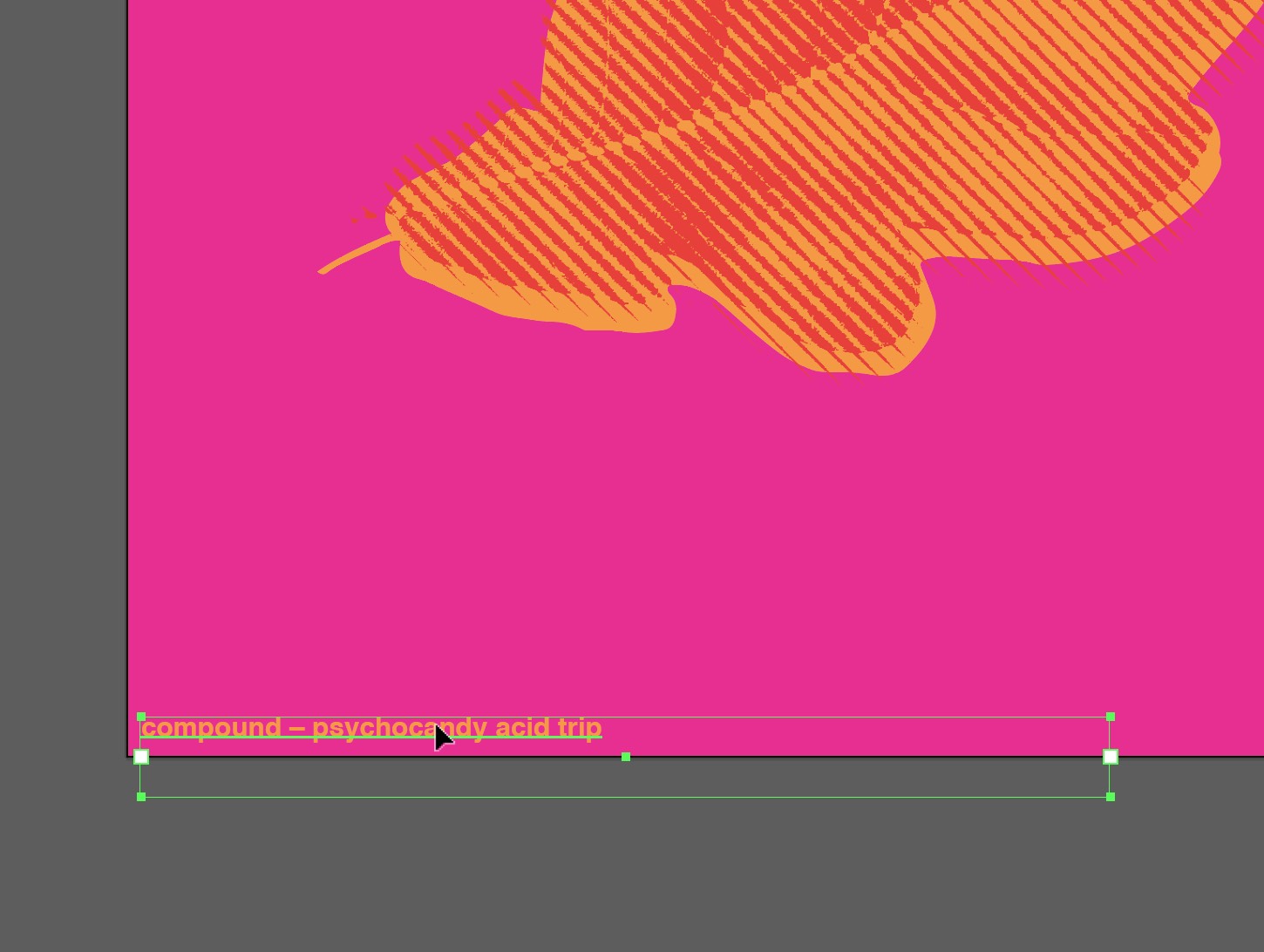
Design a poster that advertises your event. The poster must include all information about the zoo and event and the translation you choose to use from project #6.  The design should be colorful, exciting and dynamic.

The poster must include the following:

1. Information (see above)
2. Translation
3. 3 PMS Colors
4. Visual Texture: this is a background element that supports and informs the foregrounded elements. Can be abstracted, photographic, linear, translucent, etc.

Program
Adobe InDesign

Typefaces
Garamond, Baskerville, Didot, Century, or Helvetica

Colors

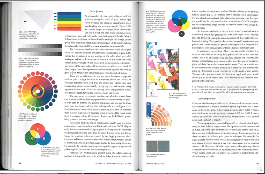
Three PMS colors from the Pantone Solid Coated collection

Dimensions
10″ x 16″ vertical, 16″ x 10″ horizontal, 10″ x 10″ square

Due Sunday, April 9 by 9pm

Blog Post
category: ‘translation poster text’

Post the complete text of your poster to the blog.
Your Name as Title, Your Zoo name, Address, Hours of Operation, Lecture name, Speaker, Blurb of subject of lecture, Date & Time

Due Tuesday, April 11

Create a 10″ x 16″ zoo poster using your text and translations.
Three colors only (tints are ok) + white
Consider overlaying translations for visual effect.
Consider your other translations tinted in the background.
No photographs.
Use only the five classic typefaces.
Let the type structure itself. Think of hierarchy of type.
Using InDesign only.
Print 11″×17″ color at Redball with crop marks and trim to size. Ready to crit on wall. Export as a PDF under the File Menu.

Due Thursday, April 13

Two other posters using all the same information.
Sizes are 16″ x 10″ horizontal and 10″x10″ square.
Use a different translation for each design.
Print 11″×17″ color at Redball with crop marks and trim to size. All three ready to crit on wall. Export as a PDF under the File Menu.

Due Tuesday, April 18

All three poster due ONSCREEN ONLY! All changes made for one last look in class. NO PRINT OUTS NEEDED!

Due Thursday, April 20

All three posters, printed, trimmed and in manilla envelope.
PDF to dropbox folder 08 Poster titled: 08_Postervertical_lastname.pdf, 08_Posterhorizontal_lastname.pdf, 08_Postersquare_lastname.pdf

b Add comment    

Leave a Reply

í Color Translations

Color can convey a mood, describe a reality, or codify information. Color serves to differentiate and connect, to highlight and to hide. — Ellen Lupton

SafariScreenSnapz027

Create a series of color schemes for your translations using the Adobe color tool.

1

Make an Adobe account to save your colors and bring them into illustrator:

Make an account here.

2

Log into the Adobe color tool site at: https://color.adobe.com
Experiment and create color schemes in the categories below:

  • Analogous
  • Monochromatic
  • Triad
  • Complimentary
  • Compound
  • Shades

Use these abbreviations to name the color themes:

  • Analogous = analog –
  • Monochrome = mono –
  • Triad = triad –
  • Complimentary = comple –
  • Compound = compo –
  • Shades = shade –
  • Custom = custom –

For example, name your colors with a prefix of the color type and a descriptive and interesting name :

  • analog – rusty nails
  • compo – scissor fight
  • comple – iguana explosion

3

Save your color schemes with playful and interesting names such as analogous – green tea diffusion, or monochrome – burnt sun desert. Look at how colors are named for paints such as Behr. Create at least one color scheme in each category to start.

SafariScreenSnapz029

4

Open Illustrator and sign in with your Adobe account in the Help menu. Your colors should appear in the “color themes” panel. Press the Refresh button to update the panel.

Adobe Illustrator CC 2015ScreenSnapz010

Adobe Illustrator CC 2015ScreenSnapz011

5

Auto-Trace your previous hand-drawn translations #2-#7 into vector art in Illustrator.

  1. Place your .psd scan onto blank page in illustrator file
  2. Convert the bitmap image into a vector drawing using “live-trace”.
  3. Select LiveTrace on top option bar-Check Image Trace Panel (this is the button inbetween Preset and View Panels)-Click on Advanced Tab-Check Ignore White–Click Expand on the top option bar under menu.
  4. This will give you a vector image that you can colorize now.
  5. #1 (your original photo) and any stippled image cannot be done this way. It requires a different technique which we will cover on Thursday in class.
  6. screen-shot-2016-10-31-at-2-53-33-pm

6

Build a new ‘color translation’ illustrator file.

  1. Create a new 6″x6″ Illustrator file and name it “last_first_color_translation.ai”.
  2. Copy your master photograph to a ‘photo’ layer for positioning.
  3. Copy more translations from your master file into it to color. Place these on a new layer.
  4. Create a 6.25 x 6.25 solid background square behind it. Make this a new layer. Start by layering two translations on top of each other. This box is slightly bigger to accommodate bleeds for accurate trimming.
  5. Be sure to position them exactly in the same place in the square. “Paste in Front” under Edit Menu will do that. (Command-F)

7

Using only two colors for images and one color for background box, create a series of color translations using each of the color types as follows:

  • 5 Different Analogous 
  • 5 Different Monochromatic
  • 5 Different Triad 
  • 5 Different Complimentary 
  • 5 Different Compound 
  • 5 Different Shades 

Use one type of translation for each set. Each set must use the same translation.

8

Make a total of 30 color translations — 5 for each type of color (analogous, complimentary, etc.) organized in illustrator and export these as one PDF.

9

Make a total of 10 more color translations — (using your #1 original photograph and #7 stipple translations) — after making them bitmaps in photoshop, then organize in your illustrator final color translations file and export these as one PDF.

  1. Open your .psd scan of original photograph #1 or stipple #7 in photoshop
  2. Convert this file into a bitmap image by choosing Image–Mode—Bitmap. If Bitmap is not available to select, then choose Greyscale first, then Bitmap.
  3. Keep dpi at 300 and do the following four example of bitmaps: 50% Threshold, Halftone Screen—Round, Halftone Screen—Line, Diffusion Dither. You can change the options for the Halftone screens only.
  4. This will give you a vector image that you can colorize now once placed in Illustrator.
  5. Place these into your final color translation file in Illustrator and do 10 more color translations using these 4 new bitmaps.

10

Put the full name of each color theme on the bottom left corner of each design. The type should be colored with the theme colors (not black or white) and set as follows:

  • font: Helvetica Bold
  • size: 7pt
  • color: according to theme
  • Sample PDF  test_leafcolor

Adobe Illustrator CC 2015ScreenSnapz014


Due Thursday, March 30th

  1. One PDF with a total of 30 color translations posted to DropBox before class. Name them as follows:
    Two-Color Translations/lastname_2color.pdf
  2. Read and comment to the Color Readings page. by Wednesday night at 6pm (If you have not already done so)
  3. NOTE: You don’t have to print these out for Thursday.

Due Thursday, April 6th

  1. One PDF with a total of 40 color translations posted to DropBox before class. Name it as follows:
    Two-Color Translations/lastname.pdf
  2. Color Prints due! 9 total. 1 choice from each of the 6 color themes=6 + 3 wildcards for a total of 9. These are cut and placed in a manila envelope, due at beginning of class.
b Add comment    

Leave a Reply

í Color Readings

acrobatscreensnapz009

Read these texts and comment about the information to these pages. What can you say about the way you use color now? How will this change the way you think about color?

Graphic Design: The New Basics by Ellen Lupton

Guide to Graphic Design: Color

Additive vs. Subtractive Color

Respond as a comment by Wednesday night March 29th at 6pm.

Share your reactions about this reading in 200-300 words.
What interested you the most about this reading? What does it make you think? What can you say about the way you use color now? How will this change the way you think about color? Articulate your thoughts clearly without regurgitating the reading.

b 10    

10 responses to “Color Readings”

  1. Emily Perry says:

    Color in Design

    Although I have always known subconsciously that color choice was important when it came to design, I did not realize how much of a science choosing and mixing colors is. Using different color groups in design allows the viewer to have an emotional reaction which ultimately controls how they view the piece. For example, the textbook reading describes neutral earth tones as quiet with strong control contrast and monochromatic blues as expressing a “no-nonsense attitude.” These readings caused me to become more interested in the psychology of color and why color makes us feel and react a certain way. I believe learning more about the psychology of color will allow my designs to become stronger.

    Although I have read and learned about Primary, Complimentary, and Secondary colors in other classes and on my own, I was unaware about analogous colors and tertiary colors. I was also surprised to learn that colors we see on screen are created by the additive color method while colors in print are created by the subtractive color method. Although I have seen the detail of RGB on a zoomed in computer screen, I had never realized zooming in to a print using CYMK would look similar in terms of the pattern of dots.

  2. Eliza Joseph says:

    In the first article, I found the claim that color is unstable very interesting. I was initially unsure about how color could be unstable, but the article explained that there are many elements that can influence and change how someone perceives a color. For example, every person has slight differences in how they see color, color can change depending on the lighting, it can change depending on what colors are around it, and the connotations of color can even shift from culture to culture. This was not something I had considered before, and it has given me a new outlook on how to use color appropriately.
    Wassily Kandinsky made another intriguing point about color that changed the way I thought about it. Kandinsky said that colors vibrate and move, creating unity and discord. For instance, a lemon-yellow color can make an observer turn away while a blue color can draw people in and give the eye some relief. I experienced this concept myself when the yellow shades were brought up on the projector and I had to look away because it was startlingly bright and hurt my eyes.
    These are just a few of the key points that I took away from these readings. I now feel more prepared to tackle the challenge of using color in visual design and I feel that I have a greater understanding of how to use it effectively.

  3. Ciara Gallagher says:

    I was interested by the idea that graphic design was seen only as something black and white at one point. The evolution of color within graphic design is very cool, as well as the style and formatting differences from generation to generation throughout time. Also the idea of colors and what they represent, and the varying meanings throughout civilizations across the world. When in Graphic Design: The New Basics talks about basic color theory, I understand this all thoroughly. I am a studio art major, and since I was a little kid taking drawing lessons, I always had a good grasp on complementary colors and analogous colors, and using the color wheel in classes at Keene help to grow my understanding of colors as well as teach me new understandings. After taking drawing classes at Keene I’ve learned about saturation, value, shade, highlight, intensity…etc. And these are all key concepts to creating a cohesive, comprehendible graphic design works. I liked to read and think about the “psychological effects of color” in Chapter 6: The Elements and Principles of form. What I really enjoyed was reading the emotions behind the colors, and reading the quote from Matisse (one of my all time favorite art masters) saying “when I paint green, it doesn’t mean grass; when I paint blue, it doesn’t mean sky.”. That is the beauty of color. Is you can even use colors that aren’t nearly related to the physical object, but gets the point across, or gets the figure across, or gesture or concept. Either way the use of color is never ending, and I find that to be utterly exciting. The way I want to think about color for graphic design, is clean clear and sharp focus, with a subtlety of softness, gestural, under your own interpretation. With my drawings and paintings for art I have to go about graphic design in a much different way. I think graphic design should be clean overall, but with art I find there is no right answer. Learning about subtractive and additive color, have one meaning overall. But the way we use these colors on screen vs. on paper are qualitatively different, and I’m excited to use color in a new way.

  4. Laura Romaniello says:

    I had always known that color plays an important role in anything created for a visual purpose, but I had not known that color was once seen as a fundamentally black and white enterprise. Back then color printing was a luxury. Nowadays, we don’t think twice about printing something in color. It is the norm to us. I find it interesting that design used to be understood as an abstract armature that underlies appearances and color was seen as subjective and unstable. The human body is an amazing machine, the way our eyes interpret how light bounces off of things which then is interpreted by our brains to output a color. Our eyes perceive color based off of pigments, brightness, and the objects around it. This makes me think more about people with color blindness, how they interpret colors based off of the reflective light that is caught in their eye.

    For the most part, I had known that color carries a specific meaning in our culture and it amazes me how much of an impact color has on the human eye and our emotions. In taking foundations of design here at Keene, I learned more about the color wheel and the different types of color systems. I had no idea there was a such thing as double complimentary and analogous colors. I just thought there was complimentary colors and that was it. I learned what colors go good with others to be visually pleasing to the eye. I also learned that instead of primary and secondary colors, there are also tertiary colors which are made up of one primary and one secondary color mixed together.

    The evolution of graphic design and the use of color astonishes me. It is so fascinating how a few different colors put together or near each other on a page can give you so many different feelings. Psychology and design definitely go hand-in-hand in terms of appearance and color. I find it so cool how color has so many different aspects that go into it such as temperature, saturation, value, and intensity. I love the idea of color in design because the possibilities are endless!

  5. Matthew Rakowski says:

    Prior to reading these articles, I knew that color choice was something of relatively high importance. However, I did not realize how important color really is and I definitely did not realize just how important it is and how much decision making should go into choosing colors. I did not know that there were such things as color systems. The only time that I had learned about colors in a prior class was in basic art classes but even then we did not do anything past the average color wheel. The only information I knew about the color wheel was the primary colors and I you mix primary colors; you get secondary colors. I never knew that different color wheels (RGB and CMYK). CMYK is a darker color scheme whereas RGB is lighter because more light is added from the original color.
    Prior to reading these articles I did not know much about color temperature. The warmer a color is the brighter the color is likely to be and if a color is cooler, the color is more likely to be darker. Because I am a film major, I work a lot with color correction. In the articles, they talk about value, saturation and hue. These articles, while they were not very long or difficult to understand, they were very helpful and they helped refresh my memory on lots of different aspects of color.

  6. Anna Heindl says:

    I have always marveled at how color works and interacts to effect our perception of things. I have noticed over time that even artists who don’t have as a developed technical skill but have a great grasp on color can still have just as popular art. Graphic designers have to choose carefully when considering colors for their designs so that they can accurately and appropriately represent the company. If the colors don’t match up well or aren’t pleasing to the eye, it can turn people away. For example, red is a common color used in palettes for restaurants because it often represents hunger subconsciously.
    One thing that did surprise me in this reading, however, was the explanation of subtractive and additive colors. I knew that it existed to an extent, but had never really knew what it meant. Pigment based colors are subtractive because they absorb more light than they reflect. When mixed, they reflect less and less light, creating black. Additive colors on the other hand, are light based colors. The more they are mixed the more light is reflected, and thus creates white instead of black like subtractive colors. I found this to be an interesting and informative bit on how color works and is perceived physically.

  7. Maria Pallozzi says:

    Color

    Color has always been a mystery to me. I know how it works and I know that some colors look good with other colors, but the science and the understanding of it always makes me stop and think. People are seeing color, but is it actually there? How do the colors look so vivid or so lifeless? Color gives off different impressions to each and every viewer. Depending on the brightness and contrast of the piece, the onlooker will either get happier vibes or more dull and depressing vibes. The readings made me think more on the meanings and science behind all colors of the universe. I am in Painting 1 and have taken Foundation Experience. In the class, we have talked about the mixing and matching of colors in our artwork, and these articles made more sense to me than just talking about them.

    I know about all the categories of color whether it be bright and vivid to dull and boring. These readings help me more on mixing, matching, and the use of the colors to bring out emotions. I will have more of an understanding while using the colors in my design classes. Primary colors are prettier than that of tertiary colors. My understanding of color, how it is printed, the creation of feelings through color, and how one looks at it on a computer compared to paper is much more clearer now.

  8. Christopher Mitchell says:

    I found this reading a very good reminder of my foundation of designs class, I took a year ago however I found this reading gave me a better understanding of how color is used within graphic design uses these methods to make signs and visual language appealing. Rather then how they are implied with studio for an example painting. Often color is token for granted with this article it shows us the science of color of how they can be used to blend and change its value and strength. Also how Certain colors side by side each other can either enhance each other. I found the readings to remind me some of the important things about color and even expended on particular color sciences I haven’t read about before. For instance the color models were like CYMK and RGB.

  9. Madeline Gaskill says:

    These readings were very enriching because they exposed me to new and different ways of how color is used. I was already aware of some of the uses of color like how color can convey different moods, reality and information. Colors are a very powerful aspect of our everyday lives that not many people actually process, but subconsciously every decision made with colors is for a reason. For example fast food restaurants make sure that their signage and menus have colors that invites us to eat and buy more, only from the usage of color. I also found it interesting in these articles that our perception of color truly depends on its pigmentation of the physical surfaces that we are looking at. The brightness and ambient lighting changes how we comprehend that sort of color. For example, my film crew and I just created a poster for our film which does not consist of many colors. We printed it in black and white and also some in color, the color print looked like it had a purplish tint to it but once we brought it out from a tungsten light and into florescent lighting the whole color changed and it looked less purple. Regardless, the color wheel provides so much contrast that designers use to their advantage to make certain things stand out or make them disappear like camouflage. Lastly, I found these articles to be very interesting and information filled with knowledge I have yet to learn more about.

  10. Julia Montecalvo says:

    I enjoyed reading these articles because there was more than just colors. Colors can set the mood of something yellow can be happy and dark red can be for something bad. Colors have shades to them like lights and darks. Its interesting looking at the color wheel seeing opposites, primary and secondary colors. You can mix colors together to make a new color or shade and show different values. This made me think about how much we use colors in our everyday lives. Something I didn’t know about was near complements. These near complements are colors I think look good together like how they looked on the coffee cup with the purple and rosy pink in the first reading. The way I use color is usually just reds and blues the simple colors. I am going to try and use different shades and try to use near complements and see what I can make . This will make me change about the way I feel about colors because there is more to colors and they can help set the tone of something and the meaning. What would the world look like if we different have color I think it would be dull and boring.

Leave a Reply

í Digital Translations

Develop your set of translations using digital processes.

Scan

Scan all hand-drawn translations. Do this as follows:

  1. Scan the translation.
  2. Save the high-contrast scan in a ‘scans’ folder with other project files.
  3. Enhance the contrast to sharp white and black contrast using ‘levels’  in PhotoShop.
  4. Save the enhanced scan as a PhotoShop file (.PSD) in a separate folder called “edited”.
  5. Use the number of the translation from the project list as the file name, Please consult the previous assignment for translation numbers.
  6. Create a new Illustrator file called “last name_translations.ai”
  7. Create art boards for each scan and place them into the file.

New Digital Translations

List of Digital Translations:

8. Curved Shapes Vector: Create a tightly translated image of the creature using all curved vector shapes (no angles).

9. Geometric Shapes vector: Use the pen tool with only corner points (just sharpe angles, no curves) to create form.

10. Triangles:  Use only triangle to create all forms and values using that shape. Do not let the shapes touch each other.

11. Abstraction: Strongly amplify and simplify the creature’s features. This must express the idea and spirit of the creature using stylistic form.

12. Your Choice: Create a new digital translation that expresses the shapes, volume, and spirit of the original image.

Due Thursday, March 23

  1. All hand drawn translation scans enhanced and placed in the illustrator file.
  2. One PDF with 12 translations all positioned in the same place and scale.
  3. Translations number 8-12 printed and trimmed to 6″x6″

Due Tuesday, March 28

  1. All hand drawn translation scans enhanced and placed in the illustrator file.
  2. One PDF with 12 revised translations all positioned in the same place and scale.
  3. All translations number 1-12 printed and trimmed to 6″x6″ in a manilla envelope.
b Add comment    

Leave a Reply

í Translations

b Add comment    

Leave a Reply