• Ê
  • Â

í Assignments

í Image Search for Translations

Homework due next Tuesday, March 7th

1. Search the web for 10-12 images of a living creature from the natural world whose body is completely within the frame of the photograph. This includes non-human creatures such as mammals, fish, birds, plants, anything…perhaps with the exception of bacteria which are a bit small.
2. The image must be at least 1000 pixels in height, width or both.
3. This image must be completely discernible from the background (or have a white background). Do not choose celebrities or other syndicated consumer imagery. The image should be raw.

Please bring assorted sizes of black sharpies to class as well.

b Add comment    

Leave a Reply

í Montage

“The minute you pick up a camera you begin to lie or tell your own truth.”
—Richard Alvedon

“Fiction is the lie through which we tell the truth.” ― Albert Camus


Montage is the technique of producing a new composite whole from fragments of pictures, text, or music. Your task is to combine images in intriguing and fantastic ways using PhotoShop to create impossible realities of your now imagination.

Montage Categories

Create 7 montages by combining 2 or more images to create surprising, intriguing, and delightful images.


1

You: Do a self portrait that expresses a hidden aspect of your personality

2

Impossible Texture: Add an incongruous texture to an object or person

3

The Future: Create an image of what you think the future will be

4

Surreal Environment: Using shifts of scale and surprising combinations create an intriguing and delightful environment

5

Theme: Invent a theme and create an montage to communicate it.

6 & 7

Do two more montages based on issues such as politics, race, gender, drugs, etc. The montage must depict an editorial position. It must convey an idea that projects an opinion or perspective.

Dimensions: 6″ x 6″
Color: Black and White


Explore

Faking It: Manipulated Photography Before Photoshop

Before Photoshop Even Existed

Incredible Manipulated Photography Before Photoshop

Tutorial

“A photographic montage is the the explicit manifestation of the implicit fiction that is photography.”
― Gerry Cox


Due Thursday, February 23

  1. Self portrait & texture montages printed, trimmed and ready to critique
  2. At least one other montage in process as a PSD. Save your files as psd formats.
  3. Blog Post in response to readings and videos. Category = “photomontage”

Due Tuesday, February 28

  1. Completed first 5 montages of the 6×6 project on DropBox in your 05 folder. Do a  SAVE AS and make them into pdf files. Title them: 05_Self Portrait_lastname.pdf, 05_Texture_lastname.pdf, 05_Future_lastname.pdf, 05_Surreal_lastname.pdf, 05_Theme_lastname.pdf.
  2. All 5 montages need to be ready to crit on screen only. DO NOT PRINT out. All Montages must be 6″ x 6″. If they are not then resize them. All Montages need to be in black and white only.

Due Thursday, March 2

  1. Completed last two montages (6&7) of the 6×6 project on DropBox in your 05 folder. Do a  SAVE AS and make them into pdf files. Title them according to whichever topic you choose to depict, for example: 05_issues_lastname.pdf, 05_issues2_lastname.pdf, etc.
  2. Both 6&7 montages need to be ready to crit on screen only. DO NOT PRINT out. All Montages must be 6″ x 6″. If they are not then resize them. All Montages need to be in black and white only.

Due Tuesday, March 7

  1. All Completed 7 montages of the 6×6 project on DropBox in your 05 folder. Do a  SAVE AS and make them into pdf files.
  2. All montages printed, trimmed and ready to critique in an envelope. All Montages need to be in black and white only and 6×6 in size.
b Add comment    

Leave a Reply

í 6 x 6

This assignment will be a scavenger hunt.

6x6

There is a great tradition of foraging amongst designers. Mining visual inspirations is a form of research, the resulting collection becomes a catalog of available languages in use out there in the world. A specimen in the collection might represent a category of beauty, elegance, ugliness, goofiness, etc.; an historical or a cultural moment; a personal sentiment or an in-joke. Graphic Design is intimately connected with collecting – it often requires the selective arrangement of existing materials – typefaces, photographs, symbols, formats, images. In many ways, Design is a process of hunting, gathering and ordering of parts.

Collect 6 photographs of each of the 6 categories listed below. 

Select strong photographs with good contrast work best. Don’t over-intellectualize your selections, the range of representation is more important than the actual items, but choose images you like – you will be using them for a few weeks.

Categories:

01 Living Things

  • animals, insects, fish, birds
  • objects smaller than a breadbox
  • food
  • body part or person doing something
  • building
  • etc.

02 People

  • Babies
  • Nudity
  • Hair
  • Hands
  • authority figure
  • Eyes
  • Full Person
  • Face
  • Teeth
  • etc.

03 Objects

  • Tools
  • Clothes
  • Houses
  • Religious Symbol
  • Radios, TV, or Computers
  • Vehicles
  • etc.

04 Natural

  • Fire
  • Moon
  • Clouds
  • Forest
  • Water
  • etc.

05 Places

  • Roads
  • Schools
  • Walls
  • Bathroom
  • etc.

06 Themes

  • Death
  • machines
  • Food
  • Demons
  • Marriage
  • Flight
  • Business
  • Places
  • Mountains
  • etc.

Photographs only

Choose only pure, unedited photographs. Do not select images that have been photoshopped already, illustrations, 3D rendered scenes, or other artwork. It is important that you are the one doing the artistry. You may also shoot or use your own photography for this assignment.

Name your images as follows:

  • gendron_people_01.jpg
  • gendron_people_02.jpg
  • gendron_people_03.jpg
  • gendron_people_04.jpg
  • gendron_people_05.jpg
  • gendron_people_06.jpg
  • gendron_natural_01.jpg
  • gendron_natural_02.jpg
  • etc.

Place 36 images in a folder called “6×6” in your “05_Montage” folder on DropBox

Due Tuesday, February 21st

b Add comment    

Leave a Reply

í Coin a New Word

Read and Respond to this post as a comment. List three words you wish were words and why.

Due Sunday, February 19, 2016 by 6pm


b 15    

15 responses to “Coin a New Word”

  1. Ciara Gallagher says:

    “oot” : meaning whoops or oh no. example, “OOT! I forgot about my essay due tomorrow”.

    “hattitude” : a hateful attitude.

    “nonversation” : small talk/ pointless conversation.

  2. Kyle Johnson says:

    1.) “HANGRY” : (adj.) describing someone as hungry and miserable at the same time, usually making them very miserable.

    I wish this was a word because I often find myself being both hungry and miserable, so a word describing the two would fit perfectly in my life.

    2.) “AWKLENCE”: (noun) extreme awkward silence between two or more people, causing people to be uncomfortable.

    I wish this was a word because often times in my life I find myself having awkward silence during a conversation with another person.

    3.) “FOODMOTION”: (noun) the state of being in love with food, having strong emotions for food.

    I wish this was a word because I love food so much and it plays a big part in my daily life.

  3. Emily Perry says:

    “Geekin” : Laughing hard for an extensive period of time

    This is a term my friends and I use a lot when one of us can’t stop laughing over something. I think this would be a useful word because I often find myself laughing longer than I should.

    “Foodbaby”: The enlargement of the stomach after consuming lots of food

    This is a term I have heard many people use after feeling full and I think it should be a word because it accurately describes how you feel after eating too much

    “Carcolepsy”: A condition where the passenger in a vehicle falls asleep as soon as the vehicle starts moving.

    I think this would be a useful word to describe me because I am someone who falls asleep in the car often.

  4. Eliza Joseph says:

    “Caraoke” (verb) – to sing loudly and often badly while driving in a car

    I always sing in the car even though I am not the best singer. I call it caraoke.

    “Confuzzled” (verb) – to be confused

    I’m not sure how this happened but my friends and I often say “I am confuzsled” instead of “I am confused.”

    “Riboflabbin” (noun) – the fat attached to a peice of meet

    I always take the fatty part of steak off and it’s much more fun to call it riboflabbin.

  5. Madeline Gaskill says:

    “Squoze”: Past tense to squeeze something or someone
    I wish this was a word because it sounds like an actual word that’d you’d use after you gave someone a big hug.

    “Hecka”: Slang for extremely or very
    My friend uses this to describe something that he likes a lot or thinks in cool

    “Merp”: Describing a feeling of awkwardness
    I feel that in a conversation sometimes it can get uncomfortable and you feel this way

  6. Maria Pallozzi says:

    “D’Angeloed”: (adj.) When someone is intoxicated.
    I wish it was a word because it means you are toasty and well off for the night.

    “Bimple”: (noun) Back dimples.
    I wish it was a word because its fun to say.

    “Yish”: (adj.)
    simply means yes

  7. Anna Heindl says:

    1. Dovorntle- When a book uses so much detail to describe something that you can no longer create an accurate image in your head of what you should be imagining.

    Unfortunately, this happens often enough for me that it needs a word.

    2. Shmwoop- The last bits of unwanted cereal, when they are too soggy to eat

    This is a relevant, constantly occurring morning event for me and it needs a word.

    3. Pinecha- The satisfying crunch made specifically by fallen pinecones when they are stepped on.

    Who doesn’t love stepping on pinecones for the crunch? It needed its own word.

  8. Kaylie Petrillo says:

    Cellfish- someone who is being inconsiderate and constantly sits on their phone when with others.

    Many people are obsessed with their phones and never get off them. A way to describe this is being cellfish (cell phone/selfish)

    Hangry- Being angry because you are hungry .

    I use this word a lot and I think a lot of other people do as well. A lot of people tend to get very cranky when they haven’t eaten and this is a perfect word to describe that.

    Hiberdating- When a person ignores their friends and or family after getting a boyfriend or girlfriend.

    A lot of people get into relationships and then fall off the face of the earth for a while. Hiberdating explains this well since eventually they come back around again its like they were hibernating.

  9. Julia Montecalvo says:

    Hangry: when you are so hungry that your lack of food causes you to become angry, frustrated or both.
    -I get angry when I’m hungry and sometimes my mom says I’m hangry.

    Nonversation: a completely worthless conversation, wherein nothing is illuminated, explained or otherwise elaborated upon.
    – I feel when you talk to someone you don’t know you make small talk and pointless conversations.

    Foodbaby: when you eat so much, that your stomach looks pregnant.
    – every time me or my friends eat too much we always say how we have a food baby.

  10. Laura Romaniello says:

    Confuzzled- to be confused

    Shmammered- to be very, very drunk

    Betch- a more affectionate and equally sarcastic use of the word bitch

  11. Matthew Rakowski says:

    One word that I believe should be a word is confuzzled. Confuzzled is a word that means confused or puzzled, except the pronunciation is different and more fun to say. The second word i think shoud be a word is hungry. This word is a word to describe your mood when you are angry and hungry or when you are angry because you are hungry. This word should be a word because it is a common mood when someone is hungry. The third and final word that I think should be a word is meh. Meh is a word that is used to describe something that is just okay or average. This is a word that I use a lot for something that isn’t actually a word. It should be a word because it can be used to describe almost anything. A piece of food can be meh or your day can be meh. Whatever the use, it almost always works.

    • Matthew Rakowski says:

      I don’t know how to delete a comment to fix it but I am aware of the lower case I that I put by accident in my post. I just missed it when reviewing it

  12. Rachel White says:

    “Textpectation” – the anticipation felt when waiting for a reply.

    In our generation, this word is very relevant because most of the communication we experience is through text messages, direct messages, etc. It’s easy to know that most people have experienced the feeling of textpectation in this day and age.

    “Dudevorce” – when two guys end a close friendship.

    Bromance has always been a common phrase that people would use to describe two guys who have a very close friendship, so it only make sense that theres a word for when the bromance ends. I also just enjoy the word and how it sounds.

    “Askhole” – someone who always asks questions that are perceived as dumb.

    While were taught there are no dumb questions, theres always someone who asks the questions that you can’t help but judge. This word allows for a fun way to describe that person that we all know.

  13. Christopher Mitchell says:

    Refill-An inch of snow.
    (The weather channel says theres going to be 5 refills today.)

    Season- Time to do something
    (It’s library season.)
    (Are you gym season?)

    Loose-When someone is acting extremely sloppy.
    (Someone walking around in the winter time with only a t shirt and shorts on and only one shoe would be described as Loose.)

    Yammed- When something is jammed into a tight space.
    (The car was full but I was able to be yammed in)

  14. Nicholas Cocivi says:

    Yam- To forcefully do something.
    “Yam that food, we have class in 5”

    Monday- Someone you can’t stand.
    “Hitler was just another Monday”

    Townie- A person who is a native of a certain town or city. Also called locals.
    “The townies always know where the best fishing spots are”

Leave a Reply

í 04 Expressive Words

Expressive Words

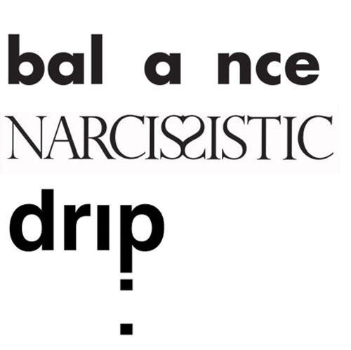
Modify a series of 4 words, one per 6″x6″ page, to express their meaning typographically.

It is said that a picture is worth a thousand words, but can one word become a picture? Graphic designers are often called to create expressive designs using only typography. Designer Ellen Lupton once wrote that “Typography is what language looks like” and your objective is to express the meaning of language using only letterforms. Using the five classic typefaces you will begin with a simple word and make the minimum changes necessary to effectively communicate the word visually.

exwords

Reread
Please take another look at  The Design and the Play by Paul Rand.

Look up your word

Before you do anything, you need to find out what these words really mean. Do not rely on your imperfect idea of what you think a word means.

  1. The Oxford English Dictionary: You will need to log in but this is the master dictionary of the English Language.
  2. Consult three different dictionaries. Read the word origins too.
  3. Look your word up in a variety of printed dictionaries as well. They have many at the library.

Create a Word Definition Post

Create a post called the name of your your words where you define the words for yourself in your own words based on your research. What did you learn about the word and its origin that you did not know already?

Use the category: “word definition”

Composition

Use the space of the frame dynamically. Create a layer that activates the tension between space and object. This usually means keeping the words smaller unless making them large is essential to the idea.

You are encouraged to place the words in different locations in the square. Where does the word communicate its idea the best? Use a variety of approaches to the designs. Do some words crop off the sides? Do all the letters fit into the space? Do letters want to overlap? Rotate? Flip?  You will choose to change the position, scale and rotation of selected letters to express them.

Rules of the game

You MAY do the following:

  1. Rotate
  2. Scale proportionally
  3. Extend off the frame
  4. Repeat letters only when necessary…

You MAY NOT:

  1. Texture words
  2. Dont stretch
  3. Cut the letters
  4. Use other typefaces
  5. Change the opacity
  6. Use outlines (solid letters only)

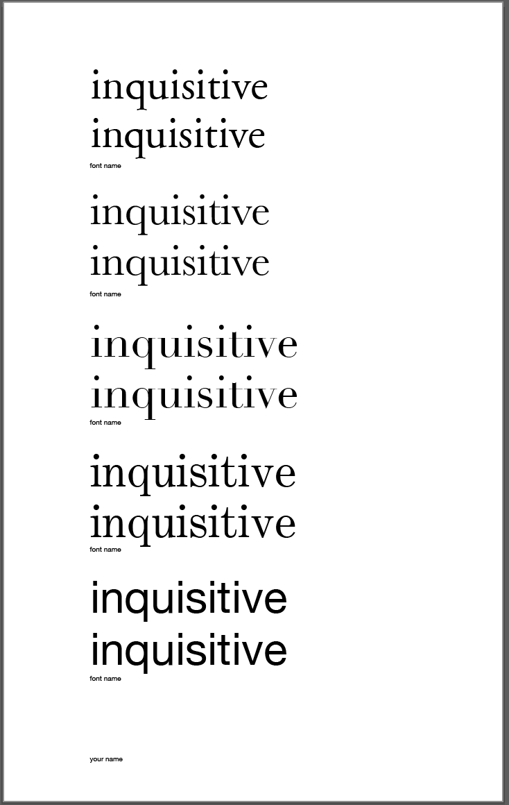
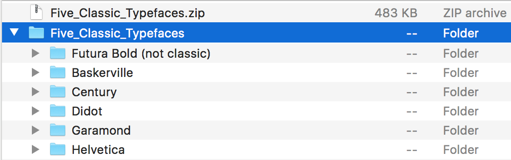
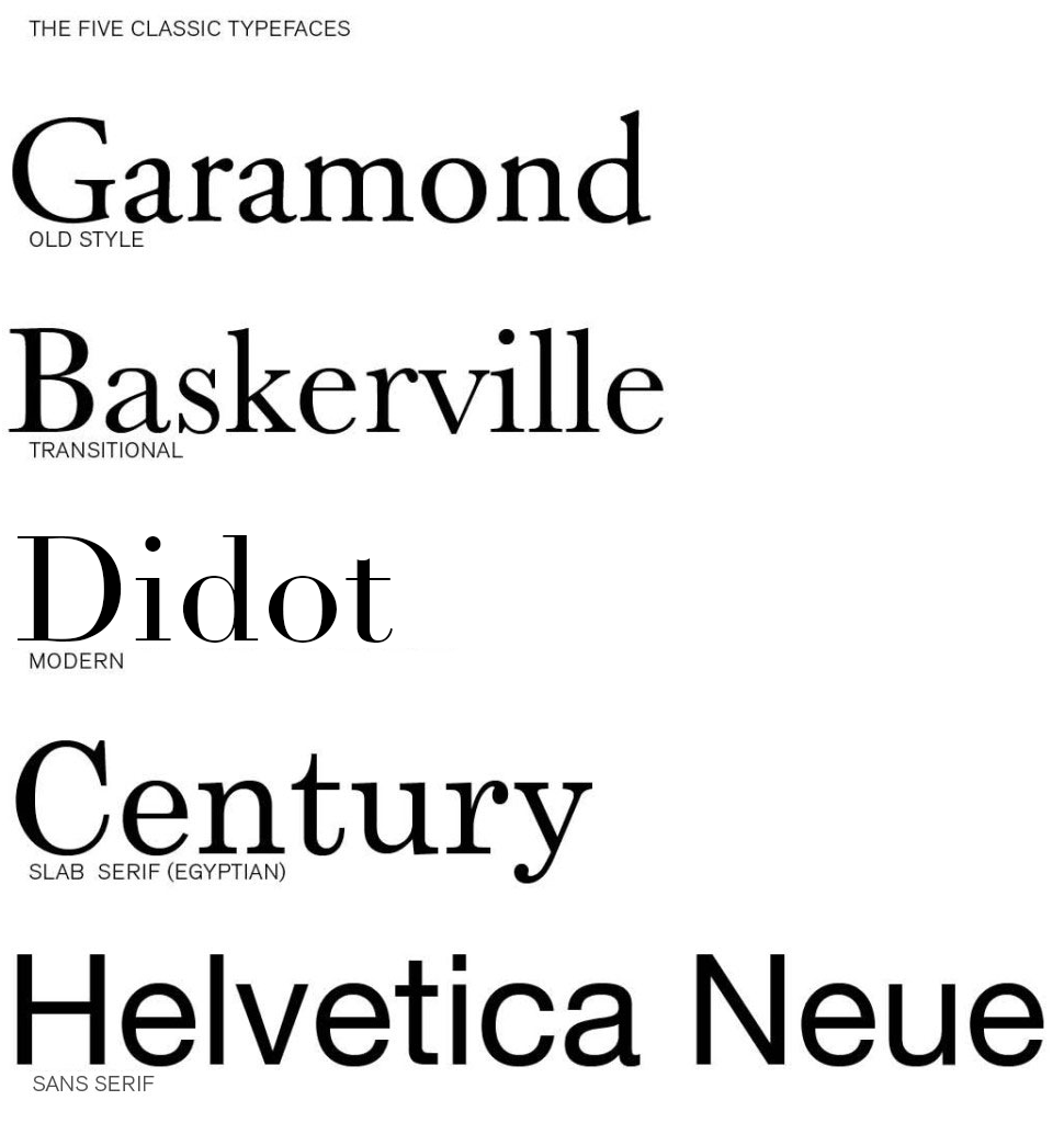
Acceptable Typefaces
You may use any typeface you want for any of your words as long as it is one of these five. You may use only the regular/book font (not bold for instance).

  • Garamond
  • Baskerville
  • Didot
  • Century
  • Helvetica

Be prepared to explain what typeface you used for which composition.

Your Words

You will work with 4 words:

  • Two from my list on this page — assigned by lottery
  • One from mind maps you create
  • One from the Compendium of Lost Words

Create three different concepts (art boards) for each word for a total of 12 designs.

The Process

  1. Using Illustrator make a 6″x6″ file.
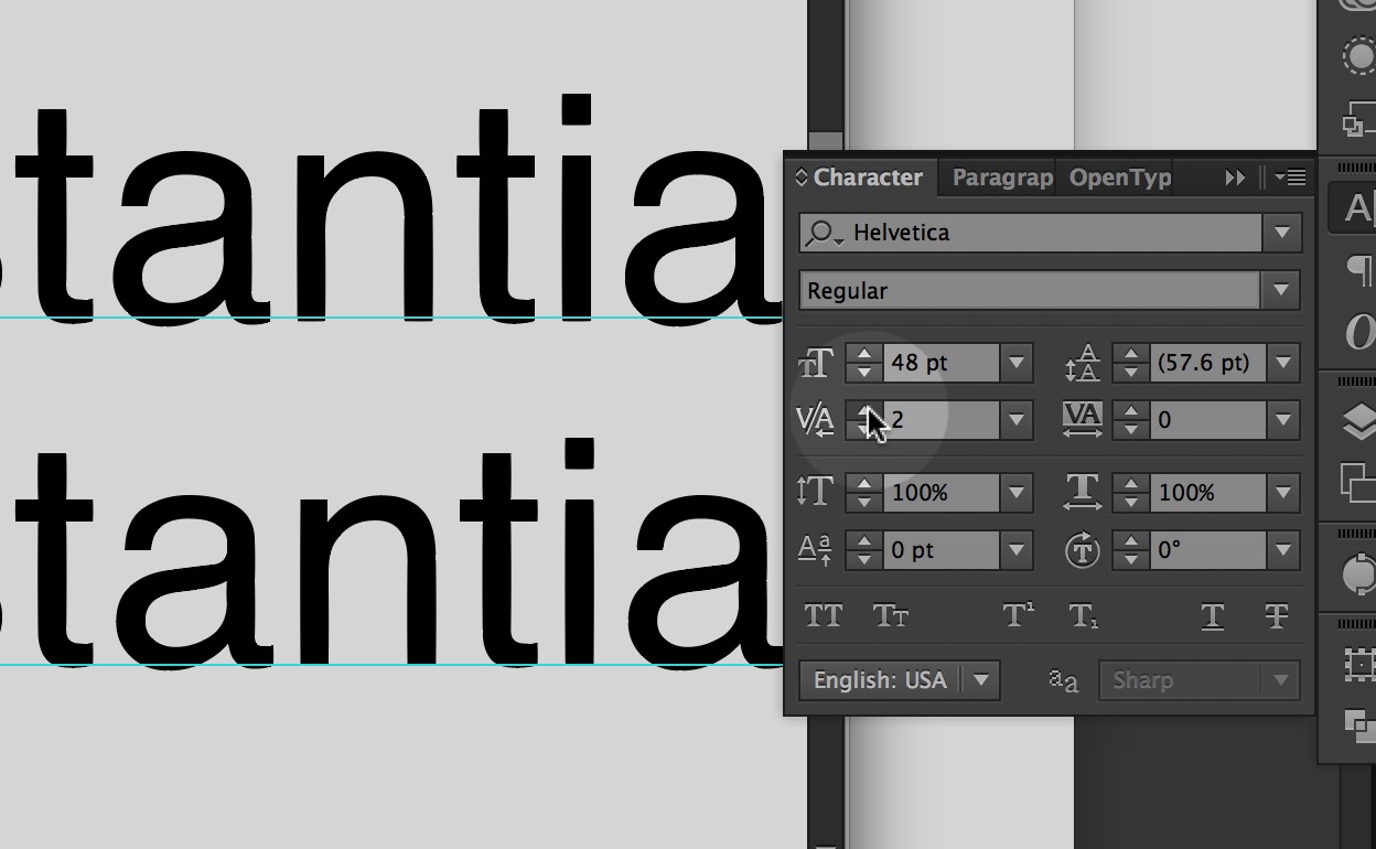
  2. Start your word in a selected typeface at 60 points.
  3. Place in the right place on the page in the correct typeface.
  4. Duplicate the artboard 2 times so you have the word + 2 copies.
  5. Change the typeface for each of the three artboards.
  6. Kern them all properly.
  7. Go to the the “Type” menu and select “Create Outlines” for each artboard.
  8. Ungroup the letters and begin working with them.
  9. Start with one change to communicate the word (scale, rotate, position). If you need more then try two changes (scale and rotate, or move two letters). Be conservative in the changes initially. Use only the graphic moves necessary to express the word.
  10. Activate the space in the composition to create a dynamic design.
  11. When you have expressed the word then move to the next artboard.
  12. Create more versions of each word than the required 3 designs to find the best solutions.
  13. Create at least three different concepts (artboards) for each of your four words for a total of 12 designs.
  14. Repeat steps 2-11 for additional three words.

1 / My List 
Assigned by lottery

    1. fright
    2. angry
    3. impulsive
    4. isolation
    5. tension
    6. energize
    7. rhythm
    8. radiant
    9. sorrow
    10. uneasy
    11. caffeine
    12. conflict
    13. scattered
    14. wander
    15. clumsy
    16. cheerful
    17. alarmed
    18. whimsical
    19. haunted
    20. overjoyed
    21. magnetic
    22. explosive
    23. surprised
    24. discombobulate
    25. splash
    26. kerplunk
    27. sizzle
    28. hiccup
    29. delightful
    30. slurp
    31. gurgle
    32. creak
    33. rebellious
    34. disoriented
    35. intrude
    36. provoke
    37. eccentric

    2 / Mind Maps

Do a mind map with a group of classmates using your assigned words on the list above as the ‘seed.’ Let your minds wander and fill the page with associations. Circle a dozen or so verbs or adjectives that have expressive potential for you. Talk to classmates and select a few words to try. Choose these words carefully. Try not to be too abstract. Is there something about those words that suggest visual solutions? Don’t be obvious such as the word ‘Fall’ (and it is only four letters).

Select one to express.

3 / Lost Words
Choose one ‘Lost Word’ from the Compendium of Lost Words and express its meaning. The class should be able to ascertain a general idea or feeling about the word from your design.

Format
6” x 6” trimmed precisely (you will be graded on the craft of cuts and precise measurement)

Color
Black and White Laser Print

Due 12 Noon Wednesday, February 15

Your word definition post

Due Thursday, February 16

PRINTED: your two best word concepts for each of your 4 words printed and trimmed
DIGITAL: three versions of each of your 4 words  — 12 compositions in a single PDF uploaded to your dropbox folder. Title them 04 Expressive Words_lastname.pdf

 Due Tuesday, February 21

All three versions of each of the 4 words printed and trimmed (12 total compositions) ready to hand in a manila envelope.
One PDF with all versions of the project uploaded to your dropbox folder. Must have at least 12 compositions (preferably more). Title them 04 Expressive Words_lastname.pdf

b Add comment    

Leave a Reply

í Kern Baby Kern!

kerning

In typography, kerning  is the process of adjusting the spacing between characters in a proportional font, usually to achieve a visually pleasing result. Observe this example of kerning. The letters have been manually fit together more harmoniously.

Assignment

You will kern three words that describe you. Do one word on each page. Each page will use all of the five classic typefaces. There will be three sheets (one of each word).

Kern it!

  1. Kern the 3 words over 5 letters in length to describe on a single vertical 11×17″ sheet of paper.
  2. The first line is un-kerned. Leave it as it is typed.
  3. The second line is the same word with letterspaces adjusted to look better.
  4. Use all 5 different sans-serif and serif typefaces for each word.
  5. Lowercase letters only.
  6. Put the name of the typeface below the image.
  7. Use this Template
  8. Use only the five classic typefaces.
  9. Print on an 11×17 piece of paper, making sure that tabloid is chosen under size.

kernfive

Read the following…

Kerning In Practice: Beware Odd Letter Spacing

A Beginner’s Guide to Kerning Like a Designer

 Use this online tool to test your kerning skills 

Use the kerning tool in the Type Panel in Illustrator.

Adobe Illustrator CC 2015ScreenSnapz009

Dimensions: 10×16″ vertical
Program: Illustrator
Typeface: You may only use the five classic typefaces.
Pages: 3 sheets with 5 of the same words per sheet.

Due Thursday, February 9

  1. Your three words kerned in all five typefaces each, printed and in manilla envelope.
  2. A good picture of a poster from around KSC with bad kerning, emailed to me by midnite Wednesday 8th.
b Add comment    

Leave a Reply

í 03 Figure/Ground

fig-gro

Use  Only  Two Letters

Using only two letters create a series of dynamic typographic compositions. There are many forms these compositions can take. Experiment with large and small letters, combining similar forms, contrasting very different letter forms. Ultimately your goal is to create beautiful and dynamic form by playing with letterforms.

Download and install these typefaces.

FinderScreenSnapz001

What is flow? 

As a designer one of your jobs is to control the attention of the viewer. By the design choices you make, you guide the viewer around the page. Your compositions will naturally have a flow to them. The viewer will start looking at something on the page and their eyes will move around the composition before coming to rest on a focal point. As a designer you have some influence over this process. Create compositions that activate the gaze and delight the eye.

Objectives

Your objective with this assignment is to:

  1. Understand how shapes interact to produce foreground and background relationships.
  2. Create stable, reversible and ambiguous figure/ground compositions.
  3. Learn how to manipulate letterforms using Illustrator

Rules of the Game

  1. You may only use two letters per composition.
  2. You make only use Garamond, Baskerville, Didot, Century, Helvetica.
  3. You may only scale and rotate.
  4. Do NOT stretch any letters.
  5. Both letters must be black on a white background.
  6. All work must be printed on a laser printer
  7. All work must be trimmed to size (6″x6″)
  8. You may use UPPERCASE or lowercase or a mixture of the two.
  9. You may use only the regular (not bold) and italic fonts of your typeface.

Make 9 Compositions

Make 9 6″x 6″ preliminary compositions in Illustrator using any two letters from the six class typefaces: Futura Bold, Garamond, Baskerville, Didot, Clarendon, Helvetica. Try to use different letters for all the compositions. The purpose of the assignment is the explore the alphabet.

3 composition with a small and a large letter

  1. Garamond
  2. Baskerville
  3. Helvetica

3 compositions with small to medium sized letters

  1. Century
  2. Didot
  3. Baskerville

3 compositions with large letters

  1. Your choice of typeface
  2. Your choice of typeface
  3. Your choice of typeface

Keywords:
large / small / contrast / asymmetry  / space / drama / focus / flow

Format: 6″ x 6″ trimmed
Color: Black and White
Output: Laser (no inkjet)

Guidelines for Final Work

  1. When you print DO NOT use the “Fit to Screen” function located in the print dialog. Print 100%.
  2. Print from Acrobat if possible.

Printing with Crop Marks

Due Thursday, February 2

  1. Print 5 compositions printed on 8.5 x 11″ paper with crop marks. WE WILL TRIM IN CLASS!
  2. PDF with 9 compositions on DropBox in your your folder:
    03_Figure_Ground/lastname.pdf

Due Tuesday, February 7

  1. Print 9 compositions printed, trimmed in a manilla envelope
  2. PDF with 9 compositions on DropBox in your your folder:
    03_Figure_Ground/lastname.pdf
b Add comment    

Leave a Reply

B Type Anatomy

SafariScreenSnapz021

Read

Read this guide about identifying the parts of letter forms.

02_Type_Anatomy_Addendum

Explore these Type Anatomy Links

Type Anatomy 

Typedia

Typography Deconstructed


b Add comment    

Leave a Reply

B The Manila Envelope

manilla

1. Get a 9″ x 12″ manilla envelope. (You will likely need 3 or 4.)

2. Write the following neatly in top right corner of the front of the envelope.

3. Write your first name last name on one line.

4. Write the name of your class on the second line.

5. Write “SPRING 2017” on the third line.

7. Insert work neatly inside.

b Add comment    

Leave a Reply

í The Five Classic Typefaces

fiveclassic

Download and install these typefaces.

Explore these Links

Designing with Type 5: Identifying Typefaces

The Five Classic Typefaces | Steve Bowden: Endicott SP13

A Simple Overview of the 5 Classic Typefaces

Read them and respond as a comment to this post.

Compare two of the typefaces and explain why they are different and what informs your opinion. It is not good enough to say “I just like it”. Be specific about the type attributes. How are they the same? How are they different? How does the history of the typeface inform your opinion. For example: John Baskerville developed his typeface with thinner serifs to take advantage of the better papers and printing presses.

Due Tuesday, January 31 before class starts


b 17    

17 responses to “The Five Classic Typefaces”

  1. Ciara Gallagher says:

    Didot and century have their own styles that differ greatly even though at first glance I could only see a slight difference. Century while being more traditional was created after the modern style Didot. Century was created by Linn Benton for the printer of the Century Magazine. While Firmin Didot created the letters and was used heavily by his brother. Didot font being created in 1784 didn’t get much attention until years later. The style grew in popularity due to the want for faces with strong contrast between thick and thin, unbracketed serifs. The unbracketed serifs are similar to century’s font, while century’s font was aiming to make the font round and sturdy and heavier than most serif’s. The century font has an x-height that was bigger while didot has a smaller x-height. To me the biggest differences is the serif styles as well as while Didot font looks wide the century font looks tighter because of thickness.

  2. Laura Romaniello says:

    The two typefaces that I found most interesting in background and style were Baskerville and Garamond. Although Garamond (1561) was created much earlier than Baskerville (1757), I found the two typefaces look fairly similar. Claude Garamond was a French publisher from Paris and is known for creating the apostrophe and accent written in French. Although Garamond died in in the mid 1500’s, his typeface didn’t gain popularity until the 1600’s. It is considered one of the most ink-friendly fonts and is known for being a very legible serif typeface. It is a typical Old Style typeface with little contrast between the thicks and thins with heavily bracketed serifs. On the other hand, Baskerville is a safe medium between Old Style and Modern. As a very traditional typeface, the serifs were more sculpted with a thicker contrast between thick and thinstrokes for a more dramatic feel. John Baskerville created a paper production technique that resulted in smoother and whiter paper. Baskerville characters are wide for their x-height, are closely fitted, and have great proportions. Both Garamond and Baskerville are considered the most readable typefaces.

  3. Emily Perry says:

    The two typefaces that I can see myself using often are Garamond and Didot. Both typefaces are very different considering Didot is a modern typeface while Garamond is old style. However, it was interesting to discover that both typefaces were created in France. Claude Garamond was originally thought to have created Garamond but it has been recently discovered that it may have been Jean Jannon in 1615. Unlike Garamond, there was no question as to who created Didot. The Didot family designed and used Didot during the 18th century. Like most modern typefaces, Didot has a strong contrast between its thick and thin lines while also having unbracketed serifs. Unlike Didot, Garamond has very little contrast between thick and thin lines and does have bracketed serifs. Garamond’s capital letters are shorter than the lowercase ascenders, making the typeface easier to read. Although these fonts are very different in their designs, I think their simplicity and history makes them strong typefaces.

  4. Kaylie Petrillo says:

    Baskerville and Century were the two typefaces which I liked the best out of the five we learned about. Baskerville was created in 1757, it is a transitional typeface which means it forms a bridge between both old style and the new modern faces. This type shows great contrast between thicks and thins and is very wide and closely fitted as well. Baskerville seems to have excellent proportions and is a clear and readable type I would use everyday. Century is a font which I already use a lot but never knew the details about. It was created in 1894 by Linn Boyd Benton. This type was the first major american typeface. It was expanded on the original type Egyptian which has thick slab serifs and thick main strokes. Century is known to be refined Egyptian font. The font is very clear and legible which is why it is used by many.
    Although these two fonts were both created in different centuries they both are legible, clear, and readable and are still popular in todays world. Century has a bigger x-height than Baskerville, and Century is a bit more thick than Baskerville. Both fonts have such elegance to them that makes them so popular to this day.

  5. Rachel White says:

    The two typefaces that I enjoy the most are Didot and Garamond. By just glancing at the design, it’s difficult to tell that these two typefaces are from two different time periods, and that Garamond is considered Old Style while Didot is Modern. I wouldn’t have thought that Didot was a Modern font since it still has an elegant design style like Garamond does. It’s interesting to see that the history of the two fonts is somewhat similar as well since both were designed in France, and appear to have a few similar attributes. Looking at the two typefaces, it’s easy to see that Didot appears much darker because it’s transition between thick and thin lines is very obvious, while Garamonds transition is slight, causing the font to appear lighter. Both typefaces are easily legible and as stated before appear to be formal typefaces, but Garamond appears more formal and elegant while Didot has some characteristics that make it appear more common and as a typeface that wouldn’t be used for significantly formal reasons.It’s interesting to read about the history of these typefaces and see what they were originally used for, and it definitely makes me think of the way I choose fonts for certain things.

  6. Julia Montecalvo says:

    The two types of typefaces I seemed to like the most are Garamond and Didot. Garamond is more old style and Didot is more modern. I think these two typefaces are different because Garamond letters are bold and thick. Didot has letter that are thin and not as bold. I like how Didot looks neater and cleaner looking if you need a simple name. Garamond seems to be more noticeable and from a distance it catches the eye more than Didot would. If you look at both fonts you can see how the letters end in a thicker line and Didot ends with thinner lines. Both fonts were designed in France and have history behind them. Claude Garamond was a French publisher and type designer whose designs many modern Garamond typefaces. Firmin Didot created the letters which was then used by his brother. It was interesting researching about these two different typefaces but also looking at some similarities that they share.

  7. Eliza Joseph says:

    Helvetica and Garamond are distinctly different typefaces in many ways. Garamond is an old fashioned typeface designed by Jean Jannon in 1615. With very little difference between the thick and thin lines, heavily bracketed serifs, and oblique stress, Garamond is a unique font with open and round letters for legibility. Helvetica on the other hand is a sans serif created in Switzerland designed by Max Miedinger. This universally used typeface is tall, has condensed letters, and equal sized strokes. Both Helvetica and Garamond are easy to read, yet they have distinct characteristics.

  8. Christopher Mitchell says:

    I have decided to compare the type faces Century and old style. These to have multiple thing in common yet differ in ways for instants look, portion and creation. For example Century was made in the USA during 1894 by Linn Boyd Benton. He made it believing it would be easier to read, with a greater legality through the characteristics. Benton had a friend as the publisher of Century Magazine who was looking for something thinner and stood out. He creatively took common looking typefaces and condensed the proportions and made the letters round and sturdy. Old style was made by Claude Garamond in 1617 long before century was created 277 years later. Garamond was a french publisher from Paris, a leading type designer who had inspired contemporary typefaces like Sabon, Granjon, and Garamond. “These early roman types are characterized by curved strokes whose axis inclines to the left, and little contrast between thick and thins.” Comparing them both Century has less contrast compared to Old Style. Yet Century is more portioned. I believe that century is a better for labeling and advertising due to the spacing. While on the other hand Old Style looks better as a font because of the contrast. Old Style has more weight distribution thought letters it as been leveled out be the proportion of each letter making it easy on the years to soothing flow visually.

  9. Kyle Johnson says:

    The two types of typefaces that caught my attention the most were Baskerville and Century. Baskerville is classified as a “transitional typeface” because it was created in between the Old Style and the Modern Faces. This font shows a large contrast between the thicks and the thins, and the stress of the type is almost vertical. Created in 1757 by John Baskerville, this font still remains popular and successful to this day. Century, on the other hand, was created much later, in 1894. This was the first American typeface and was created by Linn Benton for a magazine at the time. Unlike Baskerville, century has little contrast between the thicks and the thins. Baskerville is very wide for its x-height, have nice proportions, and are fit well. However, Century’s x-height is not too big for itself, and has a very simple markup. Both of these fonts are similar because of their simplicity and legibility. Both of these typefaces have come a long way and are still very successful to this day. These are two very common fonts, and it was interesting to learn more about the background and history of each one.

  10. Jacob Whedbee says:

    The two typefaces that were most appealing to me were Century and Helvetica. Century was created for the simple purpose of being more legible, and to me there is really no better reason than that. The letters do not vary nearly as much in thickness, and I think that is what really appeals to me about this font. It is very simple, and very clean. It originated in the United States in 1894, and that is not something you hear of very often. Helvetica was the other font I chose. Particularly after watching the film I found this typeface very interesting. It originated in Switzerland in 1957 by Swiss designer Max Miedinger. Many different variants of this typeface have been released over the years, these variants include changes in weights, widths, and sizes. Helvetica is everywhere, it seems to be one of the most widely used fonts. That to me is what is interesting about it, it fits a lot of situations. Even though there could be a typeface that does a better job in a certain scenario, the fact that Helvetica can be used in so many places is very interesting to me.

  11. Matthew Rakowski says:

    The two typefaces that immediately caught my eye when reviewing these five were Didot and Helvetica. Helvetica is a sans serif font, referring to its lack of serifs meaning extra loops and curves at the end of any given letter. When this font became popular in the 20th century, it intrigued many people worldwide. Didot on the other hand is a serif font which gained popularity during the 18th century. To me, these two fonts, even while being different styles, are both so simplistic yet can be very serious. You can argue that Didot is just a Helvetica font with serifs. The two fonts interested me because of their distinct differences yet slight similarity. Both of these fonts have a modern style to them which is why they are easy to read. These fonts are used daily because of their versatility, simplicity and ease of use. It was these factors that also made me like these fonts and will most likely be fonts I use often throughout the year.

  12. Madeline Gaskill says:

    Comparing the two typefaces Garamond and Baskerville was interesting because they are both are very different and both have interesting histories behind them. Garamond caught my eye because it is a classic old style of typeface and it is very legible because of its little contrast between the thins and thick of each letter creating an open/round form. This particular type face also went through quite a bit of revamping over the years. Claude Garmond, the creator of this typeface was one of the leading type designers of his type and while creating it he based its design off of Angelo Vergecio’s handwriting. This was very eye catching to me because that lead me to believe that people in this time really put some time and effort into their handwriting unlike today where everyone’s looks every different and possibly sloppy. Baskerville on the other hand is a traditional yet modern serif typeface that Jon Baskerville created. He created some improvements to this typeface like between the O and Q such as making the serifs sharper and more tapered by adjusting the layers around rounded letters. This font was created to be very legible and each for people to use and read. I enjoy this font compared to Garamond because it is thinner and seems slightly easier to read. I do enjoy both of these fonts and hope to learn more about them and other fonts along the way and the history behind them.

  13. Maria Pallozzi says:

    The typefaces Garamond and Baskerville are two of my favorite fonts. They are my favorites because of their classiness and their little flare they have to give them a fancy, old- fashioned theme. They have a lot of similarities between the two, but they have just enough to make them different.
    Garamond, accredited to Claude Garamond when in recent studies possibly show Jean Jannon was the creator, is an old- style font that was designed in 1615. The easiness of reading this font comes from its openness and space between the letters. The thick and thin of the lines are spread evenly throughout the letter and shows nice subtle contrast of thickness when you notice the architecture of the letter.
    Baskerville is yet another great font created by John Baskerville in 1757. This font was a transitional font because of its breakthrough out of the old style font and into the modern font style. The font has a very elegant look to it and has a good variety of letters that have a different thickness. Baskerville created the typeface because he wanted to take advantage of the printing press and the better papers.
    They are the same in a lot of ways because they are both elegant and have fancy lettering. They have very similar bases on the letters and you can see the inspiration for Baskerville looks as though it could have originated from Garamond.

  14. Anna Heindl says:

    My two favorite fonts used out the five are garamond and didot. Garamond has little contrast in its line weight, and uses a nice, curvy style that makes it comfortable on the eyes. Didot, on the other hand, is almost the complete opposite. It has high contrasting thick and thin lines and unbracketed serifs. Garamond I mostly imagine using a font for an article, while didot I pretty much exclusively imagine as a title font. Knowing the background and purpose of the font is important when considering your opinion on it. Garamond is an old style font, where the main concern with its creation was readability. Didot, on the other hand, is a modern font, where typeface designers were more concerned with the fashionable appearance of the font. I appreciate garamond for its simplicity and readability, while at the same time I appreciate didot for its more stylish and dramatic appearance.

  15. Savanna Rovazzini says:

    The two typefaces I am most familiar with are Garamond and Helvetica. When writing a paper I almost always am inclined to use Garamond. This is because I find the font to be proper and simple which is effective for formal writing. Simple fonts are effective for formal writing since the words do the talking instead of the font. With little personality or flare in the type, the reader can focus more on the content and meaning of the words. Helvetica however I find has a little more personality to it. The lines in the letters are more straight and blunt which can give a more bold vibe to the reader. I like this font when it is displayed as commercial items or in street signs. This is because the boldness of the font draws the reader in and makes them interested in what the content of the words are. So when dealing with street signs or other informative writing, Helvetica is a good font to use since it grabs the attention of the reader and comes across in a strong and impactful way. Garamond does not give off the same bold feeling due to it’s curlier, less aggressive letters. This results in the font being neutral and good to use for longer writing pieces such as essays or novels.

  16. Nicholas Cocivi says:

    My favorite two typefaces are, Baskerville and Didot. Baskerville is a more sophisticated typeface, it’s been around for hundreds of years, yet is timeless and because the characters are so wide apart, it makes for a very easy to read typeface. On the other hand, Didot looks more modern thanks to its combination of thick and thin lines, and has unbracketed serifs. This font was designed by a man by the name of Firmin Didot and his brother used the font in printing pressed. It’s a more fashionable font, that is classified under one of the most recent family of fonts called “Modern Typeface”. They both are very wide fonts and because of that, they are easier to read than most other fonts.

  17. Luke Sweeney says:

    The two typefaces that caught my eye the most were Didot and Helvetica. I like the look of Helvetica because of how simplistic it is and how easy it is to take in. Helvetica has very neat straight edge style that makes it very easy to read. It is very accepting to the eye compared to other typefaces. This would probably explain why it is so popular in advertisement and other forms of media today. Helveticas is a typeface of Swiss origin created in 1957 but did not become popular until the twentieth century. It became popular because of its clean readable design and style. Didot was named after the famous French printing family Didot it became popular because of its thick and thin design. What I like about this typeface is the contrast that is created by the use of thick and thin design that really makes it eye catching.

Leave a Reply