- Ê
- Â
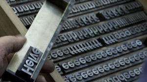
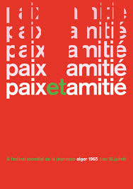
5 Helvetica Post
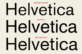
Helvetica
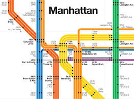
Before watching the film Helvetica, I never realized how often the typeface was actually used. The film showed logos and brand names that I never realized used Helvetica. I was especially surprised that I had never noticed that the MTA subway system in New York City used Helvetica. Having visited the city last month, I became very familiar with the subway system and found that it was surprisingly easy to use for someone like myself who did not know the city well. Massimo Vignelli’s decision to use such a simple, clean and familiar typeface like Helvetica may have contributed to how easy it made navigating the New York City subway system. This inspired me to incorporate more simple and timeless elements in my design in order to create an emotional and familiar connection to the viewer.
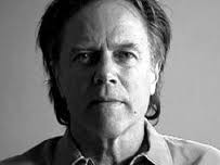
“I’m obviously a type o maniac, which is an incurable if not a mortal disease. I can’t explain it. I just love, I just like looking at type. I just get a total kick out of it: they are my friends. Other people look at bottles of wine or whatever, or, you know, girls’ bottoms. I get kicks out of looking at type. It’s a little worrying, I admit, but it’s a very nerdish thing to do.” – Erik Spiekermann
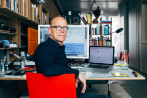
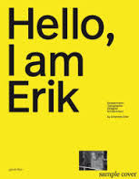
Erik Spiekermann
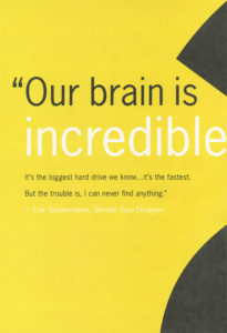
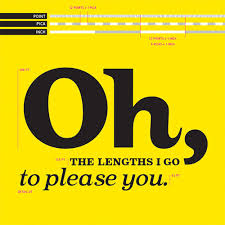
Quote and Poster by Erik Spiekermann
Poster Design by Erik Spiekermann
When I heard this quotation, I instantly related to it. Although it may be a nerdish thing to do I have always loved looking at different typefaces and their layout. Similar to Spiekermann, I have always been the person in the group to pick up a book cover or a product’s packaging to point out how interesting and clever the type or design was.
“Helvetica has almost like a perfect balance of push and pull in its letters. And that perfect balance sort of is saying to us – well it’s not sort of, it *is* saying to us don’t worry, any of the problems that you’re having, or the problems in the world, or problems getting through the subway, or finding a bathroom… all those problems aren’t going to spill over, they’ll be contained. And in fact, maybe they don’t exist.” – Leslie Savan
I remember hearing this quotation and agreeing with it very strongly after seeing all of the ways Helvetica is used in our daily lives. It is true that Helvetica often solves our problems through giving directions, helping us recognize brands, and guiding us through our tax forms. It is the ultimate typeface of problem-solving and Helvetica’s simple and clean design reassures us that everything will be okay.

Leslie Savan
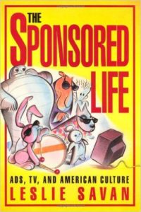
“The Sponsored Life” by Leslie Savan
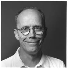
“The Swiss pay more attention to the background so that the counters and the space between characters just hold the letters. I mean you can’t imagine anything moving; it is so firm. It, not a letter that bent to shape; it’s a letter that lives in a powerful matrix of surrounding space. It’s… oh, it’s brilliant when it’s done well.” – Mike Parker
I found this quote to be rather intriguing because I think people often overlook negative and surrounding space of a typeface. When passing by a sign that uses Helvetica, all anyone does is read and move on with their day. If someone were to really look at the space surrounding the typeface they would find that the space surrounding the text is just as important. Although this may be something only designers look at it, I think it is a good habit for everyone to get into.

Mike Parker
Mike Parker “Godfather of Helvetica”

The Target logo is one of many logos that uses Mike Parker’s Helvetica.
Helvetica
I thought the movie was very informing, before I was not very aware of the history of typefaces or how it had been influenced/created. This movie moved throughout history by interviewing graphic designer and art directors from the time and their experience and lastly how this functioning art evolved.
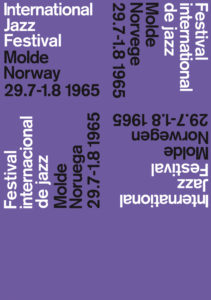
Wim Crouwel had this to say about Helvetica “The meaning is in the content of the text and not in the typeface, and that is why we loved Helvetica very much.” This is a modern, clean, clear, legible typestyle. Making it the perfect neutral typeface to use within the commercial business. This typeface was created on a grid by Max Miedinger with Eduard Hoffmann in 1957 in Switzerland.
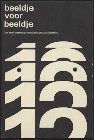
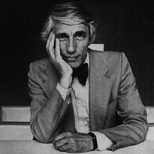
image by Wim Crouwel Wim Crouwel
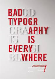
By this typeface becoming so popular and becoming the norm for the typeface in the word it had influenced graphic artist and art directors to start looking at words in a different way to provide and alternative looking typefaces. This begins a movement of artist like David Carson experimenting with design. David Carson was quoted in this movie. “Don’t confuse legality with communication just because something is legible doesn’t mean it communicates and, more important doesn’t mean it communicates the right thing” which I think perfectly describes his work. His work has a message more important then the message trying to convey within the words, he adds the emotion to the words by altering these things placement, spaces, portion, and weight.
David Carson image by: David Carson
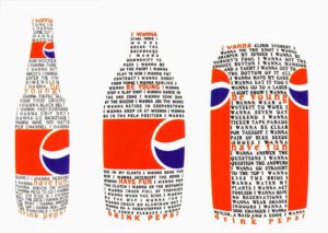
This movie also goes in-depth about Erik Spiekermann who created typefaces that used words to communicate a message in a less “grunge”/abstract style. In fact it looked more personal as he describes in this quote “A real typeface needs rhythm, needs contrast, it comes from handwriting, and that’s why I can read you’re handwriting, you can read mine” His work look like hand writing with little creative thing to give it definition of style.
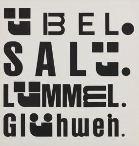
Erik Spiekermann images by: Erik Spiekermann
When we first started to watch Helvetica, I wasn’t sure what to expect. From a movie only involving one font I didn’t think there could be too much to learn.
I was wrong.
I never seemed to realize how big of a deal one typeface was, and how common Helvetica was around the world. Watching the movie, I found it fascinating how much we see Helvetica everywhere we go to the point where we are so used to it we don’t even think twice about it. I also thought it was cool that one typeface could be used almost everywhere and yet people still find a way to have their sign, billboard, or whatever else is in Helvetica, pop for customers or people to see it and be intrigued. Helvetica is one type, but that one type is used in so many ways to attract so many people. After watching this movie, i’m going to start looking around me to see all the ways Helvetica is being portrayed around me.
Below are some quotes from the film Helvetica…
“It’s not the notes its the spaces between that make the music” -Massimo Vignalli

“It’s air, you know it’s just there there’s no choice you have to breathe, so you have to use Helvetica.” -Erik Spikermann

“The perfume of the city, we don’t notice it but would miss it if it wasn’t there” -Lars Muller

The reason these quotes spoke to me were because in each of them it just shows how powerful Helvetica really is to us, even us who don’t realize it. All three of these people, in different parts of the movie explain Helvetica as something so normal, and basic, but something that can’t be taken away. If Helvetica was changed to a different type face, the world would notice, and things could be effected. It just goes to show, how important typeface really is.
More work from the above designers…
Massimo Vignalli
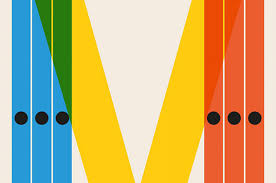
Erik Spikermann
Lars Muller
-
Classroom
-
Recent Comments
- Matthew Rakowski on Framing/Grids Reading
- Laura Romaniello on Framing/Grids Reading
- Madeline Gaskill on Framing/Grids Reading
- Anna Heindl on Framing/Grids Reading
- Maria Pallozzi on Framing/Grids Reading
- Emily Perry on Framing/Grids Reading
- Rachel White on Framing/Grids Reading
Categories
-
About
KSC Graphic Design

Leave a Reply
You must be logged in to post a comment.