Helvetica
When we first started to watch Helvetica, I wasn’t sure what to expect. From a movie only involving one font I didn’t think there could be too much to learn.
I was wrong.
I never seemed to realize how big of a deal one typeface was, and how common Helvetica was around the world. Watching the movie, I found it fascinating how much we see Helvetica everywhere we go to the point where we are so used to it we don’t even think twice about it. I also thought it was cool that one typeface could be used almost everywhere and yet people still find a way to have their sign, billboard, or whatever else is in Helvetica, pop for customers or people to see it and be intrigued. Helvetica is one type, but that one type is used in so many ways to attract so many people. After watching this movie, i’m going to start looking around me to see all the ways Helvetica is being portrayed around me.
Below are some quotes from the film Helvetica…
“It’s not the notes its the spaces between that make the music” -Massimo Vignalli

“It’s air, you know it’s just there there’s no choice you have to breathe, so you have to use Helvetica.” -Erik Spikermann

“The perfume of the city, we don’t notice it but would miss it if it wasn’t there” -Lars Muller

The reason these quotes spoke to me were because in each of them it just shows how powerful Helvetica really is to us, even us who don’t realize it. All three of these people, in different parts of the movie explain Helvetica as something so normal, and basic, but something that can’t be taken away. If Helvetica was changed to a different type face, the world would notice, and things could be effected. It just goes to show, how important typeface really is.
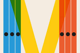
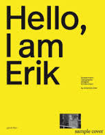
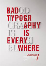
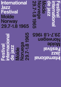
More work from the above designers…
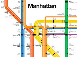
Massimo Vignalli
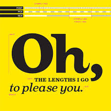
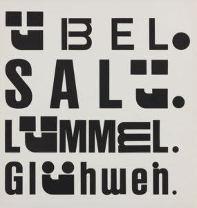
Erik Spikermann
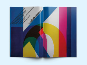
Lars Muller

Leave a Reply
You must be logged in to post a comment.