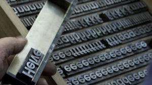
Helvetica
Helvetica
Before watching the film Helvetica, I never realized how often the typeface was actually used. The film showed logos and brand names that I never realized used Helvetica. I was especially surprised that I had never noticed that the MTA subway system in New York City used Helvetica. Having visited the city last month, I became very familiar with the subway system and found that it was surprisingly easy to use for someone like myself who did not know the city well. Massimo Vignelli’s decision to use such a simple, clean and familiar typeface like Helvetica may have contributed to how easy it made navigating the New York City subway system. This inspired me to incorporate more simple and timeless elements in my design in order to create an emotional and familiar connection to the viewer.
“I’m obviously a type o maniac, which is an incurable if not a mortal disease. I can’t explain it. I just love, I just like looking at type. I just get a total kick out of it: they are my friends. Other people look at bottles of wine or whatever, or, you know, girls’ bottoms. I get kicks out of looking at type. It’s a little worrying, I admit, but it’s a very nerdish thing to do.” – Erik Spiekermann
Erik Spiekermann
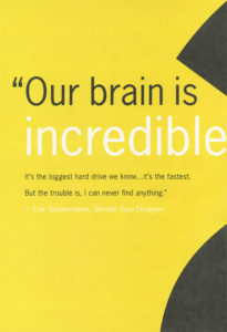
Quote and Poster by Erik Spiekermann
Poster Design by Erik Spiekermann
When I heard this quotation, I instantly related to it. Although it may be a nerdish thing to do I have always loved looking at different typefaces and their layout. Similar to Spiekermann, I have always been the person in the group to pick up a book cover or a product’s packaging to point out how interesting and clever the type or design was.
“Helvetica has almost like a perfect balance of push and pull in its letters. And that perfect balance sort of is saying to us – well it’s not sort of, it *is* saying to us don’t worry, any of the problems that you’re having, or the problems in the world, or problems getting through the subway, or finding a bathroom… all those problems aren’t going to spill over, they’ll be contained. And in fact, maybe they don’t exist.” – Leslie Savan
I remember hearing this quotation and agreeing with it very strongly after seeing all of the ways Helvetica is used in our daily lives. It is true that Helvetica often solves our problems through giving directions, helping us recognize brands, and guiding us through our tax forms. It is the ultimate typeface of problem-solving and Helvetica’s simple and clean design reassures us that everything will be okay.

Leslie Savan
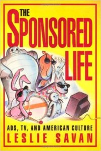
“The Sponsored Life” by Leslie Savan
“The Swiss pay more attention to the background so that the counters and the space between characters just hold the letters. I mean you can’t imagine anything moving; it is so firm. It, not a letter that bent to shape; it’s a letter that lives in a powerful matrix of surrounding space. It’s… oh, it’s brilliant when it’s done well.” – Mike Parker
I found this quote to be rather intriguing because I think people often overlook negative and surrounding space of a typeface. When passing by a sign that uses Helvetica, all anyone does is read and move on with their day. If someone were to really look at the space surrounding the typeface they would find that the space surrounding the text is just as important. Although this may be something only designers look at it, I think it is a good habit for everyone to get into.

Mike Parker
Mike Parker “Godfather of Helvetica”

The Target logo is one of many logos that uses Mike Parker’s Helvetica.

Leave a Reply
You must be logged in to post a comment.