- Ê
- Â
fMaria Pallozzi has 6 post(s)
Helvetica Thoughts and Opinions
“Helvetica,” is a movie on the typeface, Helvetica, and how it is seen everywhere you go. Multiple times throughout the movie a variety of artists continued to say that the font was everywhere and always being used for many different reasons. In my opinion, because of its repetitive agreement from all the artists saying how it was used so often, it got very old and boring. I appreciated the many people they interviewed to get their word across and see what they have to say about it, but in the end they said exactly the same thing as the one before did. I enjoyed the montages they brought into the film because it showed many examples and instances that Helvetica could be used for the public eye and for various other reasons such as advertising, packaging, promoting, etc. When Michael Place said “…ordinary things that people would just gloss over, I find very beautiful,” I can’t help but agree because it is always the small things in life that make someone feel comfortable and simple. This may be why they use it so often is for the simple reason for it being comfortable and safe. The film was certainly informative and opened my eyes a little more to see if there are any signs using the typeface, Helvetica.
“It’s air, you know. It’s just there. There’s no choice. You have to breathe, so you have to use Helvetica.”-Erik Spiekermann
This quote is great because of the metaphor he uses to describe the font. It is simple and easy to understand to any living, breathing human being.


The life of a designer is a life of fight: fight against the ugliness. Just like a doctor fights against disease. For us, visual disease is what have around, and what we try to do is to cure it, somehow, with design. –Massimo Vignelli
I like the way he describes organization and having less chaos just by using this font. Helvetica is neat and legible to read, so it is like trying to cure disorder with the typeface that demands order.


“You’re always a child of your time, and you cannot step out of that.” –Wim Crouwel
This quote made me think about the bigger picture and I thought it was very thought-provoking. It is very true how people are a product of their times and these artists happen to show it through their time with Helvetica and how people will grow up with it all around them for a very long time.
Why am I interested in Graphic Design?
Graphic Design has always been a mystery to me. For the longest time I thought art just popped up out of nowhere and was used for labels and pretty signs to entice people to look at the product. All I know is that I love seeing the designs because they are so interesting and precise. I like thinking about how these artists made the signs and how much thought went into something. I am interested in Publication and Brand and Identity Design because I enjoy the thought of people seeing my designs on products and in magazines. I enjoy promoting things to make them more popular and more memorable.
Publication Design…
is a type of Graphic Design that includes articles, magazines, newspapers, and more for different uses such as fashion, retail, travel, etc. They use a lot of photography and typography for this type of design and these are things that I am very interested in. I enjoy photography very much and happens to be the exact reason why I want to be a photographer and learn photoshop. I also love messing with different fonts and trying to make my own unique font. I love making clever slogans and making it visually appealing and thought-provoking which gives me a good idea that I may be best in Publication Design.
Eye Magazine “is the world’s most beautiful and collectable graphic design journal, published quarterly for professional designers, students and anyone interested in critical, informed writing about design and visual culture.”
Click here to open Eye Magazine webpage
YouWorkForThem “Since 2001, YouWorkForThem’s mission has been to be the world’s best source for design resources. We are privately owned and run by designers, and not subject to shareholders or bottom line.”
Click here to open YouWorkForThem webpage
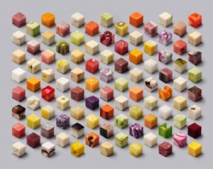
Design Envy “Dutch newspaper De Volkskrant asked Lernert & Sander to make a photograph for their documentary photography special, with the theme food. The solution was a transformation of unprocessed food into perfect cubes of 2,5 x 2,5 x 2,5 cm. A simple and clever visual input in the debate of processed vs. natural food.”
Click here to open Design Envy webpage
Brand and Identity Design…
is another type of Graphic Design I am interested in. It is for businesses that need logos, business cards, advertising, websites, etc. It uses a lot of photoshop and typography and again that is something I am interested in. I love the idea of people recognizing my logo and knowing that it was my design that people know by heart. I love looking at intricate designs and seeing unique ideas that people came up with and talked about. Thinking about the trial and error and the countless hours and examples the person had to go through to find the logo just seems so worth it in the end.
Thirst “is a communication design practice based in Chicago. We work with the design, cultural, and civic communities.”
Click here to open Thirst webpage
![]()
TED “is a nonpartisan nonprofit devoted to spreading ideas, usually in the form of short, powerful talks.”
Click here to open TED webpage
![]()
iStock “by Getty Images is one of the world’s leading stock content marketplaces, offering millions of hand-picked premium images at ridiculously low prices that you can only get from us.”
Click here to open iStock webpage

Leave a Reply Cancel reply
You must be logged in to post a comment.
-
-
Classroom
-
Recent Comments
- Matthew Rakowski on Framing/Grids Reading
- Laura Romaniello on Framing/Grids Reading
- Madeline Gaskill on Framing/Grids Reading
- Anna Heindl on Framing/Grids Reading
- Maria Pallozzi on Framing/Grids Reading
- Emily Perry on Framing/Grids Reading
- Rachel White on Framing/Grids Reading
Categories
-
About
KSC Graphic Design

Leave a Reply
You must be logged in to post a comment.