
In typography, kerning is the process of adjusting the spacing between characters in a proportional font, usually to achieve a visually pleasing result. Observe this example of kerning. The letters have been manually fit together more harmoniously.
Assignment
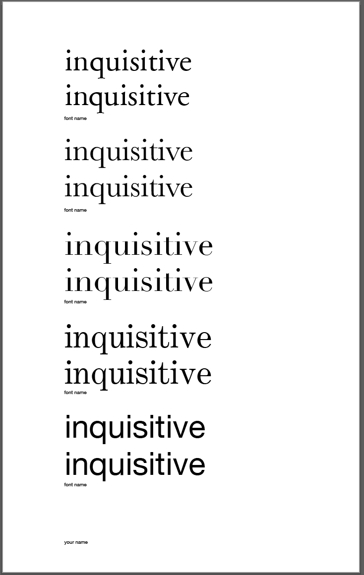
You will kern three words that describe you. Do one word on each page. Each page will use all of the five classic typefaces. There will be three sheets (one of each word).
Kern it!
- Kern the 3 words over 5 letters in length to describe on a single vertical 11×17″ sheet of paper.
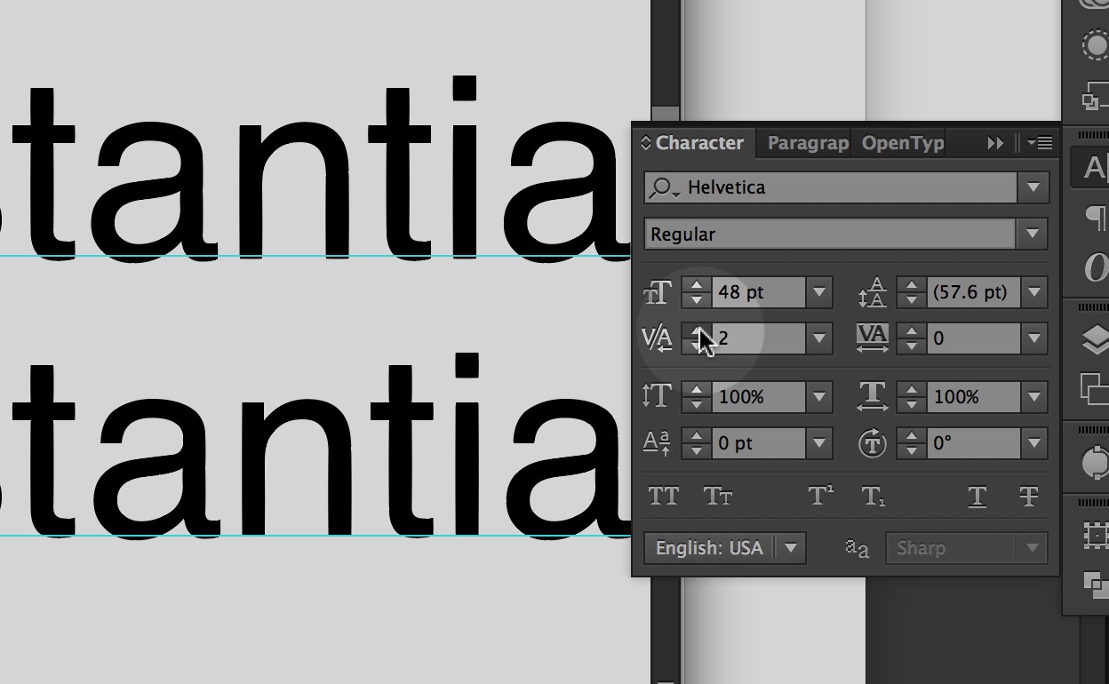
- The first line is un-kerned. Leave it as it is typed.
- The second line is the same word with letterspaces adjusted to look better.
- Use all 5 different sans-serif and serif typefaces for each word.
- Lowercase letters only.
- Put the name of the typeface below the image.
- Use this Template
- Use only the five classic typefaces.
- Print on an 11×17 piece of paper, making sure that tabloid is chosen under size.

/Users/ChrisMitchell/Desktop/image1.JPG
I got an 84 on my thrid try. I fould it diffcult to figure out each space for the varable letters that all have their own individual space. i found after playing around with the letter and stepping back and giving it an overall looked helped me see the awkward areas and lead me to the solution