- Ê
- Â
fNicholas Cocivi has 6 post(s)
Zoo: Denver Zoo
Address: 2300 Steele St, Denver, CO 80205
Hours of Operation: Open Everyday 9 a.m. to 5 p.m.
Lecture Name: The Elusive Siberian Tiger
Speaker: Sooyong Park
Date & Time: August 13th, 2017, 1:45-2:15
Blurb: Ever want to be face-to-face with a predator? Come experience first hand, the majestic Siberian tiger. Where famous researcher and documentary film-maker, Sooyong Park will speak about the importance of protecting and conserving the Siberian tiger while being mere inches away from one.
After reading the articles and watching the videos, I learned how hard it truly was to produce work like Jerry Uelsmann and how talented he was at creating images and montages prior to the creation of photoshop. Before photoshop the art of graphic design was entirely different. It would take days to produce work that we now can produce in a matter of minuets. Photos had to be developed in the dark room, then cut to be able to combine with another photos then those two photos had to be turned into one picture. I have gotten a chance to experience this process or at least one way we use to produce edited images before photoshop.
Splash:
To cause (a liquid or semi-liquid substance) to fly about; to scatter, throw up or about, with some force or commotion. Also, to pour out with a
Lonely:
Being without company
Explosive:
That expels or propels something suddenly and violently; characterized by the expulsion or propulsion of something in this way.
Slimikin:
Small and slender.
I found this quiz to be extremely tedious and frustrating. I got a 98 but only after like my 20th try, I had such a hard time figuring out where some of the letters were suppose to go, I feel like theres no real correct answer, except for what looks the best. It’s cool that someone made this, but I think that it’s way too difficult unless you take the quiz 20 times.
Helvetica Review
I felt that the movie Helvetica was quite interesting. I liked how they interviewed a broad spectrum of famous/talented graphic designers to get each of their opinions on the typeface. And they received some very different feelings about it. Some felt that the typeface was easy to read, timeless, and beautiful. While others found it to be overused, boring, and just overall . I believe it to be more of a mix of the two extremes. It’s very easy to read, and is timeless because it’s so uniform and simple. It’s definitely overused and because its so simple, using the typeface doesn’t inflict any kind of emotions of feelings in readers.
Quote from Massimo Vignelli:
“You can say, ‘I love you,’ in Helvetica. And you can say it with Helvetica Extra Light if you want to be really fancy. Or you can say it with the Extra Bold if it’s really intensive and passionate, you know, and it might work.”
I find this quote to be a little much, yes by changing the style of the font you do change the impact of the words themselves, but it’s not really going to be effective unless the person reading it is a graphic designer
Quote from Lars Müller:
“And I think I’m right calling Helvetica the perfume of the city. It is just something we don’t notice usually but we would miss very much if it wouldn’t be there.”
I find this to be the most accurate quote throughout the entire movie. And it’s why I think helvetica is not the best font, because it doesn’t pop, it’s just instantly processed in our brains.
Quote from David Carson:
“Don’t confuse legibility with communication. Just because something is legible doesn’t mean it communicates and, more importantly, doesn’t mean it communicates the right thing”
This is another great quote, and it explains Helvetica completely. Yes, it’s easy to read but it’s so uniform that it can be used to say a million different things that are unrelated. And because of that the words lack expression
Why Graphic Design?
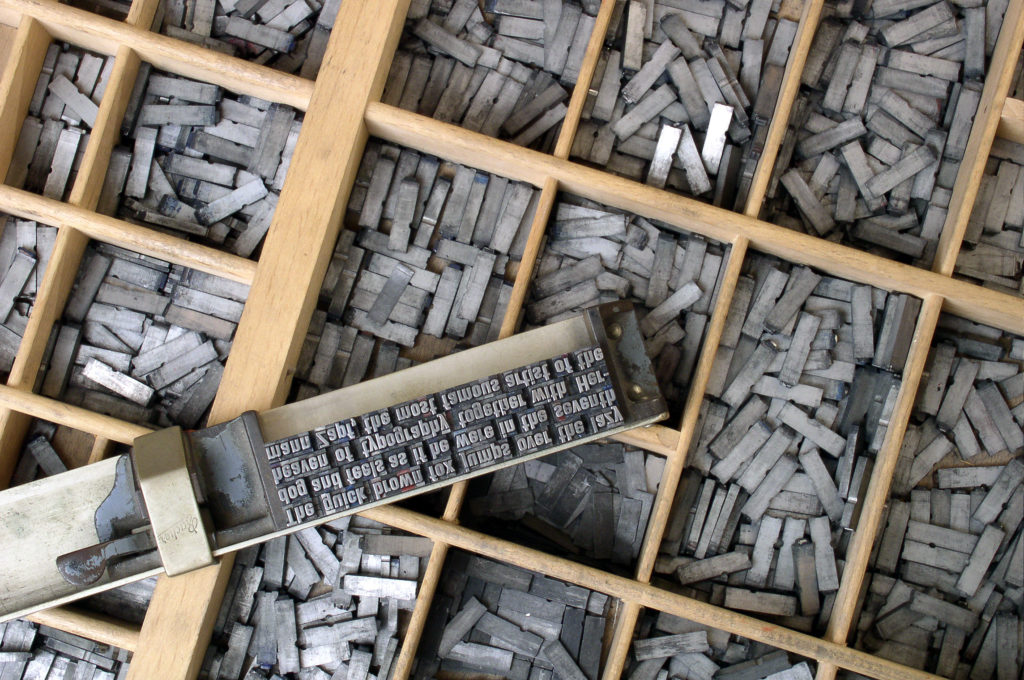
I first sparked an interest in graphic design when I took a graphics design class in high school, where I learned how to use computers to create logos, designs, magazine flyers, and business cards. In the following graphics class, I had learned about the more physical side of graphic design, like how to create advertisements and signs for businesses, how to create vinyl stickers, how to use a typesetter, how to create shirts in many different ways such as screen printing and heat transfer paper. I don’t really know yet if I want to become a designer, or just do it in my free time as a hobby.
What Draws You to the Brand and Logo side of Graphic Design?
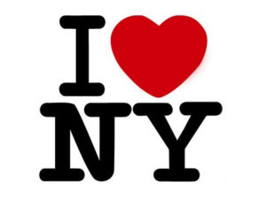
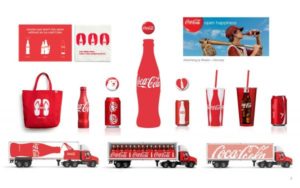
Possibly my favorite part of graphics is being able to design logos for companies, and creating a corresponding overall image of the company itself. I’d love to be able to create a logo that reflects the company in an appealing, yet fitting way. For example, a famous designer by the name of Milton Glaser created the “I Love NY” logo. This wasn’t for a company, but for the state and city of New York itself. The logo is simple, easy to read, and attractive, it was designed to help attract tourists back to the city at a time that the city wasn’t looked at in a good light. And the logo was successful, 40 years later and the logo itself generates $30 million in merchandise a year, and helped bring back tourists to New York City. Being able to accomplish something like this is insane, although possible and actually occurs all the time with all sorts of different companies and the effect their logo can create on others.

Links: Logo and Identity Design | Milton Glaser | What Make’s a Great Logo
What Draws You to the Advertising side of Graphic Design?
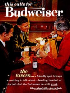
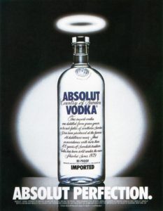
I personally feel that advertising design goes hand in hand with brand and identity design and are quite similar. While brand and identity tends to focus more on the logo itself and how it reflects the company or organization as a whole. Advertising design focuses on the ads themselves. Take the company Budweiser, their logo itself hasn’t changed much at all over the past century, but their advertisements themselves are constantly changing to remain appealing and modern, while still sticking with the same overall theme. Their ads are manly or appealing to men and thats because they’re targeting the audience that has proven to be the most profitable for them, but they still change it enough to stay in style. This is what I find thrilling, being able to create an advertisement that sends messages through visuals that evokes certain feelings and emotions in people.

Links: TV Advertising | Advertising Design | Advertising Industry
Leave a Reply Cancel reply
You must be logged in to post a comment.
-
-
Classroom
Recent Comments
- Matthew Rakowski on Framing/Grids Reading
- Laura Romaniello on Framing/Grids Reading
- Madeline Gaskill on Framing/Grids Reading
- Anna Heindl on Framing/Grids Reading
- Maria Pallozzi on Framing/Grids Reading
- Emily Perry on Framing/Grids Reading
- Rachel White on Framing/Grids Reading
Categories
-
About
KSC Graphic Design



Leave a Reply
You must be logged in to post a comment.