- Ê
- Â
fCiara Gallagher has 5 post(s)
Zoo: Bronx Zoo
Address: 2300 Southern Blvd, Bronx, NY 10460
Hours of Operation: Monday-Friday: 10am to 5pm. Weekends+Holidays: 10am-5:30
Lecture Name: Turtles Timeline
Speaker: Sophie Roe
Date & Time: July 11th 2017 @noon
Blurb: Interested in turtles of all kinds that we share the world with? Curious as to how these turtles are surviving and our impact on their life? Come to Sophie Roe’s discussion on a variety of species of turtles, their differences in biology and anatomy, similarities in needs to survives. Get educated and become a part in conserving and helping these turtles and their environment!
delightful: pleasant, pleasurable, enjoyable
scattered: throw in random directions, move off quickly in different directions. Disperse, separate, break apart
tent: collapsable shelter of fabric. teepee, big top, marquee
ossifragant: bone-breaking
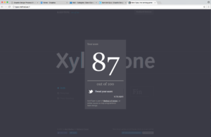
The quiz itself was fun and challenging. I could have done better than 87, but I found it difficult to kern with capital letters. I would leave too big of a space between capital and lowercase, I think because my eyes are so used to it. I’m going to keep trying to do better, overall it was interesting and I’m glad we had time in class to complete the quiz.
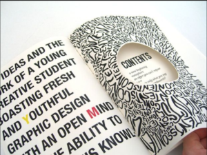
What is Graphic Design…
My interest in graphic design started in high school. I worked with adobe illustrator and loved drawing on there. I am a studio art major, and I can’t see myself leaving it, but I am looking forward to learning graphic design. Although I find graphic design intimidating, I wanted to try and see if being a designer could be a path I’d want to follow. Even if I decide that graphic design isn’t for me, It would be something I’d like to learn so I can do it in my spare time as a break from the studio. I also feel that graphic design is a good tool to have for any career in the future. Let’s say I become successful with studio art after graduation, I’m going to need graphic design skills to make a cohesive webpage, pamphlets, business cards…etc. It’s a good thing to know, and is relevant in everyday life.
BRAND AND IDENTITY DESIGN
Target, Lacoste, Walmart, Hollister…etc. What do these and many more share, memorable brand logos. Target’s target, Lacoste’s alligator, Walmart’ss flower/firework looking logo, Hollister’s seagull. Little logos that mean big things to everyone, and are easily recognizable. Simple designs are something that I would be interested in trying. What stands out even more to me is brands representing the companies, and the complimenting logo. When I think of “Gregory’s Coffee” I think of walking by Bryant Park and seeing the emblem of the top half of a man’s face. I would love to be the designer who creates that logo that you just can’t forget. Like I said before, I like being told what to do. For this case it would be I would like to know what they want, whether itd be an object and I can make multiple renditions of it. Or maybe they want a specific emotion or feeling to be portrayed through something I feel is fitting. It’s interesting how much a logo and brand could make much more money just based on curb appeal through design.


PUBLICATION DESIGN
Publication design interests me because it’s everywhere. Newspapers, magazines, periodicals…etc they are in every household or business. Everyone has seen one or all of these things, and read articles of news, travel, fashion, business…etc. It’s something we have all seen, and I could spend hours looking, then re-looking through magazines noticing different details in the designs, layouts, type, pictures, drawings…etc. An interest I have in publication design would be to see what I can do differently, to see how well I can promote the context through visual aids or different formatting. Or to see if there’s opportunity for making a spread purely for the art and graphic designing rather than including text. I think my personality would be good for this line of work because I’m great at being told what people want from me, rather than free expression. I’d like to be the person an author or journalist comes to for my layout and design to compliment their text. I wouldn’t oppose changing my style for their perspective and goals in their layout. It would be amazing to be any part of publication, seeing as it’s everywhere and anyone and everyone has an opportunity to see the work that is done.
Leave a Reply Cancel reply
You must be logged in to post a comment.
Watching the film Helvetica left me feeling more involved in the world. We all see the font helvetica day to day whether it’d be in advertising, maps, or simply on a paper for an assignment. I loved seeing flashes of just how often helvetica is used. Maybe I don’t appreciate so much that we use that font so often, but it was interesting to see how much of it we all don’t acknowledge it surrounding us. It was very funny for me to see that helvetica is what is used for subway directions. I spend my breaks and summers mainly in Manhattan, Queens, and Brooklyn with my friends. It’s something I’ve never noticed. But what I’ve noticed over time was whenever I read a those subway signs I feel okay. Hearing some of the designers talk about emotion through purely font was something that made sense to me. Nothing is better than taking the path from hoboken and seeing “Journal Square to 33rd St.” in that simple sleek familiar font. The gap between the letters in fonts is something that I have always payed attention to, whether intentional or not. Massimo Vingnelli said, “It’s the space between black that makes it”. Mike Parker echoed that talking about the “interrelationship of negative space” and how “the space between hold the letters”. All of these stood out to me and brought me back to the times I would go through fonts and look at the spacing between and see what I liked and what bothered me.
Helvetica font is comforting to me in the fact that its uniform and consistent. But Erik Spiekermann said, “Rythm, contrast it comes from handwriting…helvetica has none of that”. I loved this because I am intrigued by everyone’s, individual, handwriting or font choices. Or how Paula Scher said that “font could be your own medium”, that was something I hadn’t thought about. I always thought that font was the afterthought to the context. I was cool to hear designers perspectives of fonts. But when I thought about using font as a medium, instead of particularly the content, It seemed like something that I feel you never really know when it is finished. But seeing Stefan Stagmeister’s work, this made more sense. Stagmeister said “when I get bored of working on a typeface, I leave them alone”. That to me made me think of working with fontfaces as like working with pastel, paint, pencil or charcoal. That you can leave things when you feel done, even if others don’t consider it done. Going back to Scher’s point, that the font is the medium. This makes me feel more comfortable with graphic design and working with fontfaces. David Carson said “don’t confuse legibility with understanding”. That secured me in the feeling that working with types doesn’t need to be so “helvetica” all the time. It doesn’t need to be the default that you use, you can choose your own font to use, or multiple fonts. Watching Helvetica broke down the wall for me to look at Graphic Design and not be so scared, but relate to it and feel more comfortable with experimenting.


-
-
Classroom
-
Recent Comments
- Matthew Rakowski on Framing/Grids Reading
- Laura Romaniello on Framing/Grids Reading
- Madeline Gaskill on Framing/Grids Reading
- Anna Heindl on Framing/Grids Reading
- Maria Pallozzi on Framing/Grids Reading
- Emily Perry on Framing/Grids Reading
- Rachel White on Framing/Grids Reading
Categories
-
About
KSC Graphic Design

Leave a Reply
You must be logged in to post a comment.