- Ê
- Â
fMadeline Gaskill has 6 post(s)
Zoo- Cincinnati Zoo & Botanical Garden
Zoo Address- 3400 Vine St. Cincinnati, Ohio 45220
Zoo Hours- 10am-5pm
Speakers- Marion Petrie & Tim Halliday
Time of Event- April 15, 2017 at 2pm
Blurb- Mating success between Males & Females and the correlation between Females making their choices to mate based on appearance of Males elaborate trains.
Dark Room Deception
These readings were quite interesting because it opened my eyes a little more about how today we have it so easy, just by the click of a button we can change reality (in a way). Back in the early 1900’s there was no such thing as cell phones and apps that could change the way a person looks, it was all done in a dark room which I think interests me the most. I have learned about this type of manipulation in film classes that I have taken where in the film like Trip to the Moon and The Great Train Robbery where these types of manipulations were used to create something incredible back then. In learning about these films and photographs its quite interesting to compare them because everyone believed what they were looking at was completely real. Obviously today we can notice when things are fake or real because of photoshop editing. I still don’t exactly understand how some of these photographs were made back in the early 1900’s due to their preciseness and how one could physically put that together only in a dark room, it’s quite amazing. Now that we have technology to do much more with this manipulation it just goes to show how we have transformed as a world full of art and how the use of expressive imagination can be used.

Alarmed- To cause (someone) to feel frightened, disturbed, or in danger.
Angry- Having a strong feeling of or showing annoyance, displeasure, or hostility; full of anger.
Drunk- Affected by alcohol to the extent of losing control of one’s faculties or behavior.
Pseudisodomous- Style of wall construction using stones of different thickness.
Maddy Gaskill – Kern Quiz
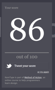
I took this quiz twice and each time I ran into different problems with different words. The first time I was trying to make the word look perfect to me and not thinking how the shapes of the letters flowed together. The second time around I found it a little easier to realize how the letters flowed with each other which helped my score go up. The words I had trouble with were the ones that had serifs, more thicks and thins and the letters that were curved next to each other.
What’s Helvetica?
Before even beginning this film I did not expect it to be at all what it ended up to be, which was captivating. When first hearing about this film and how it was about one typeface and the history behind it I began to wonder what I was about to watch and if I would enjoy it or not. Only a couple minutes into the film I realized that it was much more than just one simple typeface that we see daily. Being a Film Production major, we don’t focus to much on what kind of text we’ll add in the title of our film or the credits, it’s pretty much what looks good and is legible. It was extremely interesting to learn that Helvetica is the most popular typeface and many people (including myself) don’t even realize it because it is so widely used in our lives. One of the more interesting parts of the film was how Helvetica actually evolved over the years and how font was found to be easy to see, clear and good for mostly everything we need to read. It was also very intriguing how people can focus so much on a simple font that can make such an impact, but also have the viewers not realize how powerful that text really is.
Quotes from Cast
“You can say, “I love you,” in Helvetica. And you can say it with Helvetica Extra Light if you want to be really fancy. Or you can say it with the Extra Bold if it’s really intensive and passionate, you know, and it might work.” Massimo Vignelli
Massimo was one of the first people we were introduced to in the film and his statement really stuck with me during and after the film. The feeling you can leave with someone with just words is absolutely incredible and how we portray and interpret it in our minds is even more incredible. The fact that humans can decipher what kind of tone and emotion you are expressing through a text without the person physically there, is quite fascinating. Being in a generation where text is so heavily depended on for communication and expressing emotion it was eye opening to hear someone address the fact that depending on the wording and emphases used in a sentence can mean a different thing each time.
-

- Massimo Vignelli

“It’s air, you know. It’s just there. There’s no choice. You have to breathe, so you have to use Helvetica.” Erik Spiekermann
As I had mentioned earlier how I had learned that Helvetica is actually everywhere in everyday life, Erik emphasizes that it truly is just there. I thought he was particularly interesting because of his blunt and bold statement about Helvetica. He made the great, yet simple comparison to breathing in air and how we just have to do it to survive so we must use this type to survive as well. Although we may not realize it’s right in front of us like air, it is still always there and most likely always will be in some shape or form.
-

- Erik Spiekermann
“And I think I’m right calling Helvetica the perfume of the city. It is just something we don’t notice usually but we would miss very much if it wouldn’t be there.” Lars Muller
This particular quote I believe ties in with the other two quotes very nicely because as I have stated we don’t realize how much we use Helvetica but once we do notice it would be a lost element in our lives if it was not there. Thinking about this typeface more into depth has been quite interesting in the way where what would we have if it wasn’t Helvetica? Because this culture is so used to seeing it, but also not realizing what they’re seeing, how would it impact people if all of a sudden we stopped used this typeface. Lars is correct by saying that we would miss it very much if it wasn’t there anymore. This particular typeface is so deeply embedded into our lives that we have become so accustom to it that it is just normal to see it all the time.
-

- Lars Muller
Why I am interested in Graphic Design
I am currently a Film Production major in my Junior year, I never really thought about Graphic Design until last year when I was trying to decide what classes to take. I don’t necessarily have a desire to be a graphic designer but I do feel that I can learn many different skills that can apply to film production. Being a film major is quite different from GD as I am slowly realizing as I have taken a few different classes about graphic design. Although they may be different I can see many similarities with how they both intertwine with each other and require dedication and lots of time management. I feel that I can apply knowledge from graphic design into my film career throughout the courses I take in graphic design to also improve my film career.
Screen Design
This type of design is a collaboration of film production, experimental design and motion graphics. This type of design is very interesting to me because of the film aspect of it and how it includes media and the way we incorporate it into the layout and design of what we are looking at on the screen. Screen Design is also how we are conceiving and creating of the graphical user into using the site. The arrangement of the elements which can be seen on the screen is of greatest importance to intrigue and entice an audience to keep exploring what is on the screen in front of them. Film and Screen Design are similar in many ways in which we as filmmakers need to make something visually appealing and interesting to the audience.
![]()
Click Here to watch this awesome video about Production & Post
Click Here to learn more about Content & Programming
Want to go to the main site and explore more videos from Digital Kitchen? Click Here!
Motion Graphics
Motion graphics is a type of graphic design that caught my eye because it relates to film in a sort of way in which it involves adding sound, motion and a time sequence to pictures and words. This type of graphic design is a combination of film making and story telling to create a visual concept. I am very interested in this type of Graphic Design because it relates to a passion of mine. I sometimes believe that people don’t think that film making is something you can make a career out of unless you’re “good” at it. I think that if you believe that you are good at something you should go for in, this is why I was interested in Motion Graphics specifically because it is putting so many elements together from GD and film making that it creates something right in the middle
Leave a Reply Cancel reply
You must be logged in to post a comment.
-
-
Classroom
-
Recent Comments
- Matthew Rakowski on Framing/Grids Reading
- Laura Romaniello on Framing/Grids Reading
- Madeline Gaskill on Framing/Grids Reading
- Anna Heindl on Framing/Grids Reading
- Maria Pallozzi on Framing/Grids Reading
- Emily Perry on Framing/Grids Reading
- Rachel White on Framing/Grids Reading
Categories
-
About
KSC Graphic Design

Leave a Reply
You must be logged in to post a comment.