- Ê
- Â
fJulia Montecalvo has 6 post(s)
Zoo Name: The Maryland Zoo in Baltimore
Zoo Address: 1876 Mansion House Drive, Baltimore, MD 21217
Zoo Hours: March-December open daily 10:00am-4:00pm
Event Date and Time: May 14th 11:00am-3:00pm
Speaker: Paula B.
Blurb: Have you ever wanted to feed and learn more about a giraffe? Then come to The Maryland Zoo in Baltimore where you can learn more about our friendly animals!
Before taking a graphic design class I didn’t know much about photoshop. After reading these articles I found them to be very interesting. Its amazing how there was no photoshop and how Jerry Uelsmann would shape his own photos. In the article Incredible Manipulated Photography Before Photoshop they said that he was “skilled and diligent creative has produced remarkably believable surreal landscapes by hand in the dark room. Without the aid of photo editing software, Uelsmann uses multiple negatives and up to a dozen enlargers to create composite images that boast a wild imagination”. He would work on his pictures by hand and no help from photoshop. Now having photoshop I couldn’t imagine having to work on something by hand in a dark room. It differently took a lot of time and hard work into his pictures. We should be happy now that we have photoshop because where would we be today without it.

Loud– Producing or capable of producing much noise; easily audible
Conflict– A serious disagreement or argument, typically a protracted one
Eccentric– (of a person or their behavior) unconventional and slightly strange
Airgonaut- one who journeys through the air
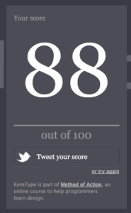
For my quiz score I got an 88%. I noticed that the ticker the letters are the easier it was to kern and when you had thinner letters it took longer. I found the the word Toronto to be challenging because of the T and how spaced out it needed to be. I also found the word Quijote to be challenging because of the end of the Q and how it had a tail at the end.
Watching Helvetica for the first time I didn’t know what to expect. After watching the movie I found it to be very interesting and informational. I didn’t know much about Helvetica and I had no clue about the different typefaces and how they are all around us. We see typeface all around the world either on brand names, logos, airplanes etc. The most interesting part I think was seeing how someone can take a word and change one aspect about it and it would look totally different. Also after seeing the movie I am now noticing how Helvetica is everywhere and before I never really noticed it so I’m appreciating it more.
Quote 1
“It’s air, you know. It’s just there. There’s no choice. You have to breathe, so you have to use Helvetica.” Erik Spiekermann
The first quote is from Erik Spiekermann and he is a German typographer and designer. Reading this quote caught my eye right away because Helvetica is everywhere so its saying how we breath it in. I agree with this quote because its just there and we have no choice about it. Its talking about how much we use Helvetica and we can’t get rid of it anytime soon.


Quote 2
“And I think I’m right calling Helvetica the perfume of the city. It is just something we don’t notice usually but we would miss very much if it wouldn’t be there.” Lars Muller
The second quote is from Lars Muller. Reading this quote I really liked it because I agree with it. Helvetica is everywhere around us like when you stray perfume it goes everywhere. We also don’t really notice Helvetica around us like the quote say. It has such an impacted on our lives and without it what would we do.


Quote 3
“You can say, “I love you,” in Helvetica. And you can say it with Helvetica Extra Light if you want to be really fancy. Or you can say it with the Extra Bold if it’s really intensive and passionate, you know, and it might work.” Massimo Vignelli.
The last quote is from Massimo Vignelli who was an Italian designer who worked in a number of areas ranging from package, housewares and furniture design. This quote is really what typeface is about. You can take a simple word and change one aspect about it and it will look totally different. You can make the word look fancy, bold or light and this is what the quote is explaining.


I didn’t know much about graphic design and I never thought I would like it. I only took graphic design at my high school so I could get enough art credits. After taking graphic design 1 and 2 in school I really enjoyed it. My first graphic design class I didn’t know what to except or what we would even do. In the beginning I felt that it was very confusing and that maybe I should switch out. I had no clue what to do on the computer or what object did what. I ended up staying in the class and after a couple weeks I got the hang of it. I decide to take the second graphic design class my senior year and I already knew what I was doing and liked it a lot. I never thought I would ever do graphic design in college or maybe as a major but now I might be thinking about it.
I had no clue what types of graphic design I would like. After reading the passage I learned a lot more about the different types of graphic design that I didn’t know existed. The two graphic designs that caught my eye and I seemed to like the most were Type Design and Publication Design.
Type Design
I found type design to be very interesting. I learned about the different fonts that you can use and how each font means something different just by the way it looks. Its amazing how someone takes time to come up with a new font that can then be changed into either bold or italic. Having one word and changing one thing about it I think it makes it mean something else. The way the different fonts look I think it gives off a different meaning. Making something for a brand or any type of label I feel would be a good fit for me because you have to be patient and organized which I think I am.
To learn more about typography click here Typography What is Typography


Publication Design
I found publication design to be very interesting. I thought about how fun it would be to make a magazine cove, newspaper or something for a business. I like reading magazines and looking at the front covers because thats the first thing mostly everyone sees. You can see how the creator uses the different colors, layouts, pictures and how they set it up. I didn’t know much about publication design but now I know how important it actually is because everyone sees it. In high school I had to make a magazine cover in one of my graphic design class and I really enjoyed doing that project. Its interesting seeing all the pictures on the front cover and seeing how they made the magazine cover by putting labels, pictures and fonts together. I feel this would be a good fit for me because I could see myself doing this and taking different pictures and putting them together to make the perfect front cover.
To learn more about publication design click here Publication Design What does a publication designer do
Leave a Reply Cancel reply
You must be logged in to post a comment.
-
-
Classroom
-
Recent Comments
- Matthew Rakowski on Framing/Grids Reading
- Laura Romaniello on Framing/Grids Reading
- Madeline Gaskill on Framing/Grids Reading
- Anna Heindl on Framing/Grids Reading
- Maria Pallozzi on Framing/Grids Reading
- Emily Perry on Framing/Grids Reading
- Rachel White on Framing/Grids Reading
Categories
-
About
KSC Graphic Design

Leave a Reply
You must be logged in to post a comment.