This course is an investigation of the role of graphic design in the visual environment. Students explore a variety of conceptual and production methodologies to create effective visual communication.
Course Summary
The world in which we live is populated by myriad printed and screen-based messages of information and entertainment. We position ourselves in this visual landscape by creating visual presentations of themselves in various forms through social media profiles, personal web sites, class projects, and so much more. Since elementary school we have been asked to create digital presentations to demonstrate their command of class material, but in what way have we been prepared to do so? While many secondary schools teach technology, very few offer a concerted education on the fundamentals of graphic design outside of exclusive art classes. It is fair to say that the vast majority of people have no real understanding of how to create effective messages in a world that increasing uses visual perception to judge them. This course addresses these issues by providing students with fundamental critical thinking and creative making skills that will increase the effectiveness of their visual communications.
Graphic design has a formative role in the production of visual messages in contemporary culture. Everything we do to share our ideas in academic presentations, resumes, political messages, corporate communications, email and social profile construction is visually articulated through a variety of conceptual and formal decisions that make up the graphic form of the message. Everyone is a publisher today, and the success of any communication often rests upon how it is visually perceived by the audience long before it is read and digested. The course positions graphic design as both a formal tool and conceptual device by instructing students to skillfully and intelligently manipulate graphic form to communicate information effectively.
This course addresses the core proficiency of crafting strong and visually persuasive messages, and is designed to help students understand how the ideas they are continually charged with presenting in academic and professional contexts are dependent upon clear visual structure and coherent graphic expression. This course will provide a critical environment for examining visual communications with current and historical examples. The skills development aspect of this course will directly address practical aesthetic methodologies for developing and producing visual communication artifacts in a series of practical and conceptual projects.
Course Objectives
INTELLECTUAL AND ANALYTICAL OBJECTIVES
• Students will critically analyze and develop informed critical perspectives on visual communication as it effects the world of ideas.
• Students will gain an understanding of the social, political, economic, and historical implications of the graphic design process.
• Students will develop conceptual proficiency as authors of graphic design artifacts.
SKILLS AND ABILITIES OBJECTIVES
•Students will demonstrate an introductory skill in using graphic design hardware and software.
• Students will develop proficiencies in visual communication design, including composition, typography, and the persuasive presentation of information.
• Students will be able to demonstrate a competence and confidence in producing and analyzing visual communication.
Learning Outcomes
CREATIVE THINKING
• Student explores and connects strategies and skills of a domain by constructing a product.
PERSPECTIVE OUTCOMES
•Critically and creatively engage in the aesthetic and intellectual components of the fine and performing arts.
•Articulate the ways that the arts and humanities shape, change, provoke, and represent our world and our perception of the world.
INTEGRATIVE OUTCOMES
•Identify elements of social and/or environmental structures: individual, group and system.
Course Requirements
•Attend class each week, as assignments will draw upon topics
covered in readings, projects and discussions.
•Collect all readings, sketches, prints, versions, ideas and other
process materials in a 3-ring process journal.
•Read the assigned texts by the next class meeting.
•Comment on class readings on the class web site.
•Participate fully in class activities.
•Complete all projects in a timely manner to the best of your ability.
Electronic Communication Policy
Facebook: A class Facebook group will be used for general questions about assignments as well as a place to post interesting links to topics related to this class. The group is called GDP/KSC FALL 2017. You will be friend requesting me today please. Heather Gendron
Email: Use email to communicate questions and comments that pertain only to you. If the question is about the class in general, please use the Facebook group.
Texting: You may text me in extremely urgent situations. My mobile number is 603-398-2929. You need to tell me your name in your text. Please try the Facebook group first.
Craft
Presentation is a critical part of graphic design. Poorly presented work handicaps the effective communication of ideas. Badly made work will not be accepted. Everything is a design problem.
Reading/Writing
The ability to articulate oneself well in written and spoken words is crucial to you professional success. Readings from contemporary and historical design topics will be assigned in this course on a regular basis.
Equipment List
This course has a considerable supply list available at the KSC Book Store. We also use computers in addition to one of your most valuable tools — your mind — please remember to bring it to class. You will need:
•Thumb Drive (min. 8GB) or external hard drive
•3-ring binder for process materials
•9×12 manila envelopes – (3 to 4 of them)
•Steel ruler (15” or18”) (no wooden or plastic rulers, please)
•X-acto knife
•X-acto replacement blades (box of 40+ blades)
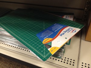
•Cutting matte (12” x 18” min.) RECOMMENDED
•Black sharpie markers (one thin, .01-.03 & one thick + various
other sizes)
Process notes
You will keep an ongoing and detailed record of all work, readings, and other visual inspiration and influence throughout the term in dedicated 3-ring binder. All drawings, notes and other materials will be uploaded on a project by project basis to the class blog.
Submitted Work
All work should be submitted according to medium. Digital files will be uploaded to class site and/or DropBox. Printed work will be submitted in clean and organized envelopes with your name written clearly in the upper right corner. No exceptions or alternatives will be accepted.
Assignment due dates
Complete the assigned reading prior to the next week’s class meeting.
You will not receive credit for any assignment passed in after the due date. If illness or other personal issues are keeping you from fulfilling an assignment, you must contact me before the assignment is due, or you will receive a zero (0%) for the missed assignment.
Students are responsible for handing in any assignments due on the day of an absence.
Evaluation
Grades are based on your performance on Participation, Website Posts, Quizzes, Exercises, and Projects as follows:
Participation / 10%
Website Posts / 20%
Quizzes / 10%
Exercises / 20%
Projects / 40%
Attendance policy
The Keene State College attendance policy emphasizes the correlation between attendance and academic achievement. A student is expected to attend all class meetings of courses in which he or she is enrolled.
Keene State policy: A student who misses more than 6 classes in the first 10 weeks of the semester (for any reason whatsoever, including excused absences and emergencies) must withdraw from the course. The student must follow the regular withdrawal procedure. The complete KSC attendance policy can be viewed athttp://www.keene.edu/administration/policy/detail/attendance/Class policy: students may take 2 unexcused absences. Students will lose a half letter off their final grade (A to A/B, A/B to B, B to B/C, etc.) for every non-excused absence thereafter. Students must provide documentation for any excused absence (doctor’s note or proof of other emergency).
Students are responsible for handing in any assignments due on the day of an absence.
You must actively seek out the information from any class you might miss from a fellow student in the class, or from me.
Please consult the KSC Academic Calendar for non-class days and other notable events.
Electronic devices in the classroom
Unless otherwise stated, students may not use any personal electronic devices during class meetings. Texting or any other type of cell phone or electronic device use during class will count as an unexcused absence and you will be asked to leave the class. And remember, more than 6 absences and you will have to drop the class.
Disability Accommodation
Any student with a documented disability should see me as soon as possible so that we can make the appropriate accommodations. Students with disabilities can register with the Keene State College Office of Disability Services on the first floor of the Elliot Center (358-2353). Additionally, the College has an ADA Officer who assists with access issues for the College as a whole and who is available to assist with conflict resolution regarding access and accommodations. Students with disabilities who may need classroom accommodations are encouraged to make an appointment with Jane Warner or Jessica Bigaj in the Office of Disability Services (x2353).
Academic Honesty Policy
All students are expected to hand in original written work. Using other people’s words without proper attribution constitutes plagiarism.
Plagiarism and any other forms of cheating will result in an F for the assignment and may include further College sanctions. In this class, every student must be aware of and adhere to the college’s policy on academic honesty. Detailed procedures and processes pertaining to the Policy on Academic Honesty can be viewed athttp://www.keene.edu/policy/academichonesty.cfm
Class Cancellations
In case of inclement weather or any other emergencies, please check your email, facebook or phones to find out whether or not this class has been cancelled.
Eating/drinking
There should be no eating or drinking in this classroom. If necessary, please use discretion. Save noisy and smelly foods (i.e. crunchy items, crinkly wrappers) for break time or in between classes. Strive to maintain a clean, efficient learning environment.
Emergency Academic Procedures
In the event the College is impacted by an emergency situation, students are responsible for regularly checking their KSC email and Canvas for information from their instructors and/or the College. Affected faculty members are expected to notify students via email, Canvas announcements and/or voice mail regarding alternative course delivery methods and course work submission procedures.
Media Arts Center (MAC) Security Policy
Mission Statement
The Media Arts Center is dedicated to serving the curricular needs of the students and faculty. The faculty, staff, students, and the community served by the Media Arts Center are our most important assets in a safe and secure environment that fosters a high-quality educational experience.
Overview
The purpose of this policy is to outline secure access procedures and establish organizational guidelines for providing access benefits to students, faculty and staff while protecting the property, privacy and security of the Media Arts Center. Recognizing that safety and security of the campus and its assets and community members is a shared responsibility, this policy has been developed to serve as a guideline regarding secure access via keys, access codes, and keycards for after-hour access to the Media Arts Center (MAC). This policy applies to all students who may need after-hour key or keycard access. This policy establishes the requirements for gaining access codes, key and keycard access to the Media Arts Center at Keene State College. Individuals reported as not complying with these policies may be referred for disciplinary action.
POLICY GUIDELINES
I. DEFINITIONS
a. Building Access Coordinator: The administrative assistant/building manager within the Media Arts Center assigned to coordinate access for employees and students where multiple departments exist within a single building.
b. Keycard: A Keene State College-issued identification card that displays an employee’s or a Student’s name and photograph that is programmed to provide entry into the entrance of the Media Arts Center during specific times.
c. Access Code: An access code that is programmed to provide entry into specific doors of the Media Arts Center.
d. Key: A physical key that is used to gain entry to a specific room within the Media Arts Center.
II. RESPONSIBILITIES
All employees and students are responsible for becoming familiar with the Media Arts Center Building Security and Access policy and procedures outlined in this document. All employees are responsible for ensuring that students are aware of these policy and procedures. All students working in the Media Arts Building are expected to not only uphold these policies but also to set an example of compliance by holding other students accountable for following these rules. Students are expected to know and understand the Student Code of Conduct as those policies all apply to the Media Arts Building.
Keys and Keycards
Keys and keycards are the exclusive property of Keene State College. No key or keycard shall be duplicated by anyone other than facilities management personnel. A redundant keycard access system will be kept in place at Campus Safety to allow for ease of operational needs. The KSC Lock Shop will be responsible for maintaining records for issuance and use of all keys and access codes. Campus Safety will be responsible for maintaining records for issuance and use of all keycards.
Access codes, key and keycard holders shall immediately notify Campus Safety and follow up with the Building Access Coordinator during business hours if a key or keycard is misplaced, lost or stolen or if an access code has been compromised. Failure to immediately report a lost or stolen key or keycard or a compromised code may result in loss of entry during after-hours and/or fee.
Individuals shall only use or hold keys or keycards that are officially assigned to them. No person shall allow the use of a key, keycard or access code to give access to a person who does not have authority to be in the controlled space. Keys and/or keycards may not be loaned out to anyone. Misuse of an access code, key or keycard may result in loss of entry to building during after-hours and/fee.
The Building Access Coordinator is responsible for tracking access codes, keys and keycards swipes, and for maintaining accurate records for the Media Arts Center. Obsolete or unneeded keys must be returned to the Lock Shop.
The Building Access Coordinator and/or Campus Safety in consultation with the department chairs and program coordinators reserves the right to confiscate keys and deactivate keycards and access codes at any time without notice. The holder of a deactivated key shall promptly return it to the Building Access Coordinator. The Building Access Coordinator shall return all keys to the Lock Shop as soon as they are no longer needed.
III. IDENTIFICATION CARDS
All employees and students shall be issued a photo identification card, which they must keep with them while conducting Keene State College business. The Media Arts Center may require students to display identification while they are working after-hours.
IV. BUILDING ACCESS
Students who need after-hours access to the Media Arts Center will be issued access levels based on need and assigned responsibilities dependent upon instructor request and department chair/program coordinator approval. The main entrance will be programed to open and lock at specific times each day. Campus Safety programs door locking schedules based on information provided by the Building Access Coordinator.
The Building Access Coordinator, located in MEDI 140, shall support the department chairs and program coordinators in coordination of access to Media Arts Center spaces. The Building Access Coordinator may request keys, keycards and access codes only for the Media Arts Center. The MAC Building Access Coordinator may not authorize access to another building’s spaces. In the event that such access is necessary, the Building Access Coordinator for that building will have to authorize the access before it will be granted.
The Building Access Coordinator must immediately notify Campus Safety and the Lock Shop of any change in status that will result in restricting building access or terminating building access.
Security and Access
The MAC maintains regular hours of operation as specified below. However, staff may periodically extend or suspend hours to meet student needs or support institutional restrictions (such as in an emergency). During the evening and weekend hours, faculty, staff and students can gain access to the building during non-business hours by swiping their keycards.
The MAC is staffed by lab monitors stationed in each department’s labs. Lab schedules shall be created and maintained by each department. Lab monitors are responsible for ensuring only authorized individuals access the labs and/or specialized areas. Lab Monitors ensure that all students sign in and out and they are responsible for reinforcing the policies articulated in this agreement. Lab Monitors also check their areas of their building each evening to ensure all students have left as required.
Visitors
Visitors are required to check in with Campus Safety when arriving on campus. During after-hours access, faculty and staff should use caution in bringing visitors into the Media Arts Center. Faculty and students who escort a visitor into the Media Arts Center during non-business hours are responsible for the activities and wellbeing of their visitors while in the building. Students may only bring visitors into the Media Arts Center if doing so pertains to their academic needs (for instance, working with film actors).
Additional Access
When it becomes necessary for certain individuals and positions to gain access to buildings and areas outside of their assigned department (such as common access to the Green Screen Room), this shall be discussed with respect to our students’ needs and usage of these spaces. Access shall be organized by the Building Access Coordinator through consultation with the department chairs and program coordinators in the building, who will identify access levels for these individuals and positions.
Curtailed Operations
Swipe card access to the Media Arts Center will be deactivated during curtailed operations. http://www.keene.edu/administration/policy/detail/weather/download/
MEDIA ARTS CENTER FRONT ENTRANCE SCHEDULE
General Hours of Operation:
Monday – Friday: Open at 7:00 am Close at 4:30 pm
Saturday – Sunday: Closed
Swipe Access for Students:
Monday – Friday: 4:30 pm – 11:45 pm
Saturday – Sunday: 7:00 am – 11:45 pm
After-Hours Swipe Access for Students:
● Students must be on access lists provided by department chairs, program. coordinators, Dean of Arts and Humanities and/or Building Access Coordinator.
● Students must use their valid KSC ID card for swipe access to the building.
● Students must sign-in with a lab monitor when entering the lab and sign-out when leaving.
● All students must leave the building at the closing times specified above.
● If students refuse to leave, the lab monitor will call Campus Safety.
● Students continuing to refuse to leave the building will be subject to disciplinary or departmental sanctions including revocation of authorized access to the MAC. Building Safety Policies
● Only authorized students are permitted in the building during after-hours and may not let other students or guests into the building.
● Students are only permitted into areas for which they have authorization.
● Students must be appropriately trained prior to using any specialized equipment.
● Student conduct in the labs must be conducive to an academic and creative environment.
● For the safety of all occupants of the building, exterior doors cannot be propped open.
● No food or drink is permitted in editing bays, labs, or the production studio.
● Failure to comply with any of these rules could result in revocation of authorized access to the MAC.
Instructors are advised to lock their classroom doors after the completion of each class. While laboratory classrooms (labs) are required to be locked at all times when not in use, instructors may, at their discretion, allow these spaces to remain open provided that they are in the building and periodically observe that lab policies are reinforced.
Condition of Space
All spaces must be left in a clean and useable manner. Building cleaning staff will vacuum each classroom daily and verify that all doors are locked and secure.
V. HIGH-SECURITY ACCESS AREAS
In addition to offices, traditional classroom and common space, the MAC includes a number of areas that contain expensive equipment that support academic programs which require a higher degree of security and monitoring. Faculty are responsible for training students in the appropriate use of specialized equipment and providing accurate and up-to-date access lists for student access. At this time, these areas include the MEDI 141 (Green Screen Studio), MEDI 156 (Control Room), and MEDI 159 (storage space). MEDI 141 (the Green Screen Studio) is available to be reserved online and used by students and faculty from the departments of Journalism, Multimedia and Public Relations; Communication and Philosophy; Film Studies; and the Graphic Design Program.
Authority for high-security areas remains with the department chair, program coordinators, and/or Building Access Coordinator charged with the security of that area. Department chairs, program coordinators, and/or the Building Access Coordinator may request certain additional areas, which are not specifically covered in this policy, as high-security access. Individuals whose positions allow unescorted access into high-security areas shall comply with the provisions of this security policy. Access to high-security areas does not imply authority over the area. Individuals without clearance shall not be granted access to high-security areas. Access to high-security areas shall be granted by department chair, program coordinator, or Building Access Coordinator prior to clearance.
Employees, Students, volunteers and members of the public who enter high-security areas must be escorted and allowed entry and must comply with the building security and access policy. Additional security requirements may exist for these areas and will be referenced in the applicable building security and access procedures.
Access for MEDI 141 Green Screen Studio
All requests to access MEDI 141 (Green Screen Studio) must comply with the Supported Uses and Policies below, and are booked on a first-come, first-served basis in coordination with the MAC Security Policy. Reservations can be made by students or faculty members via 25Live https://25live.collegenet.com/keene/. The 25Live schedule indicates the Open Booking hours that are available to any student, faculty, or staff member subject to the supported uses listed below.
Reservations may be made by MAC Faculty, Staff and the students of the Media Arts Center departments.
Supported Uses:
● College/Program/Curricular uses
● Student Organizations and Co-curricular Activities
● Film & Video Course Productions
● Still Photography/Video Studio uses
● Multimedia Classroom
Not Supported Uses:
· Any uses beyond those described above
· Public events of any kind unless authorized by the department chair/program coordinator of the supporting department
· Any assembly occupancy over the room’s legal maximum occupancy (15 max)
Student Access
Students should refer to their instructor for information regarding MEDI 141 (Green Screen Studio) access and proper training. A sponsoring faculty member will need to provide proper instruction and confirm access. This training process will be added to this policy, clearly posted on the front door of the Green Screen Studio, and also distributed via KSC email, so that students requiring access can obtain the necessary training.
MEDI 141 Rules for Usage
● Student accepts responsibility for the studio, its equipment, and all materials brought into the studio for their project.
● Removal of any studio equipment from the space is prohibited.
● The responsible student must not alter the space in any way: no use of adhesives, tacks, or nails on either the walls, floor, or green screen.
● Manual adjustment of the ceiling light grid requires proper training and advanced lighting experience. Only students who have completed the Green Screen Studio training are authorized to manually adjust the ceiling lights or to use the light board. The ceiling grid and light board must be returned to their standard placement after use.
● The following items are strictly prohibited:
○ Food and beverages
○ Fog and haze machines
○ Firearms and dangerous weapons: including ammunition, explosives, fireworks, flammable materials, or other dangerous substances and materials of any kind.
● All users are expected to clean up at the end of their reserved time and to remove any materials brought in for the project. The floor must be swept, their tape (spike marks) removed, and all trash removed. All items left behind (e.g., tools, equipment, artwork, personal items) will be disposed of. The room must be reset to a neutral agreed upon position.
● A MEDI 141 (Green Screen Studio) Responsibility Checklist supplied to the student upon entry must completed and given to a lab monitor at time of sign out.
Note the following:
a. The College shall not be liable directly or indirectly for theft, damage, destruction, loss of money, valuables, or other personal property belonging to, or in the custody of, the student for any cause whatsoever, whether such losses occur in the labs, classrooms, public areas or hallways.
b. When responsibility for damages cannot be ascertained, the damage charge will be assessed equally among all student’s present.
c. Each student agrees not to modify or allow modifications of any room or other part of the building without prior approval from department chair, program coordinator, or the Building Access Coordinator.
d. Furniture or equipment cannot be removed from any room or common areas.
Any violation of this policy will be considered a breach of the contract and may lead to disciplinary action and/or removal of the student’s swipe access to the Media Arts Center.
This space is available when classes are not in session.
VI. DRUG AND ALCOHOL POLICY
Keene State College recognizes that drug and alcohol abuse is a major societal concern and problem. This policy will apply to all college students, faculty, staff and visitors. Anyone who violates the provisions of this policy will be subject to sanctions, which could include loss of after-hours use, criminal prosecution, suspension and/or expulsion.
The Keene State College “Alcohol and Other Drug Policies” document is available at the link below. http://www.keene.edu/administration/policy/detail/handbook/alcohol/
VII. FIREARMS AND WEAPONS POLICIES
The Media Arts Center is committed to maintaining a safe and secure environment that supports the academic mission of the College. Firearms, explosives, weapons, or any item that may be construed as such, are prohibited from the Media Arts Center and events. There are some limited exceptions to this policy; for example, certified and licensed law enforcement personnel who are authorized to carry a firearm.
The Keene State College student “Weapons Policy” is available here: http://www.keene.edu/administration/policy/detail/handbook/campus-policies/#w
VIII. CRIME PREVENTION PROGRAMS
Crime Prevention Programs on personal safety and theft prevention are sponsored by Keene State College and Student Services throughout the year. Students are informed of services during New Student Orientation workshops. A common theme of all awareness and crime prevention programs is to encourage students and employees to be aware of their responsibility for their own security and the security of others.
VIIII. GENERAL PROCEDURES FOR REPORTING A CRIME OR EMERGENCY
Campus Safety Enforcement
The Keene State College Campus Safety Department is charged with the responsibility for on-campus security, safety, emergency services, and parking. Campus Safety strives to maintain a safe and secure campus environment for students, staff, faculty and visitors and is tasked with responding to all reports or incidents of crime that occur on campus. The Campus Safety Department officers have authority to apprehend anyone involved in illegal acts on our campus.
Offices, laboratories and classrooms are secured when not in use. Employees or students who discover defective doors, locks, interior/exterior lighting problems, or other safety hazards within the building must immediately report the situation to the Building Access Coordinator. If discovered during afterhours, these issues must be immediately reported to Campus Safety for action.
Emergency Policy is Available here: https://www.keene.edu/administration/policy/detail/emergency/communications/
XI. VIDEO SURVEILLANCE
The Media Arts Center is equipped with video monitoring equipment that provides 24-hour coverage of the facility and video recording devices that record the captured video images.
Keene State College Surveillance Policy is Available here: http://www.keene.edu/administration/policy/detail/surveillance/
XII. Disciplinary Action
As members of the College community, students and their organizations have an obligation to know and abide by the Student Code of Conduct. Through its policies and regulations, the College has identified the behavioral expectations it has for its students. The College expects that students will behave in a mature and responsible manner at all times. Students who fail to do so will be referred to the College’s Student Conduct System.
Upon receipt of a report, the Student Conduct Office will review the materials and determine what College policies may have been violated, and the manner in which the infraction will be addressed. These alleged policy violations become the charges which will be brought by Keene State College against the Responding Party through the Conduct System.
The Student Conduct Office will address violations of the following list of policies. College policies are described in detail elsewhere in the Student Handbook. http://www.keene.edu/administration/policy/detail/handbook/code/
XIII. PERIODIC REVIEW OF THIS DOCUMENT
The Building Access Coordinator, department chairs, and program coordinators shall review and approve this policy and corresponding procedures on an as-needed basis.
The department chairs, program coordinators, and the Building Access Coordinator at the Media Arts Center at Keene State College may establish rules and regulations to manage the interest and business for after-hours access. The policies and procedures in this document outline the process through which the persons with a stake in the Media Arts Center at Keene State College can take official action on administrative policy, and is the official record of the administrative policy.


Leave a Reply
You must be logged in to post a comment.