This course is an investigation of the role of graphic design in the visual environment. Students explore a variety of conceptual and production methodologies to create effective visual communication.
Course Summary
The world in which we live is populated by myriad printed and screen-based messages of information and entertainment. We position ourselves in this visual landscape by creating visual presentations of themselves in various forms through social media profiles, personal web sites, class projects, and so much more. Since elementary school we have been asked to create digital presentations to demonstrate their command of class material, but in what way have we been prepared to do so? While many secondary schools teach technology, very few offer a concerted education on the fundamentals of graphic design outside of exclusive art classes. It is fair to say that the vast majority of people have no real understanding of how to create effective messages in a world that increasing uses visual perception to judge them. This course addresses these issues by providing students with fundamental critical thinking and creative making skills that will increase the effectiveness of their visual communications.
Graphic design has a formative role in the production of visual messages in contemporary culture. Everything we do to share our ideas in academic presentations, resumes, political messages, corporate communications, email and social profile construction is visually articulated through a variety of conceptual and formal decisions that make up the graphic form of the message. Everyone is a publisher today, and the success of any communication often rests upon how it is visually perceived by the audience long before it is read and digested. The course positions graphic design as both a formal tool and conceptual device by instructing students to skillfully and intelligently manipulate graphic form to communicate information effectively.
This course addresses the core proficiency of crafting strong and visually persuasive messages, and is designed to help students understand how the ideas they are continually charged with presenting in academic and professional contexts are dependent upon clear visual structure and coherent graphic expression. This course will provide a critical environment for examining visual communications with current and historical examples. The skills development aspect of this course will directly address practical aesthetic methodologies for developing and producing visual communication artifacts in a series of practical and conceptual projects.
Course Objectives
INTELLECTUAL AND ANALYTICAL OBJECTIVES
• Students will critically analyze and develop informed critical perspectives on visual communication as it effects the world of ideas.
• Students will gain an understanding of the social, political, economic, and historical implications of the graphic design process.
• Students will develop conceptual proficiency as authors of graphic design artifacts.
SKILLS AND ABILITIES OBJECTIVES
•Students will demonstrate an introductory skill in using graphic design hardware and software.
• Students will develop proficiencies in visual communication design, including composition, typography, and the persuasive presentation of information.
• Students will be able to demonstrate a competence and confidence in producing and analyzing visual communication.
Learning Outcomes
CREATIVE THINKING
• Student explores and connects strategies and skills of a domain by constructing a product.
PERSPECTIVE OUTCOMES
•Critically and creatively engage in the aesthetic and intellectual components of the fine and performing arts.
•Articulate the ways that the arts and humanities shape, change, provoke, and represent our world and our perception of the world.
INTEGRATIVE OUTCOMES
•Identify elements of social and/or environmental structures: individual, group and system.
Course Requirements
•Attend class each week, as assignments will draw upon topics
covered in readings, projects and discussions.
•Collect all readings, sketches, prints, versions, ideas and other
process materials in a 3-ring process journal.
•Read the assigned texts by the next class meeting.
•Comment on class readings on the class web site.
•Participate fully in class activities.
•Complete all projects in a timely manner to the best of your ability.
Electronic Communication Policy
Facebook: A class Facebook group will be used for general questions about assignments as well as a place to post interesting links to topics related to this class. The group is called GDP/KSC FALL 2017. You will be friend requesting me today please. Heather Gendron
Email: Use email to communicate questions and comments that pertain only to you. If the question is about the class in general, please use the Facebook group.
Texting: You may text me in extremely urgent situations. My mobile number is 603-398-2929. You need to tell me your name in your text. Please try the Facebook group first.
Craft
Presentation is a critical part of graphic design. Poorly presented work handicaps the effective communication of ideas. Badly made work will not be accepted. Everything is a design problem.
Reading/Writing
The ability to articulate oneself well in written and spoken words is crucial to you professional success. Readings from contemporary and historical design topics will be assigned in this course on a regular basis.
Equipment List
This course has a considerable supply list available at the KSC Book Store. We also use computers in addition to one of your most valuable tools — your mind — please remember to bring it to class. You will need:
•Thumb Drive (min. 8GB) or external hard drive
•3-ring binder for process materials
•9×12 manila envelopes – (3 to 4 of them)
•Steel ruler (15” or18”) (no wooden or plastic rulers, please)
•X-acto knife
•X-acto replacement blades (box of 40+ blades)
•Cutting matte (12” x 18” min.) RECOMMENDED
•Black sharpie markers (one thin, .01-.03 & one thick + various
other sizes)
Process notes
You will keep an ongoing and detailed record of all work, readings, and other visual inspiration and influence throughout the term in dedicated 3-ring binder. All drawings, notes and other materials will be uploaded on a project by project basis to the class blog.
Submitted Work
All work should be submitted according to medium. Digital files will be uploaded to class site and/or DropBox. Printed work will be submitted in clean and organized envelopes with your name written clearly in the upper right corner. No exceptions or alternatives will be accepted.
Assignment due dates
Complete the assigned reading prior to the next week’s class meeting.
You will not receive credit for any assignment passed in after the due date. If illness or other personal issues are keeping you from fulfilling an assignment, you must contact me before the assignment is due, or you will receive a zero (0%) for the missed assignment.
Students are responsible for handing in any assignments due on the day of an absence.
Evaluation
Grades are based on your performance on Participation, Website Posts, Quizzes, Exercises, and Projects as follows:
Participation / 10%
Website Posts / 20%
Quizzes / 10%
Exercises / 20%
Projects / 40%
Attendance policy
The Keene State College attendance policy emphasizes the correlation between attendance and academic achievement. A student is expected to attend all class meetings of courses in which he or she is enrolled.
Keene State policy: A student who misses more than 6 classes in the first 10 weeks of the semester (for any reason whatsoever, including excused absences and emergencies) must withdraw from the course. The student must follow the regular withdrawal procedure. The complete KSC attendance policy can be viewed athttp://www.keene.edu/administration/policy/detail/attendance/Class policy: students may take 2 unexcused absences. Students will lose a half letter off their final grade (A to A/B, A/B to B, B to B/C, etc.) for every non-excused absence thereafter. Students must provide documentation for any excused absence (doctor’s note or proof of other emergency).
Students are responsible for handing in any assignments due on the day of an absence.
You must actively seek out the information from any class you might miss from a fellow student in the class, or from me.
Please consult the KSC Academic Calendar for non-class days and other notable events.
Electronic devices in the classroom
Unless otherwise stated, students may not use any personal electronic devices during class meetings. Texting or any other type of cell phone or electronic device use during class will count as an unexcused absence and you will be asked to leave the class. And remember, more than 6 absences and you will have to drop the class.
Disability Accommodation
Any student with a documented disability should see me as soon as possible so that we can make the appropriate accommodations. Students with disabilities can register with the Keene State College Office of Disability Services on the first floor of the Elliot Center (358-2353). Additionally, the College has an ADA Officer who assists with access issues for the College as a whole and who is available to assist with conflict resolution regarding access and accommodations. Students with disabilities who may need classroom accommodations are encouraged to make an appointment with Jane Warner or Jessica Bigaj in the Office of Disability Services (x2353).
Academic Honesty Policy
All students are expected to hand in original written work. Using other people’s words without proper attribution constitutes plagiarism.
Plagiarism and any other forms of cheating will result in an F for the assignment and may include further College sanctions. In this class, every student must be aware of and adhere to the college’s policy on academic honesty. Detailed procedures and processes pertaining to the Policy on Academic Honesty can be viewed athttp://www.keene.edu/policy/academichonesty.cfm
Class Cancellations
In case of inclement weather or any other emergencies, please check your email, facebook or phones to find out whether or not this class has been cancelled.
Eating/drinking
There should be no eating or drinking in this classroom. If necessary, please use discretion. Save noisy and smelly foods (i.e. crunchy items, crinkly wrappers) for break time or in between classes. Strive to maintain a clean, efficient learning environment.
Emergency Academic Procedures
In the event the College is impacted by an emergency situation, students are responsible for regularly checking their KSC email and Canvas for information from their instructors and/or the College. Affected faculty members are expected to notify students via email, Canvas announcements and/or voice mail regarding alternative course delivery methods and course work submission procedures.
Media Arts Center (MAC) Security Policy
Mission Statement
The Media Arts Center is dedicated to serving the curricular needs of the students and faculty. The faculty, staff, students, and the community served by the Media Arts Center are our most important assets in a safe and secure environment that fosters a high-quality educational experience.
Overview
The purpose of this policy is to outline secure access procedures and establish organizational guidelines for providing access benefits to students, faculty and staff while protecting the property, privacy and security of the Media Arts Center. Recognizing that safety and security of the campus and its assets and community members is a shared responsibility, this policy has been developed to serve as a guideline regarding secure access via keys, access codes, and keycards for after-hour access to the Media Arts Center (MAC). This policy applies to all students who may need after-hour key or keycard access. This policy establishes the requirements for gaining access codes, key and keycard access to the Media Arts Center at Keene State College. Individuals reported as not complying with these policies may be referred for disciplinary action.
POLICY GUIDELINES
I. DEFINITIONS
a. Building Access Coordinator: The administrative assistant/building manager within the Media Arts Center assigned to coordinate access for employees and students where multiple departments exist within a single building.
b. Keycard: A Keene State College-issued identification card that displays an employee’s or a Student’s name and photograph that is programmed to provide entry into the entrance of the Media Arts Center during specific times.
c. Access Code: An access code that is programmed to provide entry into specific doors of the Media Arts Center.
d. Key: A physical key that is used to gain entry to a specific room within the Media Arts Center.
II. RESPONSIBILITIES
All employees and students are responsible for becoming familiar with the Media Arts Center Building Security and Access policy and procedures outlined in this document. All employees are responsible for ensuring that students are aware of these policy and procedures. All students working in the Media Arts Building are expected to not only uphold these policies but also to set an example of compliance by holding other students accountable for following these rules. Students are expected to know and understand the Student Code of Conduct as those policies all apply to the Media Arts Building.
Keys and Keycards
Keys and keycards are the exclusive property of Keene State College. No key or keycard shall be duplicated by anyone other than facilities management personnel. A redundant keycard access system will be kept in place at Campus Safety to allow for ease of operational needs. The KSC Lock Shop will be responsible for maintaining records for issuance and use of all keys and access codes. Campus Safety will be responsible for maintaining records for issuance and use of all keycards.
Access codes, key and keycard holders shall immediately notify Campus Safety and follow up with the Building Access Coordinator during business hours if a key or keycard is misplaced, lost or stolen or if an access code has been compromised. Failure to immediately report a lost or stolen key or keycard or a compromised code may result in loss of entry during after-hours and/or fee.
Individuals shall only use or hold keys or keycards that are officially assigned to them. No person shall allow the use of a key, keycard or access code to give access to a person who does not have authority to be in the controlled space. Keys and/or keycards may not be loaned out to anyone. Misuse of an access code, key or keycard may result in loss of entry to building during after-hours and/fee.
The Building Access Coordinator is responsible for tracking access codes, keys and keycards swipes, and for maintaining accurate records for the Media Arts Center. Obsolete or unneeded keys must be returned to the Lock Shop.
The Building Access Coordinator and/or Campus Safety in consultation with the department chairs and program coordinators reserves the right to confiscate keys and deactivate keycards and access codes at any time without notice. The holder of a deactivated key shall promptly return it to the Building Access Coordinator. The Building Access Coordinator shall return all keys to the Lock Shop as soon as they are no longer needed.
III. IDENTIFICATION CARDS
All employees and students shall be issued a photo identification card, which they must keep with them while conducting Keene State College business. The Media Arts Center may require students to display identification while they are working after-hours.
IV. BUILDING ACCESS
Students who need after-hours access to the Media Arts Center will be issued access levels based on need and assigned responsibilities dependent upon instructor request and department chair/program coordinator approval. The main entrance will be programed to open and lock at specific times each day. Campus Safety programs door locking schedules based on information provided by the Building Access Coordinator.
The Building Access Coordinator, located in MEDI 140, shall support the department chairs and program coordinators in coordination of access to Media Arts Center spaces. The Building Access Coordinator may request keys, keycards and access codes only for the Media Arts Center. The MAC Building Access Coordinator may not authorize access to another building’s spaces. In the event that such access is necessary, the Building Access Coordinator for that building will have to authorize the access before it will be granted.
The Building Access Coordinator must immediately notify Campus Safety and the Lock Shop of any change in status that will result in restricting building access or terminating building access.
Security and Access
The MAC maintains regular hours of operation as specified below. However, staff may periodically extend or suspend hours to meet student needs or support institutional restrictions (such as in an emergency). During the evening and weekend hours, faculty, staff and students can gain access to the building during non-business hours by swiping their keycards.
The MAC is staffed by lab monitors stationed in each department’s labs. Lab schedules shall be created and maintained by each department. Lab monitors are responsible for ensuring only authorized individuals access the labs and/or specialized areas. Lab Monitors ensure that all students sign in and out and they are responsible for reinforcing the policies articulated in this agreement. Lab Monitors also check their areas of their building each evening to ensure all students have left as required.
Visitors
Visitors are required to check in with Campus Safety when arriving on campus. During after-hours access, faculty and staff should use caution in bringing visitors into the Media Arts Center. Faculty and students who escort a visitor into the Media Arts Center during non-business hours are responsible for the activities and wellbeing of their visitors while in the building. Students may only bring visitors into the Media Arts Center if doing so pertains to their academic needs (for instance, working with film actors).
Additional Access
When it becomes necessary for certain individuals and positions to gain access to buildings and areas outside of their assigned department (such as common access to the Green Screen Room), this shall be discussed with respect to our students’ needs and usage of these spaces. Access shall be organized by the Building Access Coordinator through consultation with the department chairs and program coordinators in the building, who will identify access levels for these individuals and positions.
Curtailed Operations
Swipe card access to the Media Arts Center will be deactivated during curtailed operations. http://www.keene.edu/administration/policy/detail/weather/download/
MEDIA ARTS CENTER FRONT ENTRANCE SCHEDULE
General Hours of Operation:
Monday – Friday: Open at 7:00 am Close at 4:30 pm
Saturday – Sunday: Closed
Swipe Access for Students:
Monday – Friday: 4:30 pm – 11:45 pm
Saturday – Sunday: 7:00 am – 11:45 pm
After-Hours Swipe Access for Students:
● Students must be on access lists provided by department chairs, program. coordinators, Dean of Arts and Humanities and/or Building Access Coordinator.
● Students must use their valid KSC ID card for swipe access to the building.
● Students must sign-in with a lab monitor when entering the lab and sign-out when leaving.
● All students must leave the building at the closing times specified above.
● If students refuse to leave, the lab monitor will call Campus Safety.
● Students continuing to refuse to leave the building will be subject to disciplinary or departmental sanctions including revocation of authorized access to the MAC. Building Safety Policies
● Only authorized students are permitted in the building during after-hours and may not let other students or guests into the building.
● Students are only permitted into areas for which they have authorization.
● Students must be appropriately trained prior to using any specialized equipment.
● Student conduct in the labs must be conducive to an academic and creative environment.
● For the safety of all occupants of the building, exterior doors cannot be propped open.
● No food or drink is permitted in editing bays, labs, or the production studio.
● Failure to comply with any of these rules could result in revocation of authorized access to the MAC.
Instructors are advised to lock their classroom doors after the completion of each class. While laboratory classrooms (labs) are required to be locked at all times when not in use, instructors may, at their discretion, allow these spaces to remain open provided that they are in the building and periodically observe that lab policies are reinforced.
Condition of Space
All spaces must be left in a clean and useable manner. Building cleaning staff will vacuum each classroom daily and verify that all doors are locked and secure.
V. HIGH-SECURITY ACCESS AREAS
In addition to offices, traditional classroom and common space, the MAC includes a number of areas that contain expensive equipment that support academic programs which require a higher degree of security and monitoring. Faculty are responsible for training students in the appropriate use of specialized equipment and providing accurate and up-to-date access lists for student access. At this time, these areas include the MEDI 141 (Green Screen Studio), MEDI 156 (Control Room), and MEDI 159 (storage space). MEDI 141 (the Green Screen Studio) is available to be reserved online and used by students and faculty from the departments of Journalism, Multimedia and Public Relations; Communication and Philosophy; Film Studies; and the Graphic Design Program.
Authority for high-security areas remains with the department chair, program coordinators, and/or Building Access Coordinator charged with the security of that area. Department chairs, program coordinators, and/or the Building Access Coordinator may request certain additional areas, which are not specifically covered in this policy, as high-security access. Individuals whose positions allow unescorted access into high-security areas shall comply with the provisions of this security policy. Access to high-security areas does not imply authority over the area. Individuals without clearance shall not be granted access to high-security areas. Access to high-security areas shall be granted by department chair, program coordinator, or Building Access Coordinator prior to clearance.
Employees, Students, volunteers and members of the public who enter high-security areas must be escorted and allowed entry and must comply with the building security and access policy. Additional security requirements may exist for these areas and will be referenced in the applicable building security and access procedures.
Access for MEDI 141 Green Screen Studio
All requests to access MEDI 141 (Green Screen Studio) must comply with the Supported Uses and Policies below, and are booked on a first-come, first-served basis in coordination with the MAC Security Policy. Reservations can be made by students or faculty members via 25Live https://25live.collegenet.com/keene/. The 25Live schedule indicates the Open Booking hours that are available to any student, faculty, or staff member subject to the supported uses listed below.
Reservations may be made by MAC Faculty, Staff and the students of the Media Arts Center departments.
Supported Uses:
● College/Program/Curricular uses
● Student Organizations and Co-curricular Activities
● Film & Video Course Productions
● Still Photography/Video Studio uses
● Multimedia Classroom
Not Supported Uses:
· Any uses beyond those described above
· Public events of any kind unless authorized by the department chair/program coordinator of the supporting department
· Any assembly occupancy over the room’s legal maximum occupancy (15 max)
Student Access
Students should refer to their instructor for information regarding MEDI 141 (Green Screen Studio) access and proper training. A sponsoring faculty member will need to provide proper instruction and confirm access. This training process will be added to this policy, clearly posted on the front door of the Green Screen Studio, and also distributed via KSC email, so that students requiring access can obtain the necessary training.
MEDI 141 Rules for Usage
● Student accepts responsibility for the studio, its equipment, and all materials brought into the studio for their project.
● Removal of any studio equipment from the space is prohibited.
● The responsible student must not alter the space in any way: no use of adhesives, tacks, or nails on either the walls, floor, or green screen.
● Manual adjustment of the ceiling light grid requires proper training and advanced lighting experience. Only students who have completed the Green Screen Studio training are authorized to manually adjust the ceiling lights or to use the light board. The ceiling grid and light board must be returned to their standard placement after use.
● The following items are strictly prohibited:
○ Food and beverages
○ Fog and haze machines
○ Firearms and dangerous weapons: including ammunition, explosives, fireworks, flammable materials, or other dangerous substances and materials of any kind.
● All users are expected to clean up at the end of their reserved time and to remove any materials brought in for the project. The floor must be swept, their tape (spike marks) removed, and all trash removed. All items left behind (e.g., tools, equipment, artwork, personal items) will be disposed of. The room must be reset to a neutral agreed upon position.
● A MEDI 141 (Green Screen Studio) Responsibility Checklist supplied to the student upon entry must completed and given to a lab monitor at time of sign out.
Note the following:
a. The College shall not be liable directly or indirectly for theft, damage, destruction, loss of money, valuables, or other personal property belonging to, or in the custody of, the student for any cause whatsoever, whether such losses occur in the labs, classrooms, public areas or hallways.
b. When responsibility for damages cannot be ascertained, the damage charge will be assessed equally among all student’s present.
c. Each student agrees not to modify or allow modifications of any room or other part of the building without prior approval from department chair, program coordinator, or the Building Access Coordinator.
d. Furniture or equipment cannot be removed from any room or common areas.
Any violation of this policy will be considered a breach of the contract and may lead to disciplinary action and/or removal of the student’s swipe access to the Media Arts Center.
This space is available when classes are not in session.
VI. DRUG AND ALCOHOL POLICY
Keene State College recognizes that drug and alcohol abuse is a major societal concern and problem. This policy will apply to all college students, faculty, staff and visitors. Anyone who violates the provisions of this policy will be subject to sanctions, which could include loss of after-hours use, criminal prosecution, suspension and/or expulsion.
The Keene State College “Alcohol and Other Drug Policies” document is available at the link below. http://www.keene.edu/administration/policy/detail/handbook/alcohol/
VII. FIREARMS AND WEAPONS POLICIES
The Media Arts Center is committed to maintaining a safe and secure environment that supports the academic mission of the College. Firearms, explosives, weapons, or any item that may be construed as such, are prohibited from the Media Arts Center and events. There are some limited exceptions to this policy; for example, certified and licensed law enforcement personnel who are authorized to carry a firearm.
The Keene State College student “Weapons Policy” is available here: http://www.keene.edu/administration/policy/detail/handbook/campus-policies/#w
VIII. CRIME PREVENTION PROGRAMS
Crime Prevention Programs on personal safety and theft prevention are sponsored by Keene State College and Student Services throughout the year. Students are informed of services during New Student Orientation workshops. A common theme of all awareness and crime prevention programs is to encourage students and employees to be aware of their responsibility for their own security and the security of others.
VIIII. GENERAL PROCEDURES FOR REPORTING A CRIME OR EMERGENCY
Campus Safety Enforcement
The Keene State College Campus Safety Department is charged with the responsibility for on-campus security, safety, emergency services, and parking. Campus Safety strives to maintain a safe and secure campus environment for students, staff, faculty and visitors and is tasked with responding to all reports or incidents of crime that occur on campus. The Campus Safety Department officers have authority to apprehend anyone involved in illegal acts on our campus.
Offices, laboratories and classrooms are secured when not in use. Employees or students who discover defective doors, locks, interior/exterior lighting problems, or other safety hazards within the building must immediately report the situation to the Building Access Coordinator. If discovered during afterhours, these issues must be immediately reported to Campus Safety for action.
Emergency Policy is Available here: https://www.keene.edu/administration/policy/detail/emergency/communications/
XI. VIDEO SURVEILLANCE
The Media Arts Center is equipped with video monitoring equipment that provides 24-hour coverage of the facility and video recording devices that record the captured video images.
Keene State College Surveillance Policy is Available here: http://www.keene.edu/administration/policy/detail/surveillance/
XII. Disciplinary Action
As members of the College community, students and their organizations have an obligation to know and abide by the Student Code of Conduct. Through its policies and regulations, the College has identified the behavioral expectations it has for its students. The College expects that students will behave in a mature and responsible manner at all times. Students who fail to do so will be referred to the College’s Student Conduct System.
Upon receipt of a report, the Student Conduct Office will review the materials and determine what College policies may have been violated, and the manner in which the infraction will be addressed. These alleged policy violations become the charges which will be brought by Keene State College against the Responding Party through the Conduct System.
The Student Conduct Office will address violations of the following list of policies. College policies are described in detail elsewhere in the Student Handbook. http://www.keene.edu/administration/policy/detail/handbook/code/
XIII. PERIODIC REVIEW OF THIS DOCUMENT
The Building Access Coordinator, department chairs, and program coordinators shall review and approve this policy and corresponding procedures on an as-needed basis.
The department chairs, program coordinators, and the Building Access Coordinator at the Media Arts Center at Keene State College may establish rules and regulations to manage the interest and business for after-hours access. The policies and procedures in this document outline the process through which the persons with a stake in the Media Arts Center at Keene State College can take official action on administrative policy, and is the official record of the administrative policy.


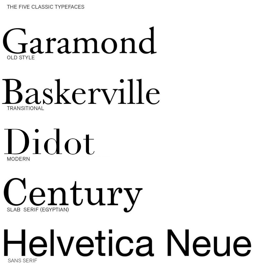


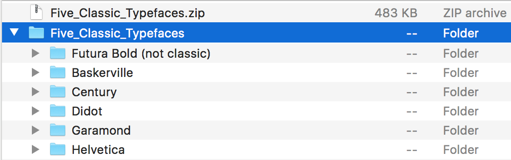
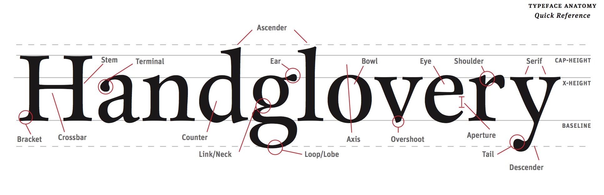


Didot and century have their own styles that differ greatly even though at first glance I could only see a slight difference. Century while being more traditional was created after the modern style Didot. Century was created by Linn Benton for the printer of the Century Magazine. While Firmin Didot created the letters and was used heavily by his brother. Didot font being created in 1784 didn’t get much attention until years later. The style grew in popularity due to the want for faces with strong contrast between thick and thin, unbracketed serifs. The unbracketed serifs are similar to century’s font, while century’s font was aiming to make the font round and sturdy and heavier than most serif’s. The century font has an x-height that was bigger while didot has a smaller x-height. To me the biggest differences is the serif styles as well as while Didot font looks wide the century font looks tighter because of thickness.
The two typefaces that I found most interesting in background and style were Baskerville and Garamond. Although Garamond (1561) was created much earlier than Baskerville (1757), I found the two typefaces look fairly similar. Claude Garamond was a French publisher from Paris and is known for creating the apostrophe and accent written in French. Although Garamond died in in the mid 1500’s, his typeface didn’t gain popularity until the 1600’s. It is considered one of the most ink-friendly fonts and is known for being a very legible serif typeface. It is a typical Old Style typeface with little contrast between the thicks and thins with heavily bracketed serifs. On the other hand, Baskerville is a safe medium between Old Style and Modern. As a very traditional typeface, the serifs were more sculpted with a thicker contrast between thick and thinstrokes for a more dramatic feel. John Baskerville created a paper production technique that resulted in smoother and whiter paper. Baskerville characters are wide for their x-height, are closely fitted, and have great proportions. Both Garamond and Baskerville are considered the most readable typefaces.
The two typefaces that I can see myself using often are Garamond and Didot. Both typefaces are very different considering Didot is a modern typeface while Garamond is old style. However, it was interesting to discover that both typefaces were created in France. Claude Garamond was originally thought to have created Garamond but it has been recently discovered that it may have been Jean Jannon in 1615. Unlike Garamond, there was no question as to who created Didot. The Didot family designed and used Didot during the 18th century. Like most modern typefaces, Didot has a strong contrast between its thick and thin lines while also having unbracketed serifs. Unlike Didot, Garamond has very little contrast between thick and thin lines and does have bracketed serifs. Garamond’s capital letters are shorter than the lowercase ascenders, making the typeface easier to read. Although these fonts are very different in their designs, I think their simplicity and history makes them strong typefaces.
Baskerville and Century were the two typefaces which I liked the best out of the five we learned about. Baskerville was created in 1757, it is a transitional typeface which means it forms a bridge between both old style and the new modern faces. This type shows great contrast between thicks and thins and is very wide and closely fitted as well. Baskerville seems to have excellent proportions and is a clear and readable type I would use everyday. Century is a font which I already use a lot but never knew the details about. It was created in 1894 by Linn Boyd Benton. This type was the first major american typeface. It was expanded on the original type Egyptian which has thick slab serifs and thick main strokes. Century is known to be refined Egyptian font. The font is very clear and legible which is why it is used by many.
Although these two fonts were both created in different centuries they both are legible, clear, and readable and are still popular in todays world. Century has a bigger x-height than Baskerville, and Century is a bit more thick than Baskerville. Both fonts have such elegance to them that makes them so popular to this day.
The two typefaces that I enjoy the most are Didot and Garamond. By just glancing at the design, it’s difficult to tell that these two typefaces are from two different time periods, and that Garamond is considered Old Style while Didot is Modern. I wouldn’t have thought that Didot was a Modern font since it still has an elegant design style like Garamond does. It’s interesting to see that the history of the two fonts is somewhat similar as well since both were designed in France, and appear to have a few similar attributes. Looking at the two typefaces, it’s easy to see that Didot appears much darker because it’s transition between thick and thin lines is very obvious, while Garamonds transition is slight, causing the font to appear lighter. Both typefaces are easily legible and as stated before appear to be formal typefaces, but Garamond appears more formal and elegant while Didot has some characteristics that make it appear more common and as a typeface that wouldn’t be used for significantly formal reasons.It’s interesting to read about the history of these typefaces and see what they were originally used for, and it definitely makes me think of the way I choose fonts for certain things.
The two types of typefaces I seemed to like the most are Garamond and Didot. Garamond is more old style and Didot is more modern. I think these two typefaces are different because Garamond letters are bold and thick. Didot has letter that are thin and not as bold. I like how Didot looks neater and cleaner looking if you need a simple name. Garamond seems to be more noticeable and from a distance it catches the eye more than Didot would. If you look at both fonts you can see how the letters end in a thicker line and Didot ends with thinner lines. Both fonts were designed in France and have history behind them. Claude Garamond was a French publisher and type designer whose designs many modern Garamond typefaces. Firmin Didot created the letters which was then used by his brother. It was interesting researching about these two different typefaces but also looking at some similarities that they share.
Helvetica and Garamond are distinctly different typefaces in many ways. Garamond is an old fashioned typeface designed by Jean Jannon in 1615. With very little difference between the thick and thin lines, heavily bracketed serifs, and oblique stress, Garamond is a unique font with open and round letters for legibility. Helvetica on the other hand is a sans serif created in Switzerland designed by Max Miedinger. This universally used typeface is tall, has condensed letters, and equal sized strokes. Both Helvetica and Garamond are easy to read, yet they have distinct characteristics.
I have decided to compare the type faces Century and old style. These to have multiple thing in common yet differ in ways for instants look, portion and creation. For example Century was made in the USA during 1894 by Linn Boyd Benton. He made it believing it would be easier to read, with a greater legality through the characteristics. Benton had a friend as the publisher of Century Magazine who was looking for something thinner and stood out. He creatively took common looking typefaces and condensed the proportions and made the letters round and sturdy. Old style was made by Claude Garamond in 1617 long before century was created 277 years later. Garamond was a french publisher from Paris, a leading type designer who had inspired contemporary typefaces like Sabon, Granjon, and Garamond. “These early roman types are characterized by curved strokes whose axis inclines to the left, and little contrast between thick and thins.” Comparing them both Century has less contrast compared to Old Style. Yet Century is more portioned. I believe that century is a better for labeling and advertising due to the spacing. While on the other hand Old Style looks better as a font because of the contrast. Old Style has more weight distribution thought letters it as been leveled out be the proportion of each letter making it easy on the years to soothing flow visually.
The two types of typefaces that caught my attention the most were Baskerville and Century. Baskerville is classified as a “transitional typeface” because it was created in between the Old Style and the Modern Faces. This font shows a large contrast between the thicks and the thins, and the stress of the type is almost vertical. Created in 1757 by John Baskerville, this font still remains popular and successful to this day. Century, on the other hand, was created much later, in 1894. This was the first American typeface and was created by Linn Benton for a magazine at the time. Unlike Baskerville, century has little contrast between the thicks and the thins. Baskerville is very wide for its x-height, have nice proportions, and are fit well. However, Century’s x-height is not too big for itself, and has a very simple markup. Both of these fonts are similar because of their simplicity and legibility. Both of these typefaces have come a long way and are still very successful to this day. These are two very common fonts, and it was interesting to learn more about the background and history of each one.
The two typefaces that were most appealing to me were Century and Helvetica. Century was created for the simple purpose of being more legible, and to me there is really no better reason than that. The letters do not vary nearly as much in thickness, and I think that is what really appeals to me about this font. It is very simple, and very clean. It originated in the United States in 1894, and that is not something you hear of very often. Helvetica was the other font I chose. Particularly after watching the film I found this typeface very interesting. It originated in Switzerland in 1957 by Swiss designer Max Miedinger. Many different variants of this typeface have been released over the years, these variants include changes in weights, widths, and sizes. Helvetica is everywhere, it seems to be one of the most widely used fonts. That to me is what is interesting about it, it fits a lot of situations. Even though there could be a typeface that does a better job in a certain scenario, the fact that Helvetica can be used in so many places is very interesting to me.
The two typefaces that immediately caught my eye when reviewing these five were Didot and Helvetica. Helvetica is a sans serif font, referring to its lack of serifs meaning extra loops and curves at the end of any given letter. When this font became popular in the 20th century, it intrigued many people worldwide. Didot on the other hand is a serif font which gained popularity during the 18th century. To me, these two fonts, even while being different styles, are both so simplistic yet can be very serious. You can argue that Didot is just a Helvetica font with serifs. The two fonts interested me because of their distinct differences yet slight similarity. Both of these fonts have a modern style to them which is why they are easy to read. These fonts are used daily because of their versatility, simplicity and ease of use. It was these factors that also made me like these fonts and will most likely be fonts I use often throughout the year.
Comparing the two typefaces Garamond and Baskerville was interesting because they are both are very different and both have interesting histories behind them. Garamond caught my eye because it is a classic old style of typeface and it is very legible because of its little contrast between the thins and thick of each letter creating an open/round form. This particular type face also went through quite a bit of revamping over the years. Claude Garmond, the creator of this typeface was one of the leading type designers of his type and while creating it he based its design off of Angelo Vergecio’s handwriting. This was very eye catching to me because that lead me to believe that people in this time really put some time and effort into their handwriting unlike today where everyone’s looks every different and possibly sloppy. Baskerville on the other hand is a traditional yet modern serif typeface that Jon Baskerville created. He created some improvements to this typeface like between the O and Q such as making the serifs sharper and more tapered by adjusting the layers around rounded letters. This font was created to be very legible and each for people to use and read. I enjoy this font compared to Garamond because it is thinner and seems slightly easier to read. I do enjoy both of these fonts and hope to learn more about them and other fonts along the way and the history behind them.
The typefaces Garamond and Baskerville are two of my favorite fonts. They are my favorites because of their classiness and their little flare they have to give them a fancy, old- fashioned theme. They have a lot of similarities between the two, but they have just enough to make them different.
Garamond, accredited to Claude Garamond when in recent studies possibly show Jean Jannon was the creator, is an old- style font that was designed in 1615. The easiness of reading this font comes from its openness and space between the letters. The thick and thin of the lines are spread evenly throughout the letter and shows nice subtle contrast of thickness when you notice the architecture of the letter.
Baskerville is yet another great font created by John Baskerville in 1757. This font was a transitional font because of its breakthrough out of the old style font and into the modern font style. The font has a very elegant look to it and has a good variety of letters that have a different thickness. Baskerville created the typeface because he wanted to take advantage of the printing press and the better papers.
They are the same in a lot of ways because they are both elegant and have fancy lettering. They have very similar bases on the letters and you can see the inspiration for Baskerville looks as though it could have originated from Garamond.
My two favorite fonts used out the five are garamond and didot. Garamond has little contrast in its line weight, and uses a nice, curvy style that makes it comfortable on the eyes. Didot, on the other hand, is almost the complete opposite. It has high contrasting thick and thin lines and unbracketed serifs. Garamond I mostly imagine using a font for an article, while didot I pretty much exclusively imagine as a title font. Knowing the background and purpose of the font is important when considering your opinion on it. Garamond is an old style font, where the main concern with its creation was readability. Didot, on the other hand, is a modern font, where typeface designers were more concerned with the fashionable appearance of the font. I appreciate garamond for its simplicity and readability, while at the same time I appreciate didot for its more stylish and dramatic appearance.
The two typefaces I am most familiar with are Garamond and Helvetica. When writing a paper I almost always am inclined to use Garamond. This is because I find the font to be proper and simple which is effective for formal writing. Simple fonts are effective for formal writing since the words do the talking instead of the font. With little personality or flare in the type, the reader can focus more on the content and meaning of the words. Helvetica however I find has a little more personality to it. The lines in the letters are more straight and blunt which can give a more bold vibe to the reader. I like this font when it is displayed as commercial items or in street signs. This is because the boldness of the font draws the reader in and makes them interested in what the content of the words are. So when dealing with street signs or other informative writing, Helvetica is a good font to use since it grabs the attention of the reader and comes across in a strong and impactful way. Garamond does not give off the same bold feeling due to it’s curlier, less aggressive letters. This results in the font being neutral and good to use for longer writing pieces such as essays or novels.
My favorite two typefaces are, Baskerville and Didot. Baskerville is a more sophisticated typeface, it’s been around for hundreds of years, yet is timeless and because the characters are so wide apart, it makes for a very easy to read typeface. On the other hand, Didot looks more modern thanks to its combination of thick and thin lines, and has unbracketed serifs. This font was designed by a man by the name of Firmin Didot and his brother used the font in printing pressed. It’s a more fashionable font, that is classified under one of the most recent family of fonts called “Modern Typeface”. They both are very wide fonts and because of that, they are easier to read than most other fonts.
The two typefaces that caught my eye the most were Didot and Helvetica. I like the look of Helvetica because of how simplistic it is and how easy it is to take in. Helvetica has very neat straight edge style that makes it very easy to read. It is very accepting to the eye compared to other typefaces. This would probably explain why it is so popular in advertisement and other forms of media today. Helveticas is a typeface of Swiss origin created in 1957 but did not become popular until the twentieth century. It became popular because of its clean readable design and style. Didot was named after the famous French printing family Didot it became popular because of its thick and thin design. What I like about this typeface is the contrast that is created by the use of thick and thin design that really makes it eye catching.