- Â
å September 2015
B Manilla Envelope
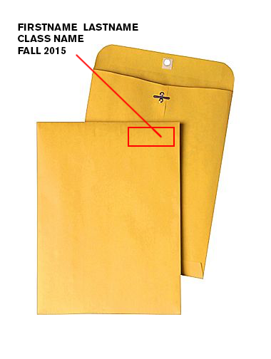
1. Get a 9″ x 12″ manilla envelope. (You will likely need 3 or 4.)
2. Write the following neatly in top right corner of the front of the envelope.
3. Write your first name last name on one line.
4. Write the name of your class on the second line.
5. Write “Fall 2015” on the third line.
6. Legibly write the name of the tool on the back in pencil
7. Insert work neatly inserted inside.
B Printing with Crop Marks in Illustrator
1. Press ⌘ + P
(you don’t have time to mouse the menus…)
2. In the print dialog box select your paper size. This is usually US Letter (8.5″ x 11″).
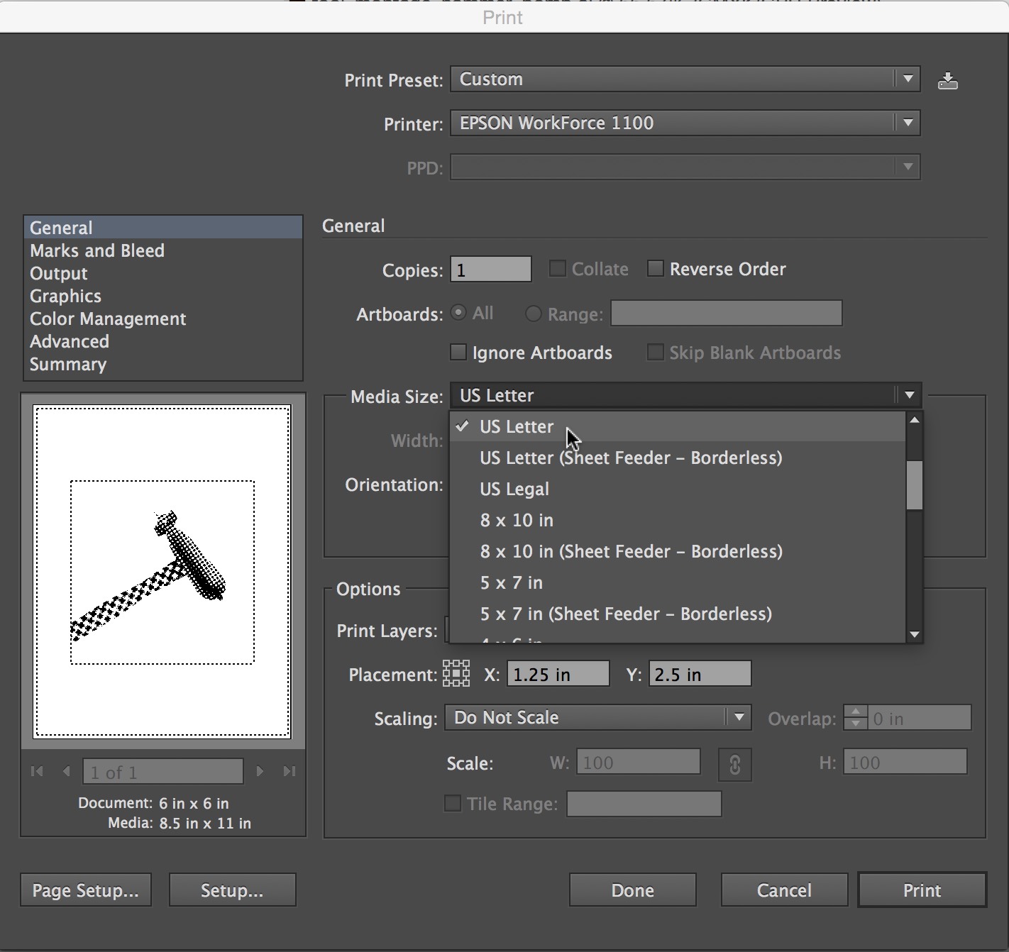
3. Select Do Not Scale from the “Scaling” menu.
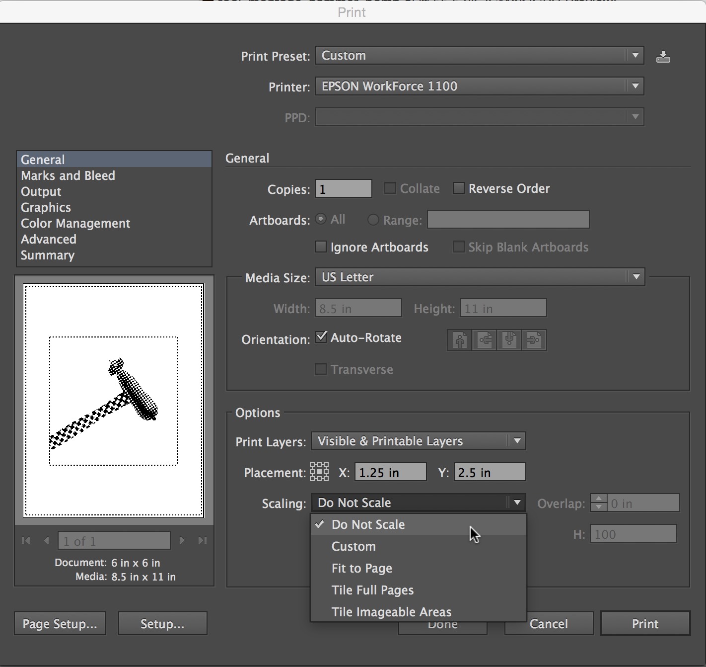
4. Select “Marks and Bleed” from the top left menu list as shown.
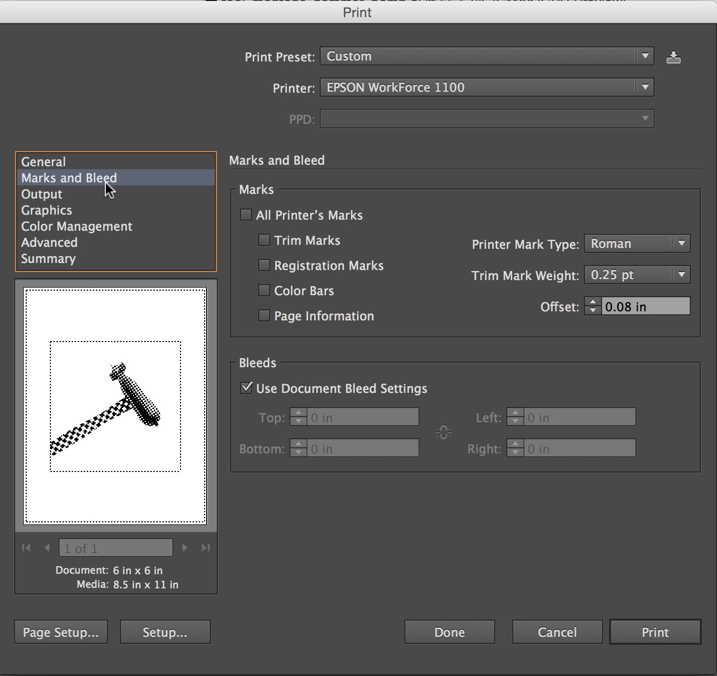
5. Check “Trim Marks” 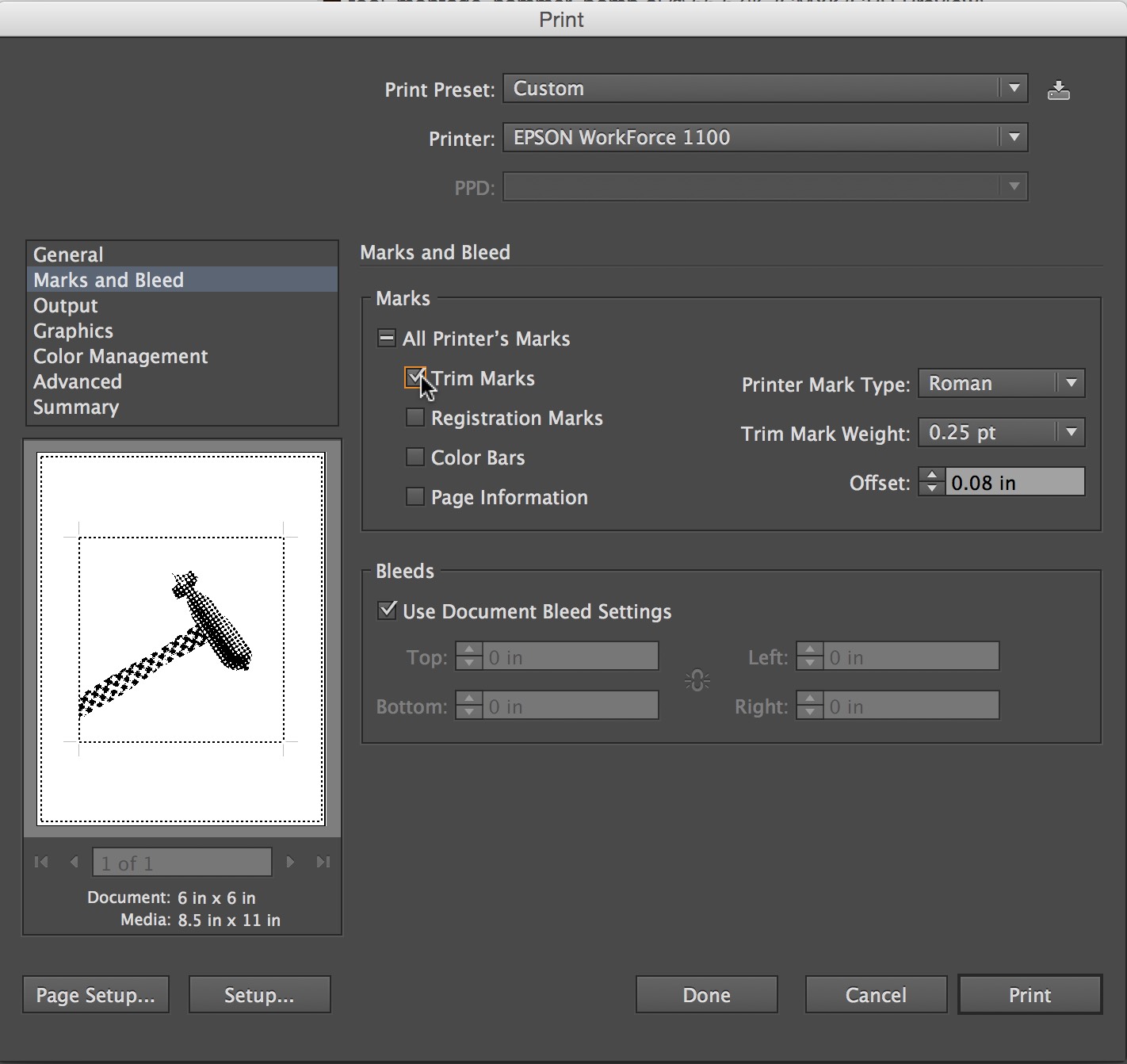
6. Press the Print button in the lower right corner.
B The Five Classic Typefaces
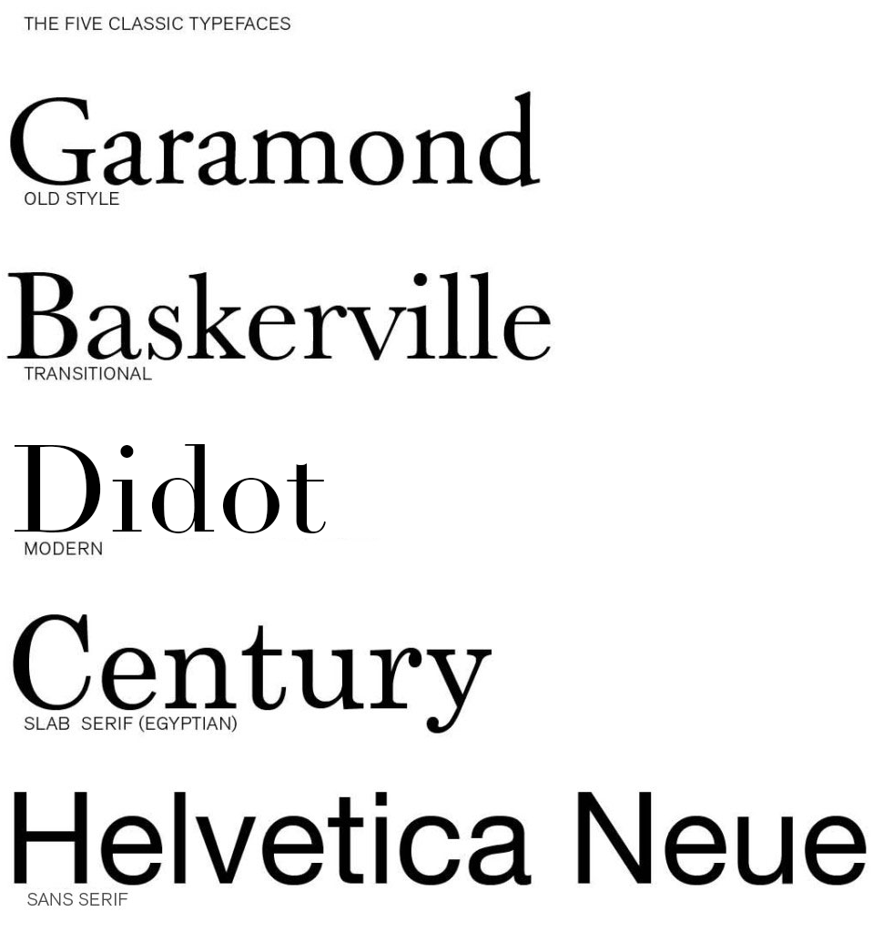
Download the Five Classic Typefaces Here…Five_Classic_Typefaces
Read
Explore these Links.
Designing with Type 5: Identifying Typefaces
The Five Classic Typefaces | Steve Bowden: Endicott SP13
A Simple Overview of the 5 Classic Typefaces
Read them and respond as a comment to this post.
Tell compare two of the typefaces: one you like and one you like less. Explain why they are different and what informs your opinion. It is not good enough to say “I just like it”. Be specific about the type attributes.
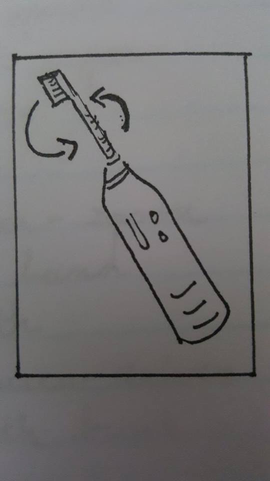
í Tool Montage : Tools of the Near Future

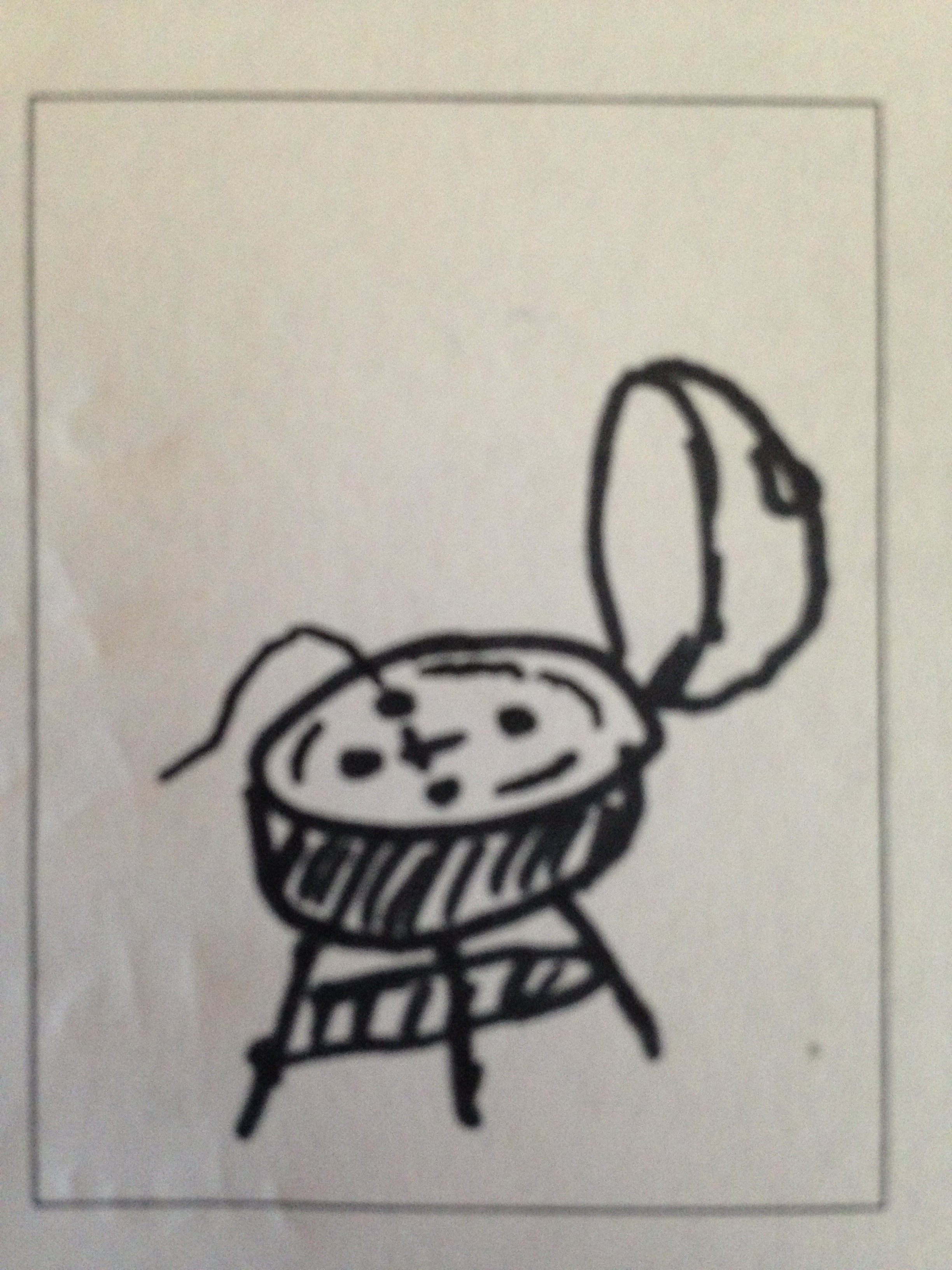
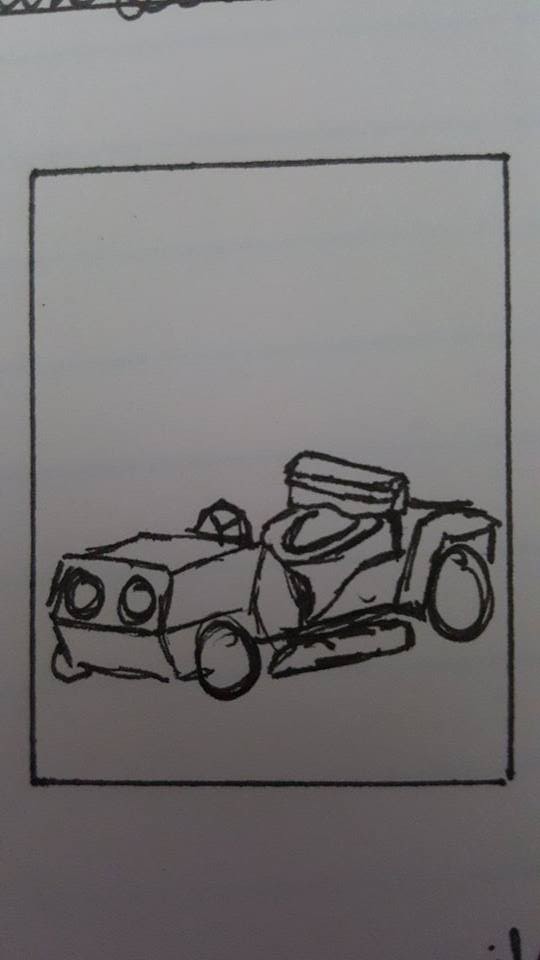
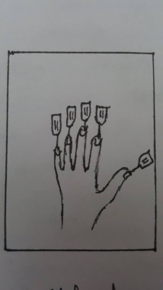
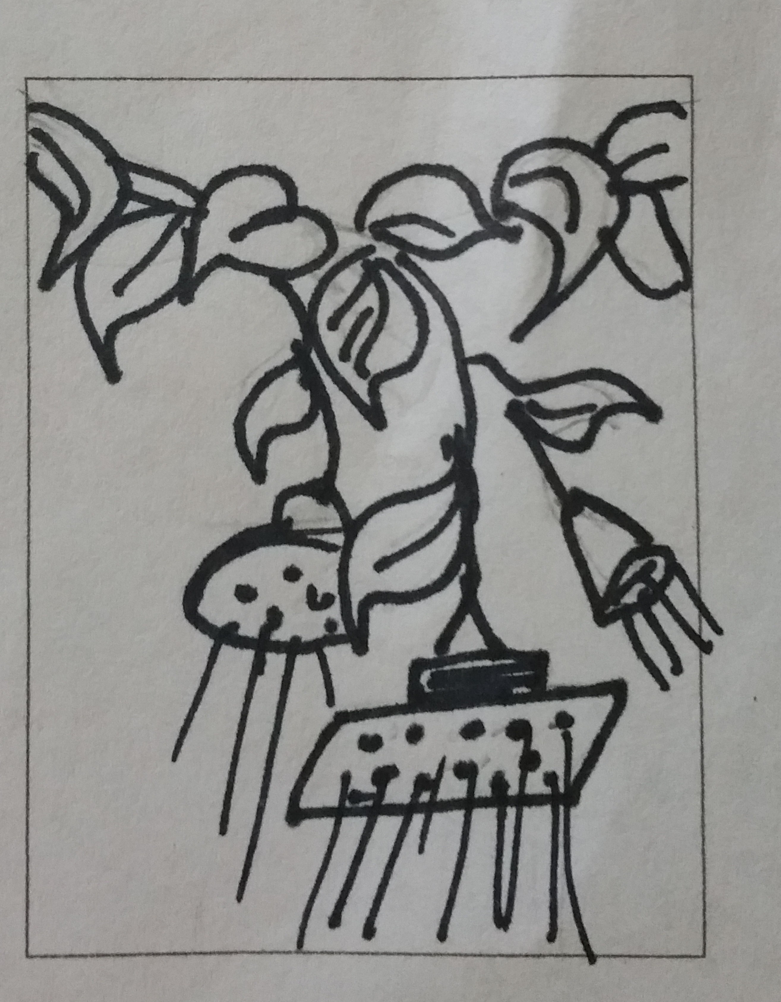
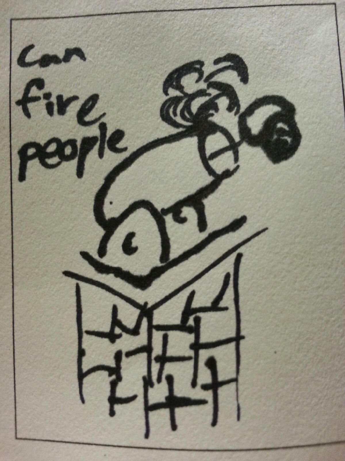
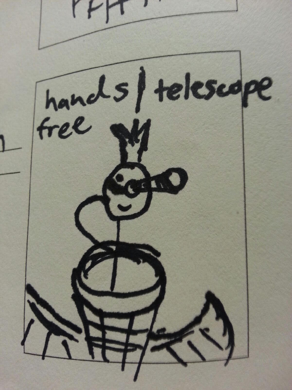
Design a series of 5 new “Tools of the Near Future” that solve problems that (may or may not yet) exist now. These tools should have plausible functions based in a specific context (for example: brushing your teeth while bike riding). The tool doesn’t have to be practical however and you are free to express implausibility and whimsy. Remember, this is about tools right? 🙂 Be prepared to answer these questions:
What problem does it solve?
How does it do it?
What is it called?
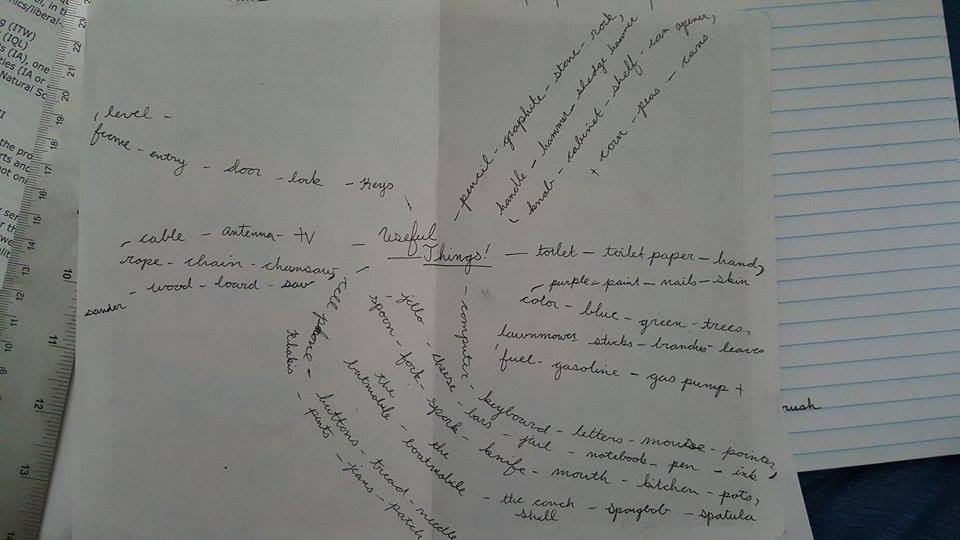
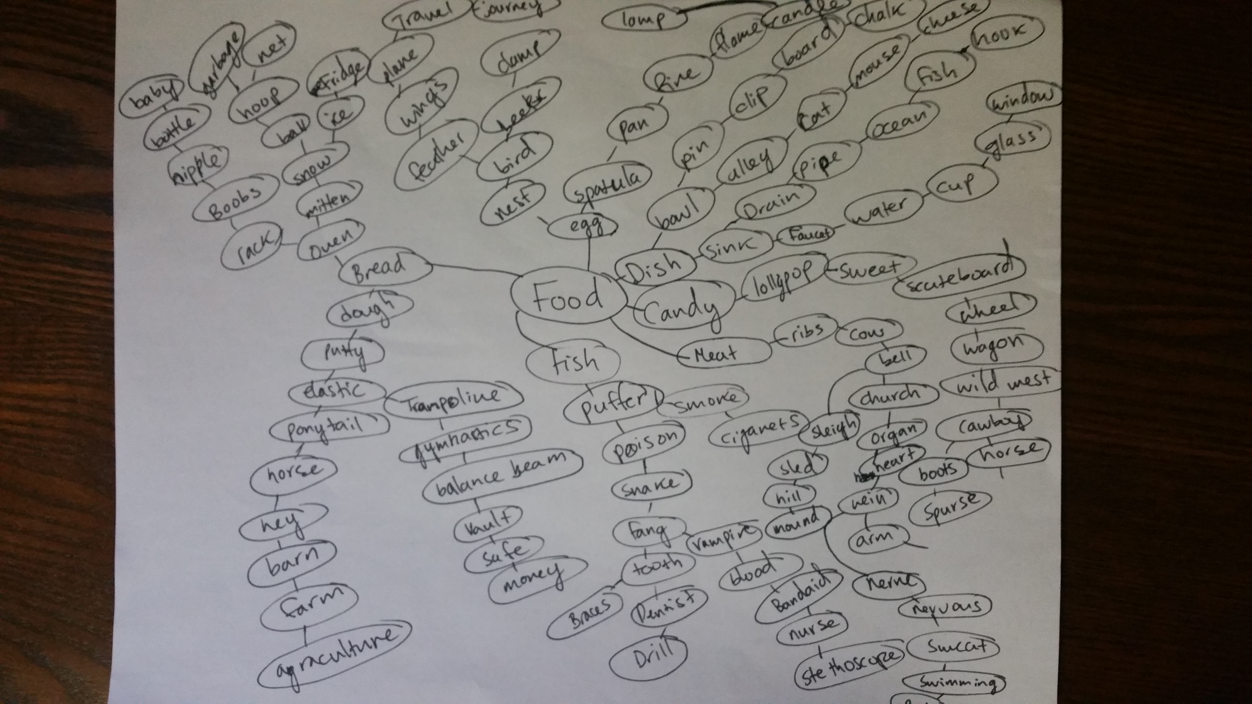
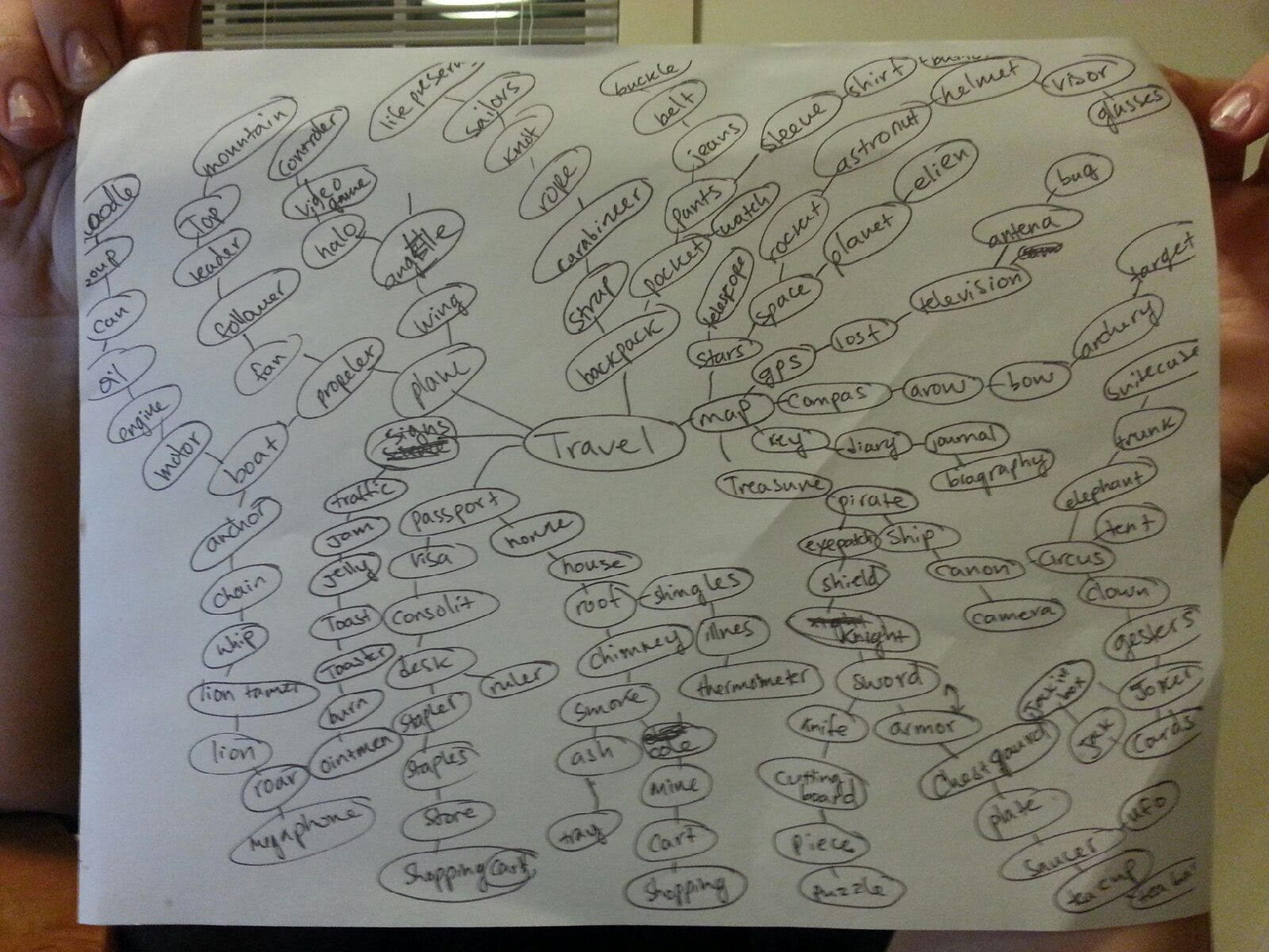
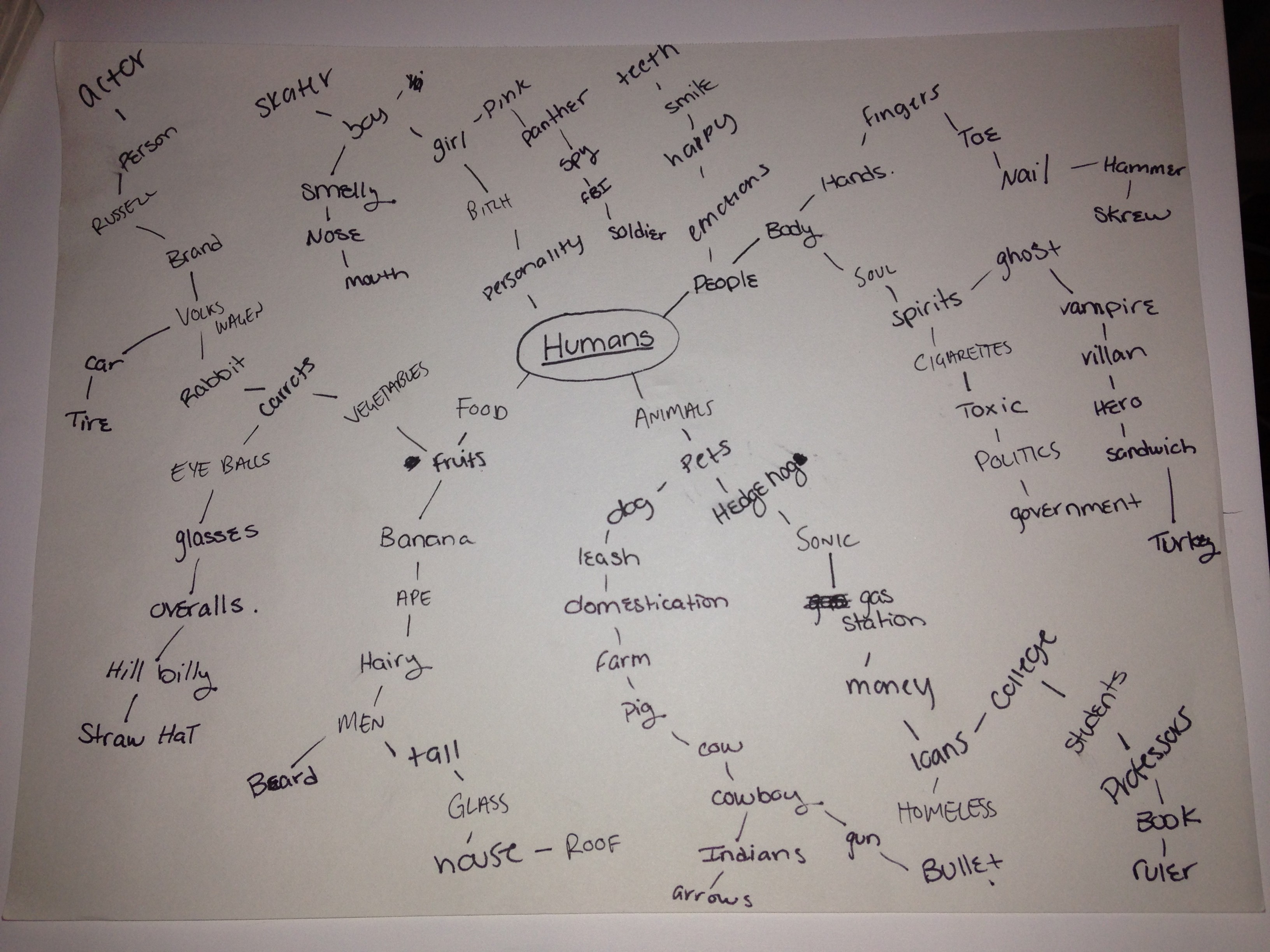
Build on your Previous Research
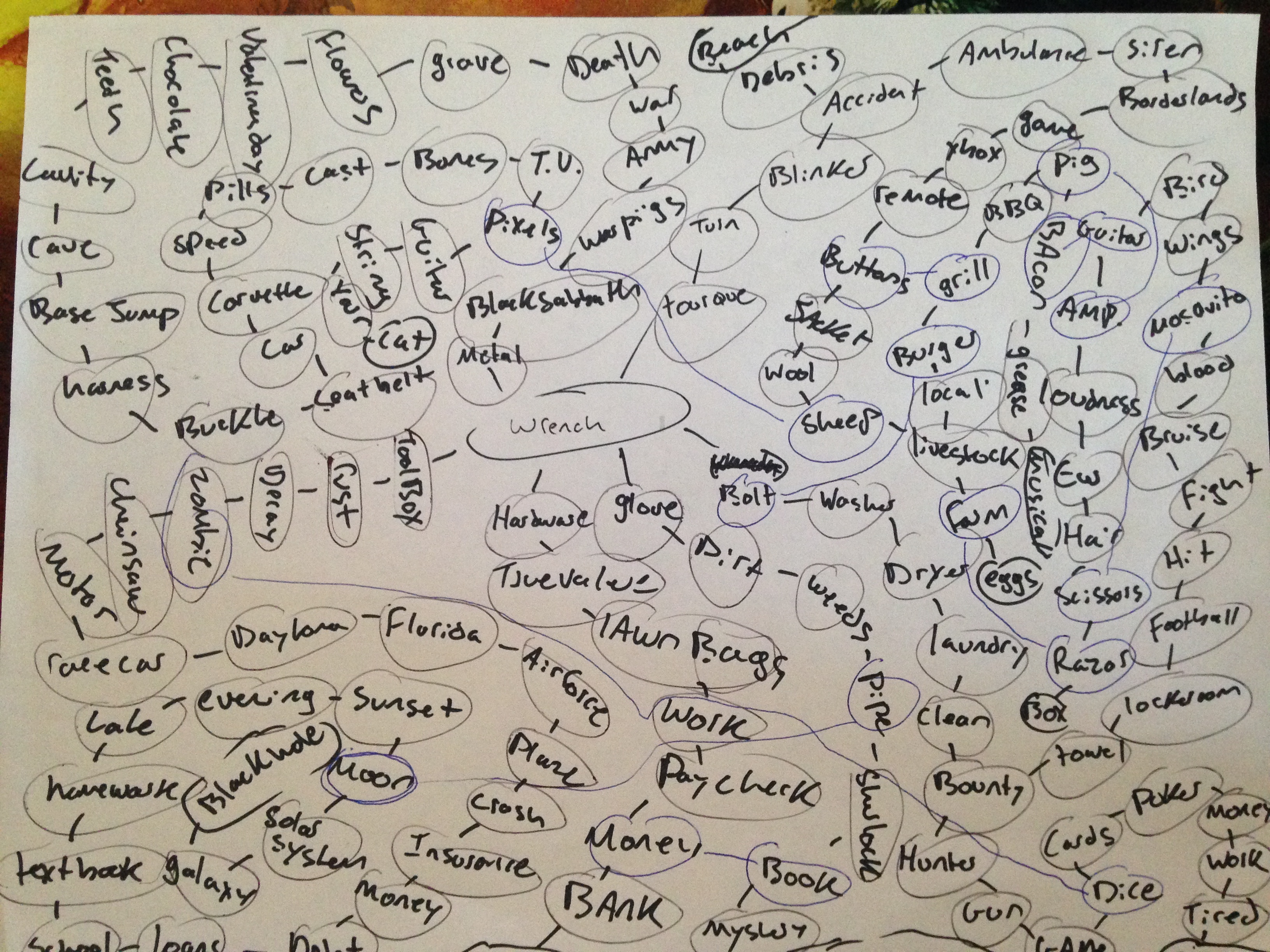
You can make tools from ideas you have already have or think up new ones. Go back to your Mind Maps to find new words and ways to look at the problem or make a new mind map to get you thinking differently. Write down twenty more tool pairings.
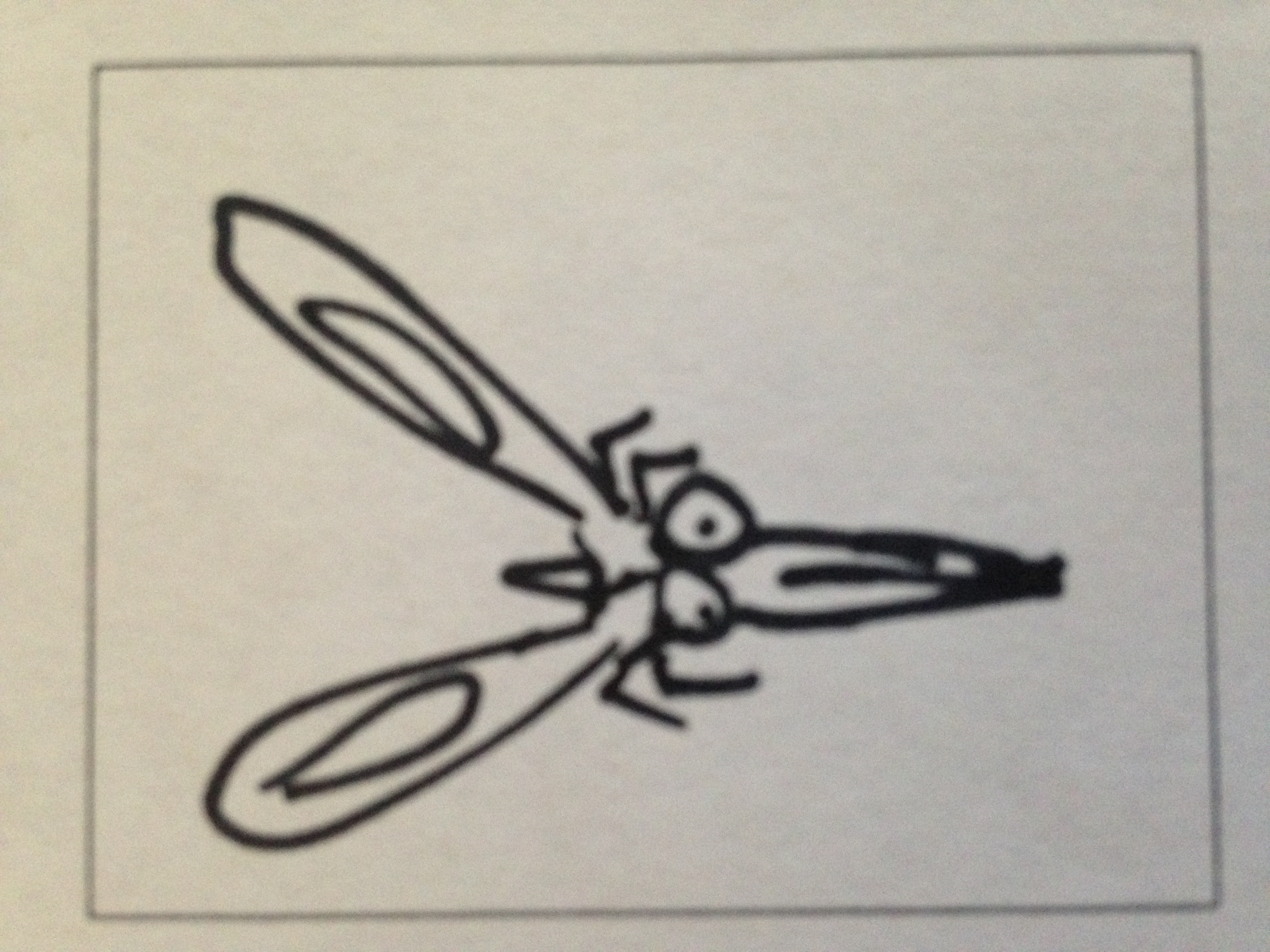
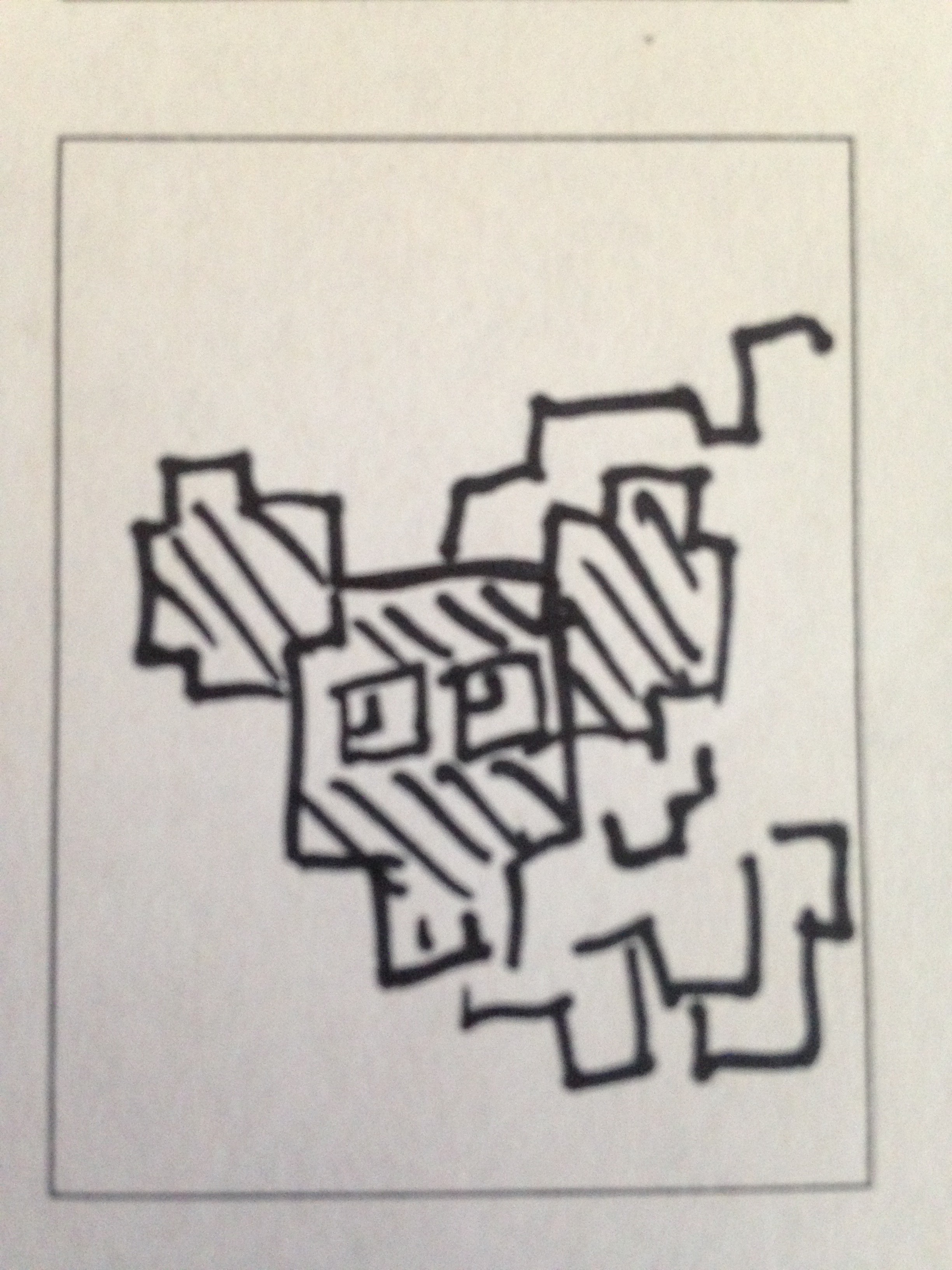
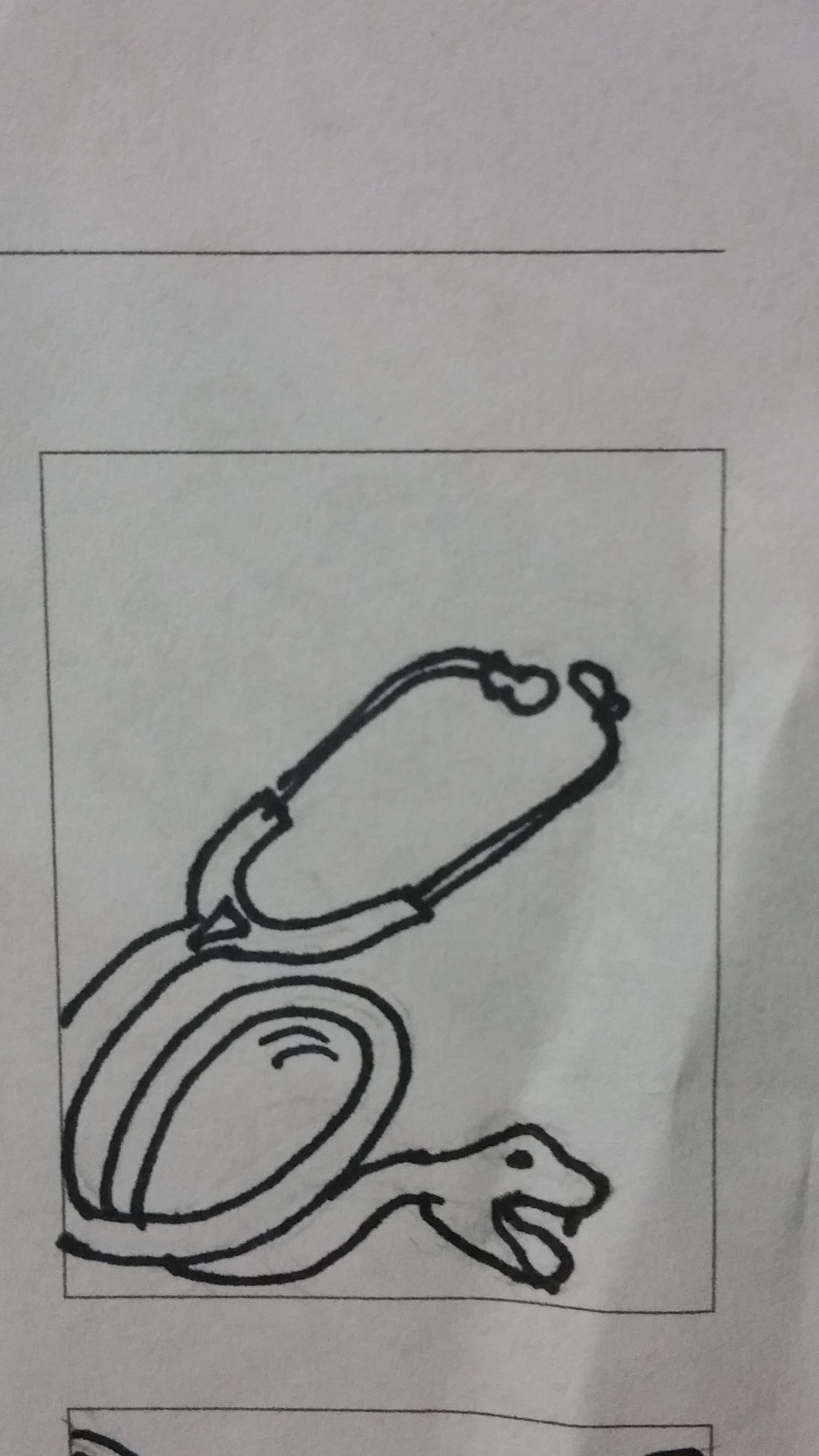
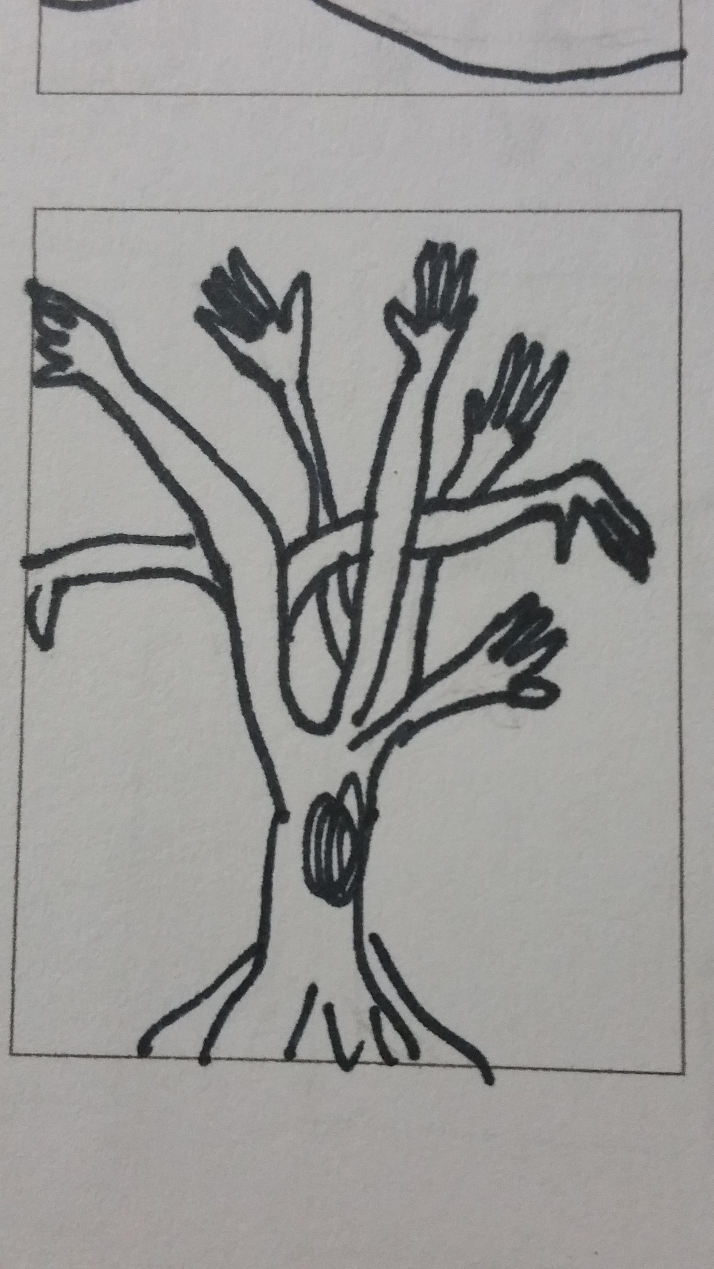
Make Thumbnails for 10 ideas
Select 10 of those tool pairings to explore with thumbnails. Make 3 sketches of each of your 10 tool combination ideas. You will have 30 sketches, or three sheets when you are done. Each sketch must be a completely different idea from the last one. Use different angles of tools for variety.
Use this template for your thumbnails
Choose 5 Tools to Create
Select 5 Tool Combos from your 10 thumbnails and make them using PhotoShop bitmaps in the program Illustrator.
The steps to prepare the images are :
- Collect Images: For both tools in your tool pair hybrid you will need 3-5 images of each (different types & angles)
- Medium Size: Source images should be between 600-1500 pixels (not to small, not too big)
- Number of Source Images: For 5 tool combos you will need approximately 30 images. This means that 5 pairs comprised of 2 different tools = 10 unique tools to research. For each of the 10 you need 3 images of each = 30 source images.
- Choose wisely: Think about the ways that the tools can combine. Sure a flat side view works but can you use dynamic angles to create more interesting final images.
- Find Interesting images: The best tool images may need to be separated from the background. Some tools will be silhouetted already, but many of the interesting ones will not. Don’t be afraid to work a but to silhouette the tool.
- Turn the images into bitmaps using only HALFTONE functions (not dither or 50% threshold). Keep the dot patterns noticeable but not too chunky or fine. We want all the images to be able blend well so very course halftones and very fine ones won’t mix well.
- Create bitmap photoshop .PSD images for each of your source images and save them with names that informative : your initials + tool + dot pattern + .psd = RH_hammer_19round.psd
- Watch these tutorialsIsolating and Enhancing Images for BitmapThere are 25 minutes of instruction that will show you what you need to know.
Isolating and Enhancing Images to Make Bitmaps / Part 1
Isolating and Enhancing Images to Make Bitmaps / Part 2
- Bitmap Format: All images must be BITMAP and saved as .PSD.
- Separate in Folders: Save all Bitmaps separated from your source .JPG files from the web
- Name them Correctly: All shared images must be prefixed with your initials…”RH_hammer_19round.psd”
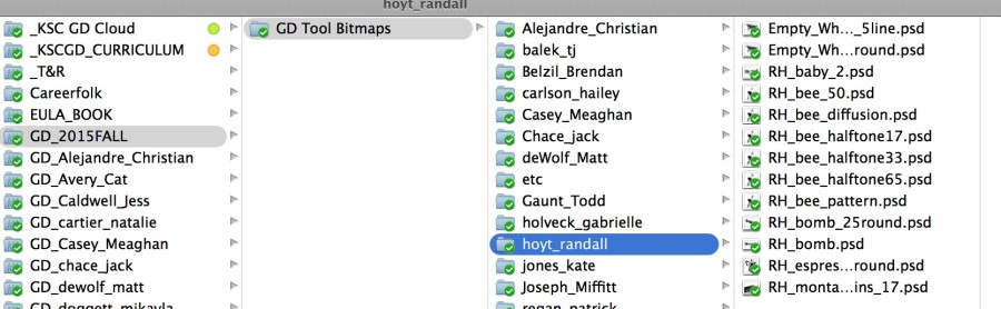
- Upload and Share: Create a folder for yourself on DropBox in “GD_2015FALL” and upload your bitmap photoshop (.PSD) images to “GD_2015FALL / GD Tool Bitmaps / [ last – first ]”
Build your Tools of the Near Future in Illustrator.
- Create a new illustrator file that is 6″ x 6″
- Import your images using: command + shift + ‘p’ / DO NOT DRAG AND DROP…
- Combine the images in creative ways. There should be only two images combined, but you may repeat one if necessary.Clipping Paths for Bitmaps in Illustrator
- Use the Menu : Objects > Clipping Mask > Make to hide parts of your images.
- You will need two (or more) variations of each of the future tools. Combine the tools in different ways or use different images to express the idea.
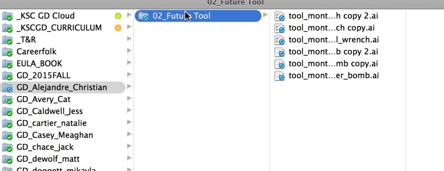
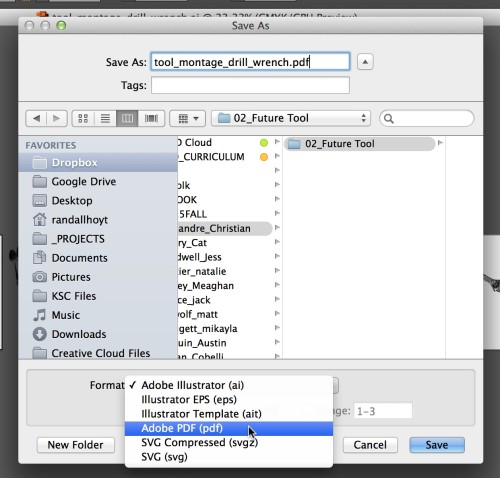
- Make a folder called “02_Future Tool” in your own Personal DropBox for your final illustrator Tool Montages.
- Save all Illustrator files as .PDF (not .ai)
Have fun and ask questions if you have them.
Due Monday, Sepetember 9
- Thumbnails for 10 tool pairings ready to hand in (photocopy from sketchbooks if necessary)
- 5 PDFs with 2-3 versions of each future tool saved in a folder called “02_Future Tools” in your own Personal DropBox.
- 5 more Future Tools created with classmates images saved as PDF in “02_Future Tools” in your own Personal DropBox.
- All tool bitmap files saved in your folder on DropBox: GD_2015FALL / GD Tool Bitmaps / [ last – first ]
-
Classroom
-

The two typefaces I’m comparing are Helvetica and Century. Out of the two, I prefer Century over Helvetica. Century has a more curvier, thinner style, as well as a better flow to it. Helvetica on the other hand is more blockier, bulkier, and bolder. It stands out of the crowd and shouts “look at me”! I chose Century because it has a very dainty feel to it compared to the other fonts. It reminds me of my own hand writing and something you would find on an important document. I didn’t like Helvetica that much because to me it seemed very plain. It just reminded me of any bold title you would see on every package at the grocery store (which is not a bad thing). I prefer interesting fonts that have a curvier sense to them. It gives them more “life”, like a person is writing it.
Century and Baskerville seem to be my favorites out of these classic typefaces. I say this because the look of century is so classic in itself, perhaps it’s called “century” since the roots of this type can be traced back for centuries! It’s a very unimposing font, as it’s easy on the eyes and the reader should have no problem focusing on each word. Baskerville is a bit different in this way as the font is more condensed. The letters seem to be much closer together and while I believe that this font looks very clean, I feel as though it is also possible that the smaller the font goes the more difficult it may be for some to focus on the letters. Overall however, this font does look very nice when utilized correctly.
My favorite of these fonts is Garamond. I like how the letters are all rounded and wispy, but they all have tails to them. I also like Century. I like the old style lettering because it looks like something you would find on an old newspaper clipping. They have an almost medieval appeal to them. I think it is because of the way the letters all have tails that are sharp and jagged. I don’t really like the Helvetia font because it is too bold and plain. There is too much simplicity to it that does not appeal to the eye. The Century font is soft and easy flowing while the Garamond is thinner and sharper.
I like the century font. It reminds me of a typewriter. It has character, but is still elegant. It seems like a font that can be used for multiple problems. This font seems sophisticated. I love the serif fonts. The letters seem to flow together well, creating a balanced composition. I did not like Helvetica. This font is overused. It is too main stream. The letters, unlike century, have very little character, which is probably why people are inclined to use it more often. When looking at Helvetica, it doesn’t catch the eye and is therefore less memorable. It isn’t an awful font. It’s modern and sleek, but I prefer the serif fonts. They seem older and more vintage.
I personally liked navigating through the designing with type website. I found that it was very user friendly and quite easy to get through all of the different tabs. The tabs also contained a lot of information that was easy to understand. Nothing was too technical or hard to navigate.
Baskerville is the font that I like best out of the bunch. It has a professional but relaxed look to it. I think this is attributed to the fact that it is a serif font that is thinner than Garamond. Helvetica is my least favorite font. It is too plain and over used. Although it is an easy font to read it has no surprise factor any more and elicits no emotion.
The two typefaces I chose to compare are Didot and Helvetica. Didot I chose as my favorite typeface. I actually used Didot quite a bit in my other classes. I really enjoy this typeface, because it has a modern, sleek look to it but also has a classic feel to it. Didot has a very stylish look to it with the varying thick and thinness in the letters. I love the top part of the lowercase “t” in Didot with that nice little curve on the top. Aesthetically, I find DIdot pleasing to my eye. My least favorite is Helvetica in this comparison of typefaces.
Personally, I think Helvetica just is so different compared to the other typefaces listed. It’s a very bold and simple look. Helvetica was used for functional purposes and to be put on signs. It was created in 1957 where typography was becoming more experimental. The other typefaces listed above are classic and were created in the 1500s and even 1800s. I just don’t like the look of Helvetica compared to these other typefaces, it’s a sans seriff fonts and all the others contain seriffs. It looks very jarring and harsh when set next to the other typefaces and stands out in an unpleasing way.
My favorite font is Garamond. It is very old fashioned and I like the style. It is very elegant looking along with simple at the same time. It looks like something you would see in a newspaper a long time ago or an old book! I love how the letters look, something about it is just satisfying to my eye.
I am nit a huge fan of the Helvetica font. It doesn’t do much for me. It is almost too simple and there isn’t much to it. It looks like you could take a sharpie and copy this font without even trying. One thing that is good about it, is how simple and practical it is. It is very clear and readable and I’m sure a lot of people like that. I prefer fonts that have more spunk to them and look like they have personality in each letter. Helvetica is too plain and bulky.
The two fonts that I find appealing are Transitional and Slab Serif (Egyptian). The Transitional lettering has more curvature and smoother flow that I find very attractive. However, the Slab Serif(Egyptian) has less curves and the text is more blunt and has more angles. It reminds me of texts that I see in magazines and books. The two fonts seem similar but have opposing differences.
The two fonts I like are Helvetica and Didot. I am a huge fan of Helvetica (especially after watching the documentary Helvetica). Helvetica is a swiss Sans serif typeface that was made in 1957. Im attracted to it’s slightly condensed letters and clean design because not only is it very readable, but to me it gets straight to the point. I like Didot as well but it’s not nearly as universal as Helvetica. Helvetica has the ability to be used to say so many different things. Didot, a modern typeface made in 1788 has a strong contrast between it’s thicks and thins, as well as a strong vertical stress. It was the first modern typeface among the older faces known as Old Style. What draws me to Didot is it’s bold expression that comes from it’s contrasting thick and thin lines.
The two fonts I have chose to compare are Helvetica and Century. I prefer Helvetica of the two because personally I enjoy more modern looking sans serif fonts that help broadcast futuristic looking media. All sans serif fonts are typically very smooth and simple while serif fonts are very contour and complex. Century would probably be my favorite out of the serif fonts if I wanted to reach more of a vintage or classic look. I would use both of these fonts in the future it just depends on the design and which direction it is going towards, modern or classic.
Didot and Baskerville are two very different fonts. Both are used for personal or design use, but I would prefer Didot over Garamond. Didot has such a bold and interesting look to it, it draws your attention to it. The thick and thin lines combine to create this effect, and I think it does a good job in grabbing my attention. On the other hand, Baskerville is a little harsh for me, and doesn’t seem to flow, like Didot does. I don’t think this font fits together well, It seems choppy and awkward to me. It doesn’t catch my eye as much as Didot or other fonts do. Both these fonts will get the job done, but I love the characteristic and feeling Didot creates.
Helvetica Neue and Garamond are the fonts most seperated by age, and it shows. As time passed, printing went from looking similar to pen and ink writing, to impossibly perfect lettering. I like Helvetica more than garamond because it’s a very common font and I prefer simple and easy to read fonts because I work on a computer programming so much. I really dislike garamond as a computer font, however I think it looks nice for books or as a decorative font, but its just less readable than helvetica. Garamond is a better font for real paper, while helvetica is a winner on the computer.
The font i took a strong liking to was Didot, while Century on the otherhand i didn’t like so much. I really like Didot’s heavy contrast between the thick and thins, it gives it a very fragile look. I also like how spaced out each of Didot’s letters appear, it makes it look like each letter stands out on its while still maintaining the cohesiveness needed for a flexible typeface. Century isn’t such a bad typefaces, there’s just a few little things about it that i personally don’t care for. I don’t like Century’s slab seriffs, it’s too distracting for me. Also i feel like the curves aren’t quite as interesting or varied as some of the other typefaces such as Garamond or Baskerville. Century probably has it’s uses, but i’d rather stick with Didot.
My favorite out of them is definitely Garamond because of it’s elegance compared to the rest of the types. I prefer the open and round letter forms because they make it seem like a friendly happier type rather than the other dull ones but it’s not too casual at the same time. My least favorite is Helvetica because it’s just boring straight letters with no elegance or excitement or anything. Garamond has the rounded edges whereas Helvetica is just cut straight and it may seem like a small detail but that small flair is much more appealing to me personally.
My favorite font out of these five type faces is Century because of its thick serifs and the over all curvy look of some of the letters, like the tail on the lower case ‘y’ for example, or the shoulder on the letter ‘r’. I like the natural boldness of the font along with its uppercase letters. It also is very legible.
My least favorite font out of these five is Didot because of its extreme thicks and thins of the horizontal and vertical lines. I think it would work well as a short heading, but as body text I think that the reader would get distracted by the extreme variation of the font itself.
Century and Baskerville fronts seem to be my favorite as of now because I like how fluent the letters are corresponding with one another. The terminals on the letters gives the font more of a dramatic and playful look. It is not as serious as Helvetica, which is very straight forward and cutting edge. Didot is probably my least favorite because I do not like how skinny the legs are and it looks too old modern fashion for me. I feel like it is a font that the elderly would enjoy using.
The two fonts I’ll be comparing are Didot and Garamound. Didot is the font I like the most, something about the symmetrical letters appeals to my eyes. Didot is a Rational Serif which contain super thin looking serifs with no curvy brackets. Garamound is the font I don’t enjoy out of the 5 different fonts. It’s a humanist serif which has humanistic brackets and mimics the looks of hand writing. This is nothing special because we see our own hand writing everyday. Didot just looks fancy which I can imagine seeing this font on a cover of a fashion magazine rather than Garmound which looks like the boring typeface cousin of the Harry Potter logo.
Helvetica Neue and Didot are very different fonts, but have a professional look to them in their own way. I believe Helvetica Neue could be used for just about any company, while Didot has that specific look that would be for a fashion company. I prefer Helvetica Neue because I like the simplicity of it and I believe you could use it as the title or the body of a page and it would be easy to read. Didot has more of a pen like quality that makes for a great title, but I believe it would not be legible if shrunken down as a body text.
My favorite typeface is Baskerville over Helvetica. Baskerville is much classier and feels more sophisticated to me than Helvetica, which seems very modern and unoriginal. I love Baskerville’s style and how it looks as if it is from the Roman times. It is not as hard as Helvetica, but is not soft and vulnerable. Helvetica is large and in charge with how its letters are designed. Helvetica is overrated to me because it is used so often for billboards and other company logos that it is seen everywhere. I believe Baskerville should be used more in expensive and classier brands, because it feels more exquisite.
Out of the five typefaces we use, Didot happens to be my favorite font. I enjoy looking at the cleaned lines of the sperifs. It gives off a clean lined look which i am attracted too. It gives off a neat and deliberate feeling when you look at this specific type face. Helvetica Neue falls just short of Didot for my personally preference. Helvetica is also a clean lined look. The letters are organized neatly; Also they look like “block” letters. Block letters remind me of posters that one would make for a car washes, garage sales, as well as sport posters, which brings back memories!
My two favorite fonts have to be Didot and Baskerville. They just really capture my attention, especially Didot with its thin flat serifs and how professional and classy Baskerville looks. They look like fonts you would use on like invitations or things you want to look clean and simple. I would have to say that Helvetica is my least favorite font, due to the reason that it looks elementary and boring with its bold, thick block lettering. Helvetica looks like the font you would use if you want to catch some ones attention such as a caution sign.
Out of the five classic typefaces, I would have to say that Didot is my favorite and Helvetica is my least favorite. I’m indifferent about the fonts in-between because of how similar they are in appearance. I don’t hate them but I don’t think they’re absolutely incredible. They’re just kind of there, and they work great for big blocks of body text.
As far as Didot goes, I love the modern look of it. It’s clean, elegant, and overall just aesthetically pleasing to the eye. It screams city to me. I can picture it gracing the opening titles of a movie (you know, when a song plays in the background and the camera pans over New York locations while text appears on the screen introducing the cast). I think the contrast between the thicks and the thins of the text really add something spectacular to it because of how severe they are. I also really enjoy the fact that it still looks good in uppercase, which is hard to find in some fonts. Sometimes I’ll find a font that I like in lowercase, but as soon as I make the switch to uppercase everything goes haywire and it looks like a completely different entity. That’s never fun.
The thing about Helvetica is that I don’t necessarily dislike it as a whole, I’m just not really a fan of the regular version of the font. I have seen many companies use the font as a base and alter it a bit, and I liked it in that case. I also really like Helvetica Light, which is just a variation of the same font. Something about the plain, regular Helvetica Neue is too dull for me. It’s straightforward and to the point. It’s a sans serif font. There just isn’t anything too fun about the plain black regular variation of the font on a white page unless something is done to liven it up, in my opinion. Thank God I have 4 other fonts to choose from for now, right?!
The five classic typefaces have a lot of similarities but many more differences. My favorite typeface I would say is Didot, I like this one the most because of how simple it is. I think this font is much more modern then the other ones and makes for a clean easy reading font. My least favorite typeface out of these five is Helvetica, its not that I don’t like Helvetica, it’s just my least favorite out of these five. I find this font to be more boring and just really pain. However this font is one of the most popular fonts and is used for everything everywhere.
Didot and Helvetica are very different from each other; Helvetica is much more of a plain, bold font very easy to read doesn’t have a lot of pizzazz to it, where I find Didot to have much more of an interesting type to it, its thin and I think it’s the way it’s more modern pulls me into it.
The two fonts I chose are Century and Didot. My favorite of the two is Century. They both have their own qualities and I could see myself using both for future projects, depending on what the word/message is or how I want it to be portrayed. I like century because it has an old or ancient feeling to it. It looks like the type of font that would be used to engrave words in an old town in Europe. The bracketed serifs are what gives it this feel, I think. Also the stable roundness to the letters. I like the way the stress in the letters is there but not as noticeable as in Didot. It looks a lot more natural and more like handwriting.
Having said that, Didot has some qualities that I like as well. Didot feels much more sleek and modern. Its obvious that it’s not supposed to look like handwriting or natural because of the sheriffs having no brackets to make it flow better, and the kerning is much further apart than natural handwriting. Didot and Century are similar in the way that they both have vertical stress. Other than that, however, they are very different.
Two typefaces to compare would be Didot and Baskerville. I prefer the font Didot because it is modern yet has a classical feel to it as well. I really like the variation of thickness and thinness about the letters. It catches my attention. For example the letters of capital O’s and D’s are very thin on the top and bottom but thick on the sides. There is just something appealing about that to me that captures my attention and draws me in.
I am not a huge fan of Baskerville font. I don’t like how the letters are very close and the letters seem too wide. For example, capital K, E, and L in Baskerville font are very wide for their x-height. Although, it is a font that can be easily read, it just isn’t one of my favorites.
My favorite font out of the five is most likely Helvetica. I really like how simple it is in terms of the lack of serifs, and I personally it always looks very clean. As someone with a small case of dyslexia, Helvetica is the easiest one to read for me because of the lack of serifs. In general, I think that San Serif fonts are the easiest to read, where as Old Style fonts are harder for me to read. Garamond is an Old Style font and it is much harder to read than Helvetica because of the heavy brackets, lack of even thickness and having very little contrast between thick and thins. I don’t think that it’s a bad looking font, I think that it works in certain cases, but it is definitely much harder to read than Helvetica.
My favorite fonts out of the five classic typefaces are both Helvetica and century, preferably I would choose Helvetica because its classic, simple, and bold design have led to some of our worlds most recognizable logos. Also I thoroughly enjoy this font because of its legibility to a greater and vastly diverse audience, the letters are clear and distraction free. The typeface I like the least has to be Garamond because I feel that even thought the letters are formed to replicate the forms of natural handwriting, I have found that it is often hard to read because of the heaviness and boldness of its little contrasted lines.
I would compare between Baskerville font with Century. Between the two typefaces, I like Baskerville. Among the list, I feel that the features and spacing leave the letters distinguished and lined up very well. Letters appear wholesome and dark, but elegant and curvy. Their roundness builds up the look of them and allows them to mesh well next to each other. Their axis is very vertical, doesn’t look very slanted at the same time.
The Didot typeface seems to flattened, and the thinness of the curves leave the letters not as distinguished, although they are farther apart between letters, they are still quite thin between major parts of each letter, Like the two ends of an uppercase ‘D’ or ‘O.’ It seems too kerned apart.