- Ê
- Â
fDanielle has 6 post(s)
Part One:
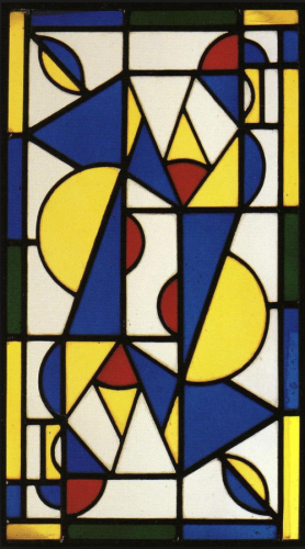
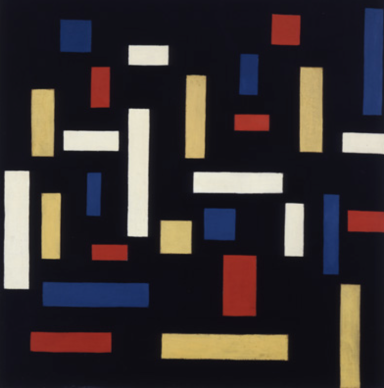
Theo van Doesburg was born on August 30th 1883, in Utrecht, the Netherlands. His real name however is Christian Emil Marie Küpper, he would always refer his stepfather (Theodorus Doesburg) to be his main father, and that is why all of his work is signed Theo Doesburg he later added ‘van’ to his name. Theo van Doesburg was a writer, designer, an art critic, and a painter he was highly influenced by Wassily Kandinsky, who was a Russian painter that was credited to the first abstract work. His work was structured more around a simplistic geometric style. van Doesburg is mostly known for his lead in the artistic movement “De Stijl” it was said “he influenced many graphic designers with his many theories that conveyed the idea that there was a collective experience of reality that could be tapped as a medium of communication.” This appealed to other artist mostly because it pursued abstraction though primary color schemes and geometric shapes. His work would change to a mix of cubism and futurism mixed together.As I looked deeper into van Doesburg’s work I found some of it to be recognizable. It is very interesting to me that his work was something to start a movement in the art world.
Part Two:
1: This artist started an art movement known as “De Stijl” which is dutch for “The style”
2. He was a known painter, writer, designer, and an art critic
3.
Part Three:

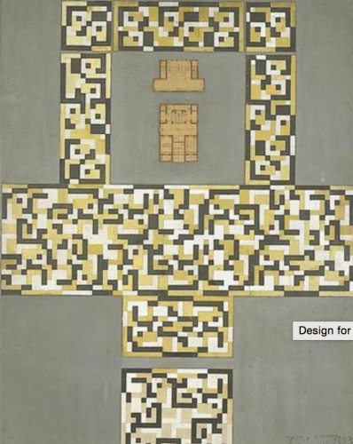
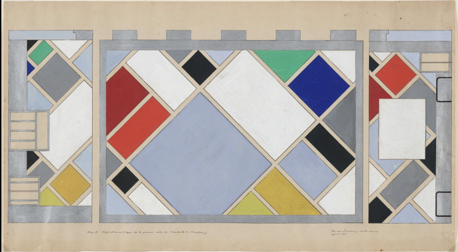
Theo van Doesburg, Design for a Tile Floor and Entrance Hall, 1917
-

- Theo van Doesburg, Design for a Tile Floor and Entrance Hall, 1917
-

-
-
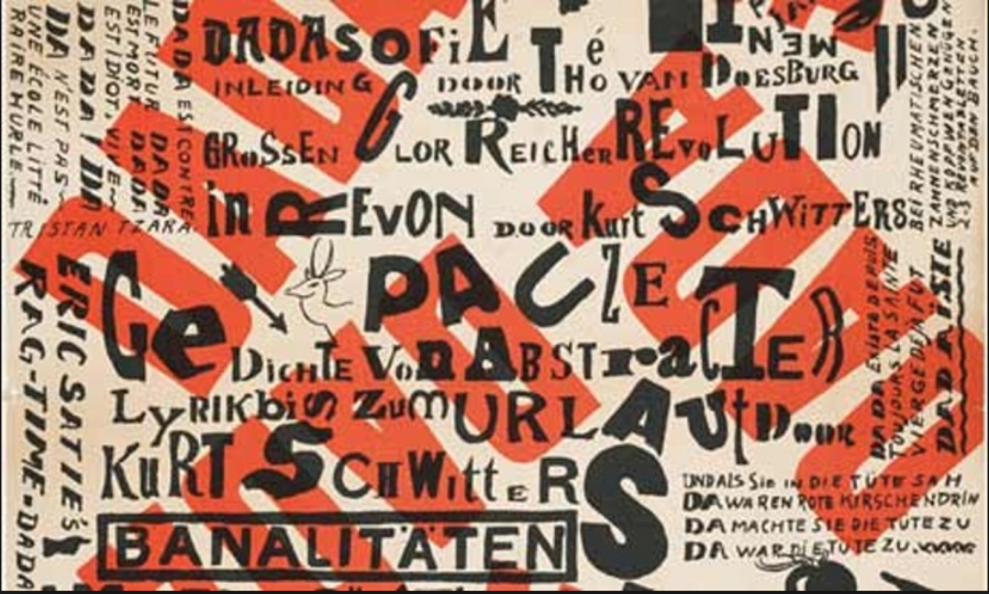
- Theo van Doesburg, Kleine Dada Soirée, 1922
-

-


-
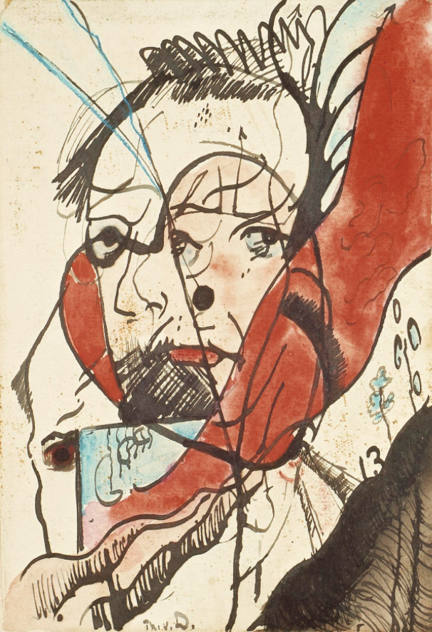
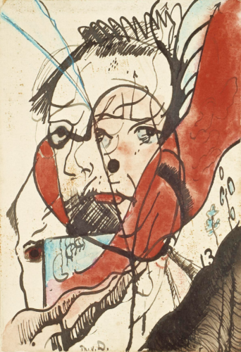
- Theo van Doesburg, Portrait of a Man, 1915
-

-
-

- Theo van Doesburg, Dance I, 1917
-

-
-
- Theo van Doesburg, The Three Graces, 1917
-

-

-
- Theo van Doesburg, Café Aubette, Strasbourg, 1927
-

-


Reading this article helped me clarify the meaning of hierarchy. I never thought that deep into the layout of things and how a certain advertisement reads and the organization of it. Once I read this article I decided to take a look into things like magazines, advertisements, and even the label on my lotion bottle. I quickly noticed how the designer of the product wants you to read the label, things that are most important and they want you to read first are the biggest, and the least important information is in the smallest point font. The designers work through the layout to pull your eyes around the way they want them too, they take the time to create a layout that will work best for what you are trying to get across to the viewer.
Baton Rouge, Louisiana
70801
Partly Cloudy
70°F / 21°C
| Humidity | 87% |
| Wind Speed | NE 5 mph |
| Barometer | 30.14 in (1020.4 mb) |
| Dewpoint | 66°F (19°C) |
| Visibility | 10.00 mi |
| Last update | 4 Nov 8:53 am CST |


Leave a Reply Cancel reply
You must be logged in to post a comment.
This assignment I found to be enjoyable, I love using my imagination to create. This assignment allowed my to stretch my mind and come up with strange and unusual objects. I found it to be very relaxing, although it took a lot of work to figure what I wanted to do, and how I wanted to pair them together. I found it so interesting how we would start with one simple word “tool” and then we would end up on a complete other topic. This assignment was a great way to make the brain think.
Mind Map
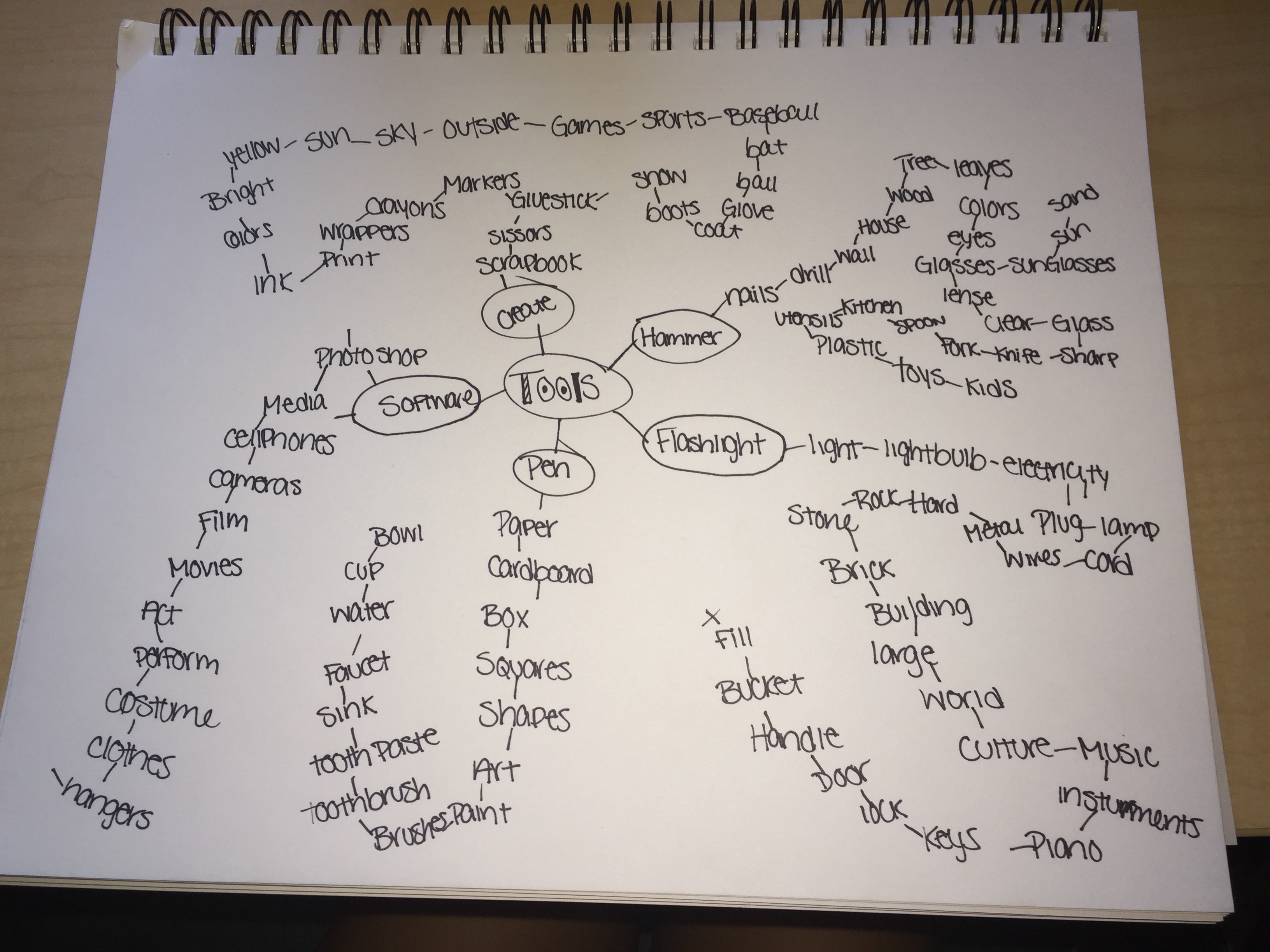
25 Possible Combinations
- Cardboard + House
- Knife + Fork
- Crayon + Marker
- Bowl + Straw
- Night + Sunglasses
- Tooth Brush + Tooth Paste
- Drill + Light
- Spatula+ Fork
- Brush + Paint
- Wire + Fork
- Camera + Lock
- Light + Piano
- Glove + Ball
- Cellphone + Printer
- Hammer + Screwdriver
- Electricity + Pen
- Leaf + Cup
- Ice Cream + Eggs
- Pills + Plants
- Gas + Sneakers
- Candy + Baseball Bat
- Flashlight + Baseball Bat
- Sink + Shapes
- Toy + Building
- Bowl + ShapeTop Ten
Cardboard House-This is a project I think could be fun to do for the homeless, this wouldn’t just be any ordinary cardboard box, it would be a place someone could call home.
Crayon Marker-It’s a double whammy, what is better than that.
Night Sunglasses-These would be night vision sunglasses, for people who want to wear sunglasses at night.
Tooth Brush and Tooth Paste-For people who are on the go.
Drill + Light-So workers can work in the light!
Brush + Paint-I just think this would be a cool new way to paint
Glove + Ball-So people can play catch by themselves
Cellphone + Printer-A convenient way to print right from your phone.
Leaf + Cup– a cup from nature
Flashlight + Bat– A way to protect yourself.
Thumbnails
For some reason they aren’t showing up when I click Add Media, but they are in my photos folder
Why I’m Interested
Growing up, I have always been a creative person, when I was in the third grade, my two friends and I decided that when we grow up we are going to own an art studio together. As we got older we all drifted into our different interests, but mine continued to be the arts. I was never good at drawing, so for a period in my life I stopped creating. When I got to high school I was introduced to a whole new kind of art, Graphic Design. During the course of my high school years I found my passion in Graphic Design.
What I’m Interested In
My areas of interest is publication design and advertising design. I find these two areas to be the most appealing to myself because these are two very publicized fields in graphic design. I love being able to come up with my own ideas and bringing them to life. I plan to double major in Marketing so that way I will have the skills of a graphic designer and an advertiser. I want to be a designer for an advertising team. Advertising is very important in our economy, not many people realize that. Every advertisement that is put out into the world is a reflection of its company. It is the designers job to bring life to the advertisement and make it stand out. Publication design has a mix of things I like to do. I enjoy photography, I like taking the pictures, editing, and seeing the end results. Publication design gives you so many options on things you can do, I love creating ideas and giving something an identity and showing my personality in my work.

I like looking at the cover of magazines because I feel like they always set the tone of what the magazine is going to be based on.

-
-
Classroom
-
-
Recent Posts
Recent Comments
- Danielle Vizard on Thinking with Type — TEXT
- Danielle Vizard on Digging’ It!
- Jenna on Thinking with Type — TEXT
- Jenna on Digging’ It!
- Elizabeth Robinson on Digging’ It!
Archives
- November 2023
- August 2023
- May 2023
- April 2023
- March 2023
- February 2023
- January 2023
- December 2022
- November 2022
- October 2022
- September 2022
- August 2022
- July 2022
- June 2022
- May 2022
- February 2022
- December 2021
- November 2021
- October 2021
- September 2021
- August 2021
- June 2020
- February 2018
- December 2015
- November 2015
- October 2015
- September 2015
- August 2015
Categories
-
About
KSC GRAPHIC DESIGN

These pairings are a bit close to the expected. What about a tooth brush + ball or other strange combo? R