Part One:
Armin Hofmann, born in 1920 in Winterhur, Switzerland. Grew up to become a Swiss designer, that had a very tremendous influence on the development of the graphic design style known as Swiss International Style. Hofmann believed in simplicity, legibility and objectivity which is the format for Swiss style. Hofmann worked at the Basel School of Arts and Crafts for 40 years and during that time became the head of the graphic design department. Armin thought Swiss International Style was all about communication and he believed the best form of communication was through posters using type and photography, but Hofmann also had written a textbook “Graphic Design Manual” which is still used to teach graphic design today. Hofmann’s former students speak highly of him, in 2011 he even was awarded the AIGA medal which stands for “American Institute of Graphic Arts”. For Robert and Alison Probst, who was also Hofmann’s student, these enduring designs are the work of “a master of his craft with a superior sense of aesthetics. His work deals with the universal language of signs and symbols, often including serendipity and always aiming for timeless beauty”(AIGA, the professional association for design). In the article on the AIGA award he received, they speak so highly of Hofmann and all that he did to help them as students and that is what you want in a teacher.
Part Two:
1) Hofmann had a good sense of structure and the ability to use space, which projected his personality as a designer and an artist.
2) Hofmann sought for musical resonance, in his work and in his students.
3) Hofmann’s teaching was thought of as unorthodox but he would bring you back to the fundamentals of design.
Part Three:
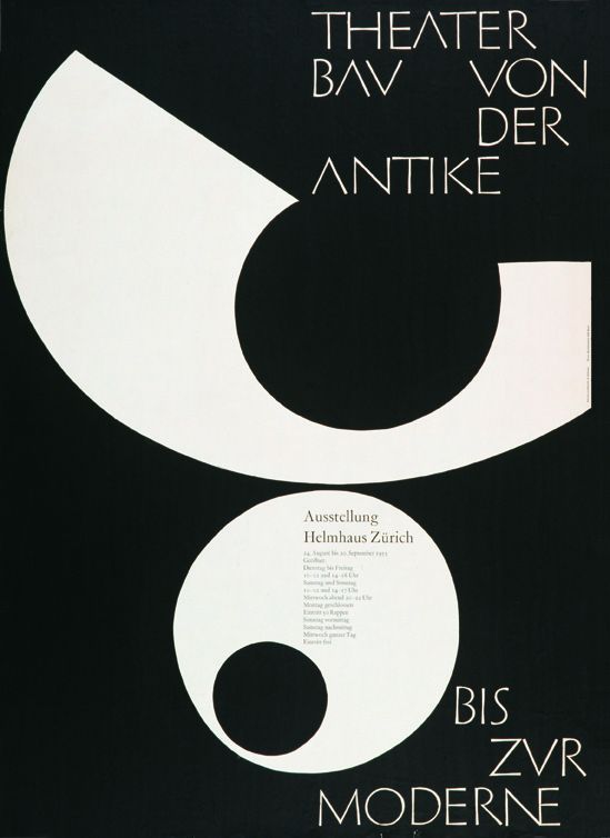
Armin Hofmann, Theater Bau von der Antike Bis Zur Moderne,1955
-
-
Armin Hofmann, Theater Bau von der Antike Bis Zur Moderne,1955
-

-

-

-
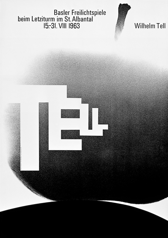
Armin Hofman, Wilhelm Tell, 1963
-

-

-
-
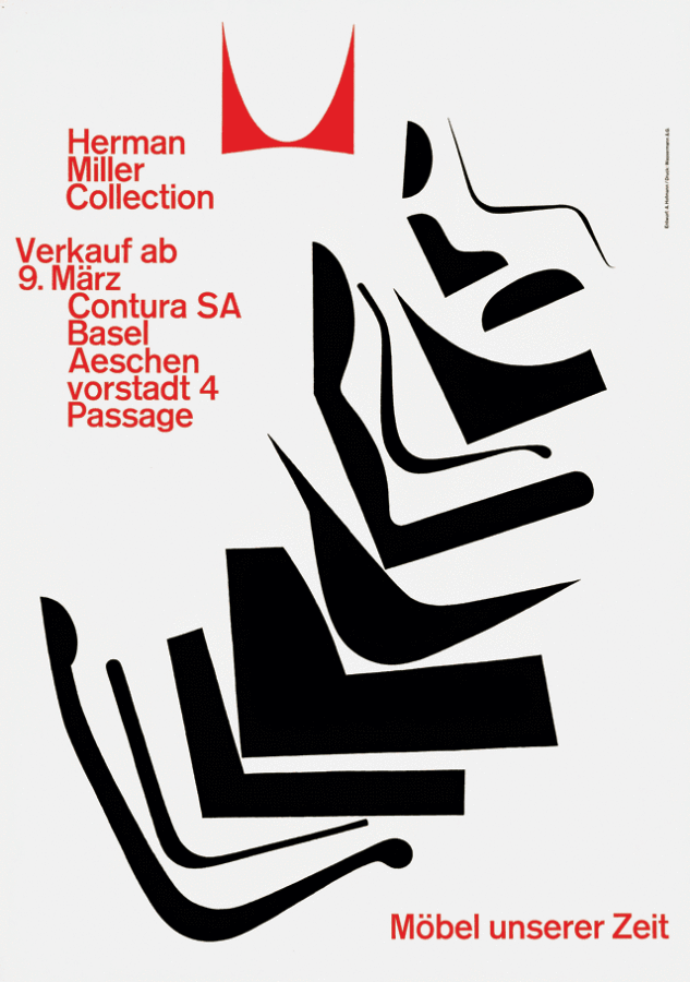
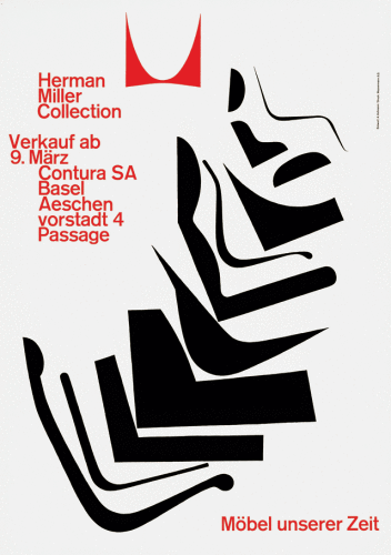
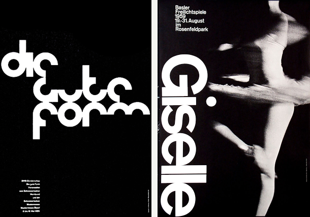
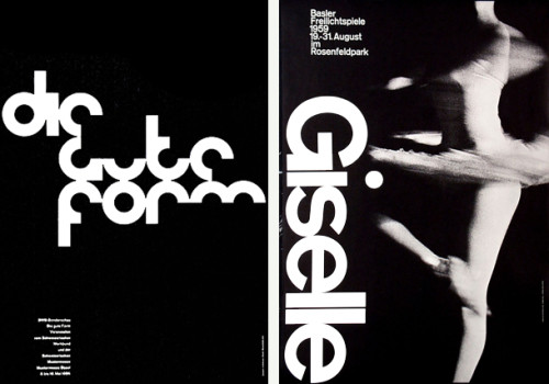
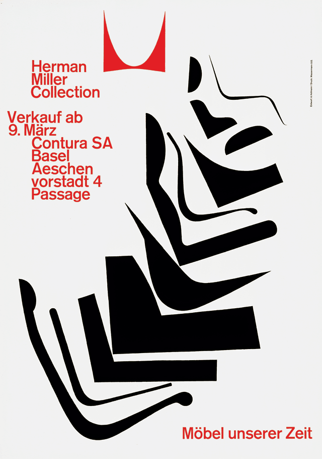
Armin Hofman,Herman Miller Collection, Möbel unserer Zeit, 1962
-

-
-

-
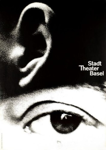
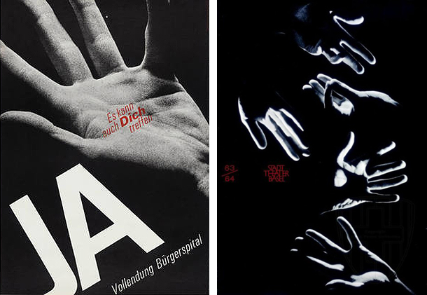
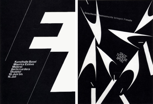
Armin Hofmann,Stadt Theater Basel, 1962
-

-
-
-
Armin Hofmann,JA, Vollendung Bürgerspital, Es kann auch Dich Treffen, 1963
-

-

-
-
Armin Hofmann, Giselle, Basler Freilichtspiele, 1959
-

-
-

-
Armin Hofmann, Kunsthalle Basel, Maurice Esteve, Malerie, Berto Lardera, Skulptur, 10. Juni bis 16. Juli, 1961
-

-
Sources:
https://kscgd.com/2015fall/gdp1/wp-content/uploads/2015/11/GTGD_CH2.pdf
http://designishistory.com/1940/armin-hofmann/
http://www.famousgraphicdesigners.org/armin-hofmann
http://www.designishistory.com/home/swiss/
http://www.moma.org/collection/artists/2697?=undefined&page=1
http://www.aiga.org/medalist-arminhofmann/

![IMG_7564[1]](https://kscgd.com/2015fall/gdp1/wp-content/uploads/2015/09/IMG_75641-e1441766958209.jpg)
![IMG_7561[1]](https://kscgd.com/2015fall/gdp1/wp-content/uploads/2015/09/IMG_75611-e1441767941901.jpg)
![IMG_7562[1]](https://kscgd.com/2015fall/gdp1/wp-content/uploads/2015/09/IMG_75621-e1441768237180.jpg)

Take a look at the assignment again and fill this post out with all elements 🙂 R