- Ê
- Â
fMikayla has 6 post(s)
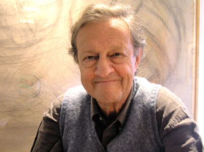
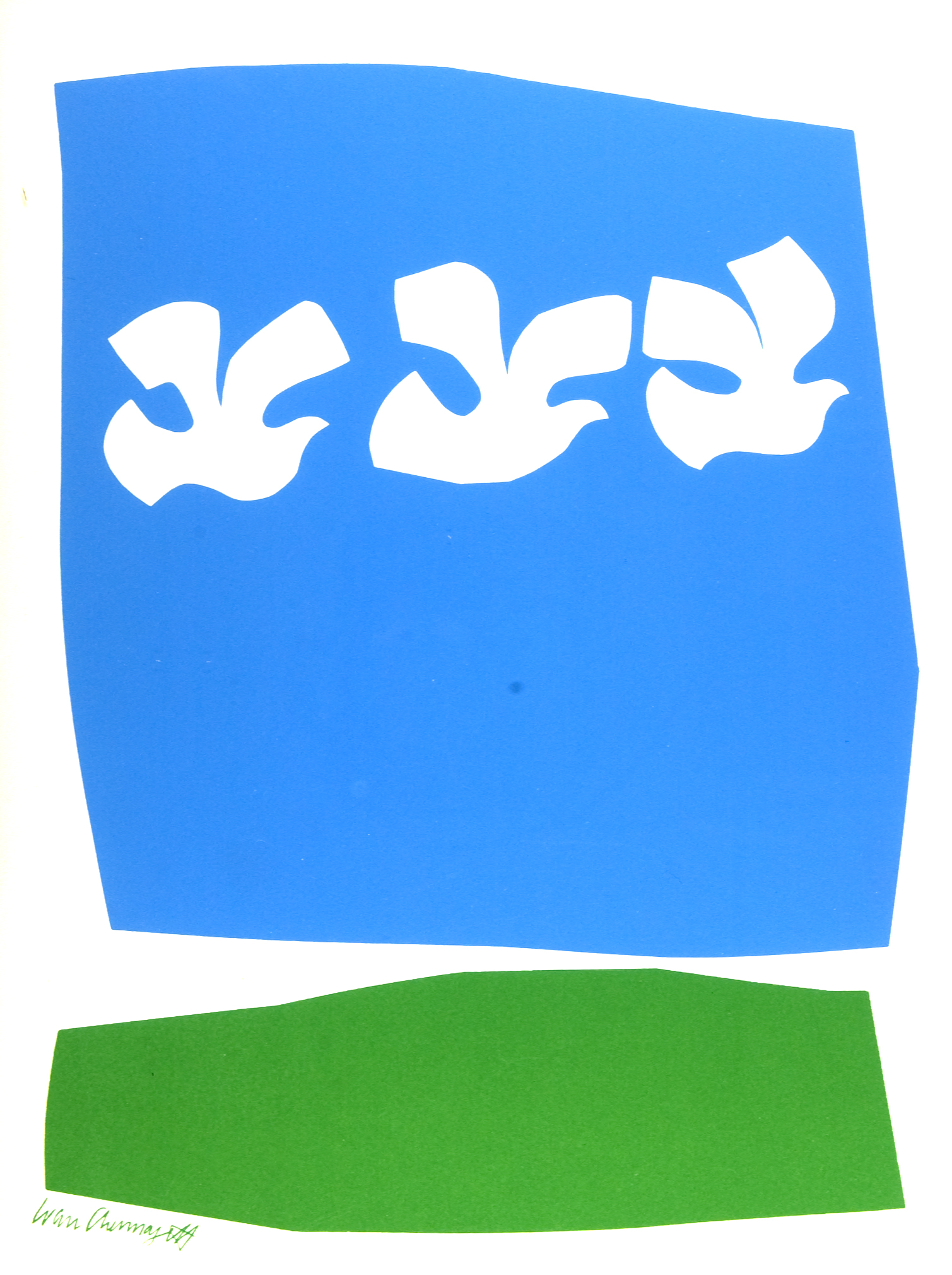
Ivan Chermayeff
Part 1:
Chermayeff used words and images together to create poster designs. He was not only known for posters, but also his logos. He had his own design studio, where the Mobil logo was made. Chermayeff & Geismar & Haviv, his design studio, was responsible for hundreds of clients, including the Showtime logo and the Smithsonian. He graduated from Institute of Design in Chicago and Yale University, School of Art and Architecture. He recieved many honors such as the Yale art medal. Chermayeff started off cutting shapes out of paper and pasting them. He came from a family of people who thought like graphic designers. His father encouraged him and supported him. He didn’t consider himself a great artist. He couldn’t draw or paint like others, so he would look in his trash and make creations out of scraps laying around. This helped him make a more graphic look and lead to clearer logos when he got older. He was the creator of the NBC logo, among countless recognizable others. In a time where people demanded clarity and simplicity while still having a sense of sophistication, Chermayeff’s work fit in well.
Part 2:
1-He made his own design studio, Chermayeff & Geismar & Haviv.
2-He graduated from Institute of Design in Chicago and Yale University.
3-He created the NBC logo, one of the most recognizable logos.
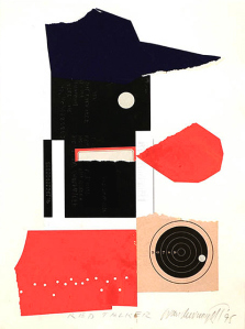
Ivan Chermayeff-Red Talker-1995
-
- Ivan Chermayeff-Red Talker-1995
-

-
-
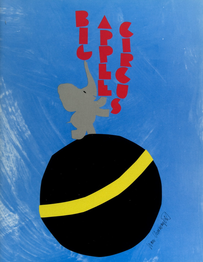
- Ivan Chermayeff-Big Apple Circus-1990
-

-


-

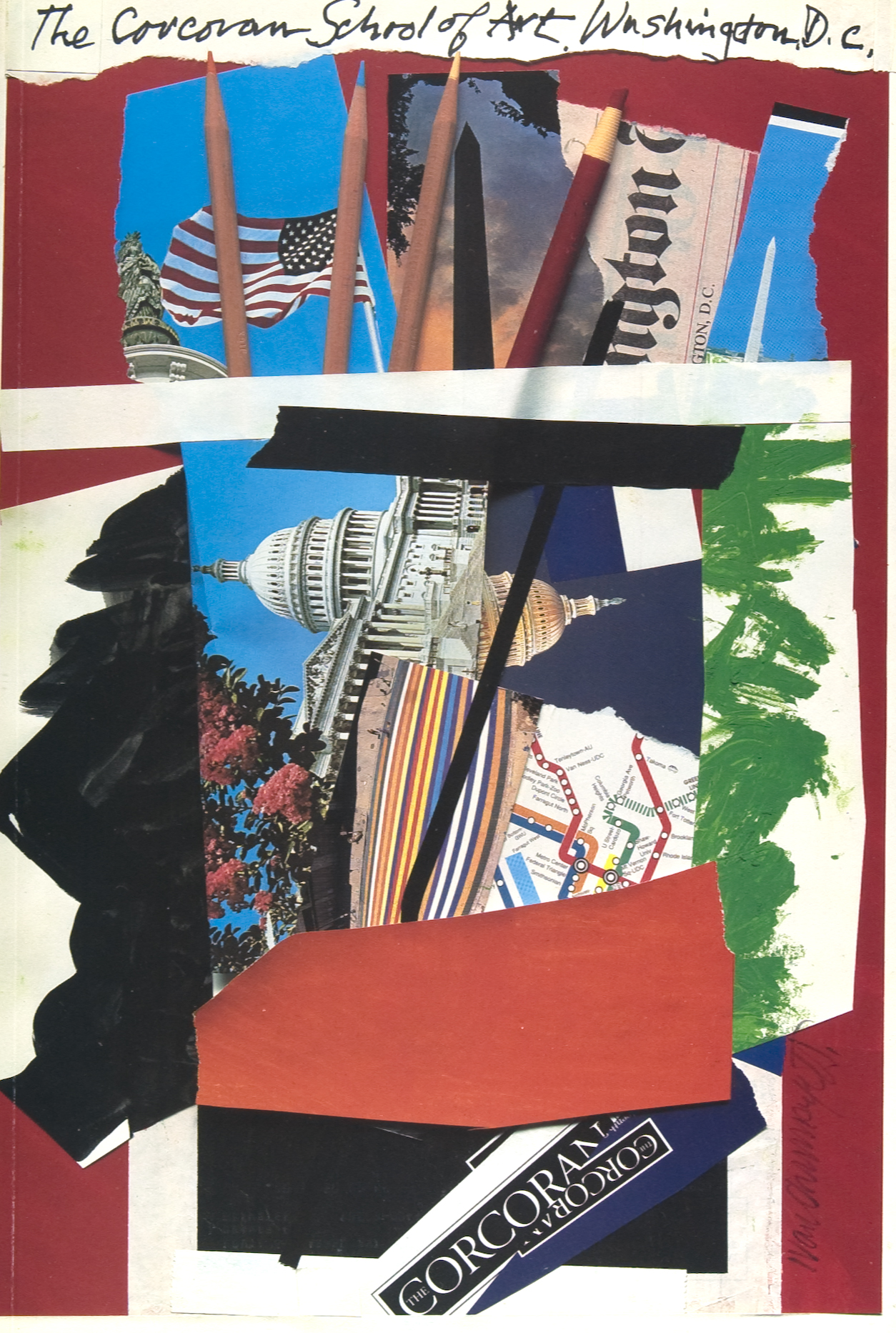
- Ivan Chermayeff-The Corcoran-1992
-

-

-
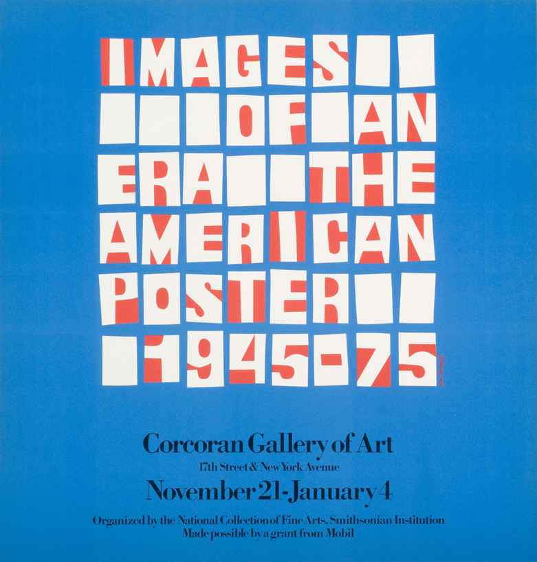
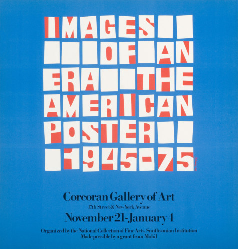
- Ivan Chermayeff-Images of an Era-1975
-

-
-
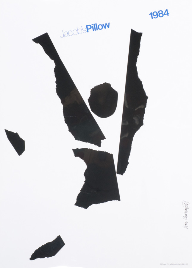
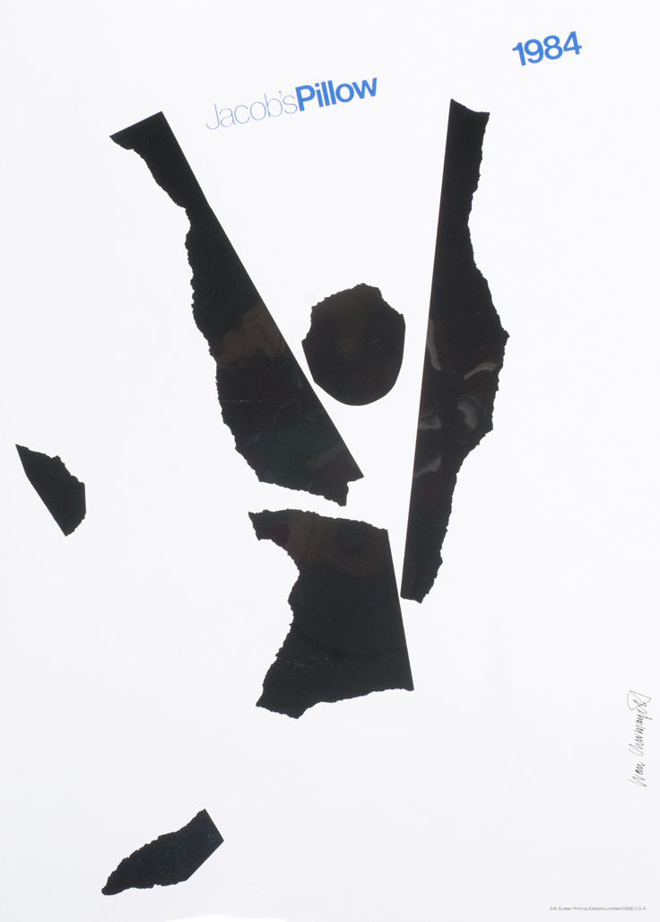
- Ivan Chermayeff-Jacob’s Pillow-1984
-

-

-

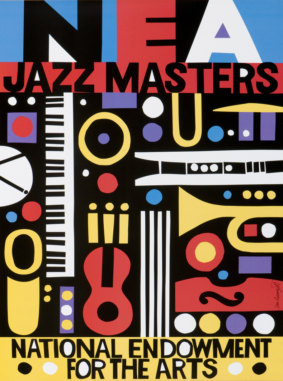
- Ivan Chermayeff-NEA Jazz Masters-no date
-

-

-

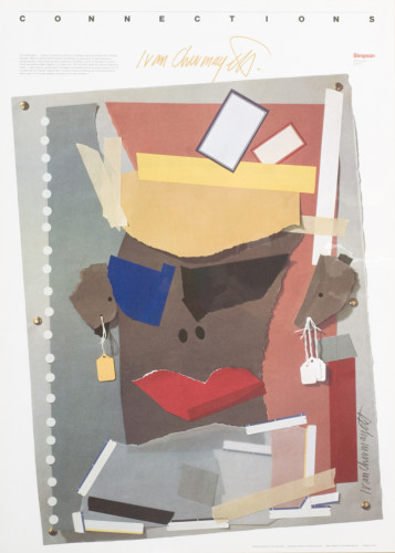
- Ivan Chermayeff-Connections: Ivan Chermayeff-no date
-

-

-

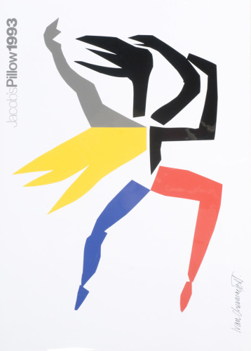
- Ivan Chermayeff-Jacob’s Pillow-1993
-

-

-

- Ivan Chermayeff-Holiday Card-no date
-

-
Ivan Chermayeff’s Web Site
Ivan Chermayeff: The Logo Genius
Article in the The Guardian
Graphic Design Archive Online
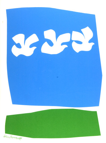
The style is similar throughout the pieces. There is often a ripped paper look that unites all the pieces. Chermayeff’s earliest works included ripped paper. Although he is also known for his logos, the look of layering paper is a common look in his pieces and inspired his later logos. The images represent the event or idea, while still being simple and easy to read. The colors are often similar, bright and eye catching.
Hierarchy is used to help get across the idea of what the artist is trying to convey. I didn’t realize how important hierarchy is in design, probably because I don’t notice it unless it’s done poorly. Text is an important part of hierarchy. It shows the viewer the important information first to clearly communicate an idea or information. Pictures are also used in Hierarchy. This is more subtle to the viewer, but it is just as important in showing the information. I never paid attention to hierarchy in my designs, I just put things in areas that I though looked good. After reading this article I will be able to improve my own designs by keeping the idea of hierarchy in mind and making a clean design that clearly states what I want it to.
Juneau, Alaska
99801
Light Rain Fog/Mist
42°F / 6°C
| Humidity | 96% |
| Wind Speed | Calm |
| Barometer | 29.68 in (1005.1 mb) |
| Dewpoint | 41°F (5°C) |
| Visibility | 5.00 mi |
| Last update | 4 Nov 5:53 am AKST |
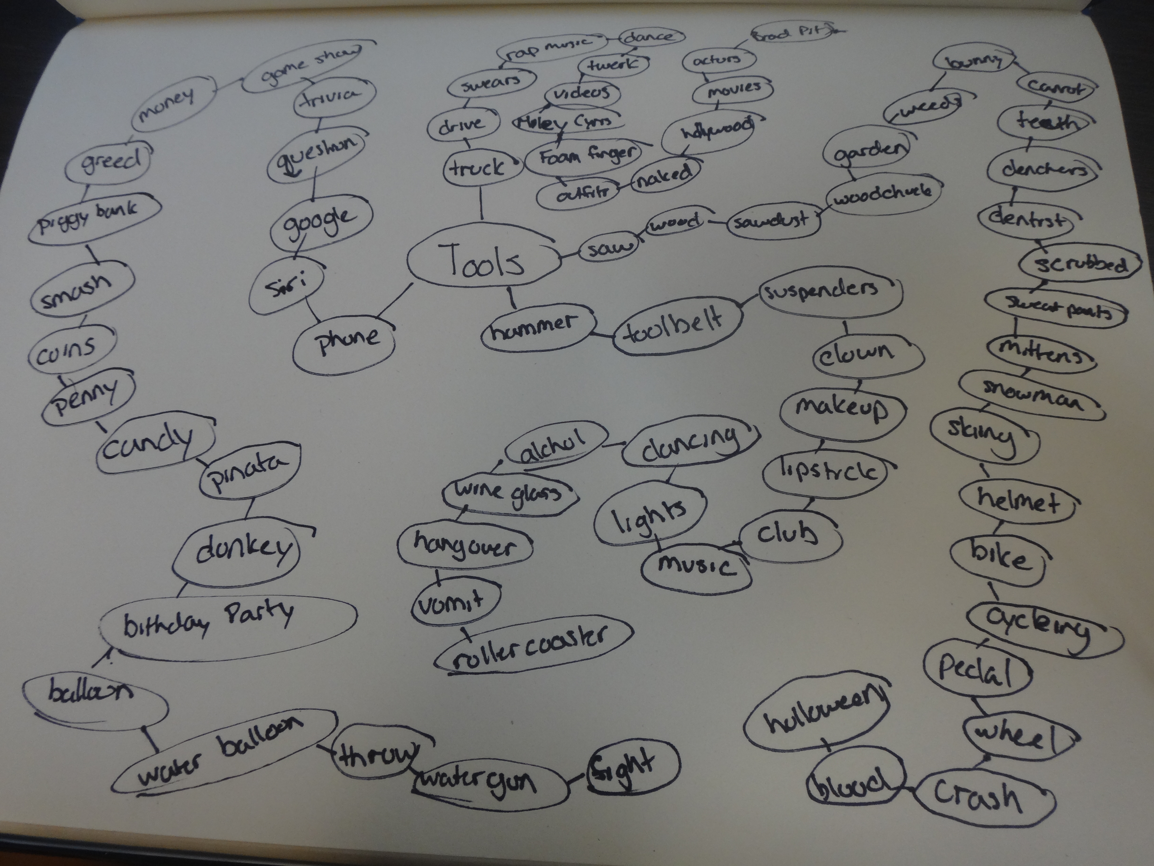
This project challenged me to find realistic combinations while still being creative. Many of the words that we had were actions or concepts instead of tools so this limited the options. It was interesting to see how other people think when making the mind maps.
25 Possible Tool Combinations
1) Lipstick- Carrot
2) Candy-Teeth
3) Balloon-Water gun
4) Wine Glass- Money
5) Mittens- light
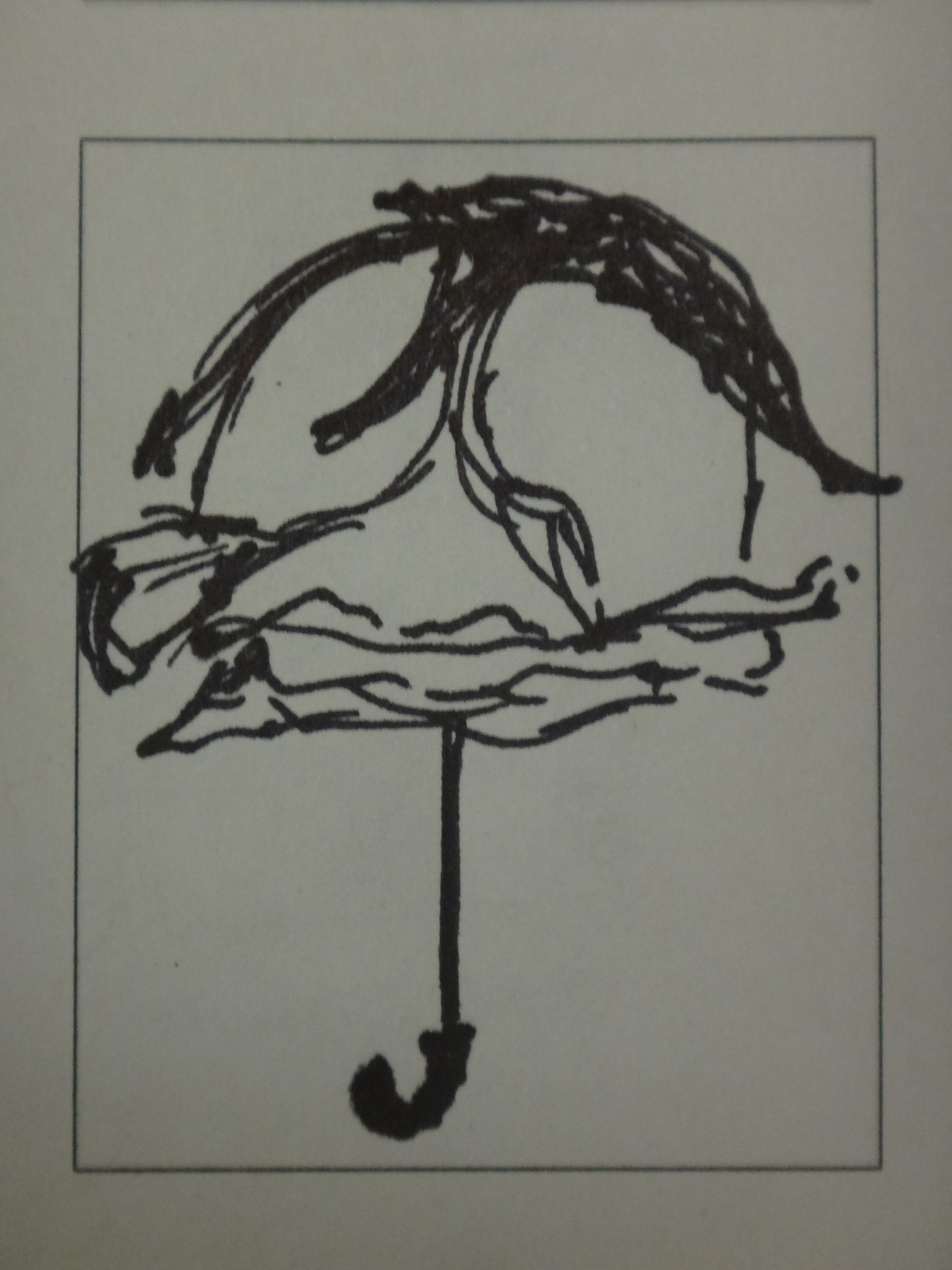
6) Rose-umbrella
7) Pickle-fishing pole
8) Skates- Ladder
9) Hand-Boat
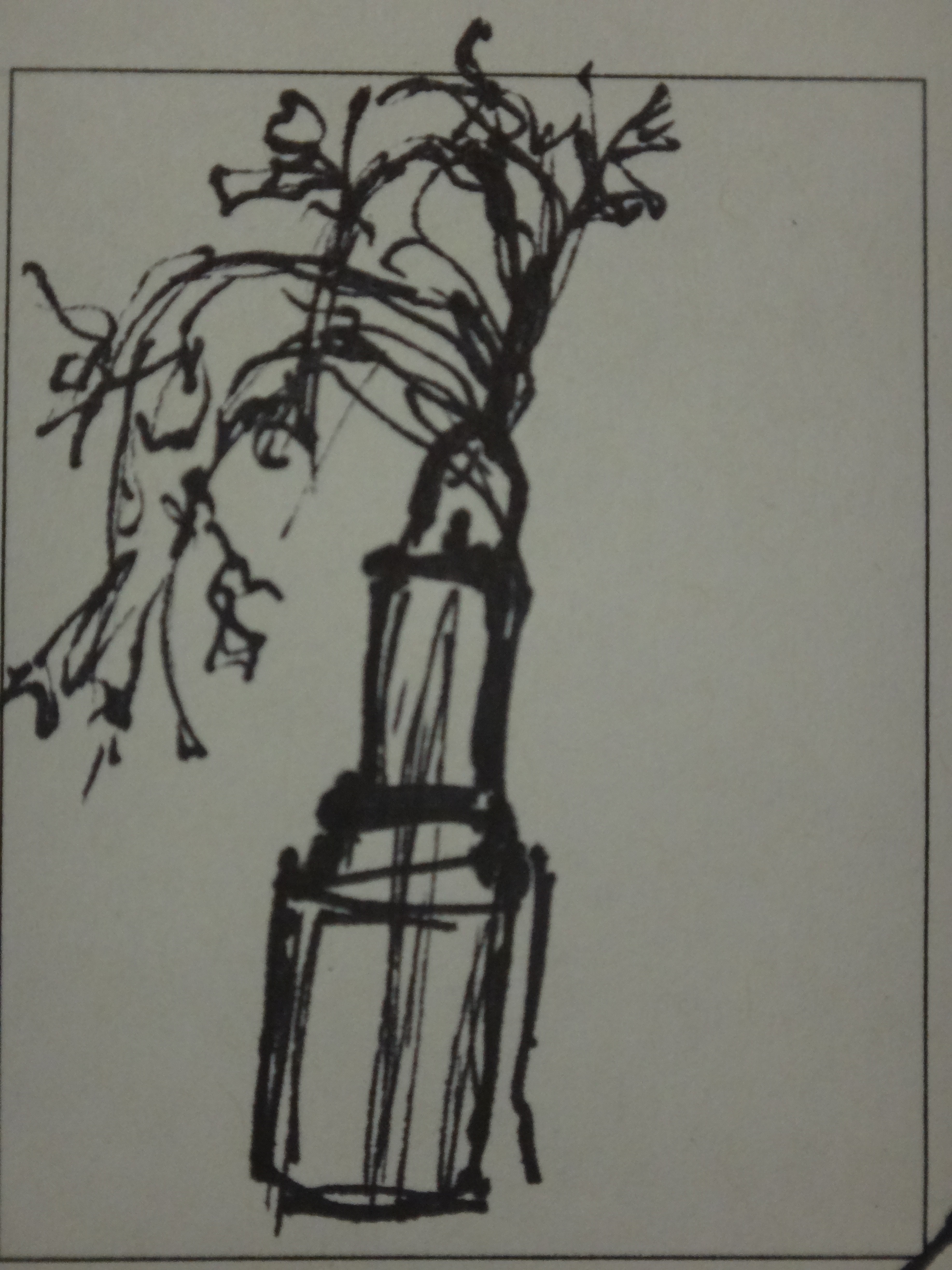
10) Pineapple- Vase
11) Book- tree
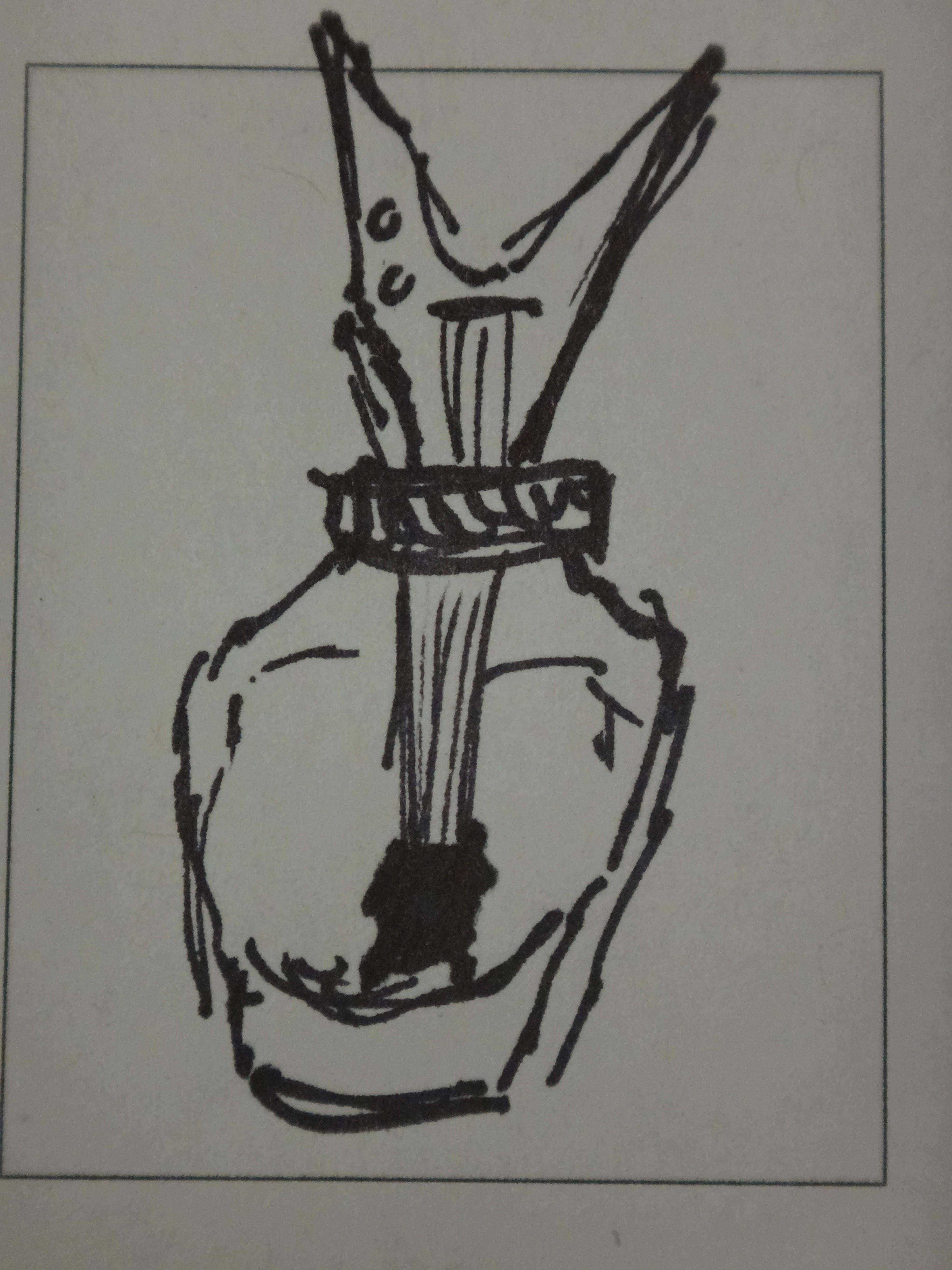
12) Bottle- dinosaur
13) Guitar- Nail polish
14) Needle- bubble
15) Shoe-cat
16) Football-screw
17) Popcorn-glue
18) Wheel-bubble
19) Gasoline-shoe
20) Popcorn-Bubble wrap
21) Ice-Star
22) Bunny-Mitten
23) Movie-money
24) Garden-Bike
25) Rock-Pineapple
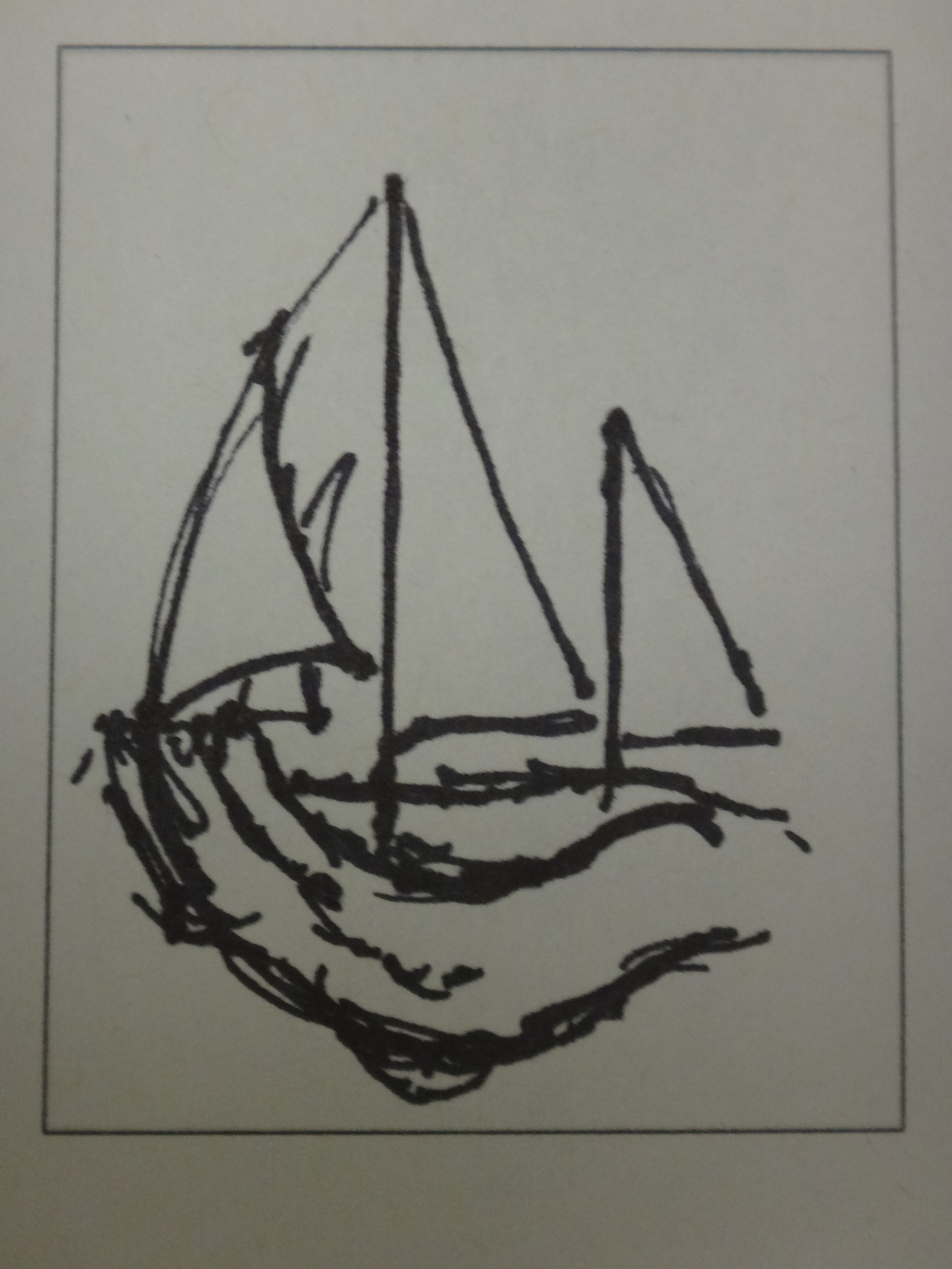
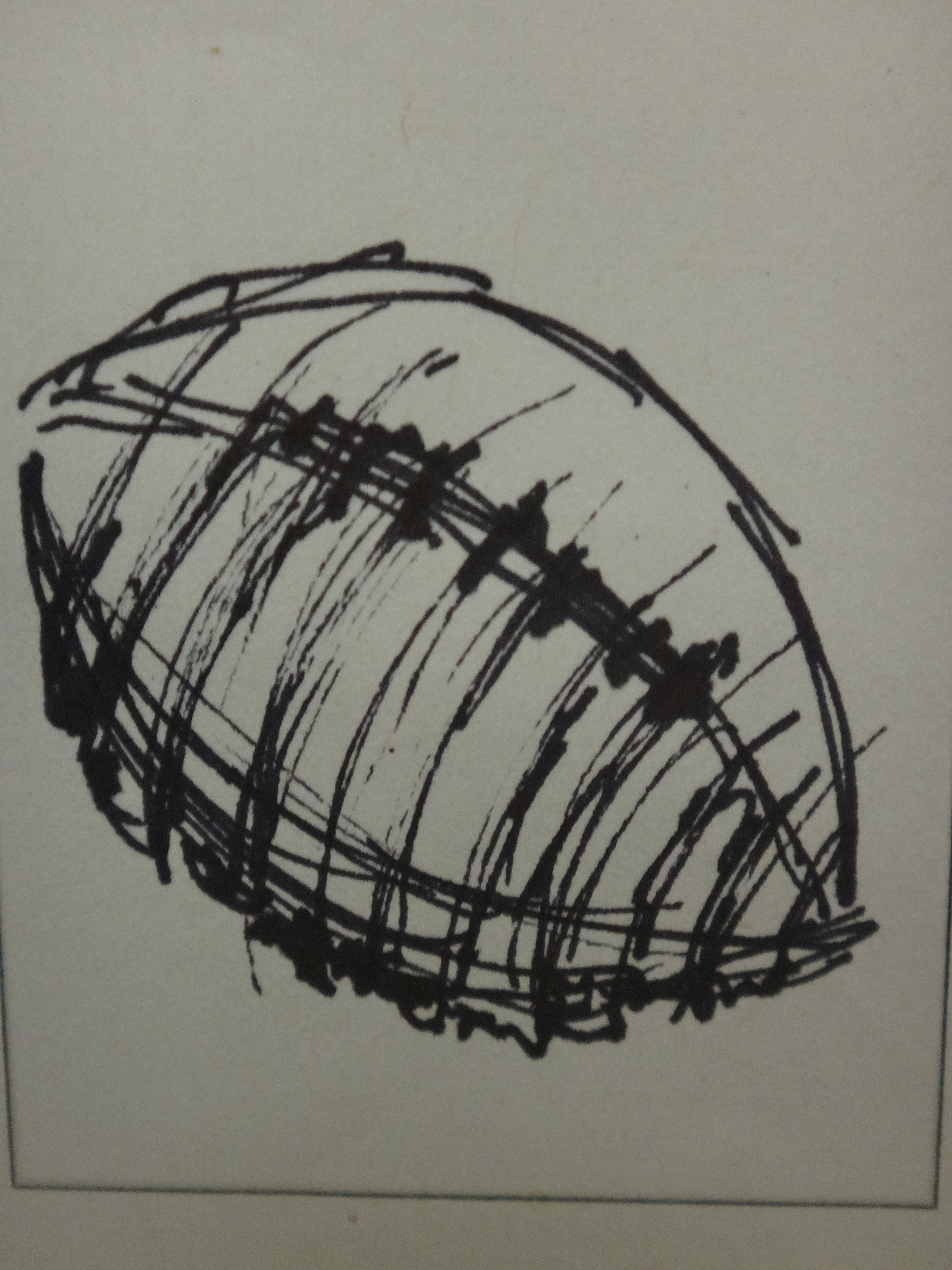
My top ten choices:
- Pineapple-Vase: These tool objects have similar shapes so they will be more likely to look realistic when they are put together.
- Rose-Umbrella:I always see roses with little dew droplets on them and I think a rose would make a great umbrella for a little mouse.
- Gasoline-Shoe: I think of shoes as a form of transportation, almost like a car, so it would make sense to fuel up the shoe.
- Guitar-Nail polish: I love listening to music and doing my nails, so why not combine them into one object?
- Ice-Star: Many Hollywood stars fade over time and are forgotten almost like a melting star.
- Lipstick-Carrot: The pigment part of lipstick reminds me of a carrot popping out of the ground.
- Hand-Boat: When you cup your hand it has the shape of a boat.
- Book-Tree: Books are made out of tree so it would make sense to combine the two of them into one object.
- Dinosaur-Bottle: Bottles and dinosaur necks are similar. Dinosaurs were my favorite growing up so it would be fun to work with them.
- Football-Screw: Footballs fly in a corkscrew pattern so it would be fun to put a screw’s threads on the football.
Thumbnails
Why Graphic Design
In High School, I was clueless to what I wanted to do. I decided to take a few courses that could help me decide what direction I wanted to take in college. Going into junior year, I was convinced that I was going to become an architect. I took a Production Graphics course just because my mom suggested it as a possible career in my future. It turned out that I hated architecture and loved the Production Graphics course. In the class I made logos for made up companies, stationary, and posters for clubs. Although I loved this course, I was still unsure if it was right for me. I took an independent study class in Graphic Design my senior year, where I focused making logos that were actually used, pamphlets for organizations that were printed, and posters that would advertise for real events. It was a step up from my class the year before and, if anything, I loved it even more. I also took a computer art course. This class focused on Photoshop. I made a Slothaphant (a sloth and elephant hybrid), a steam punk scene, and basic portraits. It was my first exposure to Photoshop and I was able to learn quickly and produce work I was proud of. I also did side projects. I made the winning logo for E.O. Smith Reads, the cover for the Senior Awards Night pamphlet, and a pamphlet for CLCC (a nonprofit organization).
Types of Graphic Design that Interest Me
It’s hard to narrow my interests in Graphic Design down to two types. My top two favorite types of design are Advertising Design and Motion Design.
Advertising
My favorite part of magazines is looking at the ads within them. I love looking at vintage advertising as well. Advertising lets the designer combine text with an image to portray an idea or emotion. I have some experience with advertising. I made a poster for my high school’s science club. I really enjoyed working with the client to make the best poster to suite their needs.

.jpg)
Motion Graphics
I also love Motion Graphics. I thought at one time that I would become an animator. I now realize that the jobs available in this area are few and competitive. Motion Graphics can help bridge the gap between animating and the less interactive form of Graphic Design. I made an animated commercial of sorts for my Anatomy class. It was far from finished since I had no real animation programs and I had only a few weeks to work on it. Although it was tedious at times, I always looked forward on working on the project.
-
-
Classroom
-
-
Recent Posts
Recent Comments
- Danielle Vizard on Thinking with Type — TEXT
- Danielle Vizard on Digging’ It!
- Jenna on Thinking with Type — TEXT
- Jenna on Digging’ It!
- Elizabeth Robinson on Digging’ It!
Archives
- November 2023
- August 2023
- May 2023
- April 2023
- March 2023
- February 2023
- January 2023
- December 2022
- November 2022
- October 2022
- September 2022
- August 2022
- July 2022
- June 2022
- May 2022
- February 2022
- December 2021
- November 2021
- October 2021
- September 2021
- August 2021
- June 2020
- February 2018
- December 2015
- November 2015
- October 2015
- September 2015
- August 2015
Categories
-
About
KSC GRAPHIC DESIGN

Leave a Reply
You must be logged in to post a comment.