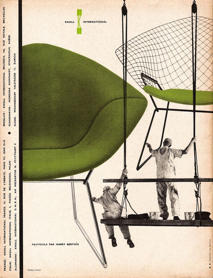
Herbert Matter, Knoll Vintage Ad, 1946
-

-
Herbert Matter, Knoll Vintage Ad, 1946
-

-

-
-
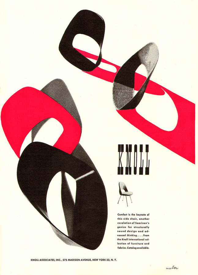
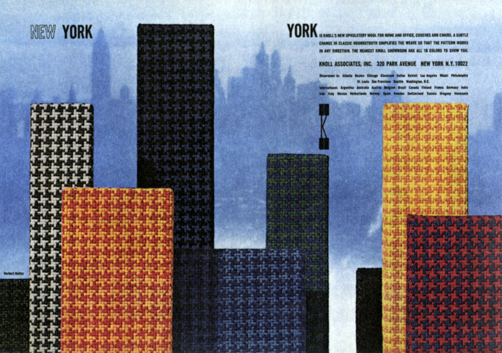
Herbert Matter, Knoll Ad, 1950s
-

-

-
-
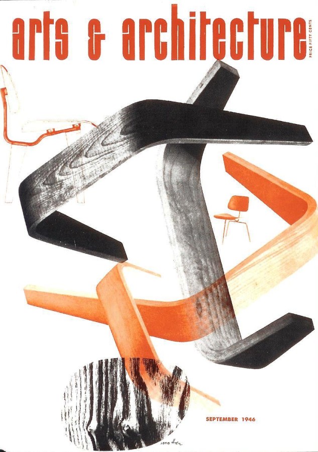
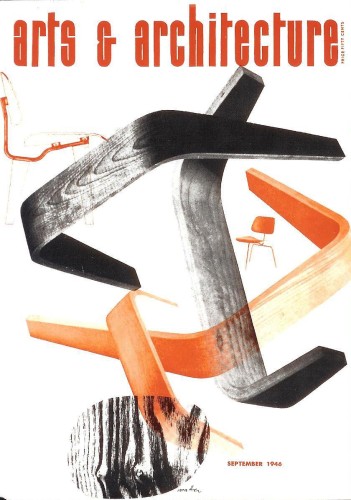
Herbert Matter, Arts & Architecture Cover, 1946
-

-
-

-
Herbert Matter, Knoll Vintage Ad, 1946
-

-
-
-
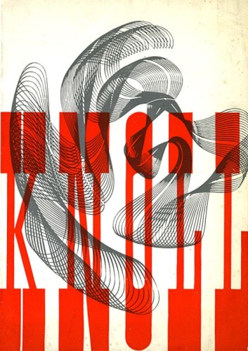
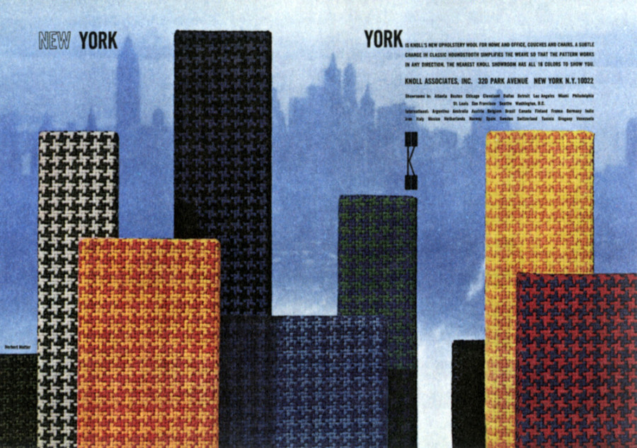
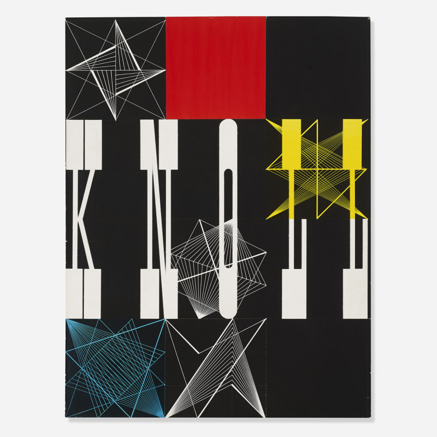
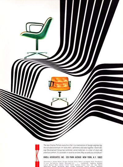
Herbert Matter, Knoll Associates Ad, 1965
-

-

-
-
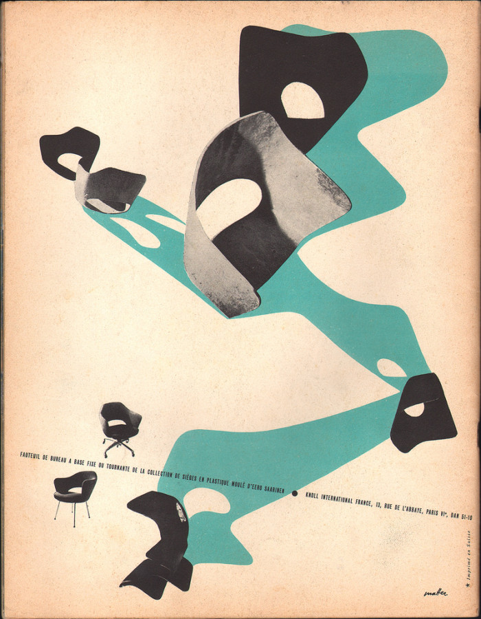
Herbert Matter, Magazine Ad, 1956
-

-

-
-
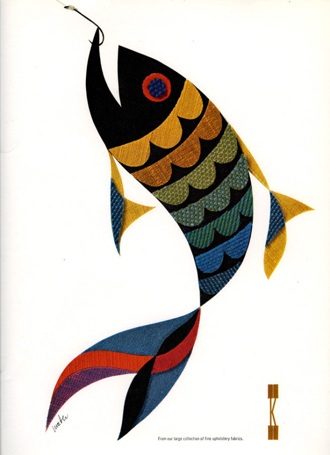
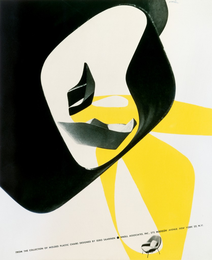
Herbert Matter, Knoll Associates Ad, 1965
-

-

-

-
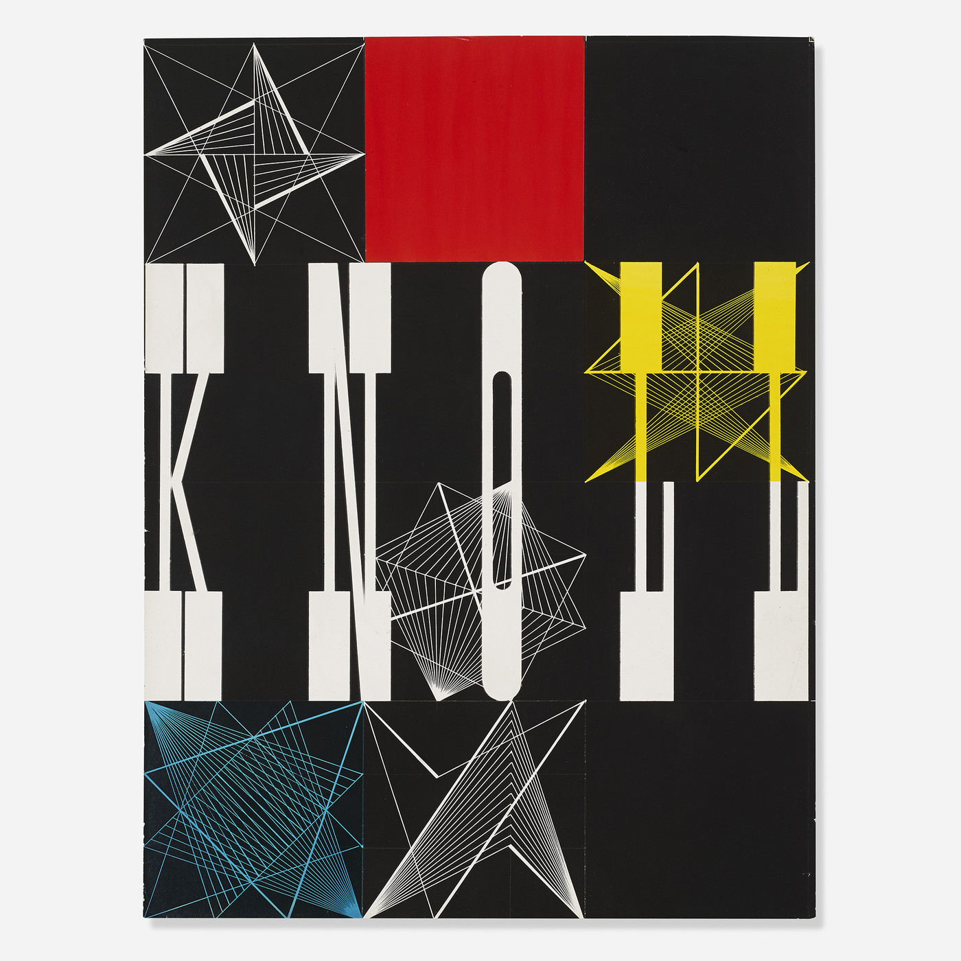
Herbert Matter, Knoll Vintage Ad, 1946
-

-

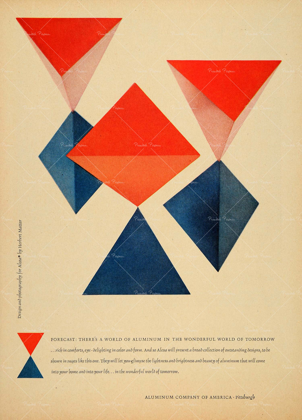
I chose these works by Herbert Matter because these are some of his famous pieces that he did for the company Knoll Associates. He is very well known for these unique works of art. Coming to the US in 1936, 8 years later in 1944, he became the designer and advertiser consultant at Knoll, molding its graphic design identity for 12 years. As Alvin Eisenman, head of the Design Department at Yale and long-time friend, points out: “Herbert had a strong feeling for minute details and this was exemplified by the distinguished typography he did for the Knoll catalogues.” I enjoy looking at these because his color themes always flow and work together really well. What I noticed is that he usually uses the basic complementary colors, yellow, red, blue, green etc… His work makes you feel calm when you look at it.
Old Post
Herbert Matter was a Swiss-born American photographer and graphic designer. He was born in 1907 in Engelberg, Switzerland. In 1925, at the age of 18, he got an education at the École des Beaux-Arts in Geneva studying painting, but after two years he went to Paris to continue his education at the Académie de l’Art Moderne As he wanted to explore his artistic ability more, he became well-known during the 1930s when he made travel posters for the Swiss National Tourist Office in Zürich. These posters were among the earliest effective uses of photomontage, which is the technique of constructing a picture from parts of more than on photograph. He came to America in 1936, and as a skilled photographer he worked for Harper’s Bazaar, Vogue, and many other magazines, and New York ad agencies. During World War II he was commissioned by the US government to design propaganda posters. In 1944, he even became the design consultant at Knoll, molding its graphic identity for 12 years. He even worked with famous designers such as Charles and Ray Eames. Not only did he do all of that and much more, he was also familiar with film as he directed a film for his friend in 1952. As a master at what he did, he began teaching design and photography at Yale University in 1952, and continued to teach until 1976. Herbert Matter passed away in the spring of 1984 in Southampton, New York.
I found this artist to be extremely talented and interesting as he had such a natural ability in almost all aspects of art. Matter had such a keen sense of collage and skillful typesetting that made his work so put-together and nice to look at. His graphic work cleverly fused the severity of Swiss style with American pop culture. He used every method available to accurately achieve his vision of texture, light and form. His color choices and themes were always on point and his style was always fresh and interesting.
- The designer’s innovative and experimental work helped shape the vocabulary of 20th-century graphic design.
- He was a master of using photomontage, color and typography in an expressive manner, transcending the boundaries between art and design.
- His work often involved manipulating negatives or cropping and retouching images in unexpected ways, and his subjects included portraits, nudes, landscapes, and still lives.
The Designs of Herbert Matter
All About Herbert Matter
The Famous Herbert Mater


Leave a Reply
You must be logged in to post a comment.