- Ê
- Â
fNick has 5 post(s)
Part 1
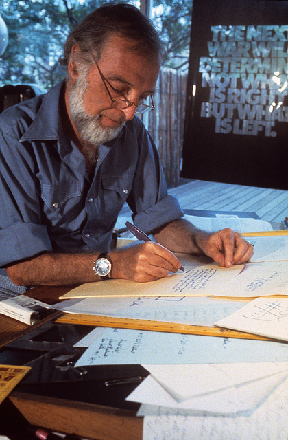
Herb Lubalin was a graphic designer, typographer, and publication designer who had worked his way from many firms to have his own design company. Lubalin had created the Avant Garde font which has been used in many logos everywhere.
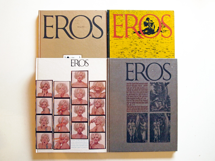
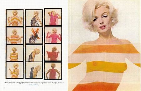
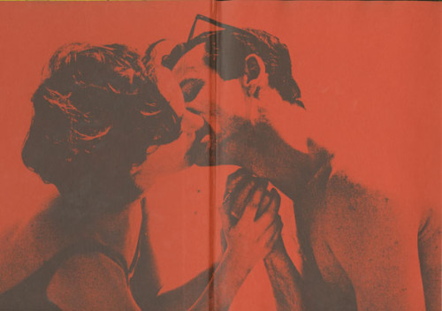
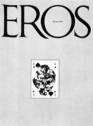
In the mid 60’s Lubalin teamed up with American author, editor, publisher and photo-journalist, Ralph Ginzburg. These two had created the publications Eros, Fact, and Avant Garde, Lubalin being the typographer and designer and Ginzburg was the writer and publisher. Lubalin designed these publications with hard covers which held eschewed colors and simple black and white templates with illustrations which made the publications dynamically minimalist. Eros was the first of the three to come out which talked about topics in love and sex. The beach themed Eros cover caught my eye over all the rest. The yellow sand is great compliment to the red logo which would be the first word you would read on the publication. Once reading the title you can see two lovers just kissing in the sand. The illustration shows how passionate two lovers could go at it, this shows that Eros was super passionate about talking about love and sex. So after the fourth issue of Eros, the government wasn’t about having these going around in mail rooms or sent to people, which soon got Lubalin’s partner, Ginzburg in some trouble. However, the second publication was a magazine called Fact.
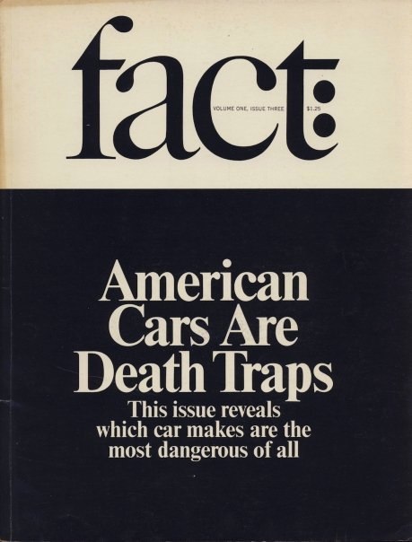
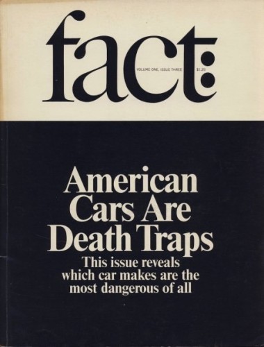
Fact had a similar approach from Eros except switched topics to 60’s culture and Politics. These artists seemed to love to unveil an untold truth about the culture back then and it got them into some trouble with presidential candidates. But would you blame them for how awesome the cover of Fact looks like. Off the bat the title’s typeface looks sharp with the slanted line which connects the lower case f and t’s ascender and bar. The title is just as sharp as the knife they are stabbing cultural and political truths with. Because of the political trouble that the publication got sued for, Lubalin and Ginzburg ceased Fact and created another publication combing both ideas from Fact and Eros, Avant Garde was born.
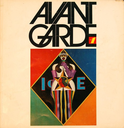
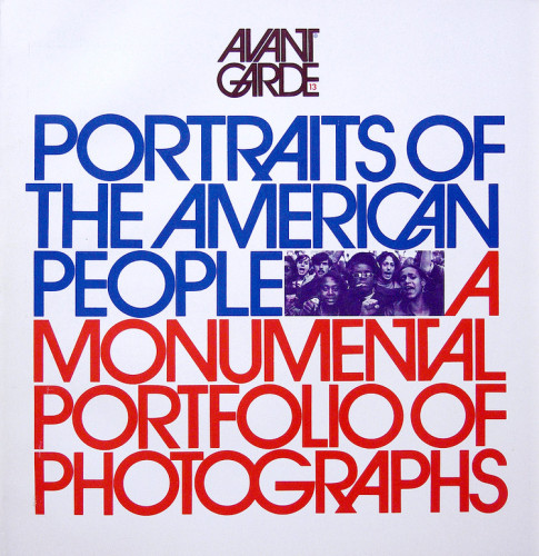
Avant Garde looks like a son to the parents Eros and Fact. The titles slanted A and V’s reminisce on the slickness and sharpness of fact, with sexual imagery on the cover, this shows Labalin and Ginzburg don’t hold back in this new publication. But Avant Garde was forced to shut down when Ginzburg got sent to prison for a scandal with the U.S postal service and Eros. After all this, Lubalin continued with a slightly less controversial publication dedicated to his interest in typography called Upper and Lower Case.
Part 2
Distinctive point 1.
Lubalin was in charge of design for such magazines Eros, Fact, and Avant Garde which shows a minimalistic modern design in both publication and type form.
Distinctive point 2.
The publications Eros, Fact, and Avant Garde used very risque illustrations and touchy topics which caused controversy. This is a perfect example of how graphic design is used in this world, informing readers the untold truths.
Distinctive point 3.
Lubalin worked hard enough after college that he soon began his own company, which he ended up creating a typeface that was used in multiple logos through out the last two decades.
Part 3
Herb Lubalin, Eros Magazine
-
- Herb Lubalin, Eros Magazine
-

-

-
- Herb Lubalin, Eros Magazine inside
-

-
-
- Herb Lubalin, Fact Magazine
-

-
-
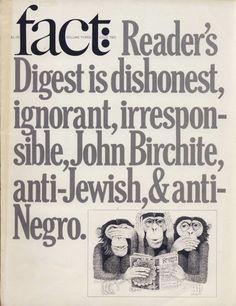
- Herb Lubalin, Fact Magazine
-

-
-

- Herb Lubalin, Avant Garde Magazine
-

-

-
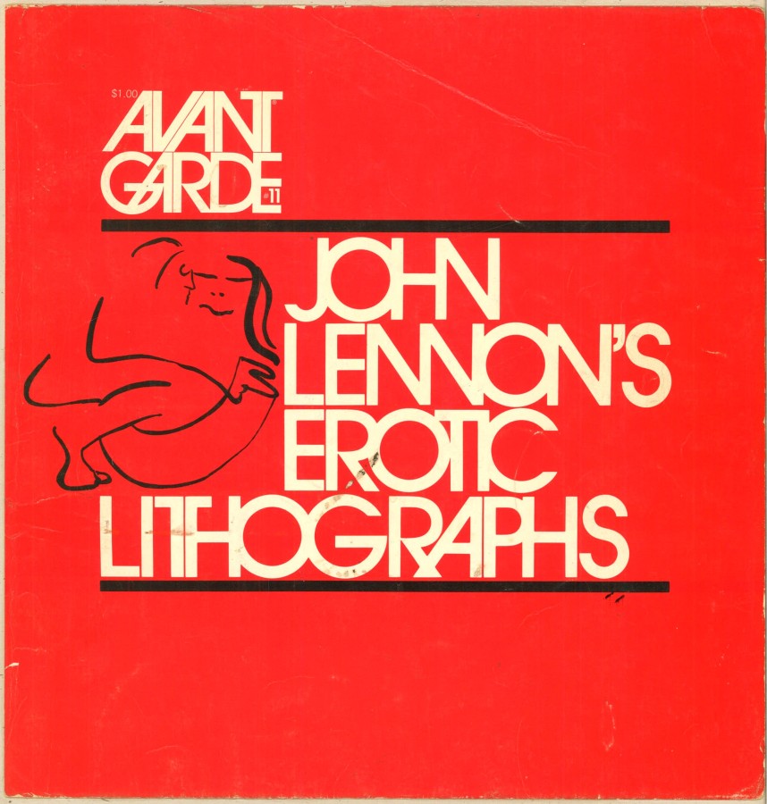
- Herb Lubalin, Avant Garde Magazine
-

-


-

- Herb Lubalin, Avant Garde Magazine
-

-
-

- Herb Lubalin, U&LC magazine
-

-
-

- Herb Lubalin
-

-
-

- Herb Lubalin, Avant Garde Magazine
-

-
-

- Herb Lubalin, Avant Garde Magazine
-

-
-

- Herb Lubalin, Eros Magazine
-

-

Style
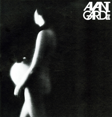
Lubalin had a style which you could say was dynamically minimalistic. Graphics wise, Lubalin would use high quality photographs which related to the idea of the publication. Some are silhouettes of objects/people making these photographs abstract to the mind. Lubalin didn’t have the same photoshop technology as we have today, so it must of been a longer process creating a red tint to a black and white photograph of two people kissing. Type wise you can tell Lubalin knew what he was doing with type because the titles of his publications relate to the meaning behind all the publications put out by the designer. Fact magazine’s type has a lot of distinct characteristics like the rounded terminals, the sharp tails, and the angled connection between the ascender and bar between the lower case letters t and f. This type defines the magazine as we see it, its a sharp well rounded publication which tells truths about the culture back in the 60’s. I dig Herb’s style because he didn’t seem to care about what they were talking about with culture, but was more focused on designing with a minimalist approach. The combination of graphics and type worked great with modern design.
Sources: http://www.aiga.org/medalist-herblubalin/
http://www.designishistory.com/1960/fact-eros–avant-garde/
62°F
| Humidity | 56% |
| Wind Speed | NE 7 mph |
| Barometer | 30.18 in (1021.3 mb) |
| Dewpoint | 46°F |
| Visibility | 10.00 mi |
| Last update | 8 Nov 10:53 am CST |
Jackson Mississippi
39201
🙂


This assignment was great. I liked how our groups had to get together and brainstorm off each others ideas. What truly helped me in the process of creating my own tools were the extra mind maps. I know that everyone has different ideas, it was helpful to branch one of mine with another person’s idea.
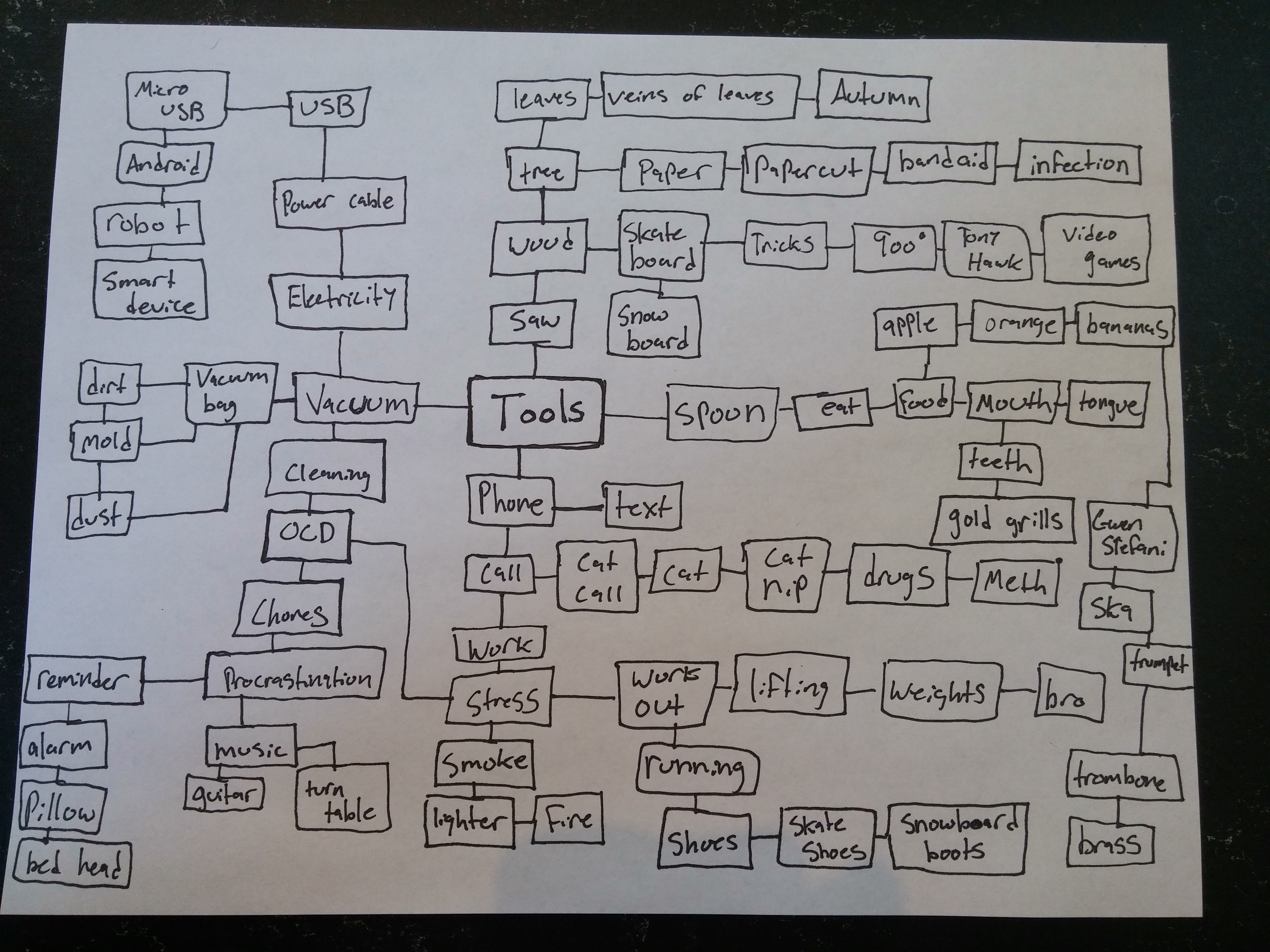
This is one of my group’s mind map. Exercising mind mapping helped me organize my thoughts with the others. It’s always tough for me to quickly think of creative ideas, however brainstorming on a mind with a team of designers made the process simpler. One of my favorite ideas on this mind map is how we got the idea Cat Nip from others branching off the idea Call.
Here are my 25 tool ideas based off mind mapping. The bold Tools are the “Chosen Ones“.
- Bed Head Balloon
- Cat Nip Cookie
- Prom Wrench
- Tiger Knife
- Water Vacuum
- Cat Call Alarm
- OCD Pillow Vacuum
- Toilet Backpack
- Alphabet Guns
- Lighter Pocket
- Karate Skateboard
- Karate Lighter
- Throw Up Vacuum
- Grill Knife
- Smart Grill
- Banana Foam
- Chocolate Band aid
- Energy Honey
- Hospital Bed Weights
- Pumpkin Spoon
- Dirt Ball
- War Nails
- Bear Belt
- Bulimic Banana
- Language Machine
The Bed Head Balloon is the perfect solution for crazy hair mornings. Imagine a balloon which you rub on your head to get rid of that jungle you call hair. Prom Wrench is a useful tool to have the perfect Prom experience without any troubles. Car has a flat tire on the way to your breath taking night? Use the Prom Wrench to switch out the tire, it will even impress your date. The Tiger Knife isn’t your dad’s normal knife. It’s the sharpest tool in the shed, great for trips like camping, self defense, and learning how to throw a knife. Toilet Backpack is a sanitary on-the-go Porta Potty for long trips. Adventures behold a revolutionary way where you don’t make a mess yet still go to the bathroom whenever and wherever you wanted. The Vomit Vacuum is a college students best friend. Did your roommate come home late and puke on the floor? No worries, this Bluetooth puke sucker will get out all the nastiness from tough areas like carpets or couches. Smart Grill is the next generation of thug life wireless mouth connectivity. With the power of Bluetooth and smartphones you can track what goes in your mouth, calculating caloric intakes. The perfect tool to help figure out weight loss by dieting. Energy Honey gives the right nutrients for a good days workout. Put Energy Honey in tea, on toast, or even eat it by spoonfuls to get great work out results. Hospital Bed Weights are for those who struggle in hospitals yet want to stay in shape at the same time. This revolutionary mattress set holds different types of weight lifting exercises to keep your body in tip top shape. The Bear Belt is a sturdy leather belt with a Tiger Knife sheath extension. Show off your belt fashion sense while intimidating others proving that you can get out of any death like situation with a comfortable belt. And finally, the Language Machine is a portable device which will translate your language so you can talk to anybody in the world. This incredible device will be the worlds next hottest item, proving that technology can help nations talk freely with one another without the frustrations of learning a whole new language.
Here are a few of my thumbnails
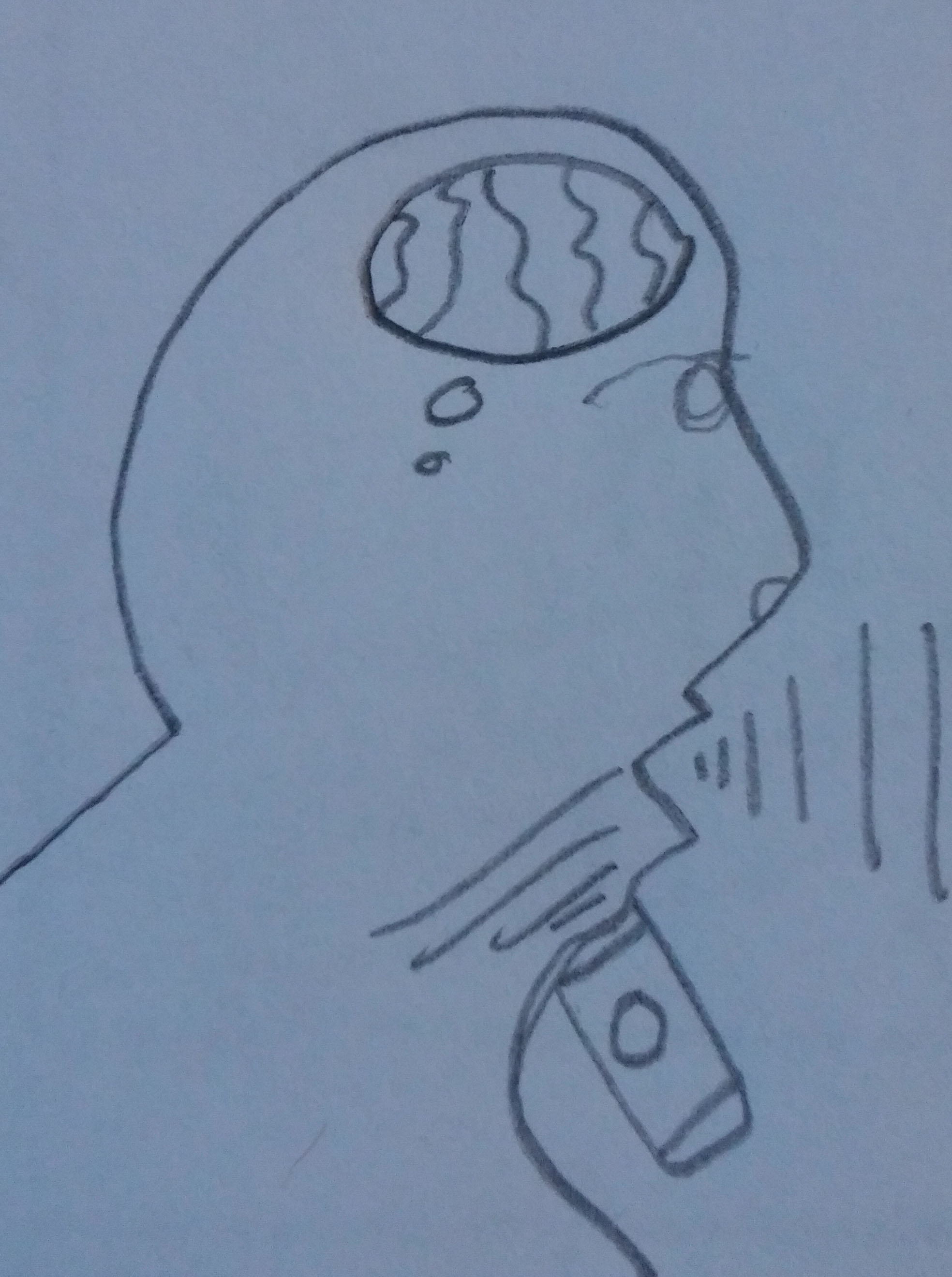
Language Machine
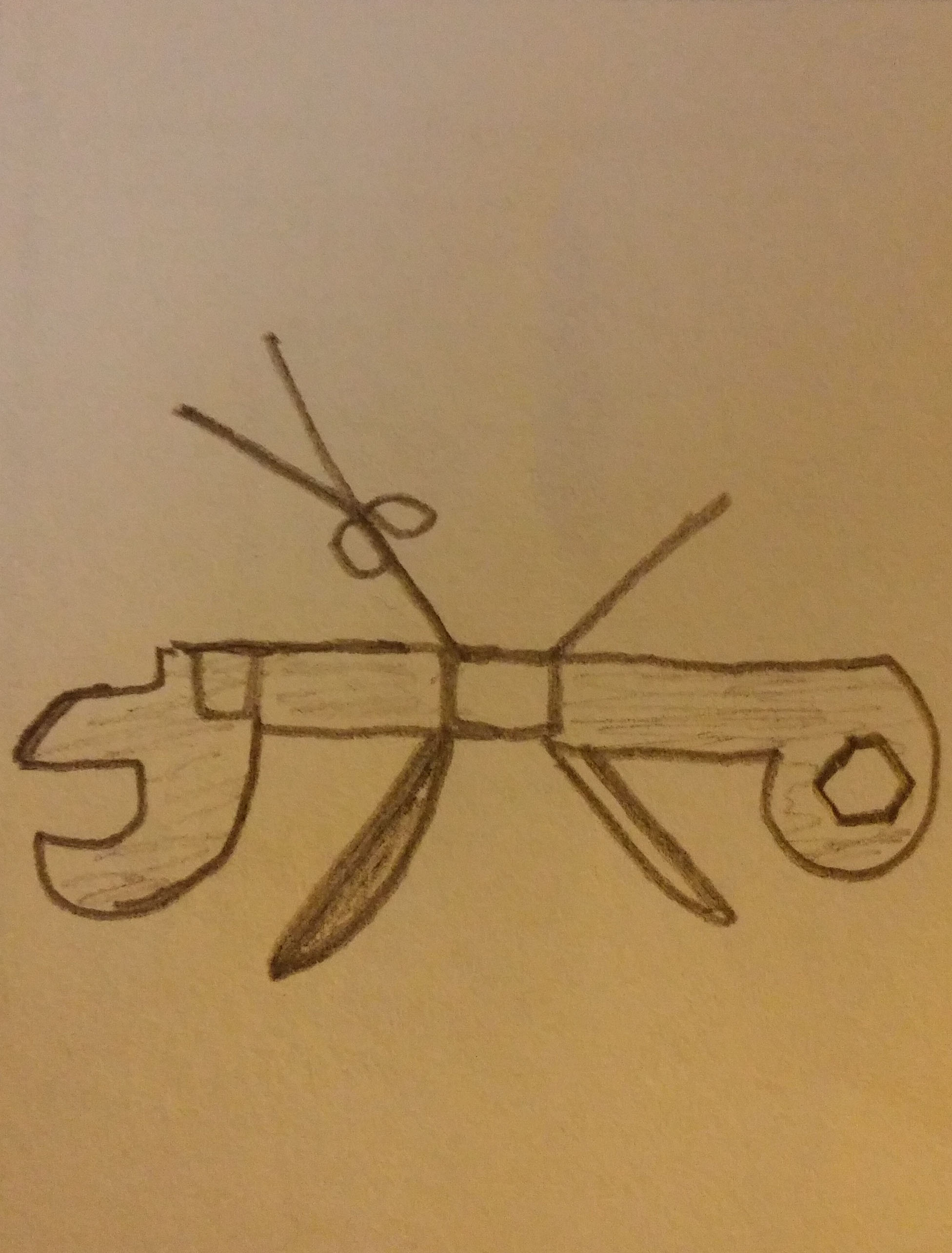
Prom Wrench
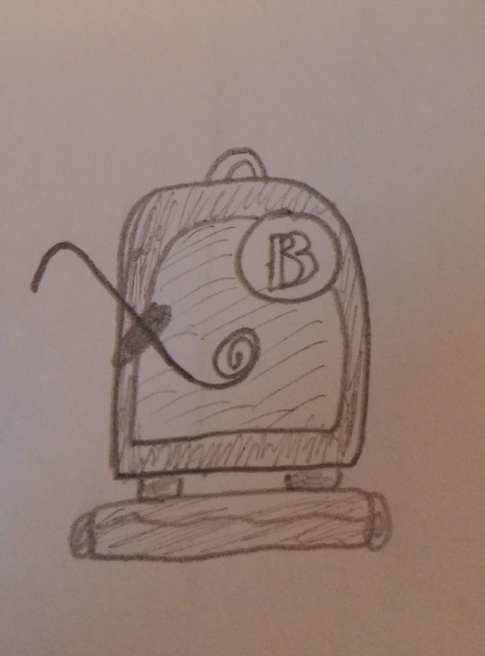
Toilet Backpack
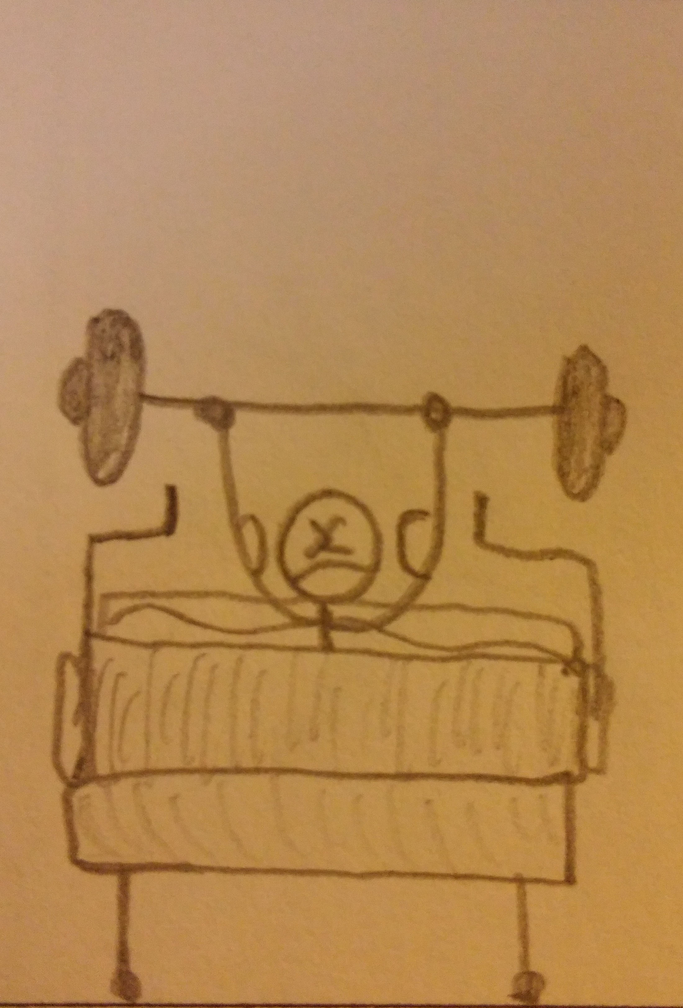
Hospital Weight
How I Got Started
I started getting into Graphic Design reading Japanese comic books as a kid. The creative illustrations on the front representing what the book would be about had young Nick going “whoa”. The way the layout was had me feeling like the publishers were breaking book limits. Instead of reading the book right to left you would read it the opposite way, left to right. Music is a big part of my life so album artwork is a factor on if I should buy a certain album or not. The way a good song can fit with a great design complements each other teasing both senses of hearing and seeing. It makes me feel good inside. This is all Graphic Design and I started in College when signing up for a random design class. The best part of Graphic Design is the way it’s all computer based. I was always on the computer as a kid, so I can learn how to work programs easy and have used media programs such as: Sony Vegas, Cubase, and Logic pro.
Publication Design
Magazines with flashy covers excite me. The cover page needs to have a big logo displaying what the name of the magazine is and what it represents as a company. Mini titles below are like little snippets of what is going to be showcased in magazines. I like how some magazine covers tell you what page the story starts on. The issue number I feel is also wicked important and makes me happy. The issue number will kindly help guide you to which month you need or already have, you never want to have the same magazine twice. Some issue numbers will stop at 12 and restart the order for the next year, or will keep going to see how many magazines have been made in total. Last they need to have the coolest picture in the entire magazine. If AP magazine didn’t an awesome photo of Fall Out Boy recreating the album art from their first album then I wouldn’t of read the story. The cover is definitely a great way to drag me into reading discovering a magazine.

Advertisement Design
Advertisements are awesome because the meaning can relate to recent events happening in our nation. One Advertisement online I looked into for an example was about the gun safety situation going on in America. It shows two children, one holding a banned piece of candy, the other a gun. Now what has my attention is that this organization is comparing banned chocolate eggs to guns in our children’s hands. This is smart advertising because it makes you realize what’s wrong or right in our country. I also find this picture of a little girl with a gun to be crazy, you don’t find a lot of kids with guns in magazines. Another advertisement that I like are the funny ones. Humor is always something that excites and gets me to want a certain product. Old Spice does the job and they create the weirdest designs for their models. In this example, the man smells so fresh, he is a snowy mountain of success all because of Old Spice. This just makes me laugh and want to buy their product. I want to smell as fresh as mountain man!

.jpg)
-
-
Classroom
-
-
Recent Posts
Recent Comments
- Danielle Vizard on Thinking with Type — TEXT
- Danielle Vizard on Digging’ It!
- Jenna on Thinking with Type — TEXT
- Jenna on Digging’ It!
- Elizabeth Robinson on Digging’ It!
Archives
- November 2023
- August 2023
- May 2023
- April 2023
- March 2023
- February 2023
- January 2023
- December 2022
- November 2022
- October 2022
- September 2022
- August 2022
- July 2022
- June 2022
- May 2022
- February 2022
- December 2021
- November 2021
- October 2021
- September 2021
- August 2021
- June 2020
- February 2018
- December 2015
- November 2015
- October 2015
- September 2015
- August 2015
Categories
-
About
KSC GRAPHIC DESIGN

Leave a Reply
You must be logged in to post a comment.