- Ê
- Â
fElizabeth has 6 post(s)
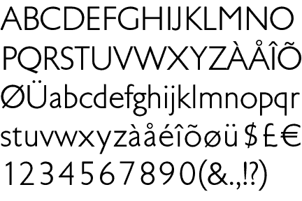
Tschichold, Transit Typeface, 1931
-
- Tschichold, Transit Typeface, 1931
-

-
-

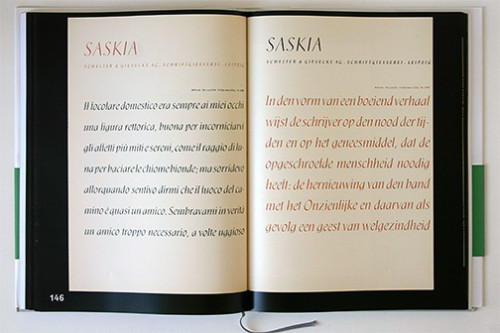
- Tschichold, Saskia Typeface, 1931/32
-

-
-
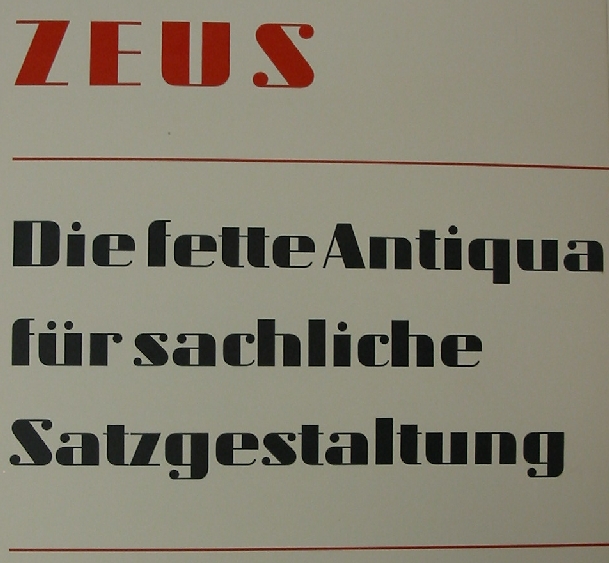
- Tschichold, Zeus Typeface, 1931
-

-

-
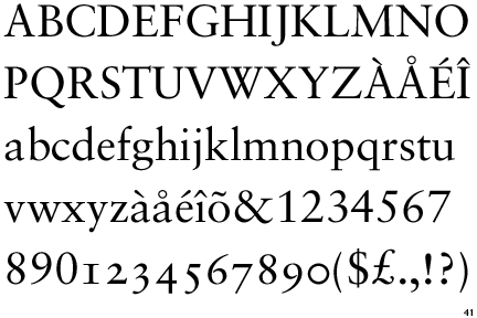
- Tschichold, Sabon Typeface, 1966/67
-

-
-

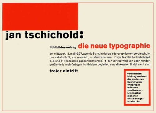
- Tschichold, Die Neue Typographie, 1928
-

-
-
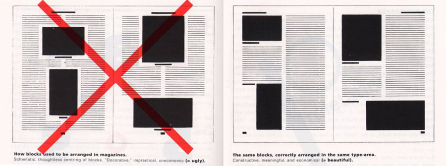
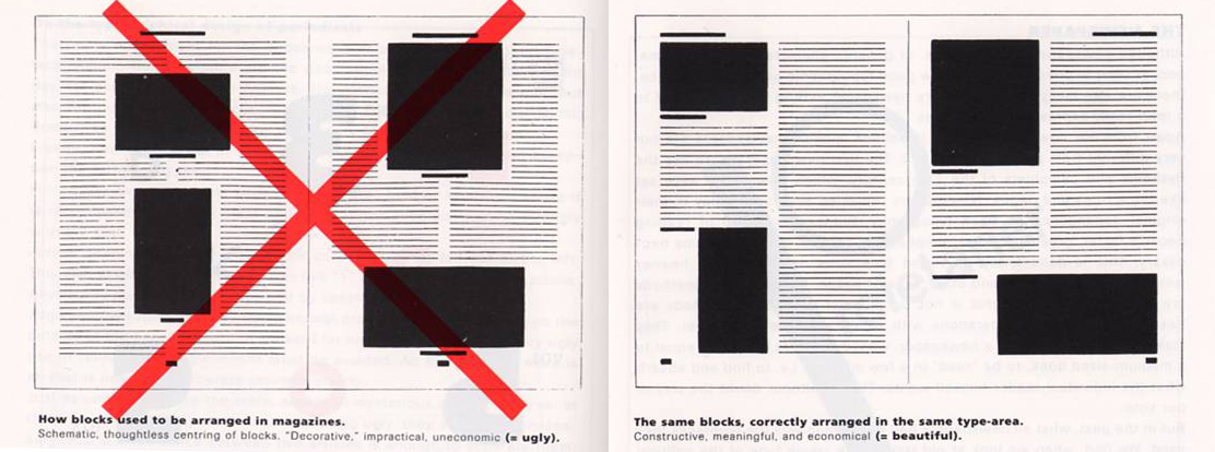
- Tschichold, Tschichold Grid, 1928
-

-

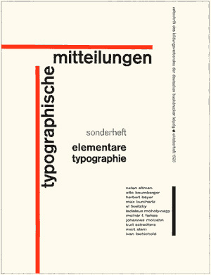
Tschichold, TYPOGRAPHISCHE MITTEILUNGEN, 1925
-
- Tschichold, TYPOGRAPHISCHE MITTEILUNGEN, 1925
-

-
-
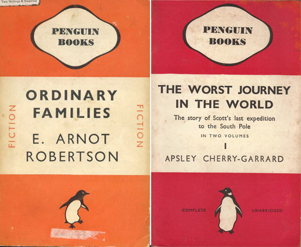
- Tschichold, Penguin Books, 1941
-

-

-
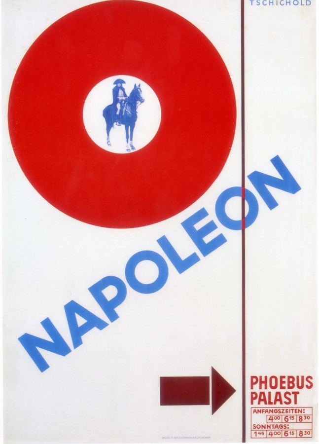
- Tschichold, Napoleon, 1927
-

-


-

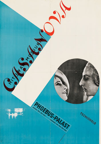
- Tschichold, Casanova, 1927
-

-
-
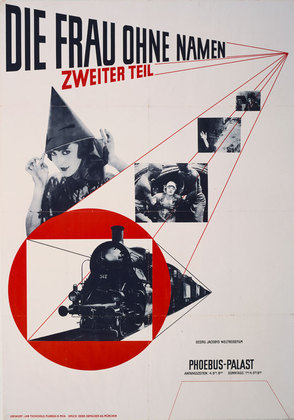
- Tschichold, The Woman Without a Name, 1927
-

-
Jan Tschichold was a creative man; a man of many beliefs. In Tschichold early years he had one specific beliefs about typography. He believed that the most powerful and important designs are made with san-serif typefaces. He criticized all other typefaces during this time. In 1928, Tschichold writes a book called, Die Neue Typographie (The New Typography), which introduces his new found philosophy. The book also conveys his opinion on asymmetry layouts. He designs a layout called the Tschichold grid which shows the right and wrong ways to design a layout. He thought that non-centered layouts can only bring more strength to your design, out with the classic and in with the abstract. His early career demonstrates this philosophy. In posters he designs for movies like, Casanova, Napoleon, and The Woman Without a Name, he layers with intense diagonals and contradicting angles. The pieces show his value for modernist design. Tschichold did not stick with modernist designs for much longer in his career. In 1947-49 he designed the Penguin Books, which, compared to his older designs, were extremely different. These books had centered type, simplified designs, and basic formatting. He abandoned all his former beliefs and called the Die Neue Typographie, too extreme. He went as far to say that the modernist design all together was fascist. In 1966/67 he then created a serif font, Sabon, which became a bestseller from then on.
Born in Leipzig, Germany on April 2, 1902, Jan Tschichold started working with typography at a very young age. He fled to Switzerland during the start of the Nazi party. Germany had strict rules against typography and only used Blackletter calligraphy. When Tschichold expanded typography and used san-serif typefaces, which were said to be a threat to the cultural heritage of Germany, the Germans took much of his work before he fled to Switzerland. He would become a writer, teacher, and designer of typefaces. He created the typeface, Sabon, which is still an extremely popular font. He published books like, Penguin Books, Die Neue Typographie, The New Typography and he oversaw the creations of more than 500 books between 1947-49. Tchischold was one of the most powerful influences of 20th century typography. His career has made a huge impact on how we think and use typography today.
I really enjoy looking at his work. Almost all the covers he designs are created with angles, levels, bold, and are distinctively no more than three colors. His work is simple, but rugged at the same time. His words are jumbled together onto one page, but the viewer is able to understand the flow and read it clearly. His work seems to have a modern feel with what people design today.
Research Links: Design is History
Hierarchy is an important aspect in design, because it emphasizes the main components of the piece. Hierarchy allows your eyes to run through the design, picking out the most important words, pictures, graphics. This system is used to pull the significant material forward to show the viewer the order of things in the design. The order is so important to a successful design. Using larger font type in a design will draw the viewer in allowing them to see the visual hierarchy of the piece. This reading was a good refresher for me and reminded me that the simplest things in a design can be the most important.

Overcast
59°F
15°C
| Humidity | 87% |
| Wind Speed | S 9 mph |
| Barometer | 29.85 in (1010.8 mb) |
| Dewpoint | 55°F (13°C) |
| Visibility | 8.00 mi |
| Last update | 4 Nov 12:53 pm CST |


![]()


Response
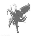
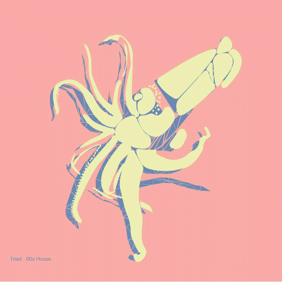
I found this assignment to be very insightful into how much work goes into figuring out the sketch or idea of your design. I enjoyed doing the thumbnails the most. I found some of the combinations to be quite funny and complicating to create.
Group Mind Map
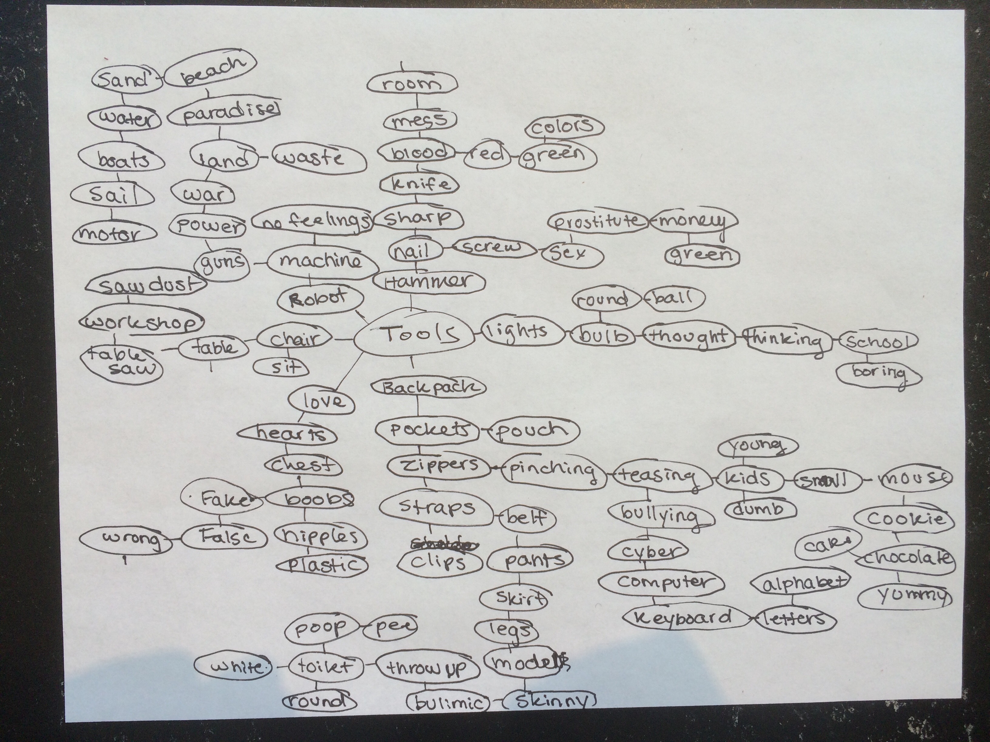
Tool Combinations
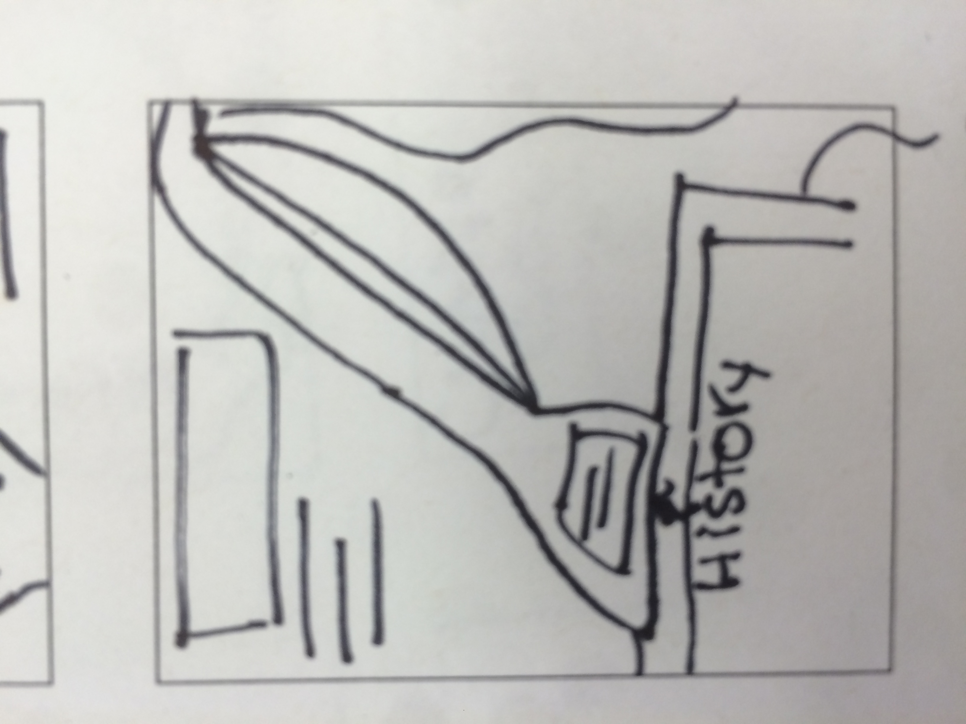
1. World Mouse– I thought this would be fun, because I thought of a ton of different designs for it when I combined them.
2. Vodka Balloon
3. Fluffy Weight
4. Skinny Ants
5. Skinny Tea
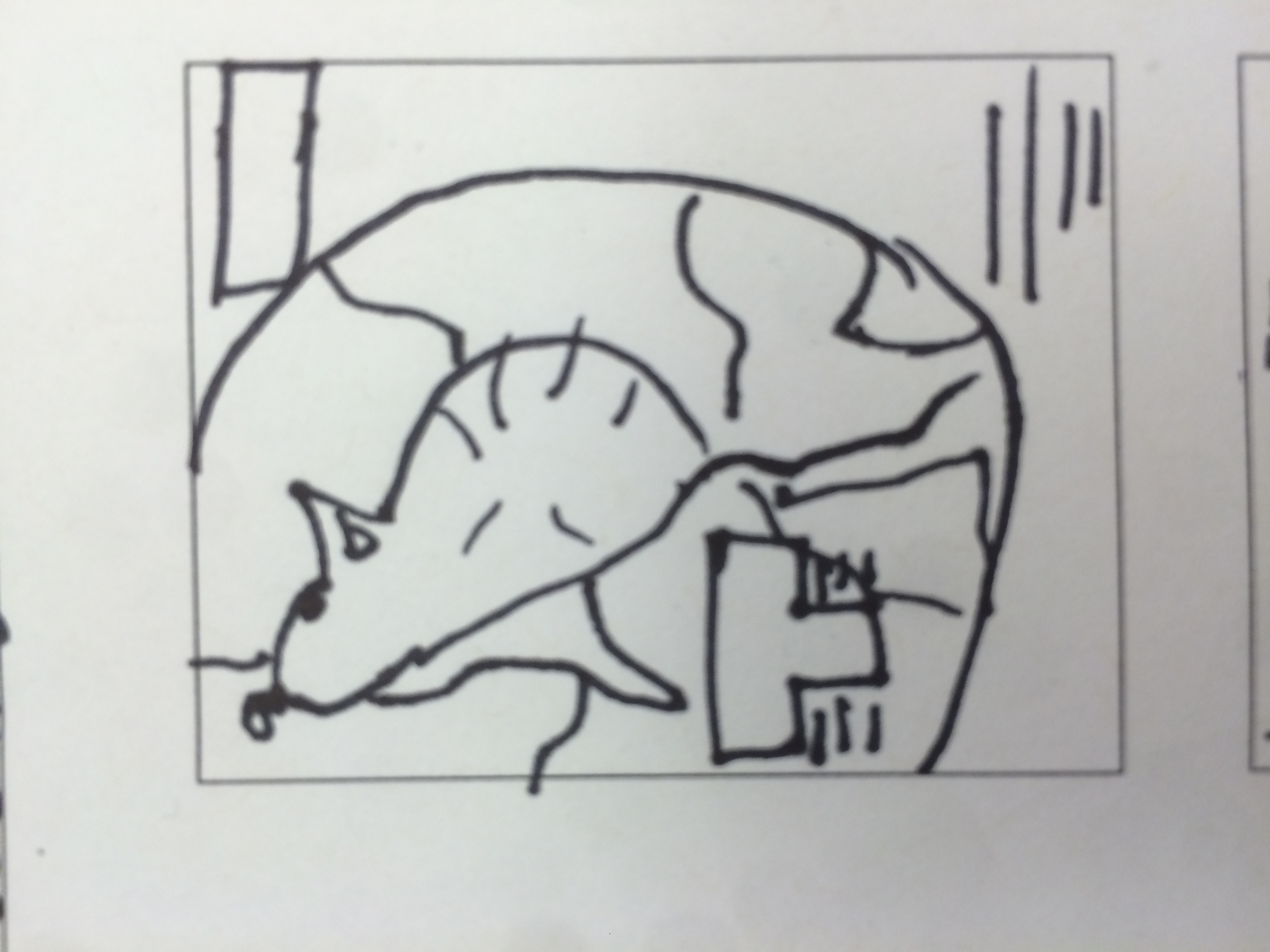
6. Twisted Vodka– I immediately thought of a cool bottle for this design logo.
7. Chubby Belt
8. Screw Pedals
9. Stress Bracelet
10. Sail Shoes
11. Bike Ball
12. Cake Tea– I thought I would draw this, because I have never heard of cake flavored tea.
13. Pen Nails– I love to do quick math on the table with my fingers. Why not be able draw with them?
14. Sweaty Bulb
15. Medicine Detective
16. Chocolate Bee
17. Electric Flowers
18. Spy Shoes– I chose this one because I thought it would be easy to design rocket shoes, sticky shoes…etc.
19. Plastic Sky
20. Electric Pen– I instantly thought of how cool a pen would be if you could speak into it and tell it what to put on the paper.
21. Boob Phone
22. Poop Cookie– Honestly, my friend told me to do this one.
23. Gun Prostitute– I thought of Austin Powers the movie and the robot seducing girls that had guns in their boobs.
24. Cyber Vacuum– I chose this one because the two work pretty well together. I thought every boy or girl needs something in their computer to instantly delete their history before their mother finds it.
25. Alarm Chair– I put these two together and just thought it would be a cool invention to have a chair that wakes you up after a quick nap before class.
Sample Thumbnails
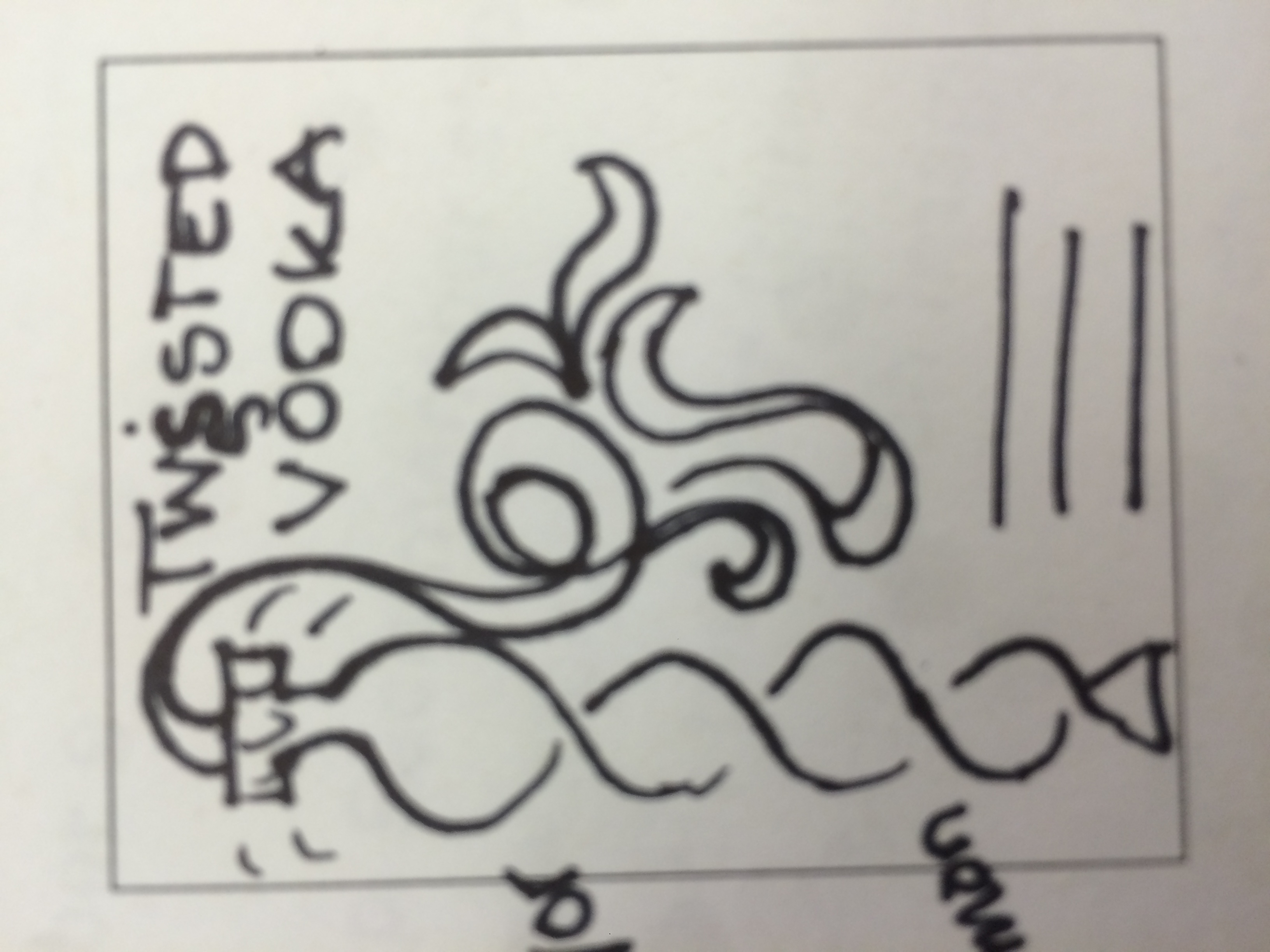
Twisted Vodka
Designing the Future
I have always been intrigued with graphic design. Growing up in a house full of my mothers typography books and magazines filled with funky advertisements. I have always been very captivated by how simple a logo might look, but how much hidden meaning is behind it. One might say the ad looks boring or too plain, but one has to connect to the product and realize the meaning of the company and what they are trying to portray. Graphic design is a big passion of mine and I hope pursue it in the future.
The perfect job would be either working in type design or advertisement. Those two fields, although very different, would be the dream jobs. Type design is a very hard field, but extremely rewarding. Building your own font would be tiring, frustrating, but exhilarating all at once. Every letter would have to be hand drawn and perfect. This would lead to many errors and recreations, but what is not exhausting in graphic design? Being able to put your own style into your work and showing the world your creation and your mind would be something unexplainable.
Advertising Design is another area I am interested in. Combining type and image into one piece might look so simple on a page of a magazine, but has taken designers long and hard work to produce. I would love to learn how to combine the two and make a magazine, billboard, or sticker come to life. This area has a lot to do with marketing, selling the product. As a advertisement designer you have to learn what the people what and what makes them want to buy your product. Although I hate Mcdonalds, they do know how to market the shit out of their product. They combined the right colors, pictures, catchy tagline, and logo to capture their customers attention. I would be fit for this job, because I am a hard-worker, like the challenge, and love some competition.
-
-
Classroom
-
-
Recent Posts
Recent Comments
- Danielle Vizard on Thinking with Type — TEXT
- Danielle Vizard on Digging’ It!
- Jenna on Thinking with Type — TEXT
- Jenna on Digging’ It!
- Elizabeth Robinson on Digging’ It!
Archives
- November 2023
- August 2023
- May 2023
- April 2023
- March 2023
- February 2023
- January 2023
- December 2022
- November 2022
- October 2022
- September 2022
- August 2022
- July 2022
- June 2022
- May 2022
- February 2022
- December 2021
- November 2021
- October 2021
- September 2021
- August 2021
- June 2020
- February 2018
- December 2015
- November 2015
- October 2015
- September 2015
- August 2015
Categories
-
About
KSC GRAPHIC DESIGN

Leave a Reply
You must be logged in to post a comment.