- Ê
- Â
fMatt has 6 post(s)
Gallery
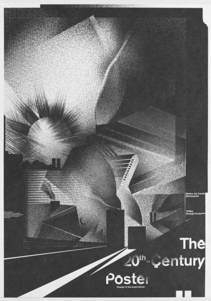
Wolfgang Weingart, The 20th Century Poster, 1984
-
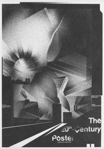
- Wolfgang Weingart, The 20th Century Poster, 1984
-

-
-
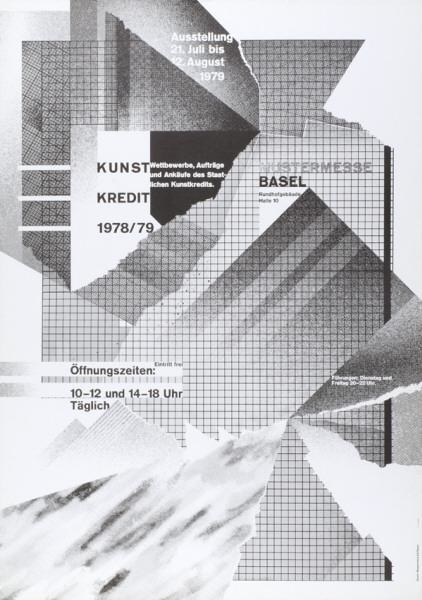
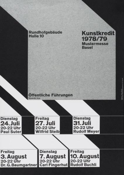
- Wolfgang Weingart, kunstkredit 1978/79, 1979
-

-
-
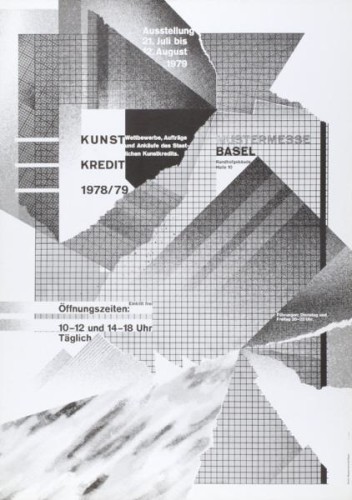
- Wolfgang Weingart, kunstkredit 1978/79, 1978
-

-
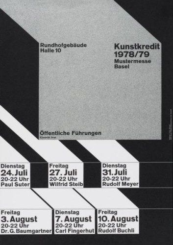
-
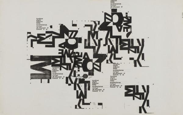
- Wolfgang Weingart, kunstdruck, graphik, antiquariat, bücher, 1962
-

-
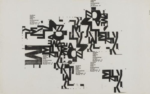
-
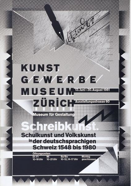
- Wolfgang Weingart, kunstgewerbemuseum zürich, 1981
-

-
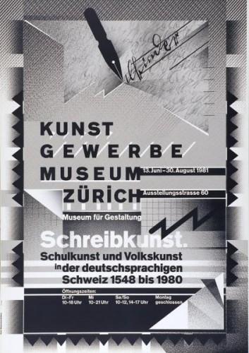
-
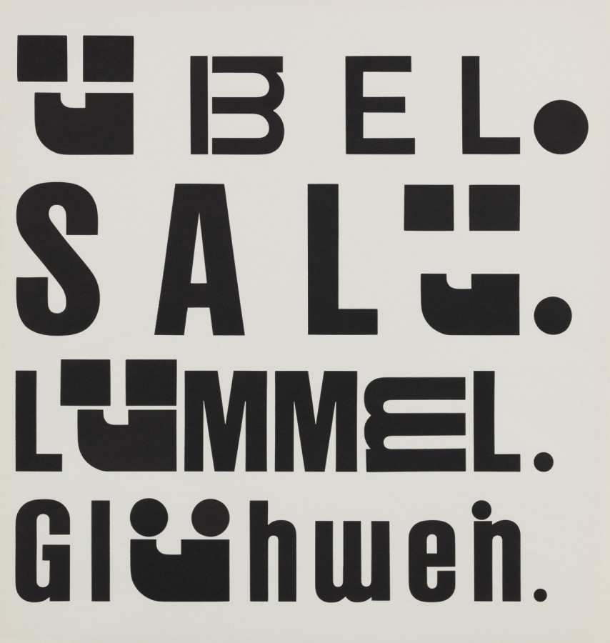
- Wolfgang Weingart, Kotzenbuch, 1972
-

-
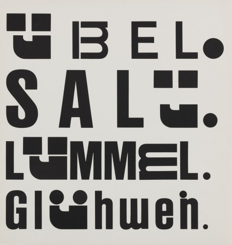

-
- Wolfgang Weingart, Untitled?, 1970?
-

-

-
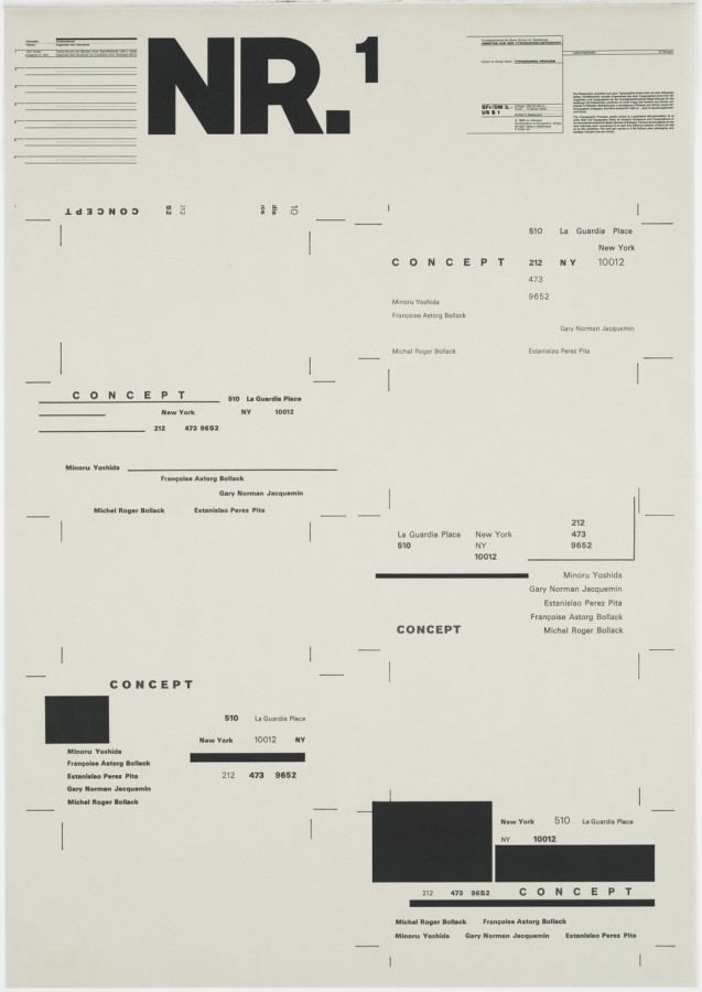
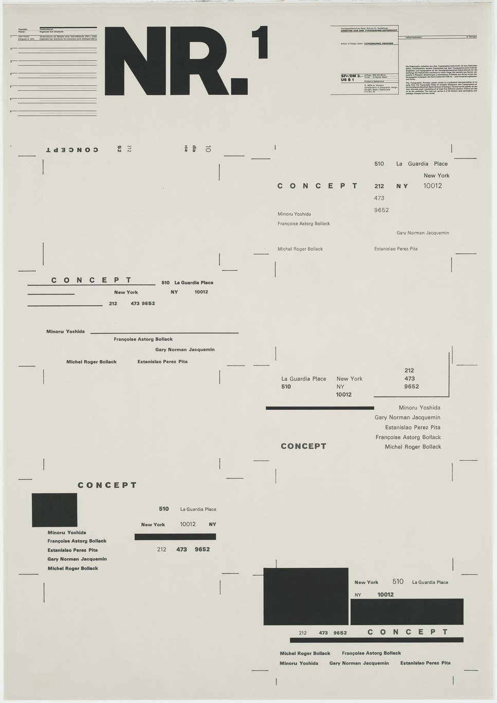
- Wolfgang Weingart, Nr. 1, 1974
-

-
-
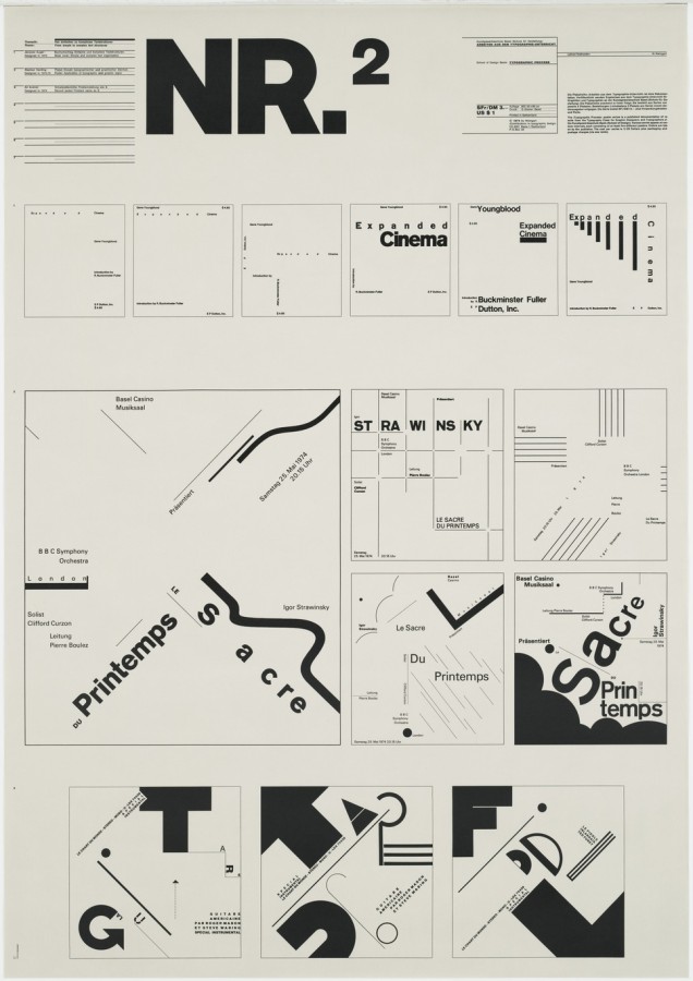
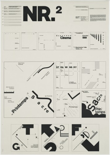
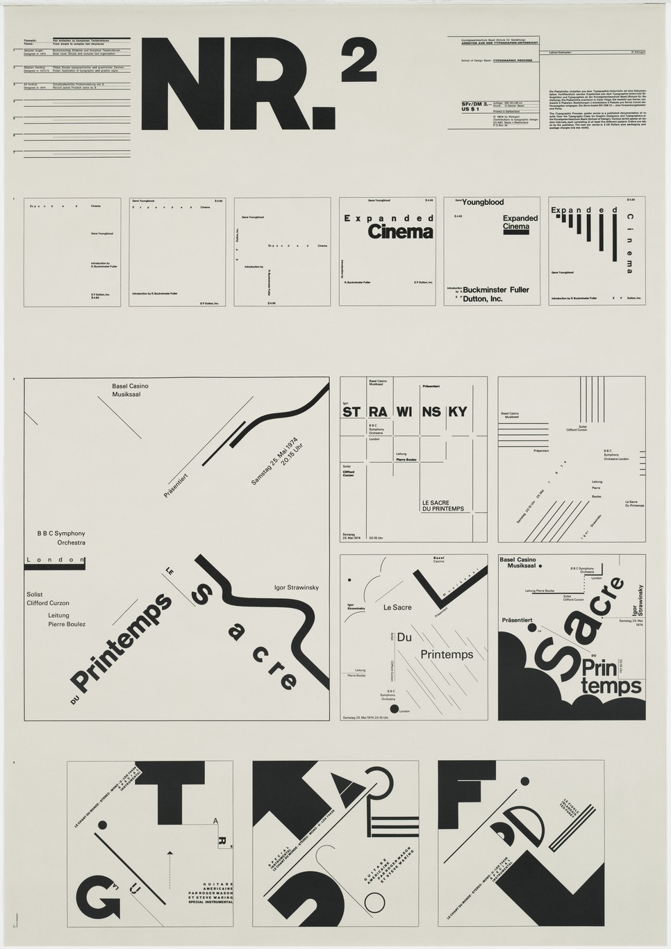
- Wolfgang Weingart, Nr. 2, 1973
-

-
-
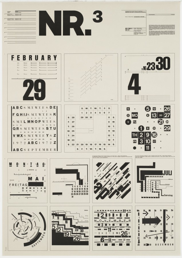
- Wolfgang Weingart, Nr. 3, 1971-2
-

-
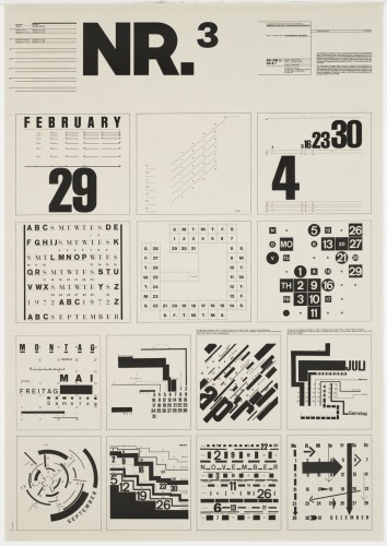

-
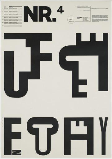
- Wolfgang Weingart, Nr. 4, 1971
-

-
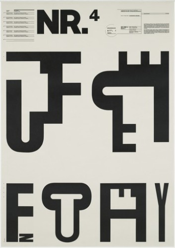
-
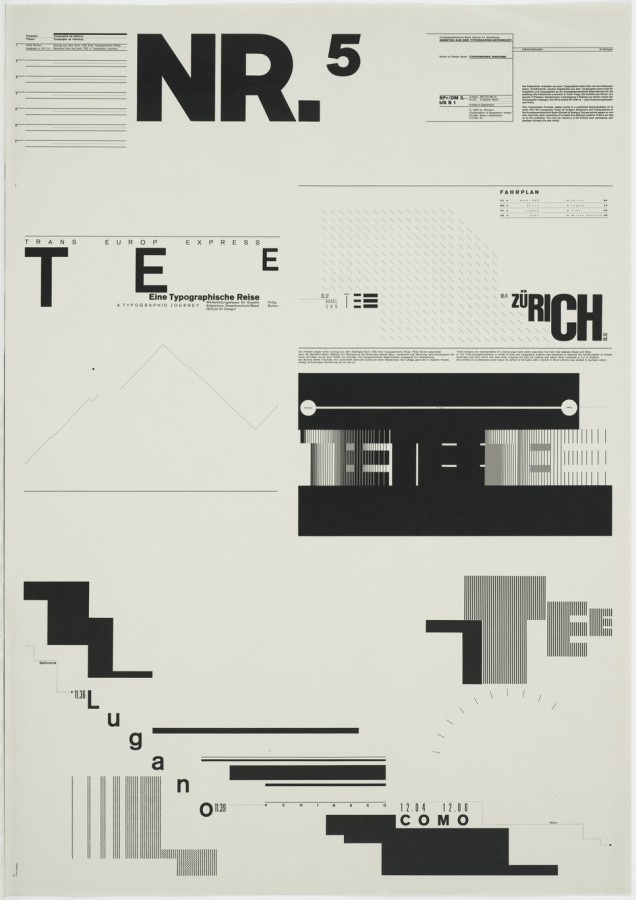
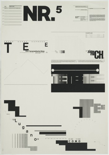
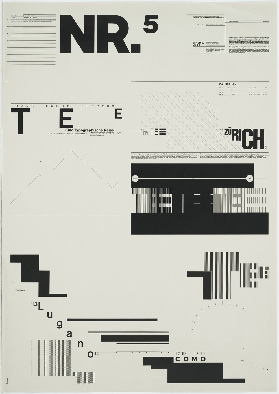
- Wolfgang Weingart, Nr. 5, 1971-4
-

-
About the Gallery
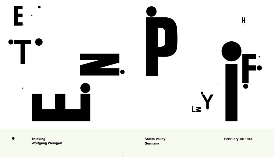
Wolfgang Weingart has found a way to break the rules of traditional Swiss typography and still make it look crisp. Although he uses sans serif fonts like the traditionalists, and works on a grid, he does so in new, dynamic way. His works exemplify disorder yet also have an asymmetrical balance to them. Throughout his works he combines letters in order to create an interesting array of abstract shapes. The strong use of black and white in most of his works lends itself to simplicity and focus. The distraction of color isn’t there to take away from the elegant and remarkable letter combinations. Having an internship as a typesetter allowed Weingart to physically interact with the letters and give him a better understanding of how they could work together.
Biography
Wolfgang Weingart is a graphic designer who is most noted for his exploration of typography. In 2013 he was awarded one of the most prestigious awards in the graphic design field, the AIGIA Medal. Weingart was born in Germany, 1941. At the age of 17 he started school, pursuing design at Merz Academy. After a two year program he took on a three year apprenticeship with Ruwe Printing. There Weingart started to develop his own style. He had a carelessness about his work that was consistent enough to turn into its own sector of Swiss Typography known as, Swiss Punk and New Wave type. After gaining attention for making innovative decisions during the internship, Weingart went on to teach and also practice at the Basel School of Design.
Traditional Swiss Typography was primarily concerned with the legibility of the type but Weingart thought of it much differently. He thought that if the text didn’t catch your eye or have any sort of concern with aesthetics than nobody would read it anyways. Weingarts mission was to create legible text that would be visually captivating. He found that his typesetting internship influenced him to use unconventional methods for printing and creating compositions. He broke the tradition of having perfect 90 degree rules and created what he believed to be more elegant and abstract. While teaching, Weingart even instructed that students work by hand and not on a computer when first exploring ideas. A tactile approach netted a better understanding for the students and even Weingart himself. If a person couldn’t draw and only knew the technical side of design then Weingart believed that they would never be able to completely understand and create a successful design.
Signature Points
- An internship where Weingart had to physically typeset led him to take a more tactile approach which had a profound influence on his methodology.
- Type has to be exciting enough to capture the attention of the audience but also legible enough to have clear meaning.
- Although he had a rebellious style he knew how to handle the problems of typography and could control himself when working for specific clients that needed clean and traditional type.
References
AIGA Medal Article
Keith Tam on Weingart
Weingart Magazine Interview
Poster Index
Type Token Posters
MoMA Gallery
When the article started with information about the design of table of contents I had to think about how often I had looked across leader lines to get to the page number of a specific chapter. It finally struck me as annoying once the example of the more modern table of contents was shown. Type should be something thats easy to look at and not be an annoyance or a strain to the eye. The dimensional hierarchy also struck me as interesting. I was amazed to see that there are companies that are willing to have important product information subordinate their logo or name. The design in turn looks more distinguishable and their company will be associated with the hierarchy of the package rather than the actual product logo. It just goes to show that the accessibility of important information and visual communication is one of the most important aspects of design.
Mostly Cloudy
79°F
Humidity 45%
Wind Speed Vrbl 6 mph
Barometer 30.19 in
Dewpoint 56°F
Visibility 10.00 mi
Charleston
West Virginia
25301
![]()

![]()


![]()
![]()
This was certainly an interesting assignment. The best part was coming up with the pairs. It was liberating knowing that what I was doing didn’t have to make sense. Whatever was interesting to me was what I could use to come up with my pairs. I felt as though I were an inventor trying to come up with some new product or idea. After all creation is graphic design.
Mind Map
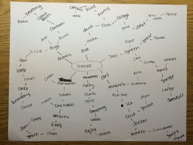
Our group rotated maps after we made an addition to keep new ideas in constant flow.
Pairs
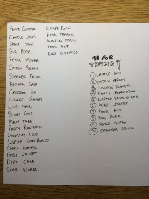
Heres why I chose the 10 I did.
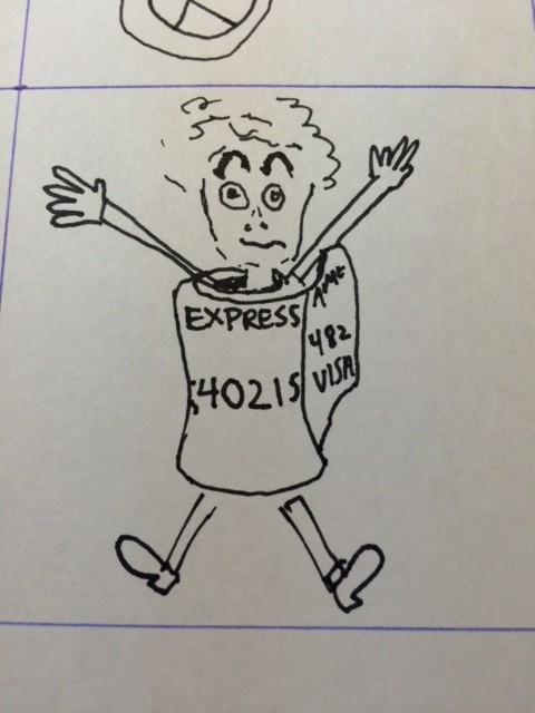
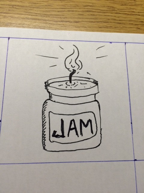
1 – Candle wax and jam have similar textures that I thought would be interesting to combine together.
2 – Cotton and brain can both be soft and mushy, why not combine them?
3 – College slavery seems to be something we can all relate to, are we learning to think for ourselves here?
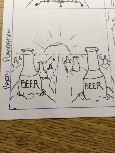
4 – A plantation that harvests party paraphernalia seems like something everyone would be a fan of.
5 – Laptop and snowboard needed to go together that way you can surf the web while you surf the snow.
6 – People seem to ‘carry’ lots of debt lately so why not do it in style with a jacket.
7 – Poor and ant seem pretty far from each other so why not span the gap some how.
8 – Bug beer sounds pretty gross but there must be a clever way to make it appealing.
9 – Fence guitars have to go together that way you can play as you go for a stroll.
10 – Speakers with water that moves to the music exist so why not build one that you can drink from?
Thumbnails
As a little kid wanting to be a skateboarder when I grew up, I was exposed to lots of interesting logos and brand designs. I remember picking out skateboards and every time it was always about how sweet the design on the back of the board was. As I grew up I started to take interest in street art which stemmed from skateboarding. Promoting a name or idea by writing it a million times in cities was fascinating and led me to want to be a graphic designer.
Typography
I’m interested in type. The way a certain font can effect how a message is conveyed is incredible. In street art all artists have their own style and its incredible how almost no one writes their name in the same style. Its exciting to see all of the variations on an alphabet and figure out how they impact the feeling of what is being said. You can tell if someone had written something while they were angry or happy.
Branding
Similar to typography, a branding is a way for something to be identified and the options are endless. I love how a design can effect the way a company is perceived by the public. Its also incredible how we are almost brainwashed into recognizing logos instantly and I’d like to be a part of that brainwashing. To be a designer behind one of the biggest brands in the world would be a dream come true and in my mind come with some sort of anonymous fame to the public.
-
-
Classroom
-
-
Recent Posts
Recent Comments
- Danielle Vizard on Thinking with Type — TEXT
- Danielle Vizard on Digging’ It!
- Jenna on Thinking with Type — TEXT
- Jenna on Digging’ It!
- Elizabeth Robinson on Digging’ It!
Archives
- November 2023
- August 2023
- May 2023
- April 2023
- March 2023
- February 2023
- January 2023
- December 2022
- November 2022
- October 2022
- September 2022
- August 2022
- July 2022
- June 2022
- May 2022
- February 2022
- December 2021
- November 2021
- October 2021
- September 2021
- August 2021
- June 2020
- February 2018
- December 2015
- November 2015
- October 2015
- September 2015
- August 2015
Categories
-
About
KSC GRAPHIC DESIGN

Leave a Reply
You must be logged in to post a comment.