- Ê
- Â
fPatrick has 6 post(s)


Then, Here, Now : Massimo Vignelli and His Wife
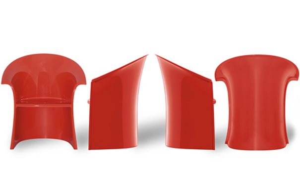
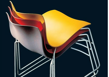
I believe that Massimo Vignelli’s work id best used to show his versatility. He had the architect background and brought that to all aspects of design. He did not only use his skills to make logos or graphic designs but instead he also created home where and furniture. He wanted to bring his simplistic views to all aspects of design to make the world an easier place to live. The exhibit should show his strive for simplicity yet a focus on beautiful design.
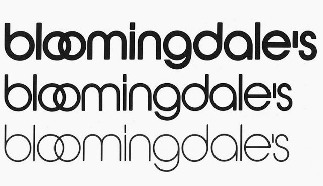
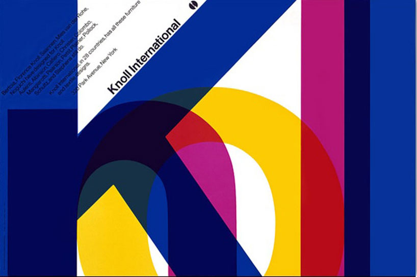
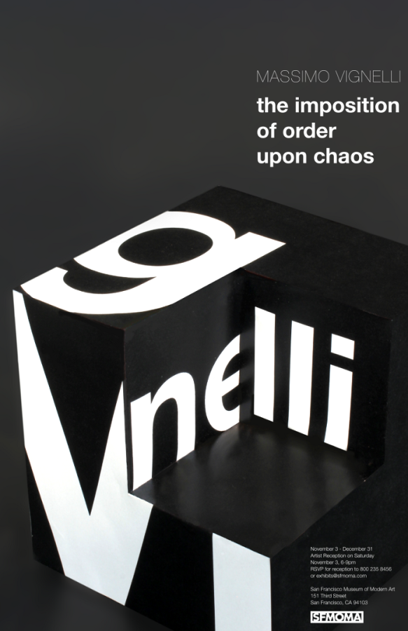
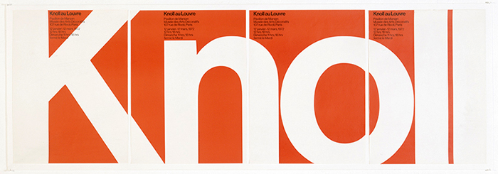
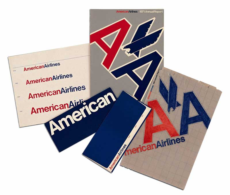
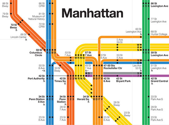
Massimo Vignelli was born in 1931 in Italy. He studied to be an architect during World War II. He used to say that if he was born a generation earlier or later he would not have been a Designer because he would either have had to participate in the war or be involved with the reconstruction after. He met his wife Lella in college and because of there shared interests in architecture and design they got married and became business partners. They both moved to New York to start their own design company Vignelli Associates. He is best known for designing logos for such companies as American Airlines and Bloomingdales as well as reconstructing the New York City subway map. He is also known as the man who brought Helvetica to the US. He had a very modernistic design approach, which could also be considered timeless because his designs are everywhere even today. He believed a good designer looked at the world and tried to make it better. Take away the things that are not needed and make everything much more simple. There is an ease to all of his work that I find comforting and smooth to look at. It takes a truly talented designer to take something so simple yet be able to make it there own and new.
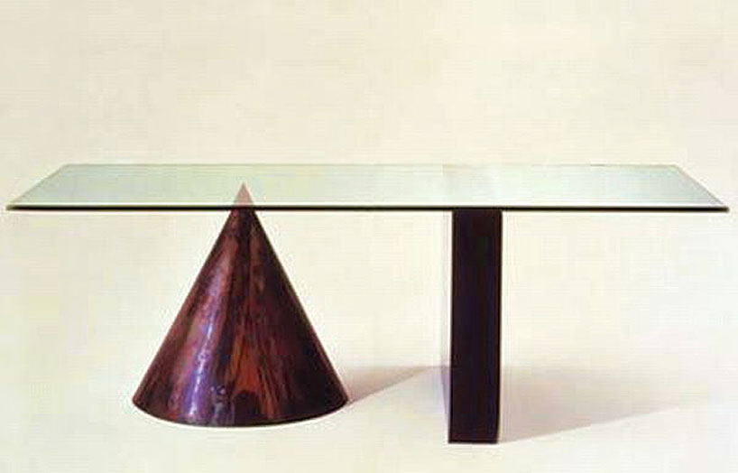
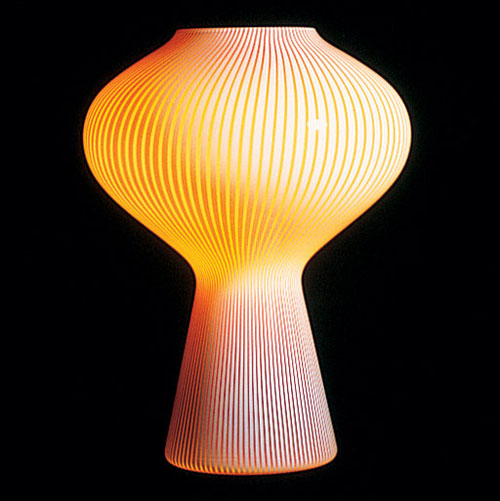
Massimo talked about how the materials that he would use to create the final outcomes for his design helped inspire him. He made a table out of just a sheet of metal and pipes that was so simple yet a beautiful design. He also used the grid and believed it was essential for design. Finally he had a need for his work to be immortal and timeless.
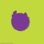
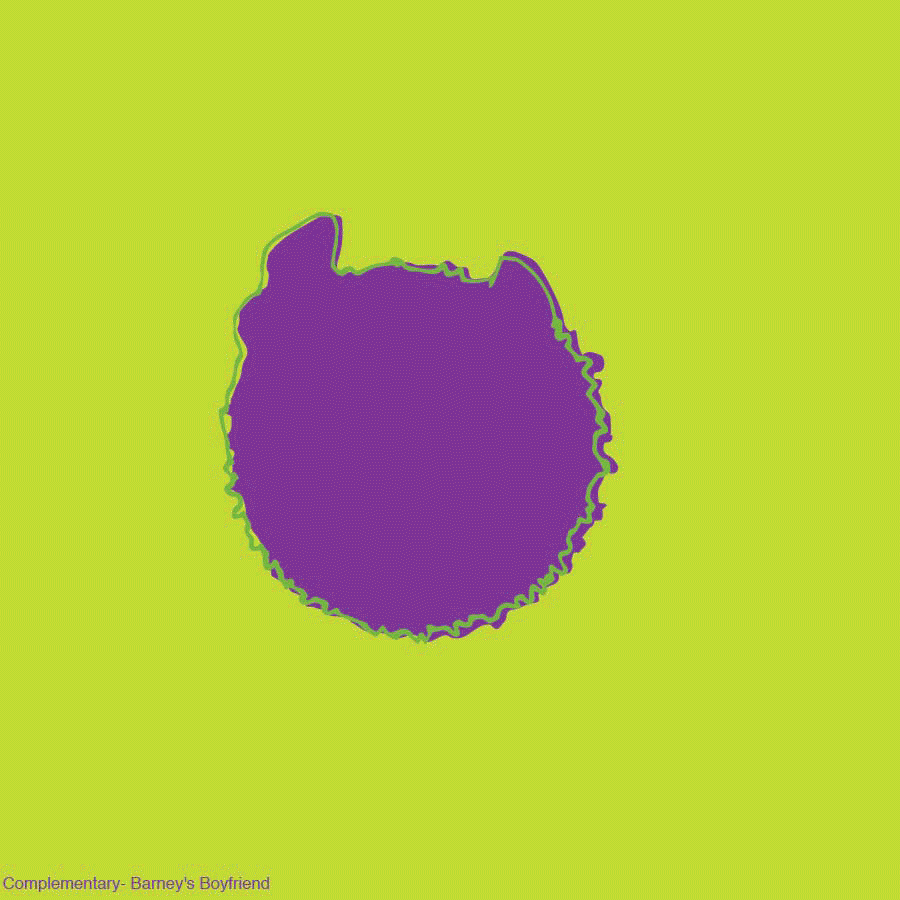
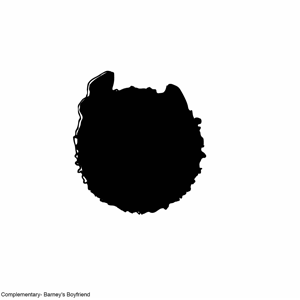
a visual hierarchy is how importance is placed on an image and how that can change the feel of the overall presentation. This is a necessary aspect for graphic designers because that is a lot of ways is what they are paid to do. while everything needs to look nice if the information that needs to be conveyed is not properly conveyed then there is no point.
Overcast
67°F
19°C
Humidity 87%
Wind Speed Vrbl 3 mph
Barometer 30.24 in (1023.8 mb)
Dewpoint 63°F (17°C)
Visibility 10.00 mi
Last update 4 Nov 1:53 pm EST


This project in general pushed my creative process. It required me to take ideas that I already had and combine them with other ideas. This would be a very time consuming project but all of the different things that need to be done where not individually time consuming. So spacing it out helped a lot. I’m a big fan of the mind map idea, I thought it was really great at just getting all of the ideas I had out. Then combing them wasn’t too hard. When I first went into this project I was thinking more about the images of these combined tools then actual concepts behind them. this gave me some weird ideas but not really practical ones
trumpet + legs – I feel like these can both be objects that in my mind relate but in all reality they don’t.
money + sail- one day people will be soo rich that they will just use there money as sails
pillow + nail- these two tools have almost nothing to do with one another
guns + stickers- I really like juxtaposition and i feel like these two things do just that.
wood + Skirt
mold + car
diamond + spoon- this is a combination of the every day with the rarely seen
waste + leaves
robot + queen
blood + hand
moon + lighter
land +boats
bull + saw
ring +ball
squid +knife
paradise + monster
hammer + chair – I liked this one because I thought about how often I step on nails and no i can hammer them in while sitting
beach + hospital
weights + cow- I am obsessed with bro culture and I think muscle milk is confusing
prom + apple
bulb + meth- I really like both of these images aesthetically
cyber + stars
room + balloons
pen + bus- both of these things are filled with either ink or people
table + backpack- I would really love a table that is also a backpack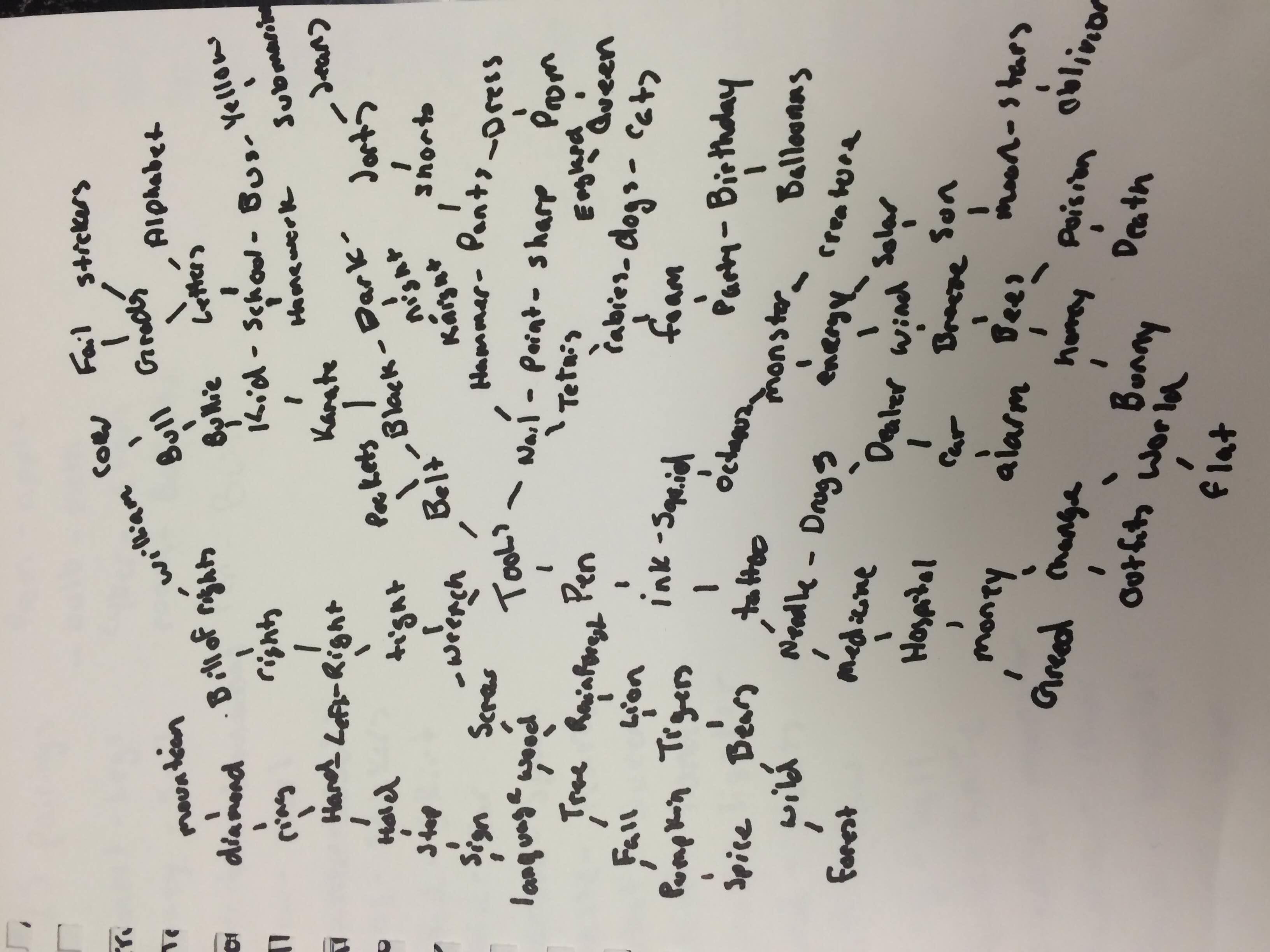
Me
I am interested in graphic design because I love art and can’t draw, or do anything like that. I am also a big fan of computers so this just seems to fit. I have always been interested in design and aesthetics like why the Mona Lisa is such a big deal but my paper-Mache pig head that I made in 4th grade gets no attention. Graphic design is also the art form that is the easiest to come by. You walk anywhere and you will see graphic design. Just look at the guy who designed those Minions. You know the gross yellow people that seem to be everywhere. That was probably not a graphic designer but it was designed and now they are on posters and tee shirts and that very well could have been a graphic designer. This field is all about an art form that is a crazy attention to detail. A painting can have a lot of attention to detail but it is not always requited while a poster really needs to have a specific focus and a clear concept. It is the most prevalent art form of the current generation.
Publication Degin
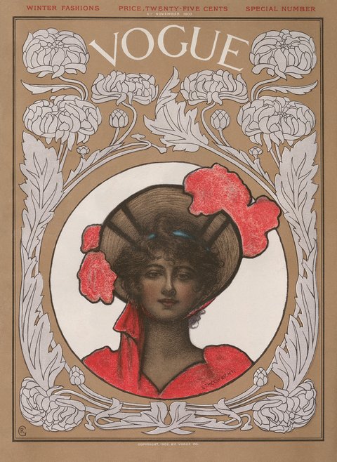
I have always been a big fan of publication design. Two years ago I was on my lunch break and wanted to get a magazine to read during my lunch so I was looking at all of my options in the Hannaford’s I was getting my lunch in and I saw Vogue. There is a level of sophistication with Vogue that I really like. It is a magazine of clothes that no one can afford but for whatever reason I was into that. I have bought every issue since that first one. My favorite design vogue has done is there first covers. They used their covers to grab the attention of the public and before it was celebrities, it was the fashionable women of that day. I love the idea of a start up magazine because they need people to buy their magazines to keep working but I think that people can see though desperation. I personally find my skills to be with layout and organization and that is definitely something that is required of a publication designer.
Type Design
Following off of this trend I am very interested in type design. Typography is a difficult art form because there is only so much you can do with fonts that has not already been done. But what interests me about typography is taking something that has been used and changing it. I have a very simplistic aesthetic and type often plays well to that. I also have an obsession with the renaissance and what that meant culturally. That is how I would take my type aesthetic. Taking the popular types and making them define our new needs.
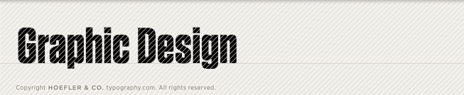
This is an example of a type that I like. It is bold but also simple. It grabs my eye without beating my eye up.
-
-
Classroom
-
-
Recent Posts
Recent Comments
- Danielle Vizard on Thinking with Type — TEXT
- Danielle Vizard on Digging’ It!
- Jenna on Thinking with Type — TEXT
- Jenna on Digging’ It!
- Elizabeth Robinson on Digging’ It!
Archives
- November 2023
- August 2023
- May 2023
- April 2023
- March 2023
- February 2023
- January 2023
- December 2022
- November 2022
- October 2022
- September 2022
- August 2022
- July 2022
- June 2022
- May 2022
- February 2022
- December 2021
- November 2021
- October 2021
- September 2021
- August 2021
- June 2020
- February 2018
- December 2015
- November 2015
- October 2015
- September 2015
- August 2015
Categories
-
About
KSC GRAPHIC DESIGN

fix broken links! R