- Ê
- Â
fDylan has 7 post(s)
Gallery

Herbert Bayer, Kandinsky zum 60. Geburtstag, 1926
-
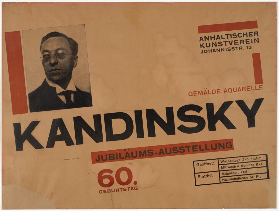
- Herbert Bayer, Kandinsky zum 60. Geburtstag, 1926
-

-

-

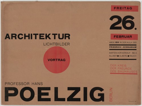
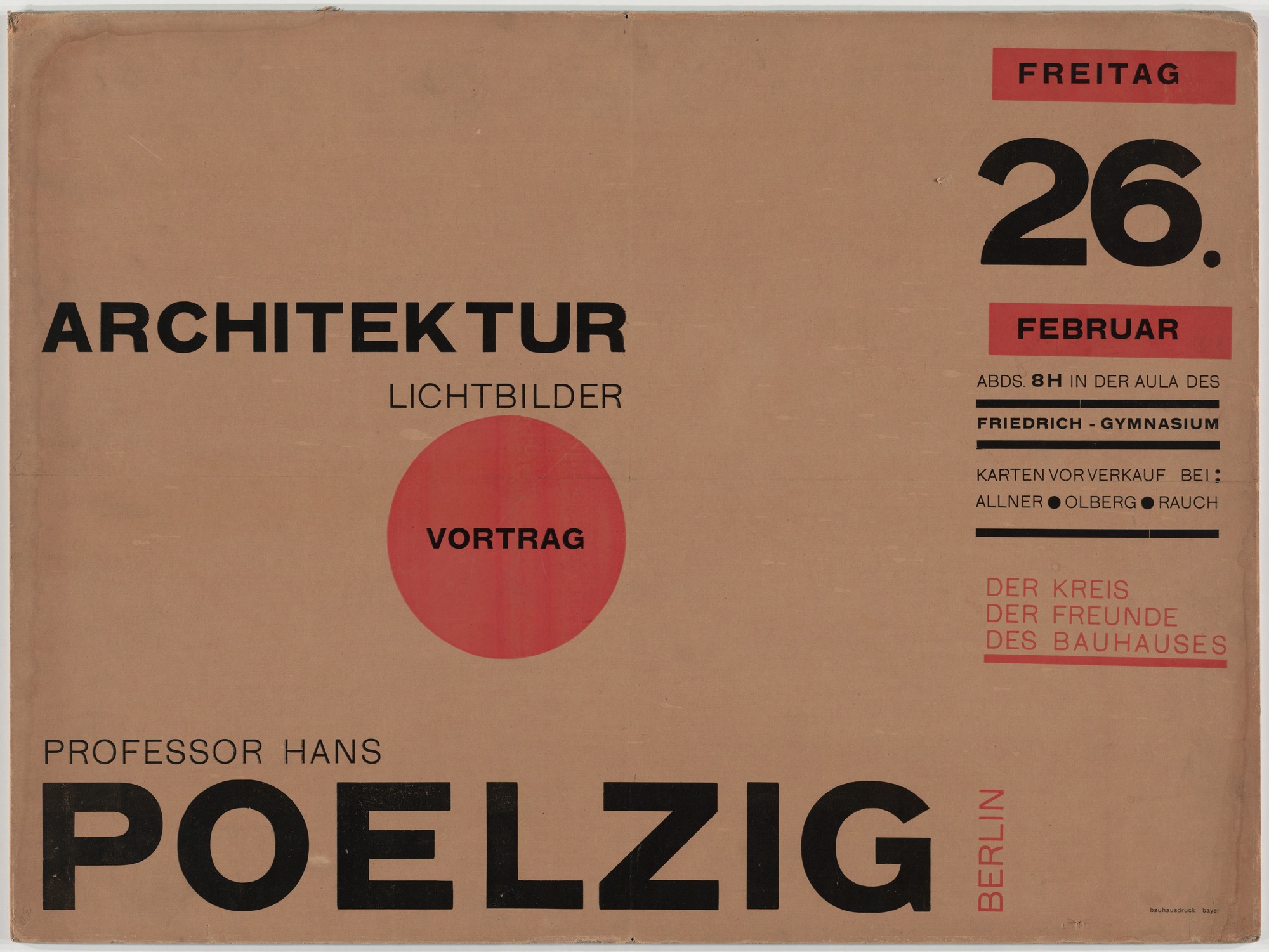
- Herbert Bayer, Architektur Lichtbilder Vortrag Professor Hans Poelzig, 1926
-

-
-
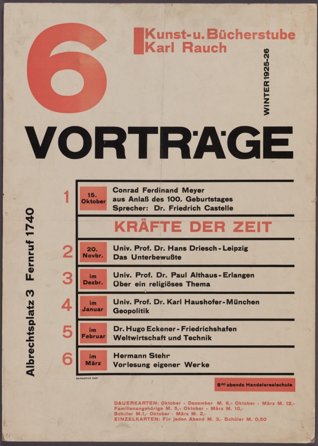
- Herbert Bayer, 6 Vorträge, 1925
-

-


-
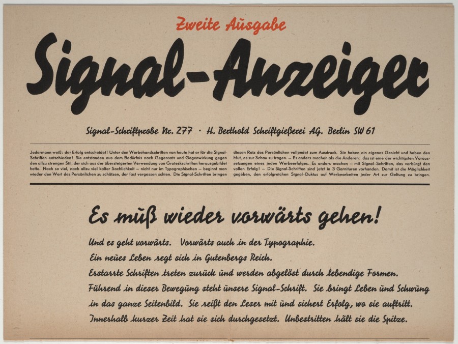
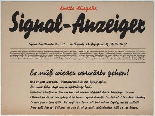
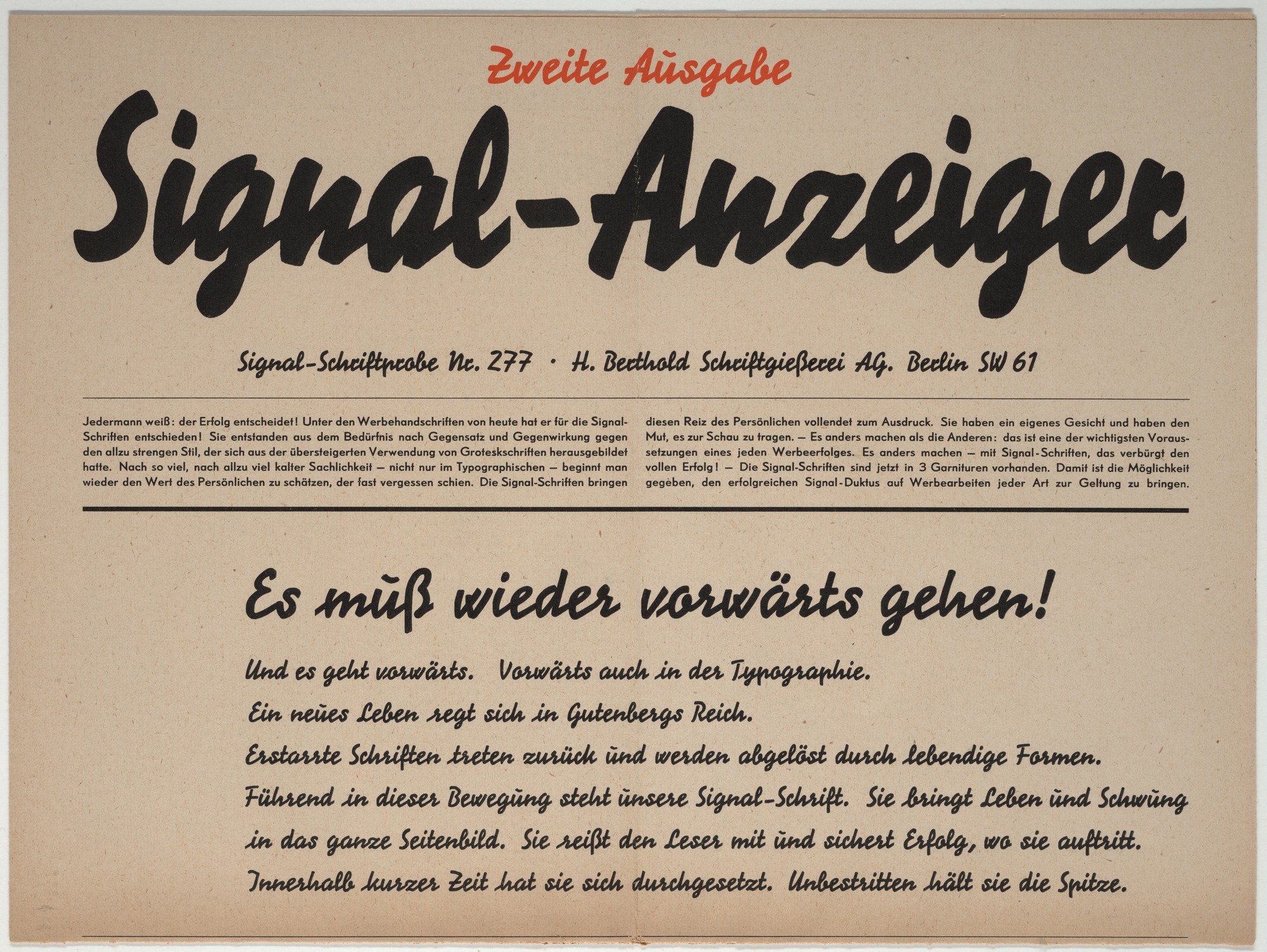
- Herbert Bayer, Signal-Anzeiger, Signal-Schriftprobe No. 277, 1929
-

-
-
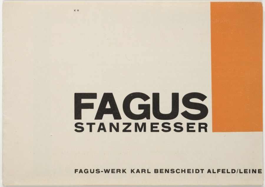
- Herbert Bayer, Fagus Stanzmesser, 1923
-

-


-

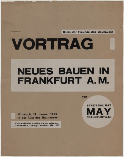
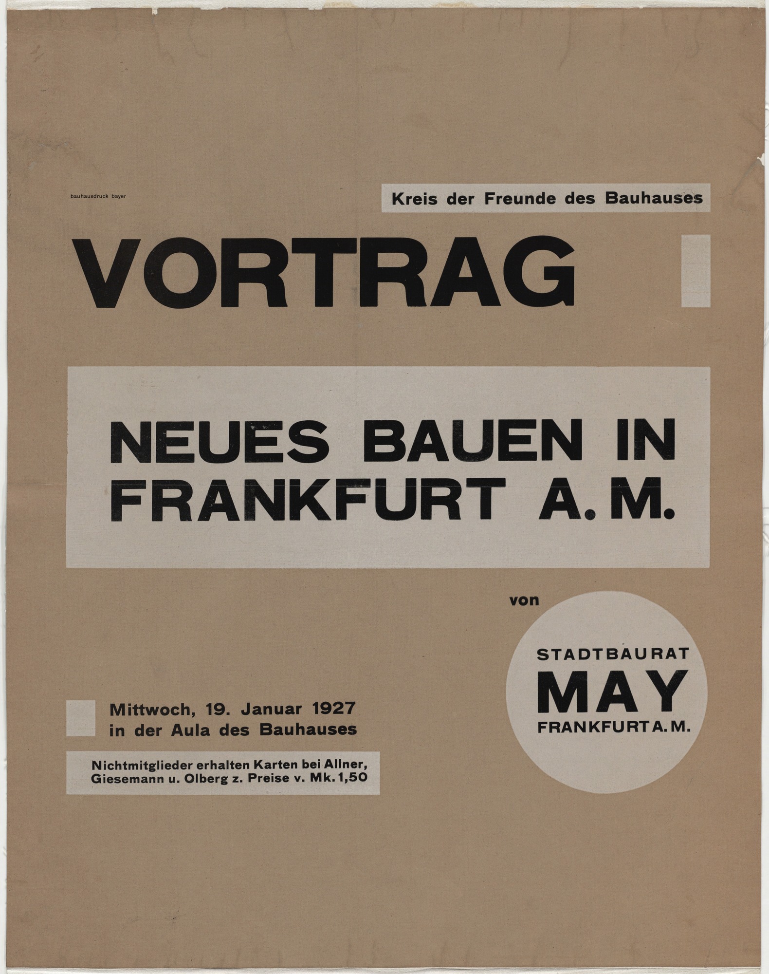
- Herbert Bayer, Neues Bauen in Frankfurt a.M , 1927
-

-
-

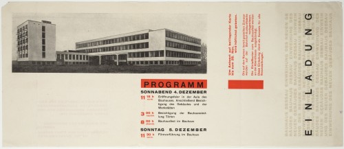
- Herbert Bayer, Einladung Bauhaus Dessau, 1926
-

-

-
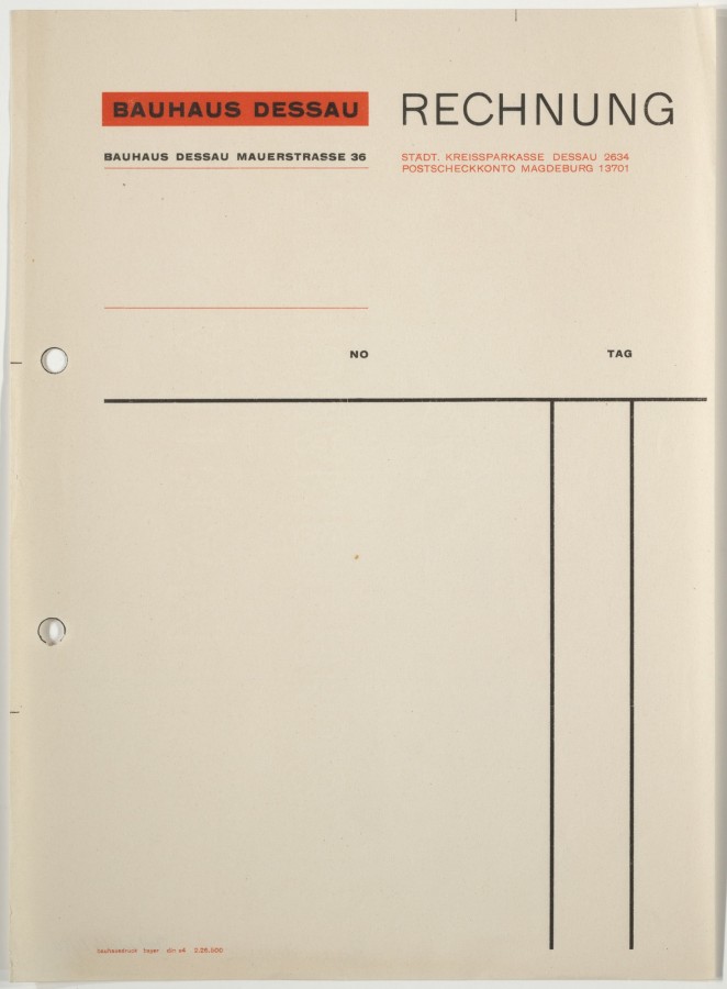
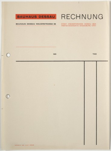
- Herbert Bayer, Bauhaus Dessau Rechnung, 1926
-

-

-

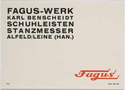
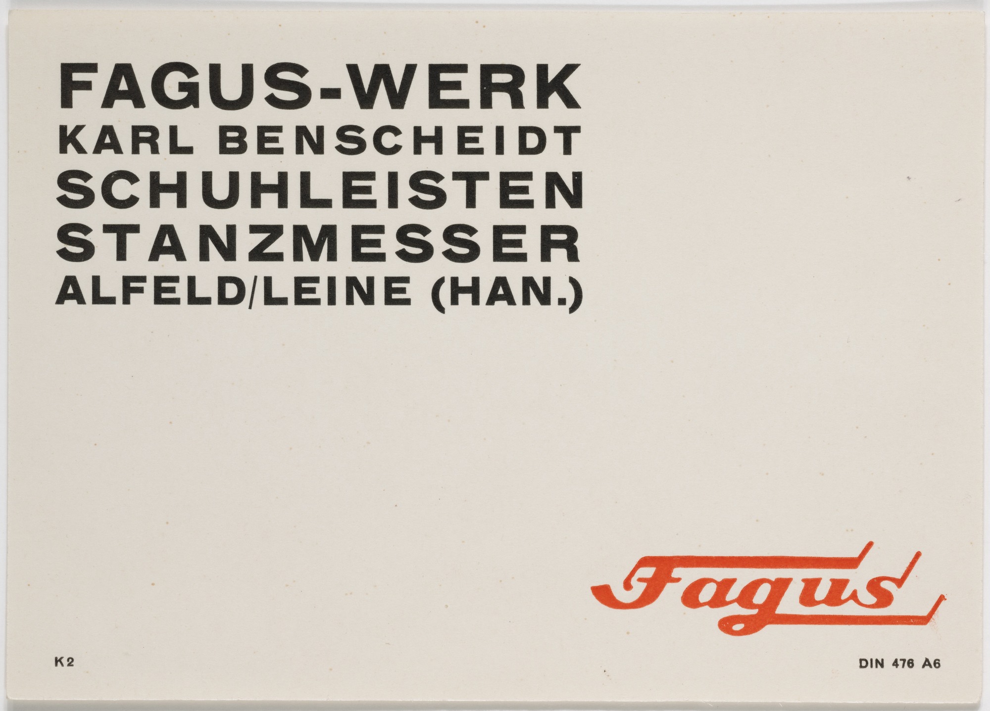
- Herbert Bayer, Fagus-Werk, Schuhleisten, Stanzmesser, 1926
-

-
-
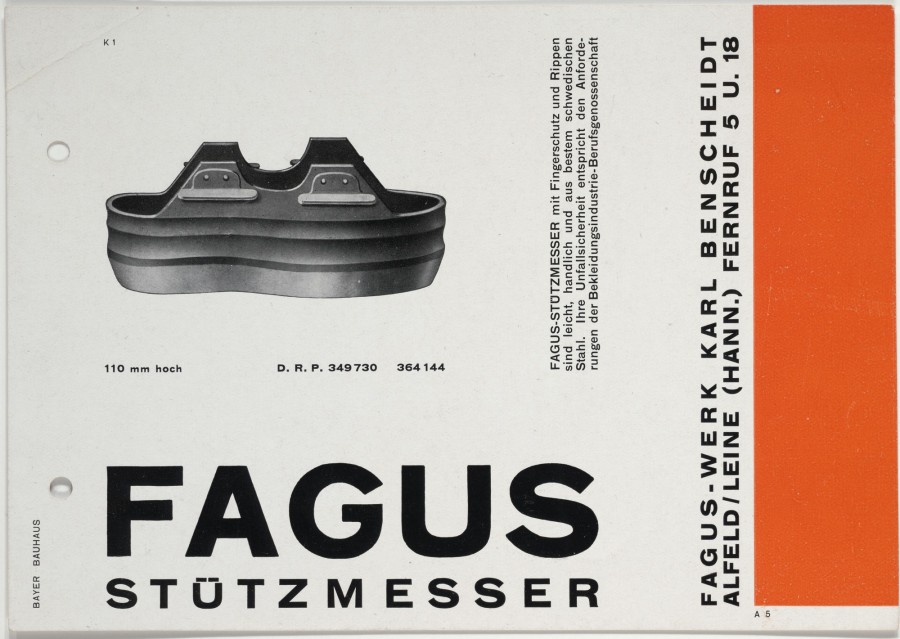
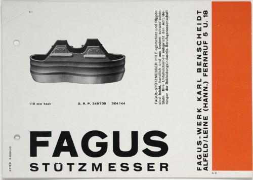
- Herbert Bayer, Fagus Stützmesser, 1926
-

-

-
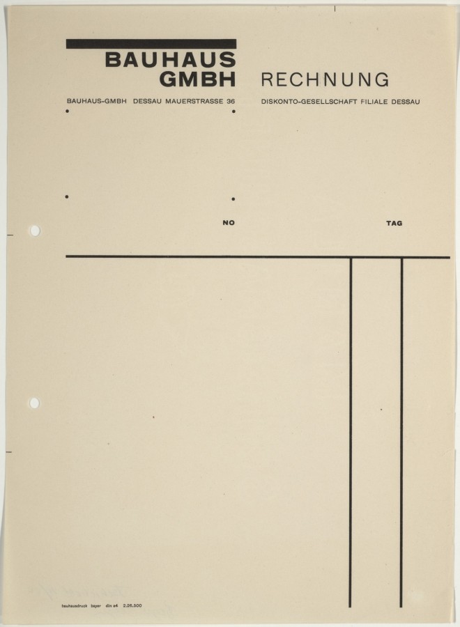
- Herbert Bayer, Bauhaus GmbH Rechnung, 1925-26
-

-


-

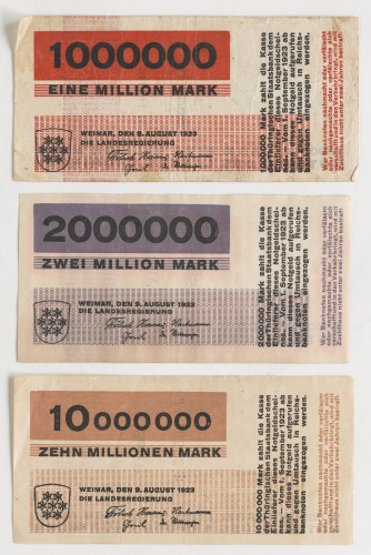
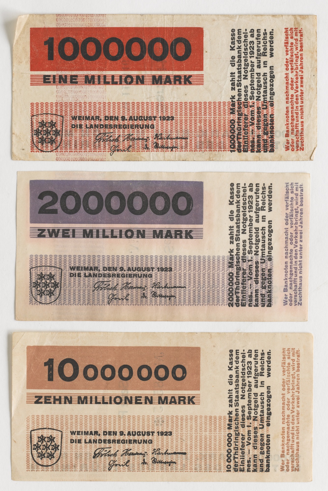
- Herbert Bayer, 10 Banknotes, designed for the State Bank of Thuringia, 1923
-

-
Gallery Info
The works selected for this gallery were picked from Herbert Bayer’s simpler, more bare-bones designs. The contents of the gallery involve almost entirely text-based designs(typically sans-seriff) with limited used of abstract shapes and sometimes photo. For the sake of avoiding complications, such as overwhelming viewers, Bayer keeps his colors monochromatic. All of these typographic works have a strong architectural structure to them. Each composition is rigidly put together with no dangling ends or floating text. While there is a great disparity between text sizes there always appears to be a counterbalance holding the shapes together. These radical differences in text sizes allow Herbert to give a fantastic amount of emphasis on certain key words. Herbert also shows a preference for taking words an places them inside of containers, whether it be within circles, squares, or grids, it has the noteworthy effect of isolating text from the rest of the page. Much of Herbert’s work seems to convey a sense of expressive restraint, he tries to keep things concise only showing what’s necessary. That being said, his minimalist typography still shows a fair deal of personality, giving off a bold, powerful impression.
BIO
Herbert Bayer is a graphic designer from Haag, Austria. He was accepted into Germany’s famous Bauhaus design school in 1921. Though an accomplished painter and photographer, Bayer was most known for his accomplishments in the typography and graphic design fields. He created a very geometry, sans-seriff typeface he called “Universal” which decided to drop uppercase letters entirely. Qualities of the type are how they have a very bold and round look to them. One detail that particularly appeals to me about the typeface, is the way that in some letters like “d” are just perfect circles with descenders and ascenders added on to them.
Herbert did a number of posters for Bauhaus. He usually sticks to flat colors to emphasize shapes in his designs. One of my favorite works of his would be his poster for architect, Hans Poelzig. It is a very sans-seriff type heavy poster with a few orange abstract shapes on a brown background. The left side of the poster is a fairly spacious with large bold text sandwiching smaller light text and a bold text containing circle. The top and bottom halves of texts have opposite allignments making the text forms appear to hook over one another. The orange circle in the middles hangs below the top half of text creating a perfect right angle. The right side of the page contrasts with left’s spacious by having a fairly dense sidebar of information. Two of words at the top are highlighted in orange blocks containing a number explaining the date of an event. As for the rest of the text, Bayer has created a neat internal logic by bolding, underling, and coloring words. Herbert Bayer has great talent for taking text and and turning them into really interesting structures.
OTHER INSIGHTS
1. Before his acceptance into Bauhaus, he apprenticed for an architect Josef Emanuel Margold in Linz, Germany.
2. He has a wide range of skill including Photography, Landscape architecture, and painting.
3. One of his reasonings for developing a lower case only typeface was to counter the fact that the German language capitalizes all nouns.
Sources
After reading this article, i feel like i have a much a better understanding of what visual hierarchy is all about. Hierarchy is focused on how a layout can control our attention by emphasizing and organizing aspects in the visual space. Hierarchy can separate lines of text into groups or make everything clump together into a big homogeneous blurb. An example in the text that stuck out was the table of contents page that tried one to many methods of separating texts and ended up looking like a complete mess. Also the page that showed a series of similar hierarchies with slight permutation was useful in showing how different types of changes can affect a hierarchy.
Isolated Snow Showers
38°F
Humidity 57%
Barometer 30.10 in
Wind Speed NA
Dewpoint 24°F
Visibility NA
89701

Tool Montage Thoughts
I had a good time working on the mind map with my groupmates. It was a lot of fun just seeing where certain words would lead us down and just seeing the interesting connections everybody would come up with. My favorite part was easily just doodling little models of the inventions and trying to decide what they’d look like.
Mind Map
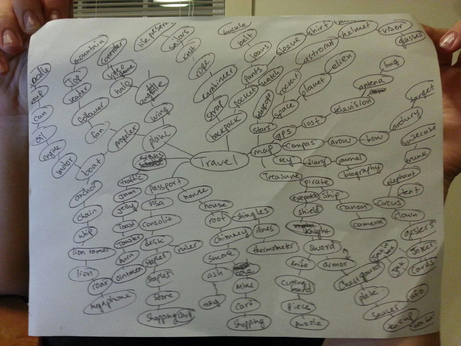
All Combinations
Thermometer + Knife
Eyepatch + Telescope
UFO + Teapot
Toilet + Throne
Backpack + Toaster
Boots + Board
Bottle Hoop
Puzzle + Plate
Belt + Fan
Desk + Pool
Lion + Stapler
GPS + map
Fork + Tree
Toilet + Train
Motor + Shopping Cart
Ointment + Jeans
Camera + Gun
Braces + antenna
Banana + Bed
Tongue + Sword
Wing + Mittens
Chimney + Cannons
Leaf + watch
Controller + Armor
Whip + Stick
Selected Thumbnails
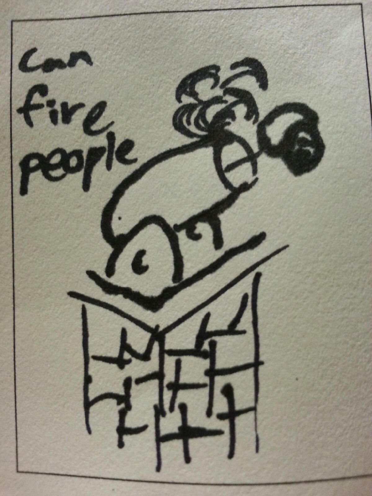
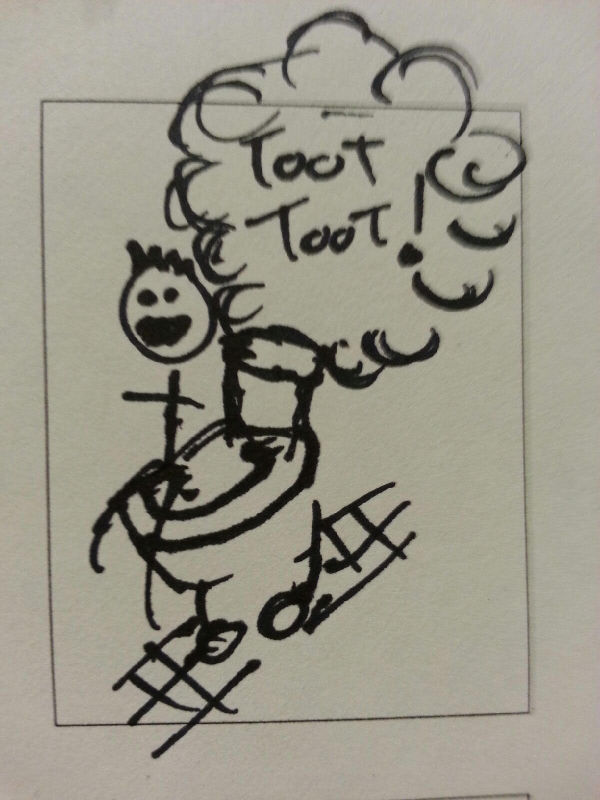
Chimney Cannon
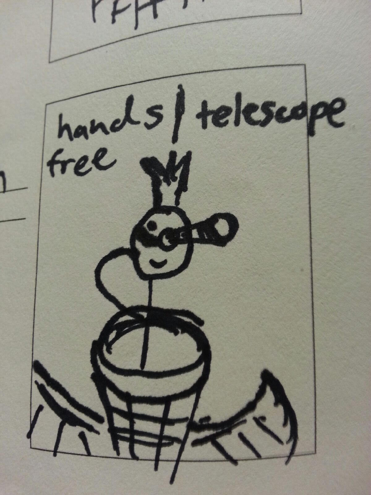
Eyepatch Telescope
Toilet Train
Top 10 Combinations
Eyepatch Telescope: I like the idea of a big goofy telescope swinging around on someones eye.
UFO Teapot: Depiction of UFO’s in media tends to look a lot like teapots. I mainly chose this combination because i liked the idea of making space ship legs into pouring holes.
Boots Board: There’s too many practical modes of transportation out there. I thought it might be enjoyable to try to walk on human-like feet that aren’t your own.
Lion Stapler: Although the Native Americans were known to hunt animals, they made sure to not to let anything go to waste. We could learn a lot from the Native Americans.
Fork Tree: I wanted to think of a new way of eating. It’s basically a mace with forks for spikes that you mash against chunks of food. I would have called it the fork mace, but i don’t think we had mace on our maps, and it was close enough to looking like a tree, which is what we had. Thus, the fork tree.
Toilet Train: The toilet train was proposed to make bodily functions a pleasant, communal activity.
Camera Gun: Adds a little bit of style to snapping pictures.
Braces Antenna: Braces are nothing to be ashamed of, especially when your rocking out to the hippest bands on your braces antenna.
Banana Bed: The arced shape of a banana is conducive to one’s posture.
Chimney Cannons: The chimney cannon is our answer to the worlds energy crisis. Firing off to your destination is both cost and time efficient. Not too mention, it’s a real blast *wink*.
What draws me into graphic design is just that I’m a very visual person and I absolutely need to have some form of career where i can get involved with visual things of any kind. I thought about numerous academic routes i could go down to fulfill this passion. At first i decided to major in computer science as i have always been interested in making videogames, but then the realized the amount of nitty gritty technical stuff i had to learn before i could get to anything fun like working with computer graphics just wasn’t worth spending four years in college. After leaving computer science, i flip-flopped between architecture, product design, and studio art. I eventually landed on graphic design because i figured that as a major, it would have a nice emphasis of on working on visual things, while being balanced out by the fact that it is a fairly transmutable skill, unlike probably studio art. Also the notion of taking images and repurposing them for other motives is a really appealing one to me. It’s always entertaining for me to think about what something means if taken outside of its natural context. Like what if an Olympics took place underwater, or inside of a department store, or at my house. It would completely change people’s perception of the event. The ability to play on perception and expectation is a pretty intriguing prospect to me.
Two of the graphic design fields that have peaked my interest would be environmental design and advertising. I might be able to appreciate environmental design because I like the restriction of designing for a physical space. I enjoy thinking about how to cater to demands of a facility while keeping a consistent and appealing aesthetic motif. As for advertising design, i admire the tight interplay between text and image. I feel like making a good advertisement might be like making a comic that tells it’s story in the course of a single panel. One of my favorite things about advertisement is how it’s never just about what is there, but what isn’t. A good advertisement should instantly grab your attention and afford the viewer space to continue thinking about design after they’ve looked over it.
-
-
Classroom
-
-
Recent Posts
Recent Comments
- Danielle Vizard on Thinking with Type — TEXT
- Danielle Vizard on Digging’ It!
- Jenna on Thinking with Type — TEXT
- Jenna on Digging’ It!
- Elizabeth Robinson on Digging’ It!
Archives
- November 2023
- August 2023
- May 2023
- April 2023
- March 2023
- February 2023
- January 2023
- December 2022
- November 2022
- October 2022
- September 2022
- August 2022
- July 2022
- June 2022
- May 2022
- February 2022
- December 2021
- November 2021
- October 2021
- September 2021
- August 2021
- June 2020
- February 2018
- December 2015
- November 2015
- October 2015
- September 2015
- August 2015
Categories
-
About
KSC GRAPHIC DESIGN

Leave a Reply
You must be logged in to post a comment.