- Ê
- Â
fJulie has 6 post(s)

Part 1
Alexey Brodovitch was born in Russia in 1898 and died in France in 1971. He is remembered today as the art director of Harper’s Bazaar for nearly a quarter of a century. Brodovitch played a crucial role in introducing a radically simplified form of modern graphic design to the United States. He used photography as a backbone of modern magazine design. He is seen as virtually the model for the modern magazine art director. Brodovitch’s impact on the editorial of Harper’s Bazaar was so great that he achieved celebrity status. He came to the United States in 1930 to start a department of advertising (later known as the Philadelphia College of Art). There he trained students in the fundamentals of European design, while also taking on freelance illustration assignments in Philadelphia and New York. Brodovitch’s legacy as a publications designer also includes the short-lived but influential magazine Portfolio, three issues of which were published in 1949 and 1950. Portfolio was a flashy, innovative quarterly aimed at the design profession. Throughout his career, he continued to teach his “Design Laboratory,” which focused variously on illustration, graphic design, and photography. Brodovitch did not formulate a theory of design. Despite his unbending manner and lack of explicit critical standards, many students under his tutelage discovered untapped creative reserves.
Part 2
1. While politically he was sympathetic with czarist russia, his artistic work shared the ideas of the avant-garde.
2. Bodovitch was one of the pioneers to bring modernist ideas to America.
3. At the Philadelphia college of Art Brodovitch taught by using examples of european graphic design, questioning his students about the placing of the elements and the decisions made by the designers
Part 3
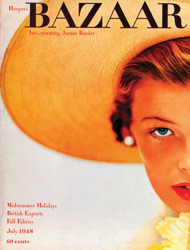
Alexey Brodovitch, Harper's Bazaar, July 1948, Photograph by Richard Alvedon
-
- Alexey Brodovitch, Harper’s Bazaar, July 1948, Photograph by Richard Alvedon
-

-

-

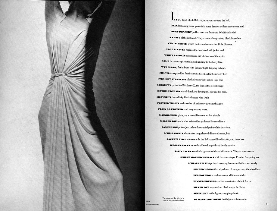
- Alexey Brodovitch, If you don’t like full skirts…, March 1938, Photographs by George Hoyningen-Huene
-

-

-
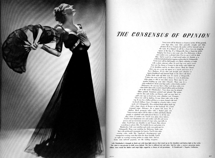
- Alexey Brodovitch, The Consensus of Opinion, March 1936, Photograph by Man Ray
-

-


-
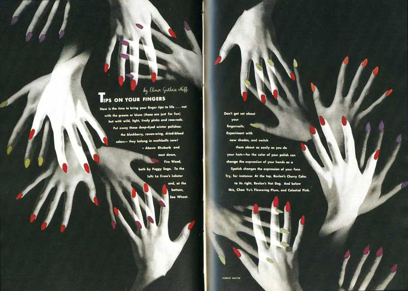
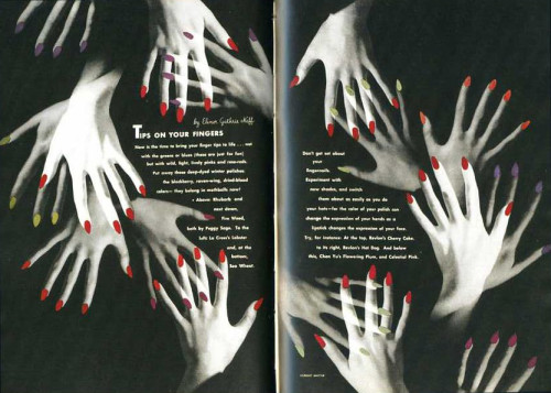
- Alexey Brodovitch, Tips in Your Fingers, April 1941, Photographs by Herbert Matter
-

-
-
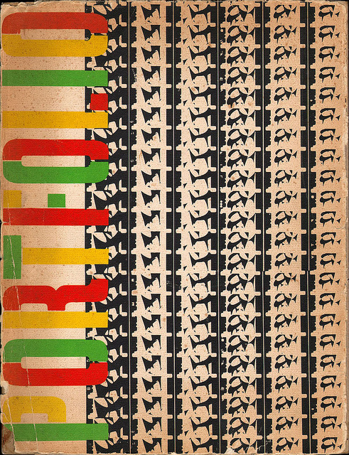
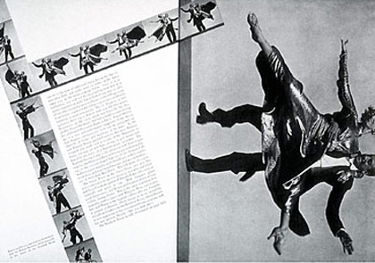
- Alexey Brodovitch, Portfolio, 1950, film strips by Charles and Ray Eames
-

-

-
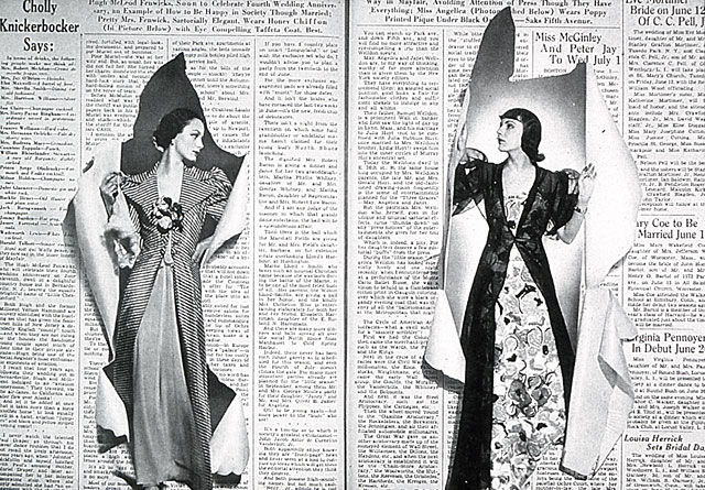
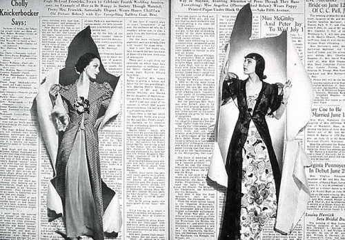
- Alexey Brodovitch, spread from issue of Bazaar, June 1938
-

-
-
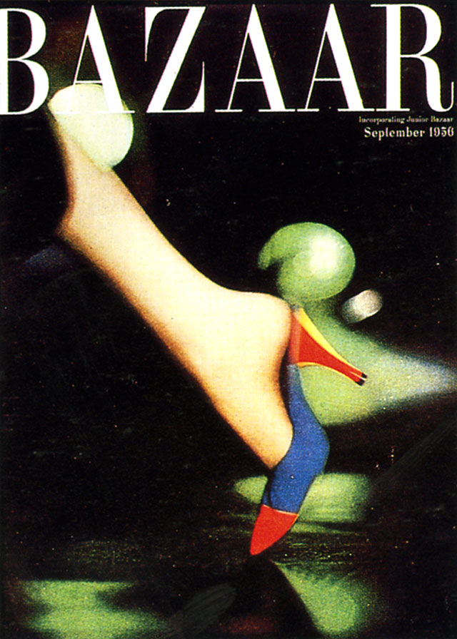
- Alexey Brodovitch, Cover Of Bazaar, September 1956
-

-

-
- Alexey Brodovitch, Ramon & Renita, 1935, Harper’s Bazaar
-

-
-
- Alexey Brodovitch, Harper’s Bazaar Cover, July 1968
-

-
These works are related in their use of photographs with the exception of Portfolio which uses film strips and creates a unique visual texture. In the page spreads, the text and photographs work harmoniously as the shapes presented in the photographs are either mimicked by the text or wrapped tightly within or around it. In the case of the cover pages, there is a limited use of text and an emphasis on the female figure photographed. The space that is present is activated by the interjecting shapes and oversized photos of the parts of the female body or face that is shown. Each work has a sense of balance .
I found this reading interesting in that it emphasized the little decisions that designers make when organizing their work. The designer has control over how the viewer looks at the piece and how their eye moves around it. If a designer wants something to stand out more, they can make the viewer’s eye see it first by simply scaling it, adjusting the weight, moving it to a specific place on the page, or a combination of all of these things. There are so many things that a designer can do to manipulate how the viewer will see their work, and if they want a specific piece of information to be more pertinent, they can easily draw the viewer’s eye to it. Hierarchy plays a large role in design and the things that the designer feels should be seen first by the viewer, will appear to stand out on the page. On the other hand, if a designer finds that some information is not as important as others, they will make that information harder to find for the viewer. Though it won’t normally bet a struggle to find the less important information, it won’t be the first thing that the viewer’s eye is drawn to.
Austin, Texas
73301
Overcast
65°F/18°C
Humidity 93%
Wind Speed SE 5 mph
Barometer 30.06 in (1017.1 mb)
Dewpoint 63°F (17°C)
Visibility 7.00 mi
Last update 4 Nov 7:51 am CST


Overall, this project was pretty fun. Though there were instances where my mind was drawing blanks and had to walk away for a few minutes, I enjoyed coming up with different ways to combine the two different tools.
Mind map
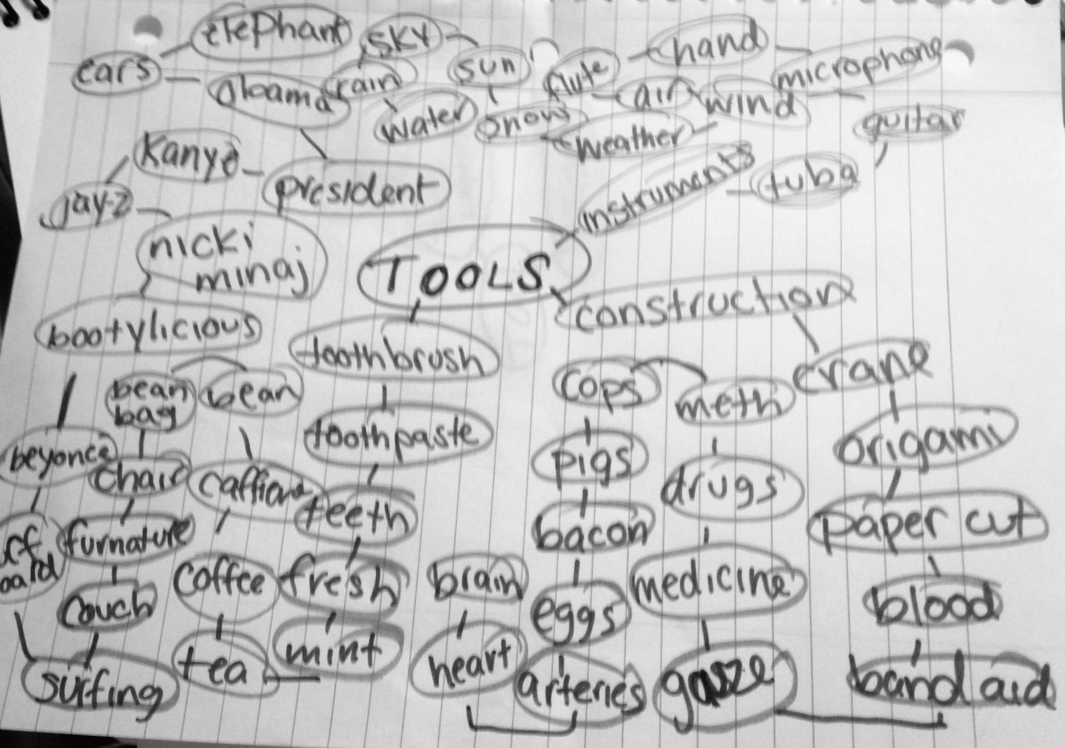
25 Pairings
car + watch
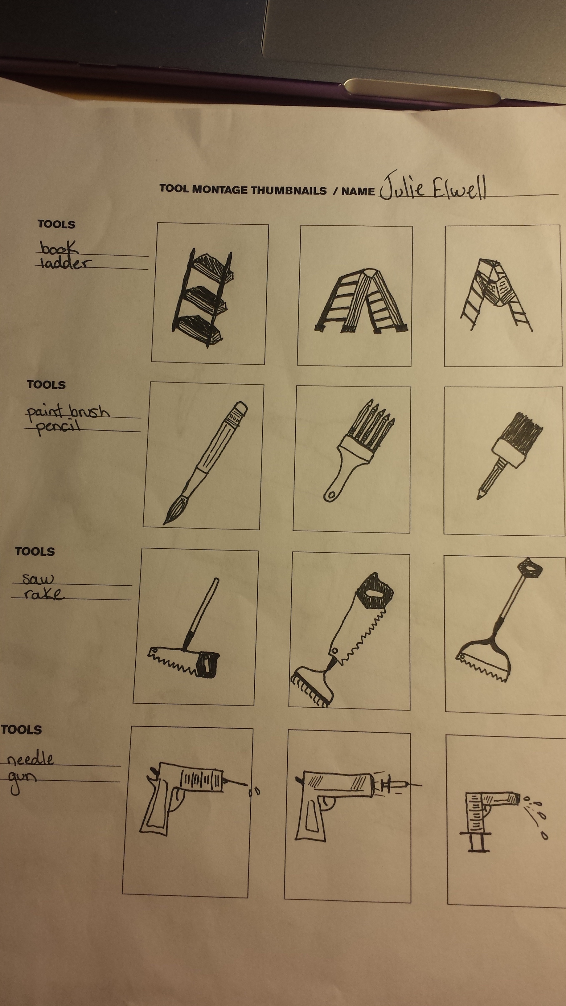
book + ladder
axe + zipper
paintbrush + pencil
bucket + axe
saw + rake
pliers + scale
razor + toothbrush
needle + gun
scale + needle
hair dryer + car
pencil + jackhammer
hammer + knife
shoe + ruler
tweezers + wrench
lightbulb + toothbrush
chair + hair dryer
chair + airplane
gun + screwdriver
scissors + needle
teeth + shovel
hand + teeth
computer + ruler
camera + pizza cutter
net + hanger
10 Pairings
book + ladder…………. I call it a metaphor for learning. Yeah, thats it.
paintbrush + pencil…. Who doesn’t want a paintbrush and pencil in one? Sold.
saw +rake……………. For when you’re trying to rake the leaves but there’s a pesky log in the way.
needle + gun……….. Because children don’t sit still to get their shots, doctors get target practice.
scale + needle………….. For weighing out the dosage.
pencil + jackhammer… When you have nothing else to do but scribble violently on everything.
hammer + knife……….. A pretty dangerous tool. Operate with caution.
chair + hairdryer……… Because no one wants to take the time to dry their own hair. Just sit.
scissors + needle…… In case you need to cut the packaging off of your meds, just grab one tool.
net + hanger……………. Your clothes will never fall on the floor again. The net catches everything.
Thumbnails
I have always been interested in art. I grew up always doodling all over everything I possibly could and I always found satisfaction in creating something aesthetically pleasing. As I got older, I kind of grew out of doodling everywhere and in high school, I took a few graphic design classes that really caught my interest. As my drawing skills seem not to be as keen as they used to, I found great interest in the digital arts. Areas of graphic design that interest me are advertising, publication, and collateral design. All of these areas are meant to get a clear concise message across, but not always in the most obvious way and usually pretty quickly. I like how these fields use psychology to catch the reader’s eye and embed a message into the reader’s mind. Knowing how the human brain sees and conceives different shapes and colors and being able to utilize that really intrigues me.
I like to incorporate other things I learn, for instance psychology, into my designs. As a person that is usually pretty creative yet concise, I like to express several ideas with as few images as possible, usually combining ideas to create one unique design. I could see myself doing logo design, for its small and simplistic nature, but on the other hand, I could also see myself designing posters for the next KSC Spring concert with a lot of important information on it. I enjoy designing things that are eye-catching at first glance and make you want to actually stop and look at it.
This logo is interesting because I learned that these two colors together psychologically make people hungry for breakfast food, which ultimately is the purpose of this ad.
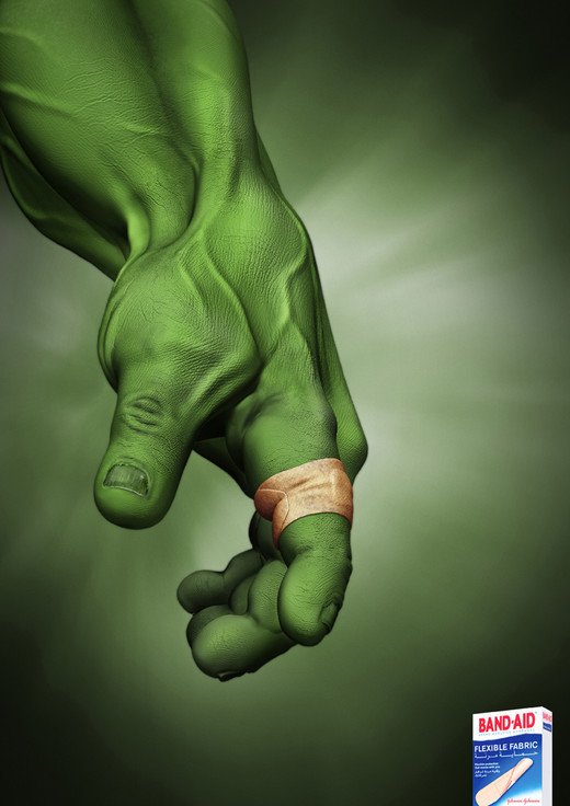
I like the power that this ad conveys with the lighting and overall idea that even the Hulk needs a Band-Aid sometimes.
-
-
Classroom
-
-
Recent Posts
Recent Comments
- Danielle Vizard on Thinking with Type — TEXT
- Danielle Vizard on Digging’ It!
- Jenna on Thinking with Type — TEXT
- Jenna on Digging’ It!
- Elizabeth Robinson on Digging’ It!
Archives
- November 2023
- August 2023
- May 2023
- April 2023
- March 2023
- February 2023
- January 2023
- December 2022
- November 2022
- October 2022
- September 2022
- August 2022
- July 2022
- June 2022
- May 2022
- February 2022
- December 2021
- November 2021
- October 2021
- September 2021
- August 2021
- June 2020
- February 2018
- December 2015
- November 2015
- October 2015
- September 2015
- August 2015
Categories
-
About
KSC GRAPHIC DESIGN

Leave a Reply
You must be logged in to post a comment.