- Ê
- Â
fChristina has 6 post(s)
Info about Gallery
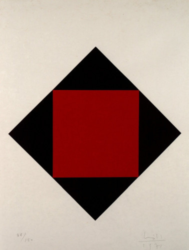
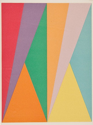
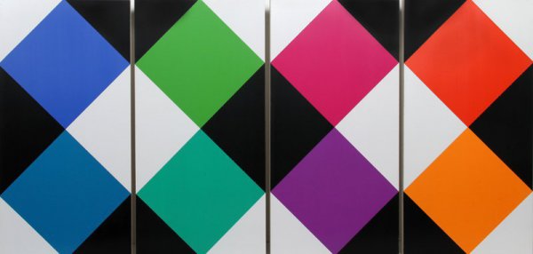
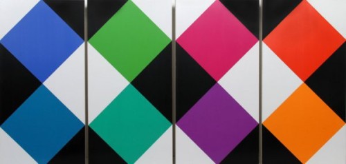
I find Bill’s work very interesting, especially in his Concrete Art. He has simple abstractions with geometric shapes. His use of color is also done in complimentary ways in similar hues. There’s no figurative or natural elements, just pure abstraction. His designs contain clarity and has precision to it. I find his forms to be very masculine and angular. It would create a great contrast in who the panelists are in the exhibition. It would be called Max Bill: Concrete Masculinity, Feminine Color Theory, where the use of color is explored in his masculine forms. This would touch upon his design in his paintings, since I believe they really capture his artistic talents and show a different light to his graphic design.
Old Bio
Max Bill was a Swiss graphic designer, painter, architect, sculptor, and product designer who lived from 1908-1994. He is associated with Concrete Art and Environmental Design. He studied at the Dessau Bauhaus where he was taught by renowned artists like Josef Albers, Wassily Kandinsky, and Paul Klee. He received a well rounded education at the Bauhaus where he learned various mediums of art. His work dominates in the medium of painting where he had begun in landscapes and portraits until in 1931 he began geometric abstraction in his works in Zurich. In the 1930s he was a member of the Parisian artist group known as the “Abstraction-Création”, where he began exhibiting his work. In Paris he befriended artists like Mondrian and Hans Arp.
While creating more abstract works, Bill began formulating the Principles of Concrete Art, where he is known to be one of the founders and great contributor to this genre. Concrete Art is a genre of abstract art which has no figurative or symbolic references, it has to be wholly devoid of natural elements. It is known as the purest form of abstraction. It is evident Bill definitely was able to develop and refine this genre from his education with Kandinsky.
In 1952 Bill was the architect and head of the department for architecture and product form at the Ulm School of Design. He continued the traditions of the Bauhaus at the Ulm School of Design. His forms and teachings were always re-interpreting the Bauhaus theory. The theory basically was form follows function. He studied at other various institutions and continued to lecture and write about his counterparts and artistic theory. His publications turned him into the most “fruitful stimulators of Modern Concrete Art in post-war Europe among the Bauhaus generation of students”.
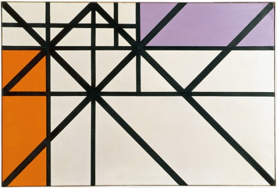
Bill was an incredibly diverse artist. He designed a series of clocks and watches for a company called Junghans. He also designed various pieces of furniture. He also created various sculptures which were spherical in form and made from stone, metal, wood, and plaster. Many of his sculptures were created for outdoor viewing. One of his most popular sculptures is the “Pavilion Sculpture”. It’s clear lines and structure are simple and abstract.
I really find his work wonderful and fascinating. I’m becoming more and more fascinated in abstract art. I am always drawn to the Bauhaus style and schooling method. I really connect to Max Bill, because I want to be a graphic designer who also works in studio art and other mediums as well.
Old Signature Bullet Points
- He was a major supporter and artist in the genre known as Concrete Art.
- He created forms that could be understood by the senses. It is characterized by its clarity in the design and precise proportions.
- He was an incredibly versatile and well-rounded artist. He was not only a graphic designer, but was a sculptor, silversmith, architect, painter, furniture maker, and more.
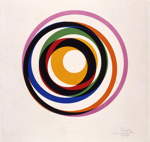
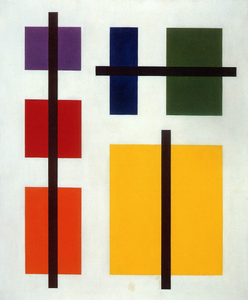
Max Bill. Variation 12. 1938
-
- Max Bill. Variation 12. 1938
-

-

-
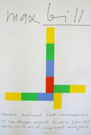
- Max Bill. Affiche exposition centre national d’art. 1969
-

-
-
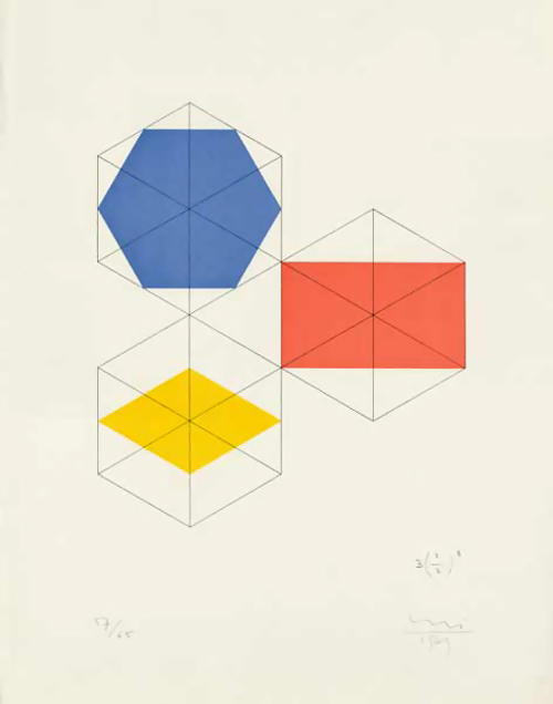
- Max Bill. Construktion Für eine Figur. 1969
-

-

-
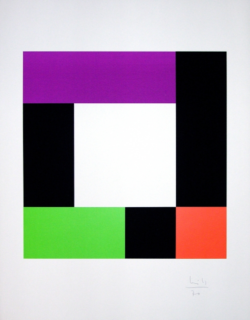
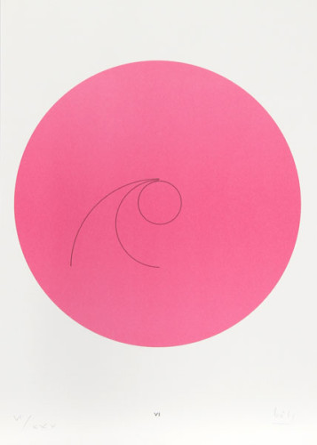
- Max Bill. Untitled. 1970
-

-

-

- Max Bill. Vibrations in the Dark. 1961
-

-
-
- Max Bill. horizontal-vertikal-diagonal-rhythmus. 1943
-

-
-
- Max Bill. Untitled. 1975
-

-

-

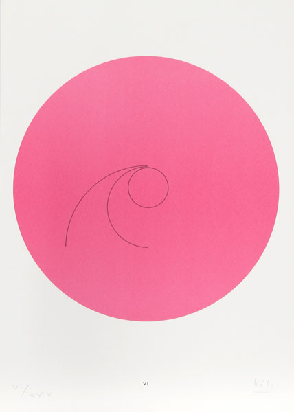
- Max Bill. Rotation around expanding white. 1971
-

-
-

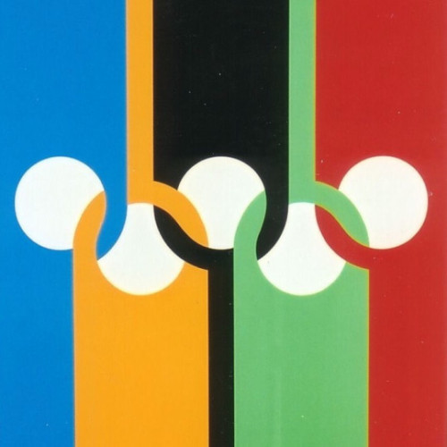
- Max Bill. Olympische Ringe.1970
-

-
-
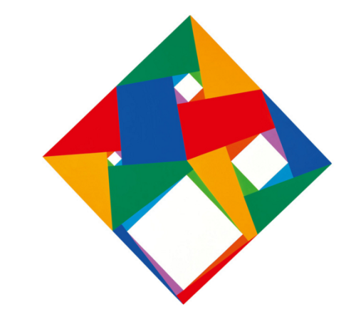
- Max Bill. Constellation. 1974
-

-
-
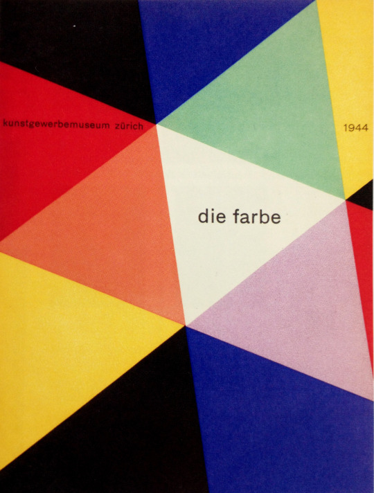
- Max Bill. Die Farbe Cover. 1944
-

-

-
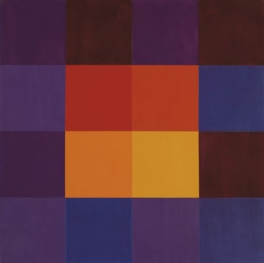
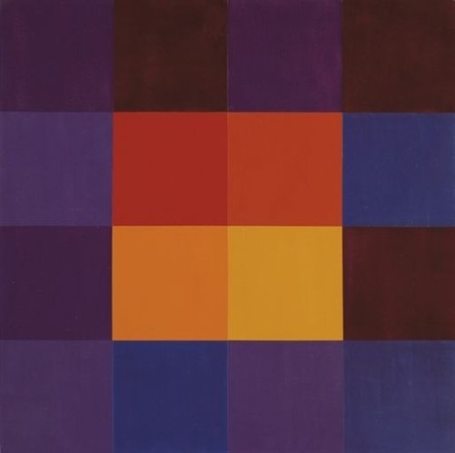
- Max Bill. Stabilisiert Kern. 1962
-

-
-
- Max Bill. Combillation. 1970
-

-
Old Post Links
Meaning of Bill’s “Pavilion Sculpture”
I really enjoyed this reading and it really helped me clarify hierarchy in text. In the beginning I really thought this exercise was monotonous, but after doing more with it and reading this excerpt, I had more respect for it. As a person who wants to work for magazines in the future, text hierarchy is super important. The covers of magazines are what catch your eye along with what headlines are emphasizes and placed. I loved the examples of the menus, I thought they were beautiful and innovative. I find it quite an art form how text can be arranged and changed in ways to manipulate the viewer’s eye. Sometimes, the text still needs to be readable which can impose an issue if you want to make it in this intricate way. It’s really crazy to think how much power a graphic designer has over their work. Back to my magazine example, many just carelessly see the fact the headlines are there, but they were put there for a reason by a designer.
Mostly Cloudy
70°F
| Humidity | 41% |
| Wind Speed | E 5 mph |
| Barometer | 30.29 in (1026.3 mb) |
| Dewpoint | 45°F |
| Visibility | 10.00 mi |
| Last update | 4 Nov 12:54 pm EST |
23218
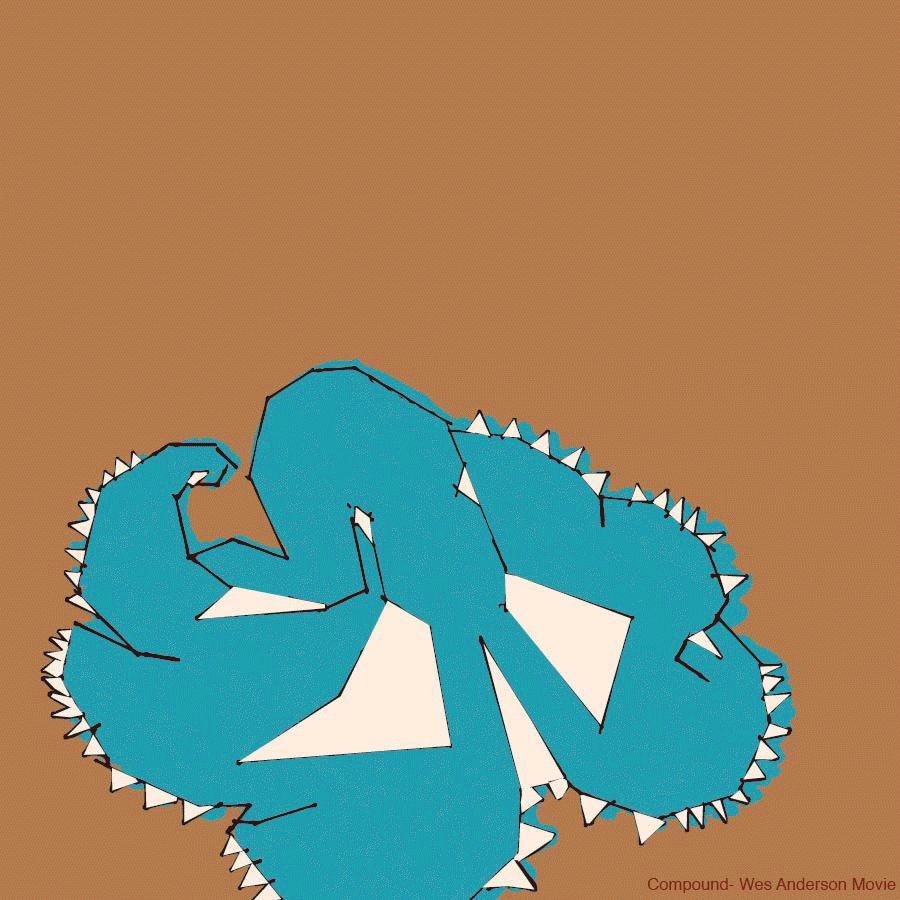


My Experience
Overall I was a bit challenged by this project, but in a positive way. I’ve never really done thumbnails before, I’m still new to my graphic design learning, I have found I enjoy creating them. This activity has helped me exercise my brain in a different way creatively. When I’m creating a concept in photography I have to center in on one main concept and elaborate off of it. I was not used to having to create multiple different ideas at once. Again, I saw this as a learning activity and I warmed up to this assignment. It was nice to work with a group with the mind maps and seeing how everyone else thinks and processes information. All in all, I liked the challenge this assignment imposed on me, but I still need much more practice.
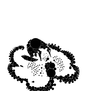
Mind Map
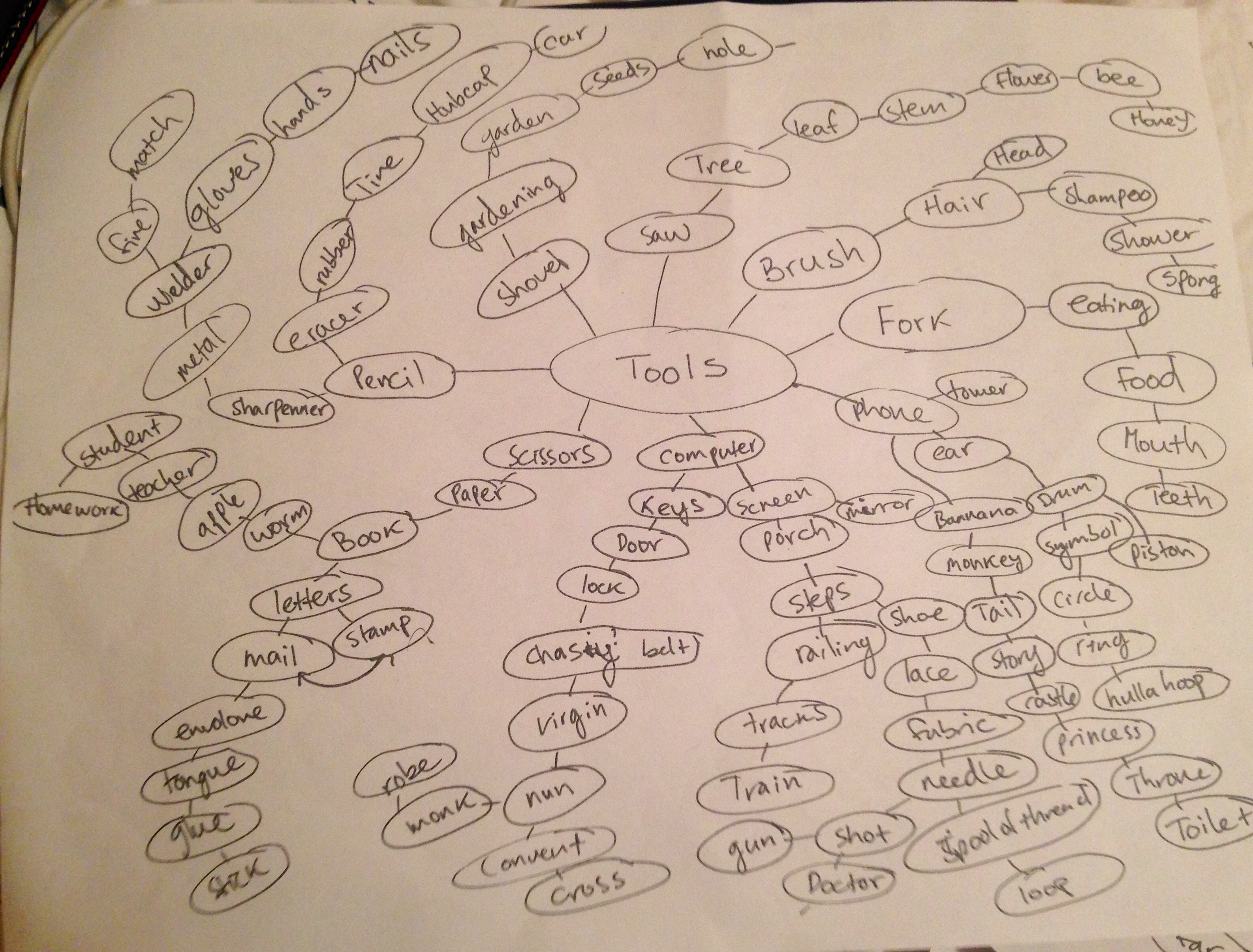
25 Possible Pairings
- Rib +Vault
- Horse + Faucet
- Teeth + Armor
- Trampoline + Alley
- Fork + Anchor
- Princess + Shampoo
- UFO + Oil
- Band Aid + Spatula
- Computer + Cannon
- Homework + Shield
- Agriculture + Gun
- Candy + Cart
- Snake + Hula Hoop
- Target + Fan
- Chastity Belt + Suitcase
- Lace + Cigarettes
- Poison + Chalk
- Toilet + Boat
- Sleigh + Jelly
- Feather + Hook
- Meat + Desk
- Sailor + Strap
- Backpack + Tent
- Mitten + Phone
- Wild West + Skateboard
10 Choices
1. Anchor + Fork- I found these similar in ways, both have prongs and are used to dig into certain things. Forks ground themselves in food and anchors ground themselves in the ground of a body of water.
2. UFO + Oil- It has an almost whimsical tone to it. It makes one wonder what could be used as fuel for UFOs or what aliens possibly use to cook!
3. Snake + Hula Hoop- I just thought of a snake eating itself and creating a hula hoop. I thought of a dream where I had where I had a hula hoop turn into a snake, it was terrifying, but really interesting.
4. Target + Fan- Just think of trying to hit a bulls eye if it was on the blade of a fan or on the center of a windmill.
5. Agriculture + Gun- I though of how political these two could go together. I took a comedic look into the pairing. I though it would be funny having a pineapple coming out of a pistol or say a piece of broccoli being used in a bow for archery.
6. Homework + Shield- College students everywhere would be looking for a homework shield if it was only an actual tool.
7. Princess Shampoo- What exactly does Rapunzel use that makes her hair so strong and long? Princess shampoo would fly off the shelves and would be an excellent tool used, we wouldn’t ever need rope!
8. Candy + Cart – It would come in handy having a personal cart for candy. Perhaps if candy was personified, I see a lollipop using a cart for shopping.
9. Chastity Belt Suitcase- It sounded bizarre and I wanted to see what I could make with this pairing.
10. Mitten + Phone – Both require hands, and both seem to do very opposite jobs. I wanted to see if I could find a connection between the two.
Thumbnails
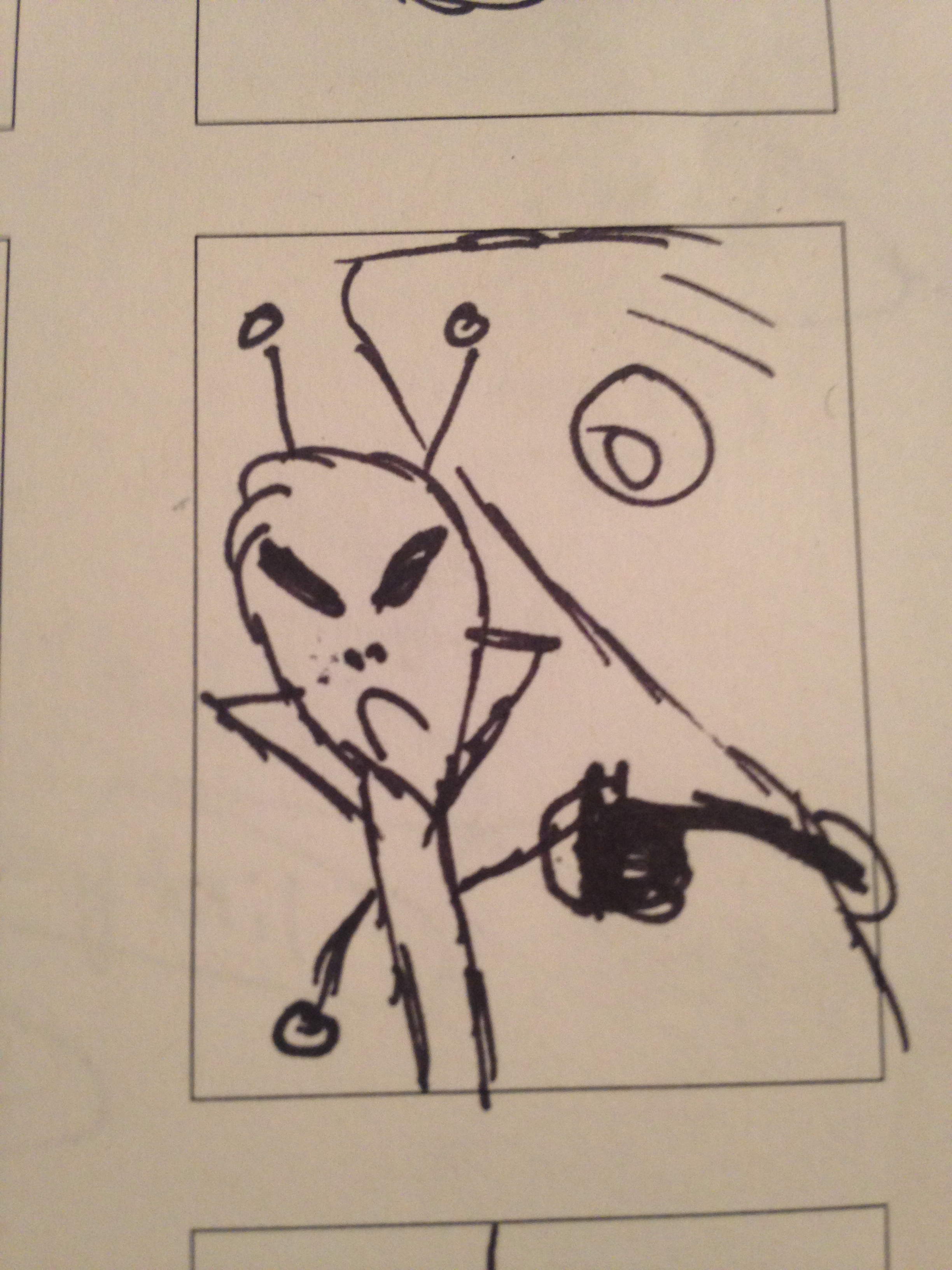
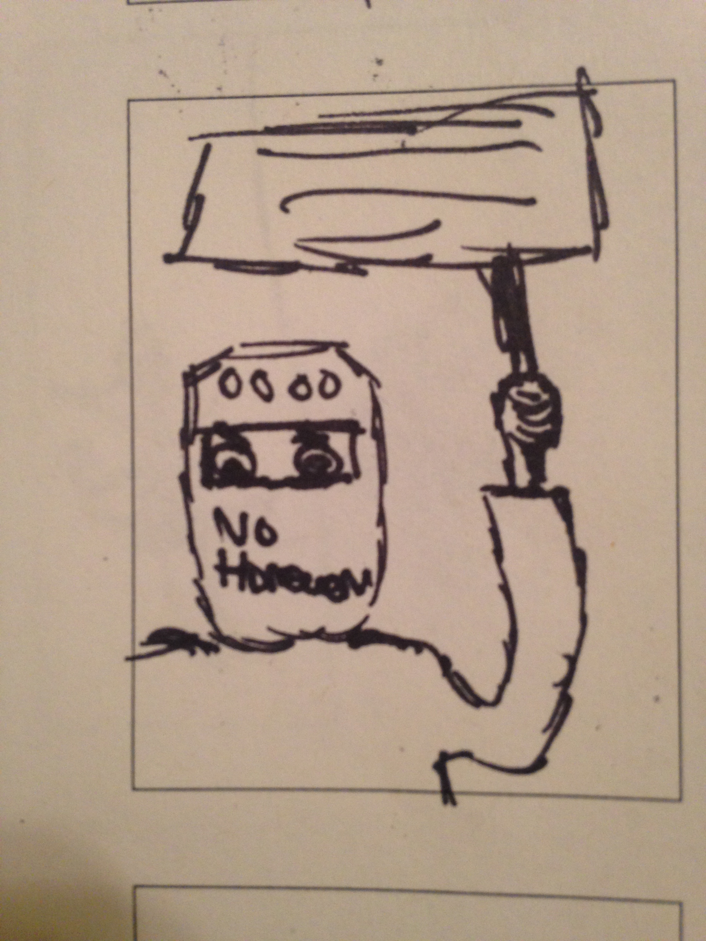
UFO + Oil
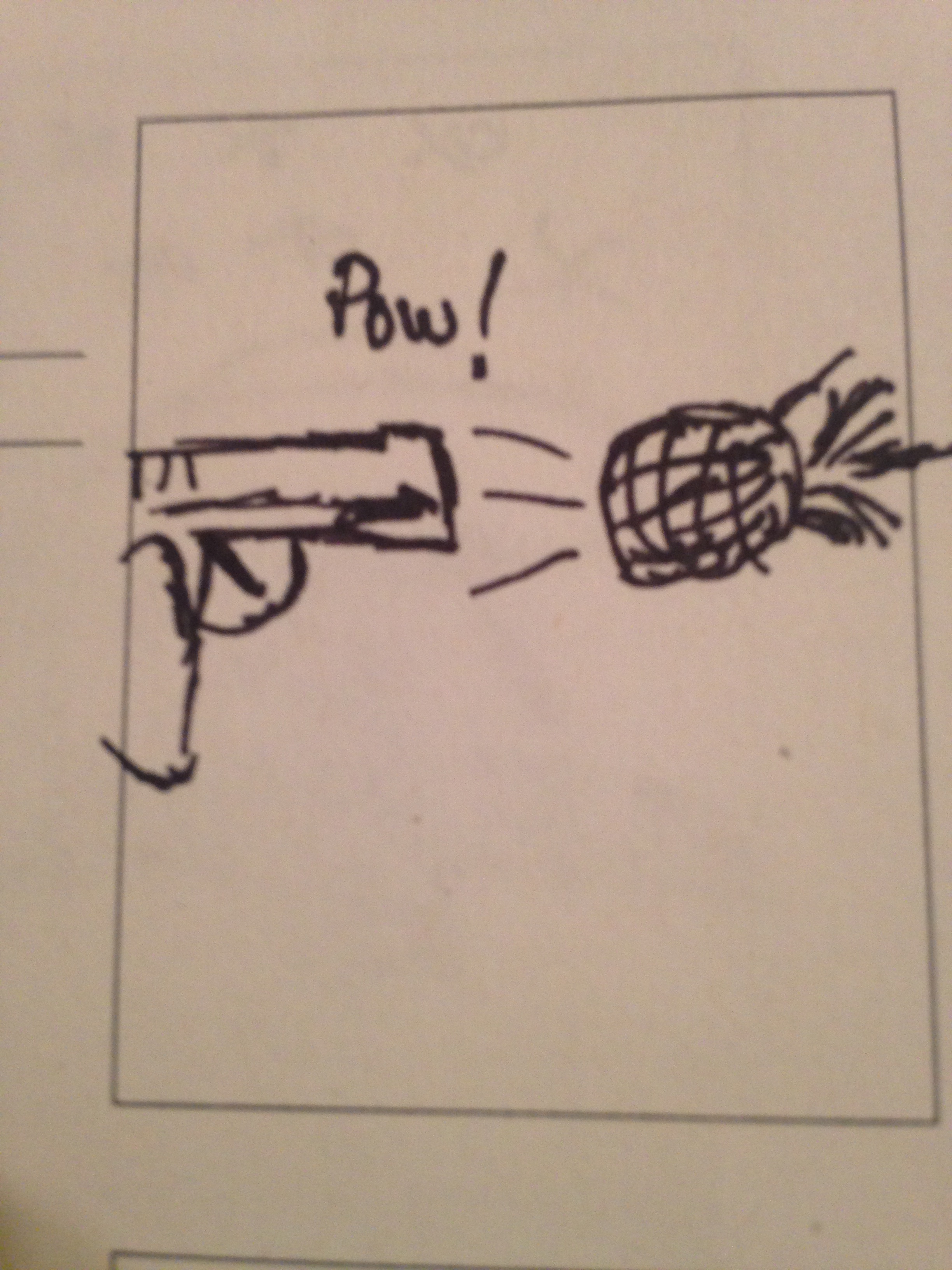
Agriculture + Gun
Homework + Shield
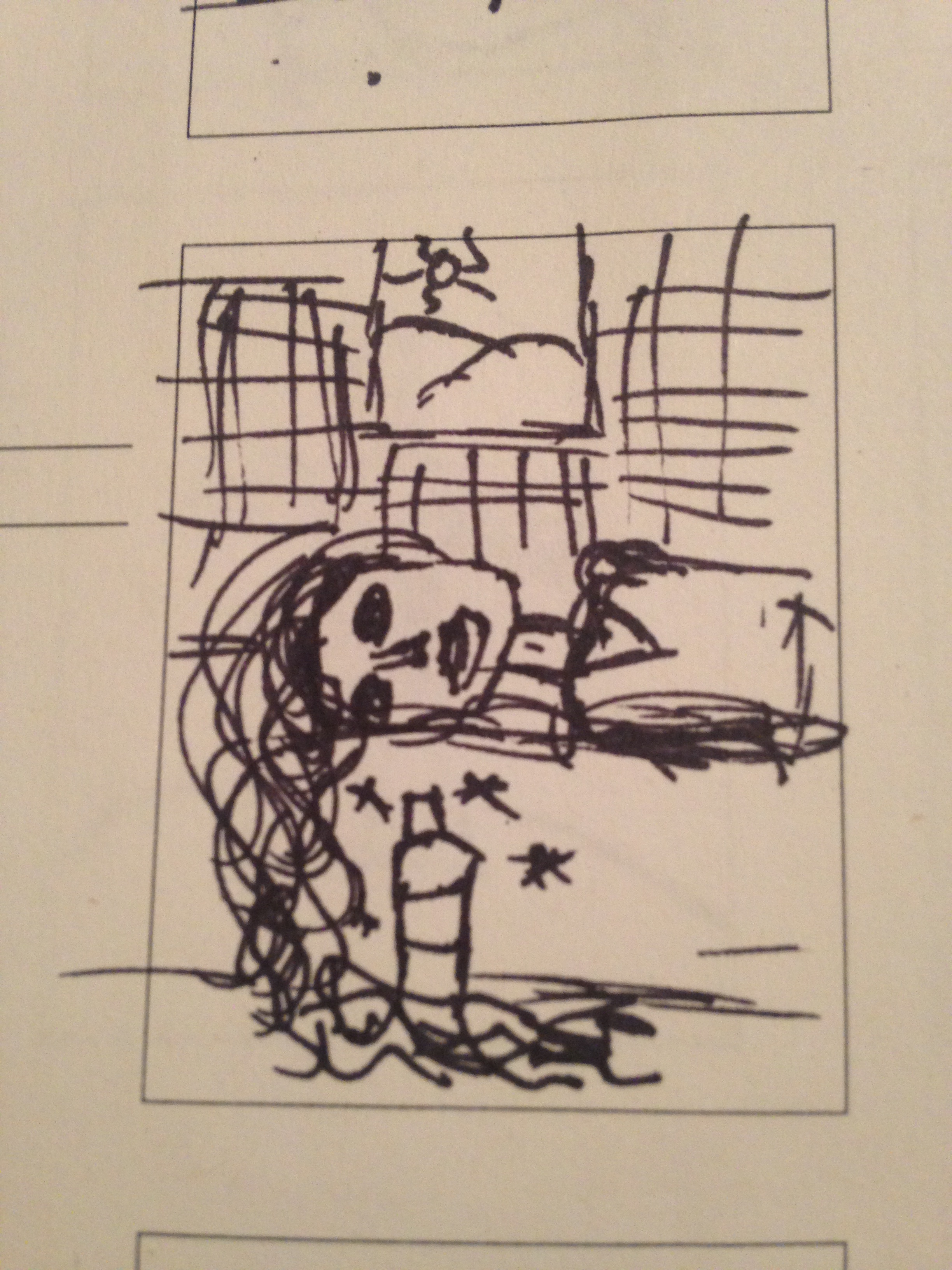
Princess + Shampoo
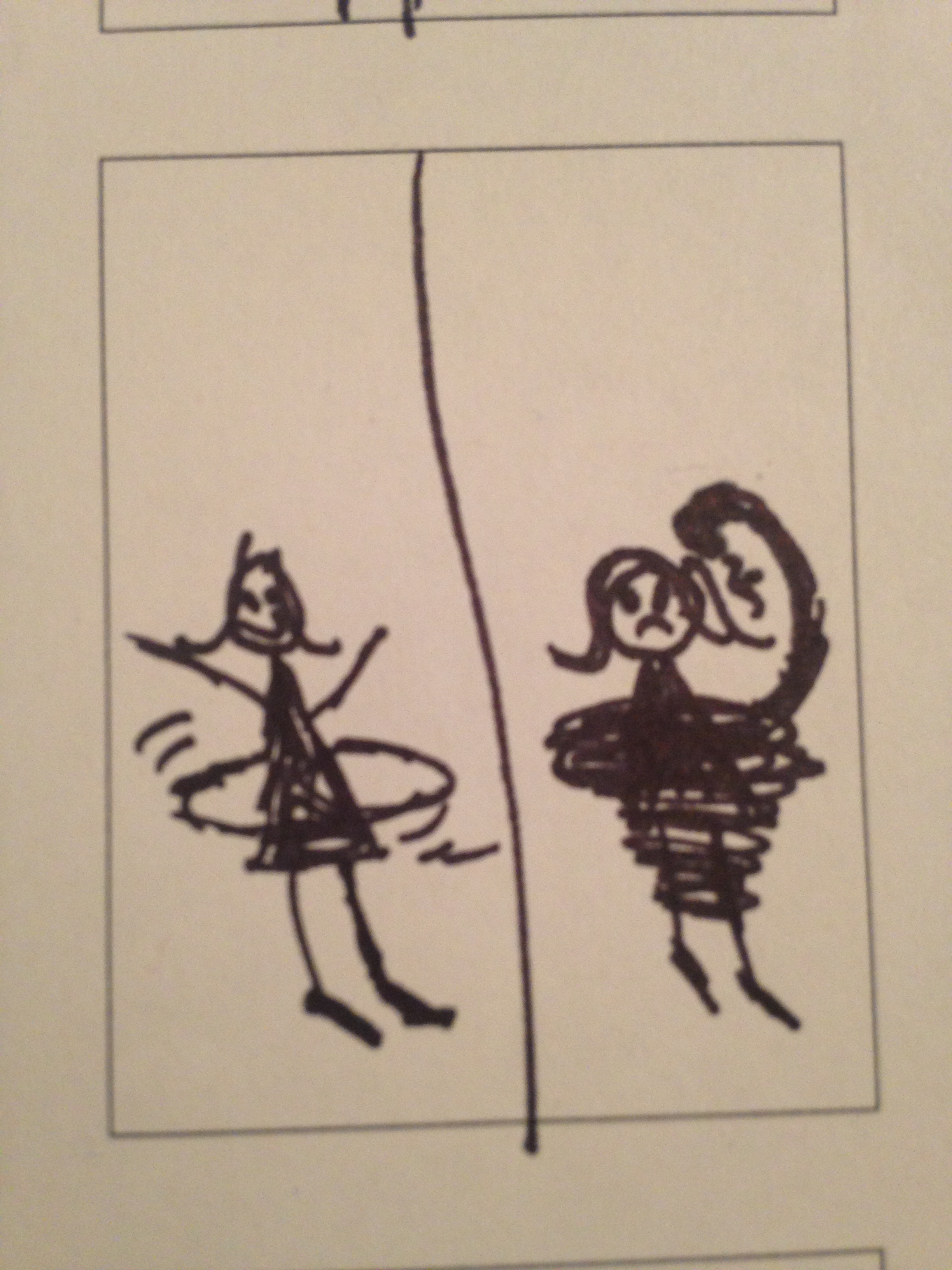
Snake + Hula Hoop
Christina Lyons
Graphic Design I
Design Interests
Graphic design has evolved into a newly discovered love of mine. I’ve always been in love with fashion magazines and fashion in general. I recently was accepted into the Graphic Design program after I made a huge change in my major from Secondary Education and European History to Graphic Design. The reason why? I have a huge love for fashion photography and recently just returned from Italy where I studied it. Before then I contemplated on Graphic Design seeing as I have been told I’m a very conceptual artist and I have a unique eye for visuals. This is a huge leap for me and I’ve been out of my comfort zone many times, but I enjoy it and I’m learning so much from this experience. I’ve also love creating collages and arranging photos from magazines in interesting ways. I’ve started to realize I would really love to work for magazines where I could combine my photography with my graphic design skills. One artist who is a very important role model to me is William Klein. He’s an amazing fashion photographer, film director, and graphic designer.

Design by William Klein

Photograph by William Klein
While I was in Italy, I took an art history class called: Avant Garde and Modernist Art. Where we got into a lot of modern and abstract art. I really enjoyed the work done in the Bauhaus in Germany, the graphic design was so ground breaking and simple. There were studio artists at the Bauhaus, like Josef Albers, who transitioned into graphic design. Albers even started the Graphic Design program at Yale. I really like to draw influence from artists from the 1930s, 40s, 50s, and 60s.

Design by László-Moholy-Nagy
I ultimately want to do publication design where I could work for magazines or publishing companies. I find I work really well with creating layouts and arranging images in appealing ways. Brand and identity design I would enjoy to pursue as well. I’m very fond of cosmetics and I always pay attention to the packaging on the products I buy and how they sell their brand. I would like to do my brand and identity design for advertising. I really want to be versatile in my field and be useful in different departments. I really am excited for what the future holds for me in the industry.
-
-
Classroom
-
-
Recent Posts
Recent Comments
- Danielle Vizard on Thinking with Type — TEXT
- Danielle Vizard on Digging’ It!
- Jenna on Thinking with Type — TEXT
- Jenna on Digging’ It!
- Elizabeth Robinson on Digging’ It!
Archives
- November 2023
- August 2023
- May 2023
- April 2023
- March 2023
- February 2023
- January 2023
- December 2022
- November 2022
- October 2022
- September 2022
- August 2022
- July 2022
- June 2022
- May 2022
- February 2022
- December 2021
- November 2021
- October 2021
- September 2021
- August 2021
- June 2020
- February 2018
- December 2015
- November 2015
- October 2015
- September 2015
- August 2015
Categories
-
About
KSC GRAPHIC DESIGN

Leave a Reply
You must be logged in to post a comment.