- Ê
- Â
fGabrielle has 5 post(s)
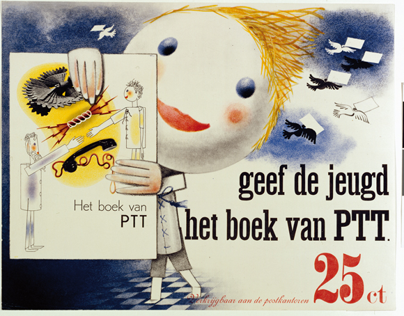
Piet Zwart was a Dutch photographer, typographer, architect, and graphic designer, however he referred to himself as a “typotekt” (typography and architect) because he built pages with type. He first attended The School of Applied Arts in Amsterdam where he was introduced to all of these disciplines but mainly developed himself because teachers were not always present. There was a social revolution after World War 1 which offered Zwart a new direction where he launched his graphic design career in 1919. He became the assistant of the influential Dutch architect HP Berlage and was given assignments such as designing a Christian Science Church and a municipal museum. At the age of 36 he created his first typographic work when asked to design stationary for Jan Wil’s office. Zwart felt strongly attahced to radical ideas which propagated an abstract utopian world, however he did not wish to surrender entirely to the dogmatic ideas of those he was working with and felt his work was too playful to be restricted. He began working with photography and learned how to achieve a balance between texts, photographs, and white space. In 1930 he was approached for the design of “The Book of PTT” which taught young kids how to use the Dutch postal service; Zwart wanted to make them curious and encourage self reliance. Each page was colorful and bright and exciting. He used photography and collages along with drawings and various types of fonts. After the publication of the book, he had been fired from the Rotterdam Academy of Fine Artsin 1933 after being explicit in sharing his thoughts on the redevelopment of Art Education. Piet was known for his indiscretion, he didnt stop working until 3 am, barely took vacations, and rarely left his desk. His work came to and end when he was arrested by German Soldiers in 1942 and held hostage with 800 other prominents. he mainly focused on industrial design after he was released and then died in 1977 at the age of 92. His versatility and influence on present day designers led the Association of Dutch Designers to award him with the title “Designer of the Century” in the year 2000.
“Among the few I have indicated, is there no dynamic man of action, the rebel who will help determine the aspect of the collective expression of tomorrow? Ponder this question and know that to make beautiful creations for the sake of their aesthetic value will have no social significance tomorrow, will be non-sensical self-gratification. Every era contains the conditions for providing a rebel.”
– Piet Zwart
Highlights:
- Worked in many disciplines but is known for his work with Graphic Design
- Made sure he didnt restrict his work to fall under specific categories; stayed true to himself and what he wanted to create
- Although he was a trained architect, he excelled with his work in typography and even more so when he learned how to add photography

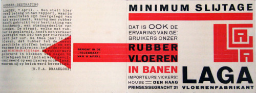
Piet Zwart, LAGA Rubber Flooring, 1923,
-
- Piet Zwart, LAGA Rubber Flooring, 1923,
-

-
-
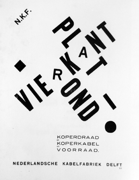
- Piet Zwart, Vierkant Plat Rond, 1926
-

-

-
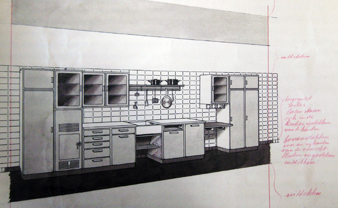
- Piet Zwart, Bruynzeel kitchen, 1937
-

-

-

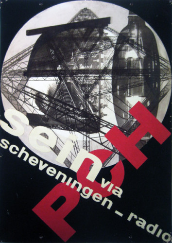
- Piet Zwart,Sein via Scheveningen Radio, 1929
-

-
-

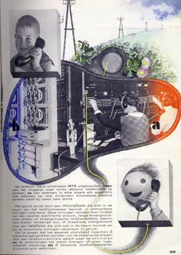
- Piet Zwart, The Book of PTT, 1938
-

-
-
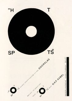
- Piet Zwart, Hot Spots, 1926
-

-
-

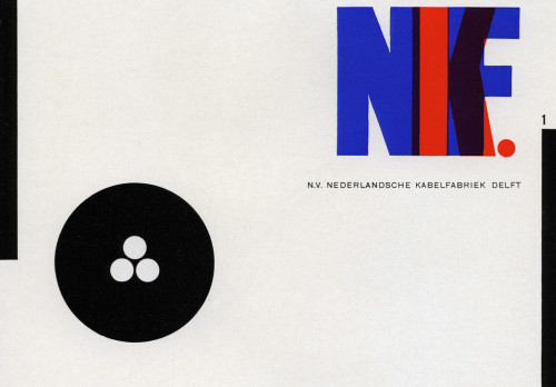
- Piet Zwart, NKF Catalogue, 1927
-

-

-

- Piet Zwart, Trio-Reclameboek, 1931
-

-
-
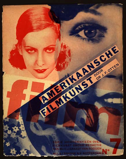
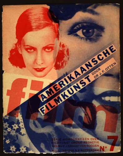
- Piet Zwart, SERIE MONOGRAFIEEN OVER FILMKUNST, 1931
-

-
-
- Piet Zwart, The Book of PTT, 1938
-

-
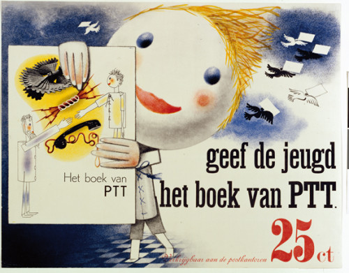
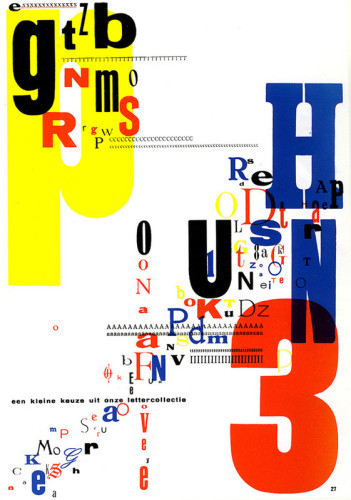
Piet uses mostly Primary colors in all of his works which are evident in all of these pieces. In some, such as The Book of PTT, he strays slightly from the Primary colors but not very far. He also likes to use cream or beige looking backgrounds which perhaps makes the colors pop more. Most of these works are works of typography where he favors block letters and in most cases they are overlapping or at a diagonal.
I would have never related type to hierarchy before reading this article but now the idea of order of importance makes perfect sense in relation to this. By using different scales and styles in type, it shows the viewer what they should be paying attention to and where their eyes should be going to see the most important parts of the piece. If the piece is poorly designed and doesnt include different scales or styles or good placement, the viewer can get confused and the piece can fail. It’s also important to keep in mind not to go over the top with scales and style and to keep it to a minimum or else it could be even more confusing than not including them at all. I really enjoyed the page that showed the series of iconic snacks with the stripped down hierarchy that displayed the architecture of the snacks. The designs were so simple but modern looking.
Mostly Cloudy
45°F
7°C
Humidity 82%
Wind Speed VRBL 3 MPH
Barometer 30.22 in (1023.4 mb)
Dewpoint 40°F (4°C)
Visibility 10.00 mi
Last update 04 Nov 10:56 am PST


Why Graphic Design?
I’ve been interested in all aspects of art and design ever since I could remember. I’m an intended Graphic Design Major and I’m hoping to use this class to build a strong portfolio in order to apply to the program. I have a passion for creativity that people seem to notice which encourages me even more. I’ve always excelled in art classes although I’m not the strongest drawer or painter, I was still able to design well and make appealing pieces. Once I entered High School I was able to take classes such as Graphic Design and Product Design and Photography as electives and that’s when I knew what I wanted to further my education in. I loved that I could make something out of nothing or make something into something entirely different and that there could be no boundaries.
Focus
Whenever people discuss career paths I always say I could never imagine having a boring desk job and why not make a living off of something I love to do? I wasn’t entirely sure at first of where I wanted to go with Graphic Design as a career but after my studies last year and just paying more attention to the media and what I saw in my every day life, I think I’d really enjoy Advertising Design and Package Design. I believe the two go hand in hand in some ways. The packaging of a product is essentially advertising for itself. Recently I was walking through a cosmetic store and noticed this bottle of sunscreen sitting at eye level. The bottle looked as if it were made from bamboo and had neon yellow writing that really caught my eye and I couldn’t help but to think that that was good marketing and design and that I would be good at a job like that. Advertisement design could be one of the most important fields because it’s what catches people’s eye and makes them want to go somewhere, do something, or purchase into something; they’re buying into the design and idea that they’re seeing. I worked at Nike for one summer and I always admired how they sold their brand. The designers of their ads that hung within the store or around the mall really used Nike’s visual identity and combined it with their own marketing strategies in order to make the company a success. They use larger than life visuals of dominant and powerful athletes wearing Nike products in order to say “Wear these clothes and you can be like these people”. Not to mention Nike’s simple but infamous Swoosh logo that can be identified by anyone, anywhere. I believe my experience working retail and helping with product placement and store visuals would really help me be successful in this area of design; I have an extremely good eye for placement. I think that’s also a good quality to have when working with package design. I really enjoy working with color schemes and fonts and placing things together in a way that would catch a buyers eye.
The Future
It’s exciting to think that the field of Graphic Design is always growing, changing, and excelling. New trends are always coming about and people are constantly changing what they like to see. Designers need to constantly be on their toes and staying tuned in to current events to better themselves and their work for their clients.
Leave a Reply Cancel reply
You must be logged in to post a comment.
-
-
Classroom
-
-
Recent Posts
Recent Comments
- Danielle Vizard on Thinking with Type — TEXT
- Danielle Vizard on Digging’ It!
- Jenna on Thinking with Type — TEXT
- Jenna on Digging’ It!
- Elizabeth Robinson on Digging’ It!
Archives
- November 2023
- August 2023
- May 2023
- April 2023
- March 2023
- February 2023
- January 2023
- December 2022
- November 2022
- October 2022
- September 2022
- August 2022
- July 2022
- June 2022
- May 2022
- February 2022
- December 2021
- November 2021
- October 2021
- September 2021
- August 2021
- June 2020
- February 2018
- December 2015
- November 2015
- October 2015
- September 2015
- August 2015
Categories
-
About
KSC GRAPHIC DESIGN

Leave a Reply
You must be logged in to post a comment.