- Ê
- Â
fMeaghan has 6 post(s)
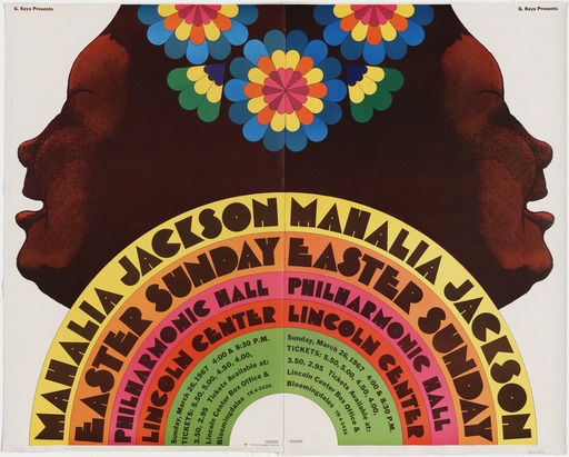
Milton Glaser, Mahalia Jackson 1967
-
- Milton Glaser, Mahalia Jackson 1967
-

-
-

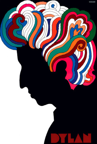
- Milton Glaser, Dylan 1966
-

-

-
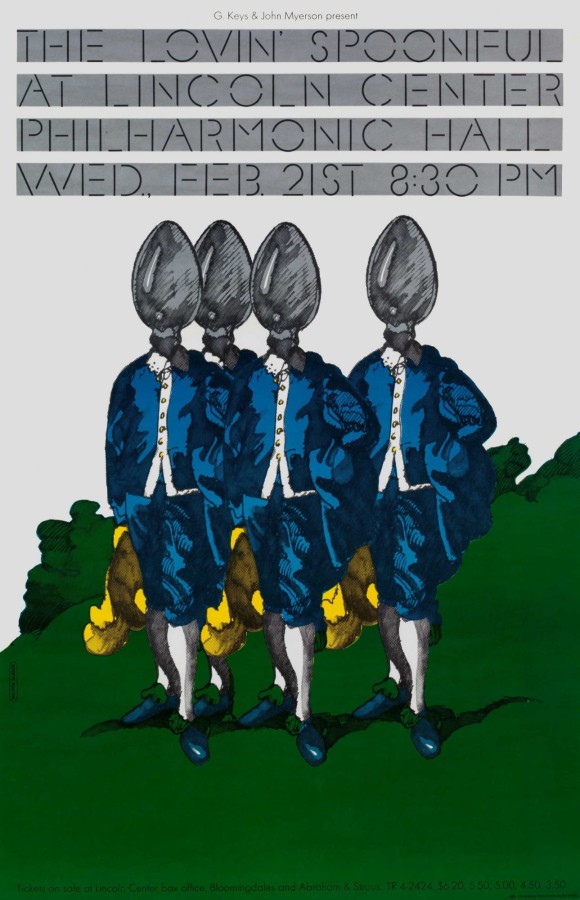
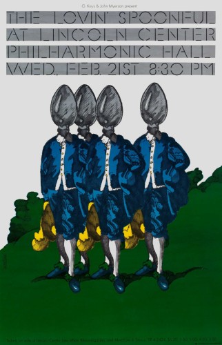
- Milton Glaser, Lovin’ Spoonful 1967
-

-

-

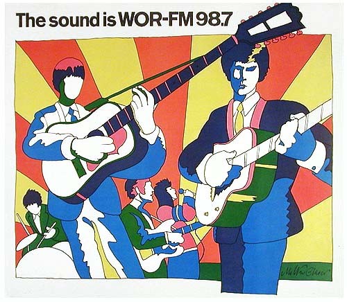
- Milton Glaser, The sound is WOR-FM 98.7 , 1966
-

-
-
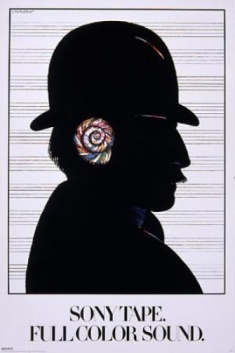
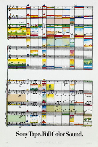
- Milton Glaser, Sony Tape. Full of Sound 1980
-

-
-

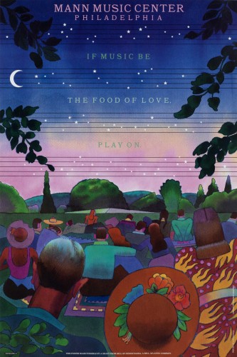
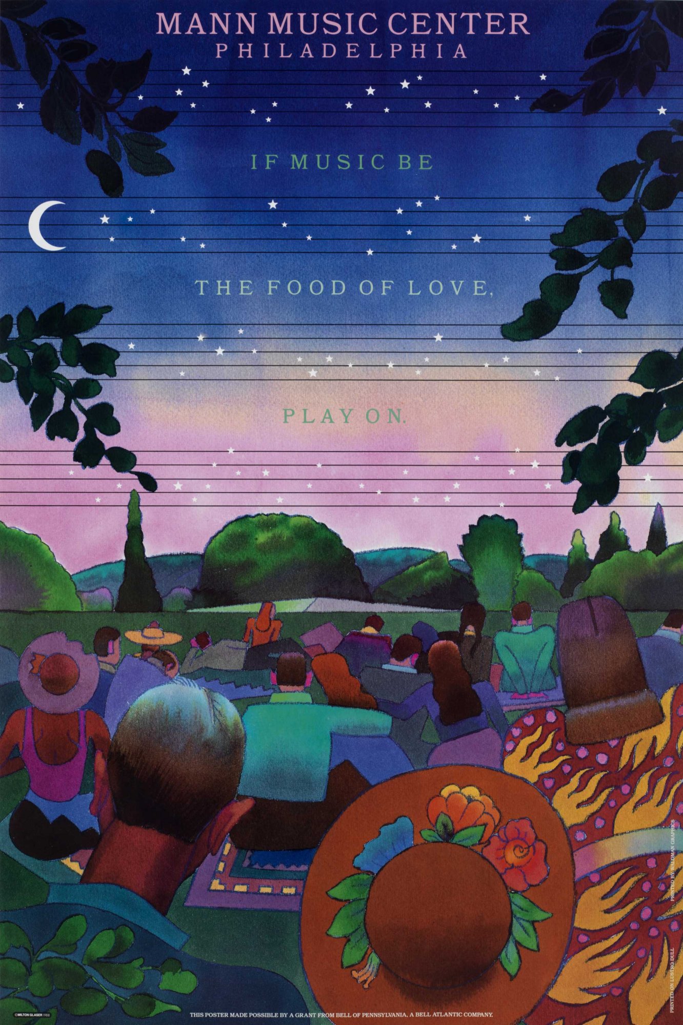
- Milton Glaser, mann music center philadelphia 1988
-

-
-

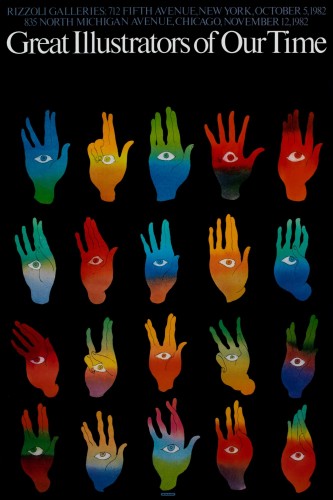
- Milton Glaser, great illustrators of our time 1982
-

-

-

- Milton Glaser, great illustrators of our time 1970
-

-

-
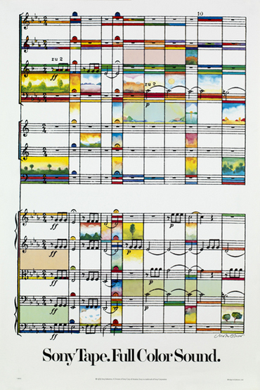
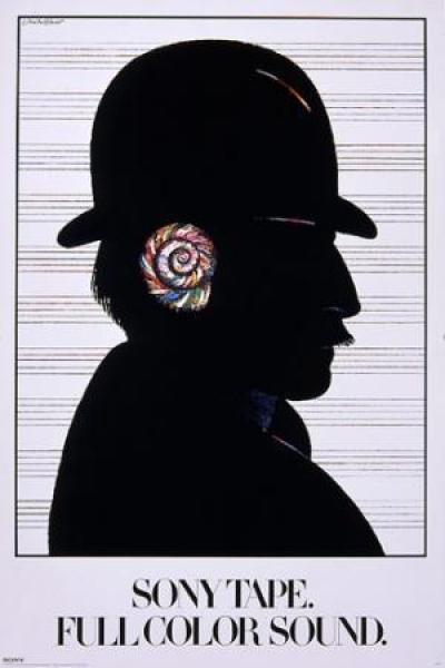
- Milton Glaser, Sony Tape Full Color Sound, 1979
-

-
-

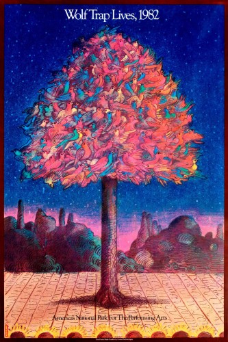
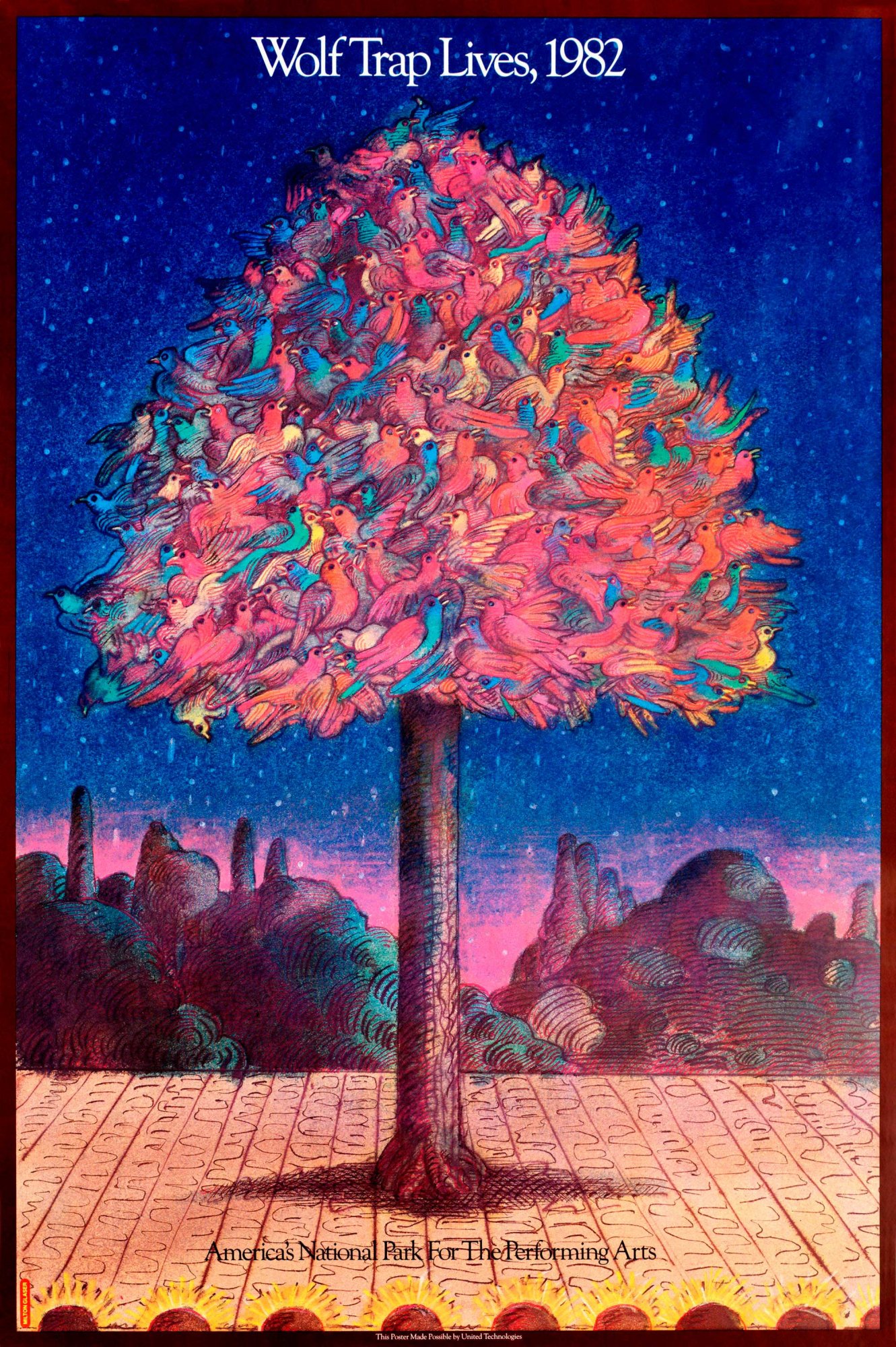
- Milton Glaser, wolf trap revival 1982
-

-
Gallery Paragraph
With the pieces that i have chosen for the gallery, I think they go together very well. They’re all posters, most of them being about music. When looking at all of the posters, i was trying to find a common theme. The common theme with these specific ones is that they’re all very vibrant in color. You can very clearly see the choices in color were really thought out in order to get the message across and I love the ones from the late 60’s because the colors just go along with the time period, i believe. These works are also spread across the time span of about 15 years so you can really see his growth in designing and where he’s going next in relation to color and subject matter and whatnot. The pieces from the 60’s are different from the 80’s ones but it reads as almost a timeline, i believe.
Part 1
Milton Glaser was well known for his poster and print designs along with typography later on. Born in 1929, Glaser went to the High School of Music and Art along with an art academy in Italy. Afterwards he co-founded Pushpin Studios in 1954 along with creating New York magazine and established Milton Glaser, Inc. in 1974, as well as teaming with Walter Bernard in 1983 to form the publication design firm WBMG. His iconic work can be found in permanent collections in many museums. His work ranges from famous logos, such as “I (heart) NY”, that are known around the world. He has created so many different things that you see every day and I think it’s kind of crazy. I actually own a shirt that has the “I heart NY” on it. He contributed so much in the design world but also in the education world by writing many essays about graphic design along with speaking about it in interviews. His ways of design and typography have taken over and are seen in packaging, logos, signs etc. His work is very influential to all current graphic designers because you can still see bits and pieces of his ways of working around even when being created by someone different.
Part 2
- He didn’t work in one specific field in graphic design, he has many different styles of visual works.
- Glaser and the Pushpin artists worked on designing things using simplified images that could function as symbols and signs.
- He had a willingness to experiment with many different types of design which lead to some of the most famous designs today.
Sources:
http://www.moma.org/collection/artists/2188?=undefined&page=1
http://www.miltonglaser.com/milton/#1
http://www.britannica.com/biography/Milton-Glaser
When doing this reading, it really made me understand the importance of visual hierarchy in design. Hierarchy is used every day, not only in design. When looking at a poster, for example, the title is the first thing that should be seen, followed by any subtitles that may be included. If the small details are larger than the title, the important part of the design is being hidden. The way things are positioned, as well, really matters. Ordering things correctly can show the order of importance without having to increase the size of anything. I never thought about, in a 3D setting, how visual hierarchy played such a big role. When taking photos of things, the background really matters when making the other images pop, basically telling you which object needs to be looked at first before the rest of the picture is examined.
Overcast
55°F
| Humidity | 49% |
| Wind Speed | S 16 G 23 mph |
| Barometer | 29.87 in (1005.5 mb) |
| Dewpoint | 36°F (2°C) |
| Visibility | 10.00 mi |
| Wind Chill | 51°F (11°C) |
| Last update | 4 Nov 11:53 am MST |
87501


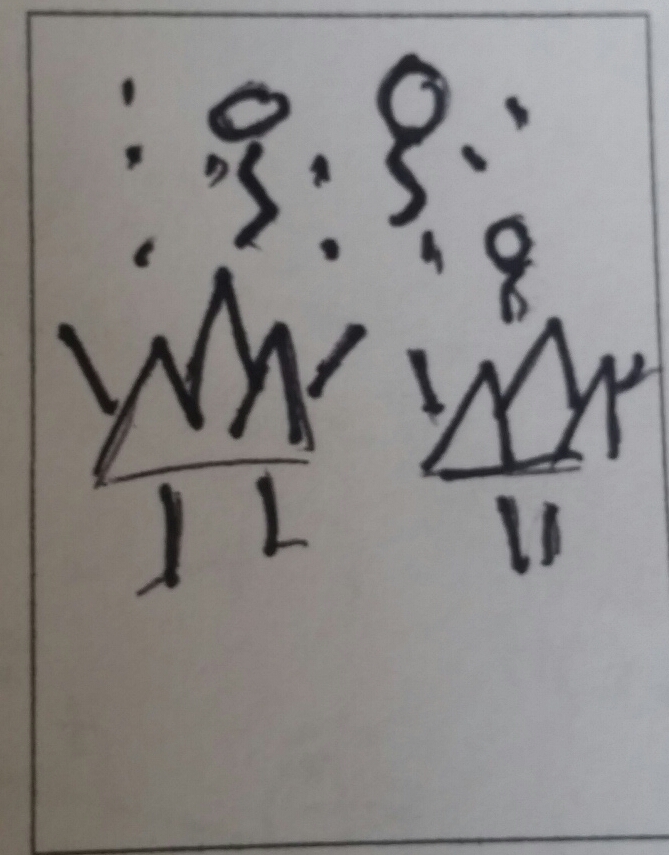
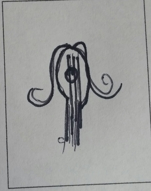
I really enjoyed doing this project because it really made me think of how i could make two completely unrelated things into a single thing. I had to be very creative coming up with the pairings and drawing them was challenging but also fun. I had never made a mind map before so it was kind of interesting to see different things that people associate with other things.
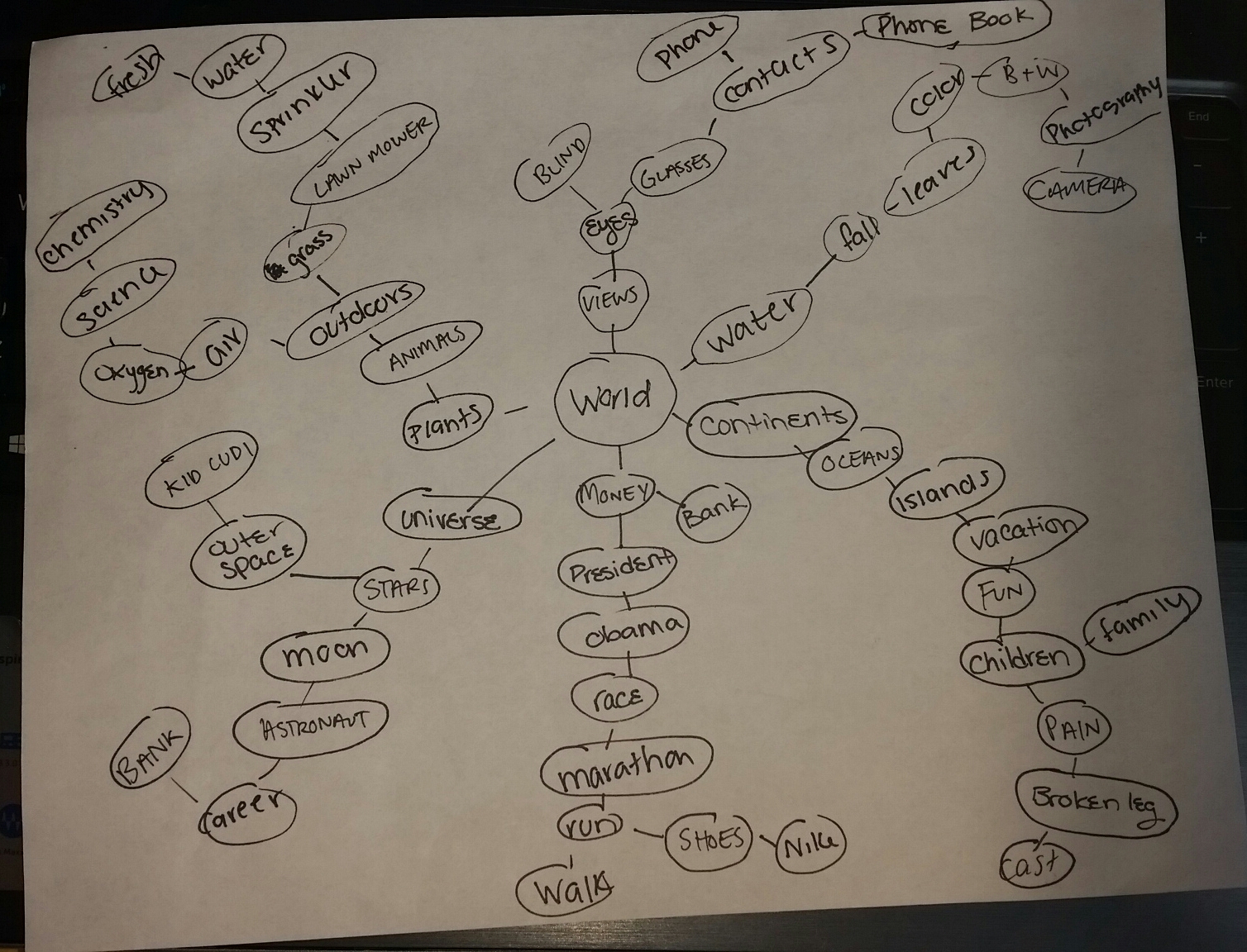
25 pairs
Phone book+Leaves
Moon+Money
Bank+Glasses
Lawnmower+Phone
Eyes+Camera
Teeth+Skater
Leash+Hand
Mountain+Party
Bunny+Camera
Astronaut+Laptop
Shoes+Plants
President+Tent
Trees+Jacket
Guitar+Hair
Chemistry+Contacts
Eyes+Family
Water+Money
Moon+Run
Planets+Grass
Sprinkler+Stars
Teeth+Test Tube
Cane+Vault
Shoes+Flag
Phone+Cake
Pickaxe+Headphones
10 pairs used
Phone book+Leaves- I felt like i could make phone books fall from the trees like leaves do and change the color of them like it was autumn.
Lawnmower+Phone- I thought it would be funny to have a phone using a lawnmower and make it like the phone screen is its face and it has arms and legs.
Leash+Hand- I was thinking about making a hand on a leash and maybe have an animal walking it or something to make it seem like it was an alternate universe.
Mountain+Party- Instead of humans partying, why not have mountains come to life and throw a party?
Shoes+Plants- I was thinking maybe have a plant wearing shoes or a plant growing out of a shoe as if it were a planter.
Tree+Jacket- Whats more fun than a tree wearing a shirt? A tree wearing a jacket.
Guitar+Hair- I wasn’t too sure if i wanted a guitar to have hair or have a person to have hair made out of small guitars. Either way it would be very cool.
Sprinkler+Stars- I think it would funny to have a star running through a sprinkler on the sun or something.
Shoes+Flag- I was thinking of just having a whole bunch of different shoes attached to a flag pole and making it into a big shoe flag.
Pickaxe+Headphones- I thought it would be funny to have a pickaxe using a pickax while listening to music in headphones.
Thumbnails:
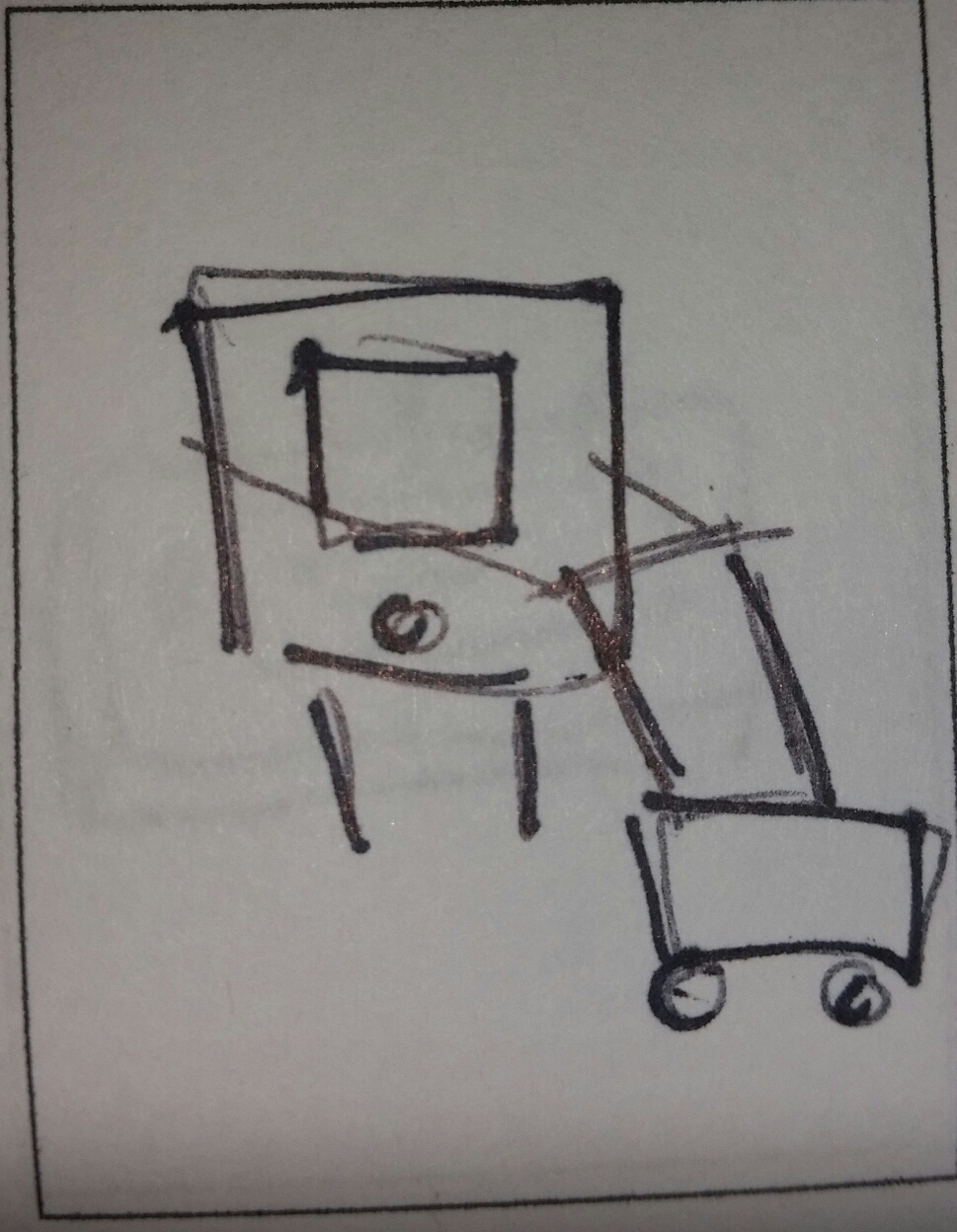
Mountain+Party Guitar+Hair Phone+Lawnmower
Why graphic design?
I grew up loving art; my grandpa was a painter so he was a big influence on me when i was younger and is probably the reason i really got into drawing and painting. I never really knew graphic design was an option for me until i took a class my sophomore year in high school. I loved everything about it. I love working on the computer and being able to be creative with the things that i make. Both of my brothers are in the design field as well, so I’ve learned a lot from them. I don’t really know what part of graphic design i want to go into but I think i’m leaning towards advertising because that is what i have the most experience in. I’m hoping to be able to figure it out soon!
One area of graphic design that i’m interested in would have to be package design. Products need presentation. I have to admit that when I’m shopping, I want to purchase some things because of the cool package design. I feel like if the way the product is packaged is boring, it’ll be less popular, even if it’s a good product. When something is a product for kids, you can really tell because of the color scheme and designs compared to if something is more for adults. I love looking at the boxes some products come in and the detail that’s put into it. I feel like designing that would be fun because you can take a bit of the product but also put some of your own ideas into it.

The next area of design that I’m interested in is definitely have to be advertising design. I’ve had the most experience in this part of the field and i really love doing it. No matter where you go, you see advertisements. There are so many creative and fun ways to get the message out to the public that can really catch their attention. There’s so much you can do with it as well. Some ads have many colors and pictures, which can really help sell a product or an idea to people. Others can be very simple, which can be just as effective. With this coke ad is really cute and i like how straight forward it is. You can clearly see that it’s an ad for coke but it also kind of makes you smile. There aren’t anythings popping out at you but sometimes less is more in advertising. This ad for glasses i think is very cleaver because you can clearly see what they’re trying to get at. I also think it’s kind of funny because the painting looks blurry because of the painting style and now it look “clear” because of the glasses. I just really love that there are so many things you can do with this area of design.
-
-
Classroom
-
-
Recent Posts
Recent Comments
- Danielle Vizard on Thinking with Type — TEXT
- Danielle Vizard on Digging’ It!
- Jenna on Thinking with Type — TEXT
- Jenna on Digging’ It!
- Elizabeth Robinson on Digging’ It!
Archives
- November 2023
- August 2023
- May 2023
- April 2023
- March 2023
- February 2023
- January 2023
- December 2022
- November 2022
- October 2022
- September 2022
- August 2022
- July 2022
- June 2022
- May 2022
- February 2022
- December 2021
- November 2021
- October 2021
- September 2021
- August 2021
- June 2020
- February 2018
- December 2015
- November 2015
- October 2015
- September 2015
- August 2015
Categories
-
About
KSC GRAPHIC DESIGN

Leave a Reply
You must be logged in to post a comment.