- Â
å October 2015
B Printing at Redball
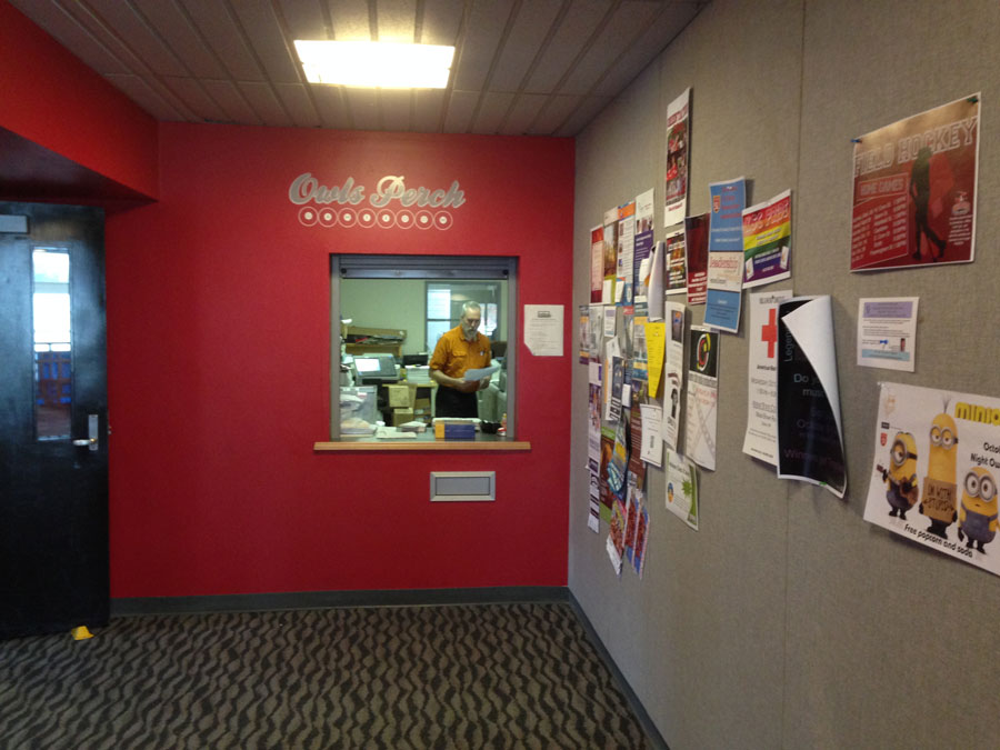
Redball is the KSC print service on the second floor of the Student Center. They do 8.5″ x 11″ and 11×17″ color and black and white laser prints inexpensively. They also do large format poster prints.
Redball Website
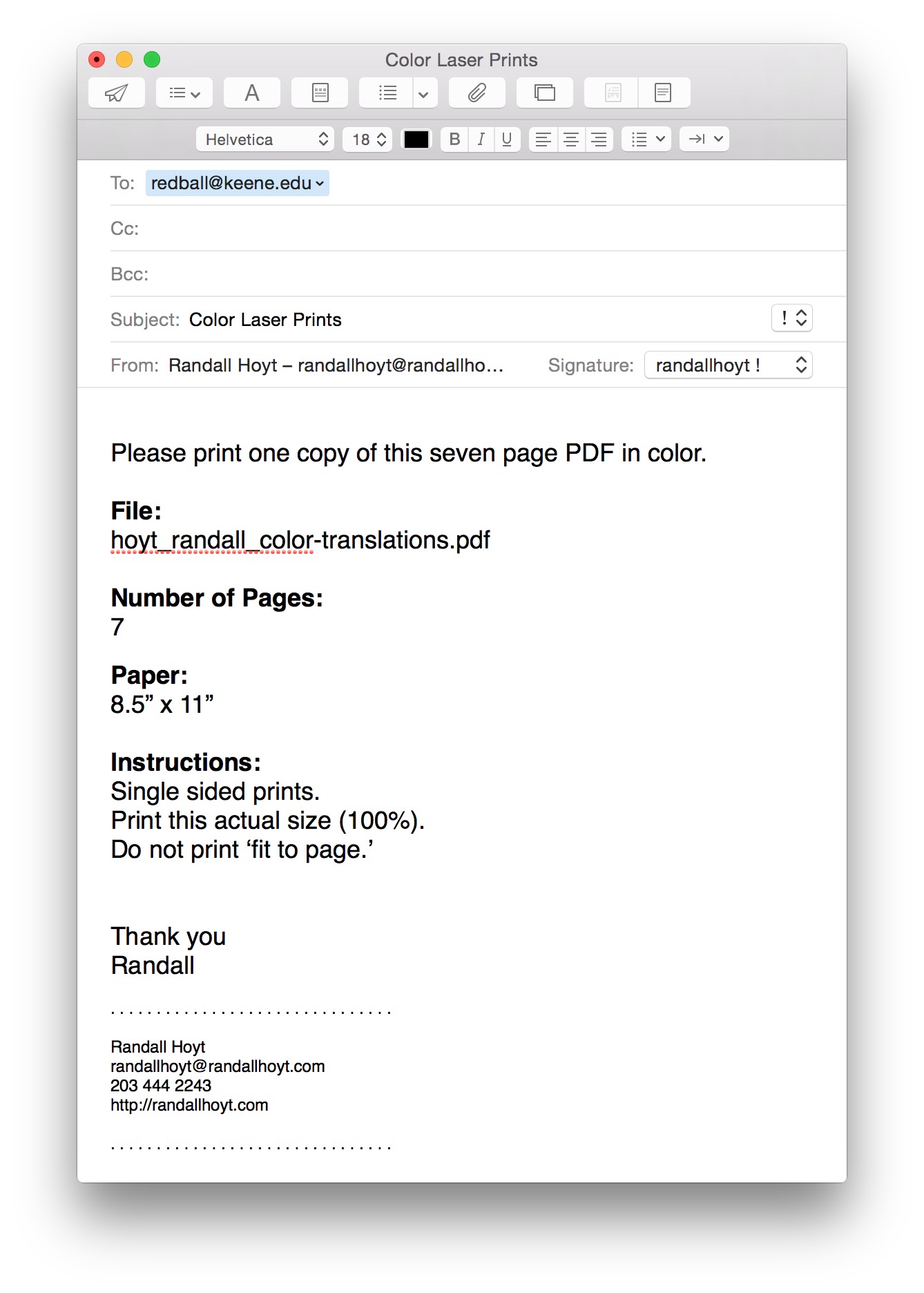
To get something printed, you email the files to redball@keene.edu. Email PDF files only. All files must be under 40MB to get through the mail system. You need to show up early and he prints it while you wait. Don’t wait until just before class.
Dana
Dana is the name of the man that runs it. Be nice to Dana. Get to know him. Bring him presents if necessary. He controls your prints and he is friendly and we love him so love him back.
Example Email
Here is an example of a very clear email to send to Dana. Err on the side of clarity and you will not be disappointed.
B Color Readings
Read these texts and comment about the information to this page. What can you say about the way you use color now? How will this change the way you think about color?
Graphic Design: The New Basics by Ellen Lupton
Guide to Graphic Design: Color
Comment below…
w Adobe Color Tool October 14, 2015
w Thinking with Type: Kerning October 14, 2015
w Kerning in Practice October 14, 2015
í Color Translations
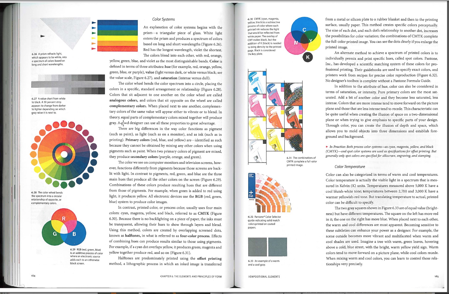
Color can convey a moon, describe a reality, or codify information. Color serves to differentiate and connect, to highlight and to hide. — Ellen Lupton
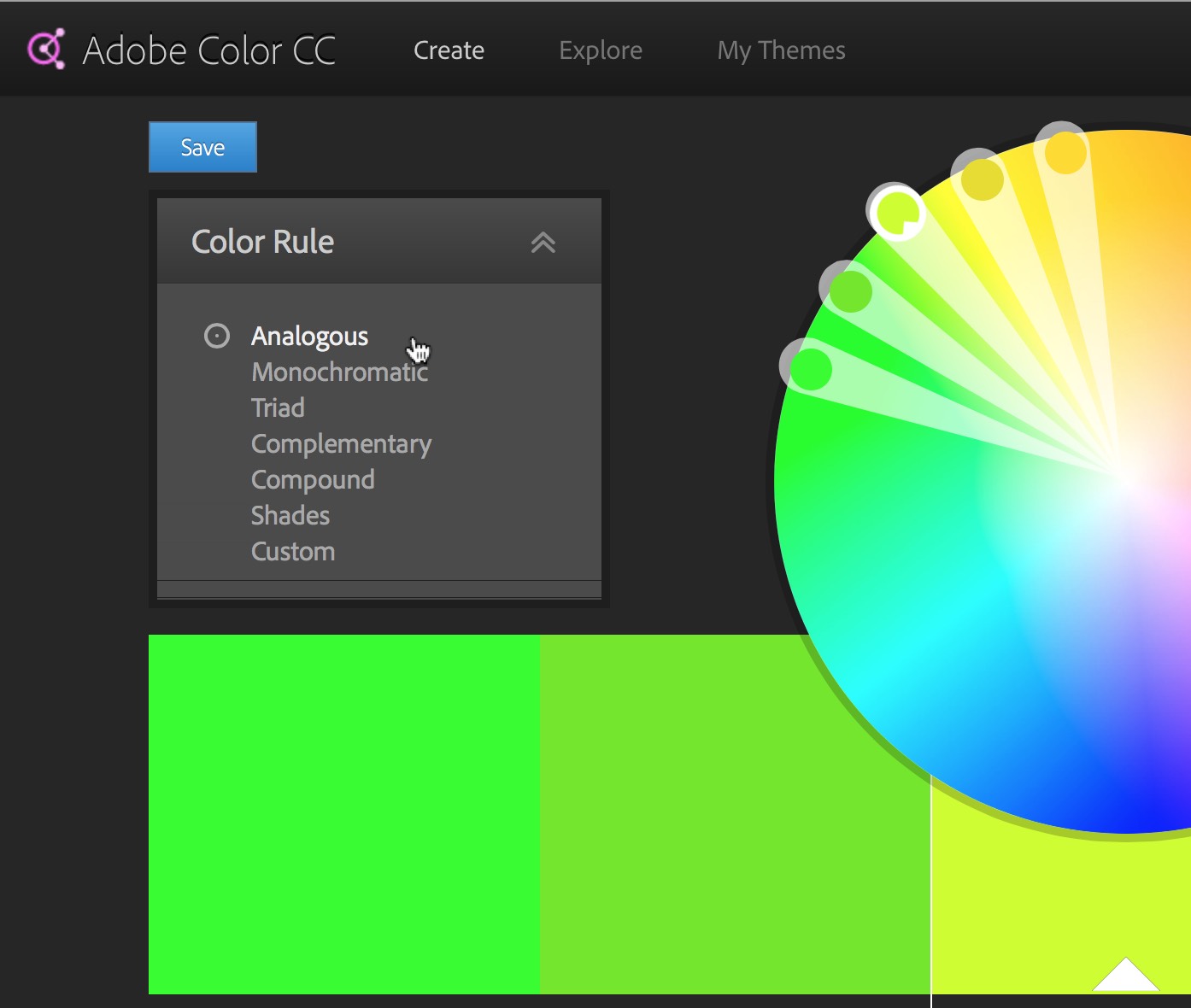
Create a series of color schemes for your translations using the Adobe color tool.
1
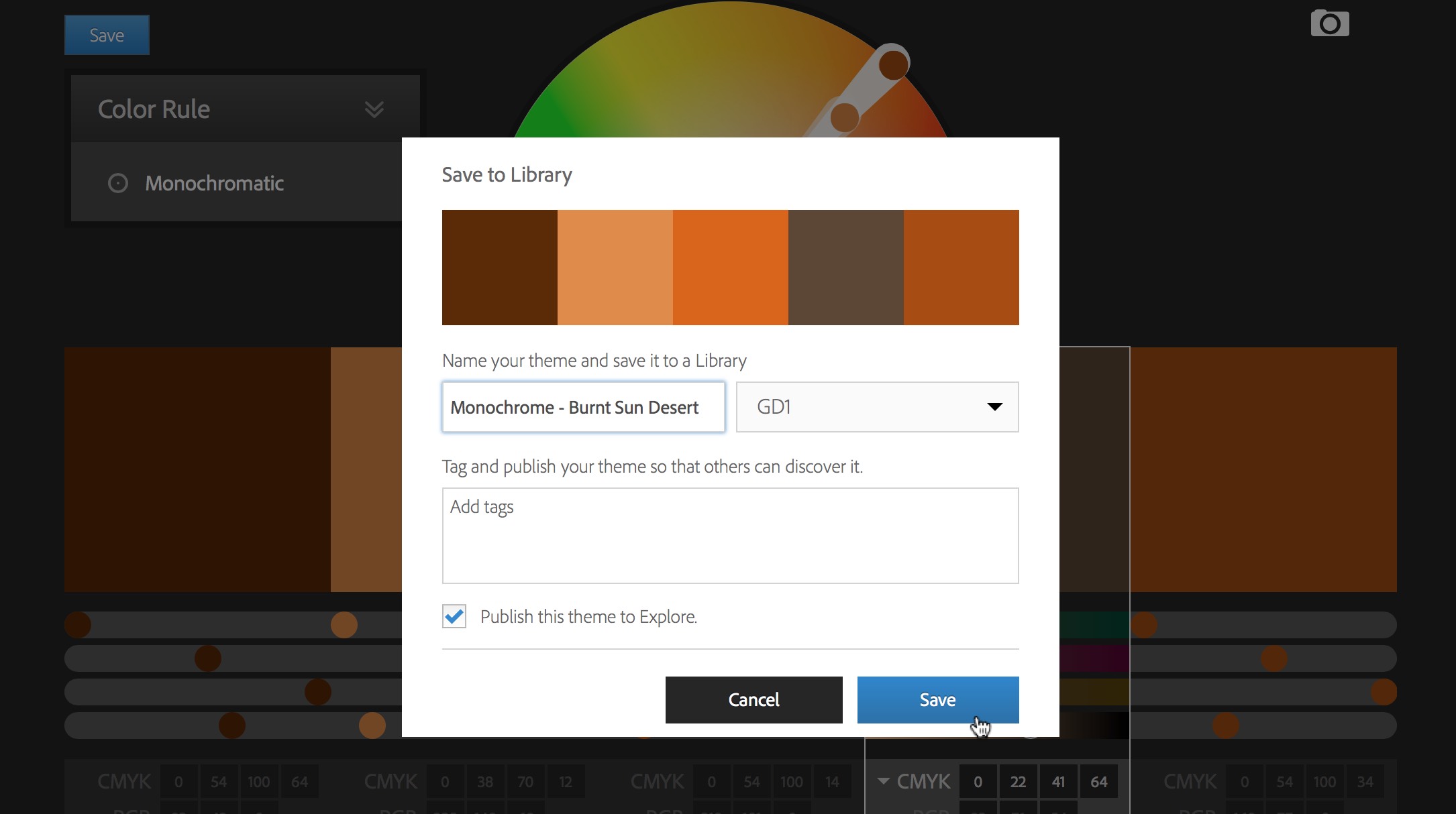
To save your colors and bring them into illustrator you will need to make an Adobe account.
2
Log into the Adobe color tool site at: https://color.adobe.com
Experiment and create color schemes in the categories below:
- Analogous
- Monochromatic
- Triad
- Complimentary
- Compound
- Shades
- Custom
Use these abbreviations to name the color themes:
- Analogous = analog –
- Monochrome = mono –
- Triad = triad –
- Complimentary = comple –
- Compound = compo –
- Shades = shade –
- Custom = custom –
For example: ‘analog – rusty nails’ or ‘compo – scissor fight’…
3
Save your color schemes with playful and interesting names such as analogous – green tea diffusion, or monochrome – burnt sun desert. Look at how colors are named for paints such as Behr. Create at least one color scheme in each category to start.
4
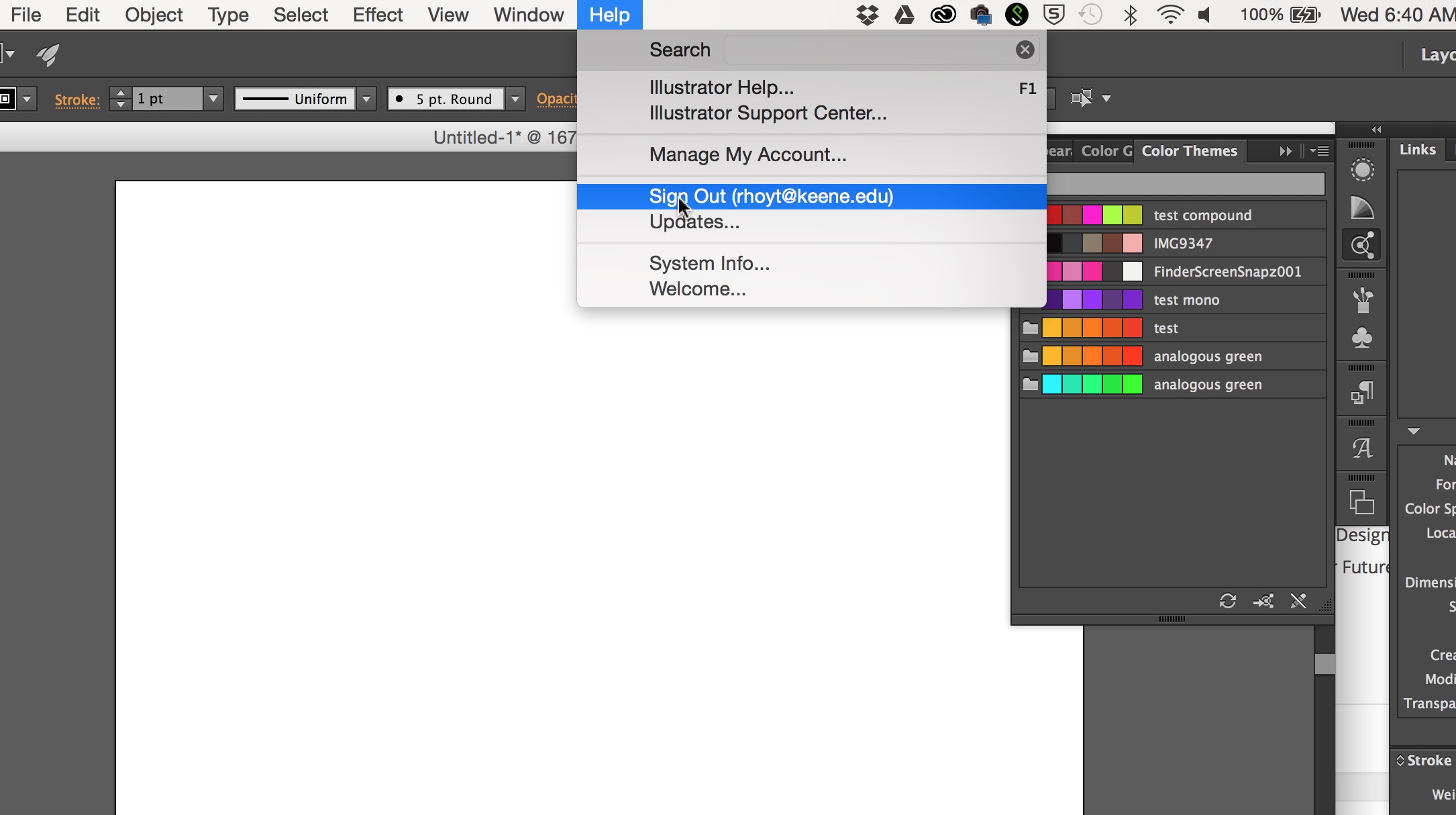
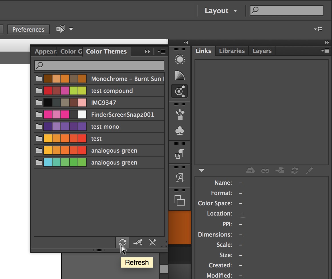
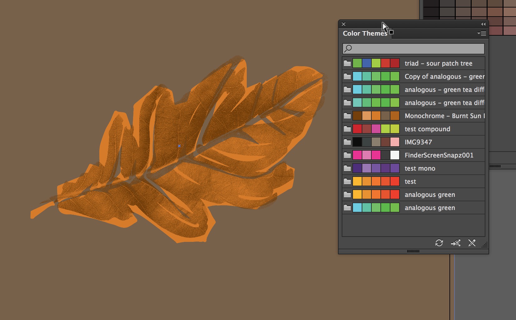
Open Illustrator and sign in with your Adobe account in the Help menu. Your colors should appear in the “color themes” panel. Press the Refresh button to update the panel.
5
Build a color translation illustrator file.
- Create a new Illustrator file and name it “last_first_color_translation.ai”.
- Copy your master photograph to a ‘photo’ layer for positioning.
- Copy more translations from your master file into it to color.
- Create a solid background square behind it and combine start by layering two translations on top of each other.
- Be sure to position them exactly in the same place in the square.
6
Create a series of color translations using each of the color types as follows:
- 3 Different Analogous
- 3 Different Monochromatic
- 3 Different Triad
- 3 Different Complimentary
- 3 Different Compound
- 3 Different Shades
- 3 Different Custom / any colors you think look good.
7
Make a total of 21 color translations and export them as one PDF.
8
Put the full name of each color theme on the bottom left corner of each design. The type should be colored with the theme colors (not black or white) and set as follows:
- font: Helvetica
- size: 8pt
- color: according to theme
- Sample PDF test_leafcolor
Due Monday, October 19
- One PDF with a total of 21 color translations posted to DropBox:
GD_2015FALL/07_Color/Color_Translations_PDF/last_first_colortranslations.pdf - Read and comment to the Color Readings page.
- NOTE: You don’t have to print for Monday.
Due Wednesday, October 21
1
Print the best one of each category at Redball.
Trim and Bring in.
See this page about how to print at RedBall.
Final PDF on DropBox.
- black and white translations
-
150 x 150 px
-
300 x 300 px
-
- color translations
- 150 x 150 px
- 300 x 300 px
í Translations 03 / Final
Due October 14, 2015
The master list of translations is below. All these must be in this exact order in a single PDF posted to DropBox by the start of class. Place them in the folder:
GD_2015FALL/06_Translations/FINAL PDF Translations/last_first_creature-name.pdf
Translation Master List:
- Original Photo: Just the original edited photograph printed on 8.5 x 11″
- Outline
- Silhouette
- Outline Shapes – Curves: the interior and exterior forms of the image using a thin marker
- Filled Shapes – Curves: Fill in the the same forms from #4 with black
- Outline Shapes – Angles: Do #4 with purely straight lines
- Filled Shapes – Angles: Fill in the straight lines outlines as in #5
- Stipple: Use stippling with a very thin marker to create the image and express dark and light values
- Expressive Contour: Draw a single contour fat line that starts one place and expresses the form in a single unbroken line
- Expressive Thick: Do an expressive rendering of the image in using thick marker
- Expressive Thin: Do an expressive rendering of the image in using thin marker
- Expressive Thick/Thin: Do an expressive rendering of the image in using thin AND thick marker
- Hand Made: Create the image using hand made style of your choice (newspaper, collage, thumbprint, etc).
- Abstract & Amplify Drawn: Abstract the image by simplification and amplifying features in black pen
- Your Choice (must be very different from above)
- Curve Shapes Vector: use the pen tool with multiple curved shapes to create the forms.
- Geometric Shapes vector: use the pen tool with only corner points (no curves) to create form.
- Triangles: use only triangle to create all forms and values using that shape. Avoid letting the shapes touch each other.
- Circles: use only circles (not ovals) with no overlap and space between
- Type Image: use large and medium size letters. Do not use words, patterns or repetitive values. Evoke the dynamism of you creature. See this page.
- Abstract & Amplify Digital: amplify and simplify the creature’s features. This must express the idea and spirit of the creature using stylistic form.
- Halftone: Original Photo as round 25 dot half-tone
- Halftone: Original Photo as round 9 dot half-tone
- Halftone: Original Photo as line 25 half-tone
- Halftone: Original Photo as line 9 line half-tone
- Extra after 26: Add other quality translations and experiments that do not fit into the categories above here.
Assignment Due Dates
The course Assignment Due Dates policy states:
- You will not receive credit for any assignment passed in after the due date. If illness or other personal issues are keeping you from fulfilling an assignment, you must contact me before the assignment is due, or you will receive a zero (0%) for the missed assignment.
- Students are responsible for handing in any assignments due on the day of an absence.
I have been pretty lenient about this policy as you get up to speed, but we are well into the semester so this policy is in effect. Please act accordingly.
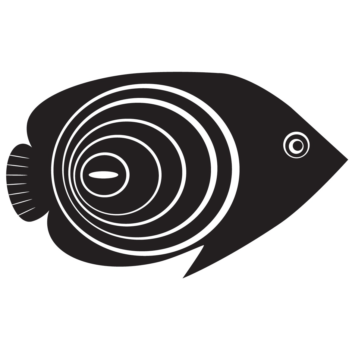
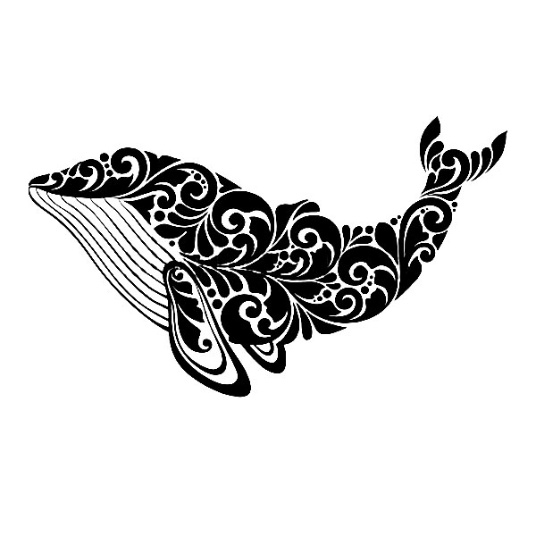
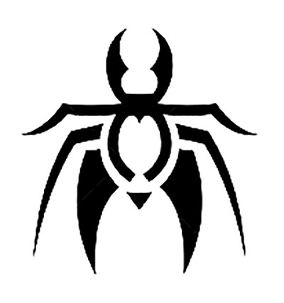
í Abstracted Translations
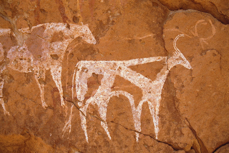
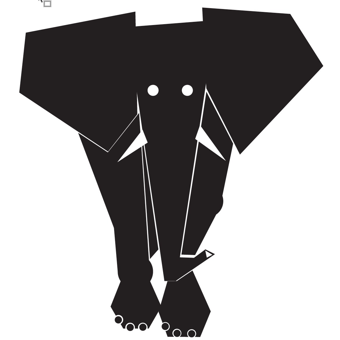
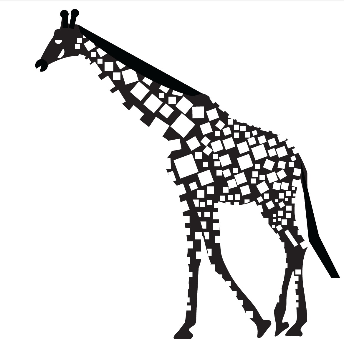
The notion of ‘abstraction’ in this project is to denote an idea, quality, or state rather than a concrete object. This means that you ignore some detail in order to amplify other details.What is is the essential nature of the creature and its physicality? What elements can be amplified? What can be sublimated? The ancient humans were masters of this capability to render animals.
Do a series of three abstractions where you create a series of images with increasing levels of abstraction and stylization.
Examples below:

í Translations 02 / Digital
Continue to develop your set of translations using digital processes.
Computer Translations
16. Curve Shapes Vector: use the pen tool with multiple curved shapes to create the forms.
17. Geometric Shapes vector: use the pen tool with only corner points (no curves) to create form.
18. Triangles: use only triangle to create all forms and values using that shape. Avoid letting the shapes touch each other.
19. Circles: use only circles (not ovals) with no overlap and space between
20. Type Image: use large and medium size letters. Do not use words, patterns or repetitive values. Evoke the dynamism of you creature. See this page.
21. Abstraction: amplify and simplify the creature’s features. This must express the idea and spirit of the creature using stylistic form.
Scan
Scan all previous hand-drawn translations. Do this as follows:
- Scan the translation.
- Enhance the contrast to sharp white and black contrast using ‘levels’ in PhotoShop
- Save the high-contrast scan in a ‘scans’ folder with other project files.
- Use the number of the translation from the project list as the file name, Please consult this page for translation numbers.
Auto-Trace
Convert your previous hand-drawn translations into vector art in Illustrator. Import each scan into illustrator and convert the bitmap image into a vector drawing using ‘auto-trace’. You will need to auto-trace the following hand translations. The numbers refer to the previous project list.
- # 2 Outline
- #3 Silhouette
- #4 Outline the interior and exterior forms of the image using a thin marker
- #5 Outline the same forms from #4 and fill in outlined forms with black
- #6 purely straight lines
- #7 filled straight line forms
- #10 thick expressive rendering
- #11 thin expressive rendering
- #12 thin & thick expressive rendering
- #14 Abstract the image by simplification and amplifying features in black pen
Bitmap Conversion
For translations with more tone such as a collage or finger smudge you will need to turn them into ‘half-tones’ in PhotoShop. The following will want to be turned into half-tone bitmaps and saved as .PSD files:
- Stippling
- Hand made style of your choice (newspaper, collage, thumbprint, etc).
- Your Choice (must be very different from above)
New Halftone Bitmaps
22. Original Photo as round 25 dot half-tone
23. Original Photo as round 9 dot half-tone
24. Original Photo as line 25 half-tone
25. Original Photo as line 9 line half-tone
Redraw as a vector
Redraw the single contour fat line as a vector line in illustrator. Start by importing the image and drawing on a layer on top of it.
Due Monday, March 30
- One PDF with 25 translations all positioned in the same place and scale.
- One folder with all of the translations as separate files.
- Translations number 16-25 printed and trimmed to 6″x6″
-
Classroom
-

This reading assignment was a cool read on how to buff up designs into modern 21st century designs. Starting with color, it was awesome to find more information on the differences between RGB and CYMK. RGB is cool because we see these colors on our displays of cell phones and computers everyday while CYMK is great for printing those displays well. It made me think halfway through that if I ever wanted to print some of my photography that I should convert colors to CYMK to print out awesome images to frame or $ell. The reading stated that when you choose color, you don’t just go with your favorite choice. Color has a whole bunch of meanings like red could mean love, the color of our hearts, or can mix with green and can create Christmas colors. Another concept I hadn’t put too much thought into with design was depth, and whats great about all this information is that I’m learning most of this in my drawing 101 course too. To show different perspectives in a 2D space you can use overlapping, foreshortening, perspective, and so on, but what amazes me is that perspective on a 3D space is based around past experiences, cultural roots, inner emotions, and the senses. Just using what we know as humans and inserting it with design can truly make graphics pop out. The image 6.24 is a great example because of how everything is super personable to the designer. It said that the designer use to work at a flee market however the artist used knowledge of selling clothes (I’m assuming) to add his own twist. Not only does the color of that old leather shoe pop out, but the hand written words shaped in the form of a tie just adds so much that it creates this experience of being in this artists shoes gazing at the cool gothic type design.
“Nobody cares what your favorite color is.” This line really made me think about how a favorite color is irrelevant in the design world. Having a favorite color is fun and all but in the grand scheme of things won’t make a design better because you personally think its awesome. Color is more of a tool than something that is arbitrarily added. Color has much more powerful meanings than just something to look at. After reading about how important color is I’d like to make a point of being more conscious about my selection and how its impacting the overall effect the design has on the viewer. Its important to be intentional and have a purpose behind what colors you use. This awareness can make the difference of a successful design or unsuccessful design. Prior to reading these articles I was always a fan of using complimentary colors. Something about their vibrance really drew me to them but now I find that the subtlety of analogous and compound colors is much more fascinating.
The colors you use in your design are extremely important to the outcome and success of your design. I have never really understood why color is so essential to the success of your design, but after reading these articles I was blown away by how color can really make or brake your design. I learned color can identify the space, mood, dimension, form, and content of your design. That is so true! Picking the perfect colors can be difficult, but knowing what each color means can really help. Yellow comes forward while blue recedes. Yellow and red are colors many would use in a food design, because they not only attract people really well but additionally make people hungry. In contrast, I have learned that blue is the type on color to use if you are on a diet. For example, eating off a blue plate can allow you to eat less because the color is unappealing while eating. Color means so much and knowing which colors to use make a successful design.
The way I use color is based on how I am feeling. If I am in a good mood, I tend to use brighter warmer colors. When I am feeling down, I use cooler colors and black. Most of the time I don’t like to use a lot of colors (especially in my clothing) because I’ve always preferred neutral colors. I never thought about the way I’ve used color, I would just use whatever I thought looked good. After reading the two articles, it made me think more about how I should use it, especially on projects and designs. I should start thinking about what color schemes would leave the impression I want on the viewer. Color is so important and effects how we feel when we see it. It can change a person’s mood and the way they think of things in a heartbeat. Learning how to use color the right way can help me become a better designer.
I believe that color is often taken for granted, and these readings really pushed the idea that it shouldn’t be. Color, whether you like it or not, is one of (if not THE) most essential aspects of a design. I look at it as the glue that holds a design together; something that can either make it or break it. I think the most important part of this reading, for me, was the paragraph that talked about how color should be part of the original design concept and not an afterthought. If you have an incredible design, but the color scheme throughout it is god awful, your design will most likely come across as god awful no matter the content which is something nobody wants. As designers, we have to train ourselves to think in color as we progress which is not a very easy thing to do, but doing so proves to be quite rewarding. Color emits feelings and can provoke thoughts (for example: red is associated with passion and aggression while yellow has a strong association with warmth, sunlight and growth), which is why choosing the perfect scheme and having a balance is so important. Color shouldn’t be overlooked or taken for granted because of how crucial and relevant it is in the world. Just imagine taking a look outside and seeing all of the fall foliage stripped of their gorgeous red, orange, yellow, green and brown colors. How gross would that be?!
I thought this reading was very interesting. It incorporated many scientific explanations and definitions of color into design. One such element it discussed was the color spectrum. I liked how it then transitioned into the color wheel and how it was applicable to the concepts we have discussed and practiced in class.
I was never aware of the different ways in which color manifested itself on different mediums like paint, computer screens, and ink. I think it is so interesting that we would need to create different color systems for different mediums. When I look at quickly at color on a computer screen and then at the same color on a printed piece of paper, I don’t necessarily notice a different between them. I think I’ve just never really paid any attention to it before. What I was familiar with prior to this reading was the concept of primary and secondary colors, and warm and cool colors. But I was never really aware of how they were applicable to the real world other than in painting or drawing. This is why I enjoyed this reading; it was really informative in an applicable way.
These articles really showed how important color can be to design and how big of a difference it can make. It’s crazy to think that different colors can make people feel different ways and they can totally change the way a person perceives a design or advertisement. Different colors attract different kinds of people and color alone can be used to target certain groups while advertising. Colors alone can also create depths and shapes and different perspective without even outlining specific shapes or objects. Color can be used with personal preference, to make something look pretty, or it can be used strategically which would be the act of a good designer. This might even include a lack of color and just keeping things simple with black and white and maybe just an accent color. After reading these articles I’ll definitely be looking at color differently and using it more strategically.
These two text gave a real insight as to what color is all about. How it isn’t simply just putting colors together that we like, but more that there is a science to it. I have learned it before, but I still find it interesting how certain colors and color combinations can effect a persons emotions to make them feel something they may have not been feeling before hand. Sometimes when I do graphic design projects I choose colors that are appealing to me and are normally simplified colors with not a whole lot of variation between them. Sometimes though I do mix it up and go with colors I would not normally choose. I do want to start using color in a more unique and professional way, in which I am using Analogous, Monochrome, Complimentary, etc. I am actually working with color right now in my web design class. We are creating our own websites and we have to come up with a color scheme that will work together and be appropriate for the the type of website we are creating.
I think that these readings were pretty interesting. It really shows that the trick behind good design relies heavily on color selection. It’s true how it doesn’t matter what your favorite color is. It isn’t about what you like to look at, it’s about what message you really want to get across to the audience. In reading these texts, it made me realize how much in past designs I created, I almost arbitrarily used a lot of complementary and analogous colors that I thought just looked good together. Now when deciding on colors now, I will take into consideration the overall feel of the color, for example warm and cool colors and what effect different hues and saturations of colors have on the overall feel of the composition. These readings really emphasize the importance of color in visual communication.
When I think about color, I immediately think how colors affect my moods. As the color reading says, each one has warm and cool shades. Warmer shades make me feel more positive while cooler shades make me feel down. However, when it comes to my favorite color schemes I prefer triad colors. These color have a larger contrast and make my work feel more dramatic and visually energetic. As a designer it is very important to know how color interacts with their work and systematically test variations of their ideas.
I never noticed how color effected me before I read the readings. I always used colors when I thought they looked good. If the poster looked good with greens and blues, I would use greens and blues, never thinking that those colors could change someone’s mood. After reading the articles, I am more likely to use color more cautiously. I will no longer use a red tone when trying to portray a calm message. It is important in design to use color in a way that matches the message you are trying to say. It is a way to add to the message without making the image busy and complicated. I will now be able to use colors in a way that benefits whatever I’m creating, rather than clashing with the message I’m trying to show.
It was nice to address color theory and it’s importance in design. As I expand more in my art classes, the more important color theory has become. As a photographer, color theory has helped me do color correction and of course when I style my models in their clothing. I use color theory when I’m doing makeup on my models as well. It has so much importance in the art world and real world. Color has different meanings to different people and the meanings that color can communicate are so important as a designer when working with it for a client or simply for an artistic audience. If you want to make the viewer feel a certain way about the piece, change the tone of the color. Of course Graphic Design started as a mainly black and white medium, but that all changed with photography. The readings mentioned two artists who I’ve studied and greatly admire. First was Josef Albers who really nailed color theory and taught at the Bauhaus School and Yale. Marc Rothko was also mentioned, his work really needs to be seen in person with the way how he beautifully interprets color theory and texture in his work. I really want to be more aware in the way I use color and to make it more appealing in my work and use it as a communication tool. Color is super useful in design and really should be taken seriously and appreciated.
Generally speaking, I only use colors that I find attractive to my own eyes. I am fairly close minded to colors that I don’t look appealing to me and that is a choice that may seem very close minded. Upon reading this, I have discovered that there is more to color than just what the eye sees, there is much more of a science behind it. Certain colors may be associated with moods and if you use the wrong color to portray a message, the whole meaning could be lost. Color is important in this aspect of design because if color is does not properly communicate the message of the design or if the color does not fit the final product, the message may be entirely lost. Color is much more important than I originally imagined and that information in itself should help me better myself as an artist.
Colors give a feeling of unity, perspective, emotion, expression, and balance in a design. Using color in a design can be complicated, in order to give the audience the right feel or emotions being portrayed. Before reading this text, I would pick the colors that looked most appealing and that went well with each other. After reading, I now know how powerful color can be when expressing an idea in a design. By using hues, values, and different colors on the color wheel correctly, you can set the tone of the design. Another consideration when choosing colors is balance. Balance provides equality and creates a relationship in the design. Colors can also symbolize something, for example red is used as a symbol for blood or death. This text has opened my eyes further in dealing the concept of color being used in design. Creating emotion and unity in a design is heavily expressed through the colors that are chosen.
When reading this, it really opened my eyes on the different perspectives people have on color. Color can be used as many things such as emotions. When you see a specific color, you automatically relate it with something for example, seeing the color red. I personally think of warnings. But seeing blue is a more calming color. Adding color to design is very important because it brings your concept to life. Before reading this i never really thought of how colors give off a certain emotion to people. I personally have always loved contrasting colors because they make each other pop and stand out on their own but also work together at the same time. I also find it interesting how much something can change if the shade or hue of a color is altered.
For the future of using color in projects I will take into account all the factors that I have just newly learned about. Such as each color uses different aspects within that specific color choice, value, intensity, and others that were stated in the article. The color wheel will play a bigger role into my color schemes and choosing colors. I will also have to listen to what I am trying to achieve through my work, if I need to be suttle then I will use colors in the same family just different ascpets of that one color! This changes the way I think about color because there is so much more thought that I have to put in to create something great!
Color is a wonderful gift that many, but not all, can perceive. Often times, we take it for granted. I do not usually think about the color of my clothes or appreciate the leaves in the fall. I have become so distracted by my life that I do not just stop and look or think about the simplicity in colors. These readings opened my eyes to not only be aware of the colors in my designs and what mood I want to set for the art with it, but to be aware of the colors surrounding me always. By seeing the color wheel again, as I have not in a very long time, I will have a better understanding of what colors will and will not work together. My art will hopefully be even better than before with color and colors that help the picture to come to life in even more ways than it had in black and white.
Color is an important tool used everyday by designers to intensify and mold their design. Color has the power to convey emotion, describe reality, or even codify information. Being a graphic design student, I make decisions involving color almost everyday. I use color to make certain points of focus stand out more than others, and other times I use color to make objects disappear/ blend in. Color is a balancing act, we use it to add contrast or connect, and to highlight and to hide. And if one is not smart about the way they use color it can completely destroy an image/design. This is why it is important to be educated on the color wheel and the relationships among the colors. For example, a designer must know the difference between complementary colors (colors that sit opposite of each other on the color wheel), for example red and green, and analogous colors (colors that sit near each other on the spectrum) for example red and purple. This changes the way I think about color because after reading both readings, and tying the information together, color can give so much more than just emotion. One can actually use color and line to give visual perspective, an effective way of creating illusion of depth. After learning about color I also learned in the second reading that depth and perspective can be manipulated to make space more active, ultimately making a design more appealing. These two readings have given me a much stronger understanding of color and how it should be used, so from now on when I work on projects involving color, they will look even better than before.
One thing this reading pointed out that made me think a bit differently about color was the flexibility when picking colors for a color scheme. Usually, i get the idea that colors must be perfectly harmonious with exact complementary colors, or triadic colors, or whatever other types of schemes. But in the reading, they seemed to be suggested use of near colors such as a red paired with a tertiary green as opposed to the usual secondary green. I imagine there is good reason to stray from what would typically be considered perfect color harmony and there are statements to be made with use of colors that don’t go by the book.
I thoroughly enjoyed reading these articles and I learned a lot! It also showed me the main things you need to think about and focus on to succeed as a graphic designer. There is so much more to color than what you see. Color is what brings something unique and distinct to your work. Graphic designers choose their color schemes very carefully to create a certain mood or atmosphere to make you feel something or express emotion. Color is a significant part of any design, but if you make a bad choice of colors your design can say something different than what you are aiming for. What I realized, As a graphic design major, it is very essential to know when to use RGB and CMYK. When I change the ink cartridges in my printer I always think to myself how those 4 colors work together CMYK (cyan, magenta, yellow, and black) but when you print an image and look closely you can see that they are just a bunch of tiny little dots that appear like the colors that we want. RGB stands for the colors red, green, and blue and are known as the primary colors. It is crazy that we can blend these colors together in certain ways to get a ton of different shades. RGB is what you see when you are watching TV or looking at your computer or cell phone. What I found most interesting is how color has different meanings to different people all around the world in different cultures. How people perceive colors has a lot to do with the culture that that person was born into. In the article by Ellen Lupton, she says “White signals virginity and purity in the West, but is the color of death in Eastern cultures.” That’s a big difference in color meaning! What colors you think looks good, may look like a piece of crap to someone else, so you have to think about what kind of meaning and emotion it has behind it!
I found this reading to be pretty cool. I kind of fell in love with the idea of digital color vs paint. digital color is light being reflected and paint does not have as shape of a reflection giving different colors when combining colors. Also when it came to printing how the black has to be added because the darkest color CYMK can make is not strong enough to be black. There are tones and hues to all colors and to think that they can be crated with for the most part three colors that are not the primary colors is kind of life altering. I mean why did I even learn that blue and red make purple.
Color is very interesting because to many it seems to be a simple concept in which you use to help decorate a room or help stylize an object that is appealing to their eye. However it has so much more meaning than that because color actually has the power to evoke emotion and create a universal language that helps reach out to all types of communities. Color can help turn a boring grey village into a bright green environment that helps give a happy life to the image and everyone can enjoy their own lives. Color is a very powerful tool and it is crazy to think that there are billions of colors and all of them can really help create a different emotion when applied to something.
Life is full of colors that are unbelievably beautiful. Could you imagine living in black and white like in the movie “Pleasantville”, that would be terrible! Not being able to experience colors and how colors react towards you.
The thought of knowing that a color that I see can be viewed differently by another person; such as, color blinded people, who mix up their greens and reds and etc. How does society know that we are right and the “color blind” people are wrong? Maybe we are the ones actually color blind. Maybe they colors that we can’t even see. Just like other species can. The mantis shrimp carries 16 types of color receptive cones which gives the crustacean the ability to recognize colors that are unimaginable towards the eye of a human or by other species. Just think about how big their color wheel is and what if there are more than 3 primary colors in the world!
Color is an enhancement to everyday life and even design . I didn’t realize how much color is used to persuade your subconscious, such as why fast food restaurants logos are usually a red or yellow color to catch your eye. Also how blue is used for businesses like BMW, Intel, and Walmart due to the professional look of the color. Color is used to evoke feelings like red for anger or passion and a world with out color would be a black and white movie but with only words and actions to help you express yourself. Now I feel like I appreciate color much more and have sympathy for the people that cant experience color to the fullest such as the blind or the color blind.
I really like how the first reading starts out with the quote, “All colors are the friends of their neighbors and the lovers of their opposites.” I like how Marc Chagell puts color into perspective that we can relate to as humans, while still suggesting that he was actually just talking about analogous and complimentary colors in a friendlier way. When you’re younger you just throw a bunch of paint on the paper and pray that it’s an attractive outcome. Now that we have been learning about RGB and CMYK, it really makes you step back and realize that we are seeing no different than how a printer is printing. Our eyes are the printers of our own perspectives of the world. If we were color blind, it would just be 50 shades of gray. Haha.
Understanding color and how two or three colors communicate with one another is honestly the first step to design. Color is what catches your eye and makes two identical shirts either be your favorite shirt or the one that you never take the tags off of. Yes, some people may have a favorite color, as mine is baby blue, but in the end it really doesn’t matter to anyone else, but you. Your client will never care what color you paint your room. They only want to see what matters to them and their ideas. They want to see what looks good in their eyes, not yours. After reading these articles I feel that I have a better understanding of color that can benefit myself as being an artist and a designer. I understand how different colors bounce off each other where others are more comfortable sitting in the background next to each other. I never realized how complex it was to think about color, but I definitely have a better understanding and appreciation for the people who took the chance to lay it out and explain the visual differences through out colors.
We take advantage of color every single day. For an example, I am at the exact moment, looking at a white screen with red text. What if it was red text against a red screen? We’re lucky that two colors can either blend very well together or not at all to the point where we can make sense of everything that is going on. We see color every day so we don’t think about how much it affects us. While I read these two documents it made me think about how I read an article on logos and branding. Blue is used when you want your company to look loyal, green is used to look fresh and resourceful, yellow is used to look happy, and so on and so far. We don’t think about these kinds of things but in our minds we automatically connect it to emotions and feelings. Every single second of your life, colors make you feel a certain way, make you perceive things you don’t even realize.
I’ve always known that color was an extremely important aspect of design, but I like the way this article proved that scientifically. The way color actually affects your mind and your emotions is so cool to me. I believe learning and understanding the way color effects the human mind is essential to being a designer of any sort. This arctic made me think of all those well known ads, commercials, or products and reconsider why exactly each color or color scheme was chosen. This article also made me think back to some drawing I did, and how back then, color was just a matter of complimenting and picking what “looks good.” But after learning so much about the real reasons behind color choice, I may have made some different decisions about my color use based on what kind of emotion I was trying to portray in the drawing. So much about design is about what the viewer will think/see/do/react to your piece and having this knowledge of color will give us a new perspective on those concepts and move us along in the design world.
Definitely after transitioning from our expressive designs to our color translations, I began to recognize more profoundly, the purpose of color and its versatile use. How we simply go off of the color rules and create themes with their names – I started to catch on to more of how we simulated a sort of purpose to the design we originally created. In response to the reading, I agree that color is implemented in our lives culturally and routinely. Good points made across in regards to the color red. Think of black and white as well. Remember the stop sign, the yellow caution sign. Okay, when you use one or more colors, it alters the meaning drastically, your eyes begin to make sense out of the values. It’s a matter of how you want to stir your audience. Do you want to make the bull angry and flash red upon his face? Do you want to catch the compulsive buyer? Depending on what you’re trying to get across, you already have a spectrum of colors that are best suited for your intent.
You look into how a printer prints or how paint mixes, you begin to see how colors turn out brighter or darker than what you’d first expect. The reading not only gives technicality to how colors work, I do love that it puts a humanizing perspective to it. You can connect with the person next to you by using color. It’s influencing to the designer and the viewer. I think there is definitely a social factor in using color.