- Ê
- Â
å Saturday, November 14th, 2015


Then, Here, Now : Massimo Vignelli and His Wife
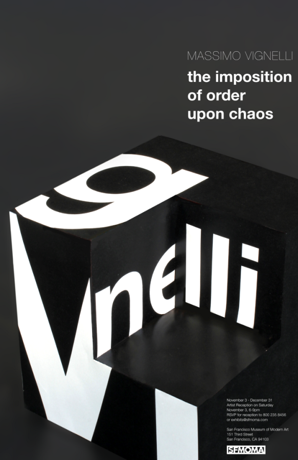
I believe that Massimo Vignelli’s work id best used to show his versatility. He had the architect background and brought that to all aspects of design. He did not only use his skills to make logos or graphic designs but instead he also created home where and furniture. He wanted to bring his simplistic views to all aspects of design to make the world an easier place to live. The exhibit should show his strive for simplicity yet a focus on beautiful design.
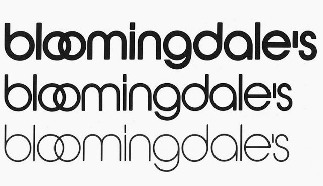
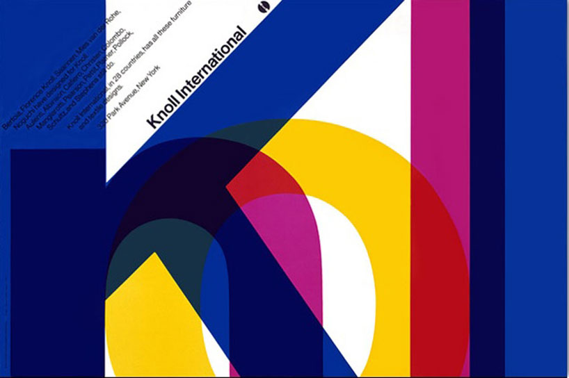
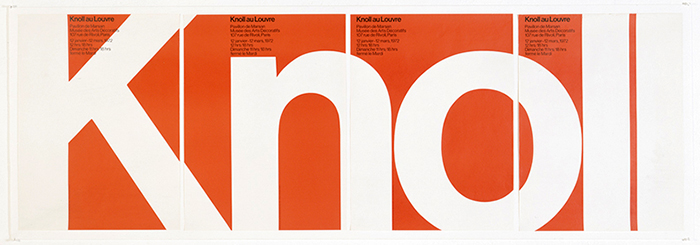
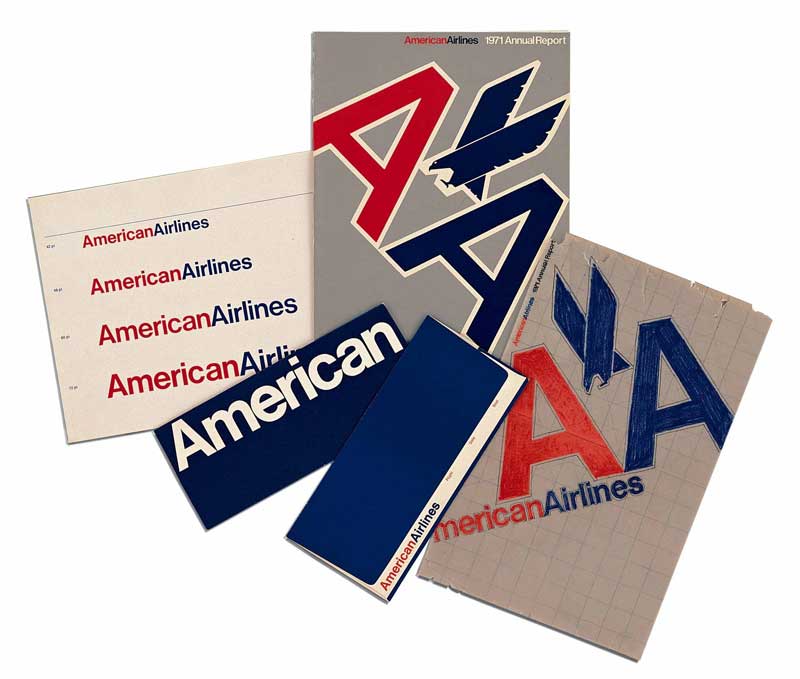
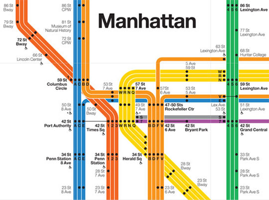
Massimo Vignelli was born in 1931 in Italy. He studied to be an architect during World War II. He used to say that if he was born a generation earlier or later he would not have been a Designer because he would either have had to participate in the war or be involved with the reconstruction after. He met his wife Lella in college and because of there shared interests in architecture and design they got married and became business partners. They both moved to New York to start their own design company Vignelli Associates. He is best known for designing logos for such companies as American Airlines and Bloomingdales as well as reconstructing the New York City subway map. He is also known as the man who brought Helvetica to the US. He had a very modernistic design approach, which could also be considered timeless because his designs are everywhere even today. He believed a good designer looked at the world and tried to make it better. Take away the things that are not needed and make everything much more simple. There is an ease to all of his work that I find comforting and smooth to look at. It takes a truly talented designer to take something so simple yet be able to make it there own and new.
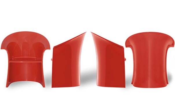
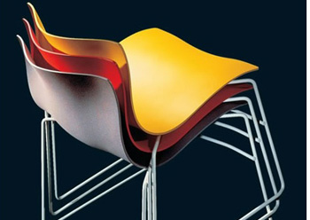
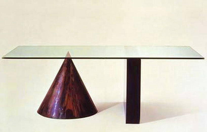
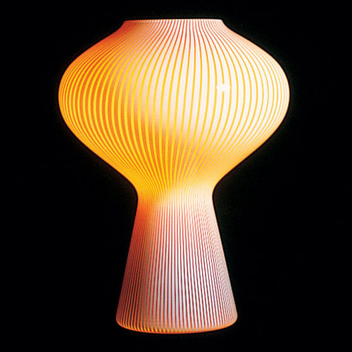
Massimo talked about how the materials that he would use to create the final outcomes for his design helped inspire him. He made a table out of just a sheet of metal and pipes that was so simple yet a beautiful design. He also used the grid and believed it was essential for design. Finally he had a need for his work to be immortal and timeless.
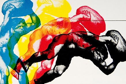
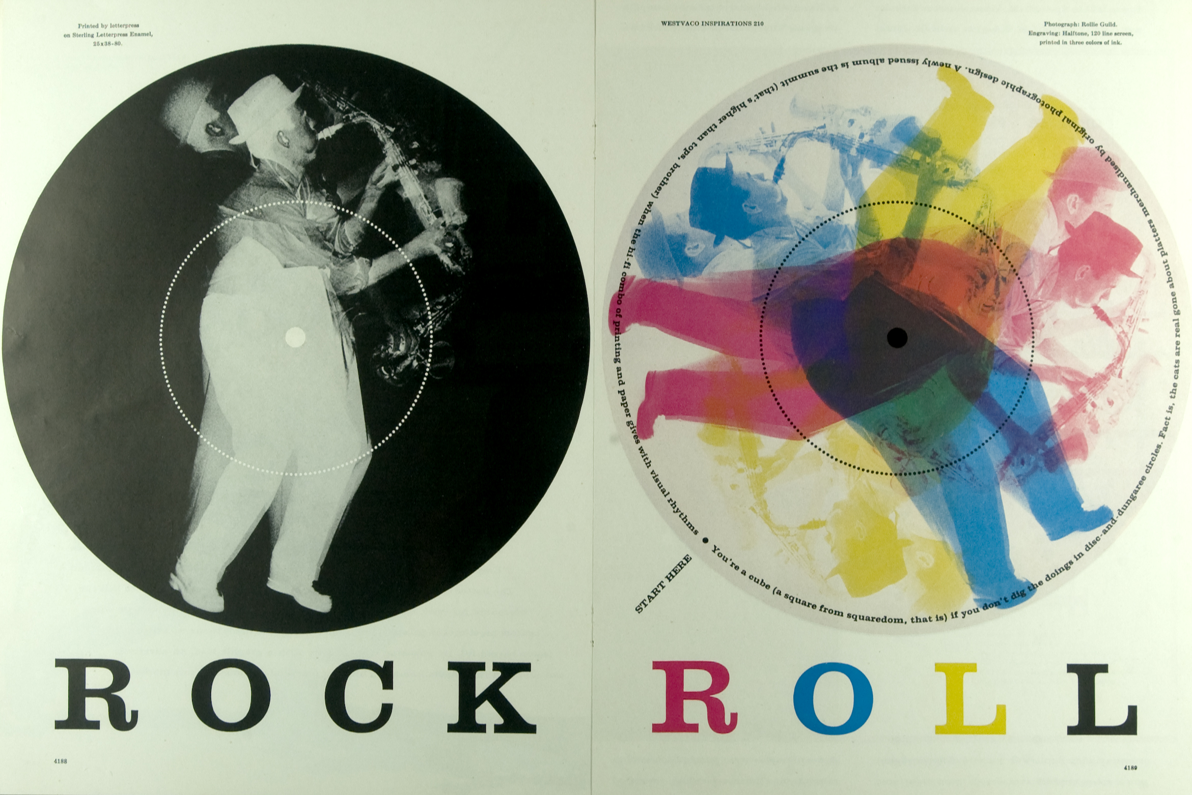
Bradbury Thompson was an influential designer of the twentieth century. His use of pop colors to accentuate certain areas of a design was intriguing to audiences around the world. People loved his work because it was generally vibrant and fun. He used color to add highlights and emphasize certain components of his work, like in his “Rock Roll: 1969-1979” or “Mademoisel: 1952”. Thompson also used shape and form to create his own hierarchy within his design and make certain elements stand out. The color schemes are simple and easy to absorb. Thompson would often work in conjunction with multiple designers over extended periods of time in order to perfect a design; whether it be a magazine cover, a poster, or another medium. Often Thompson makes use of the technique of silhouetting, where he blacks out or whites out one shape in order to make it come forth from the background. Thompson manages to do this with color too, which makes for quite an interesting piece.. Bradbury Thompson is thought to be a powerhouse designer of “pop art”, where color, form, and shape take precedence over the intimate details. Bradbury Thompson’s works connected powerfully with later designers and artists, and inspired them to continue the tradition of pop art into the modern era.
Bradbury Thompson: bibliography, facts, design
Bradbury Thompson: Graphic Design Archive
Three concepts I learned from Bradbury Thompson are:
1. Thompson stressed the importance of Background and Foreground imaging to bring his designs to life and add a 3 dimensional element to them.
2. Thompson made use of color to add highlights instead of shading.
3. Thompson really emphasized Shape and Form over the intimate details of a composition, which seemed to make the piece really pop.

Bradbury Thompson, Yale University Capital, 1968
-
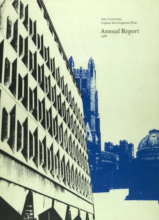
- Bradbury Thompson, Yale University Capital, 1968
-

-

-
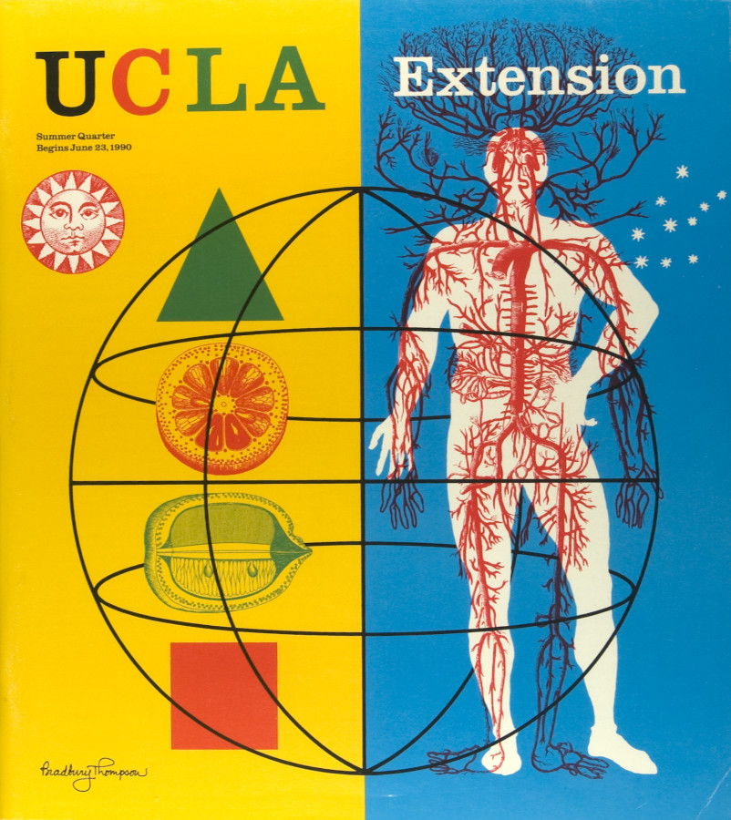
- Bradbury Thomson, UCLA Extension, 1990
-

-


-

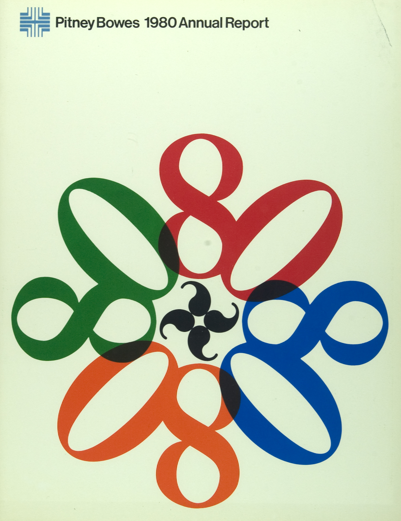
- Bradbury, Thompson, Pitney Bowes, 1980
-

-

-
- Bradbury Thompson, Inspiration for Printers II, 1953-1955
-

-
-

- Bradbury Thomson, Rock Roll, 1969-1979
-

-

-
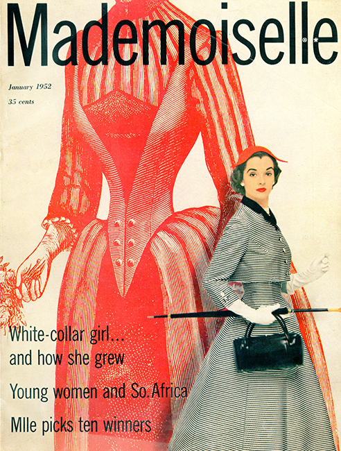
- Bradbury Thomson, Mademoisel, 1952
-

-

Tschichold, Transit Typeface, 1931
-
- Tschichold, Transit Typeface, 1931
-

-
-

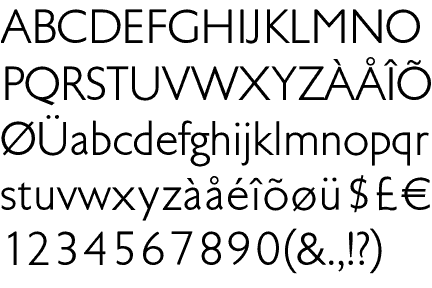
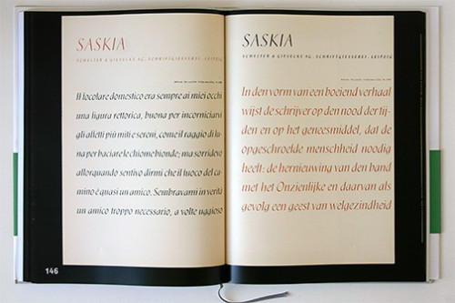
- Tschichold, Saskia Typeface, 1931/32
-

-
-
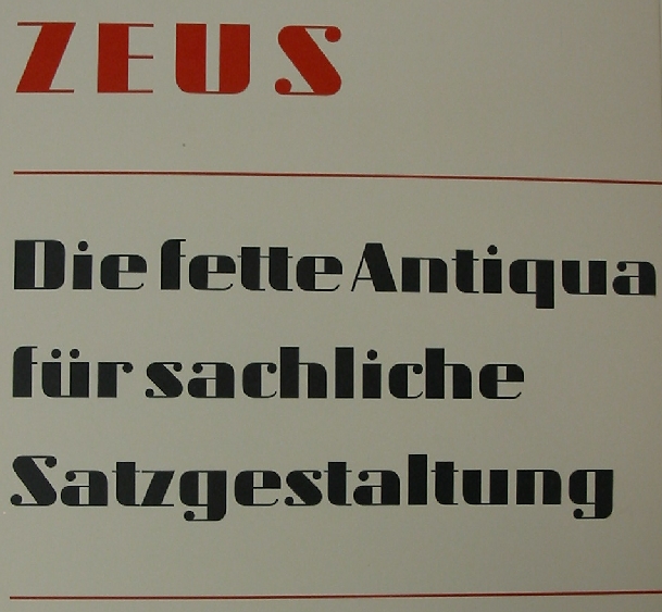
- Tschichold, Zeus Typeface, 1931
-

-

-
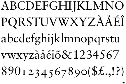
- Tschichold, Sabon Typeface, 1966/67
-

-
-

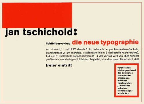
- Tschichold, Die Neue Typographie, 1928
-

-
-
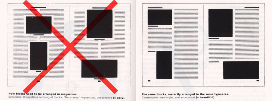
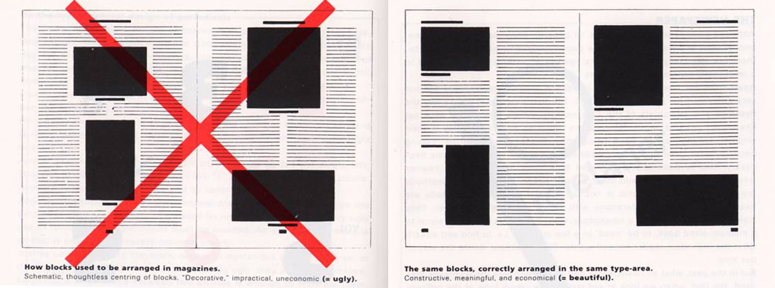
- Tschichold, Tschichold Grid, 1928
-

-

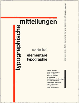
Tschichold, TYPOGRAPHISCHE MITTEILUNGEN, 1925
-
- Tschichold, TYPOGRAPHISCHE MITTEILUNGEN, 1925
-

-
-
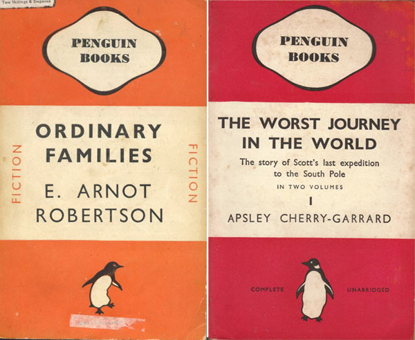
- Tschichold, Penguin Books, 1941
-

-

-
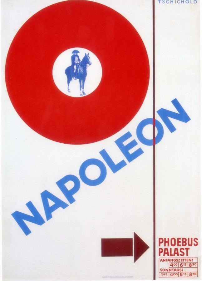
- Tschichold, Napoleon, 1927
-

-


-

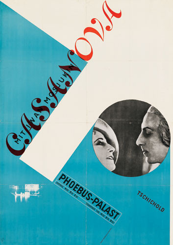
- Tschichold, Casanova, 1927
-

-
-
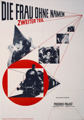
- Tschichold, The Woman Without a Name, 1927
-

-
Jan Tschichold was a creative man; a man of many beliefs. In Tschichold early years he had one specific beliefs about typography. He believed that the most powerful and important designs are made with san-serif typefaces. He criticized all other typefaces during this time. In 1928, Tschichold writes a book called, Die Neue Typographie (The New Typography), which introduces his new found philosophy. The book also conveys his opinion on asymmetry layouts. He designs a layout called the Tschichold grid which shows the right and wrong ways to design a layout. He thought that non-centered layouts can only bring more strength to your design, out with the classic and in with the abstract. His early career demonstrates this philosophy. In posters he designs for movies like, Casanova, Napoleon, and The Woman Without a Name, he layers with intense diagonals and contradicting angles. The pieces show his value for modernist design. Tschichold did not stick with modernist designs for much longer in his career. In 1947-49 he designed the Penguin Books, which, compared to his older designs, were extremely different. These books had centered type, simplified designs, and basic formatting. He abandoned all his former beliefs and called the Die Neue Typographie, too extreme. He went as far to say that the modernist design all together was fascist. In 1966/67 he then created a serif font, Sabon, which became a bestseller from then on.
Born in Leipzig, Germany on April 2, 1902, Jan Tschichold started working with typography at a very young age. He fled to Switzerland during the start of the Nazi party. Germany had strict rules against typography and only used Blackletter calligraphy. When Tschichold expanded typography and used san-serif typefaces, which were said to be a threat to the cultural heritage of Germany, the Germans took much of his work before he fled to Switzerland. He would become a writer, teacher, and designer of typefaces. He created the typeface, Sabon, which is still an extremely popular font. He published books like, Penguin Books, Die Neue Typographie, The New Typography and he oversaw the creations of more than 500 books between 1947-49. Tchischold was one of the most powerful influences of 20th century typography. His career has made a huge impact on how we think and use typography today.
I really enjoy looking at his work. Almost all the covers he designs are created with angles, levels, bold, and are distinctively no more than three colors. His work is simple, but rugged at the same time. His words are jumbled together onto one page, but the viewer is able to understand the flow and read it clearly. His work seems to have a modern feel with what people design today.
Research Links: Design is History
-
Classroom
-
-
Recent Posts
Recent Comments
- Danielle Vizard on Thinking with Type — TEXT
- Danielle Vizard on Digging’ It!
- Jenna on Thinking with Type — TEXT
- Jenna on Digging’ It!
- Elizabeth Robinson on Digging’ It!
Archives
- November 2023
- August 2023
- May 2023
- April 2023
- March 2023
- February 2023
- January 2023
- December 2022
- November 2022
- October 2022
- September 2022
- August 2022
- July 2022
- June 2022
- May 2022
- February 2022
- December 2021
- November 2021
- October 2021
- September 2021
- August 2021
- June 2020
- February 2018
- December 2015
- November 2015
- October 2015
- September 2015
- August 2015
Categories
-
About
KSC GRAPHIC DESIGN

Leave a Reply
You must be logged in to post a comment.