Elizabeth Robinson
Jan Tschichold
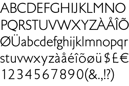
Tschichold, Transit Typeface, 1931
-
- Tschichold, Transit Typeface, 1931
-

-
-

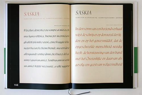
- Tschichold, Saskia Typeface, 1931/32
-

-
-
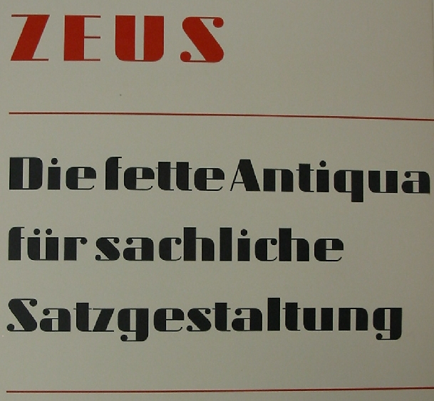
- Tschichold, Zeus Typeface, 1931
-

-

-
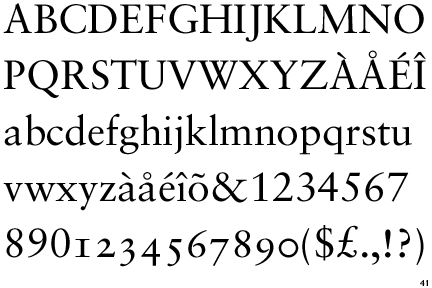
- Tschichold, Sabon Typeface, 1966/67
-

-
-

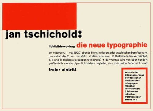
- Tschichold, Die Neue Typographie, 1928
-

-
-
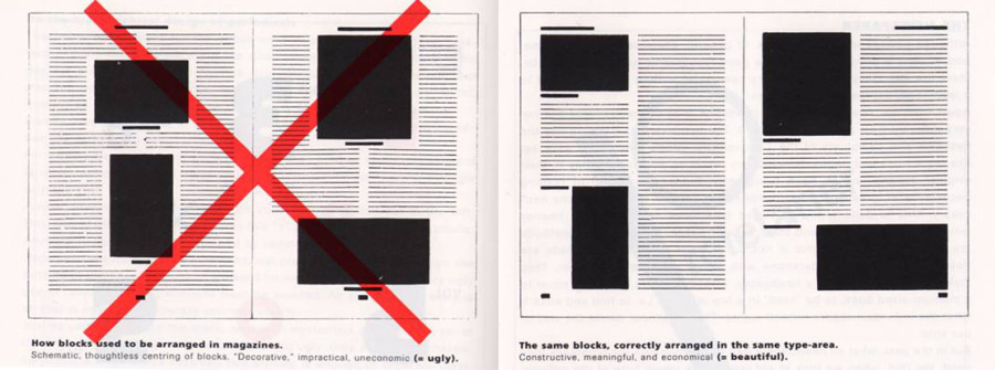
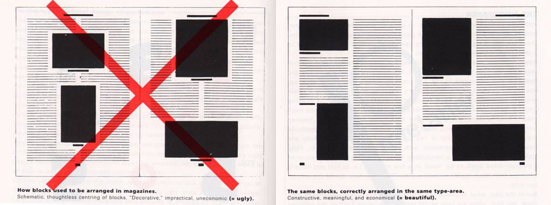
- Tschichold, Tschichold Grid, 1928
-

-

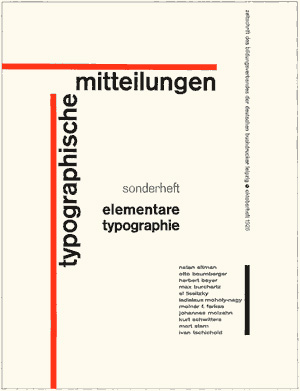
Tschichold, TYPOGRAPHISCHE MITTEILUNGEN, 1925
-
- Tschichold, TYPOGRAPHISCHE MITTEILUNGEN, 1925
-

-
-
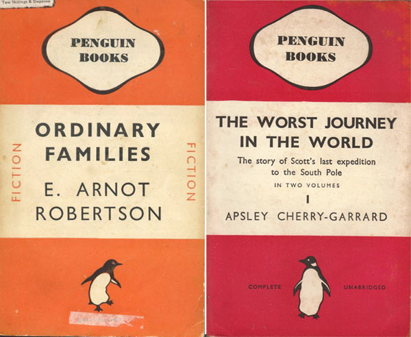
- Tschichold, Penguin Books, 1941
-

-

-
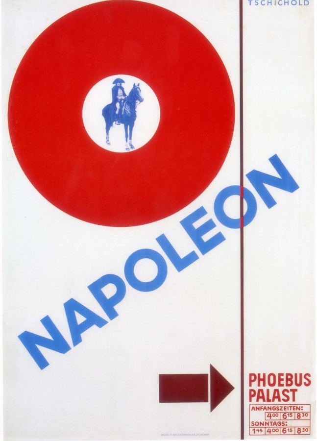
- Tschichold, Napoleon, 1927
-

-


-

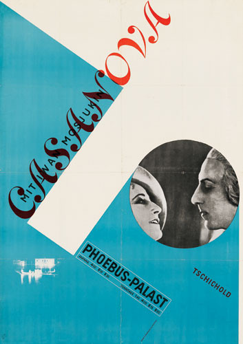
- Tschichold, Casanova, 1927
-

-
-
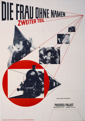
- Tschichold, The Woman Without a Name, 1927
-

-
Jan Tschichold was a creative man; a man of many beliefs. In Tschichold early years he had one specific beliefs about typography. He believed that the most powerful and important designs are made with san-serif typefaces. He criticized all other typefaces during this time. In 1928, Tschichold writes a book called, Die Neue Typographie (The New Typography), which introduces his new found philosophy. The book also conveys his opinion on asymmetry layouts. He designs a layout called the Tschichold grid which shows the right and wrong ways to design a layout. He thought that non-centered layouts can only bring more strength to your design, out with the classic and in with the abstract. His early career demonstrates this philosophy. In posters he designs for movies like, Casanova, Napoleon, and The Woman Without a Name, he layers with intense diagonals and contradicting angles. The pieces show his value for modernist design. Tschichold did not stick with modernist designs for much longer in his career. In 1947-49 he designed the Penguin Books, which, compared to his older designs, were extremely different. These books had centered type, simplified designs, and basic formatting. He abandoned all his former beliefs and called the Die Neue Typographie, too extreme. He went as far to say that the modernist design all together was fascist. In 1966/67 he then created a serif font, Sabon, which became a bestseller from then on.
Born in Leipzig, Germany on April 2, 1902, Jan Tschichold started working with typography at a very young age. He fled to Switzerland during the start of the Nazi party. Germany had strict rules against typography and only used Blackletter calligraphy. When Tschichold expanded typography and used san-serif typefaces, which were said to be a threat to the cultural heritage of Germany, the Germans took much of his work before he fled to Switzerland. He would become a writer, teacher, and designer of typefaces. He created the typeface, Sabon, which is still an extremely popular font. He published books like, Penguin Books, Die Neue Typographie, The New Typography and he oversaw the creations of more than 500 books between 1947-49. Tchischold was one of the most powerful influences of 20th century typography. His career has made a huge impact on how we think and use typography today.
I really enjoy looking at his work. Almost all the covers he designs are created with angles, levels, bold, and are distinctively no more than three colors. His work is simple, but rugged at the same time. His words are jumbled together onto one page, but the viewer is able to understand the flow and read it clearly. His work seems to have a modern feel with what people design today.
Research Links: Design is History

Leave a Reply
You must be logged in to post a comment.