Julia Hannan
Adrian Frutiger
Part 1
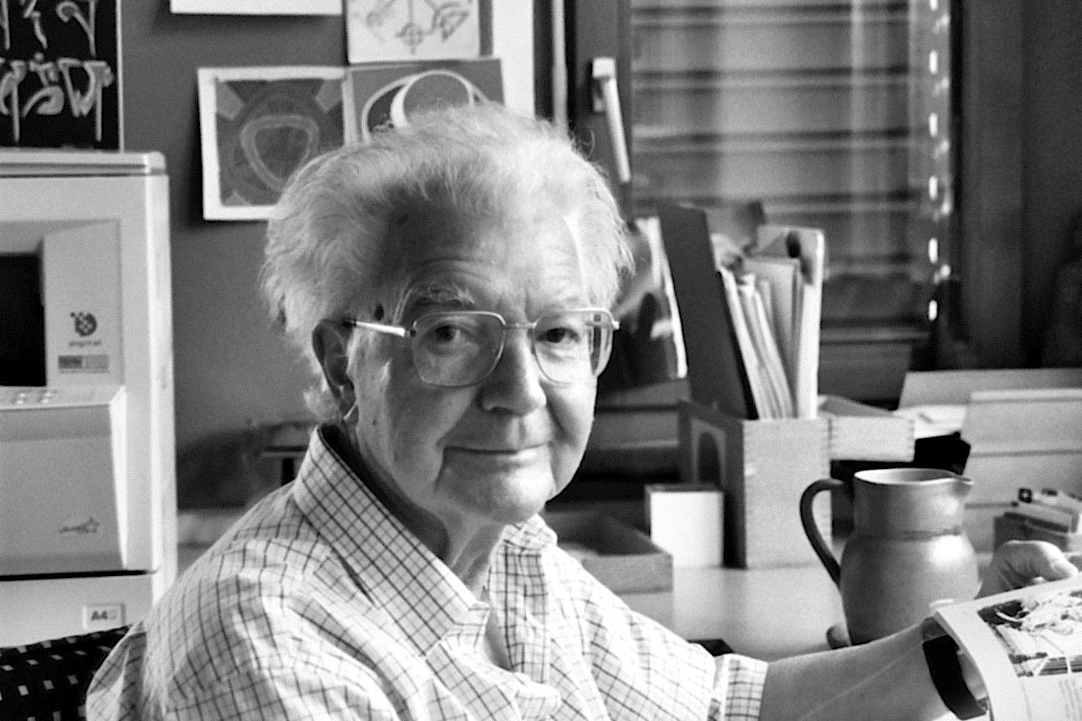
Adrian Frutiger was a Swiss designer of typeface. He was born on May 24, 1928 and died very recently on September 10, 2015 at the age of 87. Frutiger graduated from the School of Applied Arts in Zurich in 1952. After high school, he spent most of his career working for Deberny & Peignot in Paris and became their artistic director. His job was to update and change typefaces through the 20th to the 21st century. He prepared them for photo-typesetting, and created his own typefaces. He designed around 40 typefaces himself. He created Univers, which we have used in class recently on a project, which I thought was pretty interesting. Some of his other well known typefaces are Frutiger, Egyptienne, Serifa and Avenir. It’s wonderful that today we still use his fonts and they are still advertised all over the world. In the 1970’s, he designed a typeface for the Paris Charles de Gaulle airport (Frutiger). He was a professor at the Ecole Estienne for 10 years and spent 8 years at the Ecole Nationale Supérieure des Arts Décoratifs, Paris. His career spanned through three eras, including the hot metal, phototypsetting, and digital typesetting.
Part 2
Frutiger once said, “A letter follows the same canons of beauty as a face: A beautiful letter is in perfect proportion. The bar of a ‘t’ placed too high, the curve of an ‘a’ too low, are as jarring as a long nose or a short chin.” This made me think that although nothing is perfect, there are attractions to each letter as there are a face.
Frutiger paid attention to the inside of letters as well as the letter itself, which is what made each letter a little different, or showed the different of an “O” and a “0” (zero).
One of his most known hallmarks is the square dot over the lowercase “i”, which makes it look different from an “l” or “I”.
Part 3

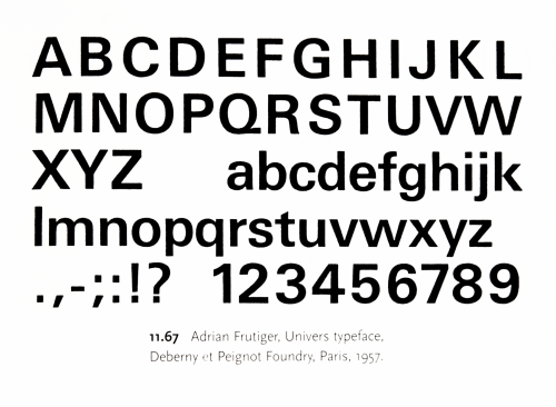
Frutiger, Univers Typeface, 1957
-

- Frutiger, Univers Typeface, 1957
-

-
-
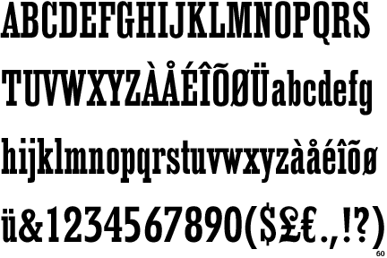
- Frutiger, Egyptienne, 1956
-

-
-
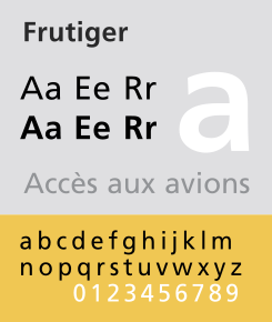
- Frutiger, Frutiger, 1975
-

-
-
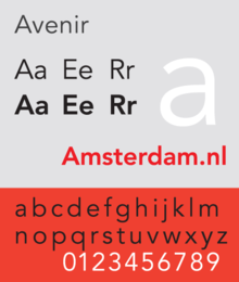
- Frutiger, Avenir, 1988
-

-
-

- Frutiger, Humanist, 1976
-

-
-
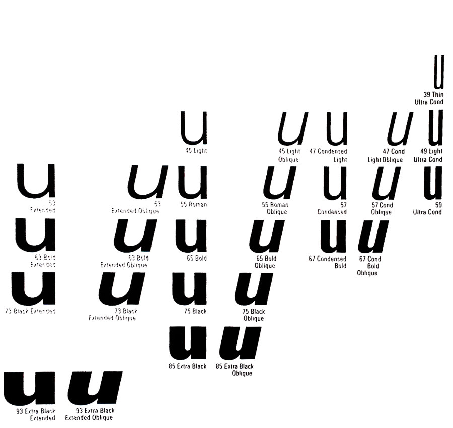
- Frutiger, Univers, 1957
-

-


-
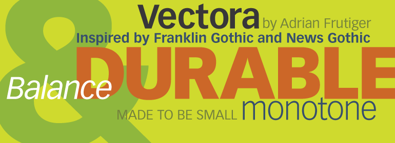
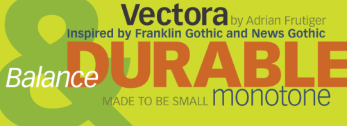
- Frutiger, Vectora, 1990
-

-
-
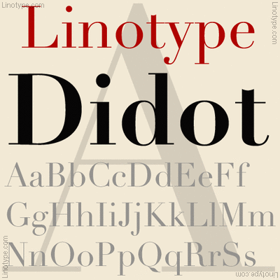
- Frutiger, Linotype Didot, 1991
-

-
-

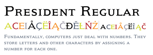
- Frutiger, President, 1954
-

-
-

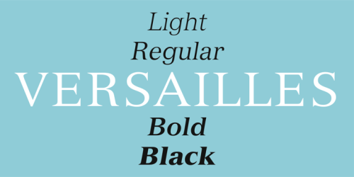
- Frutiger, Versailles, 1982
-

-
Frutiger did not like purely geometric designs. In Frutiger’s work with typeface, he uses weights in the typefaces. For example, with Univers, he uses a weight scale with numbers, rather than names. He used numbers so that the typeface could be translated through the world, as different sizes had different names in different countries. The family of letters would have multiple widths and weights all following a certain form of letter. Frutiger also stated in an interview (on eye magazine) that “my main life’s work was designing sans serif typefaces. It is much more difficult to draw a grotesque than a roman face – much can be covered up with serifs in the latter. The grotesque is like the body of a fish, it is so smooth that no mistake can be allowed to happen!” He really loved using serifs in many of his fonts to make them easier to read.
Sources

Leave a Reply
You must be logged in to post a comment.