Piet Zwart
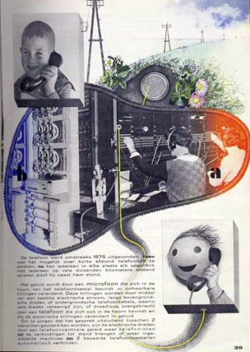
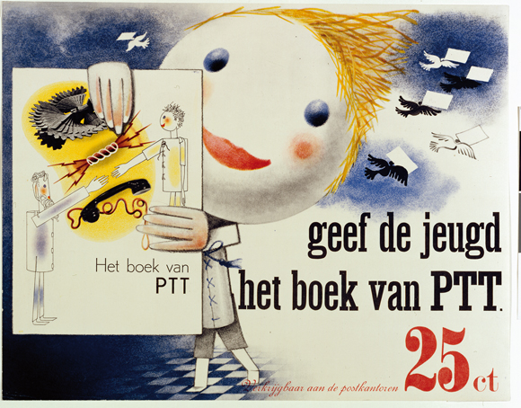
Piet Zwart was a Dutch photographer, typographer, architect, and graphic designer, however he referred to himself as a “typotekt” (typography and architect) because he built pages with type. He first attended The School of Applied Arts in Amsterdam where he was introduced to all of these disciplines but mainly developed himself because teachers were not always present. There was a social revolution after World War 1 which offered Zwart a new direction where he launched his graphic design career in 1919. He became the assistant of the influential Dutch architect HP Berlage and was given assignments such as designing a Christian Science Church and a municipal museum. At the age of 36 he created his first typographic work when asked to design stationary for Jan Wil’s office. Zwart felt strongly attahced to radical ideas which propagated an abstract utopian world, however he did not wish to surrender entirely to the dogmatic ideas of those he was working with and felt his work was too playful to be restricted. He began working with photography and learned how to achieve a balance between texts, photographs, and white space. In 1930 he was approached for the design of “The Book of PTT” which taught young kids how to use the Dutch postal service; Zwart wanted to make them curious and encourage self reliance. Each page was colorful and bright and exciting. He used photography and collages along with drawings and various types of fonts. After the publication of the book, he had been fired from the Rotterdam Academy of Fine Artsin 1933 after being explicit in sharing his thoughts on the redevelopment of Art Education. Piet was known for his indiscretion, he didnt stop working until 3 am, barely took vacations, and rarely left his desk. His work came to and end when he was arrested by German Soldiers in 1942 and held hostage with 800 other prominents. he mainly focused on industrial design after he was released and then died in 1977 at the age of 92. His versatility and influence on present day designers led the Association of Dutch Designers to award him with the title “Designer of the Century” in the year 2000.
“Among the few I have indicated, is there no dynamic man of action, the rebel who will help determine the aspect of the collective expression of tomorrow? Ponder this question and know that to make beautiful creations for the sake of their aesthetic value will have no social significance tomorrow, will be non-sensical self-gratification. Every era contains the conditions for providing a rebel.”
– Piet Zwart
Highlights:
- Worked in many disciplines but is known for his work with Graphic Design
- Made sure he didnt restrict his work to fall under specific categories; stayed true to himself and what he wanted to create
- Although he was a trained architect, he excelled with his work in typography and even more so when he learned how to add photography
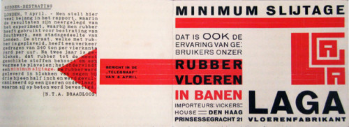
Piet Zwart, LAGA Rubber Flooring, 1923,
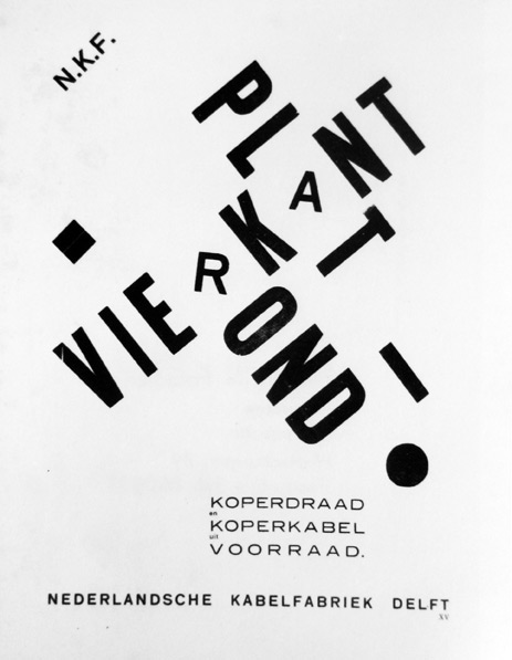
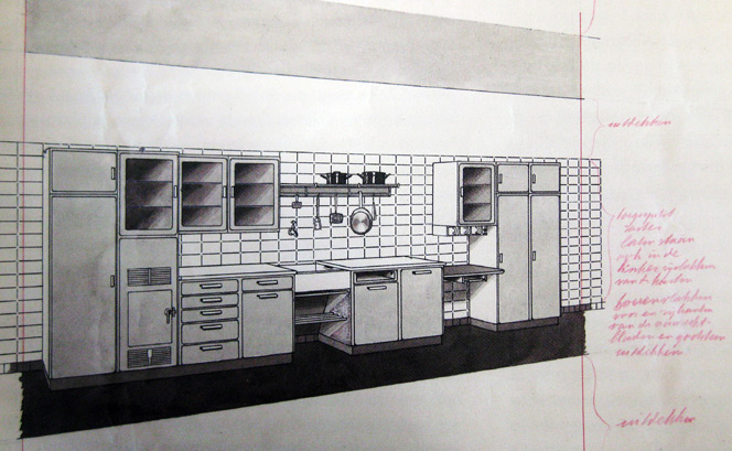
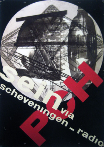
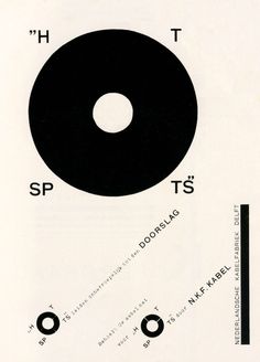
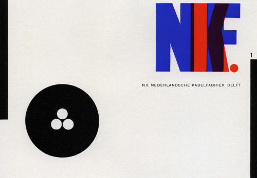
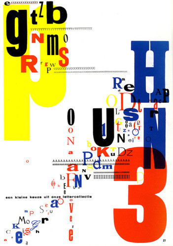
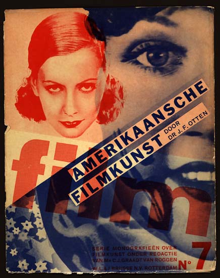
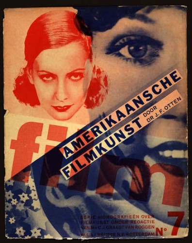
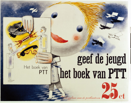
Piet uses mostly Primary colors in all of his works which are evident in all of these pieces. In some, such as The Book of PTT, he strays slightly from the Primary colors but not very far. He also likes to use cream or beige looking backgrounds which perhaps makes the colors pop more. Most of these works are works of typography where he favors block letters and in most cases they are overlapping or at a diagonal.















Leave a Reply
You must be logged in to post a comment.