Matt deWolf
Wolfgang Weingart
Gallery
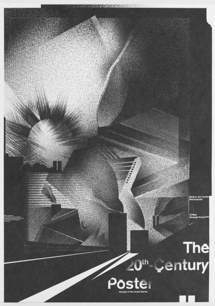
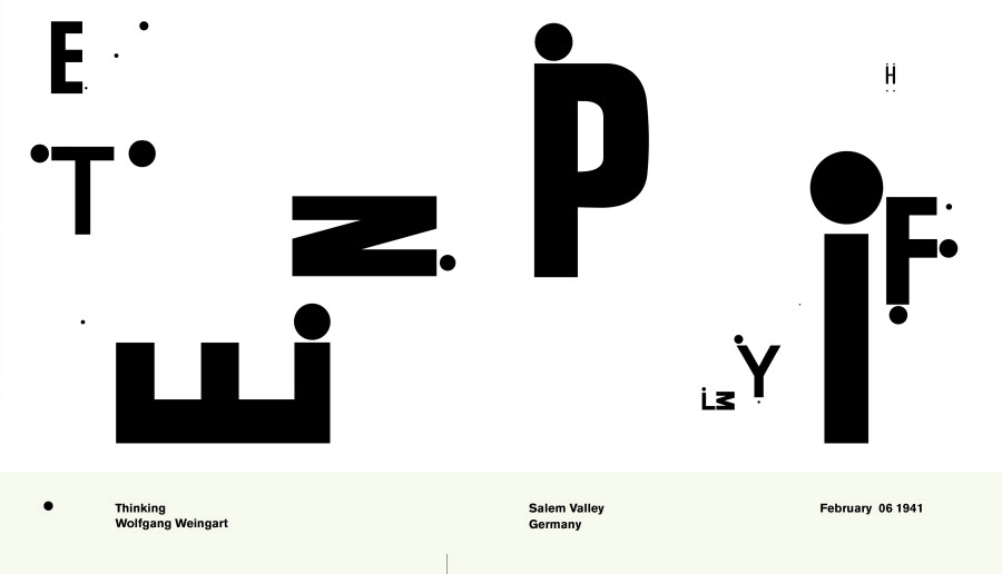
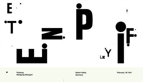
Wolfgang Weingart, The 20th Century Poster, 1984
-
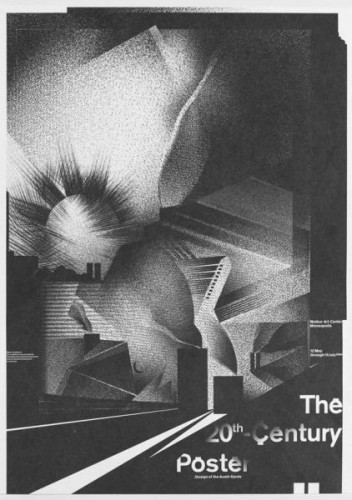
- Wolfgang Weingart, The 20th Century Poster, 1984
-

-
-
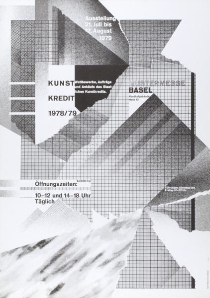
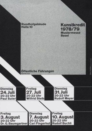
- Wolfgang Weingart, kunstkredit 1978/79, 1979
-

-
-
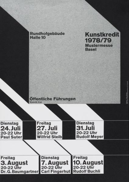
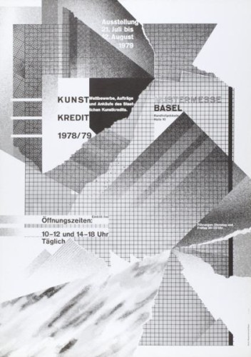
- Wolfgang Weingart, kunstkredit 1978/79, 1978
-

-
-
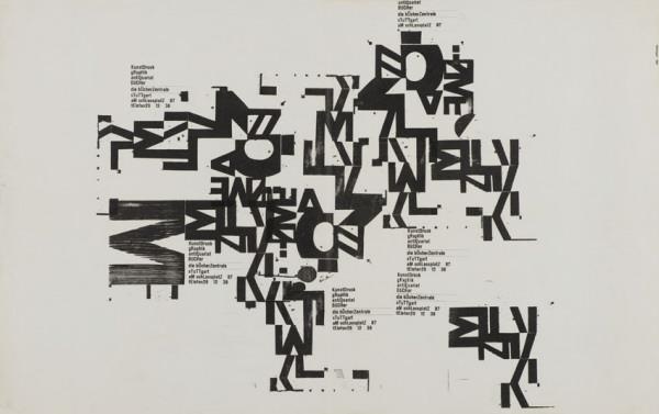
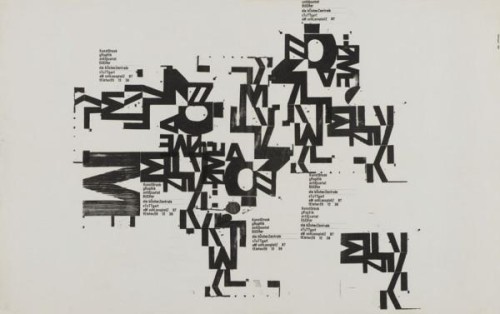
- Wolfgang Weingart, kunstdruck, graphik, antiquariat, bücher, 1962
-

-
-
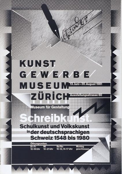
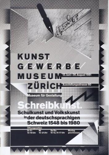
- Wolfgang Weingart, kunstgewerbemuseum zürich, 1981
-

-
-
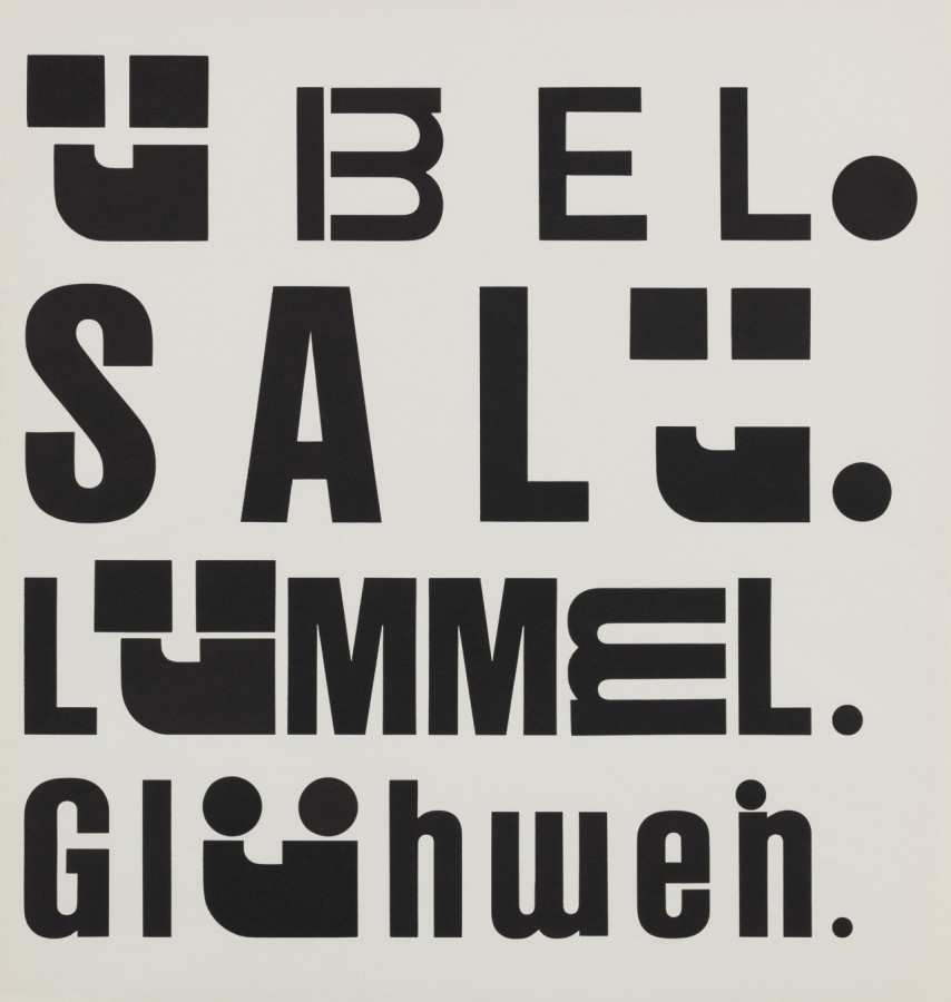
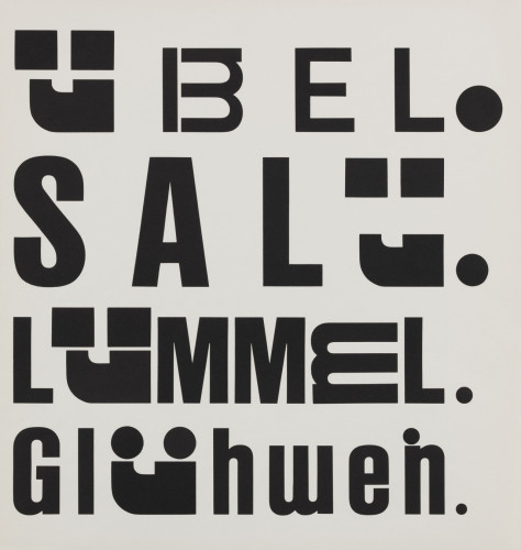
- Wolfgang Weingart, Kotzenbuch, 1972
-

-

-
- Wolfgang Weingart, Untitled?, 1970?
-

-

-
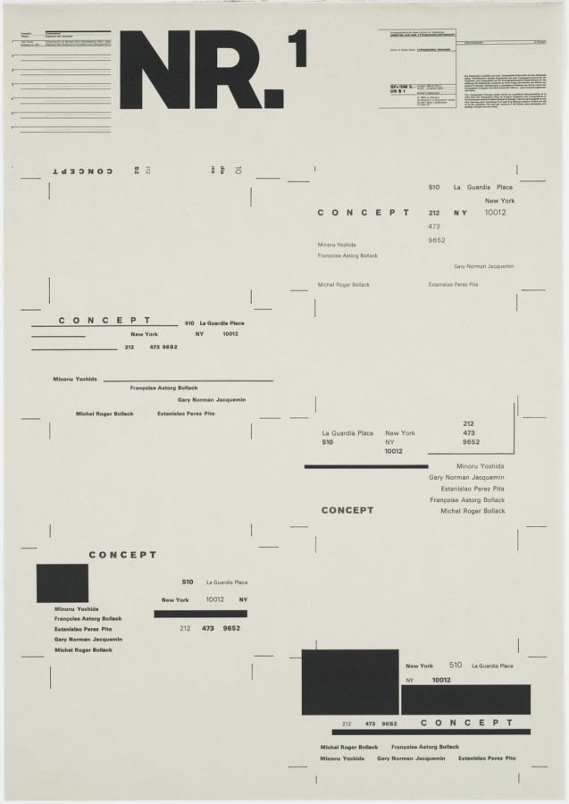
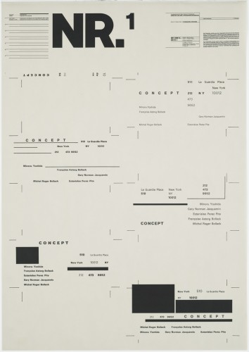
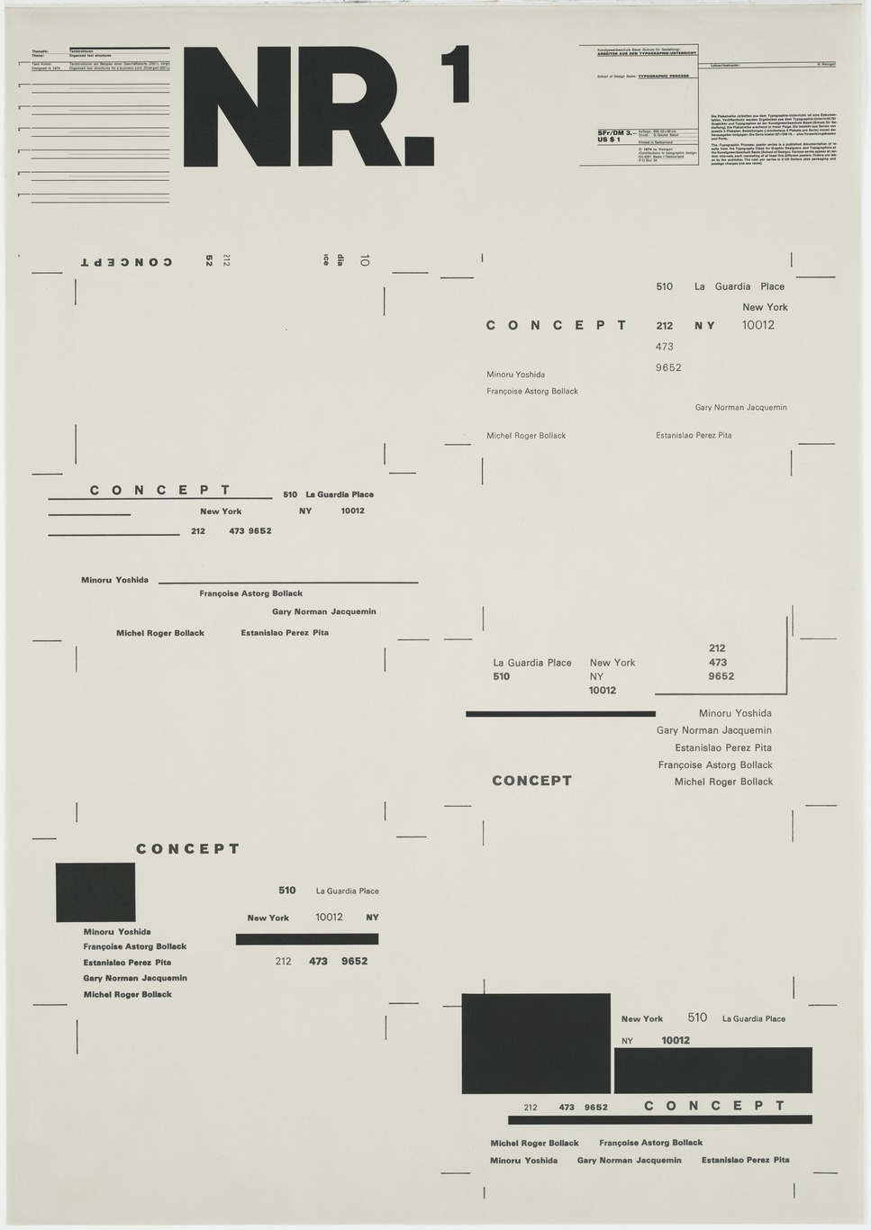
- Wolfgang Weingart, Nr. 1, 1974
-

-
-
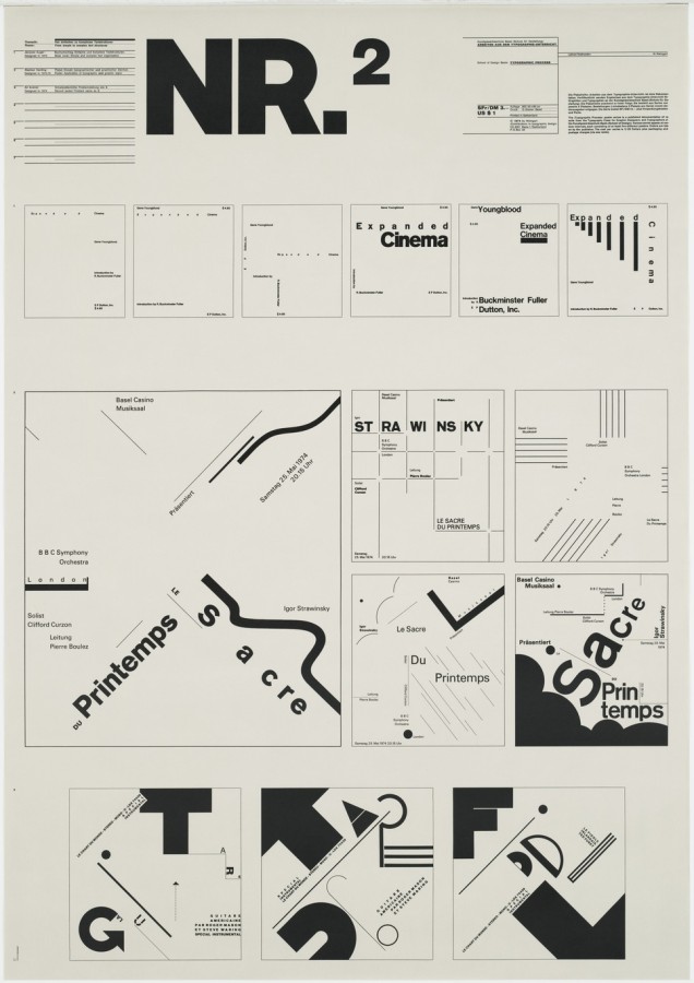
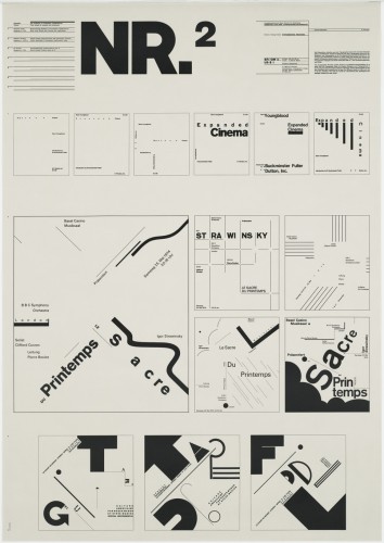
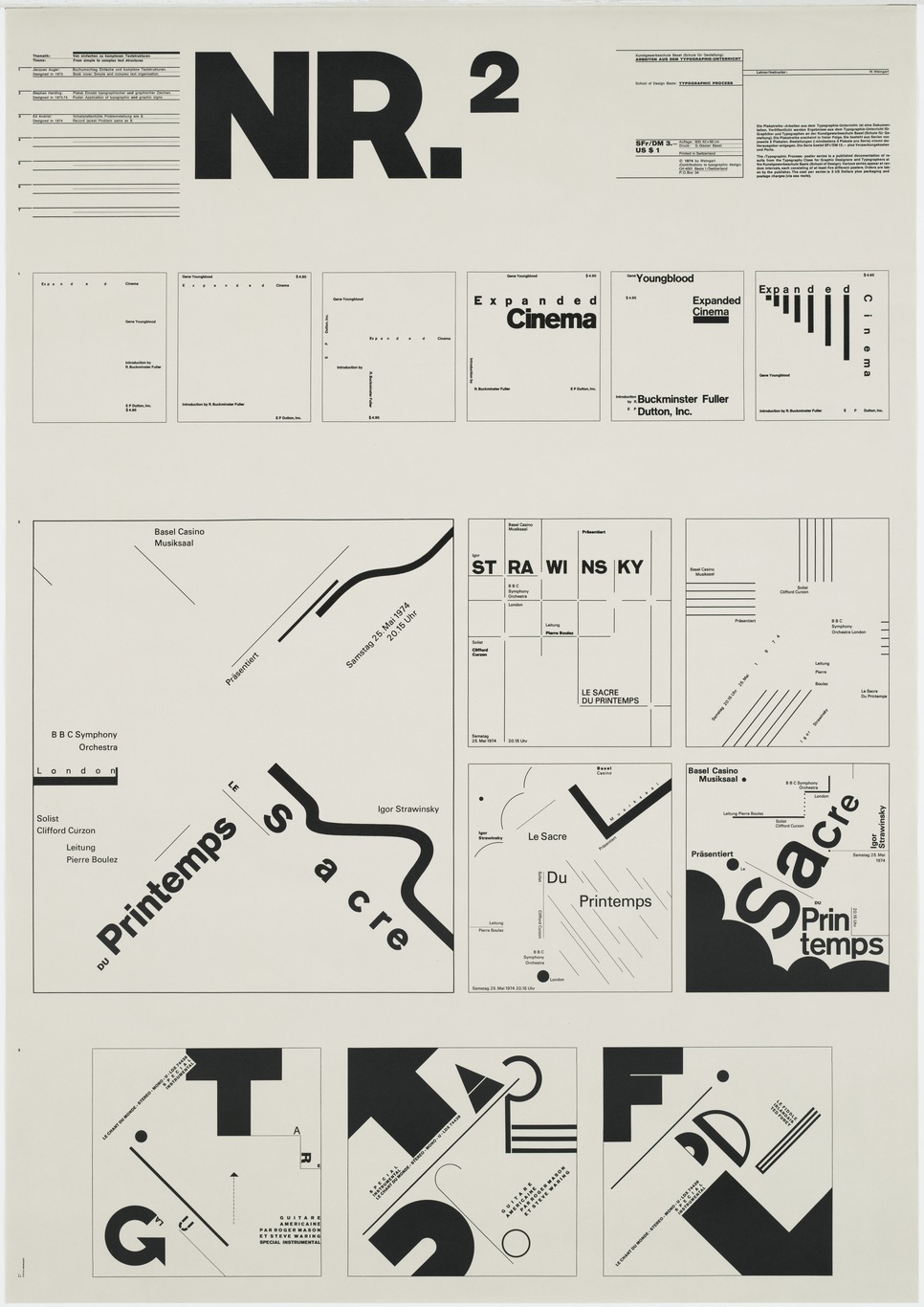
- Wolfgang Weingart, Nr. 2, 1973
-

-
-
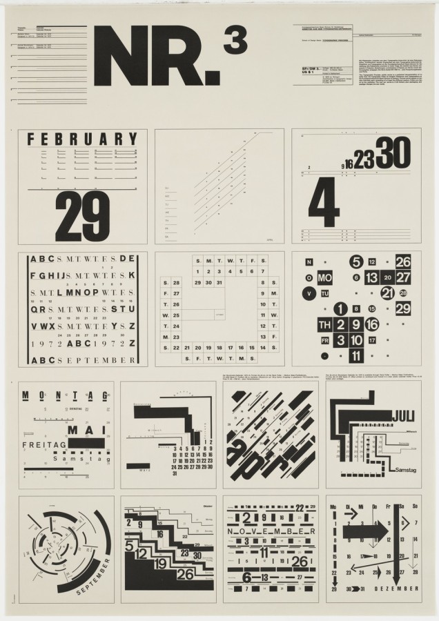
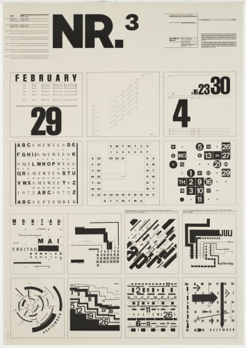
- Wolfgang Weingart, Nr. 3, 1971-2
-

-

-
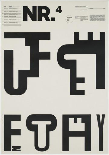
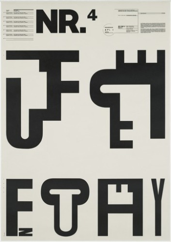
- Wolfgang Weingart, Nr. 4, 1971
-

-
-
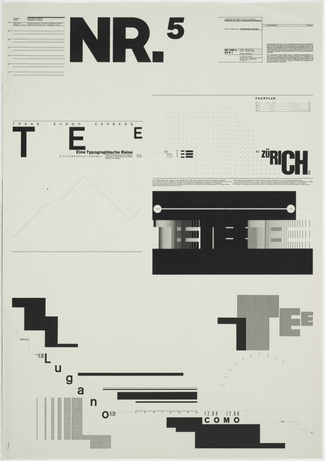
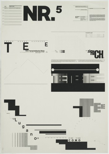
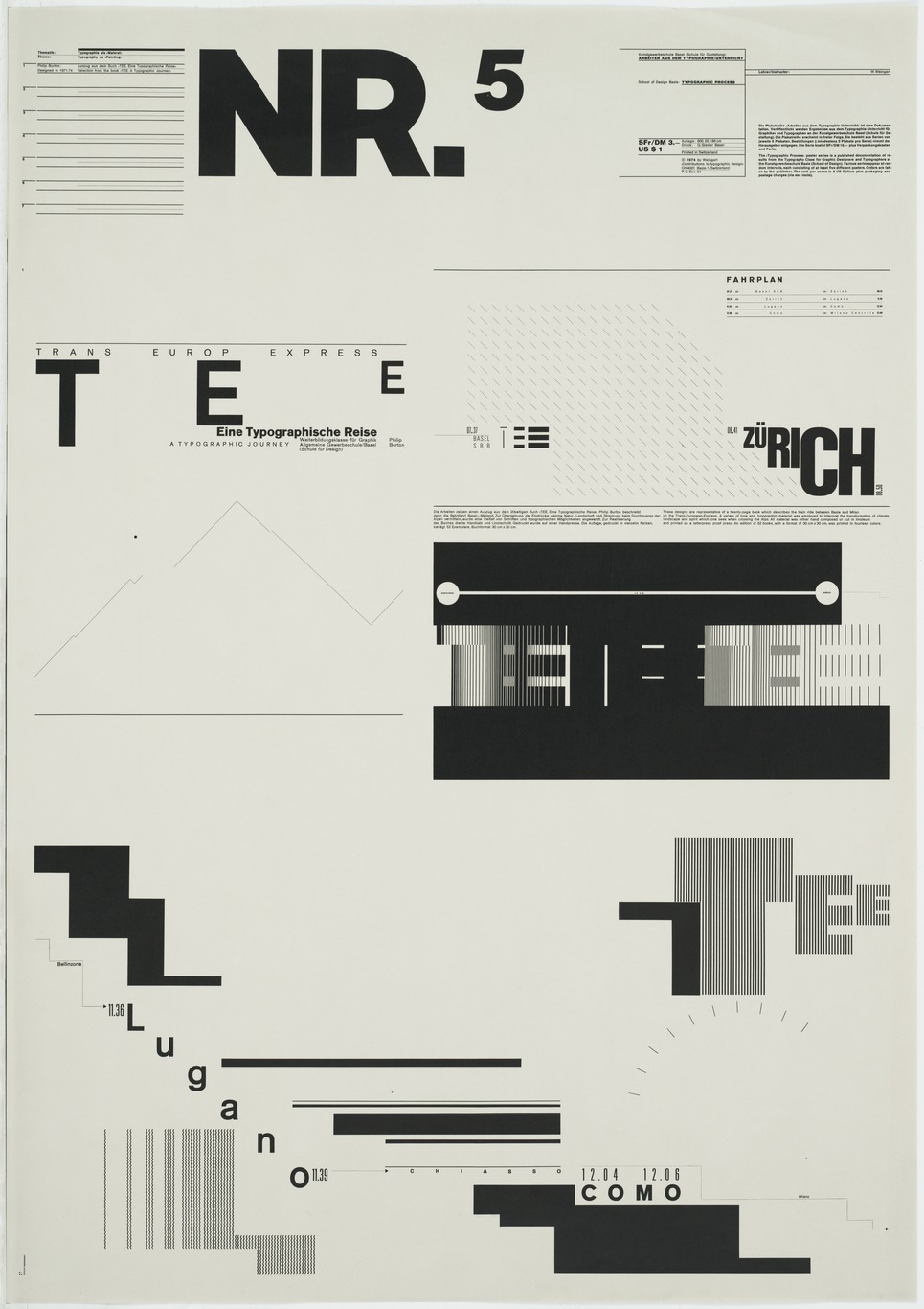
- Wolfgang Weingart, Nr. 5, 1971-4
-

-
About the Gallery
Wolfgang Weingart has found a way to break the rules of traditional Swiss typography and still make it look crisp. Although he uses sans serif fonts like the traditionalists, and works on a grid, he does so in new, dynamic way. His works exemplify disorder yet also have an asymmetrical balance to them. Throughout his works he combines letters in order to create an interesting array of abstract shapes. The strong use of black and white in most of his works lends itself to simplicity and focus. The distraction of color isn’t there to take away from the elegant and remarkable letter combinations. Having an internship as a typesetter allowed Weingart to physically interact with the letters and give him a better understanding of how they could work together.
Biography
Wolfgang Weingart is a graphic designer who is most noted for his exploration of typography. In 2013 he was awarded one of the most prestigious awards in the graphic design field, the AIGIA Medal. Weingart was born in Germany, 1941. At the age of 17 he started school, pursuing design at Merz Academy. After a two year program he took on a three year apprenticeship with Ruwe Printing. There Weingart started to develop his own style. He had a carelessness about his work that was consistent enough to turn into its own sector of Swiss Typography known as, Swiss Punk and New Wave type. After gaining attention for making innovative decisions during the internship, Weingart went on to teach and also practice at the Basel School of Design.
Traditional Swiss Typography was primarily concerned with the legibility of the type but Weingart thought of it much differently. He thought that if the text didn’t catch your eye or have any sort of concern with aesthetics than nobody would read it anyways. Weingarts mission was to create legible text that would be visually captivating. He found that his typesetting internship influenced him to use unconventional methods for printing and creating compositions. He broke the tradition of having perfect 90 degree rules and created what he believed to be more elegant and abstract. While teaching, Weingart even instructed that students work by hand and not on a computer when first exploring ideas. A tactile approach netted a better understanding for the students and even Weingart himself. If a person couldn’t draw and only knew the technical side of design then Weingart believed that they would never be able to completely understand and create a successful design.
Signature Points
- An internship where Weingart had to physically typeset led him to take a more tactile approach which had a profound influence on his methodology.
- Type has to be exciting enough to capture the attention of the audience but also legible enough to have clear meaning.
- Although he had a rebellious style he knew how to handle the problems of typography and could control himself when working for specific clients that needed clean and traditional type.
References
AIGA Medal Article
Keith Tam on Weingart
Weingart Magazine Interview
Poster Index
Type Token Posters
MoMA Gallery

Leave a Reply
You must be logged in to post a comment.