- Ê
- Â
å Monday, November 16th, 2015
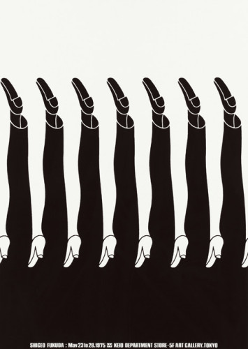
Shigeo Fukuda was born in Tokyo, Japan in 1932. Fukuda is considered to be “Japan’s consummate visual communicator” as the ADC Global puts it. He is the first Japanese designer to be placed into the Art Directors Hall of Fame. Fukuda is known for his illusionism designs as his biggest influence in life was a modern Japanese graphic designer by the name of Takashi Kohno. Fukuda is extremely well represented in his designs where he is very raw, truthful, and real with his artworks. He explains his work as “I believe that in design, 30% dignity, 20% beauty and 50% absurdity are necessary. Rather than catering to the design sensitivity of the general public, there is advancement in design if people are left to feel satisfied with their own superiority, by entrapping them with visual illusion.” Designers should be able to design things that make them happy and what they truly believe in, whether or not it is popular among others. Fukuda really exemplifies his beliefs and his true feelings in his work and he is a great designer in which he pours his heart into his pieces and people can either agree or disagree. ADC Global also talks about the “Victory 1945” which is his most famous poster. He won a grand prize in the 1975 Warsaw Poster Contest. As I looked up the poster, I was amazed at how simple the poster was as it only captured two images but it portrayed such a strong, powerful message. I also saw his work “Legs” and did not know that that was his work. This piece really holds a lot for me as this image was one of the reasons why I wanted to change my major to Graphic Design in the first place. Just the fact that I happened to be placed with the artist behind this work really baffles my mind and makes me really appreciate graphic design and especially Shigeo Fukuda. Fukuda’s illusion designs really cause the audience to really stop and think about his designs. All of them have such an incredible meaning whether it’s on peace in the world or the close knit relationships humans hold with each other, Fukuda has created a way where all his works all have a story and portray great importance.
1. Fukuda is an optical illusion designer
2. His works convey a special meaning towards world issues in his work.
3. Highly respected across the world especially in Japan (representative of Japan) as he was the first Japanese designer to be inducted into the Hall of Fame.
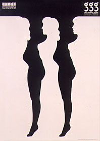
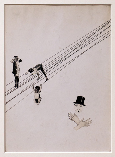
Shigeo Fukuda Shigeo Fukuda: Illustrick 421/GGG/Ginza (1986)
-
- Shigeo Fukuda Shigeo Fukuda: Illustrick 421/GGG/Ginza (1986)
-

-
-

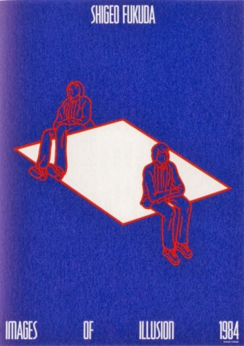
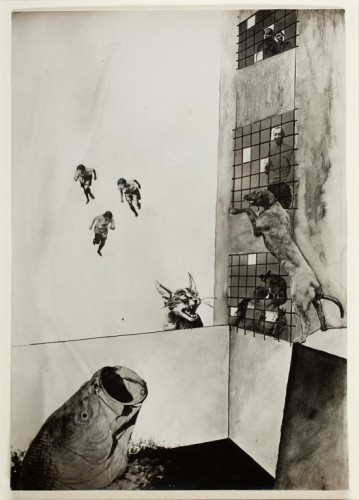
- Shigeo Fukuda “Impossible Seating” (1984)
-

-
-
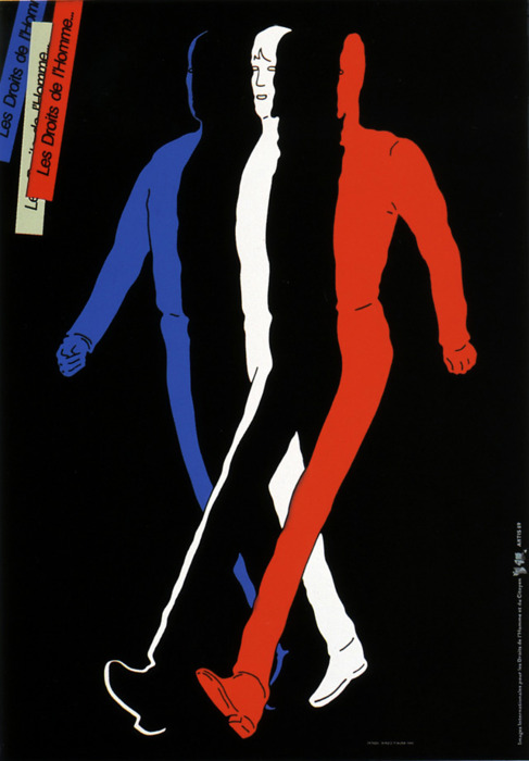
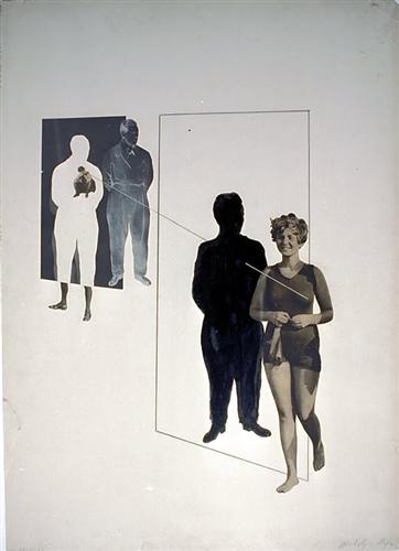
- Shigeo Fukuda “Human Rights” (1989)
-

-

-
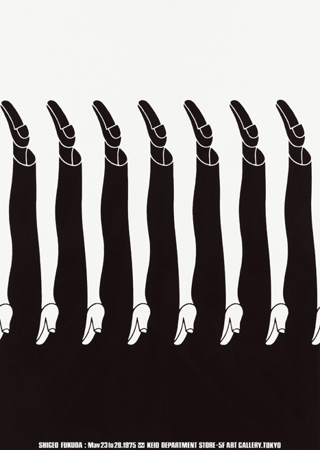
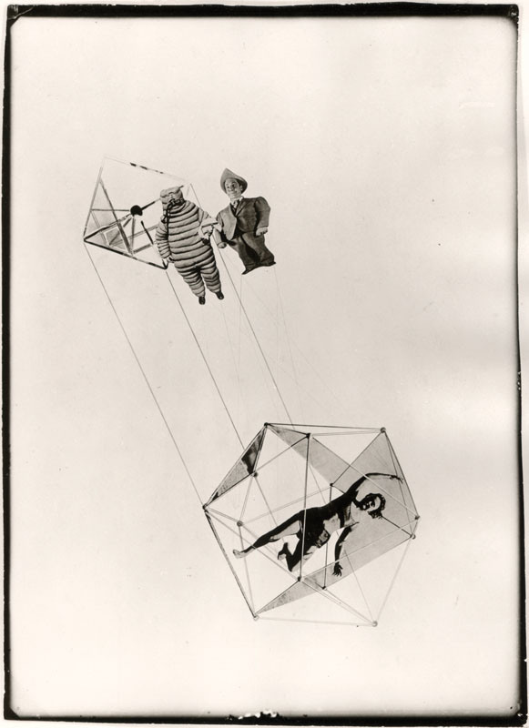
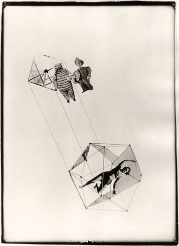
- Shigeo Fukuda “Legs” (1975)
-

-
-
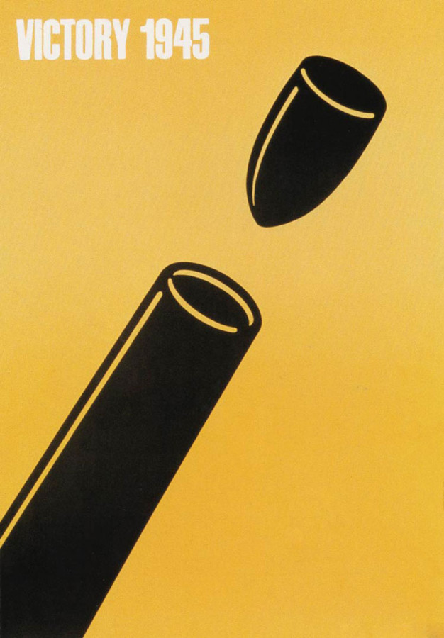
- Shigeo Fukuda “Victory 1945” (1975)
-

-


-
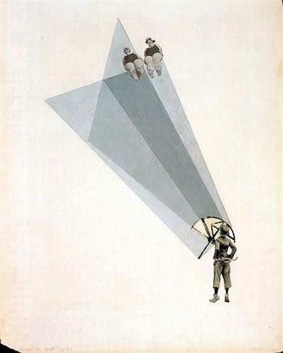
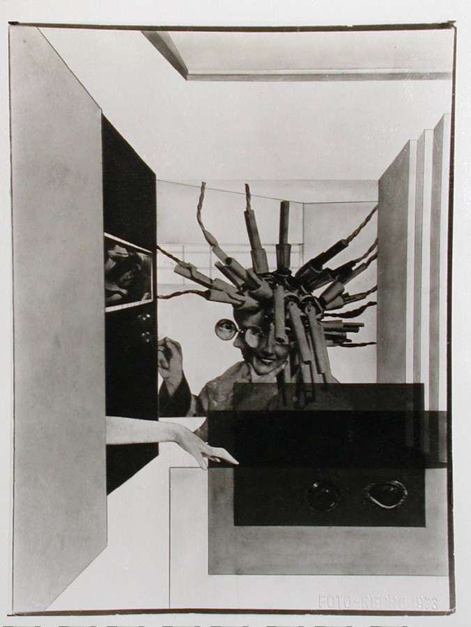
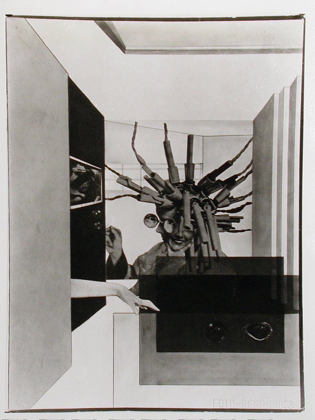
- Shigeo Fukuda “Lunch with a Helmut On” (1987)
-

-
http://adcglobal.org/hall-of-fame/shigeo-fukuda/
http://www.designishistory.com/1960/shigeo-fukuda/
http://www.opticalillusioncollection.com/2014/01/shigeo-fukudas-impossible-seating.html
Part 1
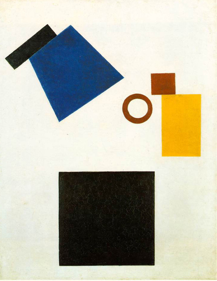
Kazimir Malevich started to draw at age 12 and he knew at a young age that he wanted to take on an artistic career and attended many art schools in his youth. He was a Russian painter and art theorist. He founded Suprematism, which is a form of simple geometric shapes with abstract painting. He combined the elements of cubism and futurism to create an abstract geometric approach of figures in space. In his first paintings, he used geometric shapes in a limited range of colors, in black alone, or against a white background. Later on, he introduced a broader range of colors as well as triangles, circles, and curved shapes. Malevich supported the October 1917 Revolution, In the years that followed he worked in political propaganda, painting posters and contributing articles about new art to the “Anarkkhia” (Anarchy) newspaper. Malevich was very interested in the spiritual movement and in expressing a spiritual reality beyond the physical reality through his art. Malevich says, “By Suprematism I mean the supremacy of pure feeling in creative art. To the Suprematist the visual phenomena of the objective world are, in themselves, meaningless; the significant thing is feeling.” I like how his work is so simple, yet it still leaves an impact on you and you can tell he put a lot of thought into each piece. One of his works was a relatively small painting filled with a large black square in a white background. He is known especially for this piece in particular. In the museum, it acts like a sudden silence. But when socialist realism was declared the official artistic doctrine of the Soviet Union, this painting and many other works by Malevich were removed and hidden from sight. He died of cancer in 1935 and was buried in a coffin made with his own design, the image of the Black Square placed on its lid. His work became internationally famous and acclaimed, but, under Stalin, his art was thought as being anti-nature, and his works were destroyed.
Part 2
- He founded a style of art called Suprematism, a geometric style with simple shapes and colors.
- Malevich supported the October 1917 Revolution, In the years that followed he worked in political propaganda, painting posters and contributing articles about new art to the “Anarkkhia” (Anarchy) newspaper.
- Suprematism, invented by Kazimir Malevich, was one of the earliest and most radical developments in abstract art.

Kazimir Malevich, Black Square, 1915
-
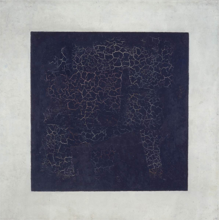
- Kazimir Malevich, Black Square, 1915
-

-

-

- Kazimir Malevich, Airplane Flying, 1915
-

-

-
- Kazimir Malevich, Suprematist Composition, 1916
-

-


-
- Kazimir Malevich, Suprematism, 1915
-

-
-
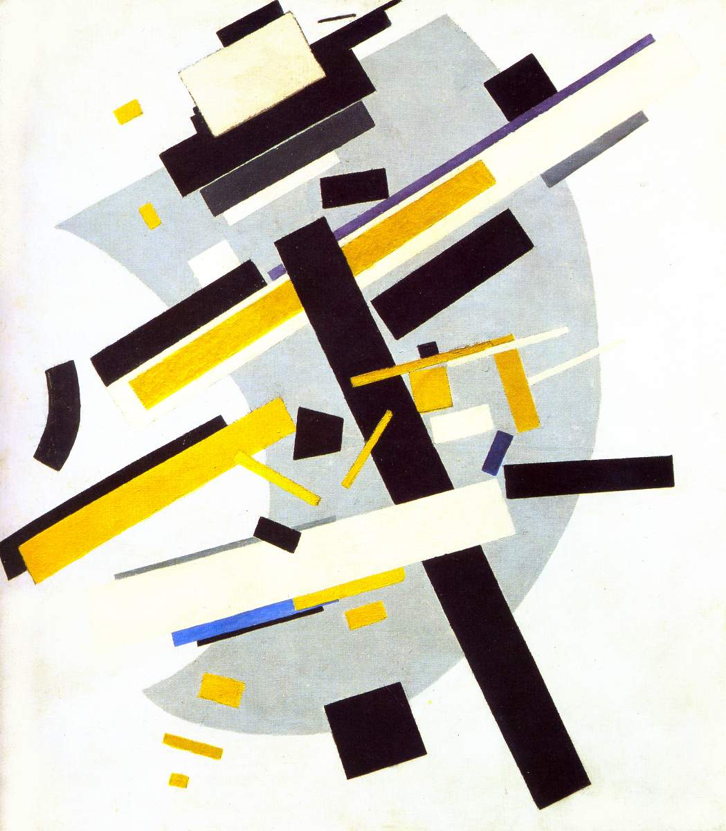
- Kazimir Malevich, Suprematism 2, 1915
-

-


-

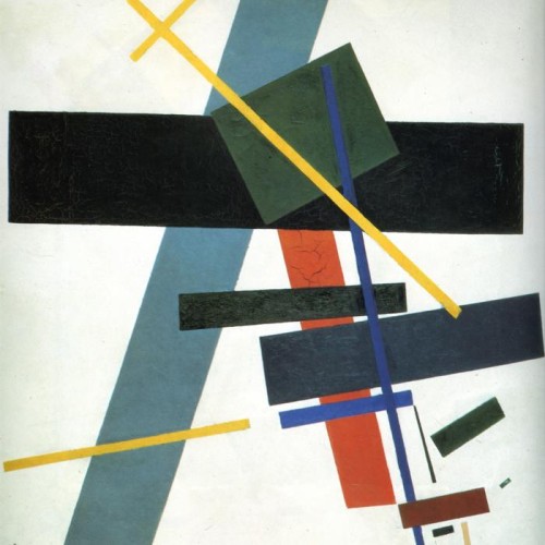
- Kazimir Malevich,
-

-
-

- Kazimir Malevich, Suprematism (Supremus N58 With Yellow And Black),
-

-
-

- Kazimir Malevich, Suprematist Painting, 1915
-

-

-
- Kazimir Malevich, Dynamic Suprematism, 1915
-

-

-
- Kazimir Malevich, Two-Dimensional Self-Portrait, 1917
-

-


-

- Kazimir Malevich, Suprematist Painting: Eight Red Rectangles, 1915
-

-

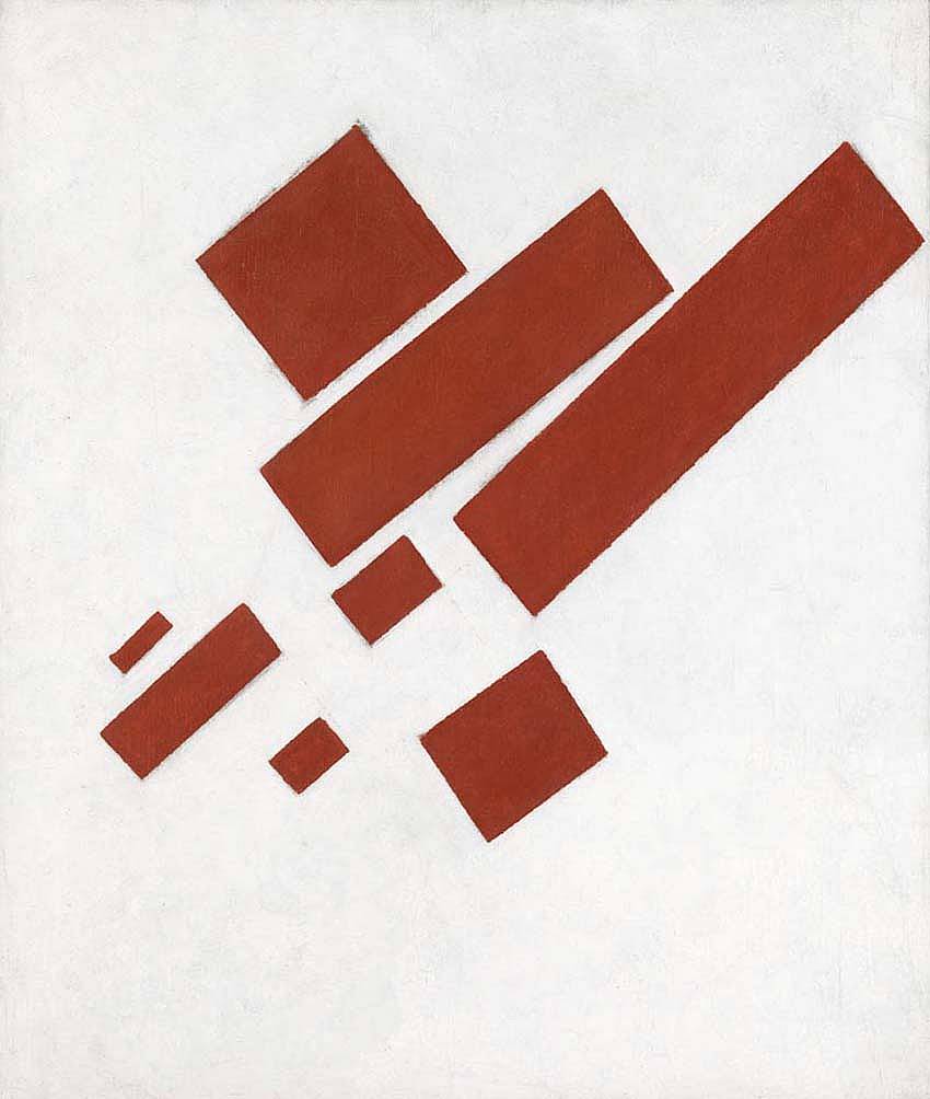
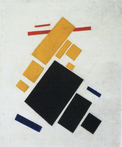
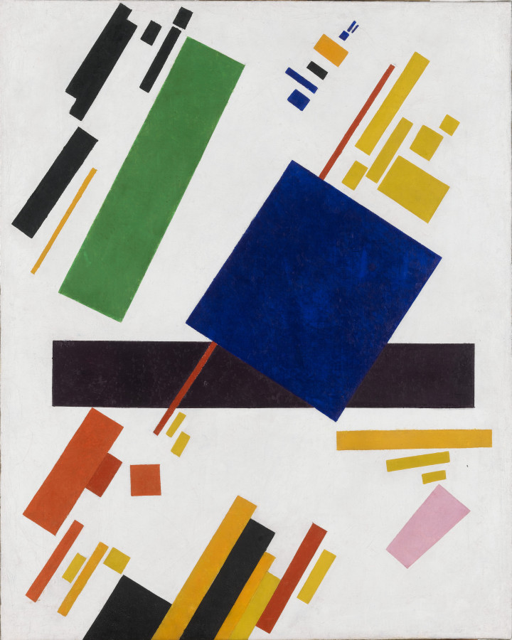
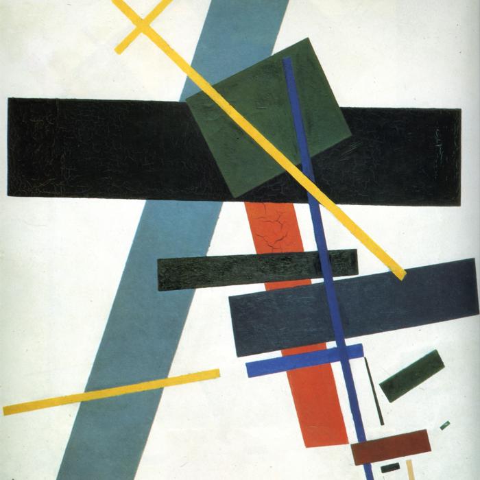
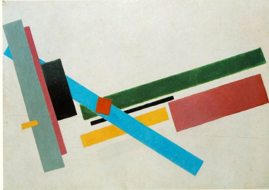
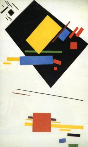
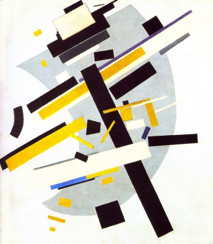
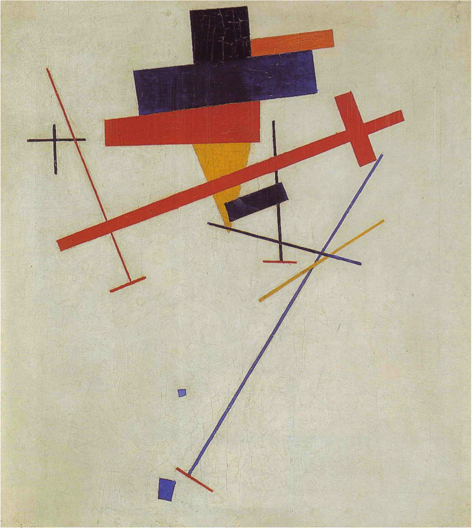
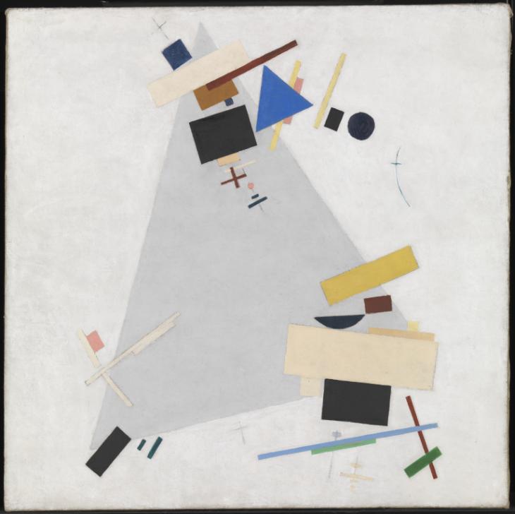
Kazimir Malevich uses geometric shapes in his work. A variety of rectangles, squares, triangles, and circles all combine to form a relationship with each other. The overlapping of shapes shows movement and depth in his pieces. He uses the shapes in a variety of different ways to create a sense of space within the piece and contrast with the white background. All of the selections above contain lots of shapes and creates a unity with one another. The theme of geometric shapes shows his modern approach to his work.
The art history: Kazimir Malevich
Kazimir Malevich Biography
The Guardian- Tate: Kasimir painting
The modernism of Kasimir Malevich
Russian Art- Kazimir Malevich
Gallery

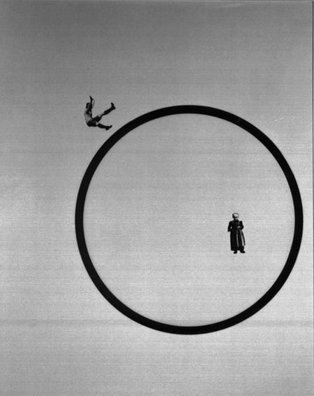
László Moholy-Nagy, Love Your Neighbor; Murder on the RailwayLove Your Neighbor; Murder on the Railway, 1925
-
- László Moholy-Nagy, Love Your Neighbor; Murder on the RailwayLove Your Neighbor; Murder on the Railway, 1925
-

-

-
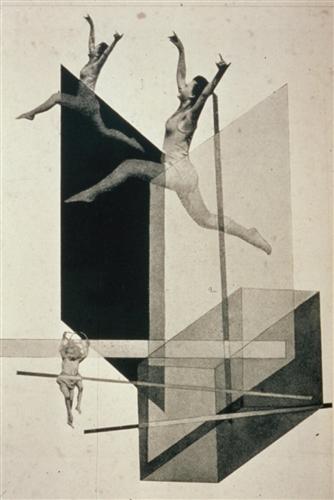
- László Moholy-Nagy, Human Mechanics, 1925
-

-

-
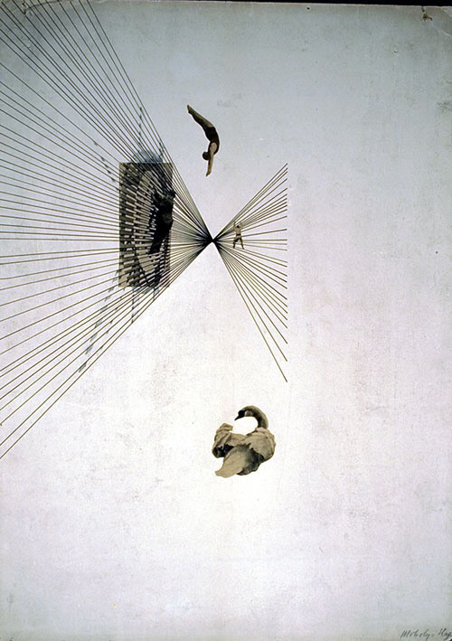
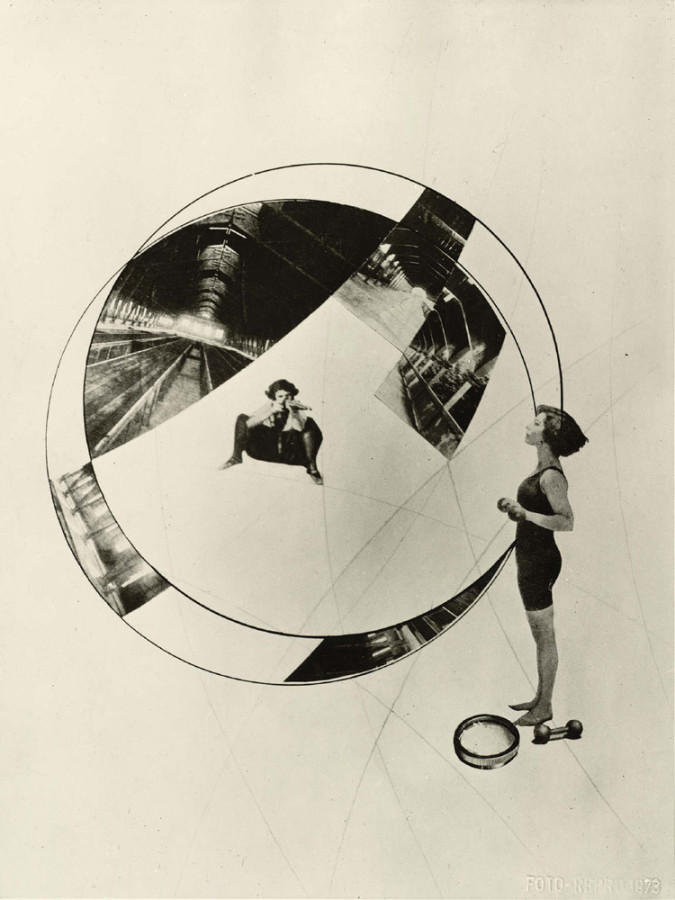
- László Moholy-Nagy, Leda and the Swan, 1925
-

-
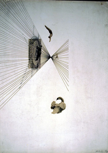
-

- László Moholy-Nagy, The Olly and Dolly Sisters, 1925
-

-
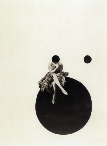
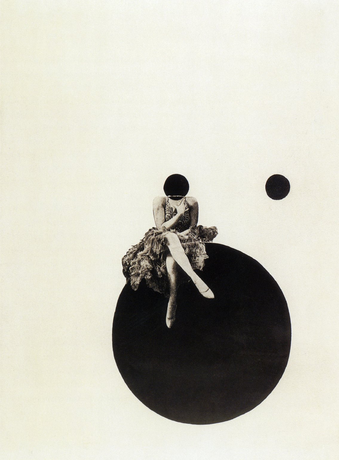
-
- László Moholy-Nagy, How Do I Stay Young and Beautiful, 1925
-

-

-

- László Moholy-Nagy, City Lights, 1926
-

-
-
- László Moholy-Nagy, Jealousy, 1927
-

-

-

- László Moholy-Nagy, The Mavericks II, 1927
-

-
-

- László Moholy-Nagy, My Name is Bunny Rabbit, I Know Nothing, 1927
-

-

-
- László Moholy-Nagy, Die Korsettstange, 1925-27
-

-
-
- László Moholy-Nagy, Die Zerruttete Ehe, 1925-27
-

-

Relationships Within His Work
The specific area of Moholy-Nagy’s work that I have chosen to focus on is his photomontage, which is seen within the gallery above. Photomontage in the wake of WWI was an attempt for artists and designers to help re-shape society by conveying how a gendered experience of modernity could be envisioned. There are two unifying characteristics of almost all of his montage work that specifically stood out to me: the first, being his use of women as subjects and the second being the inclusion of line and geometric shape. As an artist, he utilized a constructivist approach in placing the photographic elements to create dynamic relationships within his pieces.
About the Artist
Born in Borsod, Austria-Hungary in 1895, László Moholy-Nagy had picked up an interest in literature at a young age. His first ambition was to become a writer, but he was persuaded to study law in Budapest after graduation. His studies came to a halt when World War I began, and in 1915 he enlisted in the Austro-Hungarian army as an officer. Though he had begun to pick up drawing before joining the army, he turned this hobby into a more serious one during his hours in artillery observation posts where he would produce sketches on the backs of military-issue postcards. At the age of 23, he officially began his career as an artist. He became fascinated by the expressive power of lines and the effects of color on composition. His work was highly influenced by Russian Constructivism, and he strove to eliminate “personal touch” from his paintings. In addition to painting, he focused a lot of his time on creating collages on paper and dabbling into photography. He spent five pivotal years as a professor at the Bauhaus school, where his paintings continued to evolve. He then began work as a free-lance designer, creating book jackets, posters and exhibitions. In 1935, he set up a design studio with György Kepes. In 1939, he opened his own school, The School of Design in Chicago, and though it absorbed much of his time and energy, he still continued to lecture, paint, photograph and publish his works. He is noted to be one of the greatest influences on post-war art education in the United States.
Signature Points
- He worked predominantly with light as a photographer and painter.
- His time in the army played a fundamental role in not only his art but his teaching.
- He was an advocate of the integration of technology and industry into the arts.
Research Links
Part One:
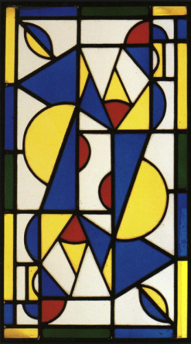
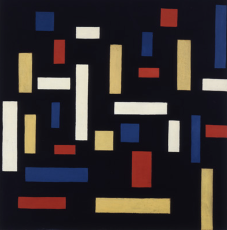
Theo van Doesburg was born on August 30th 1883, in Utrecht, the Netherlands. His real name however is Christian Emil Marie Küpper, he would always refer his stepfather (Theodorus Doesburg) to be his main father, and that is why all of his work is signed Theo Doesburg he later added ‘van’ to his name. Theo van Doesburg was a writer, designer, an art critic, and a painter he was highly influenced by Wassily Kandinsky, who was a Russian painter that was credited to the first abstract work. His work was structured more around a simplistic geometric style. van Doesburg is mostly known for his lead in the artistic movement “De Stijl” it was said “he influenced many graphic designers with his many theories that conveyed the idea that there was a collective experience of reality that could be tapped as a medium of communication.” This appealed to other artist mostly because it pursued abstraction though primary color schemes and geometric shapes. His work would change to a mix of cubism and futurism mixed together.As I looked deeper into van Doesburg’s work I found some of it to be recognizable. It is very interesting to me that his work was something to start a movement in the art world.
Part Two:
1: This artist started an art movement known as “De Stijl” which is dutch for “The style”
2. He was a known painter, writer, designer, and an art critic
3.
Part Three:

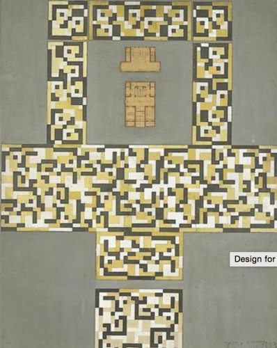
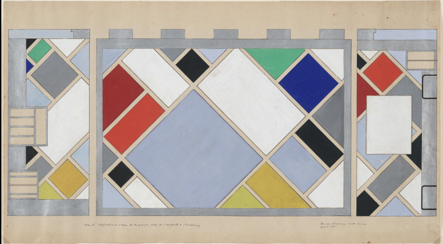
Theo van Doesburg, Design for a Tile Floor and Entrance Hall, 1917
-

- Theo van Doesburg, Design for a Tile Floor and Entrance Hall, 1917
-

-
-
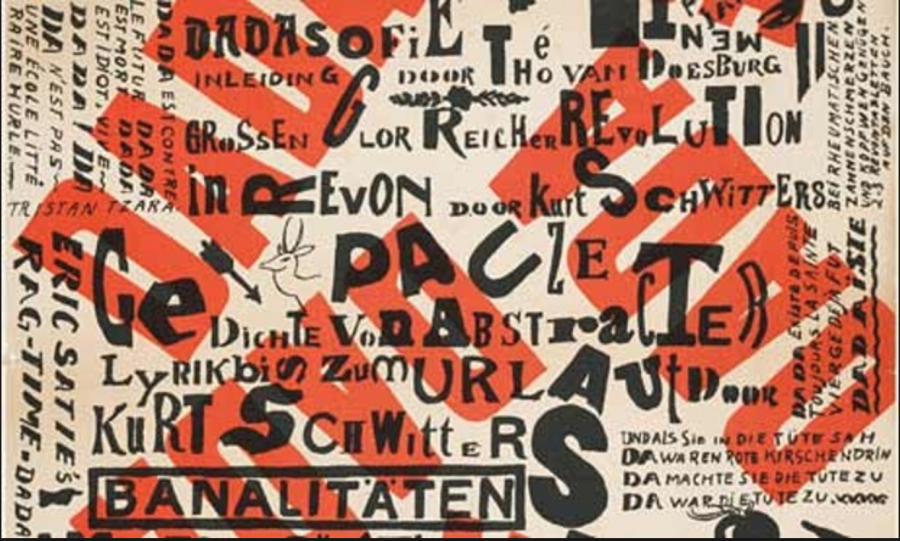
- Theo van Doesburg, Kleine Dada Soirée, 1922
-

-


-
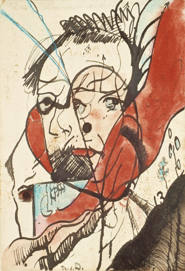
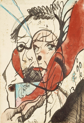
- Theo van Doesburg, Portrait of a Man, 1915
-

-
-

- Theo van Doesburg, Dance I, 1917
-

-
-
- Theo van Doesburg, The Three Graces, 1917
-

-

-
- Theo van Doesburg, Café Aubette, Strasbourg, 1927
-

-


Part One:
Armin Hofmann, born in 1920 in Winterhur, Switzerland. Grew up to become a Swiss designer, that had a very tremendous influence on the development of the graphic design style known as Swiss International Style. Hofmann believed in simplicity, legibility and objectivity which is the format for Swiss style. Hofmann worked at the Basel School of Arts and Crafts for 40 years and during that time became the head of the graphic design department. Armin thought Swiss International Style was all about communication and he believed the best form of communication was through posters using type and photography, but Hofmann also had written a textbook “Graphic Design Manual” which is still used to teach graphic design today. Hofmann’s former students speak highly of him, in 2011 he even was awarded the AIGA medal which stands for “American Institute of Graphic Arts”. For Robert and Alison Probst, who was also Hofmann’s student, these enduring designs are the work of “a master of his craft with a superior sense of aesthetics. His work deals with the universal language of signs and symbols, often including serendipity and always aiming for timeless beauty”(AIGA, the professional association for design). In the article on the AIGA award he received, they speak so highly of Hofmann and all that he did to help them as students and that is what you want in a teacher.
Part Two:
1) Hofmann had a good sense of structure and the ability to use space, which projected his personality as a designer and an artist.
2) Hofmann sought for musical resonance, in his work and in his students.
3) Hofmann’s teaching was thought of as unorthodox but he would bring you back to the fundamentals of design.
Part Three:
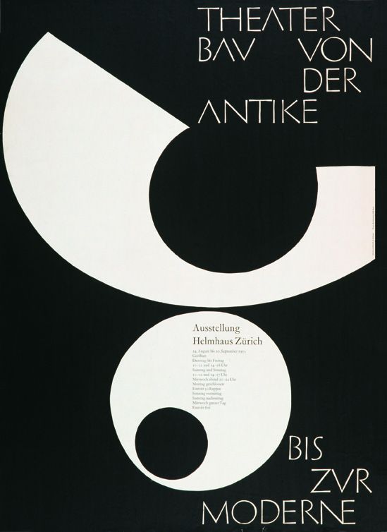
Armin Hofmann, Theater Bau von der Antike Bis Zur Moderne,1955
-
- Armin Hofmann, Theater Bau von der Antike Bis Zur Moderne,1955
-

-

-

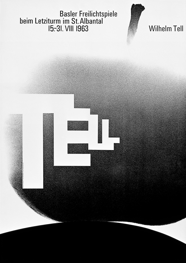
- Armin Hofman, Wilhelm Tell, 1963
-

-

-
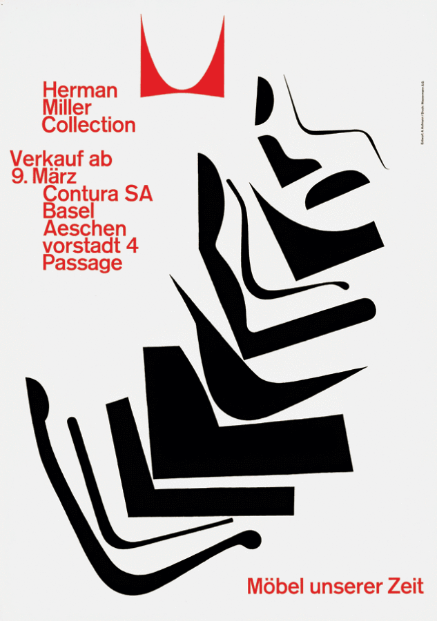
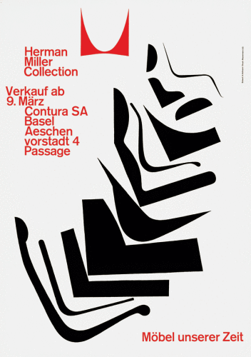
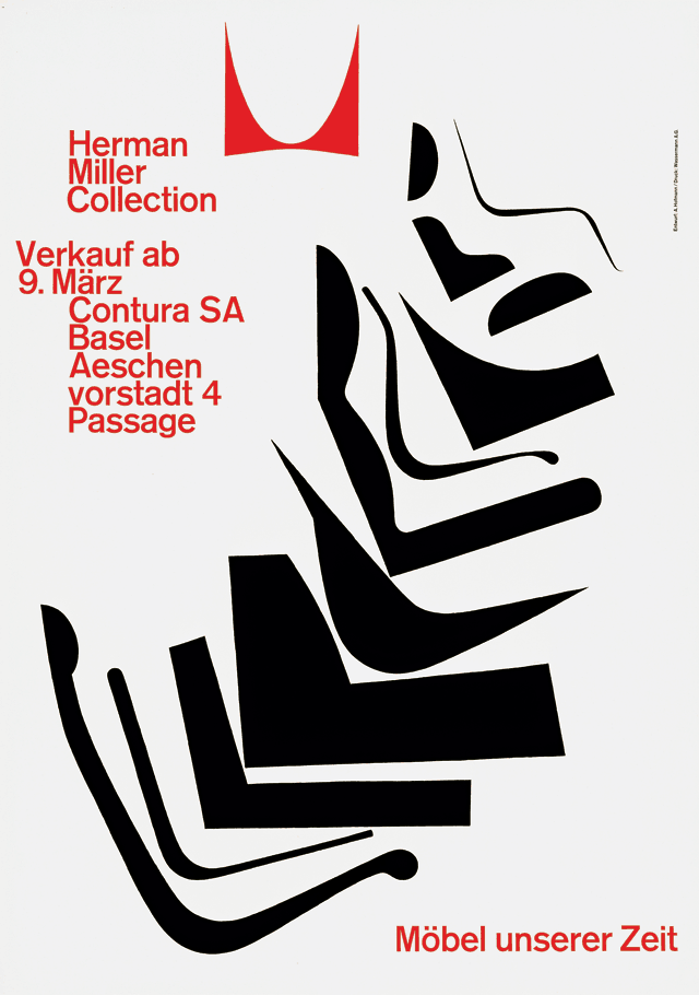
- Armin Hofman,Herman Miller Collection, Möbel unserer Zeit, 1962
-

-
-

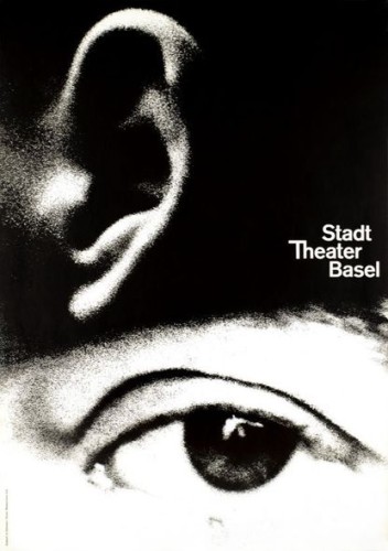
- Armin Hofmann,Stadt Theater Basel, 1962
-

-
-
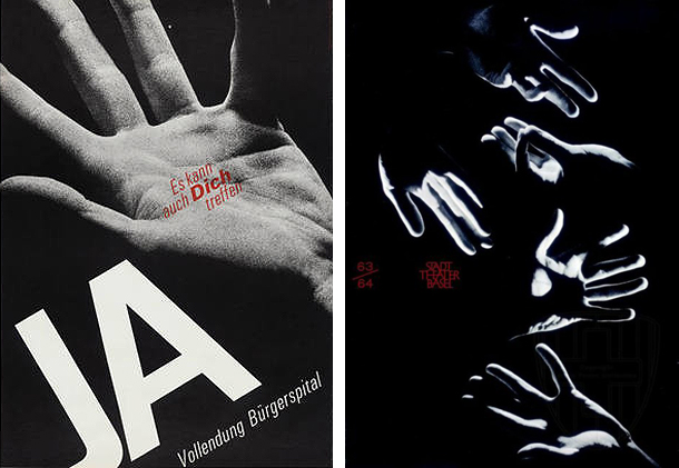
- Armin Hofmann,JA, Vollendung Bürgerspital, Es kann auch Dich Treffen, 1963
-

-

-
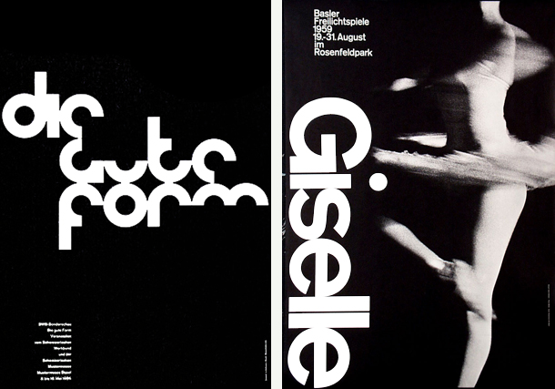
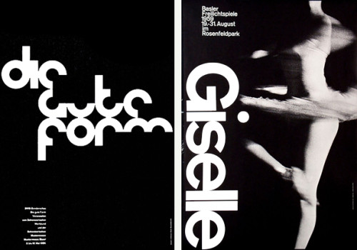
- Armin Hofmann, Giselle, Basler Freilichtspiele, 1959
-

-
-

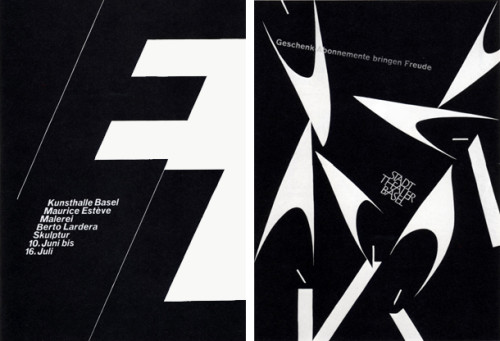
- Armin Hofmann, Kunsthalle Basel, Maurice Esteve, Malerie, Berto Lardera, Skulptur, 10. Juni bis 16. Juli, 1961
-

-
Sources:
https://kscgd.com/2015fall/gdp1/wp-content/uploads/2015/11/GTGD_CH2.pdf
http://designishistory.com/1940/armin-hofmann/
http://www.famousgraphicdesigners.org/armin-hofmann
http://www.designishistory.com/home/swiss/
http://www.moma.org/collection/artists/2697?=undefined&page=1
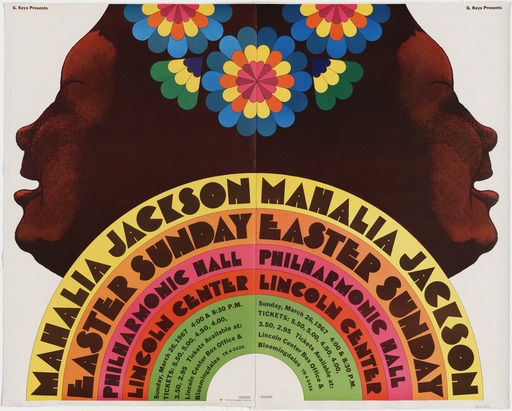
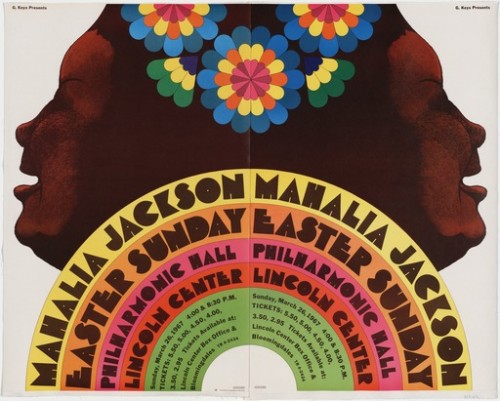
Milton Glaser, Mahalia Jackson 1967
-
- Milton Glaser, Mahalia Jackson 1967
-

-
-

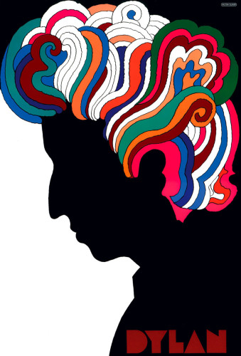
- Milton Glaser, Dylan 1966
-

-

-
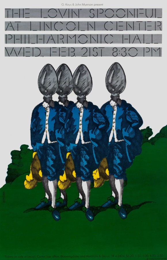
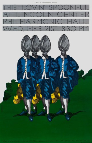
- Milton Glaser, Lovin’ Spoonful 1967
-

-

-

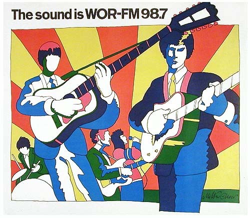
- Milton Glaser, The sound is WOR-FM 98.7 , 1966
-

-
-
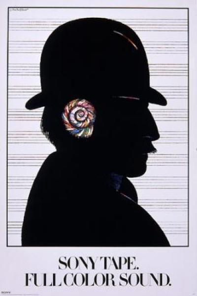
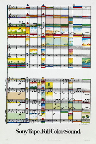
- Milton Glaser, Sony Tape. Full of Sound 1980
-

-
-

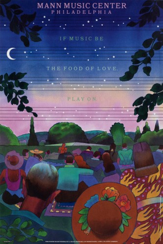
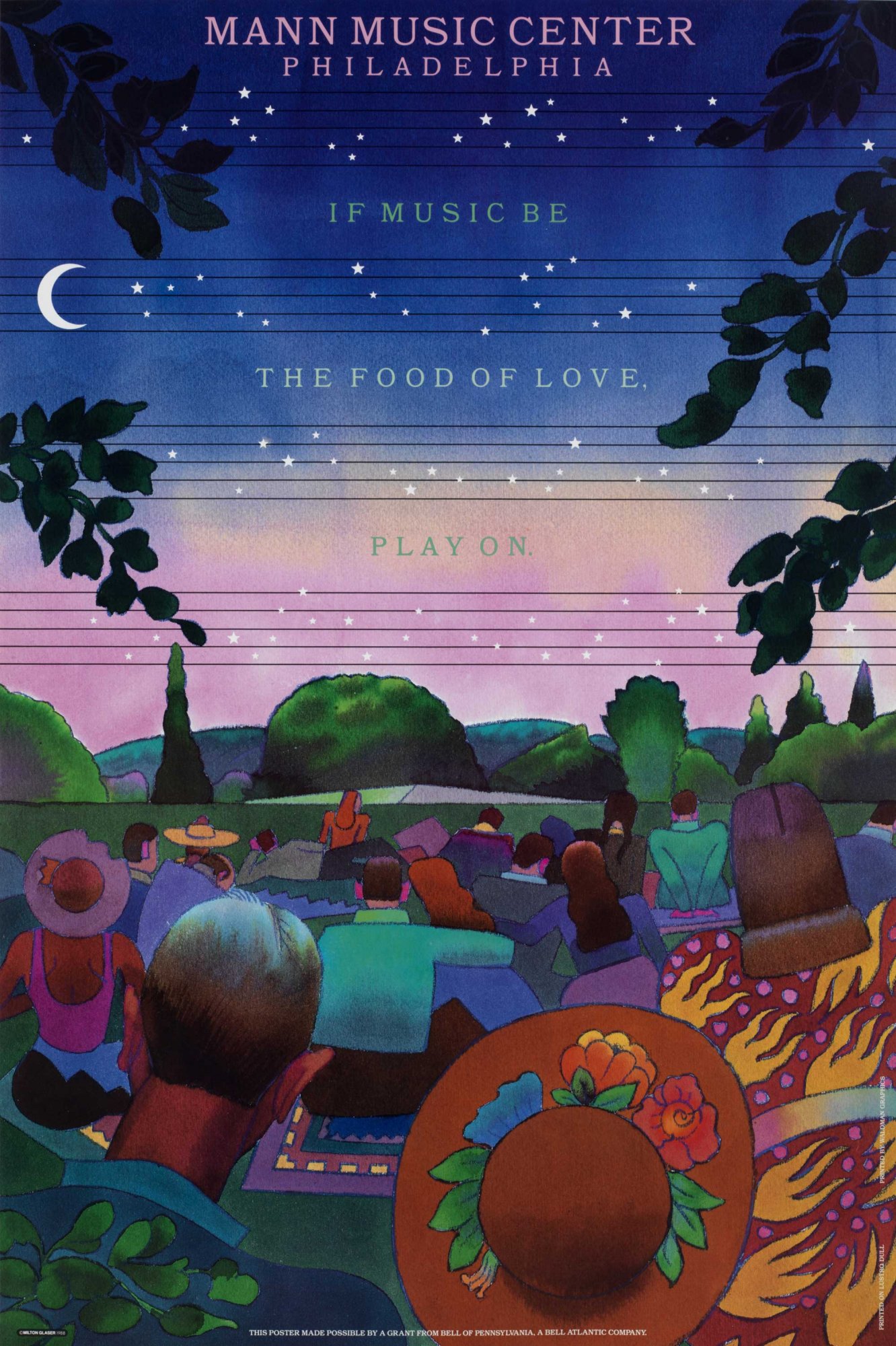
- Milton Glaser, mann music center philadelphia 1988
-

-
-

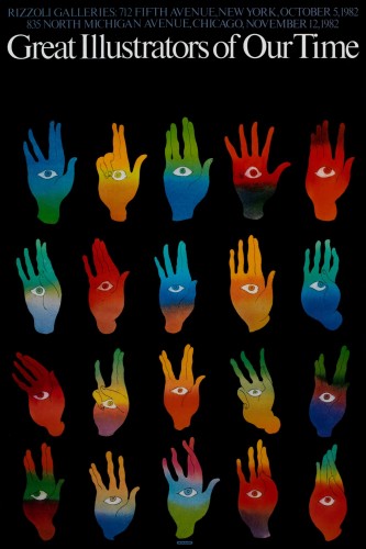
- Milton Glaser, great illustrators of our time 1982
-

-

-

- Milton Glaser, great illustrators of our time 1970
-

-

-
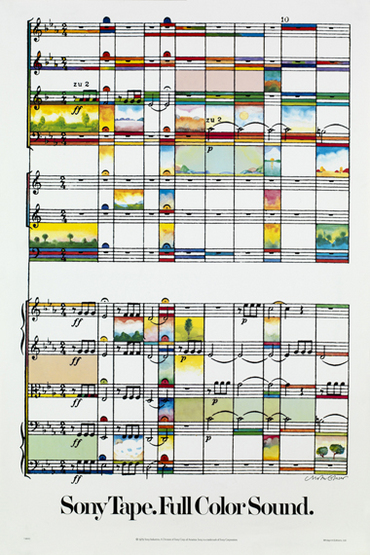
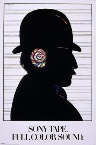
- Milton Glaser, Sony Tape Full Color Sound, 1979
-

-
-

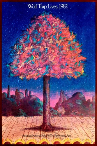
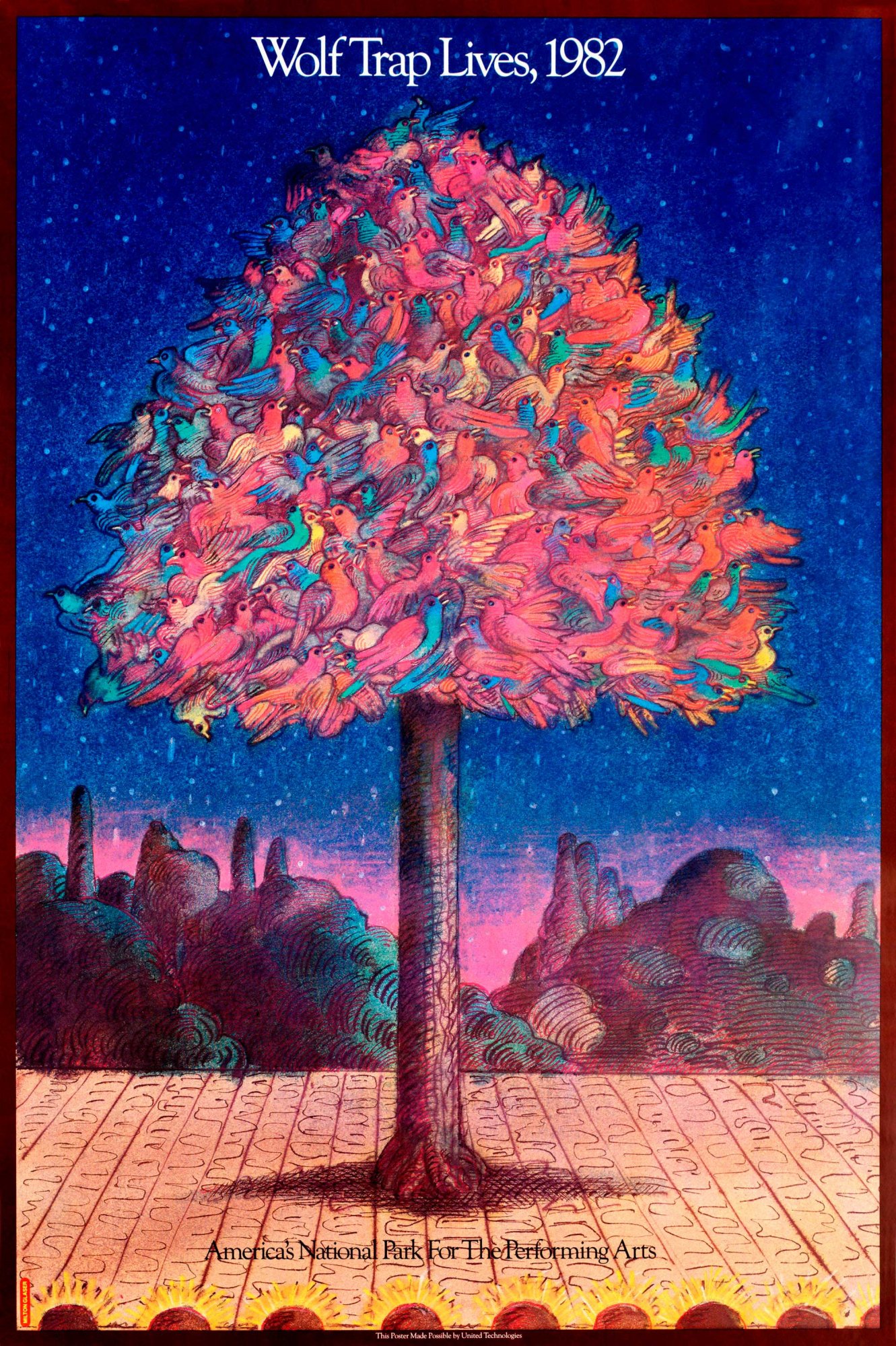
- Milton Glaser, wolf trap revival 1982
-

-
Gallery Paragraph
With the pieces that i have chosen for the gallery, I think they go together very well. They’re all posters, most of them being about music. When looking at all of the posters, i was trying to find a common theme. The common theme with these specific ones is that they’re all very vibrant in color. You can very clearly see the choices in color were really thought out in order to get the message across and I love the ones from the late 60’s because the colors just go along with the time period, i believe. These works are also spread across the time span of about 15 years so you can really see his growth in designing and where he’s going next in relation to color and subject matter and whatnot. The pieces from the 60’s are different from the 80’s ones but it reads as almost a timeline, i believe.
Part 1
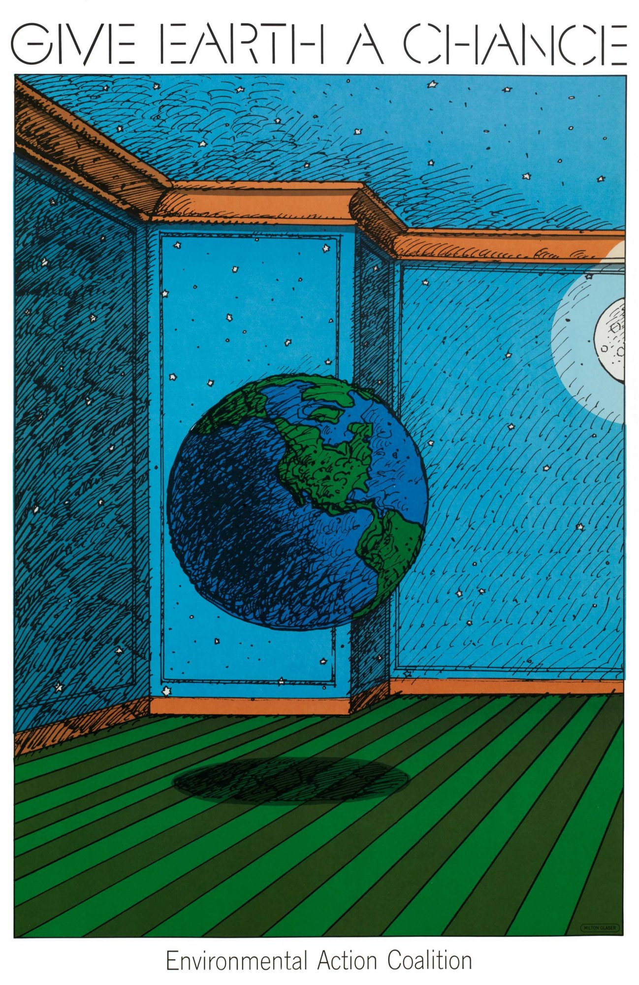
Milton Glaser was well known for his poster and print designs along with typography later on. Born in 1929, Glaser went to the High School of Music and Art along with an art academy in Italy. Afterwards he co-founded Pushpin Studios in 1954 along with creating New York magazine and established Milton Glaser, Inc. in 1974, as well as teaming with Walter Bernard in 1983 to form the publication design firm WBMG. His iconic work can be found in permanent collections in many museums. His work ranges from famous logos, such as “I (heart) NY”, that are known around the world. He has created so many different things that you see every day and I think it’s kind of crazy. I actually own a shirt that has the “I heart NY” on it. He contributed so much in the design world but also in the education world by writing many essays about graphic design along with speaking about it in interviews. His ways of design and typography have taken over and are seen in packaging, logos, signs etc. His work is very influential to all current graphic designers because you can still see bits and pieces of his ways of working around even when being created by someone different.
Part 2
- He didn’t work in one specific field in graphic design, he has many different styles of visual works.
- Glaser and the Pushpin artists worked on designing things using simplified images that could function as symbols and signs.
- He had a willingness to experiment with many different types of design which lead to some of the most famous designs today.
Sources:
http://www.moma.org/collection/artists/2188?=undefined&page=1
http://www.miltonglaser.com/milton/#1
http://www.britannica.com/biography/Milton-Glaser
-
Classroom
-
-
Recent Posts
Recent Comments
- Danielle Vizard on Thinking with Type — TEXT
- Danielle Vizard on Digging’ It!
- Jenna on Thinking with Type — TEXT
- Jenna on Digging’ It!
- Elizabeth Robinson on Digging’ It!
Archives
- November 2023
- August 2023
- May 2023
- April 2023
- March 2023
- February 2023
- January 2023
- December 2022
- November 2022
- October 2022
- September 2022
- August 2022
- July 2022
- June 2022
- May 2022
- February 2022
- December 2021
- November 2021
- October 2021
- September 2021
- August 2021
- June 2020
- February 2018
- December 2015
- November 2015
- October 2015
- September 2015
- August 2015
Categories
-
About
KSC GRAPHIC DESIGN

Leave a Reply
You must be logged in to post a comment.