Nick St. Amour
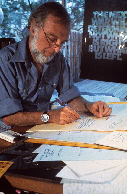
Herb Lubalin
Part 1
Herb Lubalin was a graphic designer, typographer, and publication designer who had worked his way from many firms to have his own design company. Lubalin had created the Avant Garde font which has been used in many logos everywhere.
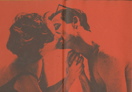
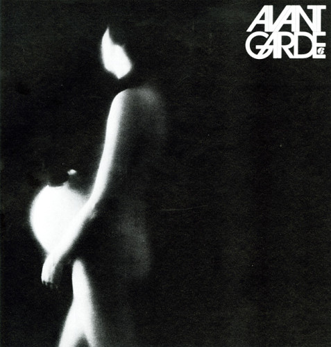
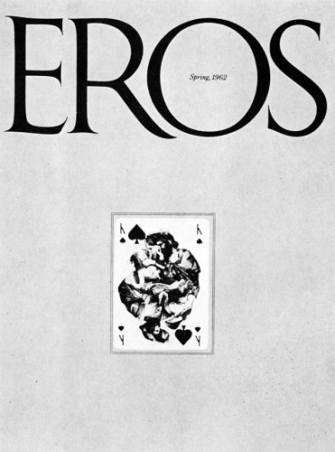
In the mid 60’s Lubalin teamed up with American author, editor, publisher and photo-journalist, Ralph Ginzburg. These two had created the publications Eros, Fact, and Avant Garde, Lubalin being the typographer and designer and Ginzburg was the writer and publisher. Lubalin designed these publications with hard covers which held eschewed colors and simple black and white templates with illustrations which made the publications dynamically minimalist. Eros was the first of the three to come out which talked about topics in love and sex. The beach themed Eros cover caught my eye over all the rest. The yellow sand is great compliment to the red logo which would be the first word you would read on the publication. Once reading the title you can see two lovers just kissing in the sand. The illustration shows how passionate two lovers could go at it, this shows that Eros was super passionate about talking about love and sex. So after the fourth issue of Eros, the government wasn’t about having these going around in mail rooms or sent to people, which soon got Lubalin’s partner, Ginzburg in some trouble. However, the second publication was a magazine called Fact.
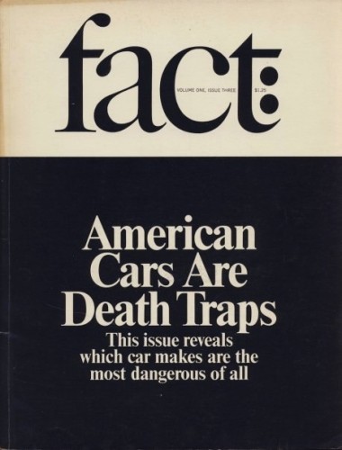
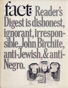
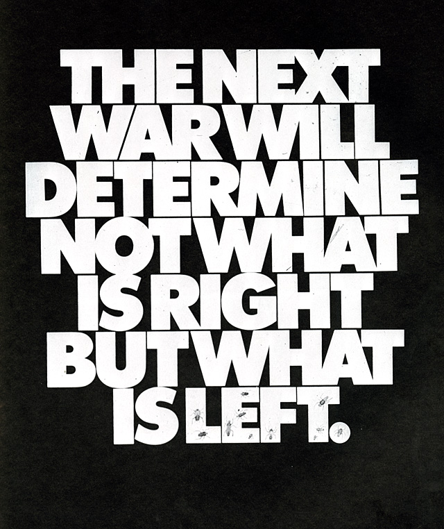
Fact had a similar approach from Eros except switched topics to 60’s culture and Politics. These artists seemed to love to unveil an untold truth about the culture back then and it got them into some trouble with presidential candidates. But would you blame them for how awesome the cover of Fact looks like. Off the bat the title’s typeface looks sharp with the slanted line which connects the lower case f and t’s ascender and bar. The title is just as sharp as the knife they are stabbing cultural and political truths with. Because of the political trouble that the publication got sued for, Lubalin and Ginzburg ceased Fact and created another publication combing both ideas from Fact and Eros, Avant Garde was born.
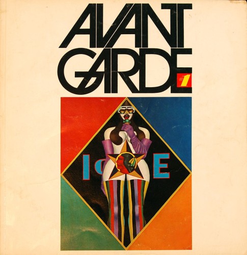
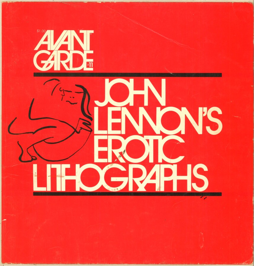
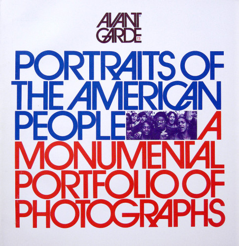
Avant Garde looks like a son to the parents Eros and Fact. The titles slanted A and V’s reminisce on the slickness and sharpness of fact, with sexual imagery on the cover, this shows Labalin and Ginzburg don’t hold back in this new publication. But Avant Garde was forced to shut down when Ginzburg got sent to prison for a scandal with the U.S postal service and Eros. After all this, Lubalin continued with a slightly less controversial publication dedicated to his interest in typography called Upper and Lower Case.
Part 2
Distinctive point 1.
Lubalin was in charge of design for such magazines Eros, Fact, and Avant Garde which shows a minimalistic modern design in both publication and type form.
Distinctive point 2.
The publications Eros, Fact, and Avant Garde used very risque illustrations and touchy topics which caused controversy. This is a perfect example of how graphic design is used in this world, informing readers the untold truths.
Distinctive point 3.
Lubalin worked hard enough after college that he soon began his own company, which he ended up creating a typeface that was used in multiple logos through out the last two decades.
Part 3
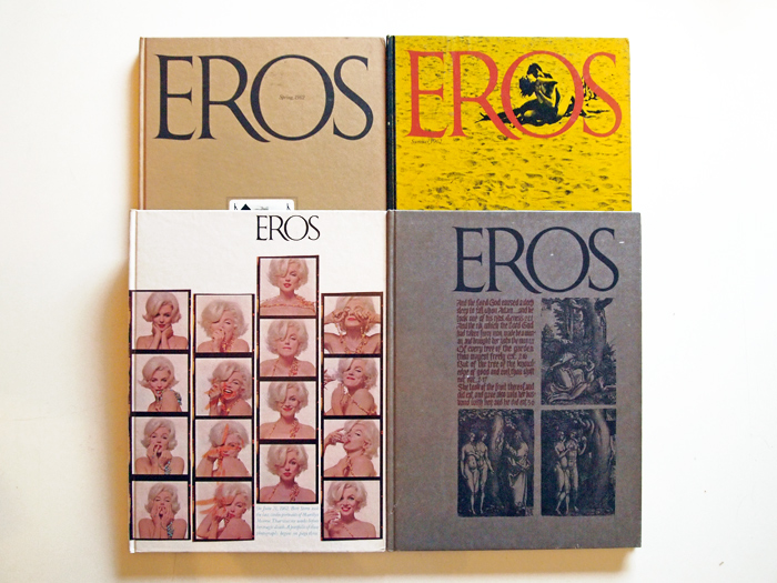
Herb Lubalin, Eros Magazine
-
- Herb Lubalin, Eros Magazine
-

-

-
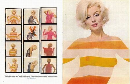
- Herb Lubalin, Eros Magazine inside
-

-
-
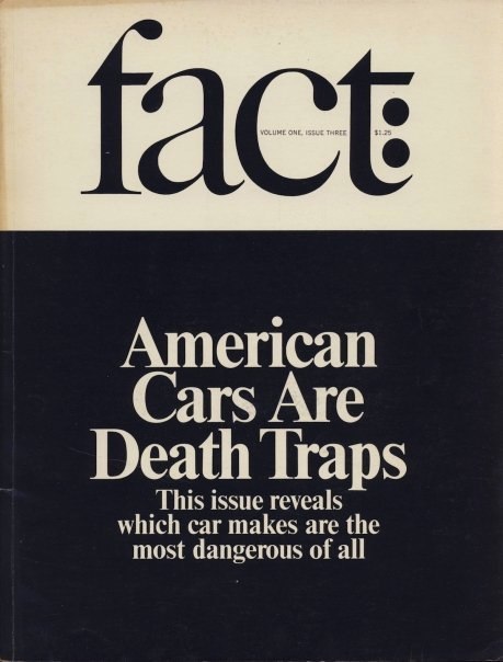
- Herb Lubalin, Fact Magazine
-

-
-
- Herb Lubalin, Fact Magazine
-

-
-

- Herb Lubalin, Avant Garde Magazine
-

-

-
- Herb Lubalin, Avant Garde Magazine
-

-


-

- Herb Lubalin, Avant Garde Magazine
-

-
-

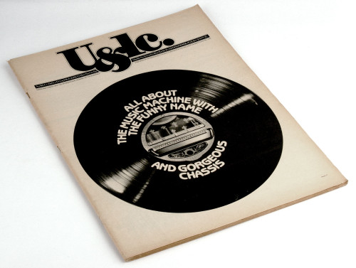
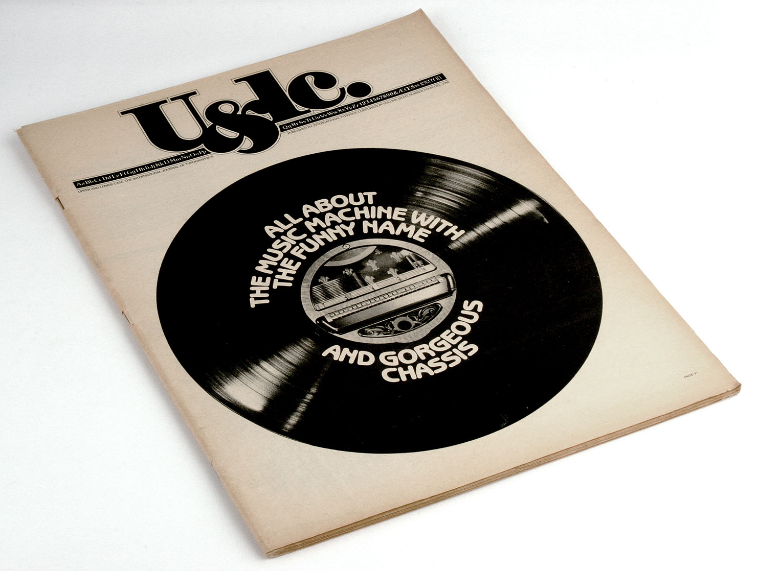
- Herb Lubalin, U&LC magazine
-

-
-

- Herb Lubalin
-

-
-

- Herb Lubalin, Avant Garde Magazine
-

-
-

- Herb Lubalin, Avant Garde Magazine
-

-
-

- Herb Lubalin, Eros Magazine
-

-

Style
Lubalin had a style which you could say was dynamically minimalistic. Graphics wise, Lubalin would use high quality photographs which related to the idea of the publication. Some are silhouettes of objects/people making these photographs abstract to the mind. Lubalin didn’t have the same photoshop technology as we have today, so it must of been a longer process creating a red tint to a black and white photograph of two people kissing. Type wise you can tell Lubalin knew what he was doing with type because the titles of his publications relate to the meaning behind all the publications put out by the designer. Fact magazine’s type has a lot of distinct characteristics like the rounded terminals, the sharp tails, and the angled connection between the ascender and bar between the lower case letters t and f. This type defines the magazine as we see it, its a sharp well rounded publication which tells truths about the culture back in the 60’s. I dig Herb’s style because he didn’t seem to care about what they were talking about with culture, but was more focused on designing with a minimalist approach. The combination of graphics and type worked great with modern design.
Sources: http://www.aiga.org/medalist-herblubalin/
http://www.designishistory.com/1960/fact-eros–avant-garde/

Leave a Reply
You must be logged in to post a comment.