Randall
Thinking with Type — TEXT
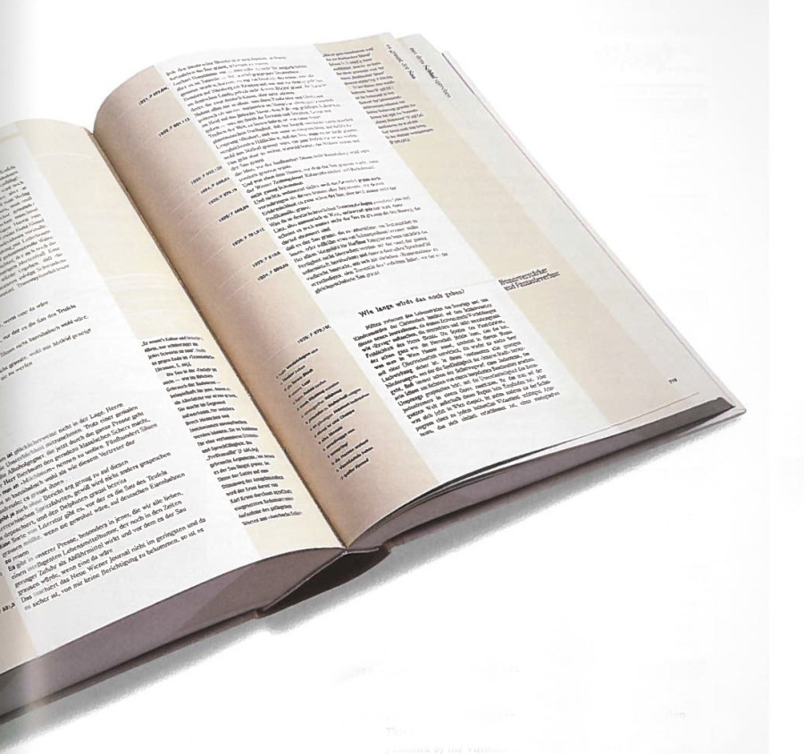
Read an comment on the reading. How does the reading speak to what you have been taught about using typefaces and arranging words? Pick three points in the text that were eye opening or intriguing to you about typography.
b
26 responses to “Thinking with Type — TEXT”
Leave a Reply
You must be logged in to post a comment.

The reading talks about kerning, line spacing, alignment, hierarchy, tracking, paragraph, and word alignment. Everything in the reading relates to what we have been learning in class, especially for our final project. It shows how to make text more interesting, readable, and relatable. Three things that were intriguing in the reading were the flush left and flush right alignment, tracking, and stacked letters. I never thought much about how the sentences aligned from left or the right would affect the reader’s flow in reading it. Having it flush left makes the text lose its organic flow and gives it an illusion of randomness. Flush right pulls away from the familiar way people usually read text. It can be difficult to add a punctuation to the end of lines and weaken the hard right edge. Tracking can give the text and sentences space and fill the space around it better. I never tracked any of my designs until I learned about it in class. Lastly, what I found to be intriguing is the vertical stacking of letters. Stacking capital letters helps even out the width of the column, as well as giving it a stable look to it. Stacking lower case letters gives the text an awkward look to it, as well as give it an uneven look to the columns. This reading made me think more about typography and how I should think about it more when I work with words in my designs.
The reading talked about elements of type that we have learned and even used, such as kerning and hierarchy, but it also discussed things I had not really focused on such as tracking, alignment, and paragraph set up. This reading was really resourceful for our current project and influenced some of the decisions I plan on making for my use of text and type in the assignment. Some of the things I found interesting in the text was when it was talking about paragraph alignment such as flush right alignment, which personally I did not like. Even though flush right alignment is difficult for the reader to read I understand its purpose, when its used as a side caption paragraph. I also found the section that went over line spacing very interesting and how you can really manipulate text to be read the way you intend. I like how they link line spacing to how a paragraph can be set up as well. I like the idea that how you set up text influences the way your audience reads it and how they perceive the information. The reading definitely shows that every detail matters, not just pictures but type as well.
This reading touches on the most crucial points and things to focus on when arranging text. Thinking with Text elaborates on kerning and tracking, line spacing, and hierarchy, all things we have briefly gone over throughout the semester. Before taking Graphic Design and Typography, I wasn’t even aware kerning and tracking existed. Kerning is the spacing between individual characters in a piece of text. Tracking is the overall letter spacing between all the characters in a piece of text. When letters in a typeface are not spaced properly they create a pattern that doesn’t look uniform enough, which is why proper kerning and tracking are important. Line spacing (leading) is the distance from the baseline of one line of type to another. This is important because as line spacing becomes more extreme, the block of text begins to read as separate lines rather than a group of text. Hierarchy is an important part of typography we’ve been focusing on a lot lately in Graphic Design. Hierarchy expresses an organizational system for type that emphasizes important information, while diminishing the less important. Hierarchy is extremely important because it helps readers scan through a text by guiding their eyes from important to least important.
This article touched upon all sorts of techniques used to create a successful text layout. Over the past semester we have talked and worked on aligning, kerning and leading. I have learned about alignment, leading, tracking and kerning before in one of my previous Graphic Arts courses before entering in this class. I find it fascinating how a simple kern of a letter or a tracking of a word can make a complete difference. This text was so interesting to me because of all the different names there are for things. Before reading this article I had never heard of the word “rag” or “bad rag” and never knew that there was name for when a soft edge looses its organic look to it. I also found it interesting that when stacking letters on top of one another it is preferred not to stack lowercase’s because the way their ascendants and descendants work it makes them look uneven and weird. I myself really don’t prefer to stack letters all together, but I can see how in some cases they are appropriate. I enjoyed the part of the article when they talked about Hierarchy and how to put emphasis on running text. I agree with the text, when it says using one type of emphasis can get the job done and that adding too many is bad.
I found the reading on Thinking with Type to be pretty interesting because it truly proved how much goes into creating a flowing set of text, which is something that many people take for granted. When a person (who isn’t a designer) picks up a book of some sort, I don’t think they focus on the amount of work and effort that has gone into text alignment or orientation (unless it’s hard to read, of course). Kerning, line spacing, hierarchy and alignment are all crucial elements that contribute to the readability of a piece of text, and getting those elements correct isn’t always a simple task. Something that I had never heard of prior to reading this article were the terms “ragged right” and “ragged left”. I like how self explanatory their names are. I also enjoyed the little “Type Crime” sections they had on the pages, especially the one they had for the stacked lower case letters. Stacked lower case letters are pretty nasty and awkward, which is something I’ve learned through previous classes as well. Attempting to do it just does not work no matter how hard you try. The section about vertical baselines also stood out to me a bit, due to what we had just worked on within the Weather Report assignment. It’s all about guiding your viewer’s eyes.
This reading discusses some of the topics that we have been learning in class with regards to typefaces. Kerning is a major part of this whole process, as it can corrupt the word flow if it is not dealt with in the appropriate manner. There is a difference between lower-case letters and upper-case letters kerning. Tracking is another term mentioned in this reading, it relates to kerning. This process allows the designer to create a more airier feel. Another process mentioned in this reading is line spacing. This effect has the ability to make lines of text become independent rather than an overall texture. This reading really speaks to me as a young immature uneducated designer. It breaks up all the elements that are needed to get typographer to have flow, structure, and ambiance. One point that sticks out to me is the debate of vertical alignment, or vertical baseline. The reading says to move the baseline of the word to a vertical standpoint as it preserves the natural affinity among the letters. Another new term mentioned was flush/right. This concept was intriguing because certain forms of flush/right are welcomed and also “evil”, giving certain points to when it is acceptable and when it isn’t okay to have flush/right. Creating emphasis with running text also popped out to me because there is a lot of text in our final project. They explain how the use of italics, boldface, small caps, and changing the color of the font changes the whole dynamic of the text.
When reading this, I read about familiar topic but then not so familiar topics. The things we have focused on the most, hierarchy and kerning, went into a bit more detail and gave helpful examples. Kerning is interesting to me that you can’t fully tell how bad the spacing between the letters are until you increase the text. With line spacing, the right amount of spacing is very important. If the lines are sitting right on top of each other, it creates a different feel than if they are spaced apart. When spaced, the lines become their own “elements” rather than part of an entire paragraph, as stated in the reading and when it’s put like that, it makes a lot of sense to me. Alignment is also something very important when it comes to graphic design. The way you decide to align text can really make the difference. If you center the text, will definitely give off a different feel if on a poster because centered text is usually seen on invitations and title pages. Reading this is really going to help me with future projects because now i know how certain alignment and spacing can really make the difference. Also, knowing the importance of hierarchy in text helps with flow of text from important content to not so important.
This reading referred to very basic ideas in typography such as kerning and tracking that make a huge difference in a typographic work and if forgotten can make the work look sloppy. This was a mistake that I had been making not even noticing what the adjustment was at first. It then talked about alignment which is something we discuss often in class and its actually harder than it comes across as being. Most people would just assume that it can be aligned in the middle, left, or right, when really there a tons of different options and each one makes a huge difference. I enjoyed all of the visual examples included in this reading as well because it really shows how everything works different across the page and what looks best. This went into further detail on topics we’ve gone over in class and will definitely be helpful during this project along with the other reading.
The reading really breaks down and explains each section of type while giving great examples within the text on the pages. It also helped show how they incorporate into the world of text and when they are fitting and when they are not. I thought it was interesting how the reading said that as line spacing gets more extreme it reads as multiple blocks of texts rather than shades of grey, it was interesting because rather than saying a more contrasted paragraph of text they explain it as shades of grey. Another interesting point was when they explain ugly gaps as when the line lengths are too short or too long while creating the image in that same paragraph because it showed how ugly they really look. Lastly I thought it very interesting how they said paragraph indentation wasn’t mandatory until the 17th century.
This reading talks about how typography is effected by kerning, tracking, stacking and hierarchy. Kerning specifies to the space adjustment between two characters while tracking focuses on the overall space between letters. When the letter size is increased the space between characters becomes greater as well and kerning becomes especially important. When stacking letter is necessary, capitals make a more pleasing visual statement rather than lower case letters. The lower case lettering makes stacking look more awkward. The next important part of typography is hierarchy. It helps distinguish more important content from the rest of the text. Hierarchy can be defined through Bolding the text, changing color, placement within space, and placing text in caps. Each component of typography is important and if one is ignored the rest might look awkward and unpleasing.
This reading reinforces the notions of kerning practices as well as the idea of hierarchy. Kerning is still something I think is a critical concept of good design. It becomes so obvious when something is poorly kerned, it turns into an eye sore. Eye sore can also occur in hierarchy. I love the idea of restraint and simplicity. It only takes a minor change in order to create an effective signal of hierarchy. There is no need for an overdone signal. The text also focused on the use of different alignments. I had never thought about how the rag looked prior to this reading. Like kerning however it becomes apparent when the rag is poorly done and well done. Along with standard alignment is vertical alignment. I thought it was clever to have text running in two different directions while retaining a vertical alignment. It can be an effective tool when trying to manipulate the view of the audience. The text examples towards the end of the reading proved to be another interesting and valuable way to influence the way a body of text is seen. Also the rag of this text is ruined by the apparent wedge that has been created..
This article was really helpful when it came to the technical aspects of typography. It really is helping me with my project. It went over some basic terms we have learned and have worked with, like kearning and text hierarchy. It also explains why these aspects of type are called what they are. For example, I learned that leading received its name from the metal stripes used to separate lines of text. The reading also gave wonderful tips on using type in different ways. I learned that centered text is very formal and classic, so it should be used sparingly since it can create static flow. If you do not, it can “look like a gravestone”. Which I very much agree with. The advice in the reading makes me more conscientious about my type. I also saw to take heed when stacking lowercase letters. It makes the text look uneven due to the stacked ascenders and descenders. I definitely will be saving this reading to refer back to while I’m working not only on the final projects but future projects including type.
The reading talks about techniques we have been learning in class and focuses on creating the right flow and adjustments needed with text. Gaps between letters gets more noticeable when the word is enlarged. This is where kerning and tracking comes in and can make the word flow more and become more appealing to the eye. Using line breaks and space in a paragraph allows the viewer to focus or order the information given to them. This is important because how the information is displayed affects how the viewer will interpret it. Hierarchy is another topic that affects how the viewer or reader interprets the information. This concept uses organization and order to display information, while showing greater importance in information using larger text or bold text, and so on. These topics are very useful to think about when designing anything and it’s interesting to think about how these techniques can manipulate how the viewer or reader interprets the information.
Three points in this text that I payed attention to the most were Kerning, text-alignment, and hierarchy. The examples and lessons in the reading about these elements are reinforcing these points similarly to we’ve been getting taught in class. Some new topics I picked up on were text flushing, and some more verbose explanations of vertical alignment and justification, and how those can be used to create hierarchy of information without even touching the actual text, with a right flushed block of text used for small notes or annotations while a left flushed block of text is used for the main body.
Another interesting thing the reading had to say were some important points about kerning. I didn’t really realize how bad kerning could get on large type. It really emphasizes how important it is to always pay attention to the kerning of letters, as even though it may look good at certain size, if you change its size at all it could end up looking bad.
This reading talks a lot about what we have learned through the semester. Talking about kerning again, I’m realizing how truly important it is. Poorly kerned letters and words become much more noticeable than they ever had been to me. I thought the section on normal, positive and negative tracking was cute. It talked about how letters love each other, but how some work and others do not, especially “V” and “L”. This article also talks about line spacing. This effect can make lines of text become independent and strong rather than being a texture overall. This reading will help me with this next project to make the typography look even better, especially because my artist is a typographer. Kerning, tracking and line spacing will all assist me in creating a better project and making the letters look cleaner and more put together.
This reading talks about all the things that we’ve learned about typography, but puts it into context and shows how different arrangements and ways of displaying type can affect the image you create. In particular, I found it interesting that when using all capital letters, more tracking is required because of the more square form that capitals take on. These shapes want space between them whereas with lowercase letters, the characters want to almost blend together and flow as a continuous thought. I also found it interesting how tight leading versus more loose leading creates totally different images with the text. When the leading is tight, the text itself overall creates its own texture and is seen as a single entity whereas with loose leading, lines are seen separately and break up the flow and texture of the text. Lastly, it is interesting how there are so many different ways to show typographical hierarchy. All of the ways are affective, but in certain contexts, some fit better than others. It all really depends on what you’re designing and who will be viewing it.
The text showed me that there are more aspects to typography than I previously thought. It went into Kerning and text Hierarchy, which is something we already explored in class. I found the section on text alignment interesting. I always used the align left option, not even thinking that sometimes it can benefit the design to use the other options. I didn’t realize that different alignments can work better for different designs. I also found the section on vertical alignment interesting. Although I normally don’t vertically align my text, I didn’t realize until after reading that putting lowercase letters up and down doesn’t look as grounded as capital letters. Finally, I found it interesting that there are different ways to indicate a paragraph. There are so many more ways than I originally thought. This can allow me to have more variation in my text.
The text introduces and explains the essential elements of typography and shows the importance of how you place text on a page and with purpose. Of course, this reading reminds us of kerning, font size and the variations of typefaces and their typical thicknesses (like medium, bold, and thin, etc). Another major practice is the usage of hierarchy that we’ve been acquainted with. I’ve read the same thing as what I was taught in class, that hierarchy is used to move the eyes in a more purposeful way. Ordering the level of importance to each line of text like the example the reading gave. Think of the lineup of the clergy or biblical symbols and characters.
We are told in more detail how flow matters with words and how they are presented with which typeface we use. Not only is kerning a concern, this tells us of leading, left and right flush, centered, or paragraph styles. I started to see more how letters are being treated more as organic objects that have more character to them than what I would have perceived before. When I start thinking of tracking and leading, I start to see how a whole paragraph might turn from a random look, to a refined block of text. Do the starting points of each line jump too much and distract your eyes from reading? Does the right end of the text lose its edge when placed this way throughout the pages? I never even thought of the difference between vertically stacking capital letters — and lowercase letters. Thinking of the book which took on a poem style format with gray bars framing the text, made me question the creative discretion behind the way they printed it. So whether you are designing a book cover like I did last year, or a brochure — everything is placed with purpose and follows a certain discipline/guideline, as well as your own style and design methods.
This reading felt like mostly a retread of things we already learning but there were some things that stood out to me. It was interesting to see what paragraphing looked before line-breaks were a thing, breaking up text with chunks of repeated letters instead. Something that took me by surprise was the fact clean edges on a flushed alignment is considered a type sin. I could think of a couple times recently when i might have made such an alignment and it never struck me as off, it might just be situational though. I really liked the text exercises at the end showing the creative ways people play alignments. The one with randomly spaced words breaking out of the justified block was my personal favorite.
Kerning has been a prominent topic throughout the semester and this reading reinforces it’s importance. It is truly interesting to see what the simple spacing of letters can do when applied in certain contexts. Paragraph breaks are also an interesting topic that this reading touched upon, and I also believe thta how they are used are crucial when working with text. Text hierarchy is on of the most important aspects of working with type I believe because the purpose of a piece of design can totally change depending on which letters become an area of focus.
Kerning helps the writers work look more attractive; without a little adjustment on words, the work would appear uneven and unfinished. It would make it look sloppy and makes the artist look careless. One needs to kern to make the work look more uniform with the spacing between the letters, giving it a nice flow. The bigger the letters get, the more likely kerning will have to involved. Smaller letters speak more freely amongst another and conjoin naturally. There for, it is important to know how to kern the proper way.
I found this reading to be really interesting because it talks about the importance of many things such as kerning, tracking, line spacing, hierarchy, and so much more! Everything that I read in this article is everything that we have discussed and learned in class this year. This text reinforces the importance of typography and everything that comes along with it. It is especially very helpful for the project that we are currently working on. It shows how to make text more appealing and makes you want to read and look at it! I found a lot interesting but one thing that really stood out to me was tracking because this is simply the adjusting the overall space between the letters so make it look more appealing to the eye. There are also different kinds of tracking such as normal tracking, positive tracking, and negative tracking. I also found line spacing to be interesting because this is also important when it comes to making your text look good. This is the distance from the baseline of one line of type to another. I also found vertical alignment interesting because this talks about how to do it the right way when it comes to different kinds of text such as stacked capitals, stacked lowercase, and vertical baselines. All of these readings are extremely helpful for becoming a designer.
One aspect that I fond interesting was the vertical alignment section. There is something about stacked letters that I found off putting. It does seem like an easily yet not effective way to make a word stand out. It is difficult to read and for me personally every time I see that I think an acronym is soon to follow. Another thing I had never thought about is the idea that the paragraphs are just a form of design. Design is there to make the world easier to understand and that is exactly what paragraphs do. They do not occur in nature it is a design construct and that really just shows the power of design. Alignment is also a huge part of this idea of design because it is used to make the text easier to read. It is really kind of nuts to think about how every paper I have ever written had design aspects built into it. It is typography but for the masses.
This article talks about all the different ways to use text in your layout. It informs the readers about the importance of kerning, tracking, line spacing, alignment and more. These techniques will help the designer create a successful layout with text. It explains the pros and cons of many of these typographic resources. Loose tracking and normal tracking are two completely different uses and can be used for specific layouts depending on your design. Another is line spacing, which is the space between each line of text, which has a big impact on how you read the text. All these are going to help us with our project we are beginning.
I think that this article was much more interesting and informative than the last one. It has a lot of things to pay attention to, but I like the way they set this up by saying the “type crime” (aka basically what not to do when working with type). I think the most interesting parts to read though, were the kerning and the hierarchy section. I thought the kerning was interesting because it showed you exactly what happens when you make a font bigger and shows the relationship between letters as you increase the size. The hierarchy part was also interesting because it helped me think of new ideas for the text in the exhibit book that we’re currently working on in class. I learned a lot when reading about the different ways to emphasis something instead of making it italicized.
This reading has a lot of information to take in as well did the last reading, the first thing that I found intriguing in this reading was the flush left, flush right. This is a subject I have never heard of before, I found it interesting how flush left makes the reading keep an organic flow to the type and right flush pulls away from how people normally read text and its best place for use is as captions or as sidebars. Another thing that I thought was interesting was the section on stacking, how it’s better to use capital letters when stacking because it forms more of a stable stack than lower case. Lastly I found the section on Hierarchy to be fairly interesting, since we got to get a glimpse of working with hierarchy I found this section to be relatable. This section gave me a brief overview and refresher of what hierarchy actually does. It is important where things are placed on a page, it helps readers be able to scan the text and still know where to start and where to end.