- Ê
- Â
fJamie has 6 post(s)
Lester Beall

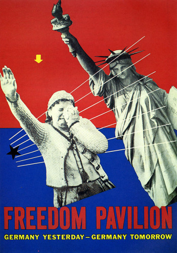
Lester Beall, Unbulit Freedom Pavilion, 1939
-

- Lester Beall, Unbulit Freedom Pavilion, 1939
-

-
-

- Lester Beall, A Better Home, 1947
-

-


-

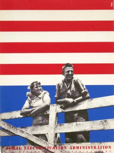
- Lester Beall, Poster for the Rural Electrification Administration,1934
-

-
-

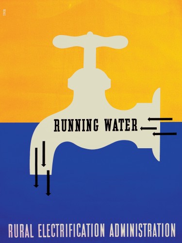
- Lester Beall, Running Water, 1937
-

-

-
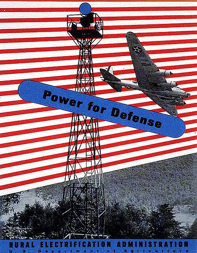
- Lester Beall, Power for Defense, 1937-1941
-

-

-
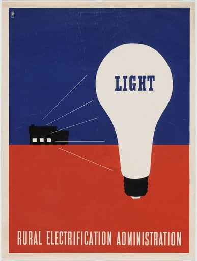
- Lester Beall, Light, 1937
-

-

-

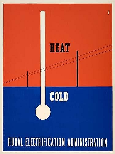
- Lester Beall, Heat-Cold, 1937
-

-
-

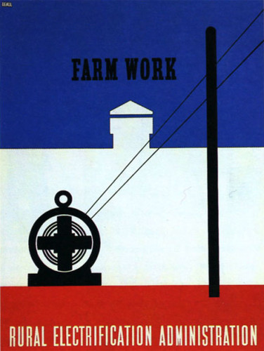
- Lester Beall, Farm Work, 1937
-

-
-

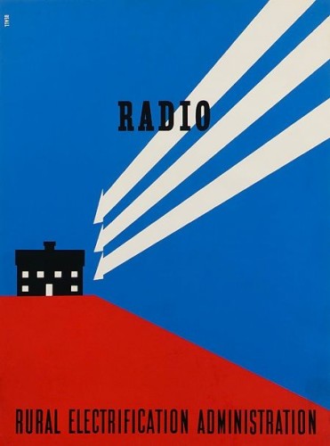
- Lester Beall, Radio, 1937
-

-
-
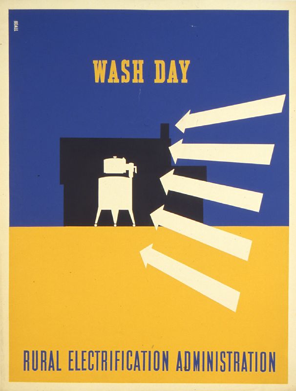
- Lester Beall, Wash Day, 1937
-

-
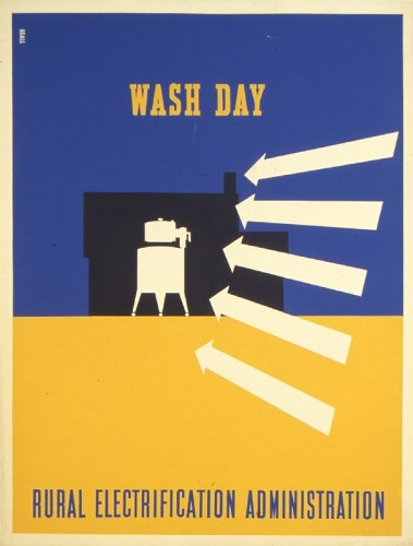
The general relationship between these designs are easily recognizable. Each one is done with primary colors (mostly red and blue). They all contain parallel and diagonal lines to create a well organized design and help the viewer’s eyes flow off the page. They each convey a message about the American life or technology that we use. His typography is very clear and concise and has the title of each print in each design. He worked with the Rural Electrification Administration and the government to help communicate with the American people. It was either good advertisement or to open his viewer’s eyes to see what was really happening in American society.
Part 1:
Lester Beall was born in 1903 in Kansas City, Missouri. He was a notable American Graphic Designer. He was mainly known for his clear precise use of typography, as well as his bold use of primary colors, lines, and arrows. It became such a well known style of his that when someone saw his work, it was easily recognizable. Beall as a young child spent most of his time in St. Louis and Chicago. He graduated the University of Chicago and began his design career in 1927. His work was quickly discovered. Each one of his designs delivered an “arresting message”. He had a thrusting perspective and abstract shapes that made his posters stand out. In 1937 he got his work exhibited in the Museum of Modern Art in New York where he moved to in 1935 and opened his own studio/office. His work demonstrated the rapid change in American culture and society. He wanted to find a way to communicate the expanding world of science, technology, and manufacturing in America and how it has brought rising expectations that called for a new graphic imagery / design. He died in New York in 1969 in his farm where he lived with his family. In my opinion Beall’s work is very simple, but effective. His work showed me that you don’t need complex designs to create a good design. I enjoyed going through his work and seeing how he tried to communicate with his audience.
Part 2:
- Being simple can sometimes be the best form of design
- Every design must convey a message as well as an emotional reaction.
- The way he used lines, arrows, primary colors and abstract shapes gave him his signature style.
After reading this article, it helped me better understand what hierarchy is. I never thought about how it gives workplace, family, religion, politics, etc. it’s power and position. In graphic design it gives words and pictures structure and meaning. It makes it stand out on a page or product and catches the viewer / consumers attention. It also gives the design flow and conveys a clear message. When we first started our weather report project, I was just placing the information around the page aimlessly. Once I read the pages about hierarchy, I placed the words in an order that had better continuity and was easy to understand. The pages from the book really helped me grasp the meaning of hierarchy and how to use it. Being able to use this information on my own designs will help me become a better graphic designer.
Montgomery, AL
36101
Overcast
73°F / 23°C
Humidity : 81%
Wind Speed : E 7 mph
Barometer : 30.18 in (1021.9 mb)
Dewpoint : 67°F (19°C)
Visibility : 10.00 mi
Last update : 4 Nov 8:53 am CST
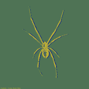
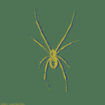


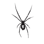
Thoughts: I found this project to be different from what I usually do, but at the same time enjoyable and interesting. The process itself was fun to do, especially sketching out the tool combinations. Being able to get with another person to create the mind maps, helped expand our ideas and made it easier to pick out what I wanted to create on the thumbnails.
Mind Map:
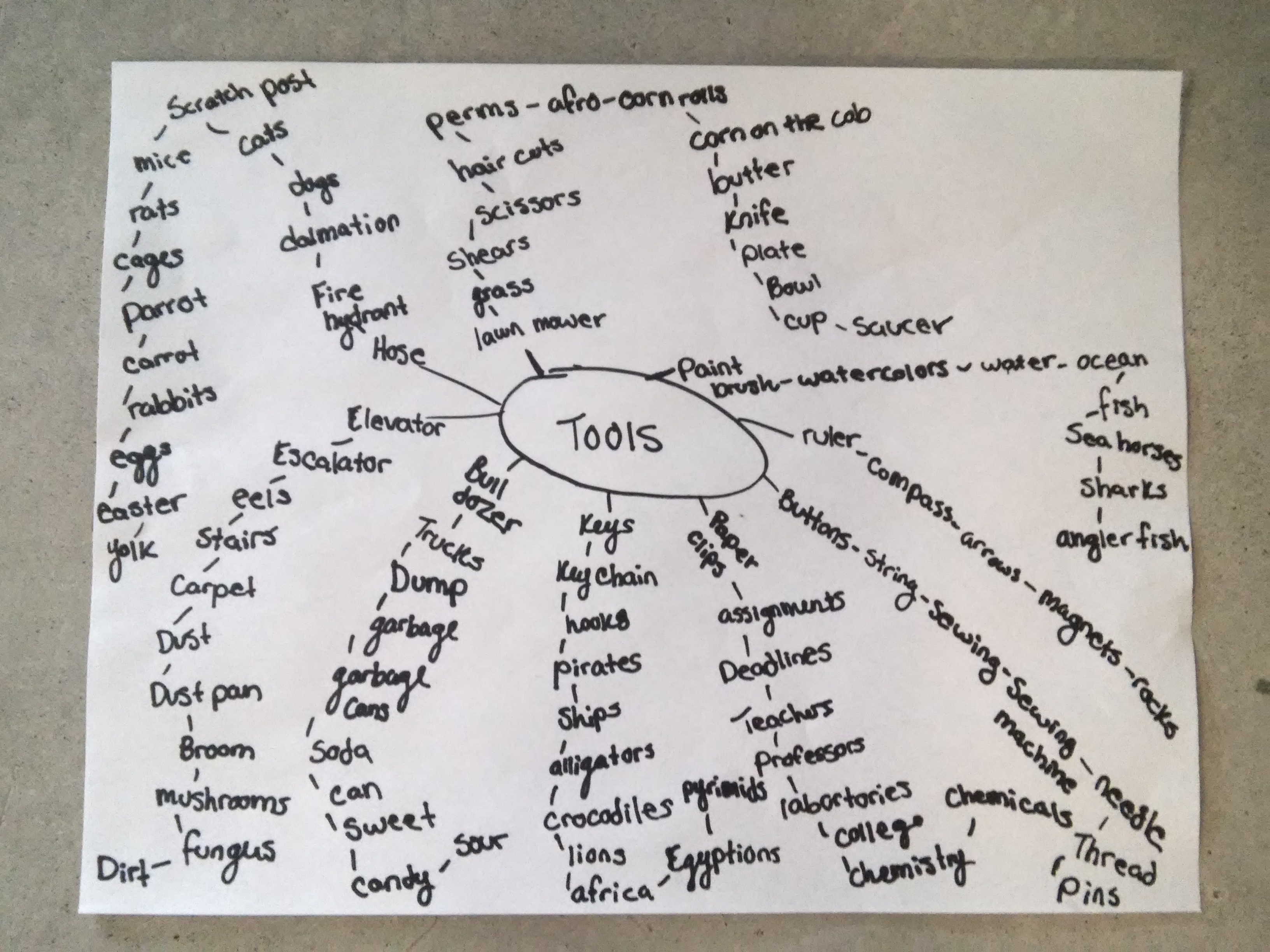
This is one out of three of the mind maps that me and my partner created. This one seemed to have the most ideas on it.
Tool Combinations:
- Sharpie + Drill
- Paper clip + Button
- Broom + Eels
- Keys + Knife
- Pen + Nails
- Spoon + Scissors
- Button + Soda can
- Ruler + Hammer
- Fork + Panda
- Carrot + Wires
- Shark + Magnets
- Compass + Headphones
- Chalk + Cheese
- Hamburger + Elevator
- Box + Bulldozer
- Paintbrush + Shoes
- Sunglasses + Socks
- Sun + Cigarettes
- Needle + Arrows
- Train + Phone
- Butter + Hose
- Cage + Bowl
- Mushroom + Toilet
- Birdhouse + Marble
- Puzzle + Plate
Top Ten Tool Choices:
- Sharpie + Drill – This would be a fun combination to draw because right away I thought of a sharpie where the drill bit would go.
- Broom + Eels – I thought since eels are wet and slippery, it would be cool to make a broom that could slide across the floor and clean by itself.
- Keys + Knife – I thought of a sharp object that could protect you, cut your meals, and at the same time get you into your house.
- Pen + Nails – I thought this would be easy to create but at the same time a useful tool to have around.
- Spoon + Scissors – I thought of creating a multi-tool that could be useful but weird at the same time.
- Ruler + Hammer – being able to have a ruler to measure out where the nails should be placed, and then having a hammer right in your hand to hammer them in
- Shark + Magnets – I thought it would be fun because it would attract more fish to feed the shark.
- Compass + Headphones – Right away I thought of the headphones being the arrows to the compass
- Hamburger + Elevator – I thought this would be fun to do because who doesn’t want to ride in style.
- Mushroom + Toilet – I thought it would be fun to create something funny, but at the same time “stylish”.
Thumbnails:
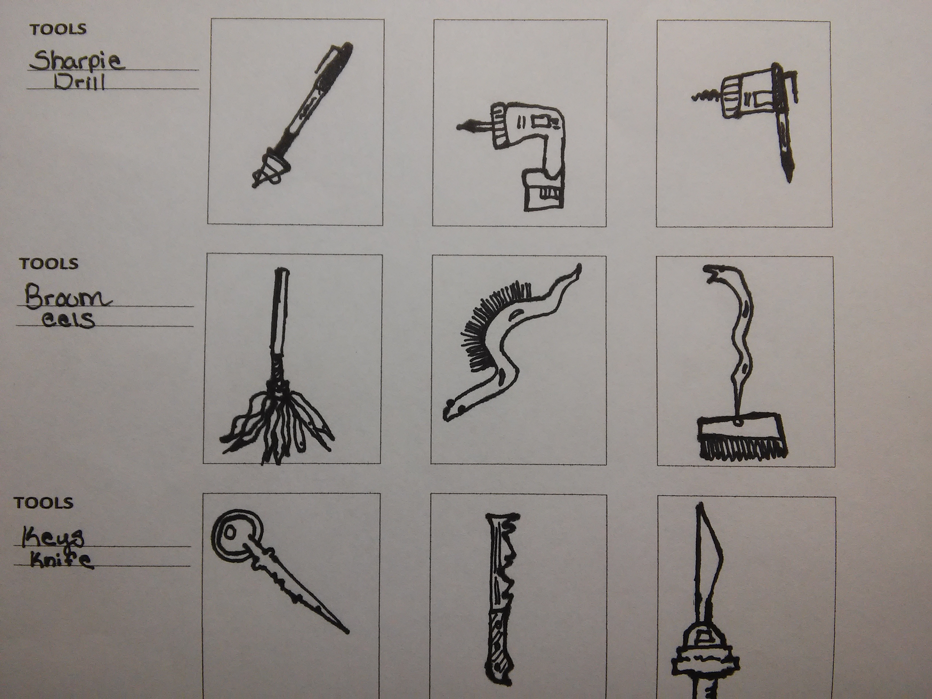
These are only a few of the thumbnails that I created out of 30.
Why Graphic Design? I am interested in graphic design because I have a love for art, as well as connecting with people through different art medias. Ever since I was a kid, I had a passion for art. Being able to impact someone just through ads, logos, or commercials means a lot to me, and is why I chose graphic design. I would like to take what I learn from this class to help me become a graphic designer myself. Two areas of that I found interesting in the reading were motion design and advertising.
Motion Design: I found motion design to be an interesting area because it is an eye catching way to attract people through sound and visual effects. Being able to produce something that can be heard and seen across the world can be a life changing experience, especially when it can connect emotionally with other people who see it. This form of graphic design can hit home for many people. Being able to create one would be an interesting experience and extremely fun. I have a very active mind that is constantly thinking of new ideas. Having those ideas come to life is a dream come true.
https://www.youtube.com/watch?v=NlseW5s-w-s
Advertising: I found advertising to be another interesting area of graphic design because it is one of the most famous forms of graphic designing. I say this because advertising is EVERYWHERE! People see it on their televisions, phones, computers, tablets, stores, and even hear it from other people. It consumes our lives and sometimes we don’t even realize it. The reason I like it the most is because a single ad that might just have a picture, can mean so much. I’m a very shy, but creative person. Sometimes it’s hard for me to express how I feel or talk about my problems, but being able to express through a picture helps a lot, and can help others as well.

This is an ad about the awareness of smoking and how it can effect the ones around you. It holds a strong message and a strong image.

This is a more funnier ad about Burger King. Ronald McDonald is ordering from his rival in the fast food industry, Burger King. This ad shows the viewer that Burger King’s food is so good, that even Ronald McDonald himself cant resist.
-
-
Classroom
-
-
Recent Posts
Recent Comments
- Danielle Vizard on Thinking with Type — TEXT
- Danielle Vizard on Digging’ It!
- Jenna on Thinking with Type — TEXT
- Jenna on Digging’ It!
- Elizabeth Robinson on Digging’ It!
Archives
- November 2023
- August 2023
- May 2023
- April 2023
- March 2023
- February 2023
- January 2023
- December 2022
- November 2022
- October 2022
- September 2022
- August 2022
- July 2022
- June 2022
- May 2022
- February 2022
- December 2021
- November 2021
- October 2021
- September 2021
- August 2021
- June 2020
- February 2018
- December 2015
- November 2015
- October 2015
- September 2015
- August 2015
Categories
-
About
KSC GRAPHIC DESIGN

Leave a Reply
You must be logged in to post a comment.